
Website Header Design in 2023: Examples and Best Practices
A site visitor likely makes up their mind about your website, and your brand, within 2 seconds of looking at your site’s initial load in their web browser, and your site’s header is a big part of that initial impression. Within those 2 seconds, a prospective customer will make an abrupt decision to either explore further or look for something else to engage them.
Your website’s header is arguably the most important element on your entire website. It helps them get a visual cue of what your site contains, how they can quickly find the information they need, and how your brand effectively solves their problem.
In this post, we’ll dive into everything you need to know about website header design, best practices to guide your projects, and a few examples as inspiration.
Website Header Design Basics
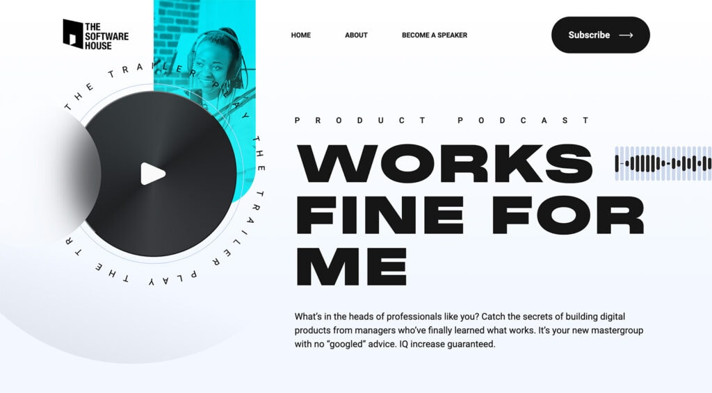
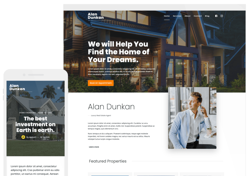
The Software House Example
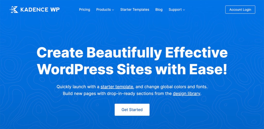
Kadence WP
But first, what exactly is a website header? So we’re clear, a website’s header is generally the top portion of a website containing brand elements, navigation, and anything that users can find helpful to navigate engagement with your brand. Headers are often on every page of a website but are often more visually impactful on home or landing pages.
There are quite a few words that we use when talking about website headers that might not be as familiar:
- Navigation, menu, navigation menu: A list of clickable links to different website sections.
- Hamburger menu: A three-line stacked icon that expands into a navigation menu when clicked. While common on mobile devices, they have also started to appear more for desktop navigation as well.
- Call to action: A button/link that encourages visitors to take a specific action, such as making a purchase, signing up for a newsletter, or performing another action.
- Dropdown menu: A menu that expands when a user hovers over or clicks an item, revealing additional sub-menu items.
- Sticky: A header that remains visible at the top of the page as the user scrolls.
- Hero header or image: An oversized image or video that occupies most of the header space. It may also include text elements or a call to action.
- Mega menu. Mega menus use large popup windows to display a range of choices not usually available through other means. They have the advantage of allowing users to select their destination without navigating through separate layers of a menu hierarchy.
Types of Website Headers
Lab Brilliance
This header highlights the logo and contact while hiding menu items in a hamburger-style navigation. This style can be effective when you want your users to dive into the content of the hero area below the header.

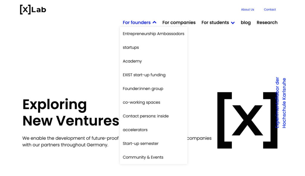
[X] Lab
[X]Lab uses a drop down navigation highlighting navigation for specific visitor types. The about us and contact information get a different treatment above the general content navigation.
There are plenty of different ways to create and design website header elements. There’s no one-size-fits-all solution, and it is important to consider your audience and visitors when selecting the type that best represents your project.
A static header remains fixed at the top of the website, even when the user scrolls down the page. It typically includes the logo, navigation menu, and sometimes a call-to-action button. This is the most common – and concise – form of header.
A sticky header, which we mentioned above, is similar to a static header but “sticks” to the top of the screen as the user scrolls. This type of header can be a good choice if you have a lot of content on your website and want to make it easy for users always to access the navigation menu. A sticky header may also “shrink” on scroll, so it is not quite as large as when you first come to a page.
A full-screen header takes up the entire screen and typically includes an image or video background, along with a call-to-action button or text overlay. These are often referred to as hero headers. This type of header can be visually striking but may only be appropriate for some websites.
A transparent header is a popular design trend that involves using a header with no background color so that the background image or video shows through. This header type can add a modern, sleek look to your website.
An overlay header typically appears after the user clicks a button or icon and overlays the website content with a menu or other options. This type of header can be a good choice for mobile-responsive websites where space is limited. An overlay header is often used in combination with a hamburger icon/menu and opens when clicked.
A mega menu header includes a large, multi-column dropdown menu that displays when the user hovers over or clicks on a menu item. This type of header can be a good choice for websites with a lot of content and information.
A multi-layer header often has two levels of header or navigation elements. This might include a smaller top bar with basic contact information or social media links above a taller, more traditional navigational header element that contains a site logo and links.
Elements to Include in a Website Header
Planoly
Planoly has simple and easy to understand navigation that makes starting a free trial a primary focus, while making it very simple for visitors new to the brand to explore their solution.

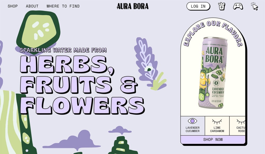
Aura Bora
Aura Bora puts their brand element front and center, while exploring where to find their product and buy at a retail location is a priority. Icons on the header’s right hand side spark curiosity for those who might have already established a relationship with the brand.
The type of header you select for your website design often depends on what information it should contain. There are standard elements that users expect to find in the website header.
Common website header elements include:
- Logo: Prominently displayed in the header, the logo is an important part of your brand identity and is often the home button for the entire website design.
- Navigation: The menu should be easy to find and use, with clear labels for each page.
- Search: If your website has a search function, including a place in the header can make it easier for visitors to find what they want.
- Contact information: Phone number, email address, or physical address can be helpful for visitors but isn’t required for all website header designs.
- Call-to-action: A button or link in the header can encourage visitors to take a specific action, especially if it looks different from other navigation elements.
- Social media icons: Make it easy for visitors to find related ways to connect if you are active on social media.
Language or currency selector: If your website serves an international audience, including a language or currency selector can make navigation much easier. - Login: If users need to authenticate to your website to manage an account or purchases, a login button should be included in the header.
- Shopping elements: For e-commerce sites, headers should include links or icons for necessary shopping actions such as the cart, checkout, or favorite/saved items.
Website Header Design Best Practices
Wergs Consultancy
A simple navigation that highlights where someone is on the site with a simple bottom border/underline is a good option for a simple site.

Live Relentless
For an eCommerce site, navigation that provides an overview of the cart contents is helpful, as is the ability to quickly find on-site search capabilities.

You probably intuitively know a good header from a bad one right away. A well-designed header is clear, easy to understand, and helps you on your journey through the website. A well-designed header puts user needs first and helps your audience find what they are looking for.
Keep these website header best practices in mind when planning top-of-page design.
- Simplicity. Remember, you only have 2 seconds to make an impression. Keep your header simple and uncluttered with essential information to guide site visitors towards further engagement.
- Responsiveness. Ensure that your header design is responsive and can adapt to different screen sizes.
- Crisp and clear. Use high-quality images or video that is optimized for web use. Blurry or pixelated images can make your website look unprofessional.
- Brand supportive. Showcase your brand in the header using a logo and brand colors to help visitors identify and remember your website.
- Clear. Use clear and concise menu labels that are easy to understand.
- Concise. Streamline the number of options available in the menu; too many choices can appear cluttered and confusing. Help lead users down a logical path with just a few high-level options.
- Easy. Choose typography that is easy to read and complements your brand style. Use font styles to guide visitors through your header design. It should be easy to scan and understand.
- Optimized. Ensure your header is designed for speed. Large images and complex designs can slow down your website, so optimize your header to load quickly. Avoid loading animations because they can make a website appear to load more slowly.
- Accessible. ADA compliance is not only required by various laws, but it is just good practice to ensure that your site is accessible for everyone no matter if they’re using a browser, a screen reader, or any other device.
Start Designing
A website header is often the first thing someone sees when they visit your site. The visual appeal and functionality are vital for this reason.
Remember, less is often more when creating a header. It needs to look good but be just as easy to read and understand. When designing a website header, always be prepared to test the design and have another option if users aren’t responding well. Sometimes something as simple as a new image or different words can make a world of difference without a complete redesign.
Building Headers with Kadence
There are a variety of ways you can build headers with Kadence. In the Kadence Theme customizer, there is an entire header builder that makes creating effective headers easier. Our help documentation on Kadence header builder walks through how to do this. If you’re looking to create a transparent header or a sticky header, we’ve got documentation on that, too. You can even set up conditional headers for specific pages or groups of pages.
And if you’re looking for even more granular control, you can replace headers based on specific conditions by using Kadence Elements content sections and setting it to replace headers.
Grow your Site with Kadence
A Kadence full bundle gives you everything you need to supercharge your site to take advantage of the latest web design trends.
Create Your Website With KadenceWP Today!

Written by Kathy Zant
Kathy is a writer and speaker who helps businesses and people thrive. She creates some of the best content and tutorials about how to get more out of technology, marketing how-tos that help you grow your business, reports on security issues you need to know as they occur, and gives you all the tutorials to stay ahead and secure your life and business.
By Kathy Zant
Kathy is a writer and speaker who helps businesses and people thrive. She creates some of the best content and tutorials about how to get more out of technology, marketing how-tos that help you grow your business, reports on security issues you need to know as they occur, and gives you all the tutorials to stay ahead and secure your life and business.
Updated February 14, 2025
Create Your Website With Kadence

