11 Effective Landing Page Examples

A strong landing page is one of the unsung heroes of digital marketing. It helps you convert users quickly on your website.
When a link or ad sends a user to a landing page designed for conversion, everything on that page leads to a single call to action. It’s designed for direct and quick response.
However, not all landing pages are created equal. A more targeted approach – one that involves crafting landing pages with a laser-like focus – is the best path to designing something that’s usable and effective.
Here, we’ll take a look at 11 landing page examples that are made with a distinct goal in mind to help you find inspiration for your projects.
1. Constant Contact
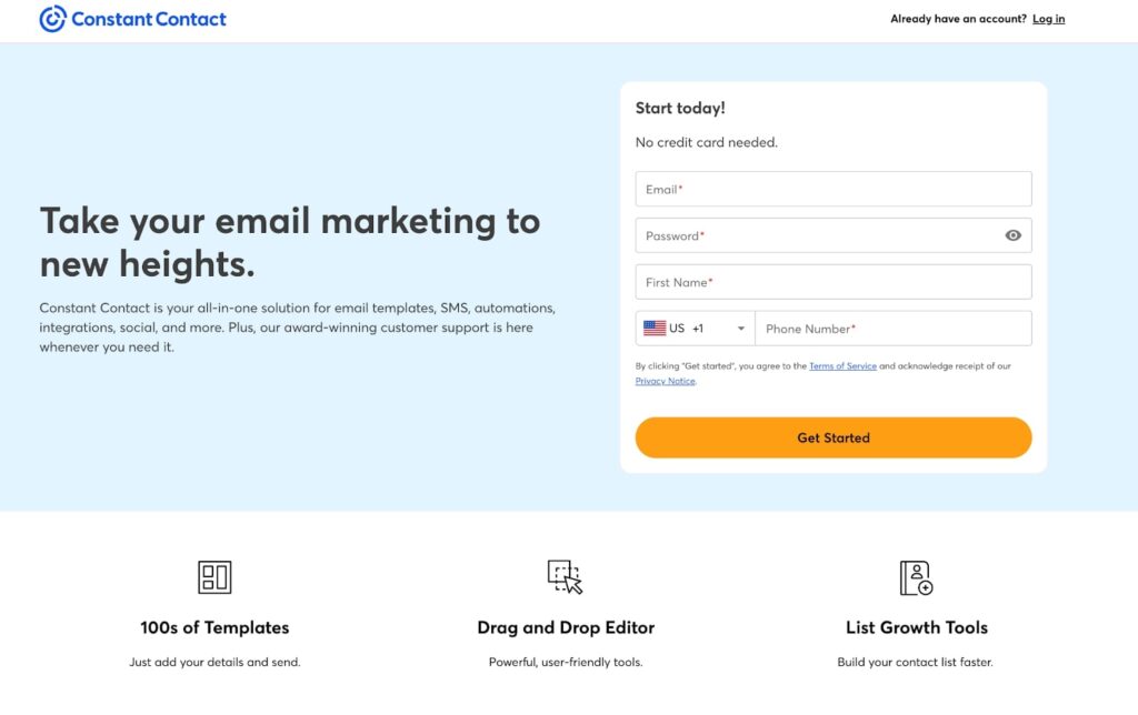
Constant Contact, an email marketing tool, created a landing page to help draw in new customers. The entire page design is centered around the call to action to “Get Started.”
What’s nice here is the page’s structure and flow. If you are ready to start, the form is front and center. If you need a little more convincing, there are plenty of value props below the scroll to help you better understand the product.
What we love: The simple form above the scroll is the first thing you see. Combine that with concise copy, a strong testimonial, and a clean design for a winning combination!
2. Capital Numbers
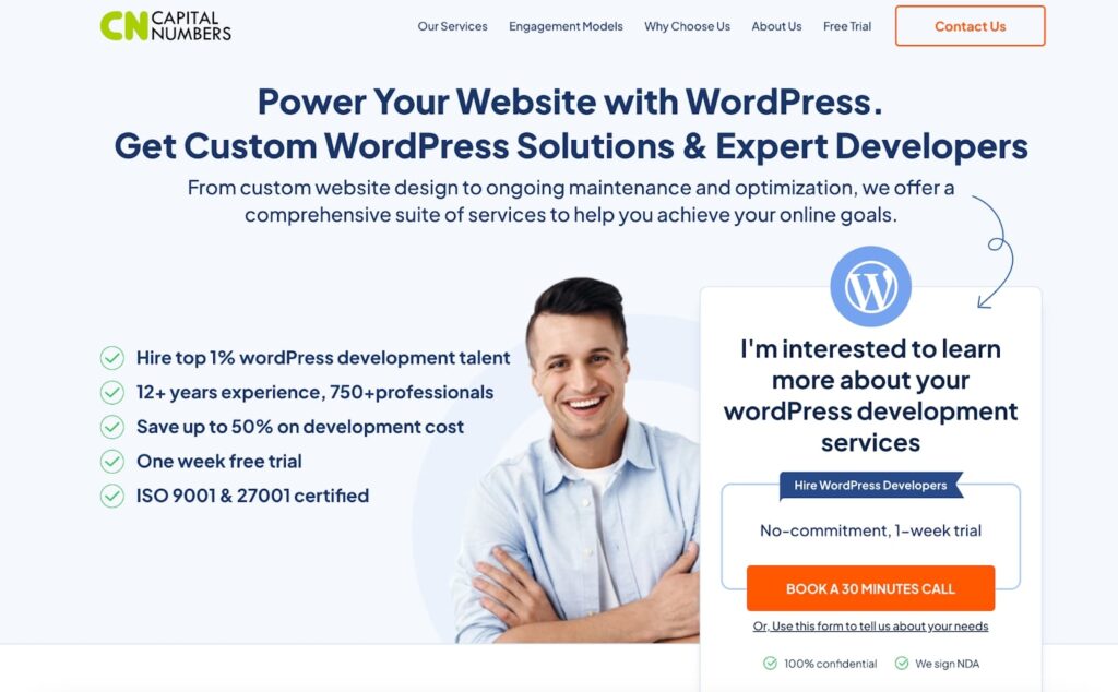
Capital Numbers has a lead generation page that helps users get started with their website development service. To help visitors understand the value of their service, they use reviews and testimonials.
Then, they make it easy to engage with a form right on the page, plus a popup if you missed out.
What we love: With frequent call-to-action elements and compelling copy focusing on benefits, Capital Numbers helps reinforce why you should engage with them.
3. Search Engine Journal
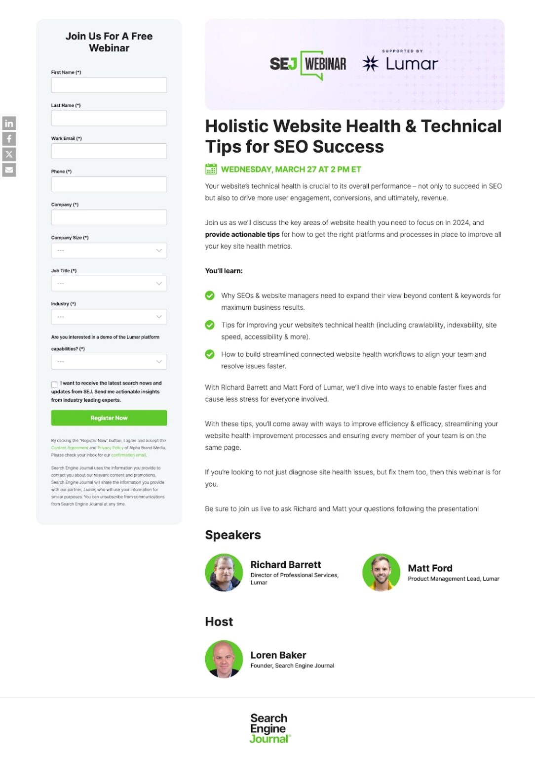
Search Engine Journal wants to make no mistake with its landing page for a webinar registration. With no menu, the form is the focus of the page.
Every element of the copy focuses on the benefits of the webinar, and there’s nothing extra to get in the way or distract from the goal of the page.
What we love: The short, focused page that gets right to the point with a clean design that doesn’t distract from the landing page’s goal.
4. Klaviyo

While not for a webinar, Klaviyo takes a similar approach with its landing page for marketing software prospecting and signups.
With a dark aesthetic, this landing page is immediately different from others you may land on. With a form at the top of the page and plenty of social proof – from companies using the tool to awards – filling out the CTA request is a no-brainer.
What we love: The clean design focuses on the form, which is simple and easy to understand.
5. WebFX

WebFX is a digital marketing agency with a strong lead-generation landing page. It has multiple opportunities to get a free proposal with a button and website entry.
There’s also a video to learn more, and the short page is quick and easy to understand so that users know exactly why they are there.
What we love: An element of social proof with popular companies who use the tool, including listing results and the benefits of working with them.
6. Kittl
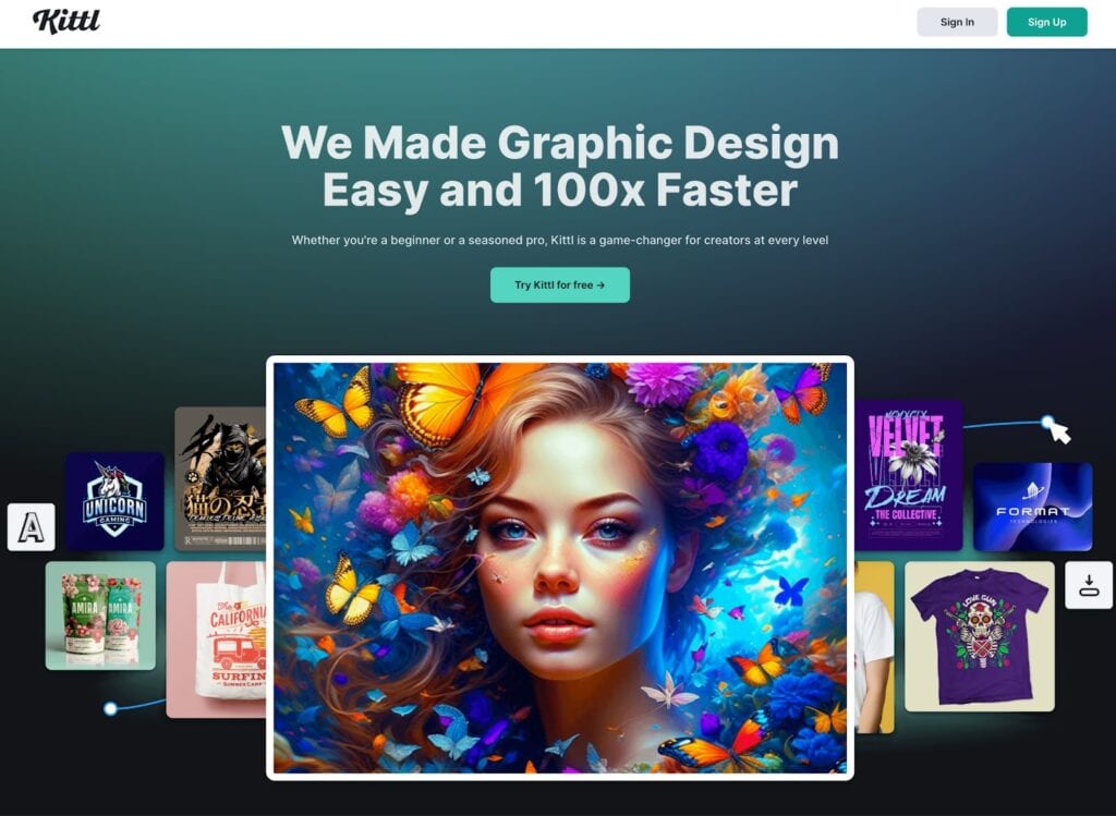
Kittl, a graphic design platform, makes its landing page clear so you know exactly what they do.
The call to action — Try Kittl for Free — follows users throughout the design to help encourage product signups. Elements of social proof, reviews, and a FAQ section make it easy for potential customers to feel good about the product before clicking through.
What we love: The super-easy popup form appears at just the right time on the scroll to help you finish converting.
7. Respondology
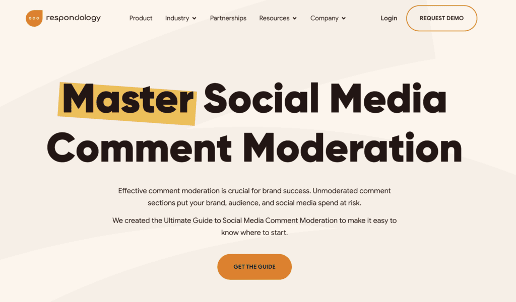
In this landing page example, Respondology wants you to download their ebook to learn more about mastering comment moderation online. This element helps the company generate leads while giving users something valuable.
Including the table of contents for the book next to the form to get it is a strong combination of value prop and CTA to encourage action.
What we love: Compelling copy focuses on the company’s ebook so you know exactly what to do.
8. Hungryroot

Hungryroot proves that a good landing page is also on-brand. Its landing page helps users understand the grocery/food service and take the quiz for their food selections or get started right away.
The clean design is engaging, encourages scrolling, and helps users find additional information, such as reviews and FAQs, if they need them to make a decision to act.
What we love: A planned lack of navigation puts all the focus on the call to action with easy-to-digest information.
9. Twilio
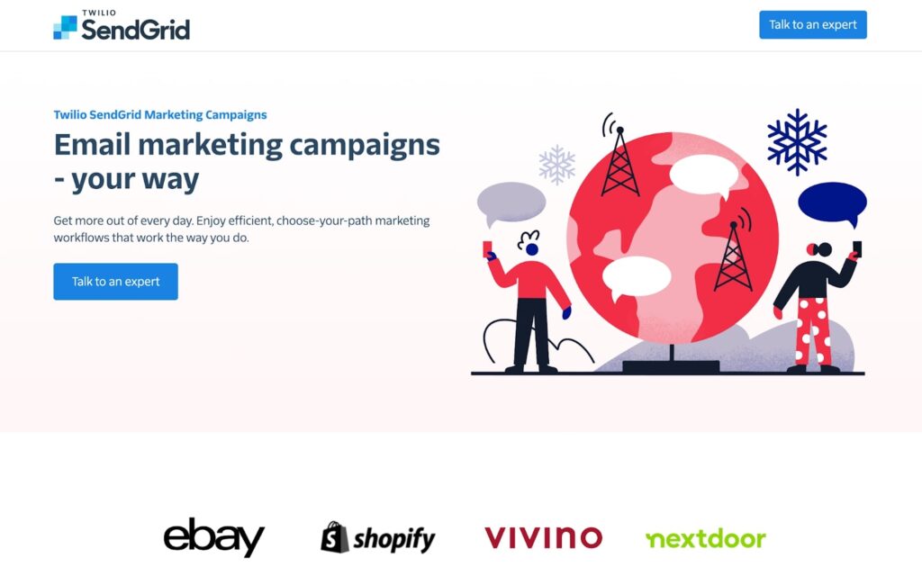
Twilio is trying to generate leads with a landing page for their email marketing service. Without a menu or navigation, the page has a direct and singular focus with easy buttons to “Talk to an Expert.”
Using social proof, frequent CTAs, and listings of benefits versus the competition, Twilio makes a strong case that ends in a form to sign up to talk with someone.
What we love: Not only is the page and design simple, but the page is concise and leads you right to the contact form.
10. Wrike

Wrike, a project management tool, is trying to generate signups and new users with a simply designed landing page with a single conversion path.
Every element of the page is designed for email registration/signup. It helps you get there with a quick overview of features and benefits wrapped in a clean design.
What we love: Social proof through testimonials can help ensure users make a choice to interact with the call to action.
11. The Daily Upside

The Daily Upside is an email newsletter with financial stories and information. The goal of the landing page is to get people to sign up for the email.
Getting users to sign up for a daily email can be a big ask, which is why the landing page is simple, short, and includes reviews that prove its worth. The design is also on-brand with what you’ll get in the daily email!
What we love: This landing page’s simplicity and conciseness are lovely and give you an idea of what to expect if you sign up.
Start on Your Next Landing Page with Kadence
As you can see from the examples above, every landing page can be a little different. When you go to create your own landing page, your design choices depend on your industry, specific campaign, and conversion goals.
If you are looking for a better solution for designing stellar landing pages on your own, Kadence has plenty of tools. With fast, effective, and beautiful design options, there’s something for everyone.
Plus, you can use Kadence in the way that works for you, from the full Kadence Theme to Blocks or Conversions with options to add lightweight pop-ups, slide-ins, or banners like some of the examples above.
View all Kadence WP products or get started for free today!
Create Your Website With KadenceWP Today!

Written by Carrie Cousins
Carrie Cousins has more than 15 years of experience in media, design, and content marketing. She’s a writer and designer, has an MBA from Virginia Tech, and is passionate about creating amazing experiences for businesses online. Her work has been featured in publications such as Design Shack, Webdesigner Depot, The Next Web, and Fast Company. She’s an avid runner, which comes in handy with a trio of Australian shepherds at home.
By Carrie Cousins
Carrie Cousins has more than 15 years of experience in media, design, and content marketing. She’s a writer and designer, has an MBA from Virginia Tech, and is passionate about creating amazing experiences for businesses online. Her work has been featured in publications such as Design Shack, Webdesigner Depot, The Next Web, and Fast Company. She’s an avid runner, which comes in handy with a trio of Australian shepherds at home.
Updated March 3, 2025
Create Your Website With Kadence