5 WordPress Web Design Trends for March 2023
Designers are waking up to big, bold styles with trendy website design elements that demand attention. We are loving the varying uses of bold aspects this month to help design bounce back from some of the more subdued trends to things that you definitely want to look at.
Here are five great trends to consider this month:
1. Experiment with Side Navigation
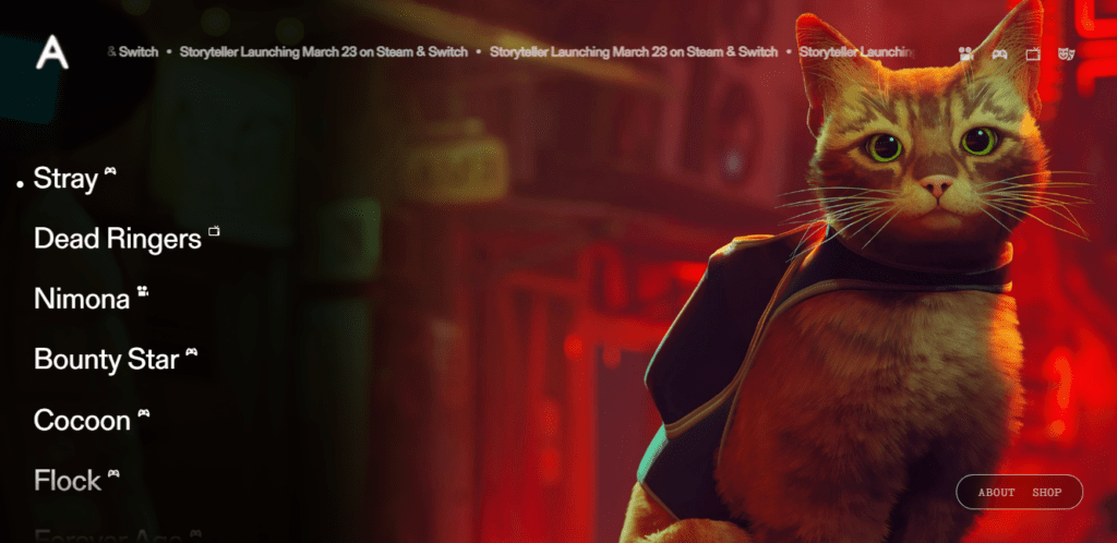
Side navigation is one of those tricky design trends that come in and out a lot like spring – in like a lion and out like a lamb. It tends to be used well on a few beautiful designs and gains popularity, and then we remember how hard it is to use, and the trend fades again quickly.
You can make this trend work though with the right aesthetic, such as in the example above from AnnaPurna. Side navigation works best when there’s not a lot of other stuff in the way, and the words can be large and focused.
Here’s another trick for making it work – words generally need to be about the same length or stacked with purpose. Alternating long and short labels in side navigation can be distracting and difficult to work with.
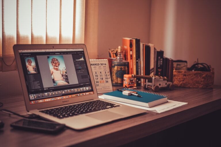
2. Mix Graphics and Photos
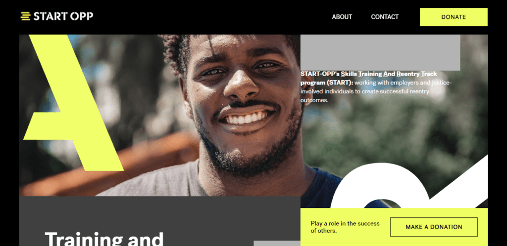
Do more with your photography by using graphic elements in trapped spaces in images. This can add color emphasis and a little extra visual interest to images that might not be enough to carry the design on their own.
In the Start OPP example above, shapes (partial letterforms) in bright, brand colors help create extra emphasis on the image and push the user through the design. Your eyes almost move across the screen to follow the letters, from left to right, even though there’s nothing to read.
The bright shapes also help add more brand quality to the image and integrate it with the rest of the design.
While this image uses letters for graphics, almost any shape can be equally effective. Use graphic elements that mimic the shape of your logo or shapes that you use in other brand elements.
3. Lean into Branding
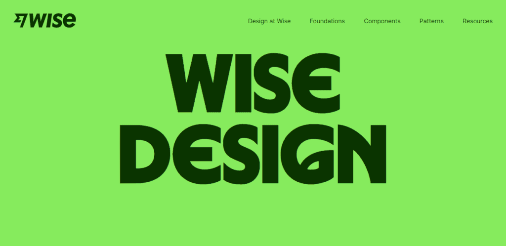
Wise recently rebranded from another name and color scheme, and their design site is going big and bold to highlight that change.
If you have a strong brand – or just want to emphasize the brand – going big with a logo, brand color, or imagery can be a good way to help better establish that visual connection. This design is so simple but effective. It’s a good example of how to create impact without having to rethink the wheel.
Your website should be a reflection of your brand and who you are. Lean into it.
4. Pair Bold Text and Images
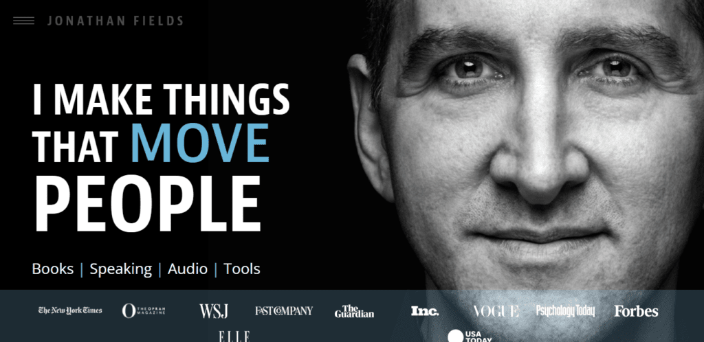
We talk about bold design options all the time, but usually for a single element. Consider a bold pairing with text and an image that jumps off the screen.
In the example above from Johnathan Fields, this includes an almost life-size face (depending on your screen size) and thick, large slab typography to drive the message home. Note that there’s both size and color variation with the main headline to create even more of a focal point.
5. Engage with Background Video
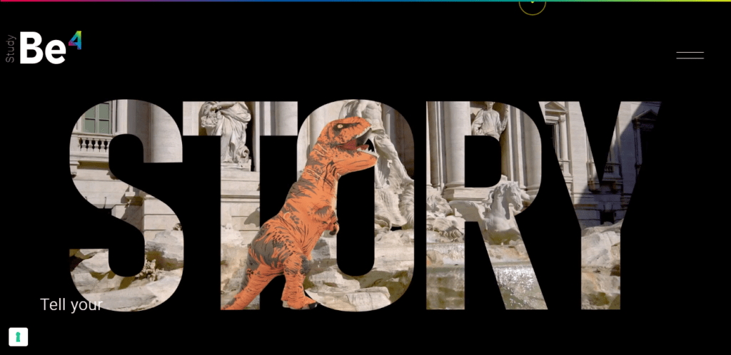
Full-screen video reels have been a dominant visual for quite some time, but this variation of the trend moves video to a background element. The impact of this design with fast-motion behind cut-out letters is beautiful and engaging.
Background videos can be a bit tricky. You have to consider what will actually be in the foreground, animation and motion, secondary elements, sound, and website speed. (Then there’s the whole issue of how it will look and work on mobile devices.)
But when it all comes together as it does in this example from StudioBe4, it can be a great way to grab and keep user attention in a big way.
Putting it All Together
WordPress web design trends are a fun element but don’t feel like you have to try every new trend. If bold and big isn’t your style, it’s ok to wait and see what else comes along. Using the right trend at the right time is part of your brand and style.
Grow your Site with Kadence
A Kadence full bundle gives you everything you need to supercharge your site to take advantage of the latest web design trends.
Create Your Website With KadenceWP Today!
Written by Carrie Cousins
Carrie Cousins has more than 15 years of experience in media, design, and content marketing. She’s a writer and designer, has an MBA from Virginia Tech, and is passionate about creating amazing experiences for businesses online. Her work has been featured in publications such as Design Shack, Webdesigner Depot, The Next Web, and Fast Company. She’s an avid runner, which comes in handy with a trio of Australian shepherds at home.
By Carrie Cousins
Carrie Cousins has more than 15 years of experience in media, design, and content marketing. She’s a writer and designer, has an MBA from Virginia Tech, and is passionate about creating amazing experiences for businesses online. Her work has been featured in publications such as Design Shack, Webdesigner Depot, The Next Web, and Fast Company. She’s an avid runner, which comes in handy with a trio of Australian shepherds at home.
Updated May 21, 2024
Create Your Website With Kadence