
5 WordPress Web Design Trends for October 2023
No tricks here! All of these WordPress website design trends are absolute treats for those looking to refresh their projects or find the inspiration to start something new.
Here are five great trends to consider this month:
1. Beautiful Landscapes
A beautiful design never gets old. Amazing landscape photography can be one of those elements that helps hook users and encourage clicks.
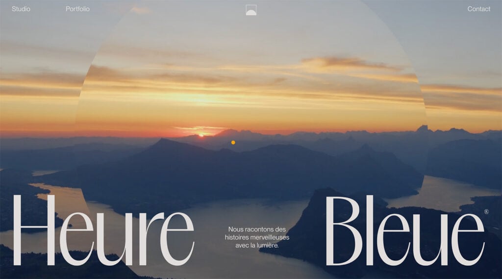
In the example from Heure Bleue, a series of great images scrolls in the background with subtle animation. It might take a full round of image rotation before you are ready to click through to other content. (This is a great idea if time on site is a key metric for your website.)
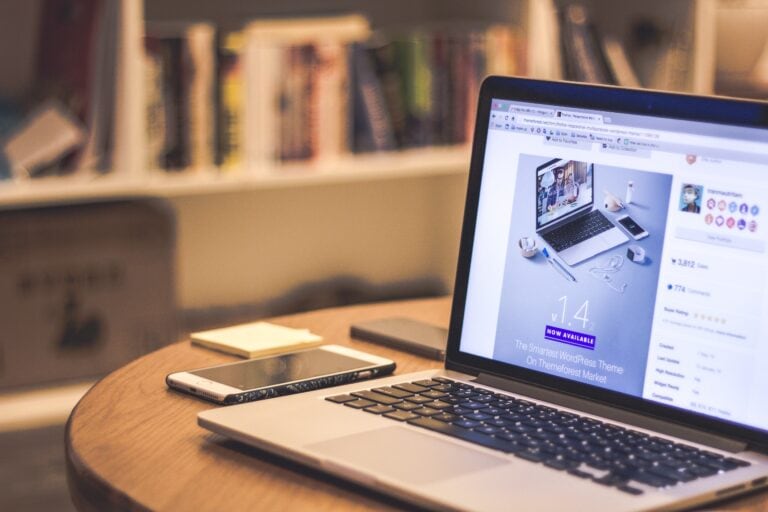
The Advanced Image Block from Kadence Blocks allows you to add fullwidth images anywhere on your site. Or if you want to add text over the image, as shown in the example above, you can set a background image within a Row Layout Block and add any block on top of it.
2. Grid Control
A structured and controlled grid can create a distinct sense of organization and hierarchy in a website design. The trick is the balance between being too grid-focused and flexible enough to feature different types of content.
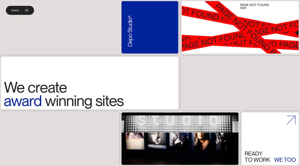
Here, Depo Studio finds the perfect mix with a static grid that features dynamic content elements in each block. The design has a distinct element of control, with photo and video elements moving into and out of different blocks on the grid.
Not only is the structure nice, but the motion keeps you engaged with the design to see what might pop up next. Three non-moving grid elements – branding, main headline, and menu – never move, creating even more stability in the design.
3. Playful Vibes
From color choices to typeface options to imagery, a playful feel can keep users flocking back to your website design.
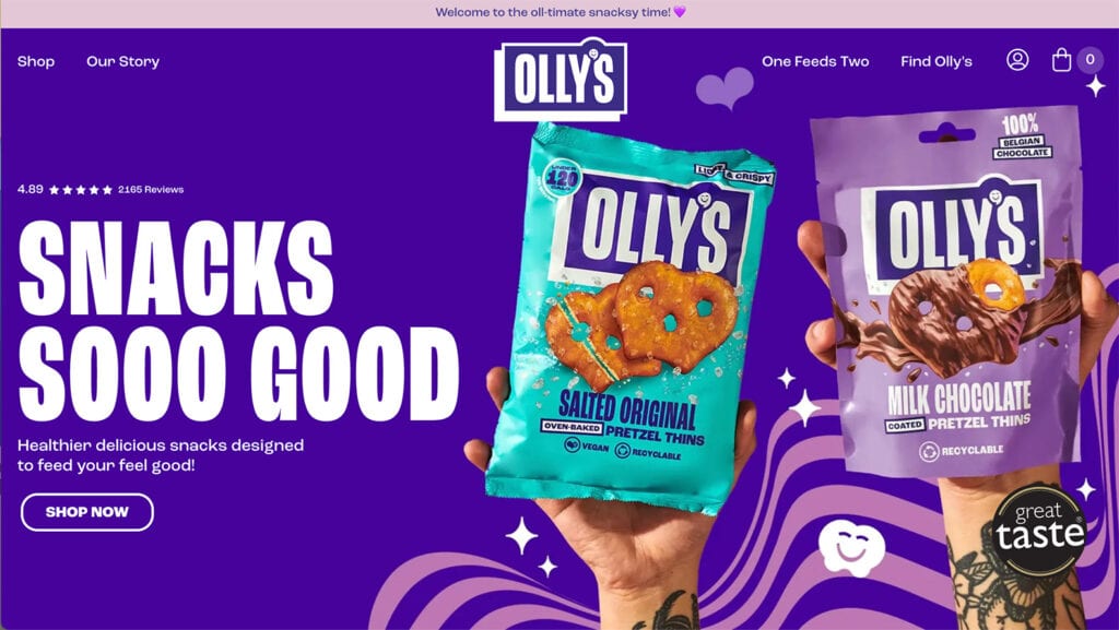
This example from Ollys, a snack company, is particularly fun and engaging. It uses a combination of bright color, typefaces that have a light and playful feel, and fun imagery (from the hands holding snacks to iconography).
The playful vibes continue throughout the scroll as well, with nifty animations with the continued color and type options. Everyone on this site is having a good time.
4. Simple Interactivity
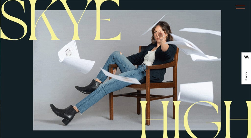
Quirky animations, loading elements, slight motions with scrolling – all of these things contribute to the simple interactivity that flows beautifully throughout this design. What’s nice is that each interactive element behaves a little differently, but they all have the same overall feel and lead into one another seamlessly. Just check out the example above from Skye High.
Much like the playful vibes trend, this type of design plan takes specific content, and the look and function of interactive elements need to match your brand voice and style.
5. Earthly Feel
In the fall, earthy tones are always top of mind. The same can be said with web design as well. Designs with an earthy feel are seasonally appropriate and just create feelings of visual harmony.
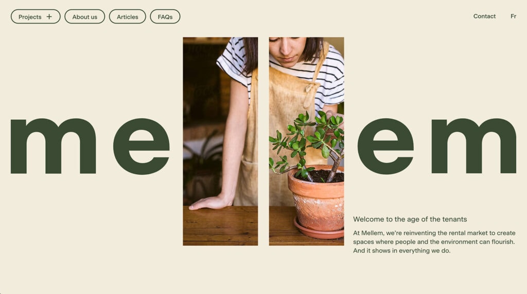
In the example from Mellem, the earthly feel is a combination of color – dark and light greens – with images that reinforce more “green” items, such as plants. What you might not expect is that this design is for real estate rentals.
For more earthy inspiration, check out our Homesteading starter template.
Putting it All Together
The common theme among these website design trend examples this month is that they are part of a full aesthetic. These aren’t one-off elements that you can easily slide into an existing design scheme.
These trends are pretty inspiring as you start thinking about new projects to wrap up 2023 or heading into the next year. Have fun planning those website designs!
A Kadence Full Bundle gives you everything you need to keep up with all the design trends and take your website to the next level. From the Advanced Image Block in Kadence Blocks to the ability to create fully customizable designs and pages, the Kadence Full Bundle gives you everything you need to make beautiful, effective, and engaging websites.
Create Your Website With KadenceWP Today!
Written by Carrie Cousins
Carrie Cousins has more than 15 years of experience in media, design, and content marketing. She’s a writer and designer, has an MBA from Virginia Tech, and is passionate about creating amazing experiences for businesses online. Her work has been featured in publications such as Design Shack, Webdesigner Depot, The Next Web, and Fast Company. She’s an avid runner, which comes in handy with a trio of Australian shepherds at home.
By Carrie Cousins
Carrie Cousins has more than 15 years of experience in media, design, and content marketing. She’s a writer and designer, has an MBA from Virginia Tech, and is passionate about creating amazing experiences for businesses online. Her work has been featured in publications such as Design Shack, Webdesigner Depot, The Next Web, and Fast Company. She’s an avid runner, which comes in handy with a trio of Australian shepherds at home.
Updated October 24, 2023
Create Your Website With Kadence