How to Use Gradients in Web Design + Examples
Using gradients in web design is a trendy and fun way to add a colorful element to almost any website design. You can use gradients for background color, buttons or user interface elements, or even text.
The great thing about a gradient color option is that it works with almost anything or any design aesthetic. Some Kadence WP starter templates even include elements with gradients, from buttons to backgrounds, that you can use for your site design to get started.
In this guide to using gradients in web design, we provide some tips to make the most of this design element plus some beautiful examples to help get you started.
What Are Gradients?

A gradient is a visual effect created by gradually blending two or more colors or shades together. Gradients can be used to create various visual effects, from simple fades to more complex patterns and textures.
Gradients can move directionally from left to right or right to left, up or down, diagonally or radially (circular pattern).
They work with any combination of colors, including monotone variations or multi-color gradients. Try a gradient with your brand colors!
This technique can be applied to almost any design element, including backgrounds, buttons, text, and images, and can be created using CSS, JavaScript, or graphic design software. Many web tools, including WordPress Gutenberg blocks, include settings for creating basic gradients, but more advanced users can create even more custom specifications with CSS.
In CSS, gradients can be created using the linear-gradient() or radial-gradient() functions, which allow you to specify the start and end points of the gradient, as well as the colors and stops along the way.
Gradients can be a powerful tool in web design, helping to create depth, dimension, and visual interest. Like any other design trick, they should be used sparingly and with intention. Too many gradients can make a design cluttered and confusing.
Using Gradients in Web Design
When it comes to using gradients in web design, there are a few things to keep in mind to ensure that the technique works to your advantage.
Start with the right color choices. Gradients work best when the colors used are complementary and create a harmonious effect. Consider using a color wheel or palette generator to help you choose colors that work well together.
Don’t try to mix and match too many tricks of effects and keep the design scheme simple. Stick to one or two colors and simple gradient patterns for the best results.
Gradients can greatly contribute to the mood or feel of a project. Think about how your color choices might make the user feel. For example, a subtle gradient can be used to create a calming effect on a website that promotes wellness, while a bold and vibrant gradient might be more appropriate for a fashion or entertainment website.
This technique can be great for helping to highlight or bring focus to certain aspects or elements in a design. That’s why gradients are a popular choice for buttons or call-to-action areas. Consider using a brighter or contrasting gradient on these elements to make them stand out.
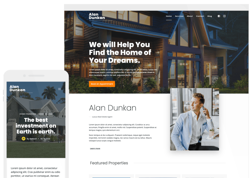
Want to get started with gradients in web design quickly? The Review Blog starter theme (pictured above) is a good place to start.
Best Practices for Gradients in Web Design
If you are ready to jump in with a gradient in your next website design project, these tips and best practices can help you create a color variation for elements that will wow users.
You’ll note each of these best practices in the examples of gradients we love section below as well!
Most of the time a gradient works best with no more than two to three colors. This includes using your brand colors to connect the design to your company aesthetic. Simple gradients can work well and don’t have to have vast contrast between hues.
On the other hand, a lot of contrast can create an impact. For example, use a light color and a dark color to create a gradient that fades from light to dark.
Consider the “light source” and the direction of the gradient. These elements impact eye flow across the screen and how “believable” a gradient may be. (A dawn sky gradient, for example, needs a light source at the bottom.) Further, a horizontal gradient can create a sense of movement, while a vertical gradient can create a sense of depth.
As with other color techniques, accessibility is important with gradients as well. Ensure that the colors you choose for your gradient meet accessibility standards, with a strong contrast between the colors.
Use gradients to draw attention to specific areas of your design, such as clickable elements or big headlines. Use a gradient that stands out from the rest of your design to make these elements more noticeable.
5 Examples of Gradients We Love
Here are five websites that use gradients in five different ways to show the versatility of this design technique and help you generate a little inspiration. Note how each project has a specific use for gradients and how they are used.
1. Evervault
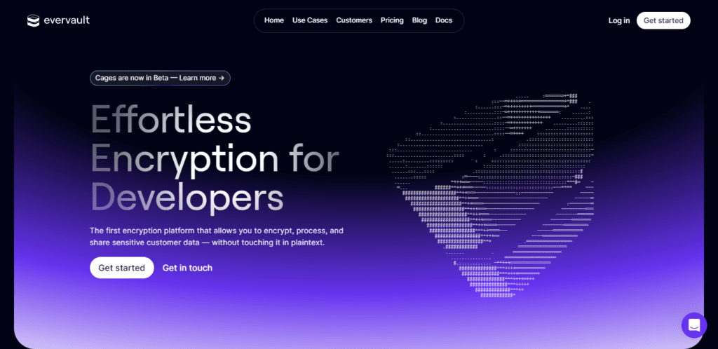
The above is a beautiful example of using gradient in web design from Evervault. Rather than a single black or purple color, the designer uses the gradient effect to blend them both.
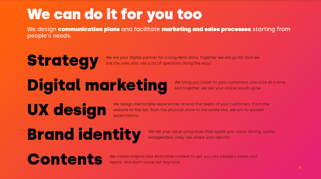
2. RETN

This example from RETN uses gradient in their font design rather than the background color. The effect is still the same. It draws your attention to that part of their website.
3. Sinfonialab
This example is from Sinfonialab brings bright pink and orange together. This makes the page really pop, drawing your attention to this space on their site.
4. Orbit

In this example from Orbit, you see a subtle gradient being used. It still draws your attention to the site without being overly bright or harsh.
5. Axiome
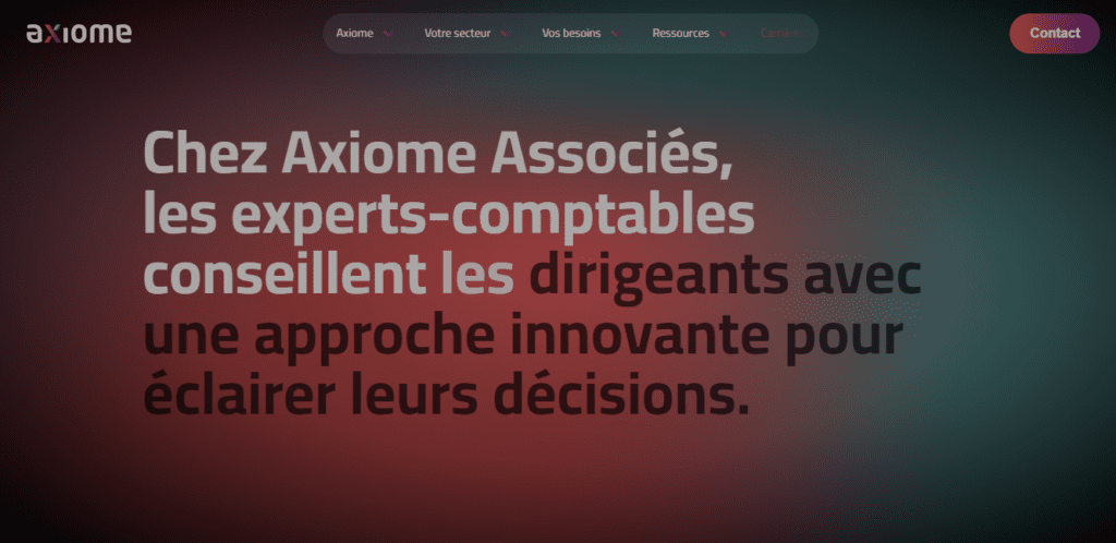
Axiome uses darker colors in their gradient but it’s not overdone. It creates a spotlight affect around the content, drawing visitors to this point on the site.
Get Started Today
Gradients are a design technique that’s pretty easy to use and can work with new or existing projects. You can start with something as simple as a single gradient headline or deploy buttons with a gradient color throughout the design to test this trend immediately.
Remember, gradients work best when used to accent or place emphasis on something, and the colors you choose can have a major effect on how people feel about the design. Test your projects to ensure they resonate with your users.
Grow your Site with Kadence
A Kadence full bundle gives you everything you need to supercharge your site to take advantage of the latest web design trends.
Create Your Website With KadenceWP Today!

Written by Carrie Cousins
Carrie Cousins has more than 15 years of experience in media, design, and content marketing. She’s a writer and designer, has an MBA from Virginia Tech, and is passionate about creating amazing experiences for businesses online. Her work has been featured in publications such as Design Shack, Webdesigner Depot, The Next Web, and Fast Company. She’s an avid runner, which comes in handy with a trio of Australian shepherds at home.
By Carrie Cousins
Carrie Cousins has more than 15 years of experience in media, design, and content marketing. She’s a writer and designer, has an MBA from Virginia Tech, and is passionate about creating amazing experiences for businesses online. Her work has been featured in publications such as Design Shack, Webdesigner Depot, The Next Web, and Fast Company. She’s an avid runner, which comes in handy with a trio of Australian shepherds at home.
Updated July 22, 2024
Create Your Website With Kadence