Improve Your WooCommerce Checkout User Experience
Your WooCommerce checkout should be the smoothest part of your customer’s journey. After all, they’ve already decided to buy. Now, it’s just about making it easy for them to follow through.
If you suspect your default WooCommerce checkout could be performing better, you can absolutely fix that. Better yet, you won’t need to write a single line of code to make it happen.
In this guide, we’ll walk you through the exact changes to optimize your checkout in minutes so you can help more customers complete their purchases with confidence.
Why customizing your WooCommerce checkout matters
Let’s look at the real-world benefits of creating a custom checkout experience:
Increases conversion rates
Did you know that better checkout design alone can increase your conversion rates by over 35%? The Baymard Institute’s research shows that thoughtful checkout optimization has a massive impact on sales.
In practice, this means streamlining those lengthy form fields that frustrate customers, strategically placing trust badges that build confidence, and providing the payment options your customers prefer. These improvements directly translate to more completed purchases and fewer abandoned carts.
Enhances user experience
A well-designed checkout creates the smooth experience customers expect — and they’ll reward you for it. Research from PYMNTS and Checkout.com found that 91% of consumers say a satisfying checkout experience heavily influences whether they’ll return to a store.
So, what makes a checkout good? Most of all, it’s the thoughtful details: Address auto-fill that remembers shipping details, smart error messages that helpfully suggest “Did you mean [email protected]?”, and mobile-optimized pages that make buying feel natural whether someone’s shopping from their couch or during their commute. All of these small touches show customers you value their time and want them to have a great experience.
Improves brand consistency
Your checkout should feel like part of your brand. When customers move from product pages to checkout, they shouldn’t feel like they’ve landed on a different website. Using your brand colors, fonts, and overall style builds trust throughout the entire process.
Boosts average order value
Smart product recommendations at checkout can seriously improve your sales. In fact, a MyBuys study of over 100 online retailers found that products recommended in shopping carts converted 915% higher than the site average. But there’s an art to doing it right.
- Show phone cases when someone buys a smartphone
- Suggest a matching wallet with a purse purchase
- Ooffer expedited shipping for time-sensitive items like gifts
The key is making genuinely helpful suggestions that enhance your customer’s purchase — when you nail this, both your sales and customer satisfaction grow naturally.
Captures valuable data
Custom checkout fields are great for gathering insights that truly matter to your business. Think beyond the basics here. Yes, you want delivery instructions and gift messages, but consider adding fields that really help you serve customers better, like:
- What’s the best time for delivery?
- Any allergies we should know about? (perfect for food/beauty products)
- Would you like care instructions with your order?
Streamlines operations
While customers enjoy a better shopping experience, checkout customization offers behind-the-scenes benefits, too. Automatic inventory updates prevent overselling and keep stock levels accurate. Built-in tax calculations and real-time shipping rates eliminate manual number-crunching. Even small touches, like gathering specific packing instructions through custom fields, help your fulfillment team work more efficiently.
Customize your checkout without code using Kadence Shop Kit
Now, let’s get into how you can actually implement these checkout improvements. Kadence Shop Kit is a premium WooCommerce plugin that gives you more control over your online store. It includes tools for product pages, shop layouts, and checkout customization.
The checkout manager adds a new section to your WordPress dashboard where you can customize every part of your checkout page. You can add new fields, remove unnecessary ones, and reorganize the entire checkout layout through a straightforward interface that doesn’t require any coding.
Here’s your step-by-step guide to customizing your checkout:
Initial setup
- Install and activate Kadence Shop Kit from your WordPress plugins page.
- Find Shop Kit in your WordPress admin panel.
- Find and click the Checkout Editor option.
- Toggle the Enable Checkout Fields Editor.
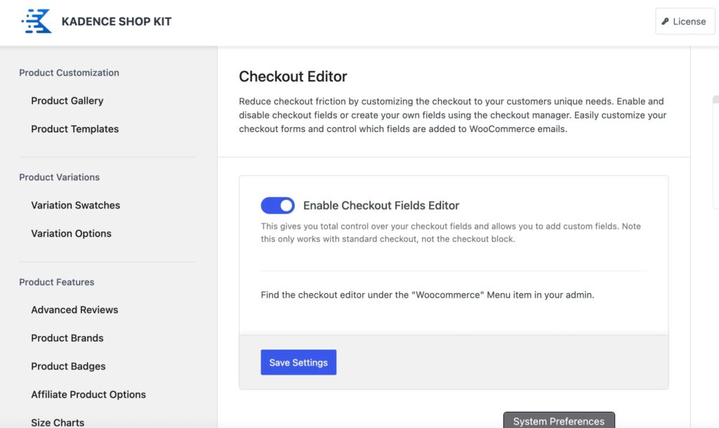
- Save your changes and refresh your admin dashboard to activate all features.
Customizing your checkout fields
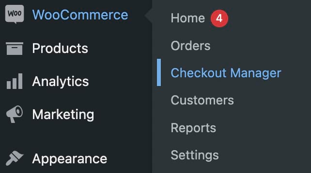
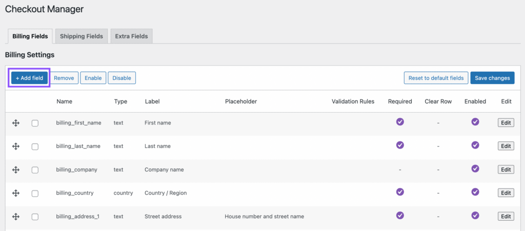
- Navigate to WooCommerce > Checkout Manager.
- You’ll see three main tabs: Billing Fields, Shipping Fields, and Extra Fields.
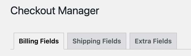
- To add a custom field, select the appropriate tab (like Billing Fields).
- Click the Add field to create a new field.
- Set the following configurations for your new field:
- Type: Pick from text, dropdown, checkboxes, and more.
- Name: Give it a backend name (like billing_tax_id).
- Label: Provide a descriptive label for the checkout page.
- Placeholder: Add a placeholder text for when the field is empty.
- Class: Stick with the default unless you need specific styling.
- Validation: Leave this blank unless specific validation is needed.
- Required: Check this box if the field should be mandatory.
- Clear Row: Check this box if needed.
- Enabled: Ensure this box is checked to activate the field.
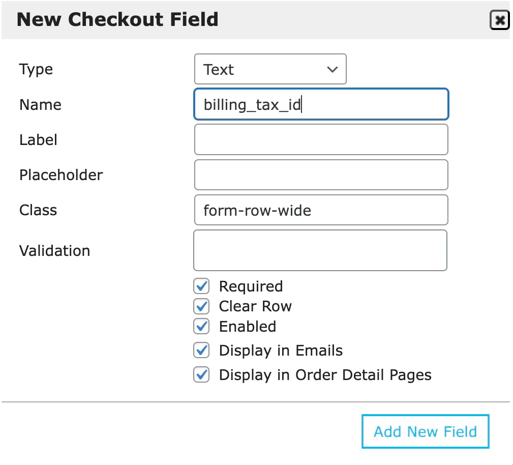
- After configuring your custom fields, save and test your changes.
Other ways to enhance your checkout page experience
Kadence Shop Kit offers more than just custom fields. Here’s how to use its advanced features to create an even better checkout experience.
1. Add conditional cart banners
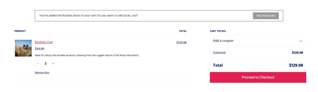
Cart banners show up when specific conditions are met — like when a customer adds certain products or reaches a spending threshold. They’re perfect for announcing, “You’re $10 away from free shipping” or “Add waterproofing spray to protect your new boots.”
In one case study, an Australian retailer saw their average order value jump by 32% after implementing dynamic shipping threshold messages. This shows how the right message at the right time can make a real difference to your bottom line.
Here’s how to set up cart banners:
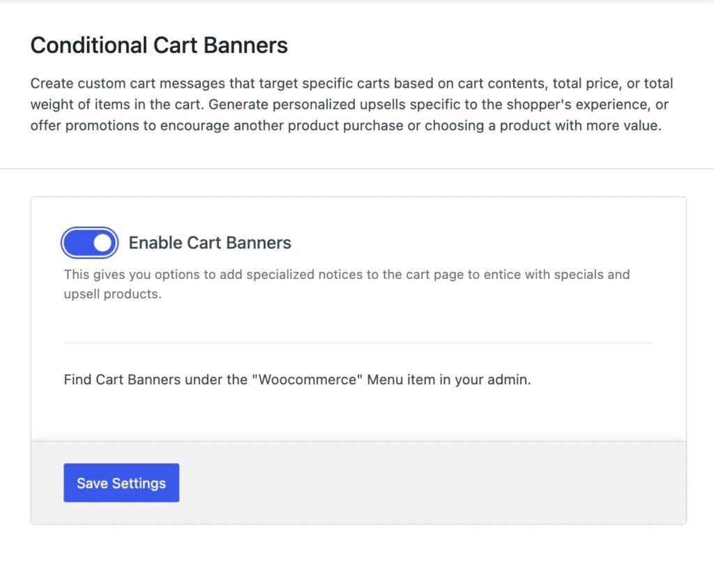
- Navigate to the Shop Kit settings in your WordPress dashboard and find the option for Conditional Cart Banners. Activate it by toggling Enable Cart Banners, save changes, and refresh the page.
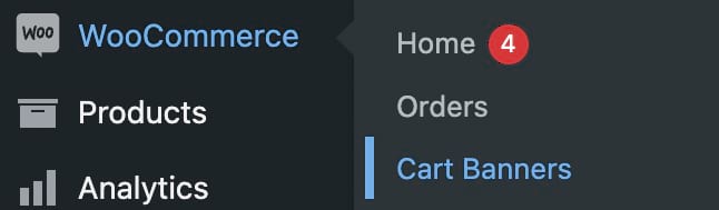
- To create a cart banner, go to WooCommerce > Cart Banners in your WordPress dashboard.
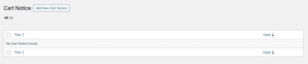
- Click on Add New Cart Notice to start creating the banner.
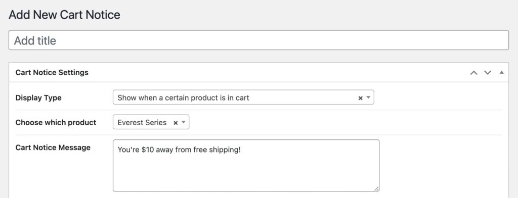
- Choose the Display Type for your banner. This could be based on specific products, categories, cart total price, or cart weight. For example, you might set the banner to display only when a particular product, like a pair of hiking boots, is added to the cart.
- Write a message that will be shown to customers when the banner appears, like “You’re $10 away from free shipping!”
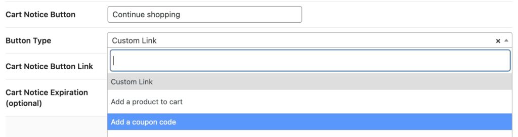
- Decide on the text for the button that will appear in your banner, like “Continue shopping.”
- Choose what action this button will perform, such as adding another product to the cart or applying a coupon code.
- If you want your banner to only appear until a certain date and time, configure the expiration settings. This is useful for time-sensitive promotions or sales.
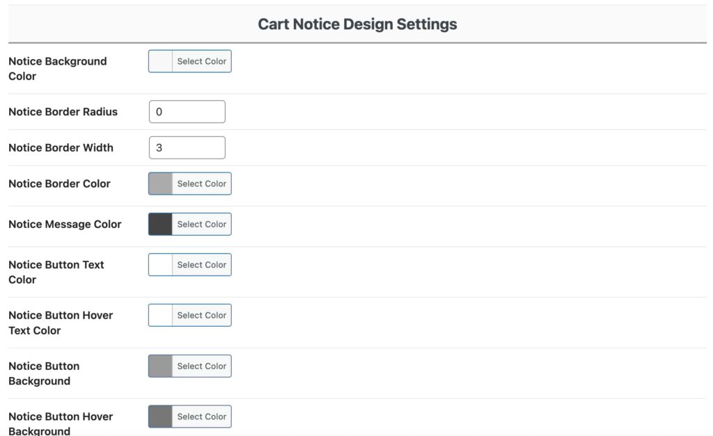
- Use the design settings to customize the appearance of your banner, including text style, button design, and background.
Pro tip: Time your banners strategically. Show shipping threshold messages early in the shopping journey, but save cross-sell suggestions for when items are already in the cart.
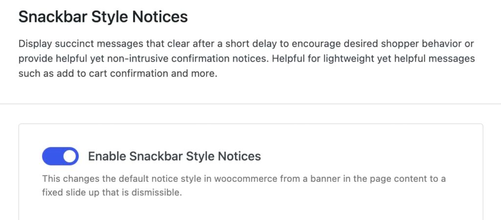
2. Display snackbar-style notices
Snackbar notices keep customers informed without disrupting their shopping flow. These notification bars appear at the bottom of the screen, showing important updates like “Item added to cart” or “Coupon applied successfully”.
They’re much better than traditional WooCommerce pop-ups because they let customers keep browsing while still confirming their actions worked. It’s also great for busy shoppers who want to add multiple items to their cart quickly.
To set up snackbar notices, follow these steps:
- Open your Shop Kit menu.
- Find Snackbar Style Notices.
- Toggle Enable Snackbar Style Notices.
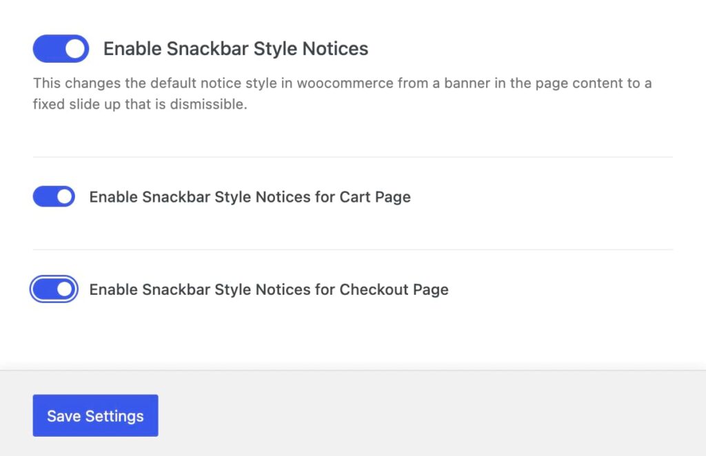
- Choose where you want them to appear (cart page, checkout page, or both).
Pro tip: Keep your snackbar messages short and action-focused. If you need to communicate more complex information, use the snackbar to direct customers to where they can find those details: “Shipping updated — view details in cart.”
3. Make coupon entry easier
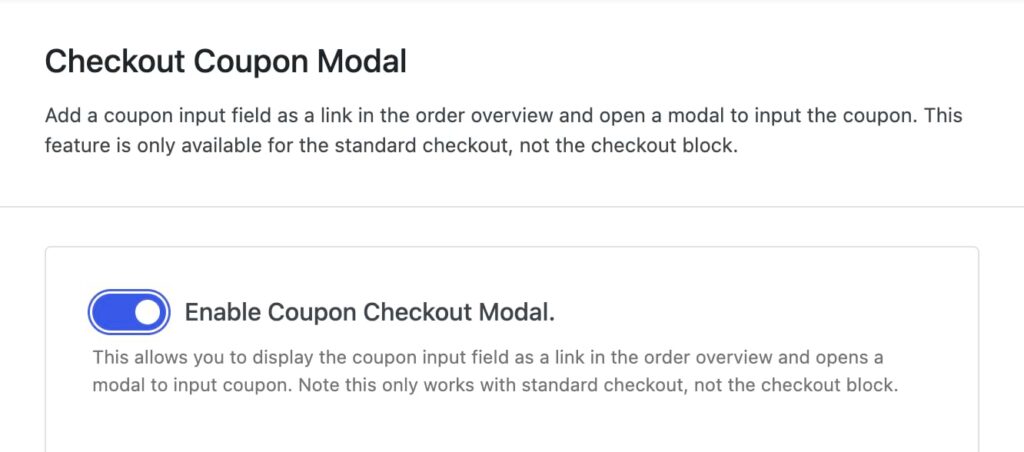
Shop Kit’s Checkout Coupon Modal replaces the standard WooCommerce coupon box with a smarter design: A simple “Got a coupon?” link that opens a clean, focused popup when clicked. This keeps your checkout tidy while giving customers a straightforward way to apply their discounts.
Quick heads up: This works with the traditional WooCommerce checkout page, not the block-based version.
Here’s how to set up the Checkout Coupon Modal:
- Head to your Shop Kit menu and turn on Checkout Coupon Modal.
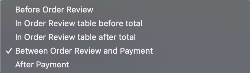
- Pick the perfect spot for your coupon link. You’ve got several options:
- Before the order review.
- In the order review table (before the total).
- After the total.
- Between order review and payment.
- After payment.
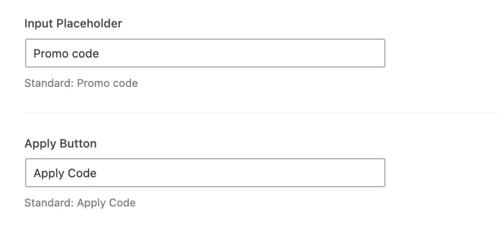
- Set the text that will appear before the link and the link text itself.
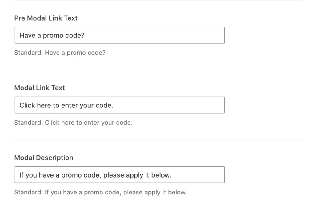
- Configure additional text settings for the modal, including the modal description, placeholder text for the coupon input field, and the button text.
Pro tip: Test your modal with the most common coupon-entry mistakes (like spaces or caps). Then, customize your error messages to help customers correct these specific issues quickly.
Tips to optimize your checkout for conversions
You’ve set up your custom checkout fields and added smart features like cart banners. Now, let’s turn those improvements into actual sales with some proven optimization strategies.
Tip #1: Build trust throughout the checkout process
Security badges placed near payment fields make a real difference in conversion rates. In fact, Baymard Institute’s research shows they can increase perceived security by 75%. Beyond security, show shipping costs and taxes early in the process so customers know exactly what to expect. Keep your return policy visible and easy to find, not buried in fine print.
For higher-priced items, adding a few customer reviews to your checkout page can help seal the deal — customers love seeing that others have made the same purchase successfully.
Tip #2: Recover abandoned carts
Most customers need a gentle reminder to complete their purchase, and the data proves it: While regular marketing emails average a 35.63% open rate, abandoned cart emails see a much higher 50.5% open rate. This high engagement rate makes a strong case for a two-step recovery strategy.
First, send a friendly email reminder within 24 hours with a direct link back to their saved cart. If they don’t respond, follow up with a second email offering a small discount — this often works well for customers who are on the fence. Exit-intent popups can work, too, but keep them simple. Try a simple message like “Your cart is saved” to let customers know they can return to their shopping later.
Tip #3: Test and improve
Small changes can lead to surprising improvements. Dutch electronics retailer GSM.nl demonstrated this perfectly: By simply changing their button color to orange, they increased customer engagement by 5%. These results show why testing matters.
Start with the basics: Experiment with button designs, streamline your form layout, and remove unnecessary fields — do you really need that birth date? Then, move on to testing different locations for trust badges and reviews until you find what resonates with your customers.
Transform your checkout with Kadence Shop Kit
Every successful online store needs a checkout that converts. Kadence Shop Kit puts that power in your hands with its custom layout builder, smart field controls, and mobile-perfect design tools.
With its checkout editor, you can build custom layouts that work perfectly for your products and your customers. Add fields that matter, remove ones that don’t, and arrange everything exactly how you want — all without touching a line of code. Every change you make looks great on both desktop and mobile, so your customers get a smooth experience no matter how they shop.
Start customizing your checkout with Kadence Shop Kit today and watch your conversion rate grow!
Create Your Website With KadenceWP Today!
Written by Alexis Bryan
Alexis Bryan is a content marketing specialist at StellarWP with over five years of experience in the marketing industry. She loves writing and creating content for all kinds of audiences, from blog articles and website copy to videos and guides. Alexis enjoys crafting engaging and informative content that helps businesses and people thrive.
By Alexis Bryan
Alexis Bryan is a content marketing specialist at StellarWP with over five years of experience in the marketing industry. She loves writing and creating content for all kinds of audiences, from blog articles and website copy to videos and guides. Alexis enjoys crafting engaging and informative content that helps businesses and people thrive.
Updated February 13, 2025
Create Your Website With Kadence