
Kadence creates two separate and distinct headers for your site: one for Desktop and one for Tablet/Mobile. In this guide, we’ll show you how to access and customize the Tablet/Mobile navigation area.
Navigate to Headers in the Customizer
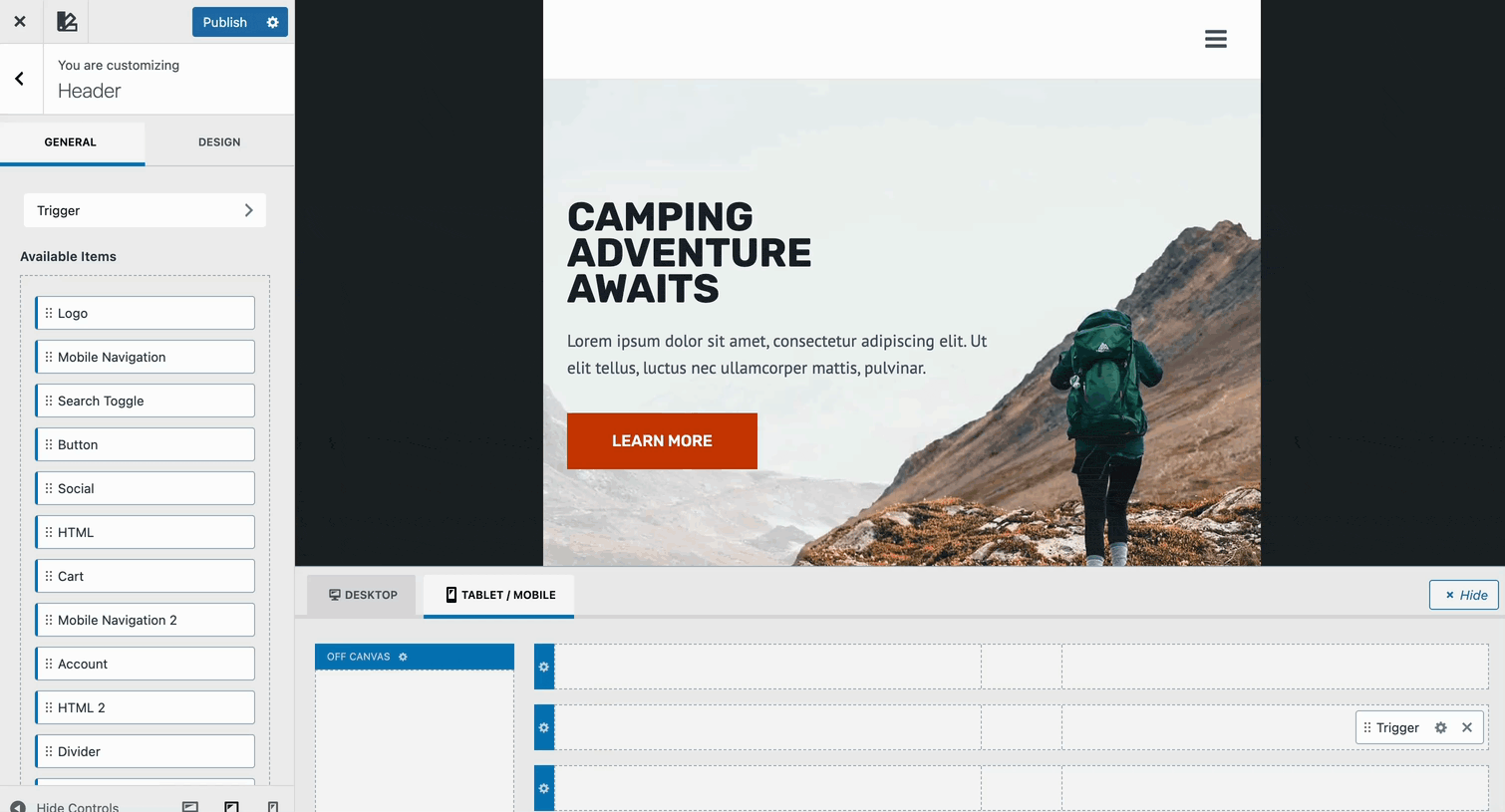
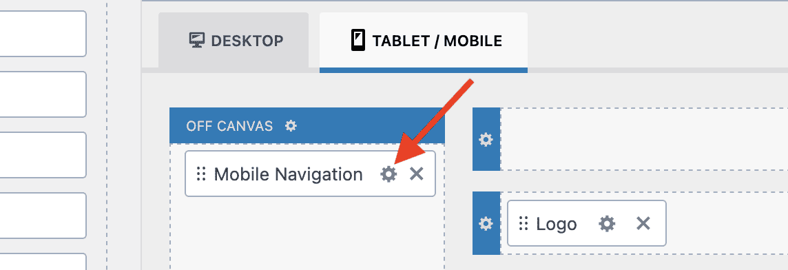
From the WP Admin menu, go to Appearance → Customizer and click on Header. From here, click on the Mobile/Tablet tab to access the mobile header layout.
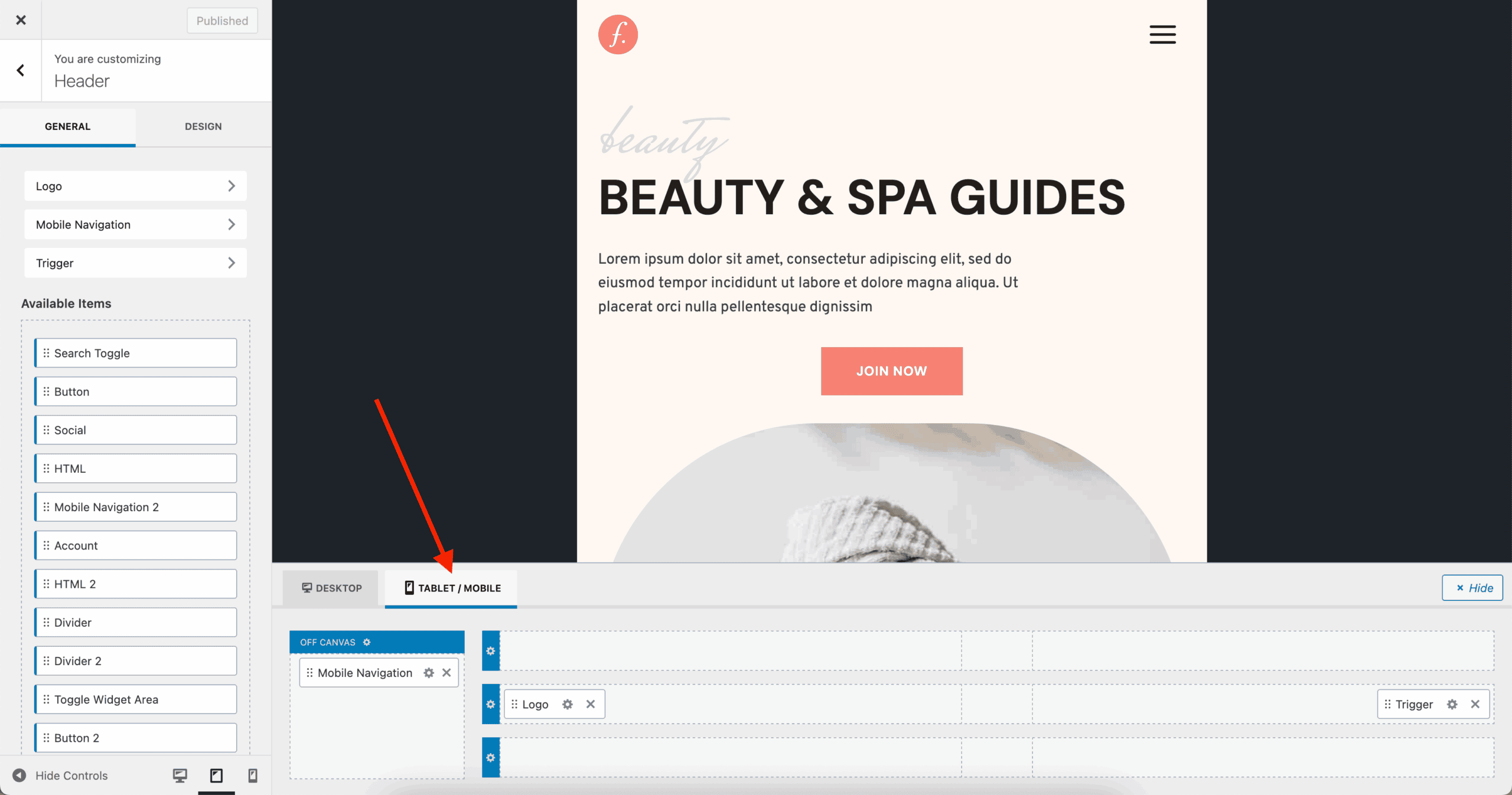
The Mobile Navigation Components
The mobile navigation consists of two main components: The Trigger and Mobile Navigation blocks.
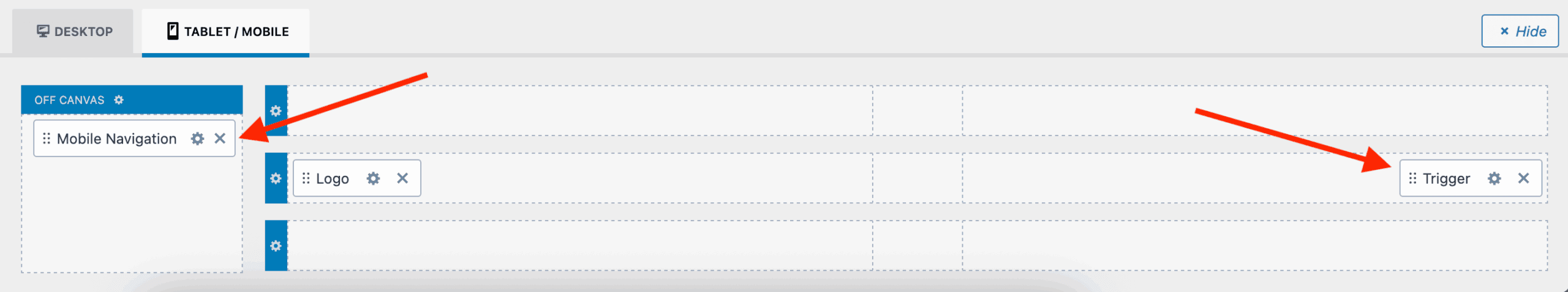
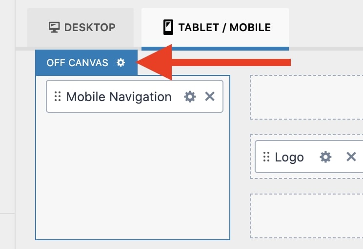
The Mobile Navigation block is added to the Off Canvas area. This is the area that appears when the Trigger is tapped. The Off Canvas area can also contain other blocks such as buttons, socials, search bar, etc…
The Trigger block (also known as the “hamburger” menu icon) opens and closes the mobile menu. This block is typically added to the Main Row (center row) of the header.
Whenever you click the Trigger, it toggles and opens the Off-Canvas area, as shown in the GIF below.
Additional header items can be added to either one of the Header Rows or inside the Off-Canvas area, depending on where you want the item to appear. Either drag an item from the available items over to the visual builder or hover over an area of the visual builder and click the plus icon to add an item.
Additionally, you can use the gear settings icons to modify each Header Row, customize the Off-Canvas Area, and edit each Header Item within the header.
Customizing the Mobile Navigation Block
To customize the settings for the mobile navigation, click the gear icon in the Mobile Navigation block header. This will open the settings panel for the block.
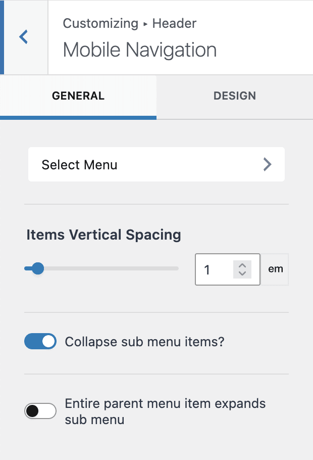
Mobile Navigation – General Settings
Select Menu – If you haven’t already done so, you should create a menu to be used for the mobile navigation. For more information about creating and editing menus, please see: How to Add and Edit a WordPress Menu.
Items Vertical Spacing – Controls the spacing between the menu items.
Collapse sub menu items? – If the menu has sub-menus, they will show as collapsible menus when this is enabled. Otherwise, the complete menu and sub-menus will show.
Entire parent menu item expands sub menu – When Collapse sub menu items is enabled, this allows you to control whether users can click the entire parent menu item (enabled) or only the arrow to open and close the menu (disabled).
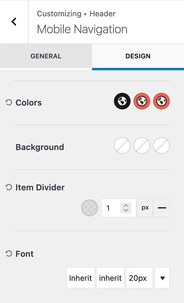
Mobile Navigation – Design Settings
Colors – Set the Initial, Hover, and Active colors for the menu items.
Background – Set the Initial, Hover, and Active background colors for the menu items.
Item Divider – Set the Color, Thickness and Style of the menu item dividers. Select X for style for no dividers.
Font – Select the Font, Style, and Size for the menu items. Clicking Size will open the font modal. Clicking the down arrow will show a preview of the selected font.
Customizing the Trigger Block
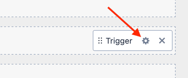
To customize the settings for the trigger, click the gear icon in the Trigger block header. This will open the settings panel for the block.
Trigger – General Settings
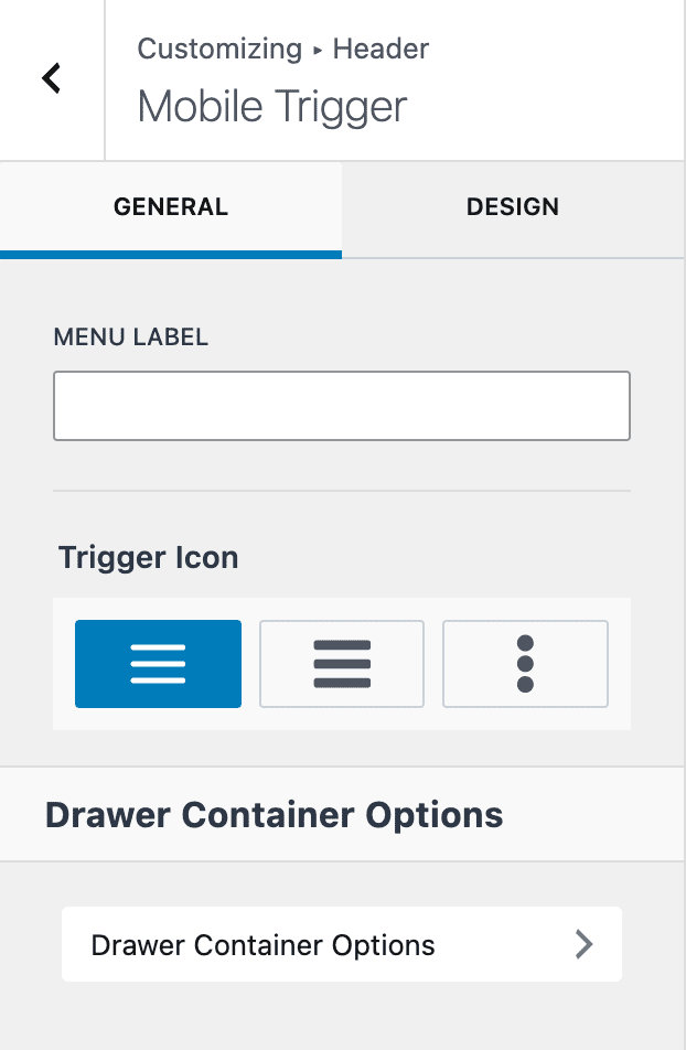
Menu Label – The Menu Label allows you to add text before the mobile trigger. For example, you might add “MENU”.
Trigger Icon – choose from one of three options for the trigger icon.
Drawer Container Options – this links to the Off Canvas settings. See Customizing the Off Canvas Area below for details.
Trigger – Design Settings
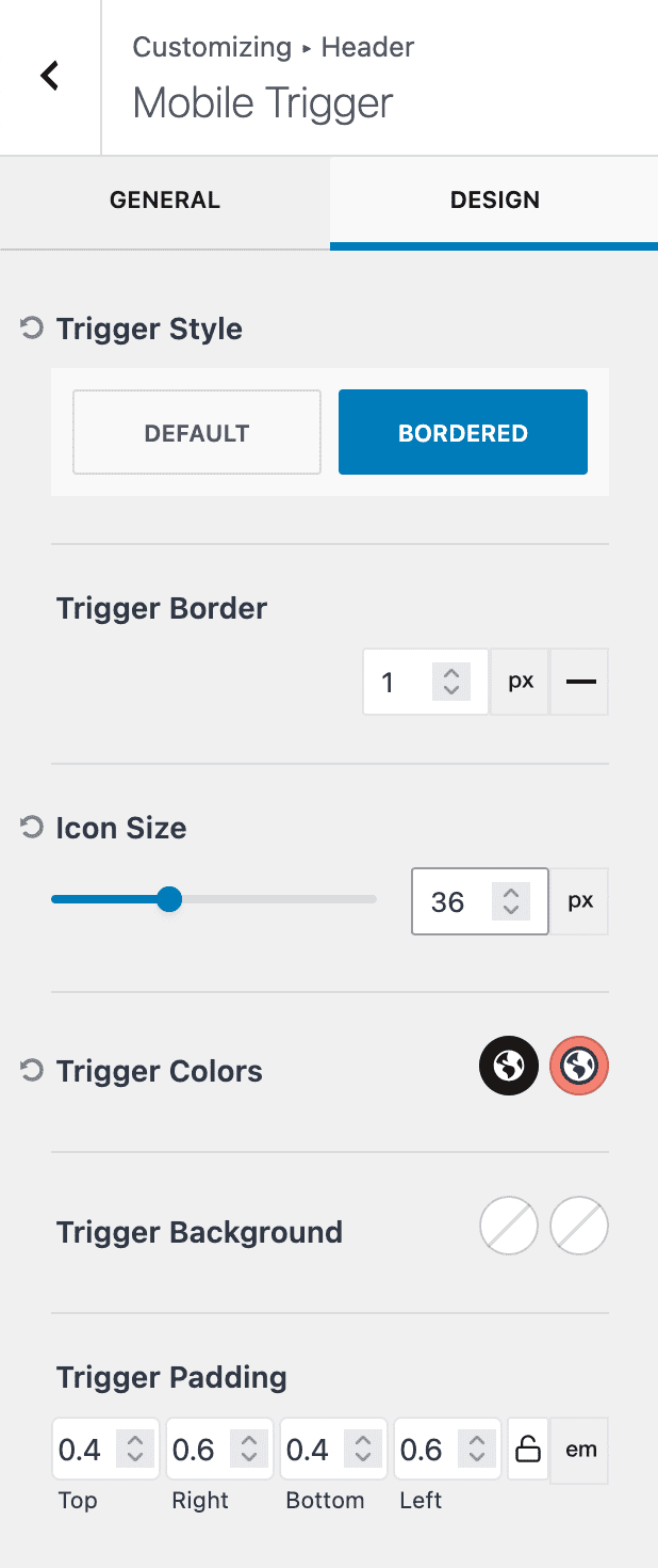
Trigger Style – Choose Default (no border) or Bordered.
Trigger Border – if Bordered style is selected, choose the width and style of the trigger border.
Icon Size – choose the size and unit of measure for the trigger icon.
Trigger Colors – Select the Initial and Hover/Active color for the trigger icon.
Trigger Background – Select the Initial and Hover/Active background color for the trigger icon.
Trigger Padding – Set the padding around the trigger icon. If you selected the Bordered style, this padding will appear inside the borders.
Customizing the Off Canvas Area
To customize the settings for the Off Canvas area, click the gear icon in the Off Canvas header. This will open the settings panel for the off canvas area.
Off Canvas – General Settings
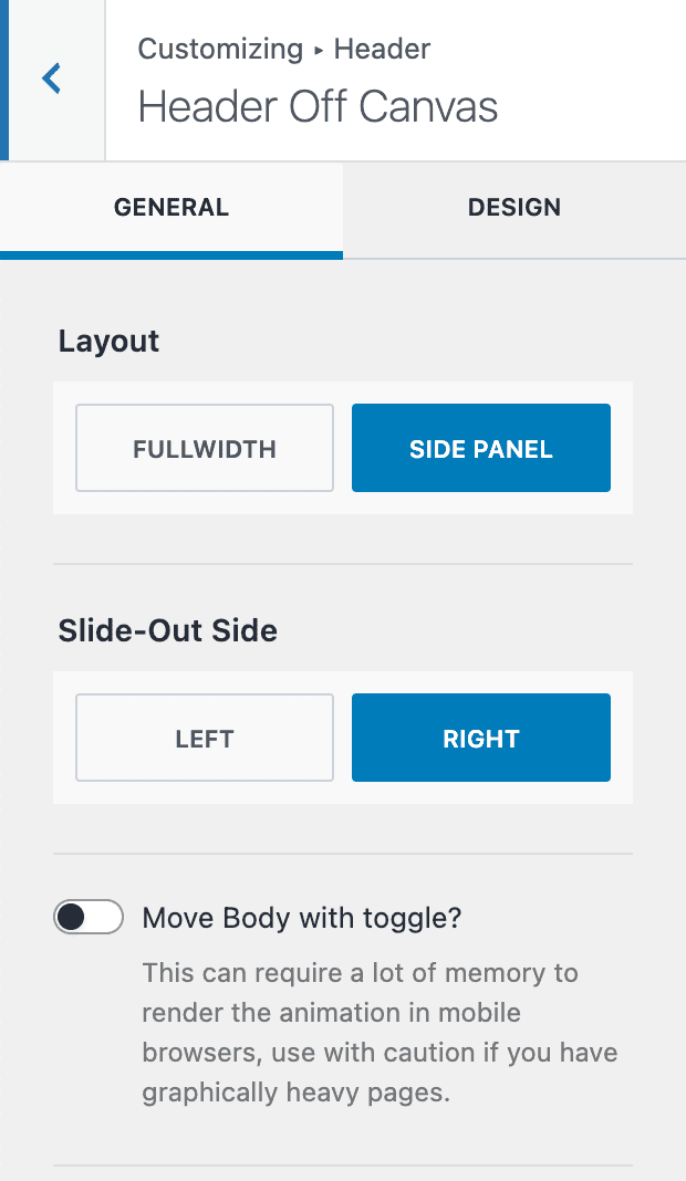
Layout – The Off Canvas area appears over the page content. Choose Fullwidth to completely fill the screen or Side Panel to partially cover the screen.
Animation (not shown) – When Fullwidth is selected, the animation can be set to Fade, Scale, or Slice.
Slide-Out Side – When Side Panel is selected, choose which side the menu will originate from (Left or Right).
Move Body with toggle? – When Side Panel is selected, this option will move the body (i.e. slide over) as the side panel appears. Note: This can require a lot of memory to render and can impact mobile performance.
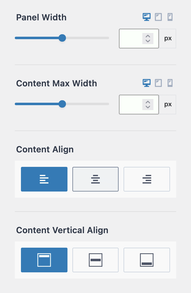
Panel Width – When Side Panel is selected, choose the width and unit of measure for the side panel. Responsive settings are available.
Content Max Width – Set the Maximum width (size and unit of measure) of the content inside of the panel. Responsive settings are available.
Content Align – Choose to align the content Left, Center, or Right.
Content Vertical Align – Choose to vertically align the content Top, Middle, or Bottom.
Off Canvas – Design Settings
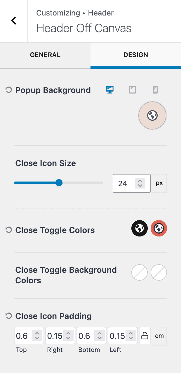
Popup Background – Select the color of the off canvas background.
Close Icon Size – Set the size of the X close icon that appears on the top-right of the canvas.
Close Toggle Colors – Set the Initial and Hover/Active colors for the close icon.
Close Toggle Background Colors – Set the Initial and Hover/Active background colors for the close icon.
Close Icon Padding – Set the padding around the close icon.
Conclusion
Customizing the mobile navigation experience with Kadence is easy! With several design and layout options to choose from, you can customize your mobile experience to fit the design of your site. Don’t forget to click “Publish” in the Customizer when you’re all done designing your mobile navigation!
