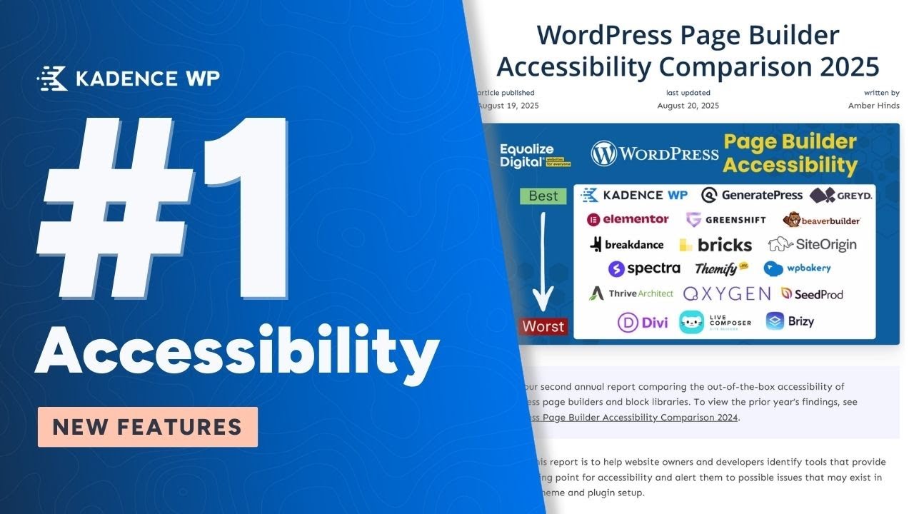
#1 WordPress Page Builder for Accessibility: Kadence Updates You Need to Know
At Kadence, accessibility isn’t just a checklist, it’s a core part of how we design our products. We want every website built with Kadence to be usable and enjoyable for everyone, including people using screen readers, keyboards, or other assistive tools. That’s why we partnered with a third-party accessibility expert to refine our theme and blocks, making small but meaningful improvements that add up to a much better experience for all users.
We’re proud to share that Kadence has been ranked #1 for accessibility among WordPress page builders by Equalize Digital for the second year in a row. This recognition reflects our mission to give you the tools to build websites that are not only beautiful and fast, but truly inclusive for everyone.
Why Accessibility Matters
A truly accessible website means everyone can interact with your content, no matter how they browse the web. For site owners and developers, that often comes down to the little things: markup, focus states, navigation, and how content is structured. At Kadence, many of the new changes we’ve made might be subtle, but they add up to a noticeable difference for users, especially those relying on screen readers, keyboards, or other assistive tools.
In this post, we’ll take a closer look at some of the recent accessibility updates we’ve made in Kadence and explain how they help make your websites more inclusive.
Key Accessibility Improvements in Kadence
Better Semantic Markup
Testimonials as Blockquotes
Testimonial blocks now use blockquotes, providing proper context for screen readers. This helps users understand that the text is a quote from someone else rather than regular content, without affecting the visual design.
Blog Posts as Lists
Blog and archive layouts now use semantic list markup, letting screen readers announce the number of items in a list. This makes navigation smoother and more predictable for users relying on assistive technology.
Clearer Link Indicators
Relying on color alone to show a link’s hover state isn’t enough for accessibility. Some users have low vision or color vision deficiencies, which means they may not notice subtle color changes. According to WCAG guidelines, hover states should use more than just color to indicate interactivity.
That’s why Kadence now adds a subtle underline shift when you hover over a link. It’s a small design tweak, but it gives users a visual cue that doesn’t depend on color. The underline appears or changes on hover, making it easier for all users to see which elements are interactive.
Pause Autoplay and Improved Navigation
Sliders are a common design element, but they can also be a major accessibility barrier when not implemented thoughtfully. Autoplaying sliders, for example, move content too quickly, making it difficult for users with visual or cognitive impairments to follow along. Continuous motion can even cause discomfort or trigger vestibular issues.
To improve this, Kadence sliders now include the option to pause autoplay. This gives users full control over movement so they can engage with content at their own pace. Whether they are using a screen reader, navigating by keyboard, or simply needing more time to read, they can stop the motion and focus on the content.
We have also made navigation more intuitive for keyboard and screen reader users. Instead of awkwardly tabbing through slides, users can now press Enter or Space to jump into the current slide and access captions or content more directly.

Smarter Link Handling in Blog Blocks
Blog blocks often include multiple links to the same destination, such as the image, the post title, and a “read more” link all pointing to the same blog post. For sighted users, this isn’t usually an issue, but for someone using a screen reader it can create a frustrating experience. Hearing the same link repeated three times in a row adds unnecessary noise and slows down navigation.
Now, screen readers only announce the link once, while the post title, image, and “read more” still behave as expected visually. Reducing repetition makes it easier for assistive technology users to move through content quickly and efficiently, without extra clutter or confusion.
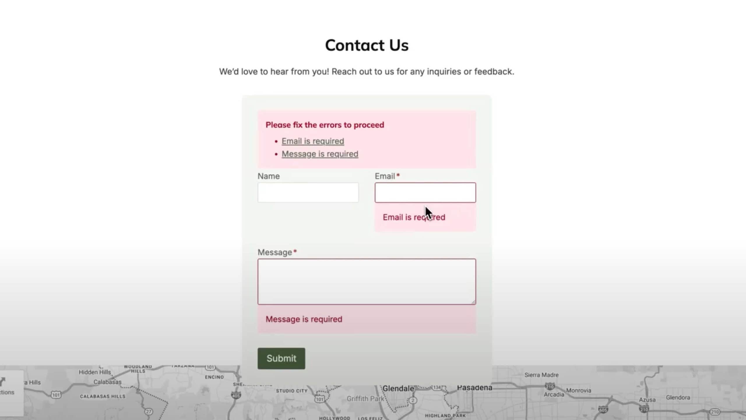
Accessible Forms
Forms now include an error summary at the top, listing all issues as links that take users directly to the corresponding field. This helps screen reader users quickly understand what needs attention and navigate the form efficiently.
By providing a clear overview and direct navigation to each issue, users can complete forms faster and with less frustration.
Better Color Contrast & Roles
Color Contrast
We’ve refined contrast settings across blocks to improve readability against backgrounds. Site owners should still test their own color choices, but Kadence now provides a more reliable foundation for accessible text.
ARIA Roles & Focus States
Elements like search modals and escape actions now handle focus correctly, ensuring users are returned to the right spot on the page after interacting with overlays or modals.
Mobile Header Consistency
Accessibility also means making sure your site works well on all devices. Features that are easy to find on a desktop, like search, a shopping cart, or key navigation buttons, should also be accessible on mobile. If users can’t find these elements on a smaller screen, it can create confusion or prevent them from completing important actions.
Kadence makes it easy to configure mobile headers and menus so all essential elements remain visible and usable. You can choose which items appear in a pop-out menu or as buttons, ensuring users on any device have the same access to your site’s core features. Thoughtful setup like this helps maintain a seamless experience for everyone, whether they’re browsing on a desktop, tablet, or smartphone.
Small Tweaks, Big Impact
Accessibility improvements aren’t always flashy. Most of the changes we’ve implemented happen behind the scenes, but they add up to a significantly better experience for users who rely on assistive technologies.
At Kadence, we focus on thoughtful design that makes your websites easier to navigate and more inclusive for everyone. These small adjustments help ensure that every site you build is both user-friendly and accessible
Create Your Website With KadenceWP Today!
By Nicola Tweed
Nicola is the newest member of the Kadence marketing team, stepping in with more than 10 years of hands-on web design experience. She knows exactly what it takes to create beautiful, user-friendly websites that connect with people and get real results.
Updated August 26, 2025
Create Your Website With Kadence