5 WordPress Web Design Trends for November 2023
This time of year isn’t traditionally known as a time for new projects with the holidays looming, but a few new things are happening in WordPress website design. The biggest is with brands focusing on e-commerce as Black Friday and Cyber Monday approach.
Here are five great trends to consider this month:
1. BFCM Themes
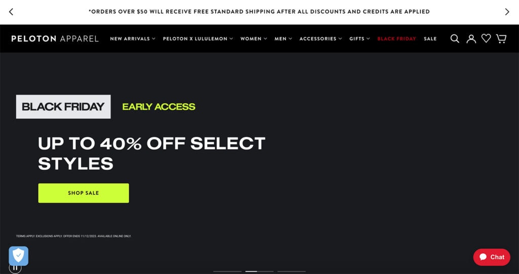
Black Friday and Cyber Monday inspire many website owners – especially those with e-commerce sites – to re-envision their home pages and other landing pages with language and imagery for the holiday sales season.
Many of these designs will change a couple of times between now and the end of the year, beginning with early Black Friday sales that don’t have a ton of holiday imagery to full-on BFCM design pushes to kick off the holiday season officially.
The themes you see here will include holiday colors, plenty of Black Friday and Cyber Monday language, and big numbers for percent off deals or special sales as you see in Peloton Apparell’s example above.
In 2023 we did a live Teardown session with Jon MacDonald from The Good and we talked all about strategy for your landing page with an emphasis on BFCM. Go back and watch for some fresh inspiration!
2. Underlines
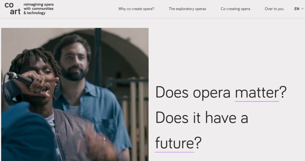
An underline in a design immediately creates a focal point and will draw the eye to the content around it. (That’s one of the reasons links in the middle of text blocks have an underline – so you will pay attention and then interact with them.)
In this context, underlines are a way to make you think or see a particular element of the design. In the example above from Co Art, the design asks you to see the words “matter” and “future.” These are also internal links to supporting pages within the website design.
Underlines can be light and somewhat subtle, such as with this example, or be thick and carry much more weight. The Advanced Text Block from Kadence Blocks allows you to highlight text and give it a different style, so certain words can stand out.
3. Inset Video
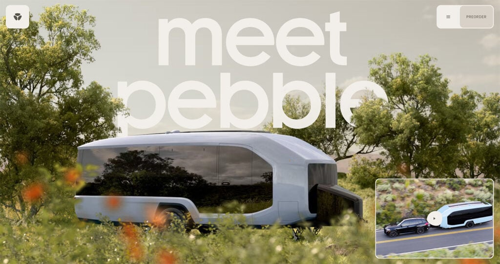
Depending on the project, a full-screen video header can feel overwhelming. That’s where using an inset video can come in handy.
This works great if video content is easy to understand without being huge and can add a little something extra to the design. For maximum impact, allow users to click on the video to expand it to a larger size.
This works great for Pebble in the example above because the big image provides a way to see the vehicle in detail. The video provides extra and quick information to help you understand precisely what you are looking at.
4. Downpage Navigation
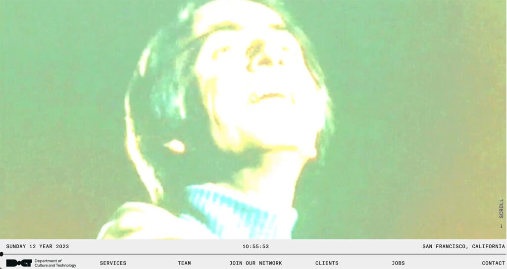
While the most common – and most trusted – location for website navigation is across the top of a screen on a desktop, it’s not the only option. Downpage navigation is growing in popularity with elements that anchor to the bottom of the screen rather than the top. Check out the example above from The Department of Culture and Technology.
This mimics some mobile apps and browsers with static information anchored to the bottom of the screen rather than the top.
As long as navigable elements are clear and understandable, users will catch on to this design trend with ease.
5. Tilted Text Elements
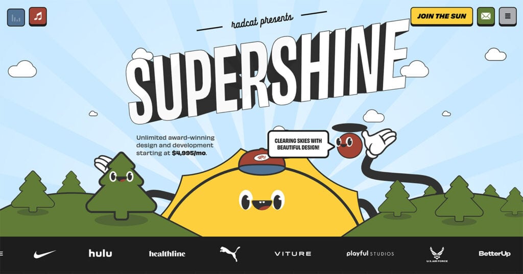
Just a few degrees either way can make a huge difference in the style and feel of typographic elements. Tilted text elements can draw the eye and work especially well with one or two simple words or as a brand element.
In the example above from Supershine, the tilted text is combined with some animated hover effects for an extra level of interactivity.
Putting it All Together
While the shopping season gets most of the attention this month, it can be a good time to implement other small trends as traffic flows increase for the holidays. But if you don’t have time or resources right now, don’t worry; just bookmark these trends and return after the holidays.
Most design elements featured in this roundup can be implemented anytime and don’t require a complete website facelift. Have fun with them.
A Kadence Full Bundle gives you everything you need to keep up with all the design trends and take your website to the next level. From the Advanced Image Block in Kadence Blocks to the ability to create fully customizable designs and pages, the Kadence Full Bundle gives you everything you need to make beautiful, effective, and engaging websites. And if you purchase a bundle between now and Cyber Monday, you can take 40% off. Cheers!
Create Your Website With KadenceWP Today!
Written by Carrie Cousins
Carrie Cousins has more than 15 years of experience in media, design, and content marketing. She’s a writer and designer, has an MBA from Virginia Tech, and is passionate about creating amazing experiences for businesses online. Her work has been featured in publications such as Design Shack, Webdesigner Depot, The Next Web, and Fast Company. She’s an avid runner, which comes in handy with a trio of Australian shepherds at home.
By Carrie Cousins
Carrie Cousins has more than 15 years of experience in media, design, and content marketing. She’s a writer and designer, has an MBA from Virginia Tech, and is passionate about creating amazing experiences for businesses online. Her work has been featured in publications such as Design Shack, Webdesigner Depot, The Next Web, and Fast Company. She’s an avid runner, which comes in handy with a trio of Australian shepherds at home.
Updated May 28, 2024
Create Your Website With Kadence