
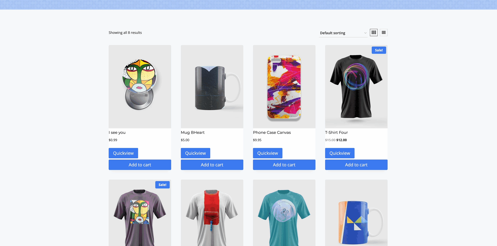
With the Kadence Shop Kit plugin, you can improve the shopping experience by adding a Quickview Button to your Product Shop and Archive Items. This feature allows users to view detailed product information and add items to their cart without leaving the current page.
The Quickview functionality includes many features, including some of the ones listed below.
- Quickly access product details in a responsive popup modal.
- Navigate between products using left/right arrows to view previous or next products in the loop.
- Select product variations (where applicable).
- Add products directly to their cart, eliminating the need to visit the Single Product Page.
- Use WooTemplates to fully customize the Quickview Modal.
This feature is particularly useful for improving the user experience, encouraging faster checkouts, and making it easier for customers to complete their purchases with fewer steps.
Getting Started
To get started with Quickview, first, ensure that the Kadence Shop Kit plugin is activated on your website. Once activated, navigate to the Dashboard and go to the Shop Kit page. From there, click on the Product Quickview tab. Within this section, you’ll find the option to Enable Product Quickview. Simply toggle the setting to activate this feature, allowing you to display a Quickview Button on your WooCommerce products.
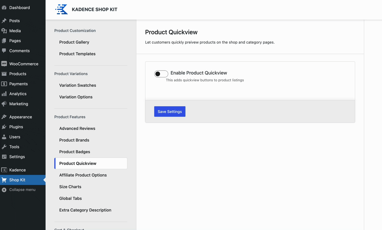
Quickview Settings
Automatically Insert Button: When this option is enabled, the Product Quickview Button can be placed using one of the pre-built placement options. (See the next setting). If this option is disabled, you can use a ShortCode to display the Product Quickview Button dynamically. Click here to learn more about using a Quickview Shortcode.
Button Placement: When the Automatically Insert Button setting is enabled, use the Button Placement to determine where the Product Quickview Button will be placed. Below are the available placement options:
- Before Add to Cart
- After Add to Cart
- Before Price
- After Price
- Before Title
- After Title
- Before Item
- After item
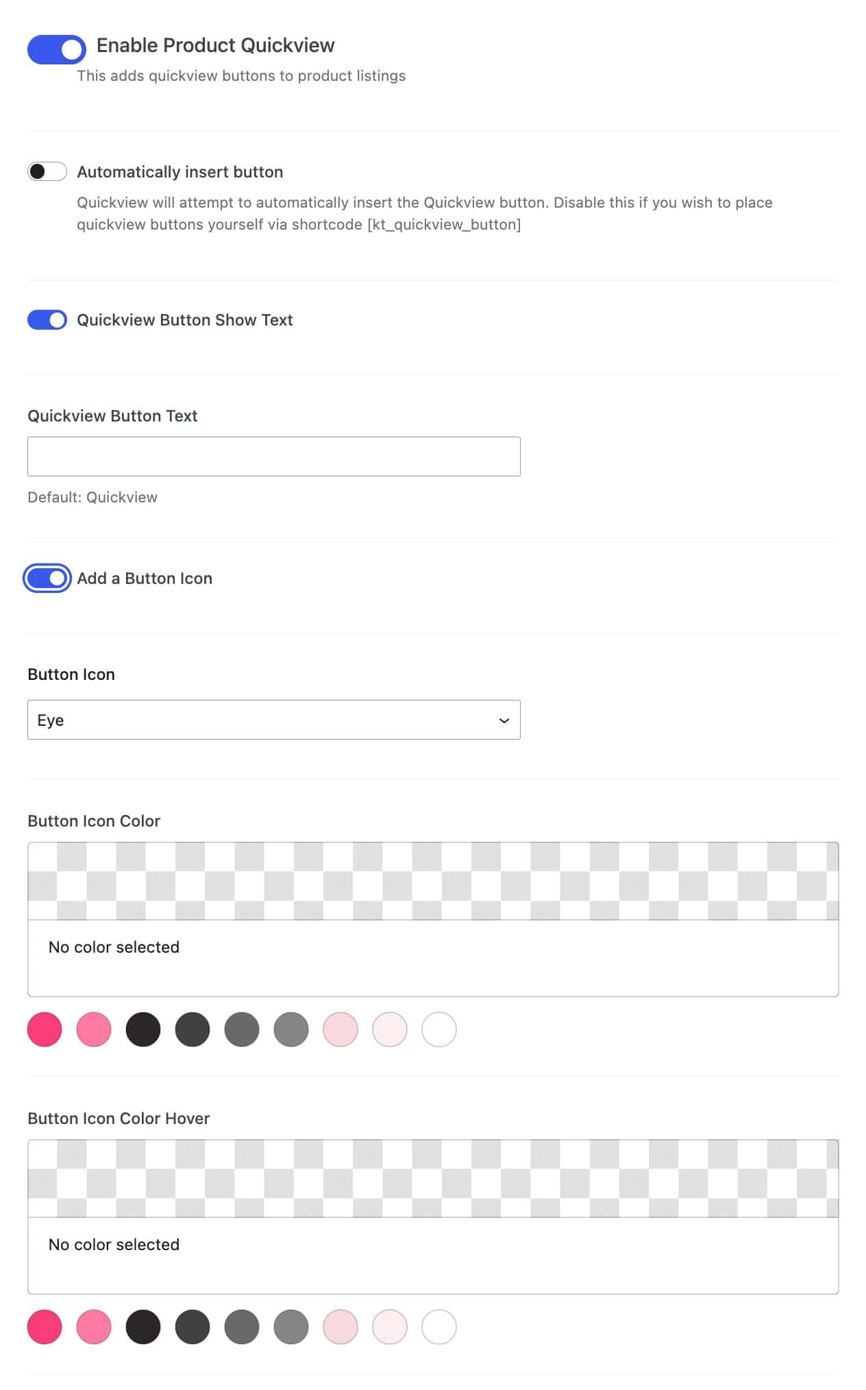
Quickview Button Show Text: Enable this option to use a Button Text for the Quickview Button. Use the Quickview button Text setting to Set the Text for the Quickview Button. The default text is Quickview.
Add a Button Icon: Use this option to enable and use a Button Icon for the Quickview Button. The following Icons can be used for this feature:
- Play
- Eye
- Click
Button Icon Color: Set the Icon Color for the Quickview Button in the normal state.
Button Icon Color Hover: Set an Icon Hover Color for the Quickview Button when hovering over it.
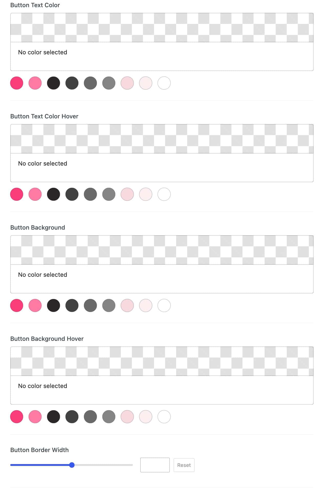
Button Text Color: Set a Button Text Color for the Quickview Button in the normal state.
Button Text Color Hover: Set a Button Text Color for the Quickview Button when being hovered over.
Button Background: Set a Button Background Color for the Quickview Button in the normal state.
Button Background Hover: Set a Button Background Hover Color for the Quickview Button when hovering over it.
Button Border Width: Use the Slider or enter a Value to set a Button Border Width for the Quickview Button. The unit of measurement is in pixels and will apply to all sides of the button.
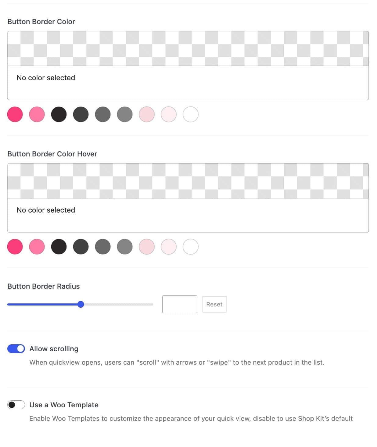
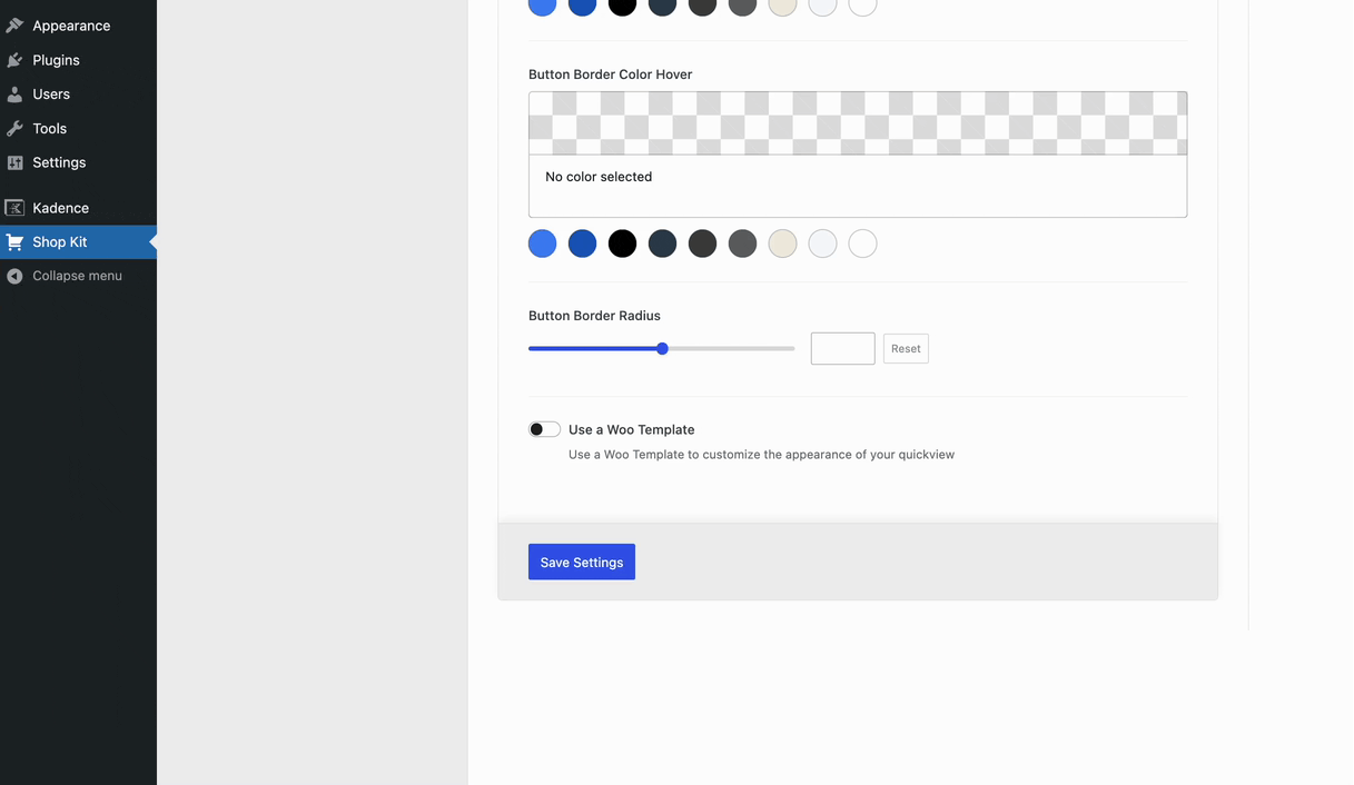
Button Border Color: Set a Button Border Color for the Quickview Button in the normal state.
Button Border Color Hover: Set a Button Border Hover Color for the Quickview Button when hovering over it.
Button Border Radius: Use the Slider or enter a Value to set a Button Border Radius. This is measured in Pixels and will apply to all sides of the button.
Allow Scrolling: Enabling this option allows users to swipe or use arrow navigation buttons to view the previous or next product in the loop.
Use a Woo Template: Enable this option to Use a Woo Template for the Quickview Popup Modal instead of the default Quickview layout. You can learn more about this feature in the section below.
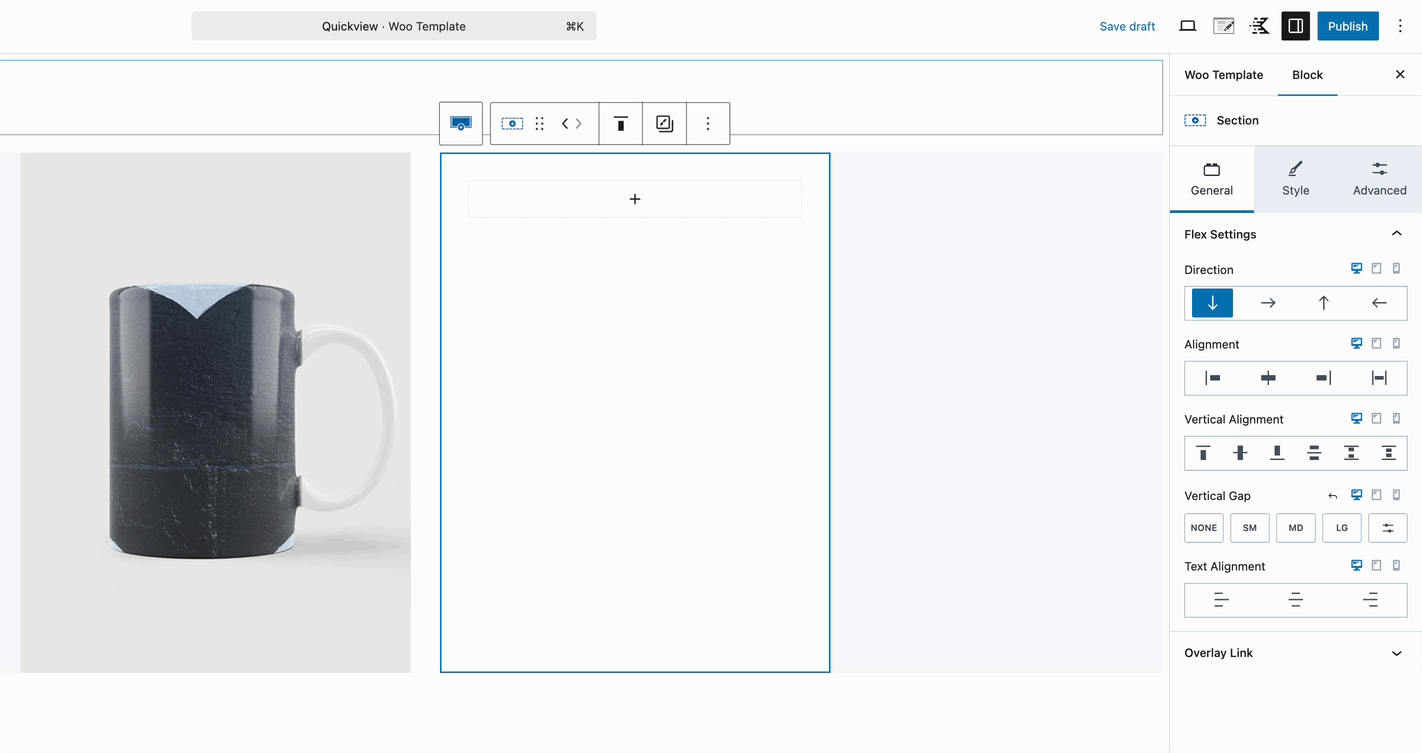
Creating a Custom Quickview WooTemplate
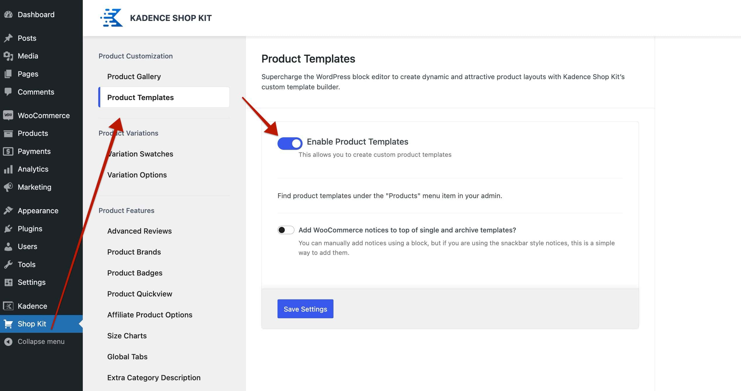
WooTemplates can be used to create a Custom Quickview Template. To do so, you should first enable Product Templates from the Dashboard -> ShopKit page. Look for the Product Templates option, then use the toggle to enable the feature.
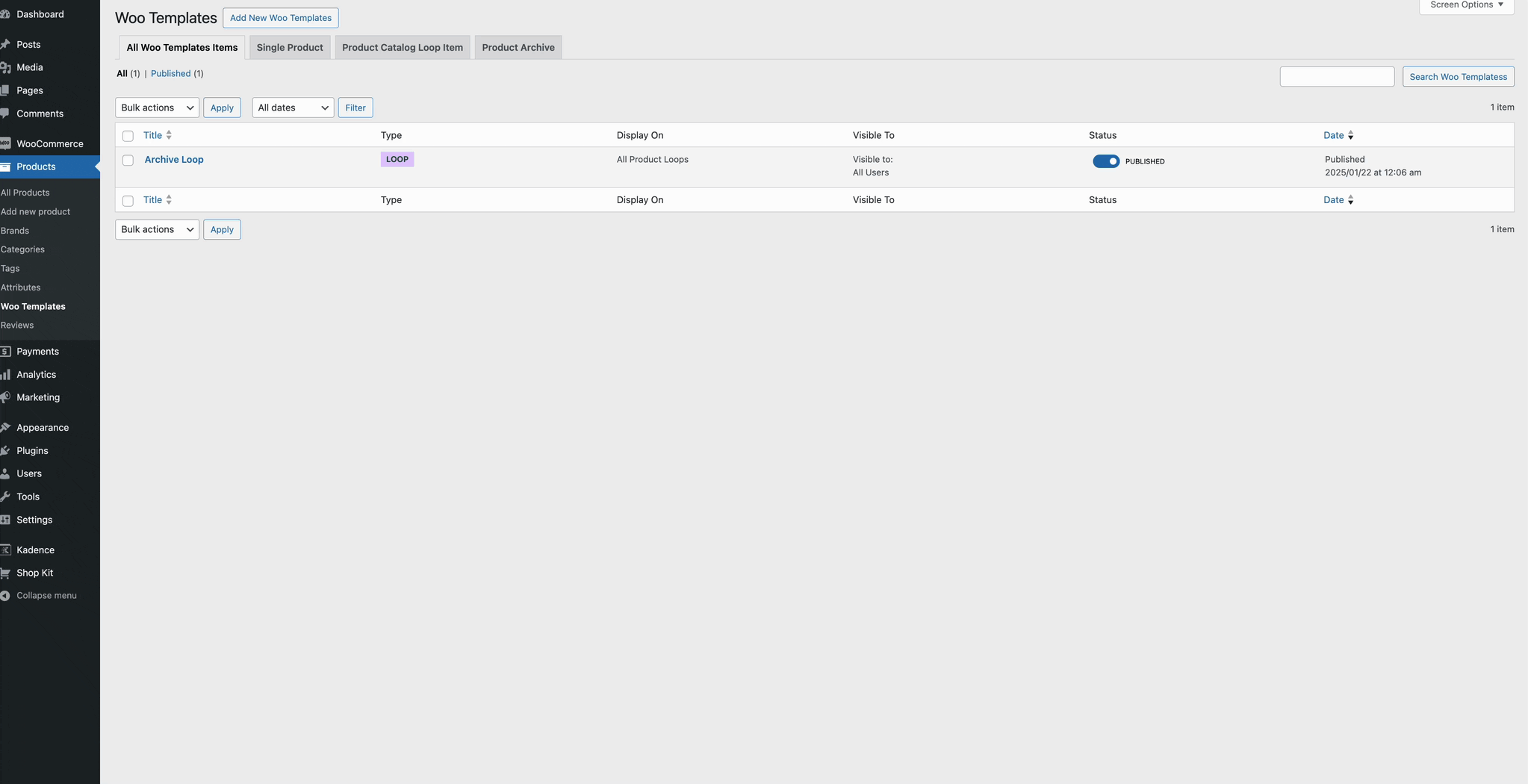
Once Product Templates are enabled, refresh the page, then navigate to the Dashboard -> Products -> WooTemplates Page. Here, you can click on the Add New Woo Template button to add a new WooTemplate to the website. Then, select the Quickview Template option.
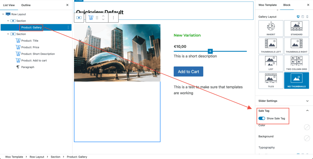
The default layout template uses the Product Gallery Block. This block will also have the WooCommerce Sales Tag enabled. If you are using Kadence Product Badges, you should disable this setting.
You can use the default layout template to customize it to meet your needs or start from a blank template. Use a combination of Kadence Blocks and WooTemplate Blocks to display dynamic content. Here are some useful blocks to help you get started.
- Product: Gallery Block
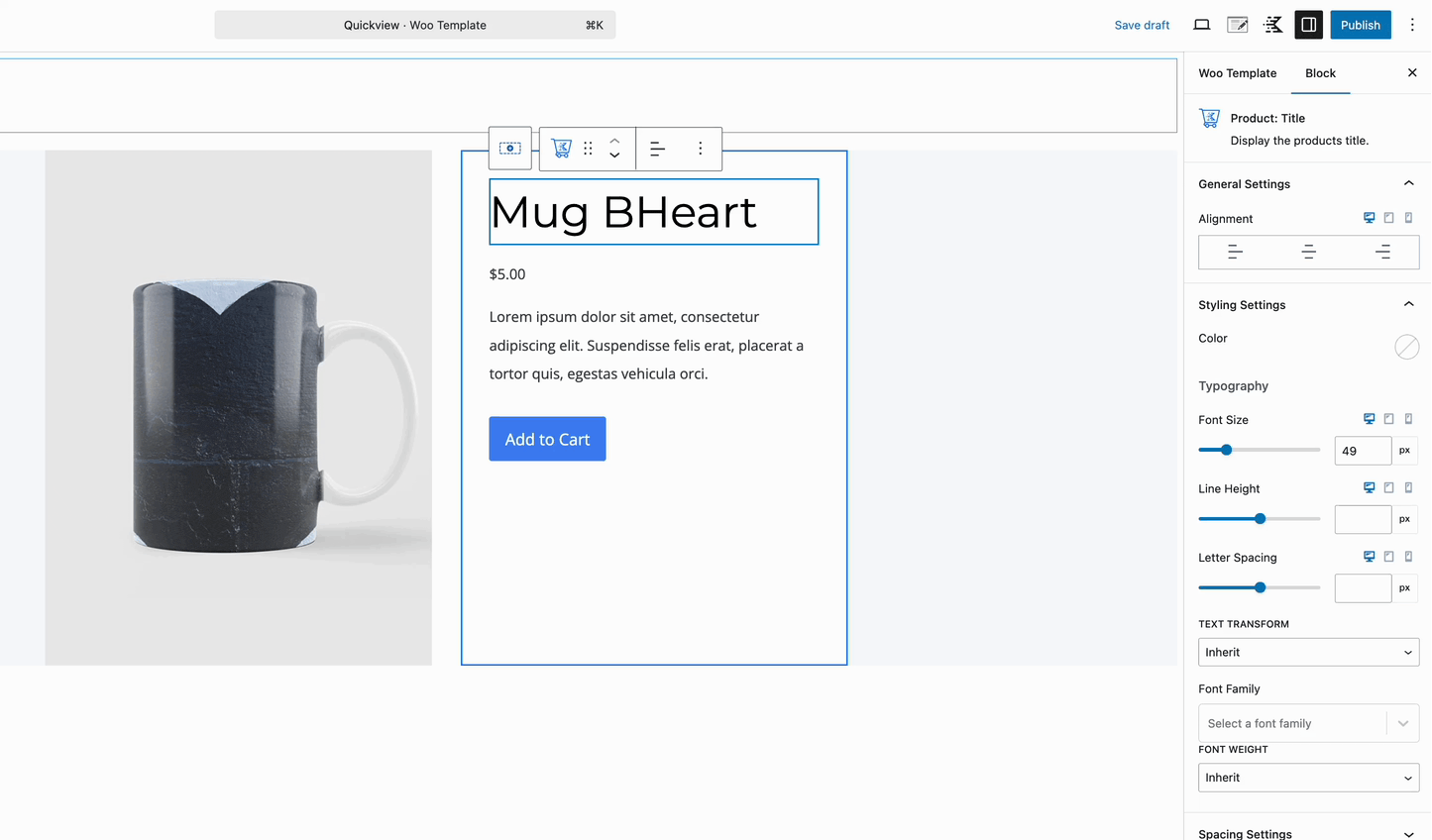
- Product: Title Block
- Product: Price Block
- Product: Add to Cart Block
- Click here to see all of the available WooTemplate Blocks.
You can also use the standard Gutenberg and Kadence Blocks, along with the Kadence Dynamic Content and other Block Features. Allowing you to completely customize the Quickview Popup Modal.
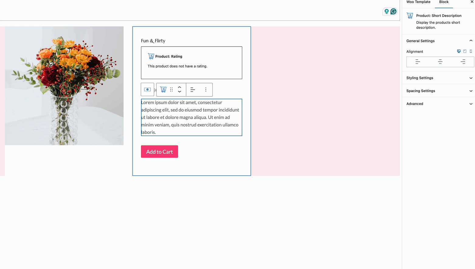
The Quickview Template uses a Product Short Description Block. This shows a shorter version of the full description. You can use the Dynamic HTML Block to show the Post Content if you would rather display the entire description
Once the WooTemplate is created, click on the Publish Button to save the template.
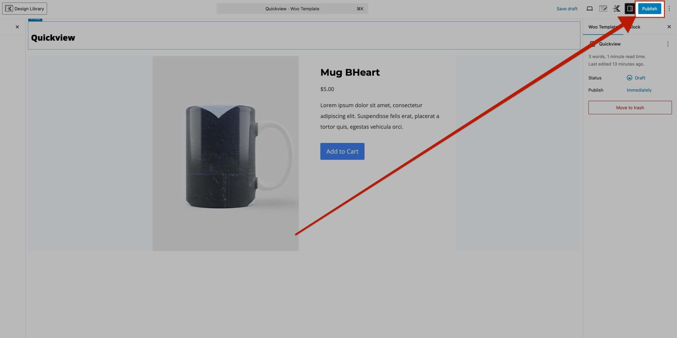
Once the WooTemplate is Published, navigate back to the Dashboard -> ShopKit -> Product Overview page. At the bottom of the settings, enable the option named Use a WooTemplate. You will then be able to select your newly created WooTemplate as the Product Overview Popup Modal.
Don’t forget to click the Save Settings button to ensure the settings are saved. Afterward, the WooTemplate will be used as the Overview Popup Modal.
Using a Quickview ShortCode
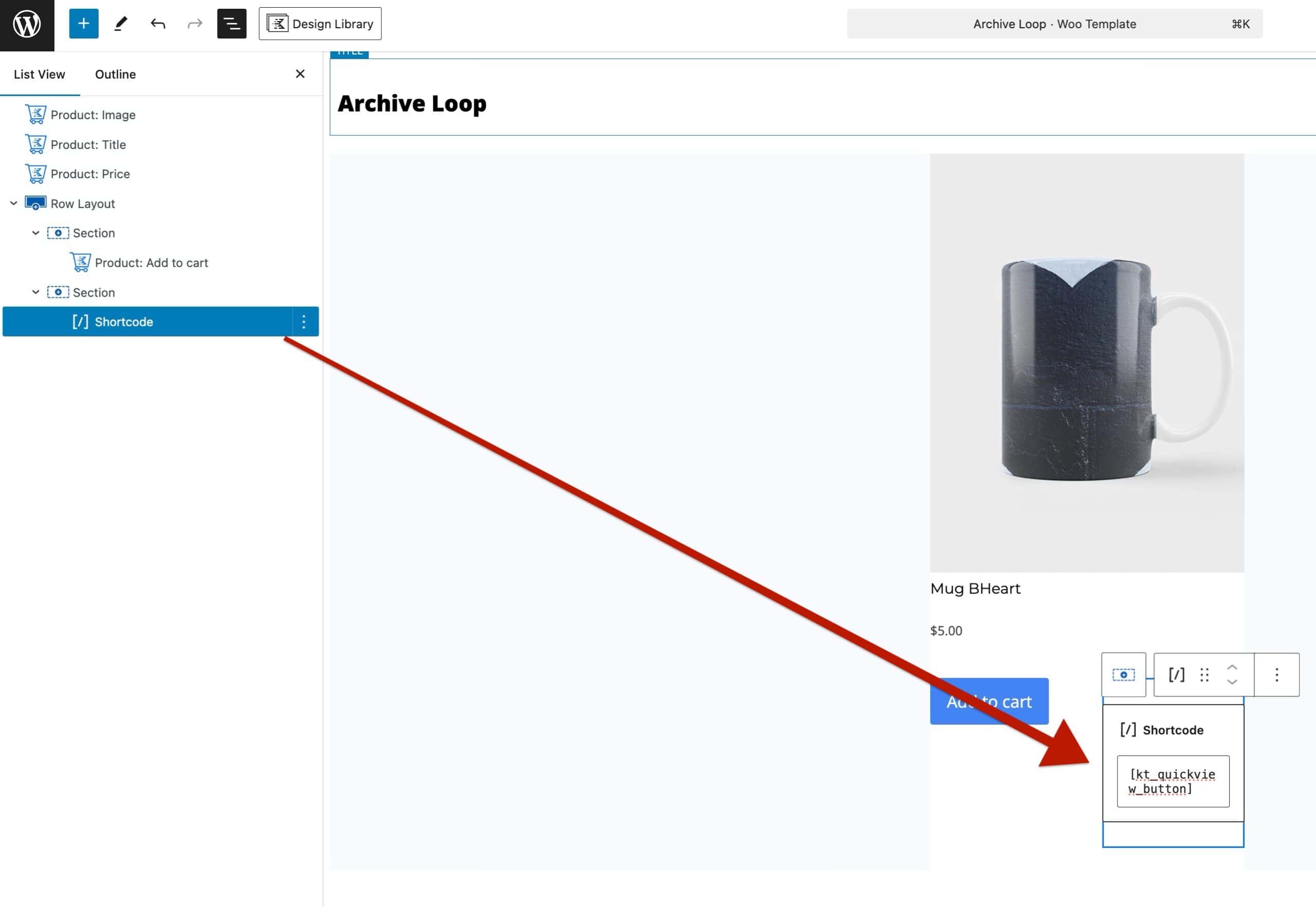
In some cases, the Quickview default Placement Options may not meet your design goals. In this case, you can use the Quickview ShortCode to dynamically display the Quickview Button for the current product. This can be used in Product Loop WooTemplates, Query (Adv) Blocks, and anywhere else the current product information can be used within Blocks.
To display the Quickview Button of the Current Product, use the following ShortCode inside of a Gutenberg ShortCode Block:[kt_quickview_button]
To display a Specfic Product by ID, use the following ShortCode inside of a Gutenberg ShortCode Block:[kt_quickview_button id="16"]
In place of 16, you should use the specific Product ID you wish to Quickview.

