Hi Hannah,
Thanks for the speedy response.
No change with gutter settings altered unfortunately. The issue appears to only affect rows containing the ‘Ascend Recent Posts’ widgets, so I’m baffled!
Andrew.
Hi again,
I’ve put a Language Switcher (WPML) in the Mobile Top Icon Bar Widget Area. It worked but is aligned in the middle of the top icon bar. I would prefer to have it aligned right in mobiles and pads.
I have tried:
.wpml-ls-native
{ text-transform: uppercase;
color: #444444;
align-items: right;}
Hope you can help me!
Pamela
5. The widget doesn’t ignore sticky posts already. That is how it’s supposed to work.
Ben
I am considering some options for a more robust dock/popup/convert kit tool but I don’t have a timeframe for it. At the moment the widget dock doesn’t work for that kind of thing.
Ben
Hi Carolina,
Do you mean this demo- http://themes.kadencethemes.com/ascend-premium-2/ ?
That is done using the split content widget. You can enable the home widget area from the homepage layout manager in theme options, then add the widget from Appearance > Widgets.
Hope that helps!
Hannah
Hello,
1. This CSS will remove the bullet points:
.elementor-widget-container ul .postclass {
    list-style: none;
}
2. This CSS will move the date below the title:
span.recentpost_date.kt_color_gray {
    display: block;
}
3. Try this CSS instead:
span.recentpost_date {
    display: none !important;
}
4. Those titles take on the color of your links. This CSS will allow you to set the font separately:
.recent_posts_widget_content_inner a {
    color: black;
}
5. There is no way to do this currently, but possibly in the future. I’ll flag this for a developer followup so Ben can take a look.
Let me know if the CSS works for you!
-Kevin

Hi there!
I’m having some problems with the Recent Posts Widget on my homepage and would be really glad if you could help me. I’m trying to build the website based on the Wanderlust demo, but I’m using Elementor (the free version, not Pro) instead of Site Origin. So I imported the demo content, but ended up creating a new homepage that I could work on using Elementor. The thing is that the Recent Posts Widget is kind of messed up when using Elementor. Here’s the website link so you can check it out:
*Login to see link
I want it to look like it does on the demo with Site Origin, without the bullet points and with the date below the blog post title, not right next to it. So…
1) How do I get rid of the bullet points?
2) How do I make the date show up right below the blog post title?
3) If I want the date to not show at all, how can I hide it? I’ve found this CSS here on the forum, but I gave it a try and nothing changed.
.kadence_recent_posts .recentpost_date {
display: none;
}
4) Using the widget, all blog post titles show up in a green font color. I looked through all the Theme Options, but didn’t find anything that would allow me to change that color. Am I missing something? Is there a way of changing that font color?
5) Also, is there a way of making the Widget ignore sticky posts? I know a few other Recent Posts plugins allow that, but I’d prefer to stick with the Kadence widget.
I guess that’s it. Thanks a lot 😀
Carolina
What is the suggested method to make a full height background image on the homepage?
I’m looking for something like this.
Hi Team,
Would it be possible to activate the widget dock only on certain productpages?
If yes, how to accomplish?
thank you
Regards
Alex
I was wondering if there is a way for me to create 2 buttons below my text in a split content widget. Often times I offer a service and use this split content to give a brief description and then would like it to have a button to allow the customer to go ahead and contact us about that particular service, or have a button to allow them to link to that services page where it would describe it in more depth. Thank you!
Hi Kevin,
So here’s the final set up using Elementor. It resulted in some fiddling in order to get the row to cover the width of the page. I wonder if there’s a more elegant way to do that?
Anyway, here’s the CSS:
#widget-row {margin-left:-15px;}

@media screen and (min-width: 992px) {
#widget-row {
    width: 103.3%;
}
}

@media screen and (max-width: 990px) and (min-width: 766px) {
#widget-row {
    width: 104.2%;
}
}

@media screen and (max-width: 766px) {
    #widget-row {
    width: 105.1%;
    }
    #widget-left > div, #widget-right > div {
        margin: 0px 20px;
        padding: 20px;
    }
    #widget-middle > div {
        margin: 20px;
        padding: 20px;
}
Thanks for your help,
Phil.
You can use css like this
.sidebar .widget-title span {
    background: #fff !important;
}
Ben
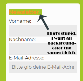
Oh, that’s hard. There are different widget. I can not enter clearly here = /. My site is currently in maintenance mode. I think we should write privately by post, not here because I can give you the information.
I can see the image now! However, without a link I can’t really tell why the text has that background. Would it be possible for you to post directly to this widget so I can inspect where the styling is coming from?
-Kevin
I still think this would be best to use a page builder plugin for so it looks better in mobile, but try this CSS in Theme Options> Advanced Settings:
@media (min-width: 767px) {
.row .home-margin.home-padding.kad-animation {
    width: 105%;
}
.row .home-margin.home-padding.kad-animation .home-widget-area-widget {
    min-height: 300px;
}
}
I also adjusted your h3 fonts to match the other site.
-Kevin
Hi,
Is there a setting for changing the width of the search results page display? When someone uses the site search to find a page on my site that it displays as the archives do? The following link is the archives where the widget banners open up fully to span responsively across the page:
*Login to see link
Search results show the same widget banner is 1/3 of the width:
*Login to see link
Thanks.
Dawn
I searched a long time, but I could not find that attitude. I hope you can help me.

