
Just Launched: 3 Professional One-Page Website Templates for Kadence
Are you ready to launch your business, portfolio, or event online, but feel overwhelmed by the thought of building a multi-page website? Creating a full site can feel complicated, time-consuming, and expensive. But what if you could showcase everything you need, beautifully and effectively, on a single page?
That’s the power of a one-page website.
With all your content laid out on one seamless, scrolling page, you get a streamlined, professional web presence that’s easy to navigate and quick to launch. One-pagers keep visitors focused, eliminate unnecessary clicks, and guide them smoothly toward taking action, whether that’s booking, buying, or getting in touch.
Simply put, a One-Pager gives you clarity and impact without the overwhelm.
Why choose a one-page website?
Beyond being simple to set up, one-pagers come with a range of benefits:
- Clarity for your visitors: With everything on one page, there’s no confusion about where to click next.
- Faster launch: Skip the complexity of multiple layouts and get your site live quickly.
- Focused design: Guide your audience to a single, clear next step.
- Mobile-friendly experience: Scrolling is intuitive and effortless on any device.
And the best part?
We’ve made it even easier with the launch of three brand-new professional one-page website designs for Kadence: Thorne, Cornerstone and The Pantry. Each designed with a different style and purpose in mind, giving you a head start on creating a polished online presence without the overwhelm.
Explore our Kadence One-Page Website Templates
1. Thorne
Thorne cuts a perfect line between bold personality and refined professionalism. It’s made for designers, creatives, or small agencies who value style and substance. With Thorne, every visual choice has purpose.
What makes Thorne stand out:
Thorne uses a clean, modern aesthetic with plenty of whitespace, balanced typography, and a strong visual flow that guides visitors naturally from the About section through Services and Work, ending with Contact. Service sections are structured with clarity, highlighting design, UX, and brand identity in a way that’s easy to scan. Conversion-focused elements like clear calls to action and trust-building stats (“Years of Experience,” “Projects Delivered,” etc.) help move visitors toward getting in touch. The overall look feels polished and professional without being cold, making it an excellent choice for a portfolio or service-based website.
Ideal for:
- Freelancers, digital designers, or consultants who want to sell both expertise and personality
- Creatives who already have branding or want to lean into one that feels expressive
- Anyone wanting a high-quality, simple one-page site with strong visuals + strong voice
2. Cornerstone
Cornerstone is tailored for businesses where credibility, thoroughness, and precision are essential. This One-Page template is perfect for home inspectors, contractors, consultants, or anyone selling safety and expertise. It presents your services with transparency and authority, making it easy for prospects to see you as the reliable pro they want.
Key features of Cornerstone:
Cornerstone features a trust-first design with certifications, reviews, and client satisfaction stats placed prominently to build confidence. The layout makes service offerings easy to scan, clearly separating what’s inspected, the types of inspections, and the process. Bold call-to-action buttons like “Book Your Inspection” are repeated in multiple sections, paired with a simple step-by-step visual flow. Testimonials and real-world examples are integrated into the design for strong social proof, while clean spacing, structured sections, and a modern aesthetic keep everything professional and approachable.
Ideal for:
- Home inspection companies, realtors, contractors, or anyone doing detailed, safety-sensitive work who want to show reliability
- For professionals who need to build trust fast, with licensing, reviews, and past experience showcased right away.
- Businesses that benefit when customers understand how they work (process), what they do (services), and why they’re different (attention to detail, reports, etc.)
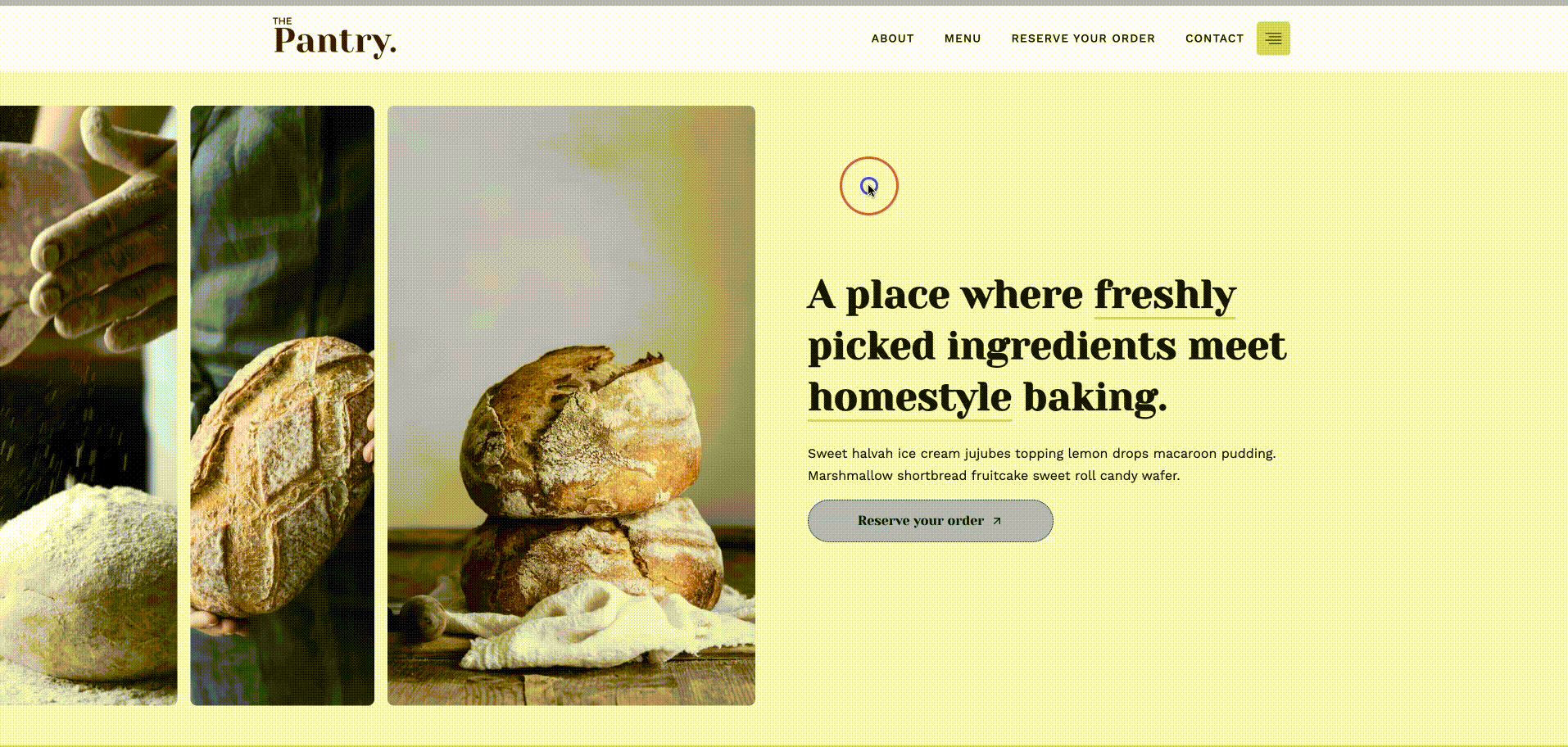
3. The Pantry
The Pantry is perfect for bakeries, cafés, food trucks / pop-ups, or anyone who wants their site to feel deliciously inviting. It’s all about simple pleasures like fresh ingredients, homestyle vibes, and making connections through food.
What makes The Pantry special:
The Pantry’s design creates an authentic, homey feel, using warm imagery and a welcoming layout that evokes comfort and personal connection. The menu is clearly organized into sections like Breads, Pastries, and Cookies & Cakes, making offerings easy to scan at a glance. The flow guides visitors smoothly from browsing to reserving an order and contacting, with simple, frictionless steps. Visual elements, including photos of baked goods, customer testimonials, and ambient touches, combine with thoughtful spacing and layout to create a comforting, inviting atmosphere.
Ideal for:
- Bakeries, cafés, artisan food makers who want a website that feels warm, personal, and mouth-watering
- Small food businesses that want visitors to feel the experience, not just see the menu
- Situations where you want customers to order/reserve easily and feel good doing it
Smart headers for seamless browsing
Each of our one-page templates features a unique navigation header built with our Advanced Navigation block, designed to enhance how visitors move through your site.
Thorne has a sticky header that highlights the current section as you scroll, making it easy for visitors to know exactly where they are. Perfect for a smooth, guided experience!

Cornerstone takes a different approach with a rounded header that scrolls with the page, giving a friendly, approachable feel.

The Pantry combines a sticky header with a toggle on the right, offering more navigation options while keeping things organized and intuitive.
In one-page websites, navigation is key: instead of clicking from page to page, visitors scroll or use anchor links to jump straight to the section they want. These headers show how our Advanced Navigation block can create a seamless, visually engaging experience across each template.
Ready to bring your One-Page Website to life?
Our Kadence one-page templates are built to make your site look polished, professional, and effortless to navigate. With unique headers, smooth scroll navigation, and thoughtfully designed sections, your visitors can move through your content with ease, with clarity. Explore the templates, see the headers in action, and pick the one that fits your brand best.
Create Your Website With KadenceWP Today!
6 responses to “Just Launched: 3 Professional One-Page Website Templates for Kadence”
-
-
Hi Kevin, I am really sorry that you are having this issue, our support team are extremely helpful and would be more than happy to help you sort this out. Please can you submit a support ticket so that they can help you out – https://www.kadencewp.com/help-center/
-
-
I love the new one-page templates from Kadence Thorne, Cornerstone, and The Pantry all look polished and purposeful. I’m using one of them on my own site and the smooth navigation + sleek design really makes a difference. These kinds of templates help maintain clarity and focus, especially when you want people to take action without getting lost.
-
Thank you so much for the lovely feedback! We’d love to see how you’ve used one of the templates to create your own site – would you mind sharing the link with us when it’s complete?
-
-
“Really impressed by these new one-page templates from Kadence — Thorne, Cornerstone, and The Pantry. Each offers a distinct aesthetic and purpose, whether you’re a creative professional, a service provider, or a food-oriented business. I especially like how the navigation headers are smartly designed to guide visitors in a seamless flow very important for maintaining clarity and engagement.
It’s a bit like organizing a car parking lot: good layout, clear signage, and user-friendly design make everything easier. These templates seem built with that same mindset — aesthetics + functionality. Great job by the Kadence team!”
-
Wow, thanks for the amazing feedback! Love your parking lot analogy, that’s exactly the kind of seamless flow we aim for with these templates. We’re so glad you’re enjoying the balance of design and functionality.
-

By Nicola Tweed
Nicola is the newest member of the Kadence marketing team, stepping in with more than 10 years of hands-on web design experience. She knows exactly what it takes to create beautiful, user-friendly websites that connect with people and get real results.
Updated September 17, 2025
Create Your Website With Kadence
I have been waiting to about 15 for the verification email for creating account. i cant connect any other way that i know of can someone please tell is this normal ? if not what can i do ?