Skip to content
Help Center
  • Pricing
  • ProductsExpand
    • Premium PlansGet all the tools you need in one plan
    • Kadence ThemeLightning-fast performance theme for modern websites
    • Kadence BlocksDrop in ready designs with advanced controls for pixel perfect websites
    • Kadence Shop KitCreate a more effective WooCommerce shopping experience
    • Kadence ConversionsBoost sales and build engaged audiences with popups and banners
    • Kadence InsightsEasily create A/B tests. Optimize your pages to drive higher conversions.
    • View All Products
    • Get Kadence + Hosting
      In One Place

      Enjoy faster setup, top-tier performance, and worry-free WordPress hosting – Kadence Theme, Kadence Blocks, and Solid Security all pre-installed.

      Learn More

  • Kadence AI
  • Starter Templates
  • Blog
  • SupportExpand
    • Resource HubStart here for guides, Product docs, FAQs, and Troubleshooting tips, all in one place.
    • Contact SupportStuck on something? We’re here to help! Open a ticket for top-notch support.
    • Contact Our TeamGot pre-sales questions or need help choosing a plan? Open a ticket and our team will guide you.
    • About usCrafted with love in Missoula, Montana. Meet the team behind the mission.
Account Account
Get Kadence
Kadence Theme
  • Features
  • Pro
  • Starter Templates
  • HelpExpand
    • Documentation
    • Facebook Group
    • Submit a Ticket
    • Feature Requests
    • Roadmap
    • Changelog
Help Center
Kadence Theme

Getting Started

Customize Settings

Header

General WordPress

Troubleshooting

  • Troubleshooting White/Blank Screens in the Editor or Customizer
  • How to Download Previous Versions of the Kadence Theme and Plugins
  • Recommended Server Resources

Advanced

Theme Kit Pro

  • Kadence Custom Fonts

Kadence Elements

Woocommerce

Hooked Element Guides

  • How to Design a Post Grid/Carousel using a Kadence Element
  • Home
  • Knowledge Base
  • Kadence Theme
  • Kadence Blocks
  • Block Tutorials

Responsive Breakpoints in Kadence

When building with Kadence products, you may want to adjust values for different screen sizes. For example, as you adjust the size of your browser screen width, you’ll notice the content on your site responds accordingly.

Breakpoints

The Kadence Theme, Kadence Blocks plugin, and other Kadence products generally use the following responsive breakpoints:

Desktop: > 1024px
Tablet: 768px – 1024px
Mobile: < 768px

Note: These breakpoints apply specifically to Kadence Blocks and not Core WordPress Blocks.

Table of Contents
  • Responsive Settings
    • WordPress Editor Preview vs. Kadence Responsive Breakpoints
  • Mobile Headers
  • Real-world examples for adjusting the "Screen size to switch to mobile header" setting:

Responsive Settings

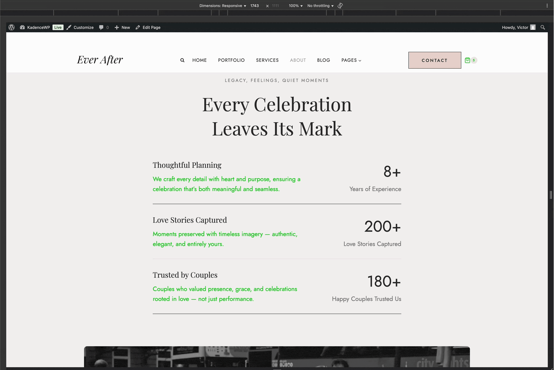
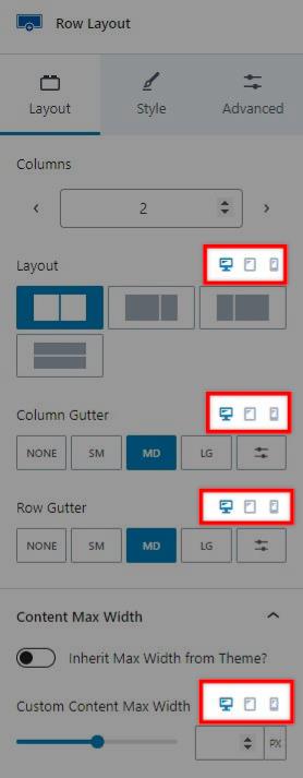
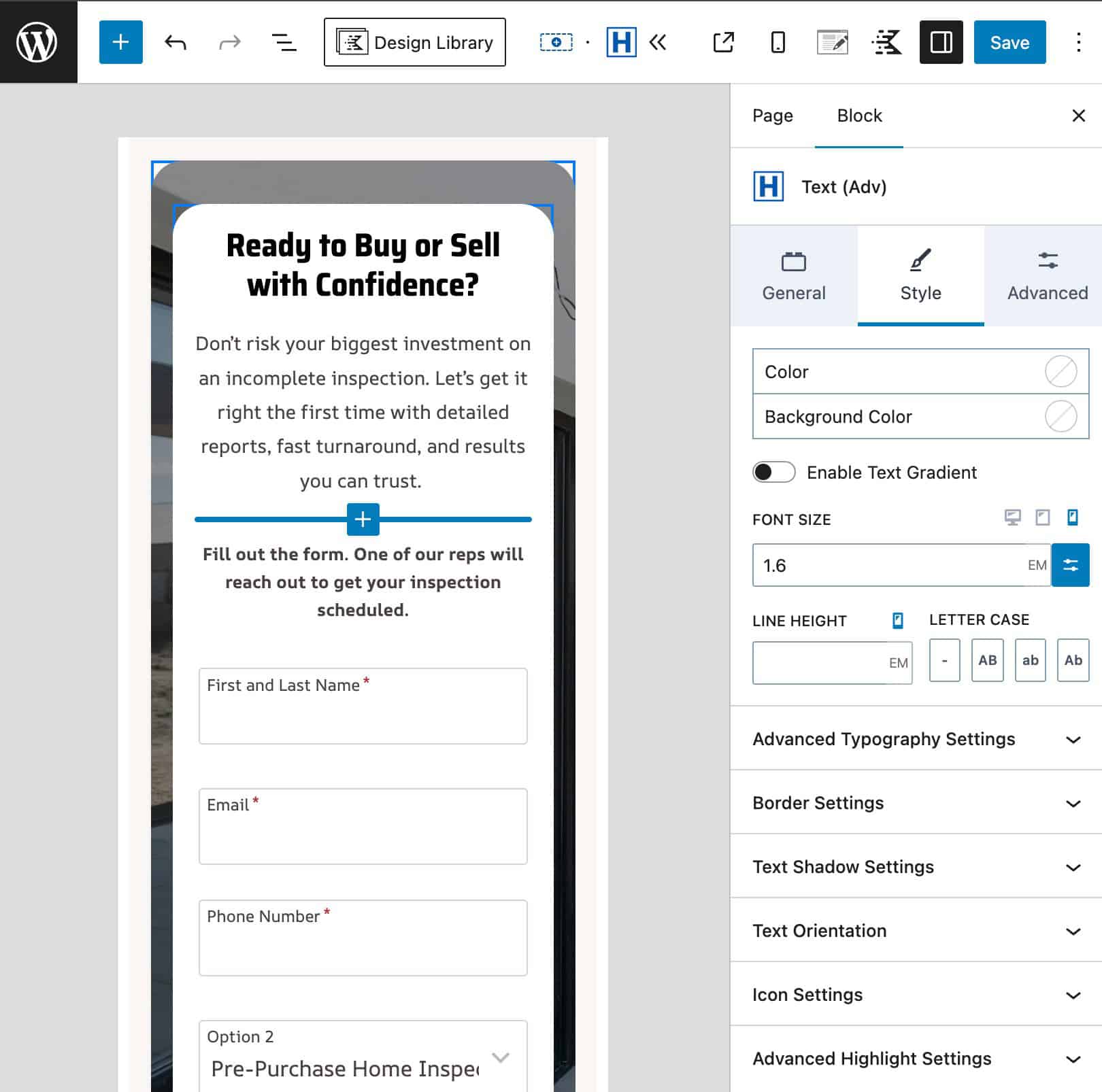
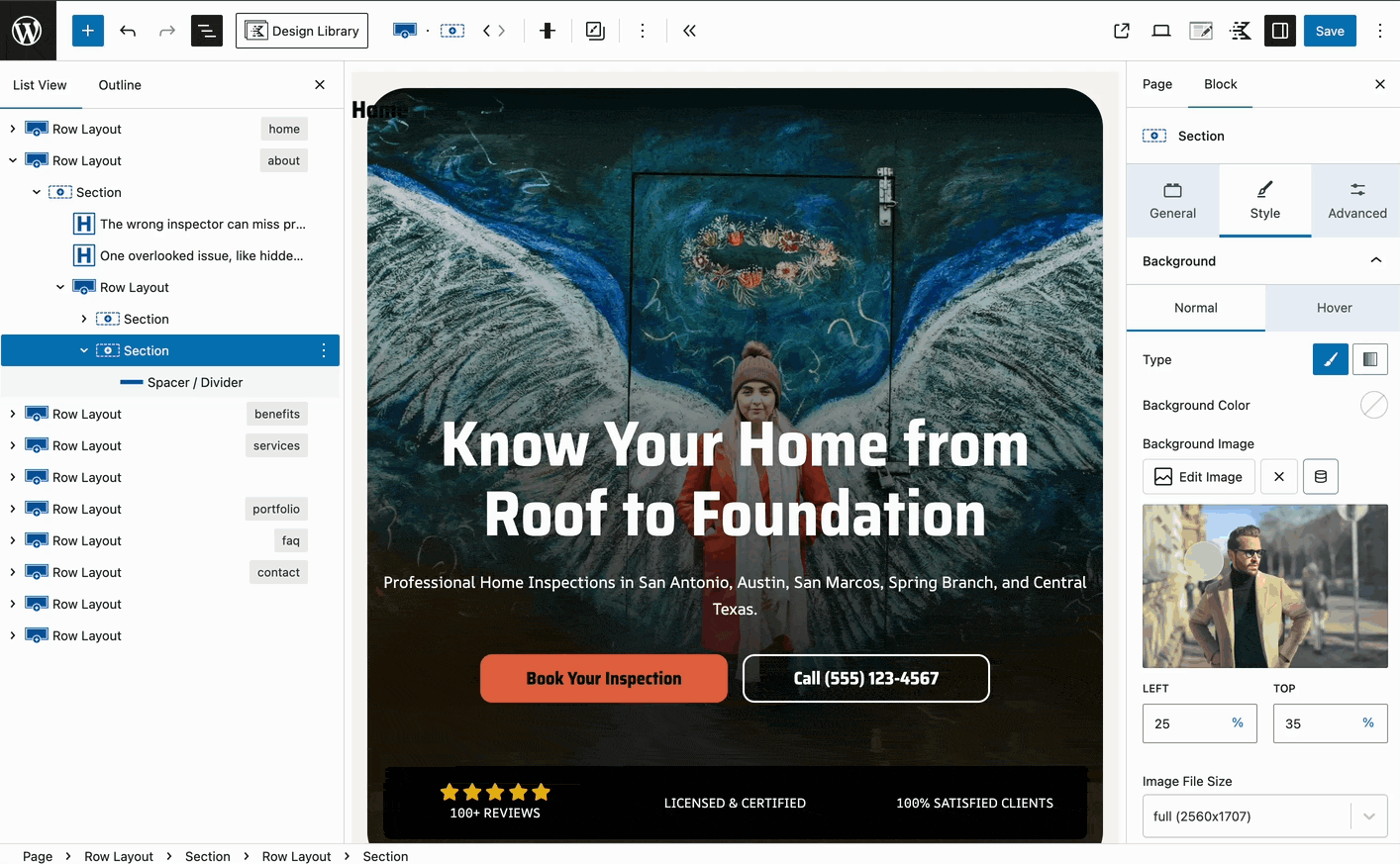
Some options through the Kadence theme and blocks include icons for desktop, tablet, and mobile devices. Clicking on one of these icons will update the setting for that screen size, allowing you to set a responsive option. The Kadence theme and blocks plugin have various responsive settings.

For example, the Row Layout block has “Layout” settings that let you adjust the column layout. Just above the setting are the three breakpoint icons. Initially, the setting applies to desktop devices, but you can decide to add different settings for tablet and mobile devices. This allows you to turn a four-column row into a two-column row for tablets and a single column for mobile devices.

Users sometimes want to know if they can customize these breakpoint values. However, there are no settings to change the breakpoints. If you need more control over styles at different screen widths, you must rely on media queries.

WordPress Editor Preview vs. Kadence Responsive Breakpoints

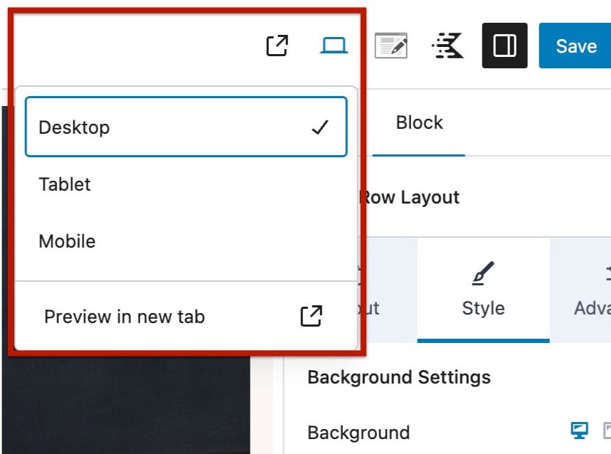
When using the Responsive Controls in Kadence Blocks, you’ll notice the editor automatically adjusts its screen width as you switch between the desktop, tablet, and mobile icons. These screen widths are based on WordPress Core’s built-in responsive preview sizes.

Editor Preview in Mobile

At the top right of the editor, you can also use the Core preview controls to switch between device views or open each view in a new tab. Both the Core preview options and Kadence’s responsive controls use the same underlying WordPress Core behavior for screen width changes, ensuring a consistent experience within the editor.

Responsive Editor Settings

Kadence Blocks and the Kadence Theme apply specific responsive breakpoints to determine when styles switch between desktop, tablet, and mobile. These are:

  • Mobile: less than 768px
  • Tablet: between 768px and 1024px
  • Desktop: greater than 1024px

Because the WordPress editor preview is based on general device sizes, what you see in “Tablet View” inside the editor may not exactly match how your design appears on the front end. The preview is helpful for quickly styling layouts for general screen sizes, but actual devices vary widely in resolution and pixel density.

As a result, a layout that looks correct in the editor’s tablet or mobile preview may appear slightly different on real devices. For the most accurate results, we recommend previewing your design in a new tab and testing it in your browser using Inspector Tools, where you can manually adjust the viewport width or use device presets to see how your content responds across Kadence’s actual breakpoint ranges.

Previewing in a new Tab

Using the browser Inspector Tools, you can test your layout across various device sizes. You can also use Responsive Mode to manually adjust the screen width and see how your design adapts in real time.

Mobile Headers

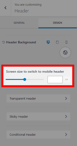
Another responsive setting applies to the mobile header. You can set the screen width at which the header switches between the mobile and desktop headers. Navigate to Appearance > Customize > Header, then click on the Design tab. There is an option to set the “Screen size to switch to mobile header.” This setting sets the screen width (in pixels) at which the desktop header will turn into the mobile header. Screen widths lower than this setting will show the mobile header, and widths above this setting will show the desktop header.

Real-world examples for adjusting the “Screen size to switch to mobile header” setting:

  • Show mobile menu on larger screen sizes — For example, if your menu items or other header widgets or elements break into multiple lines on smaller laptops or tablets, you can set a larger breakpoint so the mobile menu appears before the wrapping happens.
  • Always show mobile menu, even on desktop — Some users prefer the mobile menu layout for design or simplicity. You can set a very high breakpoint so the mobile menu displays on all devices.
  • Always show desktop menu, even on mobile — If you want the desktop menu visible on all screen sizes, set the breakpoint to a very low value so the mobile header never appears.
Do you feel this document was helpful?
The Kadence WP Logo
Crafted in Missoula, Montana
  • Follow Kadence on Facebook
  • Follow Kadence on Youtube
  • X
  • Follow Kadence on Instagram
Trustpilot
Products
  • Kadence Plans
  • Kadence Theme
  • Kadence Blocks
  • Kadence AI
  • Kadence Starter Templates
  • Kadence Shop Kit
  • Kadence Conversions
  • Kadence Pattern Hub
  • View All
Resources
  • Blog
  • Podcast
  • Knowledgebase
  • Support ticket
  • Feature Requests
  • FAQ
  • WordPress Hosting Services
About Us
  • About Kadence
  • Become an affiliate
  • Contact us
  • Terms
  • Privacy Policy
  • Security
Our Partner Brands
  • SolidWP
  • LearnDash
  • The Events Calendar
  • GiveWP
  • MemberDash
Kadence Community
  • Kadence Marketplace
  • Join the Facebook Group
  • Subscribe to our YouTube Channel
© 2024 Kadence WP | All prices are in USD
Logo for StellarWP an umbrella brand of Premium WordPress plugins
  • Pricing
  • Products
    • Premium PlansGet all the tools you need in one plan
    • Kadence ThemeLightning-fast performance theme for modern websites
    • Kadence BlocksDrop in ready designs with advanced controls for pixel perfect websites
    • Kadence Shop KitCreate a more effective WooCommerce shopping experience
    • Kadence ConversionsBoost sales and build engaged audiences with popups and banners
    • Kadence InsightsEasily create A/B tests. Optimize your pages to drive higher conversions.
    • View All Products
    • Get Kadence + Hosting
      In One Place

      Enjoy faster setup, top-tier performance, and worry-free WordPress hosting – Kadence Theme, Kadence Blocks, and Solid Security all pre-installed.

      Learn More

  • Kadence AI
  • Starter Templates
  • Blog
  • Support
    • Resource HubStart here for guides, Product docs, FAQs, and Troubleshooting tips, all in one place.
    • Contact SupportStuck on something? We’re here to help! Open a ticket for top-notch support.
    • Contact Our TeamGot pre-sales questions or need help choosing a plan? Open a ticket and our team will guide you.
    • About usCrafted with love in Missoula, Montana. Meet the team behind the mission.
Account Login
  • Features
  • Pro
  • Starter Templates
  • HelpExpand
    • Documentation
    • Facebook Group
    • Submit a Ticket
    • Feature Requests
    • Roadmap
    • Changelog