
If you are new to web design, seeing options like PX, EM, REM, and VW/VH in your Kadence settings can feel overwhelming. You might wonder, “Which one should I choose?”
While Pixels (PX) are the default and work perfectly for almost any design, Kadence offers other units to give you more flexibility. This guide will help you understand what these units mean and how to use them across both the Kadence Theme and Kadence Blocks to build a site that looks great on every screen.
1. Where to Find Unit Settings
In Kadence, you will find unit selectors in two primary locations:
- In Kadence Blocks: When inside the WordPress Editor, click on a block (like a Row Layout or Advanced Text). In the Block Settings sidebar on the right, look for settings like “Padding,” “Margin,” or “Font Size.” You will see the unit toggle (PX) right next to the number input.
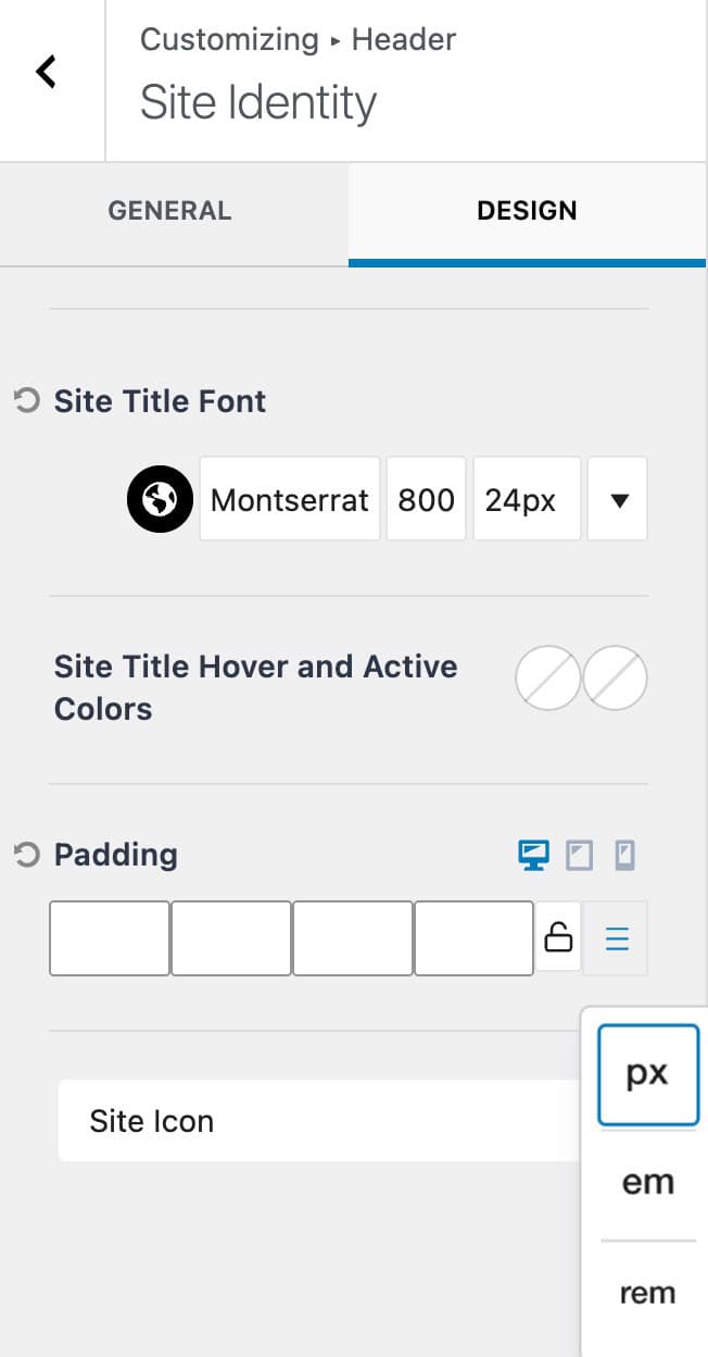
- In the Kadence Theme: To set site-wide defaults, go to Appearance > Customize. Unit settings are found under General > Typography (for base font sizes), General > Layout, and within the Header/Footer builder options.
2. Choosing Your Unit
Clicking the unit label allows you to toggle between different types of measurements (For applicable Block Settings). Here is an overview of the different types of measurement units.
PX (Pixels)
Pixels are the classic unit of web design. If you set a value to 20px, it stays exactly 20 pixels wide.
- When to use: Use PX when you want total control. It is the go-to for beginners and works for everything from text to spacing.
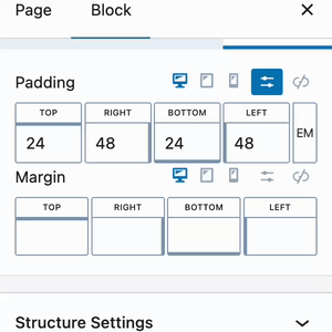
EM and REM (Relative Units)
These units are based on the size of the text, making them “flexible.”
- REM: Based on the Root (the default browser font size, usually 16px). If the browser default is 16px, then $1rem = 16px$.
- EM: Based on the font size of the specific block or parent element you are editing.
- Why use them? They are excellent for accessibility. If a visitor has their browser set to “Large Text,” your layout will scale up naturally to match their preference.
Percentage (%)
This is based on the size of the “parent” container.
- Example: If you set a block width to 50%, it will always take up exactly half of the row or section it is sitting in.
VW and VH (Viewport Width/Height)
These are “Full Screen” units based on the size of the person’s browser window (the viewport).
- VW: 100vw is 100% of the width of the screen.
- VH: 100vh is 100% of the height of the screen.
- Why use them? These are perfect for “Hero” sections where you want a background image to perfectly fill the entire screen height when a user lands on the page.
Note on Mobile Viewports: When using 100vh for mobile devices, keep in mind that mobile browsers (like Safari or Chrome on iPhone/Android) often have address bars or navigation toolbars at the top or bottom. Because of this, 100vh might actually be taller than the visible area, causing the user to have to scroll. In these cases, you may want to use a slightly smaller value (like 90vh) for your mobile responsive settings to ensure your content stays fully visible.
3. Using Responsive Controls
A common question is: “If I use Pixels, won’t my text be too big on mobile?”
Kadence solves this with Responsive Controls. Next to most settings in both Blocks and the Theme Customizer, you will see three icons: a Desktop, a Tablet, and a Mobile phone icon.
- Select the Device: Click the tablet icon to switch to the tablet preview or click on the mobile icon to switch to the mobile preview.
- Adjust the Value: Change the number (and even the unit!) specifically for that device.
- Independence: You can use 80px for a heading on Desktop, but switch it to 32px on Mobile so it fits perfectly.
This is also useful when using padding and margin. A desktop design may call for larger padding than on mobile. In return, the proper mobile responsive controls should be used to set a smaller value on mobile. This allows designs to work responsively and prevent obsessive spacing on smaller devices.
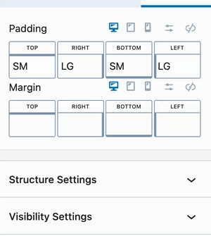
4. Kadence Size Presets (SM, MD, LG, XL)
Sometimes, you don’t want to worry about numbers or math at all. Kadence includes Size Presets to make designing faster and more consistent.
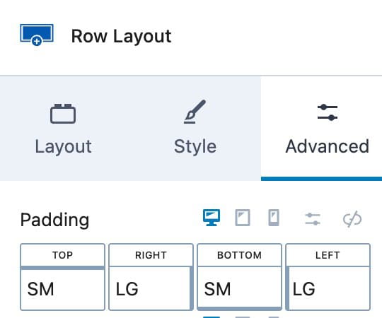
When you see the Small (SM), Medium (MD), Large (LG), and Extra Large (XL) buttons, you are using presets.
- Consistency: If you use “MD” for padding on every section, your site will look uniform.
Kadence offers presets in multiple areas, such as Fonts, Gap Spacing, and more. These presets are synced within their category:
- Using an SM Gap in one section will apply the same SM Gap elsewhere.
- However, an SM Font is not the same as an SM Gap; each type has its own set of presets.
(Aside from margin/padding values.)
Presets let you design efficiently without worrying about exact numbers, while keeping your site consistent and easy to update.
Tip: Kadence Font Size Presets can be programmatically changed. Learn more here.
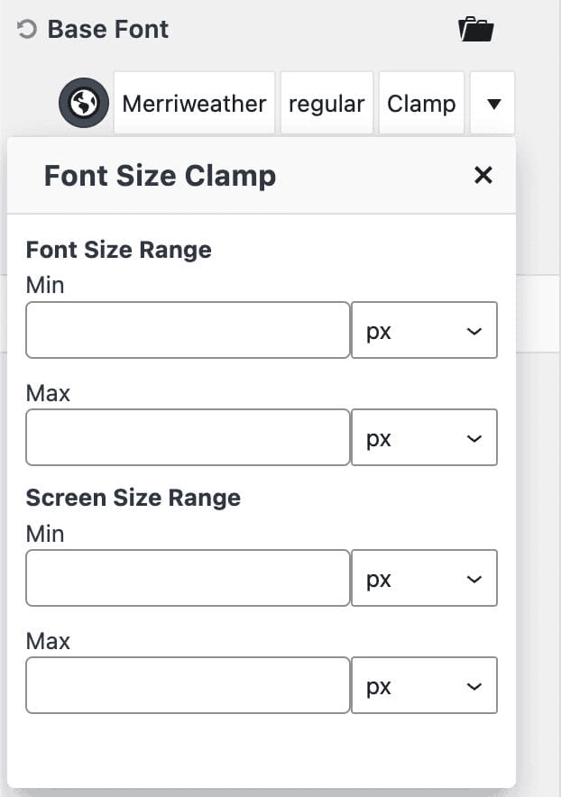
5. Advanced: Fluid Scaling
If you want your text to grow and shrink smoothly as someone resizes their browser window—without you having to manually set sizes for every device, you can use CSS Clamp.
Kadence has built-in support for Clamp in the Theme Customizer, allowing you to set a “Range” for your sizes (for example, “Never smaller than 16px, but never larger than 48px”).
Learn More Here: Understanding CSS Clamp in the Kadence Theme
