
Notice: These forums are now retired and closed. For active support, please Submit a Ticket or visit our official WordPress.org community pages.
Kadence Theme | Kadence Blocks | Starter Templates | WooCommerce Email Designer | Ascend | Virtue | Pinnacle
Search Results for 'COLUMNS'
-
AuthorSearch Results
-
In forum: Virtue Theme
In reply to: Virtue: carousel – image size
March 30, 2016 at 11:59 am #88393ok, this is in part because of implementing new wordpress responsive images: https://make.wordpress.org/core/2015/11/10/responsive-images-in-wordpress-4-4/
Your images are not at least the size looked for by a single column carousel (560×560).
http://ecp-shop.ru/wp-content/uploads/action_cryptoexpress.png
Where as before the output would just have your image now it has srcset which allows the browser to pull in the image that best matches based on screen size and resolution.
Because your image size it not at least the size looked for by the carousel it can’t be cropped and thus can’t be registered within wordpress as a size and so in the srcset output the image isn’t there. It doesn’t match up with the ratio of the carousel.
So I suggest increasing your images size. Will give to better support for all screens as well
Another option is to change the carousels requested size from 560 to 300. This is done using a shortcode trick.
[carousel columns="4" mcol="1" scol="1" xscol="1" sscol="1" type="portfolio"]Ben
In forum: Virtue ThemeTopic: Footer Column Width
In forum: Virtue ThemeIn reply to: Center portfolio
March 29, 2016 at 10:01 pm #88281Hey,
So portfolios aren’t set up for fullwidth content. They are designed to stay within the container size. so the image output size is not large enough. To center and make look better make sure your pagebuilder row is not fullwidth, then choose three columns and your three portfolio posts will be aligned center.Ben
In forum: Virtue ThemeIn reply to: Need some features.
1) I heard about that, however as long as it works with spaces, why do I actually have to use it without spaces? I’m really a bit of old-school man, and letting some other person inside my website makes me nervous. Didn’t want to show all back-end just to implement one feature.
So I finally did it myself, the idea was to use echo before get_post_meta. After doing so it works perfectly.
2) JS is something I’m not really ready to learn right now, I have reorganized my tabs so they all have 5 columns, so they show as 2 on mobile.
Thanks!
In forum: Virtue ThemeIn reply to: Mobile site issues
To Ben:
1. In your theme options > menu settings. Do you have a hover color set for the mobile menu.
IN MY MOBILE MENU FONT, IT’S WHITE. NO COLOR SELECTED FOR Mobile Hover and Active Font Color AND Mobile Hover and Active Background Color2. That is jetpack, not the theme.
YES I DEACTIVATED MOBILE THEME IN JETPACK. AND WHERE DO I FIND COPYRIGHT FOOTER IN JETPACK?3. I’m not sure I don’t think I can see this page without a login?
Using pagebuilder the layout would switch to mobile and have columns turn to rows. so they can be seen and read better.
THAT WHAT IT MUST HAVE DONE. I THINK I WILL LEAVE THIS ALONE UNLESS CLIENTS DON’T LIKE IT.In forum: Virtue ThemeIn reply to: Mobile site issues
March 29, 2016 at 9:54 am #881571. In your theme options > menu settings. Do you have a hover color set for the mobile menu.
2. That is jetpack, not the theme.
3. I’m not sure I don’t think I can see this page without a login?
Using pagebuilder the layout would switch to mobile and have columns turn to rows. so they can be seen and read better.Ben
In forum: Virtue ThemeIn reply to: Mobile site issues
I did have Jetpack’s mobile theme activated. I deactivated, and the mobile view option is no longer there at the bottom of the website on my phone. I didn’t realize that it interfered with your theme’s responsive features. I think this did it.
Now the only mobile issues have to do with the following:
1. Menu is there as a teal color box on right, but when I click it it only shows home page. The other links are there but can’t see them until I click under “home” link. When clicked they are very faint in color. On my computer, the menu text color is a grey and when hovered it is teal. And remains teal when it takes me to that page. Maybe that is why on the phone, the nav links are basically invisible because the menu box on the right is teal color. How can I fix that just for the mobile devices? Usually on other sites, there is a similar box but has white lines in it designating it has the menu bar; and when clicked all nav links are clearly seen.
What changes do I make if any via your Mobile Menu Options to make it easier to see menu on mobile devices?
2. On my phone, the Calendar page and About Us page at the bottom as the footer copyright as “Proudly powered by WordPress.” Would like it to be the same as it is on my computer view, “© 2016 Choice Connection.” All other mobile pages with open and logged in access have the correct copyright footer.
3. On the logged in access only page, Living Inside-Out, the mobile view of the first two paragraphs are laid out in a table with 2 columns using the Site Origin Editor. But in the mobile view it breaks up the table and lays them out one on top of the other. Correct layout is below. Hope I make sense here. If it’s too involved to correct, I’ll just ignore it.
left column, row 1–
You are here as a Choice Partner:
right column, row 1–
Because You are Choosing to take control of your body to achieve Optimal Health at every stage of life, from the INSIDE-OUT!left column, row 2–
I am here to support Your Choice:
right column, row 2–
Because for 25 years and counting, I have used these products. I see, feel and experience every day optimal benefits from the INSIDE-OUT and will pass on to you, Why and How they work!In forum: Virtue ThemeMarch 28, 2016 at 11:30 am #88000Hey,
There isn’t a way to change the shortcode defualt and because it’s a shortcode you can’t edit the template since there isn’t a template it’s a function.The only real option would be to turn off the theme shortcode and make your own in a child theme. There you could set the defaults.
This is the same with any setting in the gallery shortcode. For example the columns default to 3. The lightbox size defaults to full. There isn’t a way around this unfortunately other then to add in your options.
Again using the widget interface may be more appealing to you.
Ben
In forum: Pinnacle ThemeIn reply to: Blog grid
March 28, 2016 at 11:15 am #87997Hey,
1. Using the blog grid page template you should be able to select three columns right in the page settings.2. If you want the images to be the same size you can turn on a hard crop in your theme options > blog options.
3. Moving the category above teh title isn’t a built in option. That you would have to change in the code. Are you using a child theme so you can override templates?
https://www.kadencewp.com/child-themes/Are you aware of how a child theme works?
4. You can make the text center with this css:
#kad-blog-grid .blog_item {
    text-align: center;
}
Ben
In forum: Virtue ThemeIn reply to: Automatized page
In forum: Pinnacle ThemeTopic: Blog grid
Hi,
These forums are awesome! Thanks everyone for being so patient with me as I get up and running. I have another issue hopefully someone can help me out.
I’d like for my posts page ( *Login to see link ) to be in the blog grid format with three columns. Each image should be the same size, and display the following:
IMAGE
Category
Blog title
subtitleAdditionally, I would like the text centered under the image. Is this possible? I seem to be striking out with every attempt I make to configure the settings properly.
If coding is necessary, please speak very simply, as I’m brand new to this. Thanks!
Nick
In forum: Virtue ThemeIn reply to: Need some features.
Hi, Ben
1)I tried to use this get post meta, but I don’t understand how to make it visible. I added this code inside the imghoverclass in content loop portfolio file:
<div class=”captiontitle headerfont”><?php $price1 = get_post_meta ( $post->ID, ‘value price’, true );
echo esc_attr($price1); ?></div>However the value doesn’t show up on the thumbnail, what am I missing?
2)I have 2 carousels with 3 columns on homepage and one carousel with 5. What css should I add to @media (max-width:480px;) in order to make carousels of 3 items show 2 columns instead of 1 on mobile? carousel with 5 items shows 2 column layout by default.
Thanks!
http://asp-polyana-sochi.ruIn forum: Virtue ThemeIn reply to: Language settings
March 25, 2016 at 4:45 pm #87790ok, there are shortcodes for columns too (click “virtue shortcodes”)so just about anything you can do in page builder you can do through shortcodes.
BenIn forum: Virtue ThemeIn reply to: Language settings
That’s a fantastic solution! I don’t know how exactly to choose number of columns and other details, but I am satisfied with the result! I didn’t know I could add a mosaic gallery that way.
I tried polylang plugin before and it made a mess. WPML doesn’t have a free version so I am avoiding it for the moment!
Thanks so much Ben.
Problem solved!In forum: Virtue ThemeIn reply to: Mobile to be split column?
March 25, 2016 at 4:22 pm #87783Hey,
You can’t make mobile “exactly” like computer. It’s not the point of a responsive theme. The theme’s code is responsive to screen size and the layout breaks down as you access on smaller devices. This is for better mobile browsing (no zooming in and out) and it’s also important for mobile SEO. The text doesn’t shrink as you screen breaks down. That is key. I really suggest you consider what’s more valuable in terms of mobile traffic.So can you have two columns on mobile? absolutely. Should you try to make the space on mobile for all your content and a sidebar.. no. really really no.
But If you want to experiment with the code I can let you try and force something like that. (but again this will not look good because text remains the same size as desktop).
In terms of the link you posted? That isn’t a responsive site so simple put. No you can’t do that with a responsive theme. And more then that I would strongly encourage you to look around at articles for how bad that is for your site to not be mobile friendly.
Ben
In forum: Virtue ThemeTopic: Mobile to be split column?
I was wondering if it is possible to make the mobile version exactly like the computer version? Mening i have two columns when viewing the site on a computer screen, and i would like that on the mobile version. a simple example would be to look like http://www.lovetaza.com
Thanks! Im using virtue but have the premium just havent uploaded it, not sure if that matters?In forum: Virtue ThemeIn reply to: Portfolio category pages duplicates content
In forum: Virtue ThemeIn reply to: Portfolio category pages duplicates content
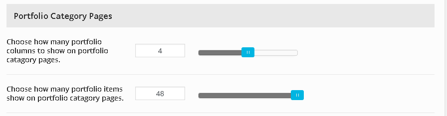
March 25, 2016 at 3:12 pm #87751I’m not talking about columns.. You can set how many items show per page in your theme options settings.
Theme options > portfolio options.
“Choose how many portfolio items show on portfolio catagory pages”What is that setting and the one in your settings > reading.
Ben
In forum: Virtue ThemeIn reply to: Portfolio category pages duplicates content
1)When I set it to 4 columns and 4 items per page, it creates a lot of pages, also with duplicated content. Morevover, pages after 7 to 15 gives 404 error.
Why did you ask for that actually? I don’t really need to show just 4 objects per page.2)I can keep it as 48 for now, but how to increase this amount? Also how to show them by most recent first? They seem to be random.
In forum: Virtue ThemeTopic: 3 columns instead of four
Hi,
My site akycha.com is a full width, 4 column website. When I use the blog page, I get 4 columns. When I search a category, I get 4 columns too. But when I do a search (e.g. kerkhof) I get a 3 column grid. Can’t find the cause. Could you help me?
Thanks,
Diana van den Broek
-
AuthorSearch Results
