
Notice: These forums are now retired and closed. For active support, please Submit a Ticket or visit our official WordPress.org community pages.
Kadence Theme | Kadence Blocks | Starter Templates | WooCommerce Email Designer | Ascend | Virtue | Pinnacle
Search Results for 'banner'
-
AuthorSearch Results
-
In forum: Virtue Theme
Topic: kadence slider image sizes
At http://www.africatrademakers.com I have a kadence slider on home page. What is the recommended image size for the slider images? The only picture that is sized right on my slideshow is the first one, the others are way too large. Please assist on how to make all the sizing consistent
Also how can I add a banner or some content in the empty space above the slider and below the menu on the home page and other pages?
In forum: Virtue ThemeTopic: Visual editor
Hi guys.
Hopefully a quick one today lol. I have a visual editor widget on my home page with tabs in it. Could you please let me know the css required to get the visual editor inline with the banner. So there is no gap between the banner and tabs. Thanks, here is a link *Login to see link
Kind regards, PaulIn forum: Virtue ThemeIn reply to: help with the banner top
Now I changed the leyout to moxed , check the menu and the main banner of the site are less than the photo slider that is just below , I would like to stay all the same size minus the part where are the news. the same with the footer that is with size boxed well.
In forum: Virtue ThemeOk thanks Hannah, yes after running the plug-in it change the static page, didn’t think to check that. fixed.
Does anyone know what the dimensions of the banner image on the demo one is? and what the Layers Grid Size is? I set mine to 1366 x 400 which is the same dimensions of my images but the demo seems to behave better than mine over different screens I’ve tested it on. Thanks for tips on that.
I am very happy with the plug-in Ben, things are really starting to shape up now
In forum: Virtue ThemeTopic: help with the banner top
It has as I leave the template banner boxed width 100 % ? I want to make the banner template in boxed occupying the entire page with the menu however the body site where are the news and whidgets wanted it to be boxed . someone help me ?
its my site: *Login to see link
he is the whide template would like the banner to stay that way put in boxed layou.
tanks for all
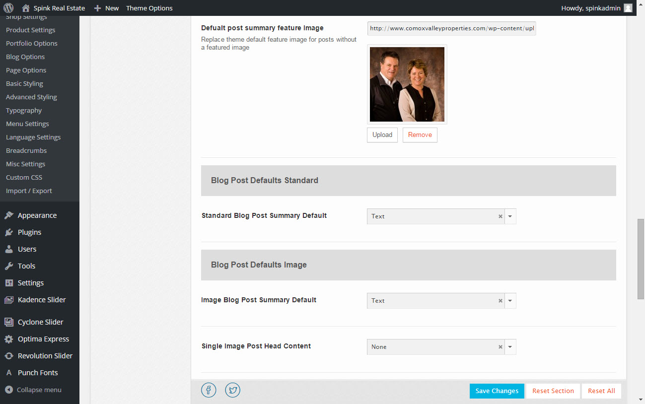
In forum: Pinnacle ThemeIn reply to: Default blog post showing empty Image
Same Result.. Added an image too this time. I could opt to add a banner here or a 1×1 transparent img.
Screenshot: http://www.comoxvalleyproperties.com/wp-content/uploads/2015/05/shot.jpg
Noticed you have a typo as well.
~B
In forum: Virtue ThemeIn reply to: Fixed Top NavBar Spacing issue
May 11, 2015 at 5:05 pm #40414Ok lets try this, remove the css hannah posted. Then make sure you do not have a mobile menu selected in appearance > menus.
Then add this css:
#kad-banner > .container > .row {
  display: none;
}
#topbar .kad-topbar-right {
    width: 20%;
    float: left;
}
#topbar .kad-topbar-left {
    width: 80%;
    float: right;
}
#topbar .kad-topbar-left .topbarmenu {
  float:left;
}
Ben
In forum: Virtue ThemeIn reply to: Fixed Top NavBar Spacing issue
In forum: Virtue ThemeIn reply to: Sub-Page Banner
In forum: Virtue ThemeTopic: Sub-Page Banner
Is there a way to get a banner image for the non-home page pages on the Virtue Theme? Here is an example – *Login to see link
In forum: Virtue ThemeIn reply to: Mobile Slider above the header
May 5, 2015 at 11:55 am #39667ok, this is’t an option so you will have to use a child theme to force this. add this function to your child theme and make sure in your theme options > mobile slider is off.
add_action( 'get_header', 'mobile_slider_top_replace', 0 );
function mobile_slider_top_replace() {
	$detect = new Mobile_Detect_Virtue;
  if ( is_front_page() && $detect->isMobile() && !$detect->isTablet()) {
  	  remove_action( 'get_header', 'revolutionslider_top', 1 );
      echo '<div class="kad_fullslider">';
      echo do_shortcode('[slidershortcode here]');
      echo '<div class="kad_fullslider_arrow"><a href="#kad-banner"><i class="icon-arrow-down"></i></a></div>';
      echo '</div>';
    }
}
Make sure you change the “[slidershortcode here]” to whatever shortcode you want for the slider for mobile.
BenIn forum: Virtue ThemeIn reply to: Logo full width of screen?
May 1, 2015 at 2:59 pm #39312Yeah change it to this:
#kad-banner > .container {
    width: 100%;
 padding: 0;
}
#kad-banner .kad-header-left {
    padding: 0;
}
Ben
In forum: Virtue ThemeIn reply to: Logo full width of screen?
May 1, 2015 at 2:38 pm #39304add this css in your theme options > advanced settings:
#kad-banner > .container {
    width: 100%;
}
#kad-banner .kad-header-left {
    padding: 0;
}
Ben
In forum: Virtue ThemeIn reply to: Home Page Picture cropped
April 22, 2015 at 12:11 pm #38332You aren’t closing out the media query that is right above the css you added… so for example you have this:
@media (min-width: 992px) {
html, body {
height: 100%;
}
html body.wide #wrapper.container {
min-height: 100%;
position: relative;
padding-bottom: 65px !important;
}
#containerfooter {
position: absolute;
bottom: 0;
left: 0;
width: 100%;
}
.infobanner {
  background-size: contain !important;
}
But it should be this:
@media (min-width: 992px) {
html, body {
height: 100%;
}
html body.wide #wrapper.container {
min-height: 100%;
position: relative;
padding-bottom: 65px !important;
}
#containerfooter {
position: absolute;
bottom: 0;
left: 0;
width: 100%;
}
}
.infobanner {
  background-size: contain !important;
}
Ben
In forum: Virtue ThemeIn reply to: creating a gray line between the header and body
April 21, 2015 at 10:57 pm #38260You can use css like this:
#kad-banner {
  border-bottom: 1px solid #ddd;
}
Ben
In forum: Virtue ThemeIn reply to: Home Page Picture cropped
April 21, 2015 at 1:43 pm #38183Hey so you can add this css in your theme options > advanced settings:
.infobanner {
  background-size: contain !important;
}
Just a note about the image menu items. They are designed to hold background images. The title and text are supposed to be the focus. See here: http://themes.kadencethemes.com/virtue-premium-3/
So that image just fills the space it’s not supposed to determine the space. With the css above it will change that, make it so the image is always visible.
Ben
In forum: Pinnacle ThemeIn reply to: Attempting to style dropdowns on MainNav menu
April 20, 2015 at 1:51 pm #38088#kad-banner .kad-primary-nav ul.sf-menu ul li a:hover, #kad-banner .kad-primary-nav ul.sf-menu ul li.current-menu-item a { background: rbga(0,0,0,.6); }Ben
In forum: Virtue ThemeIn reply to: Image cover and Home Page issue
April 20, 2015 at 1:02 pm #38070Found it on another post….
I just tested the home page. I was able to move things to enabled and save theme without any issue. What browser are you using?
I added css for your header issue with the product zoom plugin..
#kad-banner, #nav-main {
    z-index: 100000 !important;
}
Ben
In forum: Virtue ThemeI’m still stuck one particular issue in Virtue Premium but Ben has been great working with me through these. I think that’s what separates the all-too-few like him from the rest of the theme authors out there; commitment to his customers. Anyway, thank you Ben. Now for the issues.
Issue 1: Featured Image Coverage – I was placing Featured Images in their places so that they’d appear on a product’s individual page. With a sticky header containing the company’s logo (centered) and horizontal menu activated, when selecting a product, the product’s page would appear but as it was scrolled up, while while the page itself would dive under the header and menu, the image would not. It would scroll up with the rest of the page but scroll over the top of the header logo image and menu. A secondary issue arose concerning the drop-down menu. The menu lies just beneath the centered logo and when I was on a product’s page, clicking on a menu selection would yield the usual a drop-down slate of sub-menu selections but it too was hidden under the featured image.
Correction: Ben wrote a bit that I put into the Advances Setting’s CSS part of the theme options and it corrected both issues. In case someone is having problems with the same thing, here is Ben’s fix.#kad-banner {
z-index: 10000 !important;Issue 2: I’ve selected a Wide Layout and centered logo from the Main Settings and no side bar from the Home Layout options and I’ve selected static page and Home from Selections/Reading and Front Page options. I created an independent “Home” page from the Pages option but when I return to the Home Layout option and attempt to move items like Featured Products, Best Selleres or any slider from the “Disabled” to the “Enabled”, it won’t stick. I must be doing something wrong so I’ll keep trying to figure it out but for now, all I have is a Flex Slider that I created and positioned on my Home Page/. Any help anyone could offer would be greatly appreciated.
position:relative;
}In forum: Pinnacle ThemeIn reply to: logo in mobile menu
April 18, 2015 at 10:58 pm #37901I think I see what you want, add this css:
@media (max-width: 767px){
    #kad-banner #logo .kad-lg, .kad-header-style-basic #logo #thelogo, .kad-header-style-basic #logo a.brand, .stickyheader #kad-banner, .nav-trigger-case .kad-navbtn {
        height: 100px !important;
        line-height: 100px !important;
    }
}
Ben
-
AuthorSearch Results
