
The Kadence WooCommerce Email Designer ⧉ plugin gives you complete control over the design of your WooCommerce emails, without needing any custom code. You can easily customize styles and content layouts to match your brand identity. This plugin gives you control over the default WooCommerce emails, such as the order confirmation email, lost password emails, and more.
The live preview editor lets you see your changes instantly, so you know exactly how your customers will experience your store’s communication.
Getting Started
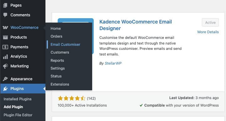
In your WordPress website, go to the Dashboard → Plugins → Add New page.
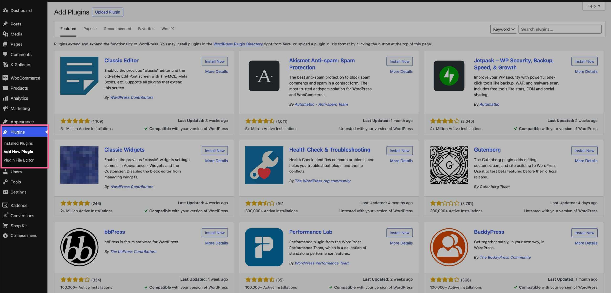
Search for the Kadence WooCommerce Email Designer plugin.
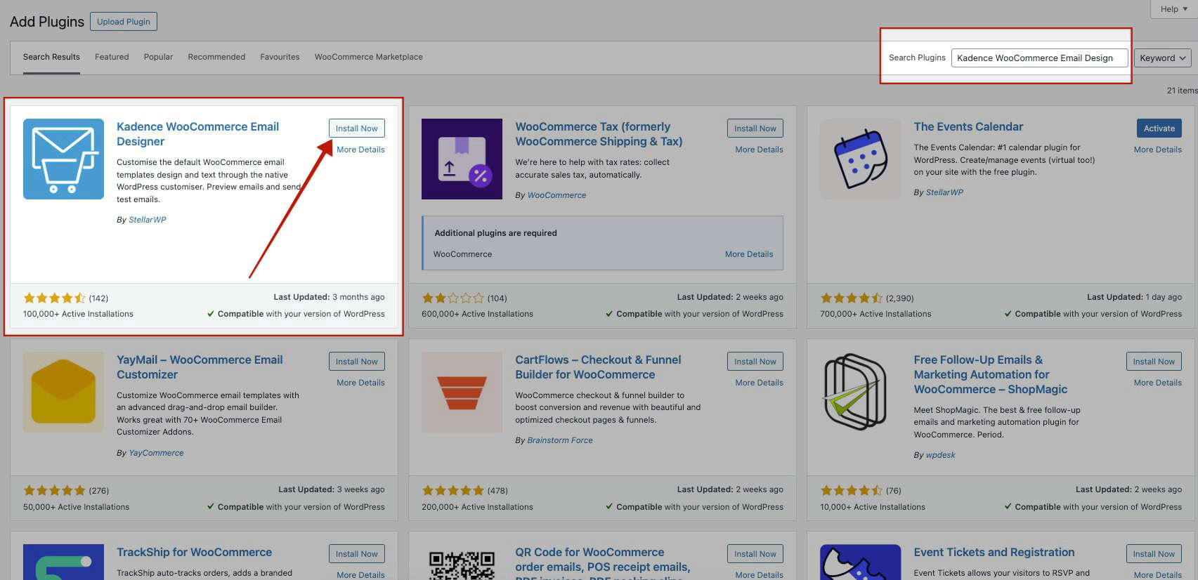
Click Install Now, then Activate. Once the plugin is activated, you can access the Email Customizer by going to the WooCommerce → Email Customizer page.
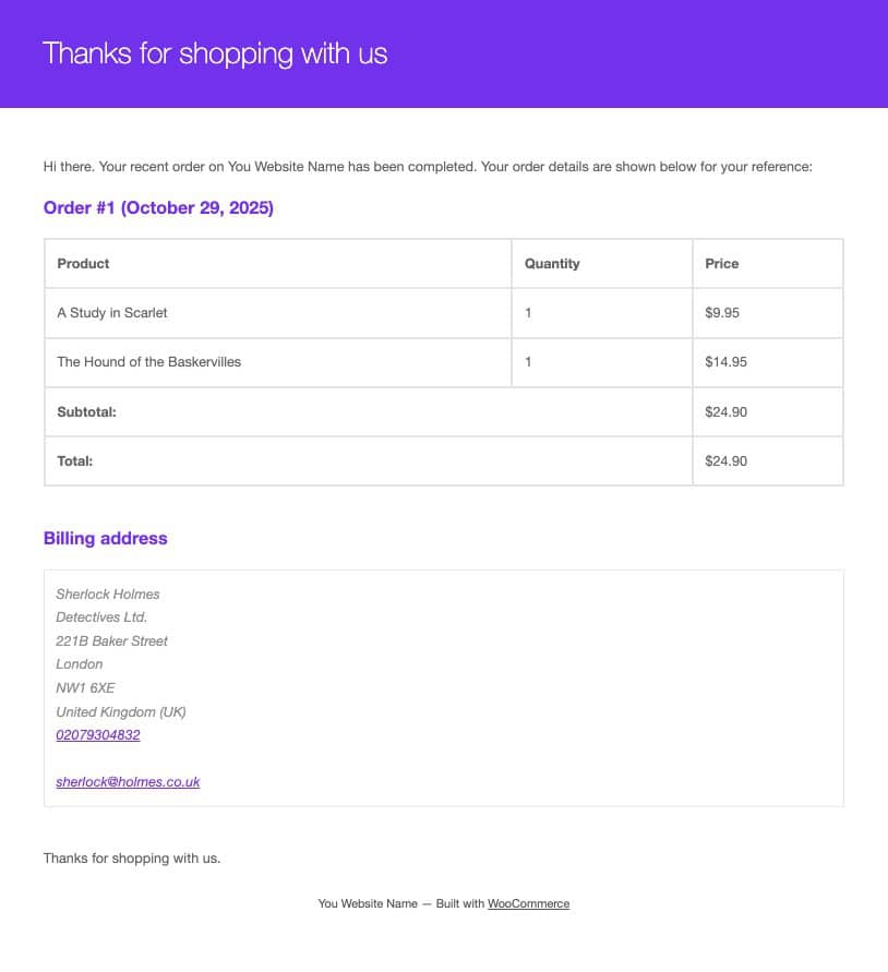
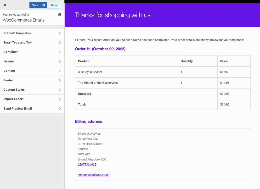
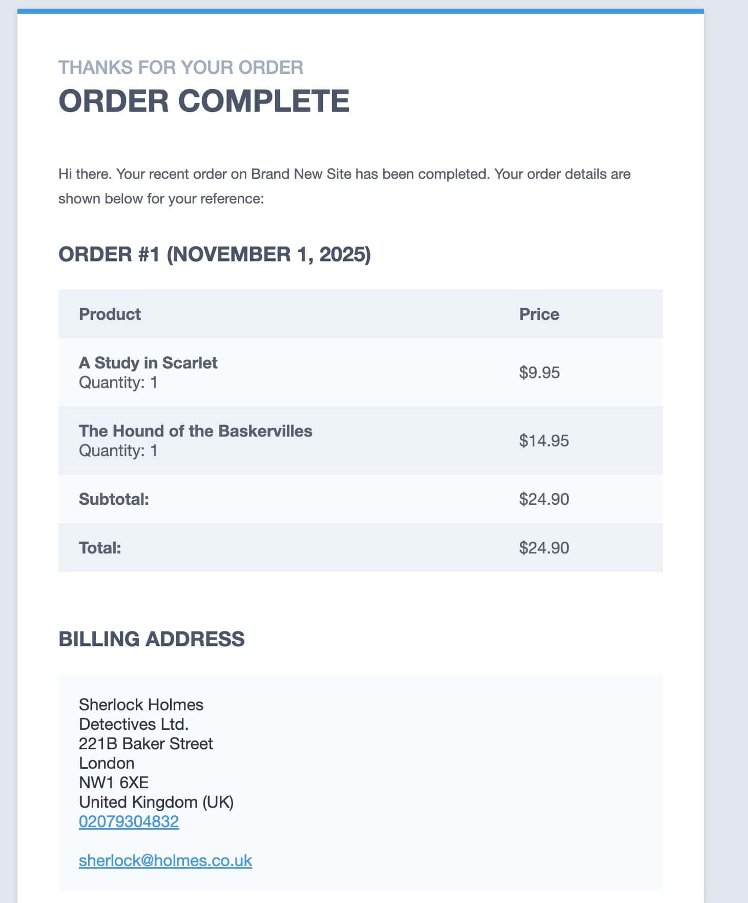
The WooCommerce Email Customizer includes a variety of settings that give you full control over your store’s email designs and content. When you first open the Email Customizer, a mockup order is automatically loaded as a sample, and the default email type displayed will be Customer Completed Order.
If you’d like to preview a different order that exists on your site, navigate to the Email Type and Text tab. From there, you can select a specific order to use as the preview.
You can also switch between different WooCommerce email types directly within the customizer. The Kadence WooCommerce Email Designer allows you to edit 10 different email types, giving you the flexibility to personalize every email your customers receive. (Learn more about customizing email types below.)
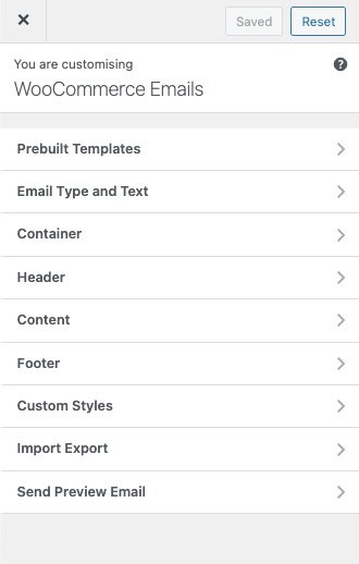
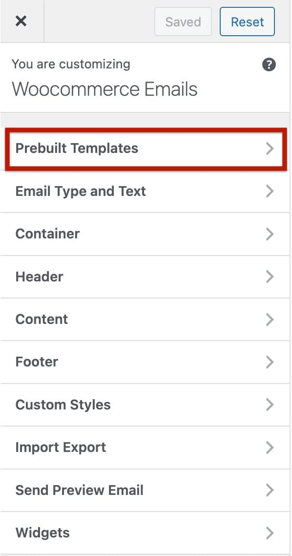
The Kadence WooCommerce Email Designer plugin includes a wide range of settings that give you full control over the design and content of your WooCommerce emails. Below is an overview of each section within the Email Customizer, along with the available options you can configure.
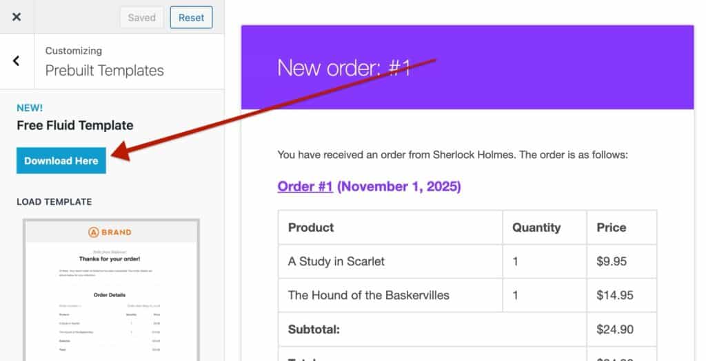
Prebuilt Templates
Prebuilt templates provide a quick way to start designing your emails. These professionally designed layouts help you save time and maintain a consistent look.
To use one, select your preferred template; three are available by default, then scroll to the bottom of the panel and click Load Template.
The selected template will automatically load into the editor, ready to use. From there, you can send it as is or further customize the design, text, and branding to match your needs.
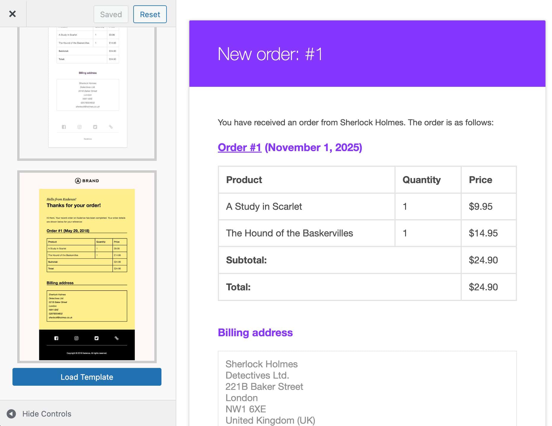
Additionally, you can download and use the Kadence Fluid Template, available for free to Kadence email subscribers. To get it, simply subscribe to the Kadence email list ⧉. From there, you’ll receive the Fluid Template ZIP file directly in your inbox after subscribing.
To import the Free Fluid Template, first extract the downloaded ZIP file. Next, go to the Import Export settings in the Kadence Email Designer and select the extracted kadence-responsive-email-template.dat file to import it.
Email Type and Text
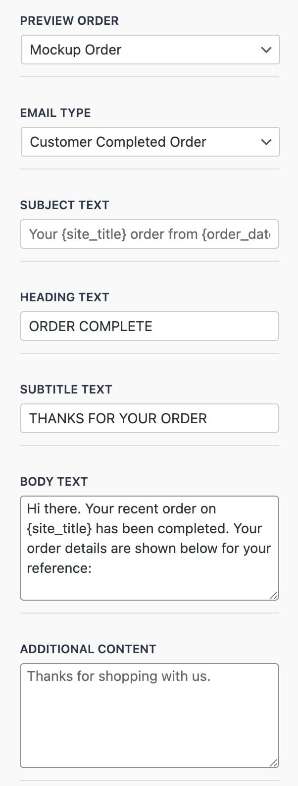
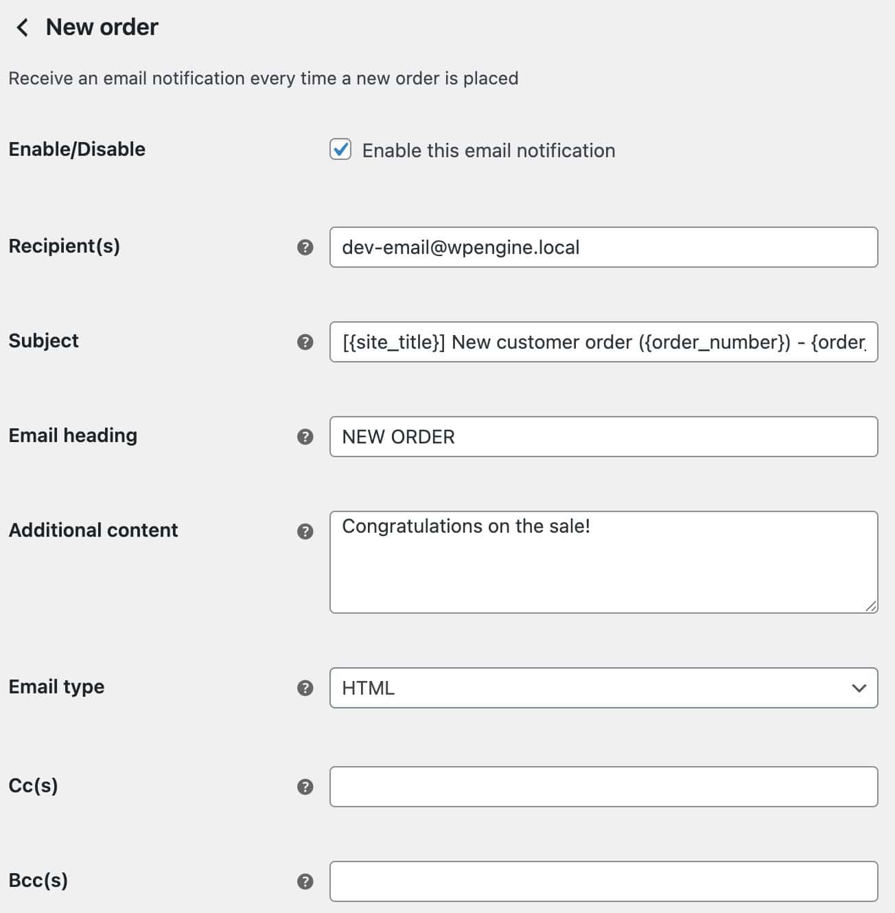
The Email Type and Text settings let you control the main content and structure of your email. Here, you can select a Preview Order and Email Type, as well as define key content elements such as the subject line, heading text, body text, and more.
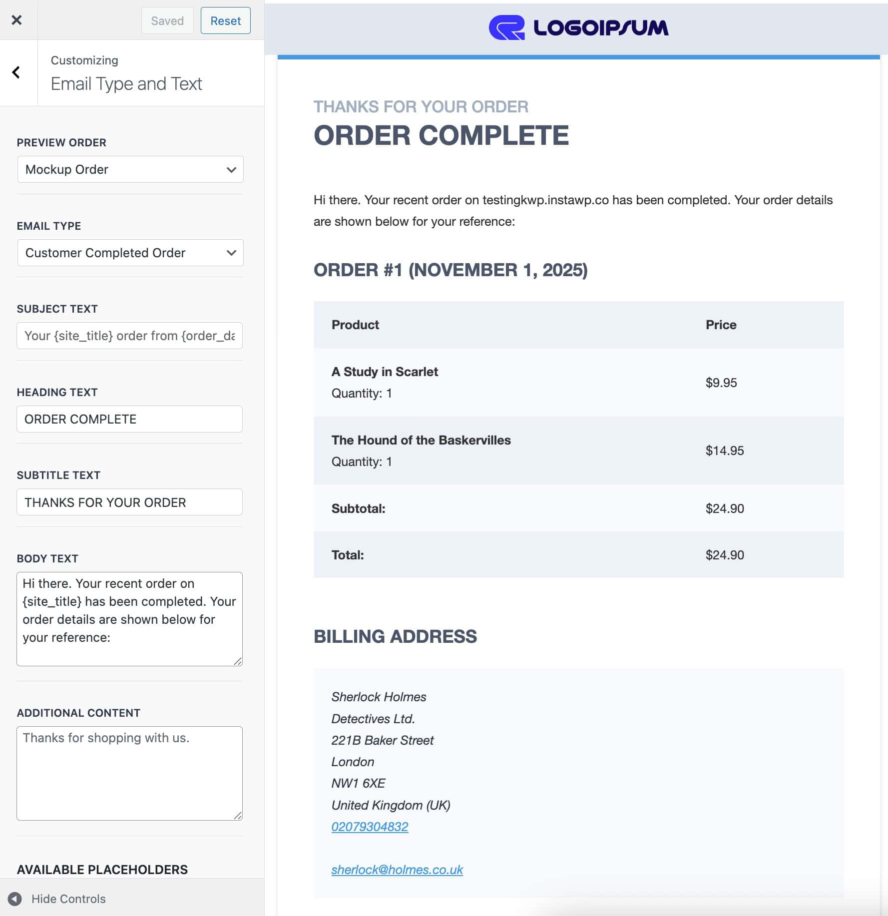
Preview Order: Select which order is displayed in the live preview. By default, a Mockup Order is used, but you can choose an existing order from your store.
Email Type: Choose which WooCommerce email you want to edit. The default is Customer Completed Order.
- Available options include:
New Order, Cancelled Order, Customer Processing Order, Customer Completed Order, Customer Refunded Order, Customer On Hold Order, Customer Invoice, Failed Order, Customer New Account, Customer Note, and Customer Reset Password.
Subject Text: Modify the Subject Text for the selected email type.
Heading Text: Set the heading that appears at the top of the selected email.
Body Text: Customize the main body content for the selected email type.
Additional Content: Add optional text or information below the main email content.
Placeholders
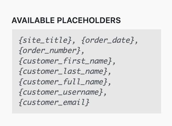
Available Placeholders: You can use dynamic placeholders within the Email Type and Text content fields to automatically display order and customer information.
Supported placeholders include:{site_title}, {order_date}, {order_number}, {customer_first_name}, {customer_last_name}, {customer_full_name}, {customer_username}, {customer_email}
Container
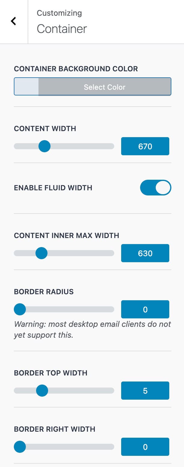
The Container Settings let you adjust the overall email container for the selected Email Type, including its layout, width, padding, and background styling.
Container Background Color: Set the background color for the main email container.
Content Width: Define the overall width of the email content area.
Enable Fluid Width: Allow the email container to expand fluidly based on the screen size.
Content Inner Max Width: Set a maximum width for the inner content area to maintain readability.
Container Inner Max Width: Control the maximum width of the inner container for better layout consistency.
Border Radius: Add rounded corners to the email container.
Note: Most desktop email clients do not currently support border radius.
Border Top Width / Border Right Width: Set custom border widths for the top and right sides of the email container.
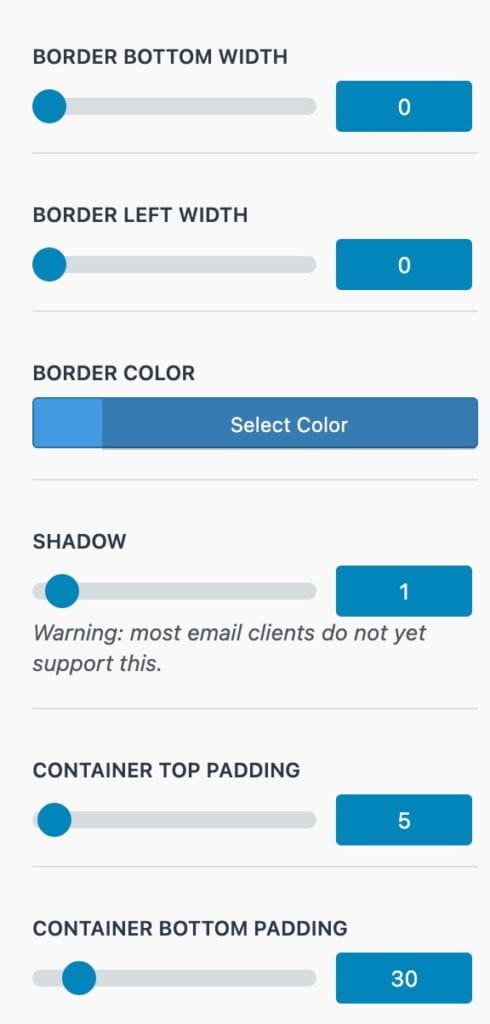
Border Bottom Width / Border Left Width: Set custom border widths for the bottom and left sides of the email container.
Border Color: Choose the color for the container borders.
Shadow: Add a drop shadow to the email container.
Note: Most email clients do not currently support shadows.
Container Top Padding / Container Bottom Padding: Adjust the spacing above and below the email content within the container.
Header
The Header Settings provide controls for customizing the appearance and layout of your email header. This includes options for the Header Image, Header Style, and general Header configuration.
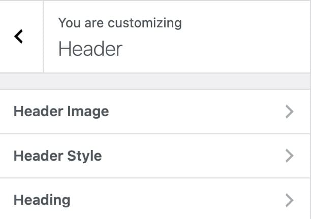
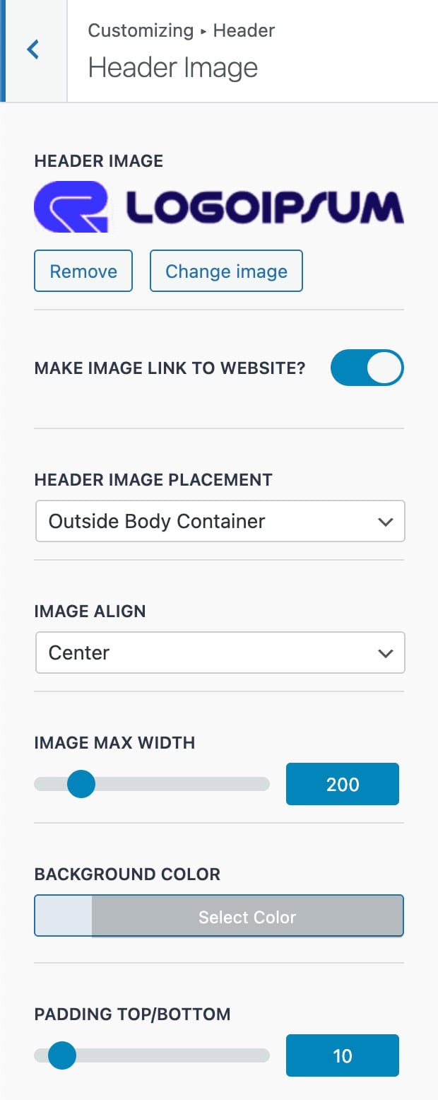
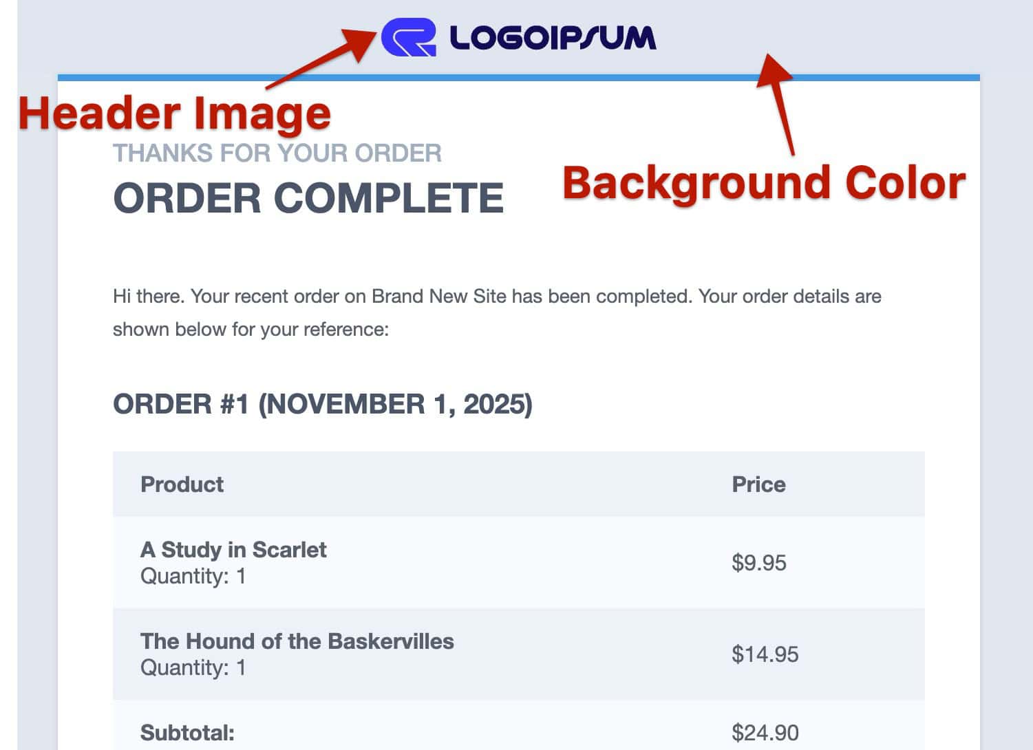
Header Image
Header Image: Add a header image, such as your company logo.
Make Image Link To Website: Enable this option to make the header image clickable, linking to your website’s homepage.
Header Image Placement: Choose the position of the header image; either inside or outside the email body container.
Image Align: Set the alignment of the header image to Left, Center, or Right.
Image Max Width: Define a maximum width of the header image to limit the size.
Background Color: Set a background color for the header area.
Padding Top / Bottom: Adjust the spacing above and below the header image within the header container.
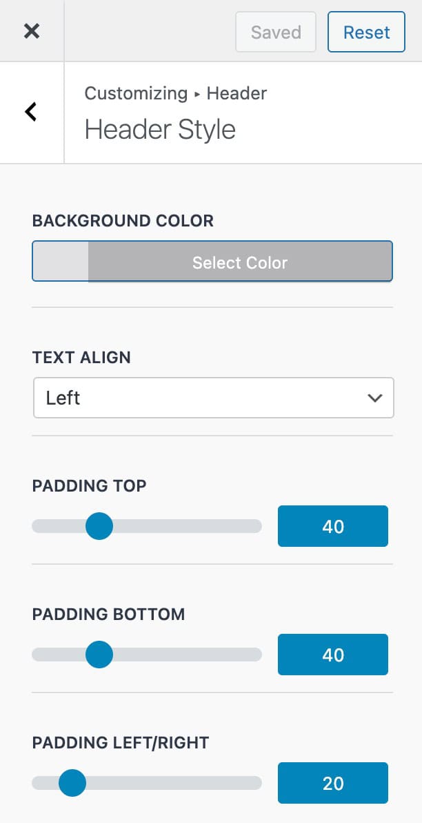
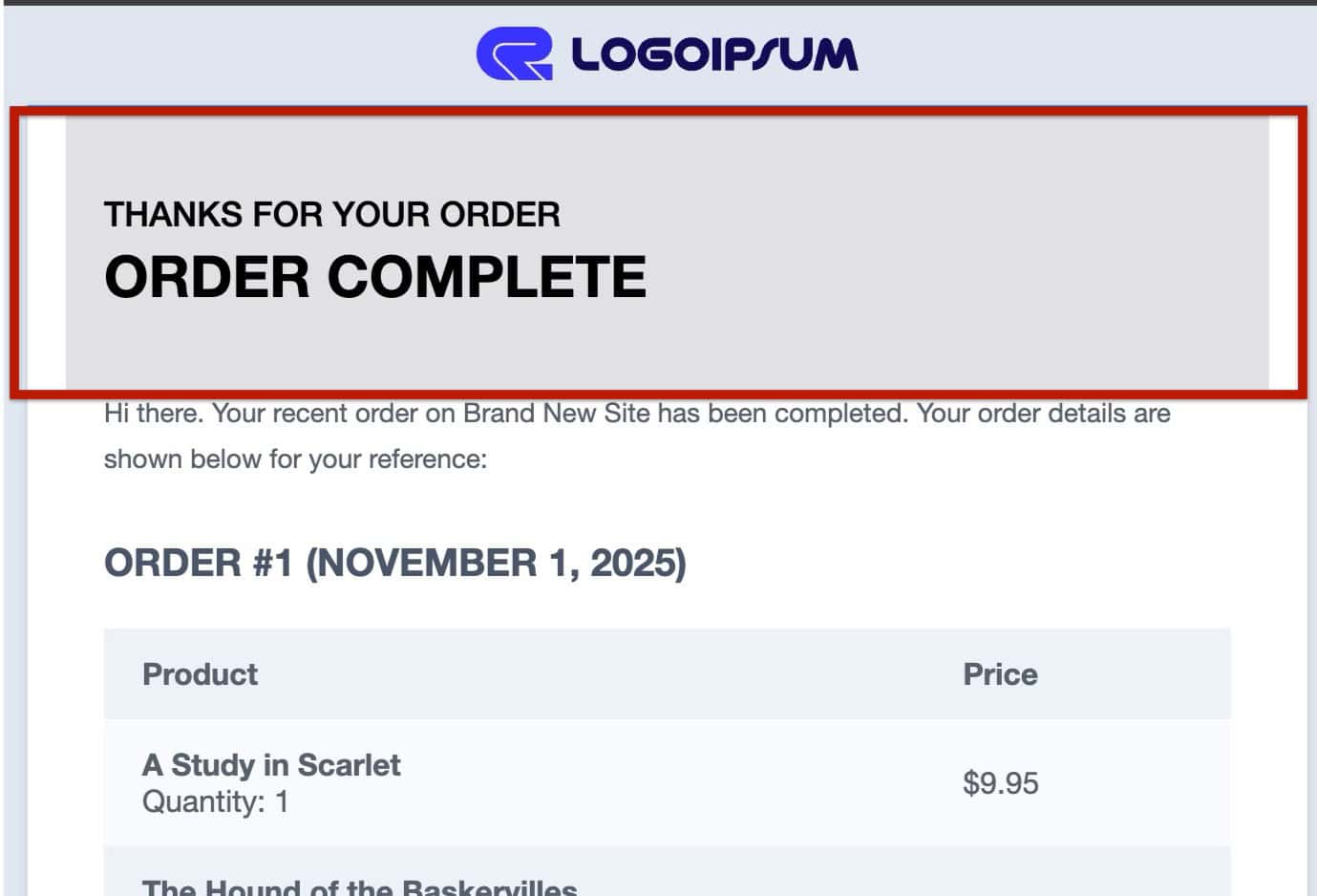
Header Style
Background Color: Choose a background color for the header area of the email.
Text Align: Set the alignment of any header text (Left, Center, or Right).
Padding Top / Bottom: Adjust the vertical spacing above and below the header content. These settings are separate and not linked together.
Padding Left/Right: Adjust the horizontal spacing on the sides of the header content. The Left/Right padding values are synced together as one value for both.
Header
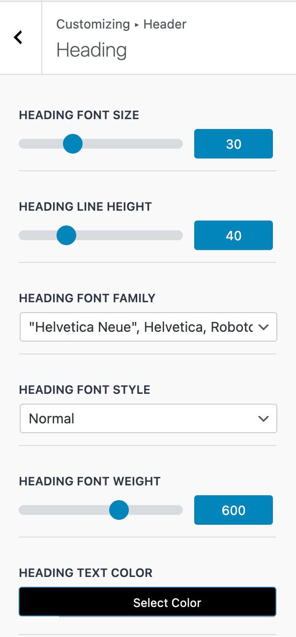
Heading Font Size: Set the size of the header text.
Heading Line Height: Define the spacing between lines of header text.
Heading Font Family: Choose a font for the header text; Google Fonts are available.
Heading Font Weight: Adjust the thickness of the header text.
Heading Text Color: Set the color of the header text.
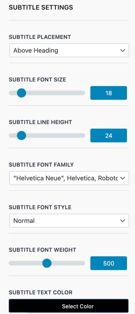
Subtitle Placement: Choose whether the subtitle appears Above or Below the heading.
Subtitle Font Size: Set the size of the subtitle text.
Subtitle Line Height: Define the spacing between lines of subtitle text.
Subtitle Font Family: Select a font for the subtitle text.
Subtitle Font Style: Choose a style for the subtitle text.
Subtitle Font Weight: Adjust the thickness of the subtitle text.
Subtitle Text Color: Set the color of the subtitle text.
Content
The Content Settings allow you to control the overall styling of your email content. This includes configuring the Content Container layout as well as the Heading and Text styles within the email body.
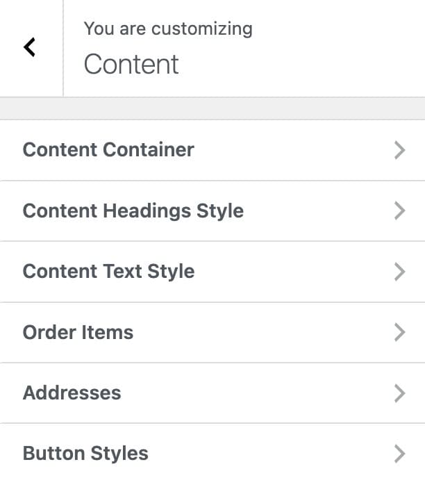
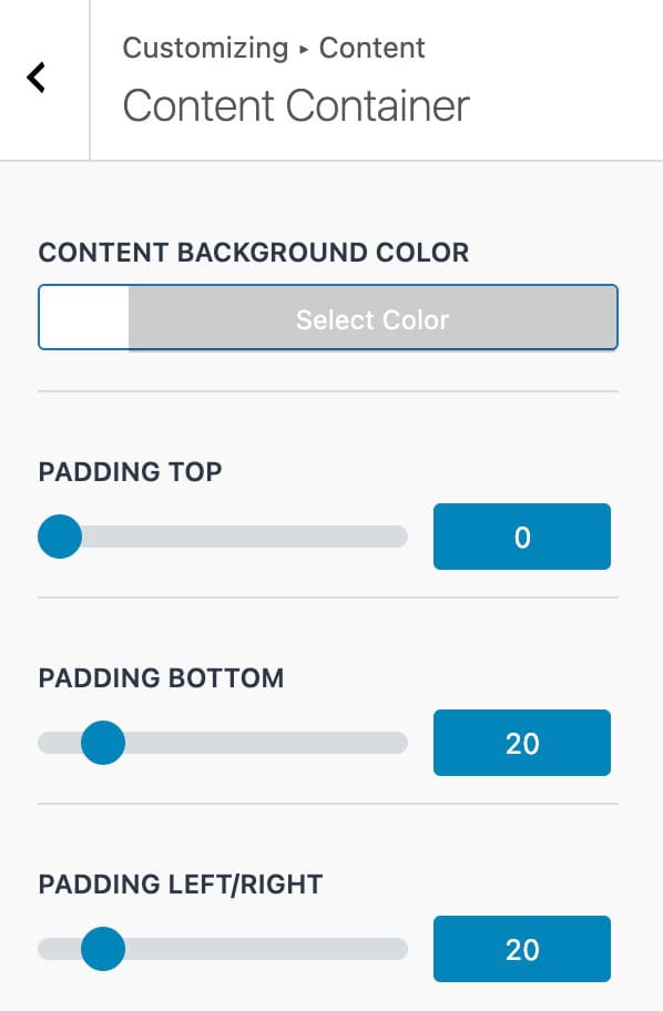
Content Container
Content Background Color: Set a background color for the main content area.
Padding Top: Adjust the top spacing above the content within the container.
Padding Bottom: Adjust the bottom spacing below the content within the container.
Padding Left / Right: Adjust the left and right spacing on the sides of the content within the container. These settings are synced together as one value.
Content Heading Styles
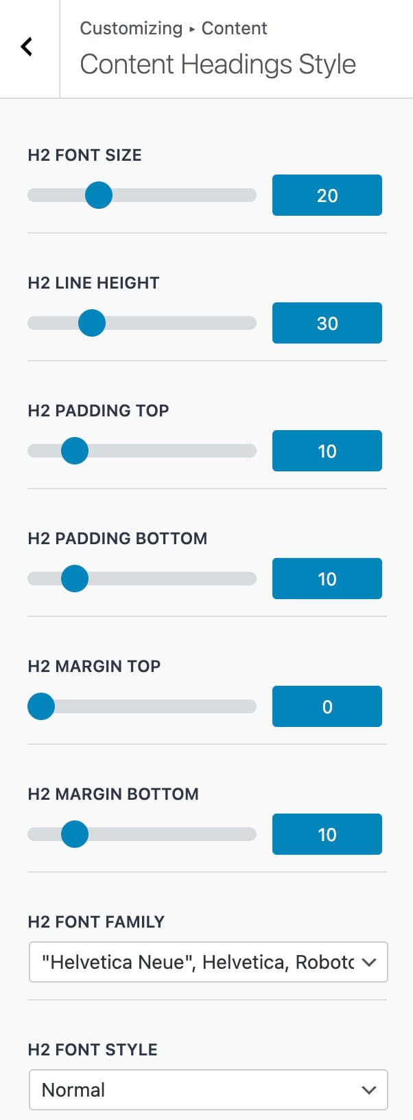
H2 Font Size: Set the size of H2 headings in the email content.
H2 Line Height: Define the spacing between lines of the H2 heading.
H2 Padding Top: Adjust the spacing above the H2 heading.
H2 Padding Bottom: Adjust the spacing below the H2 heading.
H2 Margin Top: Set the margin above the H2 heading.
H2 Margin Bottom: Set the margin below the H2 heading.
H2 Font Family: Choose the font for H2 headings.
H2 Font Style: Select the style for H2 headings
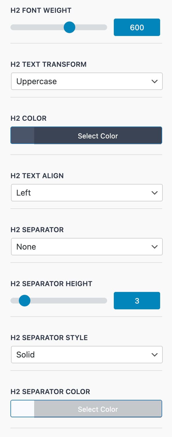
H2 Font Weight: Adjust the thickness of the H2 heading text.
H2 Text Transform: Set text capitalization for H2 headings: Uppercase, Lowercase, or Capitalize
H2 Color: Choose the text color for H2 headings.
H2 Text Align: Set the alignment of the H2 heading: Left, Center, or Right.
H2 Separator: Choose whether to display a separator Above, Below, or None.
H2 Separator Height: Define the thickness of the separator line.
H2 Separator Style: Select the line style: solid, double, groove, dotted, dashed, or ridge.
H2 Separator Color: Set the color of the separator line.
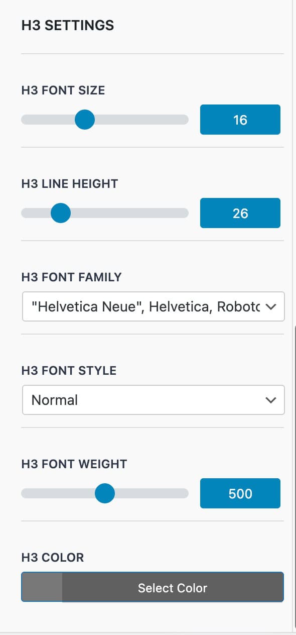
H3 Font Size: Set the size of H3 headings in the email content.
H3 Line Height: Define the spacing between lines of the H3 heading.
H3 Font Family: Choose the font for H3 headings.
H3 Font Style: Select the style for H3 headings.
H3 Font Weight: Adjust the thickness of the H3 heading text.
H3 Color: Set the text color for H3 headings.
Content Text Styles
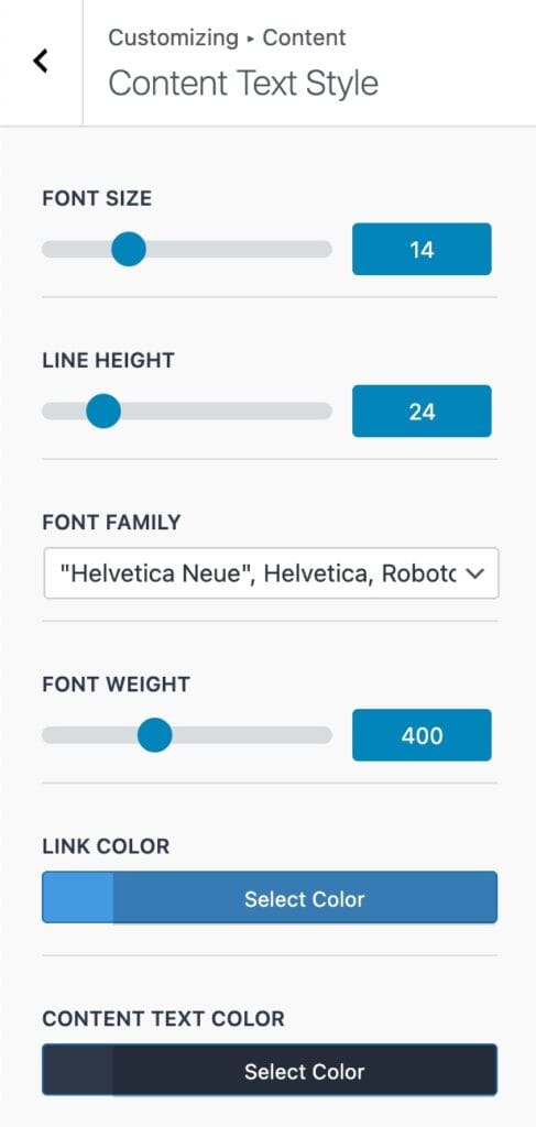
Font Size: Set the size of the body/standard texts in the email content.
Line Height: Define the spacing between lines of body text.
Font Family: Choose the font for the body text.
Font Weight: Adjust the thickness of the body text.
Link Color: Set the color for hyperlinks within the content.
Content Text Color: Choose the default text color for the email body.
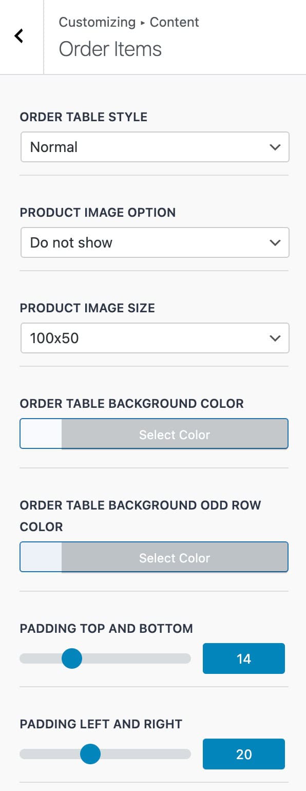
Order Items
Order Table Style: Choose the table style: Normal or Light.
Product Image Option: Decide whether to display product images: Show or Do Not Show.
Product Image Size: Set the size of product images: 40 x 40, 50 x 50, 100 x 50, 100 x 100, 150 x 150, or WooCommerce Thumbnail.
Order Table Background Color: Set the background color for the order table.
Order Table Background Odd Row Color: Choose the background color for odd-numbered rows in the order table.
Padding Top / Bottom: Adjust the spacing above and below the order table content.
Padding Left / Right: Adjust the spacing on the sides of the order table content.
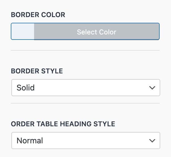
Border Color: Set the color of the order table borders.
Border Style: Choose the border style: Solid, Double, Groove, Dotted, Dashed, or Ridge.
Order Table Heading Style: Select the heading style for the order table: Normal or Split.
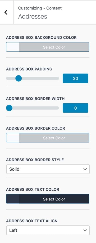
Addresses
Address Box Background Color: Set the background color for the address box.
Address Box Padding: Adjust the padding on all sides of the address box (all sides use the same value).
Address Box Border Width: Set the thickness of the address box border.
Address Box Border Color: Choose the color of the address box border.
Address Box Border Style: Select the border style: Solid, Double, Groove, Dotted, Dashed, or Ridge.
Address Box Text Color: Set the color of the text inside the address box.
Address Box Text Align: Choose the alignment for the address box text: Left, Center, or Right.
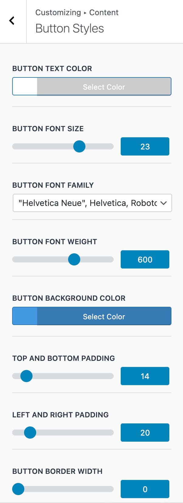
Button Styles
Button Text Color: Set the color of the button text.
Button Font Size: Define the size of the button text.
Button Font Family: Choose the font for the button text.
Button Font Weight: Adjust the thickness of the button text.
Button Background Color: Set the background color of the button.
Top and Bottom Padding: Adjust the spacing above and below the button text.
Left and Right Padding: Adjust the spacing on the sides of the button text.
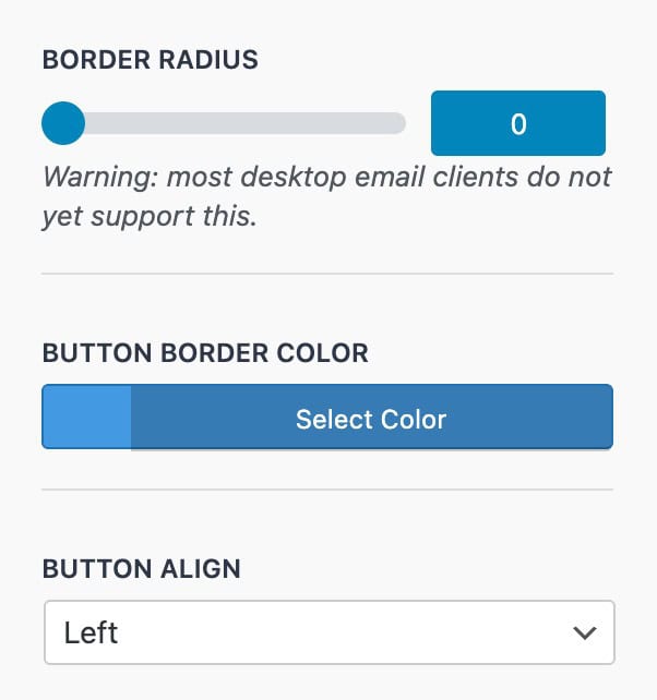
Button Border Width: Set the thickness of the button border.
Border Radius: Add rounded corners to the button.
Note: Most desktop email clients do not currently support border radius.
Button Border Color: Set the color of the button border.
Button Align: Choose the alignment of the button within the email: Left, Center, or Right.
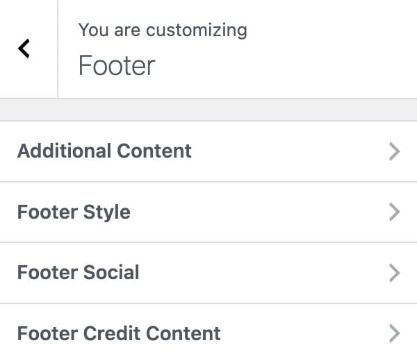
Footer
The Footer Settings allow you to control the appearance and content of your email footer. This includes configuring Additional Content, Footer Style, Footer Social Links, and Footer Credit Content.
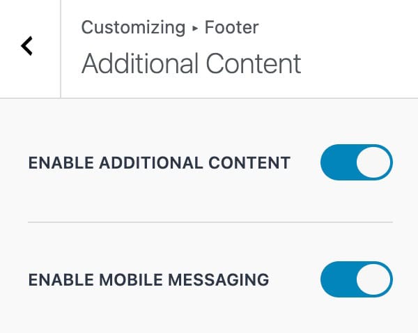
Additional Content
Enable Additional Content: Toggle this option to add extra content to the email. The content itself can be set using the Email Type and Text settings.
Enable Mobile Messaging: When enabled, this ensures that any additional content is optimized for display on mobile devices, improving readability and layout on smaller screens.
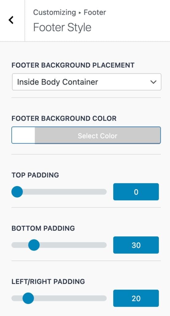
Footer Style
Footer Background Placement: Choose whether the footer background appears Inside or Outside the email body container.
Footer Background Color: Set the background color for the footer area.
Top / Bottom Padding: Adjust the spacing above and below the footer content.
Left / Right Padding: Adjust the spacing on the sides of the footer content.
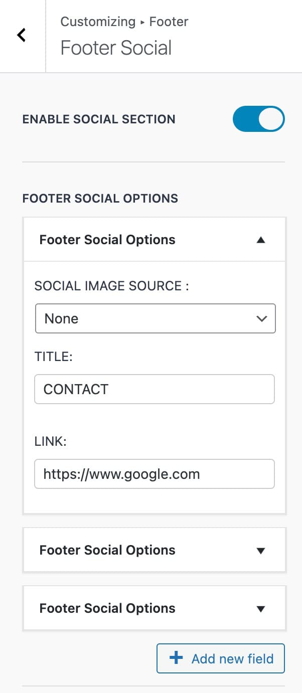
Footer Social
Enable Social Section: Toggle this option to display the footer social section.
Footer Social Options: Within this section, you can manage individual social items. Click the Add New Field button to add additional social links. Each social item expands to show three configurable options:
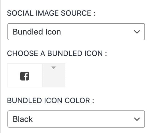
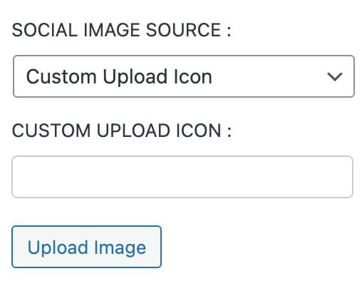
- Social Image Source: Choose the icon for the social link. Options include None, a Custom Upload, or a Bundled Icon. Bundled Icons are included with the plugin and include standard social media icons and more.
- Title: Enter the text label for the social item.
- Link: Set the URL that the social item should link to.
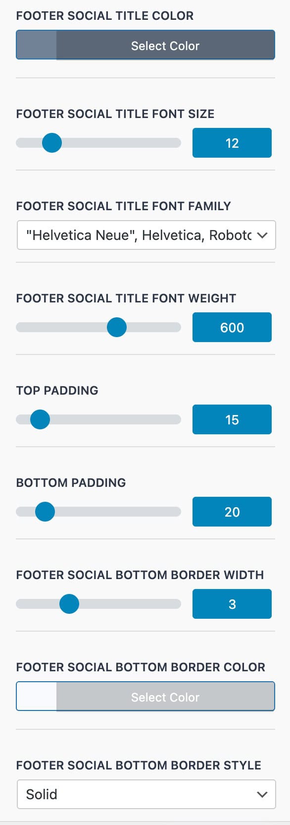
Footer Social Title Color: Set the color of the social section title text.
Footer Social Title Font Size: Define the size of the social section title text.
Footer Social Title Font Family: Choose the font for the social section title.
Footer Social Title Font Weight: Adjust the thickness of the social section title text.
Top / Bottom Padding: Control the spacing above and below the social section.
Footer Social Bottom Border Width: Set the thickness of the border at the bottom of the social section.
Footer Social Bottom Border Color: Choose the color of the bottom border.
Footer Social Bottom Border Style: Select the style of the bottom border: Solid, Double, Groove, Dotted, Dashed, or Ridge.
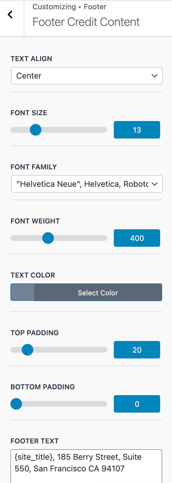
Footer Credit Content
Text Align: Set the alignment of the footer credit text: Left, Center, or Right.
Font Size: Define the size of the footer credit text.
Font Family: Choose the font for the footer credit text.
Font Weight: Adjust the thickness of the footer credit text.
Text Color: Set the color of the footer credit text.
Top / Bottom Padding: Adjust the spacing above and below the footer credit content.
Footer Text: Enter the text for the footer credit section. You can use any of the available placeholders mentioned previously to dynamically display site or customer information.
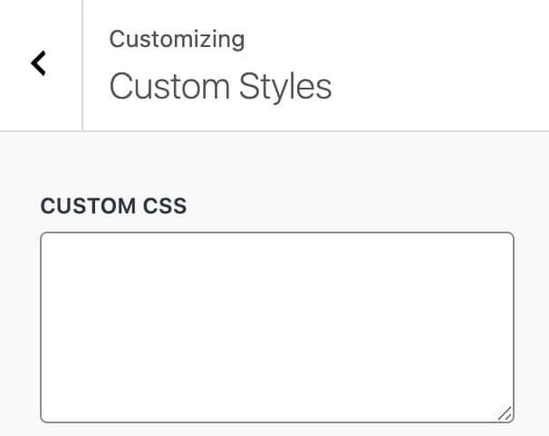
Custom Styles
The Custom Styles settings allow you to add and apply custom CSS directly within the email template. Any styles added here will be applied across all email types.
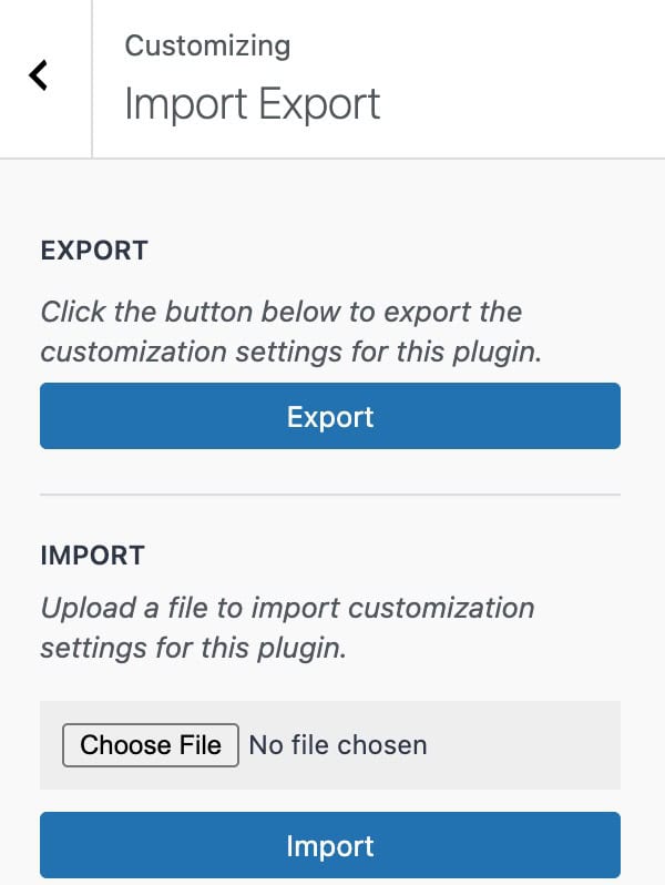
Import Export
The Import and Export settings allow you to export your current email template or import previously saved templates. Exported files are generated as .json files, which can be reused or shared across different sites.
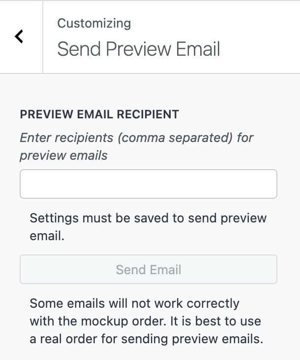
Send Preview Email
The Send Preview Email settings allow you to send a test email to preview the result.
Preview Email Recipient: Enter one or more email addresses (comma-separated) to send a preview of the email. Once a valid email is entered, use the Send Email button to send the test email.
Note: Settings must be saved before sending a preview email.
Important: Some email types may not display correctly with the Mockup Order. For the most accurate preview, it is recommended to use a real order from your store.
Configuring WooCommerce Email Settings
While the Kadence Email Designer plugin allows you to customize the design of your emails, the primary email controls, such as recipients and triggering options, are managed directly within WooCommerce
You can access these settings by navigating to:
Dashboard → WooCommerce → Settings → Emails
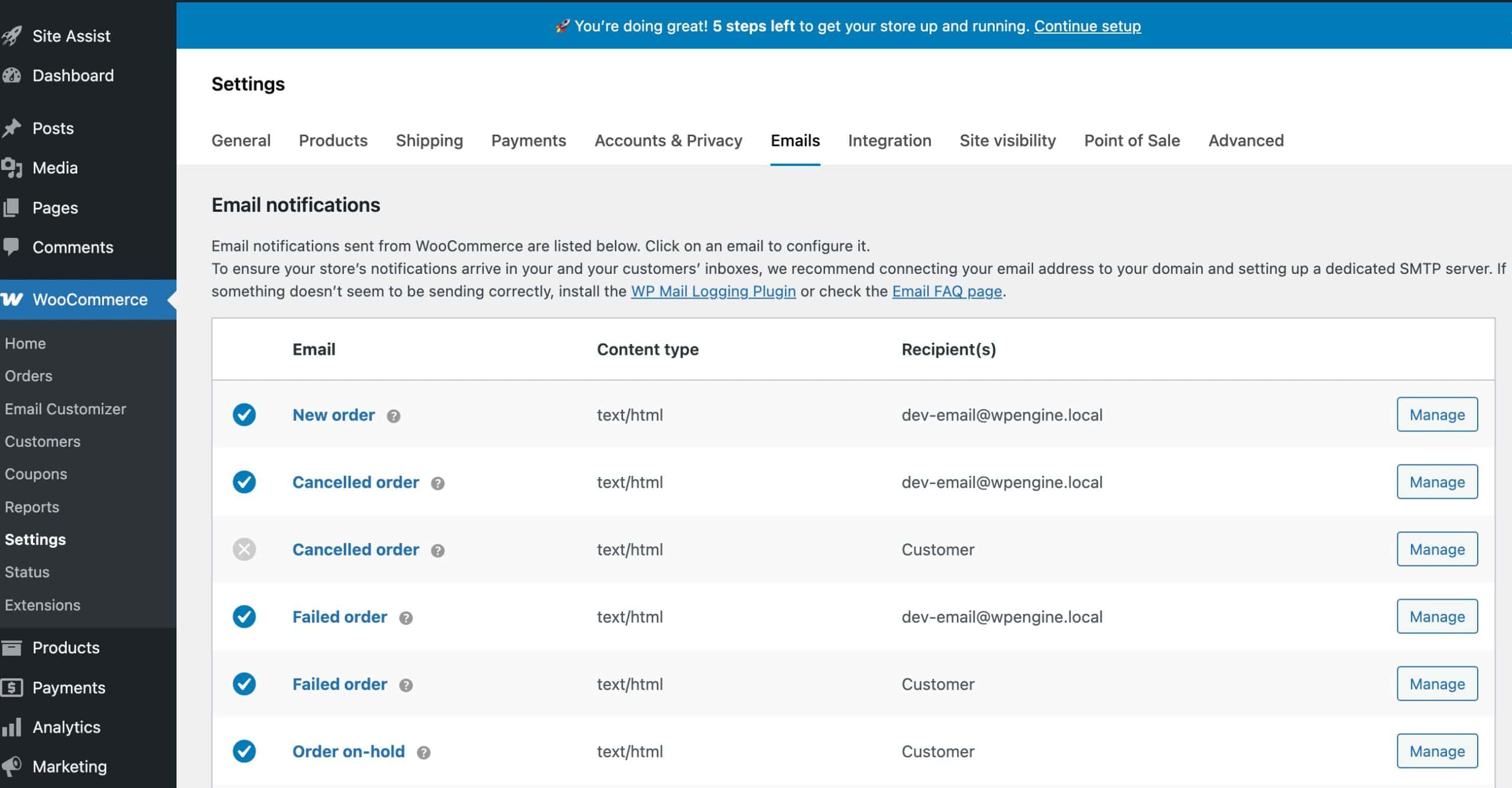
Note: Kadence Email Designer works with default WooCommerce emails. Third-party email plugins or custom emails may not appear in the plugin by default.
Adding Custom Fields using Kadence Shop Kit
The Checkout Editor in Kadence Shop Kit lets you add custom Billing, Shipping, and Other fields to your WooCommerce checkout. These fields will also display in order emails, making it easy to include additional custom information for your customers. (Get Kadence Shop Kit ⧉.)


For more details and instructions, see the Shop Kit Checkout Editor document ⧉.
