
Notice: These forums are now retired and closed. For active support, please Submit a Ticket or visit our official WordPress.org community pages.
Kadence Theme | Kadence Blocks | Starter Templates | WooCommerce Email Designer | Ascend | Virtue | Pinnacle
Search Results for 'COLUMNS'
-
AuthorSearch Results
-
In forum: Ascend Theme
Hello,
I would like to make all testimonials excerpts and a uniform size but I can’t find the option to do that. My preference is a Testimonial Carousel with one row and 3 columns rather than filling a page with them all. I do use Elementor for some pages so that is an option.
Is there a way to do this?
In forum: Virtue ThemeTopic: center footer columns
Hi
*Login to see link
I’d like the 3 columns to be fairly evenly spaced; the first row has a layout builder which is fine the way it is.
Could you help me please?Thank you so much.
CarrieIn forum: Membership ForumsIn reply to: Styling the Woo Tempates Woo Product: Related widget
In forum: Virtue ThemeMarch 8, 2019 at 10:59 pm #219119The carousels are a little different because they are built with Javascript. You would have to use a shortcode and then in the shortcode define the column count for smaller sizes:
[carousel type="featured-products" columns="3" items="8" speed=9000 scol="3" xscol="2" sscol="2"]Or you can just add this into your theme options > header and footer scripts in the header scripts and it will change all your carousels:
<script type="text/javascript">
jQuery(document).ready(function ($) {
 $('.kt-content-carousel.products').each(function(){
$(this).attr('data-slider-xs', '2');
$(this).attr('data-slider-ss', '2');
});
});
</script>
In forum: Virtue ThemeIn reply to: Virtue Blog Grid template featured image size
March 8, 2019 at 10:17 pm #219110Hey,
Currently, there isn’t a way to do this within the theme settings you can use a child theme and override the templates/content-fourgrid.php template file and change line 5 to the number you want.Another option for you since your setting the grid in a fullwidth container is to make the grid switch to 5 columns are larger screen sizes, then 6 columns on even larger screen sizes.
Like this:
@media (min-width: 1400px){
    .page-template-page-blog-grid .b_item {
        width: 20%;
    }
}
@media (min-width: 1800px){
    .page-template-page-blog-grid .b_item {
        width: 16.66%;
    }
}
I hope that helps!
Ben
In forum: Virtue ThemeIn reply to: Virtue Blog Grid template featured image size
Apologies for the confusion, on the blog grid set at 4 columns the grid box width is 25%, which on my display is approx 500px, however the blog grid images are fixed at 364px wide. This results in the image being entered in the grid box with an approx 70px margin either side, before the border. what I am looking to do is change the maximum width of the blog grid images from 364px to 550px, which happens to be the size I have my medium images set to
In forum: Membership ForumsIn reply to: full column blocks background color
In forum: Membership ForumsI created a column block of 4 columns. I want the entire set background color changed. I do it individually but want background to be completely covering the columns blocks. The column blocks are the ones with icons.
Is there also a way to change the column widths?
In forum: Virtue ThemeHey Jennifer,
This post should have what you need: https://kb.kadencethemes.com/knowledge-base/two-product-columns-in-mobile/
Hope that helps!Hannah
Hi,
What is the CSS that would make products show in two columns instead of one on mobile for Virtue Premium? (Shop page and product carousels.) Sorry if this has been asked previously, I was unable to find the answer when searching the forum.
Thanks,
Jennifer
*Login to see linkMarch 7, 2019 at 5:24 am #218885Hello there!
Sample of the question: *Login to see link
That’s a page containing some headings and some categories embedded via shortcode:<h2 id="1" class="anker" style="text-align: center;"><strong>Speisezimmer & Wohnzimmer</strong></h2>
<p style="text-align: center;">[product_categories columns="3" hide_empty="0" number="0" parent="265"]</p><h2 id="2" class="anker" style="text-align: center;"><strong>Sitzmöbel</strong></h2>
<p style="text-align: center;">[product_categories columns="3" hide_empty="0" number="0" parent="266"]</p>I would like to control the vertical distance between two rows of categories, but their vertical position seems to be calculated and then set with an inline top: xxx style:
<div class="tcol-md-4 tcol-sm-4 tcol-xs-6 tcol-ss-12 kad_shop_default kad_product" style="position: absolute; left: 0px; top: 0px;">
<!-- content of first row, left category -->
</div>
...
<div class="tcol-md-4 tcol-sm-4 tcol-xs-6 tcol-ss-12 kad_shop_default kad_product" style="position: absolute; left: 0px; top: 387px;">
first ontent of second row, left category -->
</div>Note the different “top: 0px;” and “top: 387px;”
Can I somehow modify that calculation, so that the vertical gap between the two rows get’s smaller?
In forum: Virtue ThemeIn reply to: Virtue Blog Grid template featured image size
This isn’t possible, simply because there isn’t enough room on the page to have images that wide. The columns would not be able to disperse evenly if the image size was increased that much.
If you want wider images, you can reduce the amount of columns. Would that work for you?
-Kevin
In forum: Ascend ThemeIn forum: Pinnacle ThemeIn reply to: blog posts via shortcodes
In forum: Virtue ThemeMarch 2, 2019 at 11:27 pm #218403Hey,
That error in your image is showing from the Core columns block, not the Kadence Blocks Row.Here is the best way to resolve broken blocks: https://www.kadenceblocks.com/docs/how-to-recover-a-broken-block/
Just install the Gutenberg plugin and you will see the options to attempt block recovery.
Ben
In forum: Membership ForumsIn reply to: Z-index issues with Modal
March 1, 2019 at 6:02 pm #218343Thanks, for posting!
I know what’s going on. A z-index is assigned to rows and columns because you can technically overlay columns with a negative margin. This is causing the issue with the modal being inside a row.
For a temp fix add the class “includes-modal” into the row settings where you have a modal.
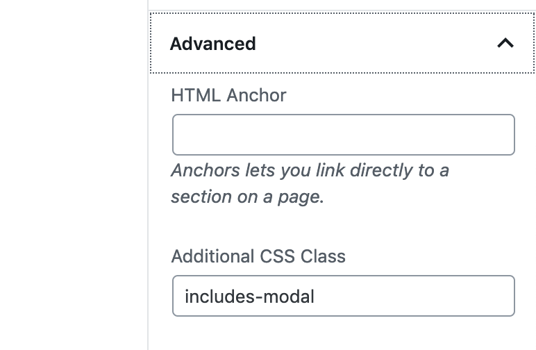
Then add this CSS in your site’s custom CSS:
.includes-modal {
    position: relative;
    z-index: 100;
}
I’m going to brainstorm some ways to check for this so I can automate a long term solution.
Ben
In forum: Ascend ThemeIn reply to: how to get a bigger picture in the carousel
In forum: Pinnacle ThemeIn reply to: Portfolio Carousels Not working consistently
OK thats fixed it.
me NOT thinking like a geek didn’t help:-)
the number of columns wasn’t the only way to specify the number portfolios to be shown
TBH the UX for this is NOT that friendly.
“Choose how many columns are in carousel”
comes first so you assume this is what controls the number of portfolios that are shown“Choose how many portfolio items are in carousel”
i thought controlled the number of images shown if the portfolio is a slide show.Can you not add some pop up info boxs to explain what each control does and they interact with each other?
OR a video. Looked for one but couldn’t see anyIn forum: Virtue ThemeIn reply to: put “UP” the home image menu & reduce size of header
Hi Pipa,
In Theme Options > Home Layout > Home Image Menu you can set the number of columns to 4. Are you then just wanting to remove the margin between your columns?
You can reduce the header height from Theme Options > Main Settings > Header Start Height.
Hope that’s helpful!Hannah
In forum: Ascend Theme -
AuthorSearch Results
