
The Kadence Theme includes the classic header builder, which includes many free header items to help you create a beautifully designed header. When paired with Theme Kit Pro, you unlock even more powerful header items to elevate your design. This guide will walk through both the free and premium header items available in the Classic Header.


Want to build a header using blocks in the Gutenberg editor? Check out the Kadence Advanced Header and Navigation blocks.
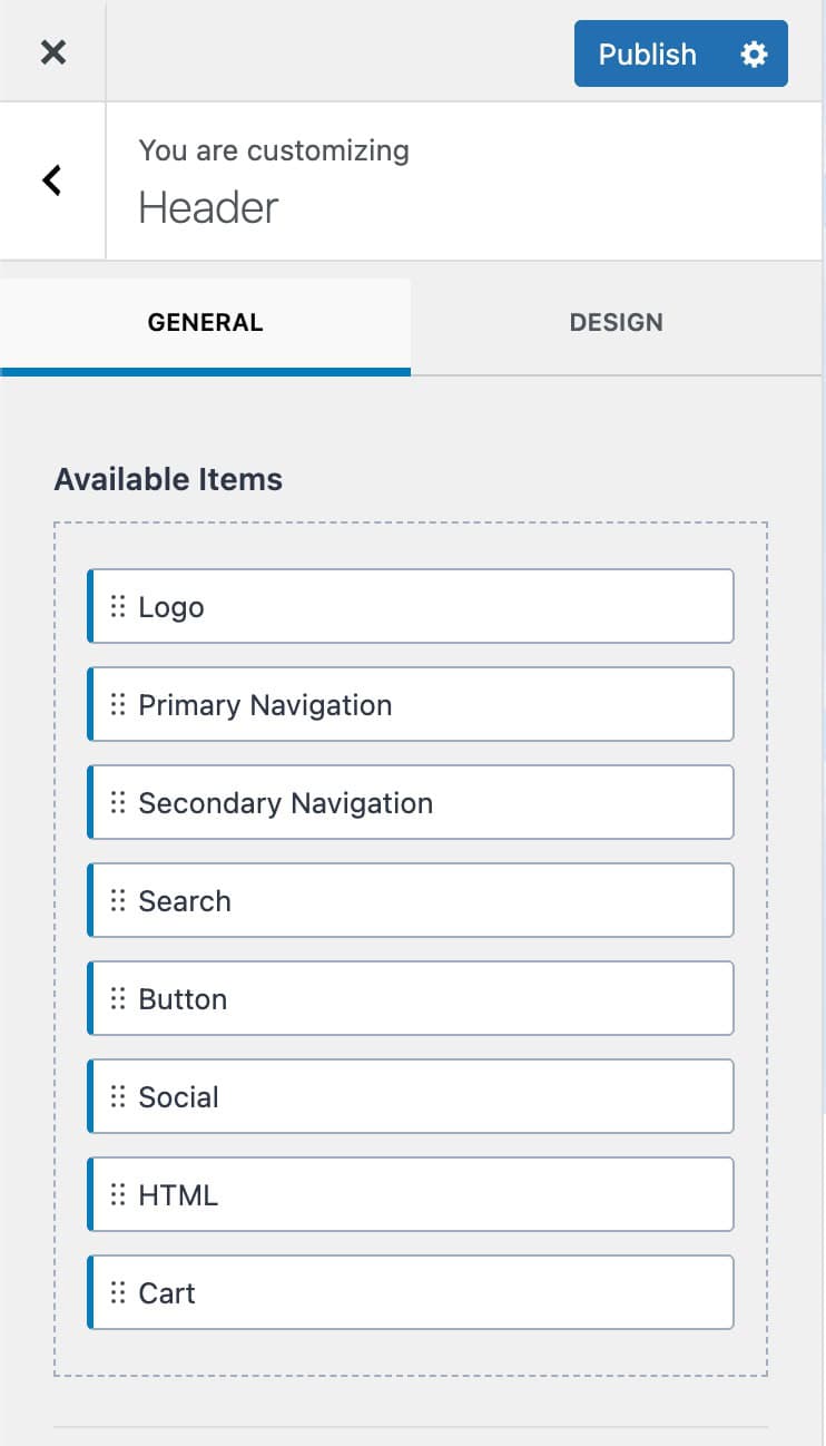
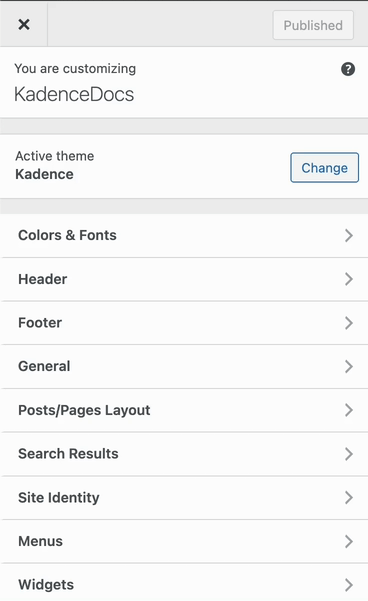
Header Items
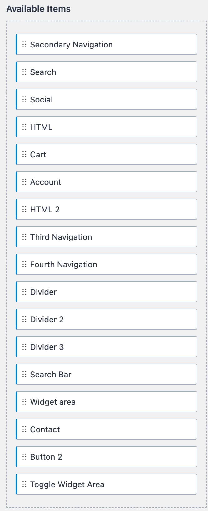
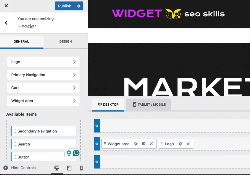
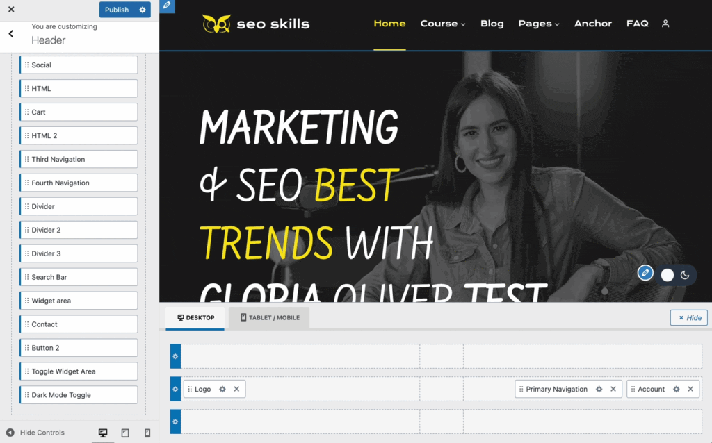
Header items can be accessed from the Customizer -> Header settings. You will see a list of Available Items.
The Free Kadence Theme comes with many useful header items out of the box.
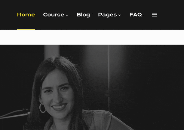
This includes the Logo, Primary Navigation, Secondary Navigation, Search, Button, Social, HTML, and Cart items.
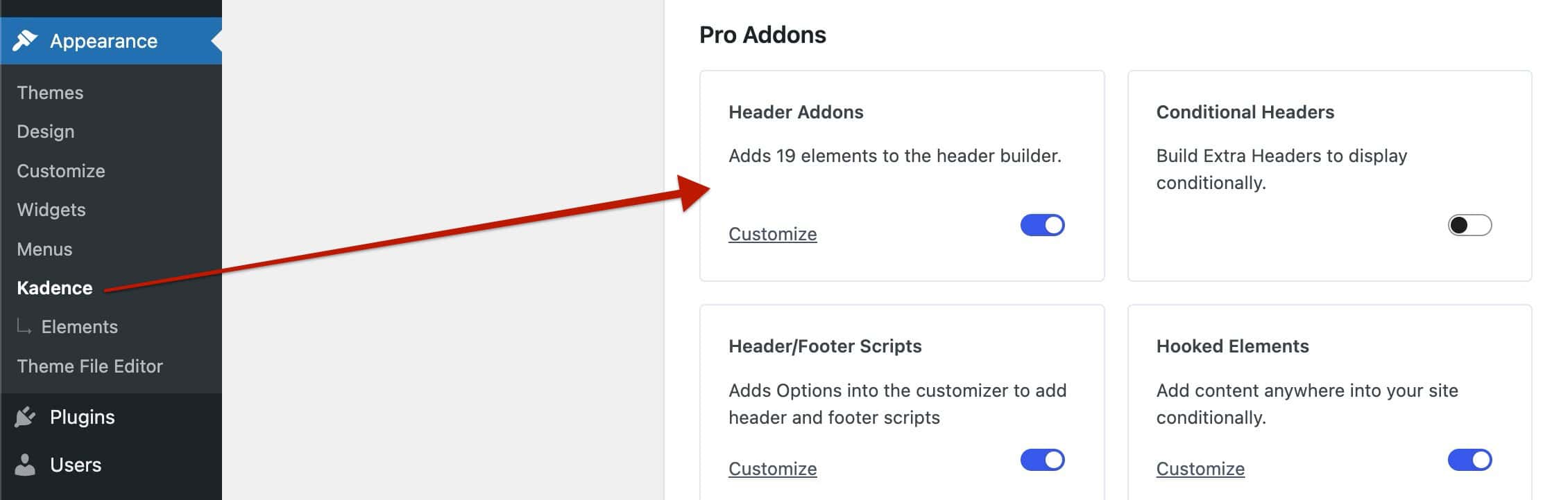
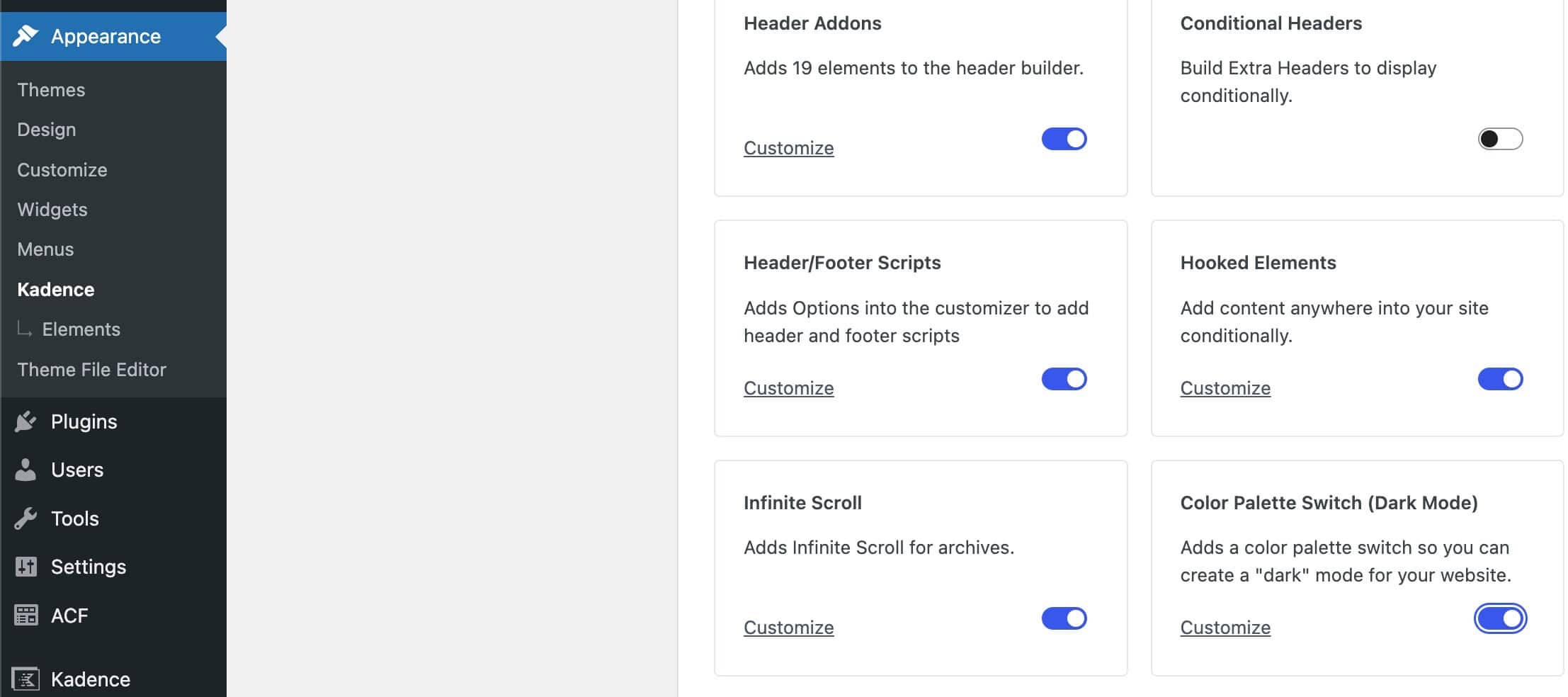
Theme Kit Pro unlocks access to additional header items to further take control over your header. You can enable Header Addons from the Dashboard -> Appearance -> Kadence page.
Click the toggle in the Header Addons box to enable and use the additional premium header items.
Header Items can be dragged onto the Visual Header Builder to be added to the header. Use the settings icon in the visual builder to access the specific header item settings. You can also click on the header item name tab above the available items list to access the relative header item settings.
You can also click on any section within the visual header builder to select and add a header item to the header.
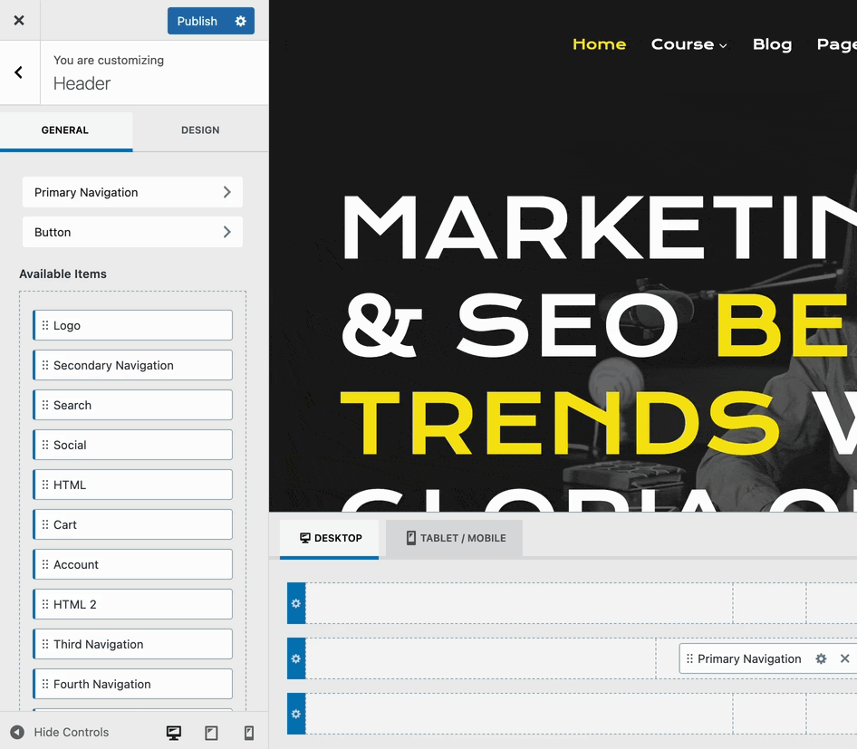
Once in the header item settings, use the General Tab to adjust general settings and use the Design Tab to customize style-related settings.
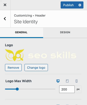
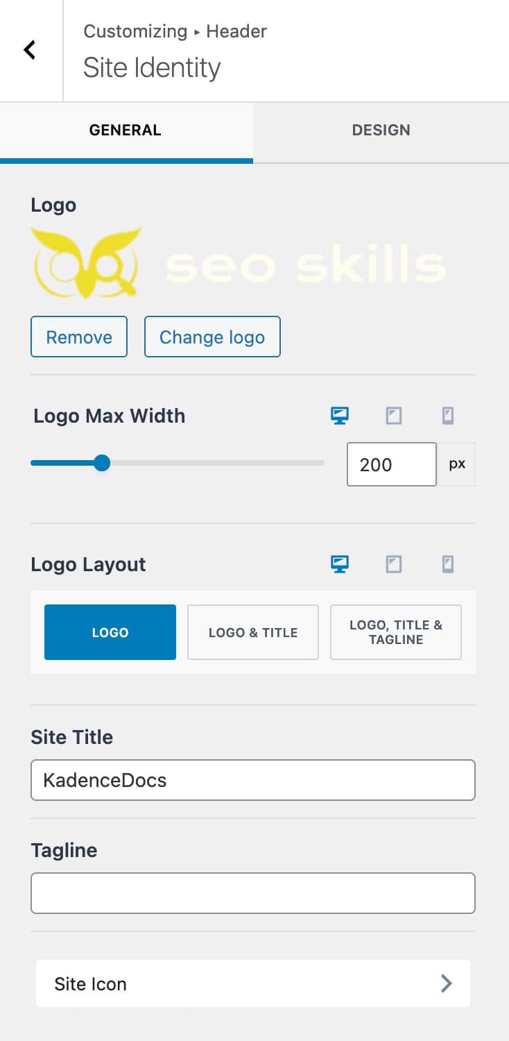
Logo (Free)
The Logo header item allows you to display your Site Logo. It also offers options to display the title and/or tagline.
Logo: Select an image from your media library to use as the website logo.
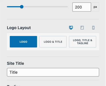
Logo Max Width: Control the overall size of your logo by limiting it using the max width setting.
Logo Layout: There are three logo layouts available. Just the logo alone, the logo & title, or the logo, title, and tagline. Each selection will offer additional layout options to control where each applicable element will go.
Title: If your logo layout uses the title, set it here.
Tagline: If your logo layout uses the tagline, set it here.
Padding: Add padding to the logo. This can be set for desktop, tablet, and mobile devices.
The Site Icon can be set from both the general and design settings. When clicking on the site icon tab, you will be brought to the Customizer -> Site Identity page, where the site icon/favicon can be set.
Navigations (Free & Premium)
The Kadence classic header features multiple Navigations. The free Kadence Theme offers the Primary and Secondary Navigation items. Theme Kit Pro header addons also offer a Third and Fourth Navigation item. Each navigation can be configured and used independently within the header.
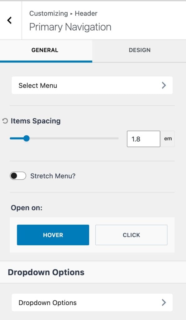
When using any of the available navigations, the first setting will be the Select Menu option. Click on the select menu tab to select the navigation you wish to use for the current header item.
This will bring you to the Customizer -> Menus settings, where you can select, edit, and create new navigation menus from the customizer.
(Menus can also be created from the Dashboard -> Appearance -> Menus page)
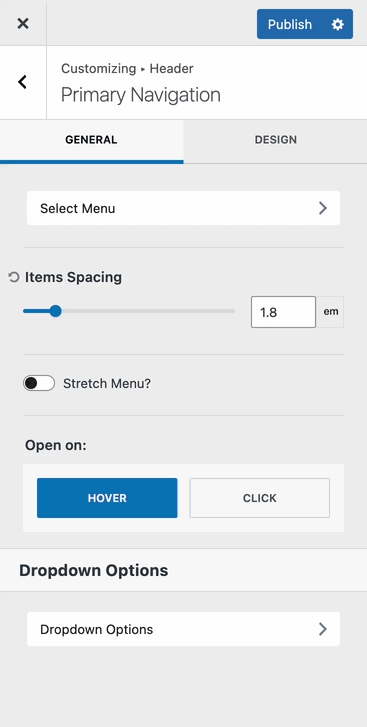
Item Spacing: Control the space between each inner navigation link. The available units of measurement are px, em, rem, or vw.
Stretch Menu: Enable this option if you wish for the menu to stretch and fill all of the available space of the parent section.
Open On: This setting determines how the dropdown items will open. This can be set to hover or click.
Dropdown Options: View more information on these settings below.
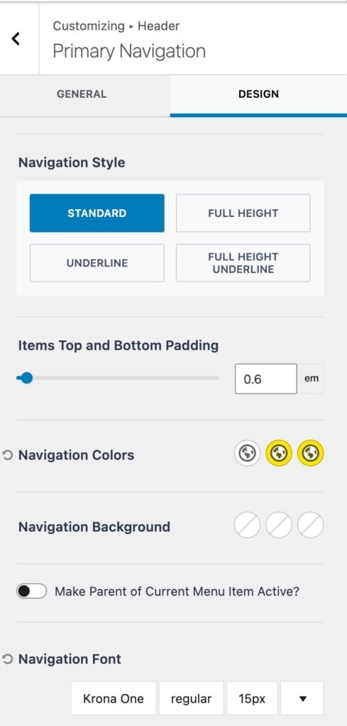
Navigation Style: Set a navigation style for navigation links to follow.
- Standard – Uses a standard padding value that can be set using the “Items top and bottom padding” setting.
- Full Height – This setting ensures the navigation links use up the entire height available.
- Underline – Adds an underline to the current active navigation link.

- Full Height Underline – Uses the entire available height on all navigation links and adds an underline to the current active navigation link.

Navigation Colors: Set the main navigation colors for the initial, hover, and active states.
Navigation Background: Set the main navigation background colors for the initial, hover, and active states.
Make Parent of Current Menu Item Active: When enabled, this option ensures that if a dropdown item is active, its parent link will also become active.
Navigation Font: Set the font family, font style, and font size for navigation links.
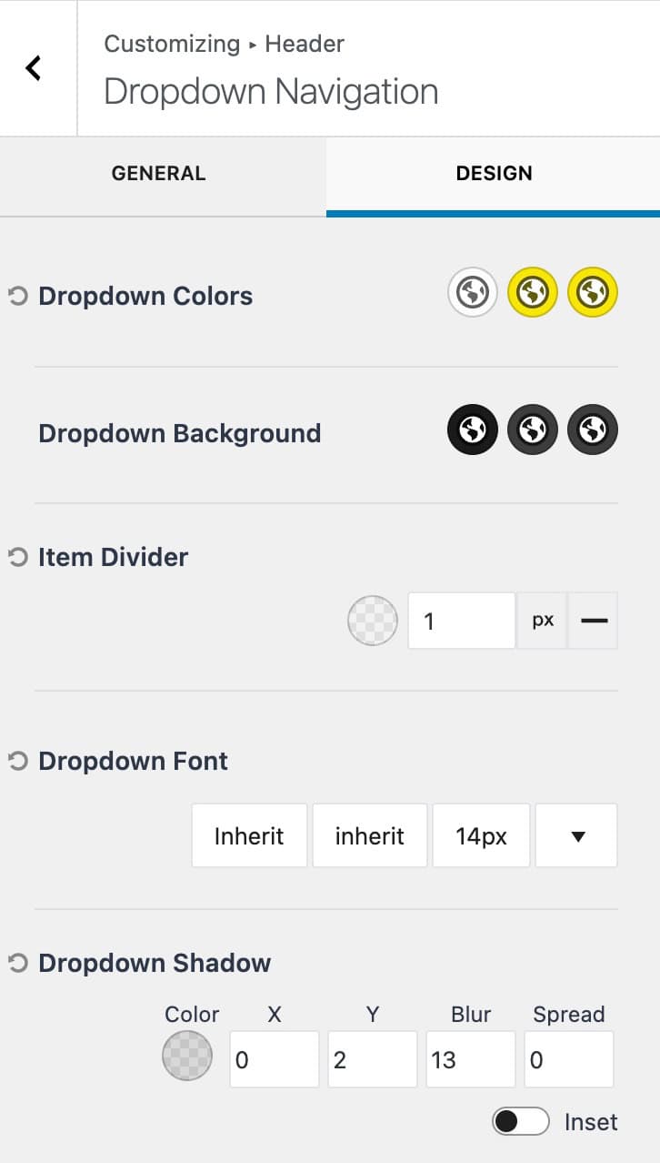
Dropdown Options
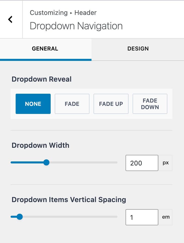
At the bottom of both the general and design tabs, you can access the Dropdown Navigation Options. These settings control the behavior and styles of dropdown menus within a navigation. These settings will apply to all theme header navigations.
Dropdown Reveal: Select a reveal animation for the dropdown. Includes: Fade, fade up, and fade down.
Dropdown Width: Specify a dropdown width.
Dropdown Items Vertical Spacing: Control the vertical spacing between dropdown items.
Dropdown Colors: Control the dropdown colors for the initial, hover, and active states.
Dropdown Background: Control the dropdown background colors for the initial, hover, and active states.
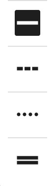
Item Divider: This option allows you to select an item divider color, width, and style.
Dropdown Font: Control the font family, style, and size for the dropdown item texts.
Dropdown Shadow: This setting allows you to select a dropdown shadow color along with x, y, blur, and spread settings. You can also enable an inset box shadow.
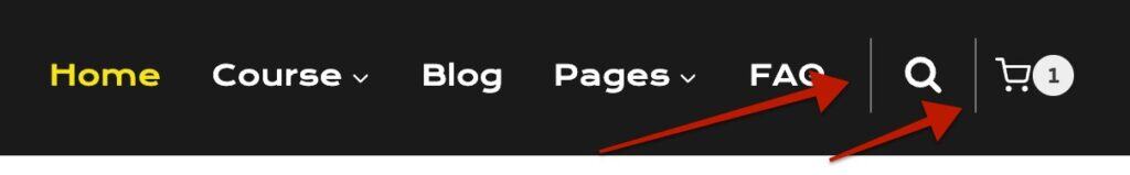
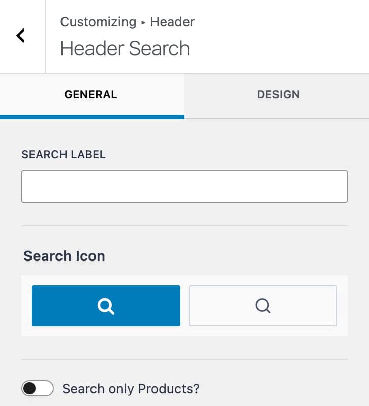
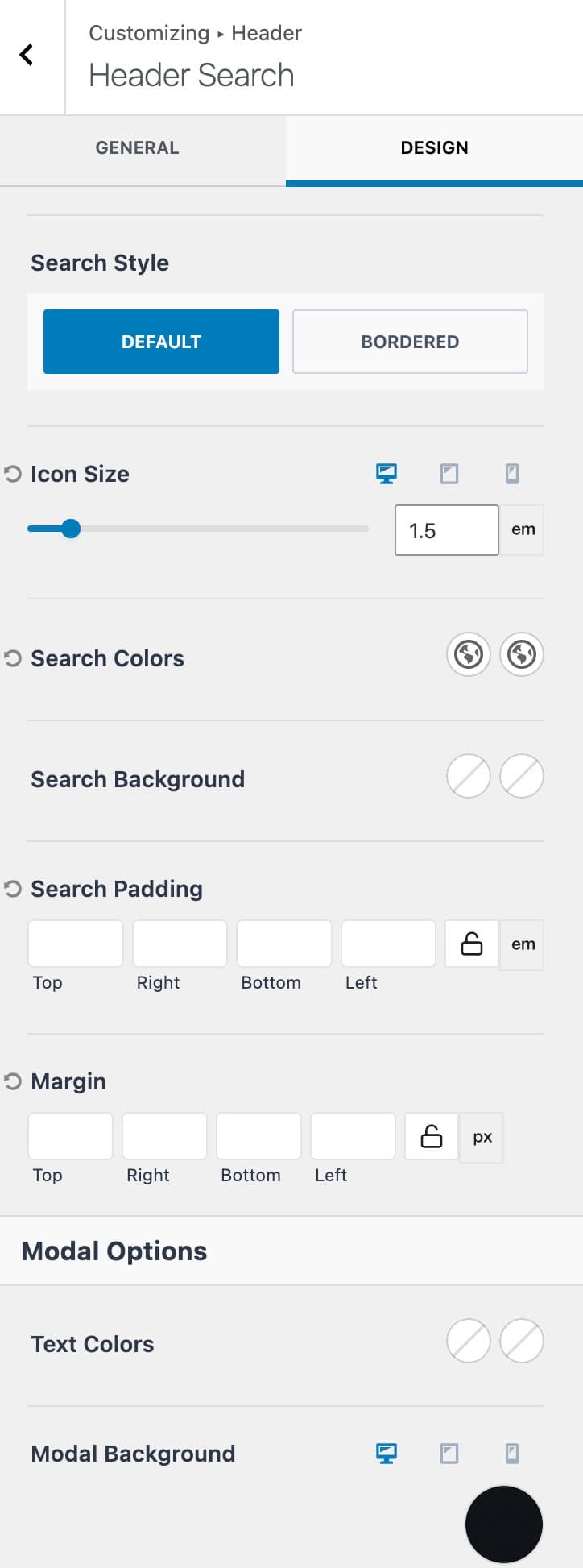
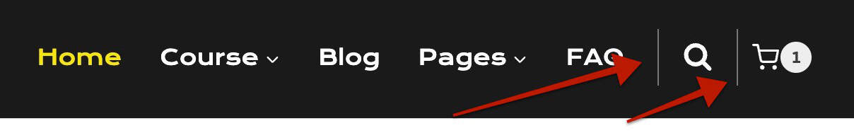
Search (Free)
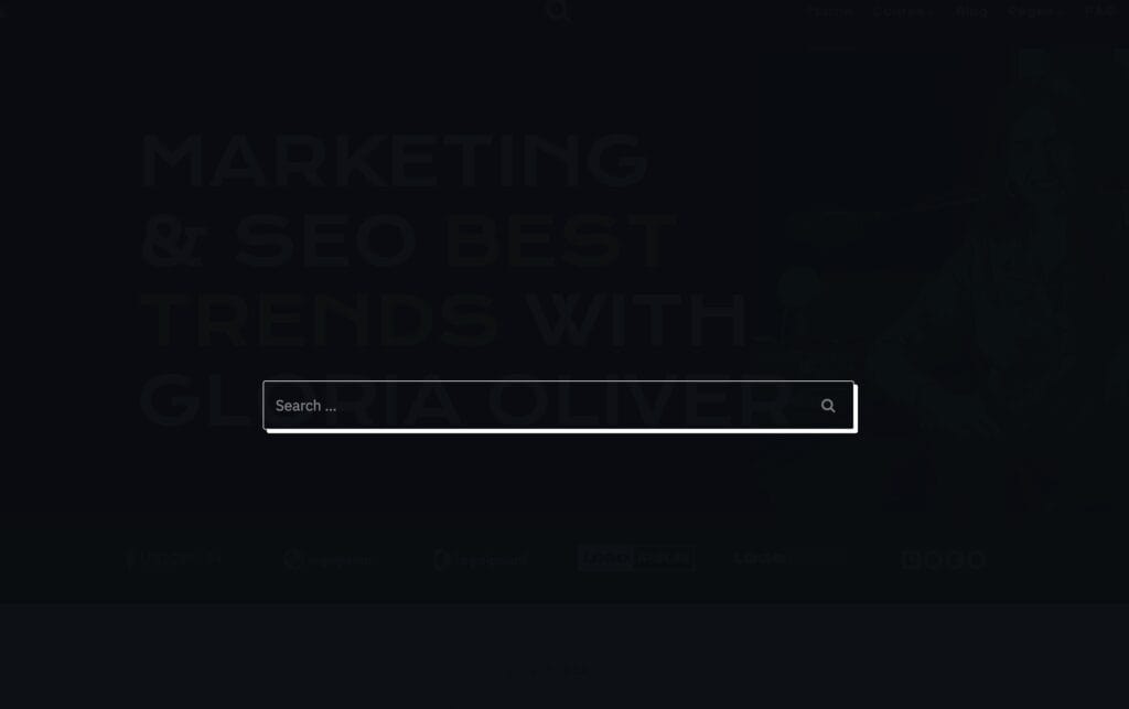
The Search item allows you to add a search icon to your header. Once the Icon is clicked, a search pop-up will appear, allowing users to search through posts/products across your website.
Search Label: Set a search label that will appear next to the icon.
Search Icon: Select from one of the two available icons.
Search Only Products: Enable this option if you wish for the search to only look for products.
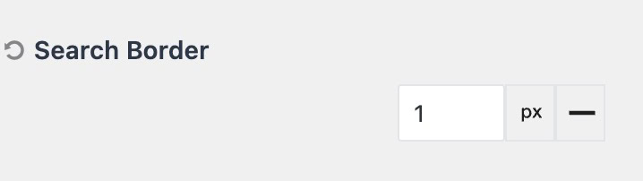
Search Style: The search style can be set to either default or bordered. When selecting bordered, you can set a border color, size, and style that will surround the header search item.
Icon Size: Set a size for the search icon. This can be set for desktop, tablet, and mobile devices.
Search Colors: Set the search colors for the initial and hover states.
Search Background: Set the search background colors for the initial and hover states.
Search Padding: Add padding to the header search item.
Search Margin: Add margin to the header search item.
Text Colors: Set the initial and hover colors for text within the search popup modal.
Modal Background: Set the modal background color for desktop, tablet, and mobile devices.
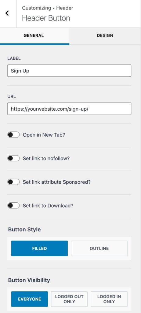
Buttons (Free & Premium)
The free Kadence Theme offers the Button item. When using header addons, you also gain access to the Button 2 item.
Label: Set a Label/text for the button.
URL: Specify a URL for the button.
Open in New Tab: Enable this option to open the button URL in a new tab.
Set link to nofollow: Enable this option if you wish for the link to use the nofollow attribute.
Set link attribute Sponsored: Enable this option if you wish for the link to use the sponsored attribute.
Set link to Download: Enable this option if the button URL is intended to be used as a download.
Button Style: The button style can be set to either filled or outline
Button Visibility: Set the visibility for the button. This can be set to either everyone, logged-out only, or logged-in only users.
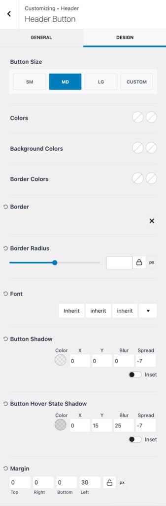
Button Size: Set the button size to either sm, md, or lg, or you can use a custom button size.
Colors: Set the button text colors for the initial and hover states.
Background Colors: Set the button background colors for the initial and hover states.
Border Colors: Set the button border colors (if applicable) for the initial and hover states.
Border: Use this setting to select a border style. Once a style is selected, you will be able to specify the button border color and width.
Border Radius: Use this setting to add a border radius to the button.
Font: Set the font family, style, and size for the button text.
Button Shadow: This setting allows you to set the button shadow color along with the x, y, blur, and spread values. You can also enable an inset shadow.
Margin: Set a margin for the button.
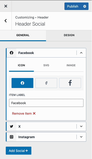
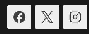
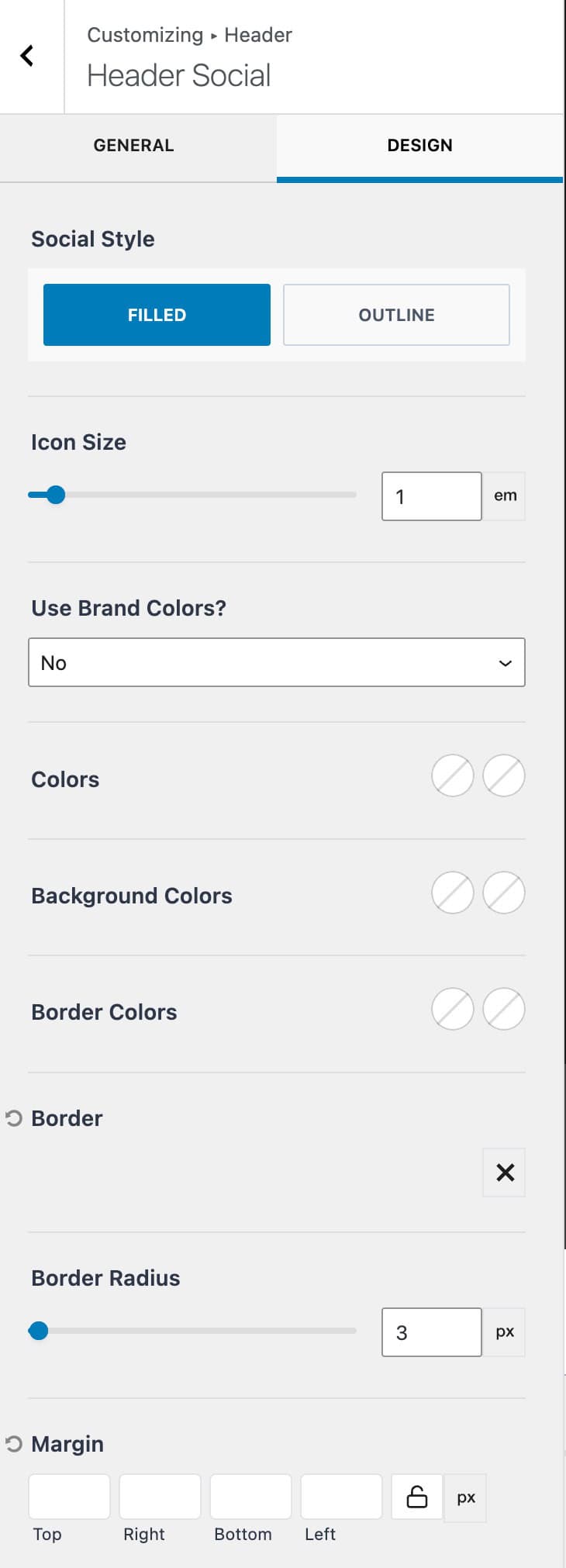
Social (Free)
The Social item allows you to add social media icons that link to their respective platforms. It includes many pre-defined platforms, as well as the option to add custom icons, images, and platforms.
The first part of the Social settings includes each social icon currently added to the social item. Each item can be expanded, where you will be able to modify the Item Label. You can use either a pre-selected Icon or a custom SVG or Image.
Show Icon Label: Enable this option if you wish for the Icon Label to be shown.
Item Spacing: Control the spacing between the inner social icons.
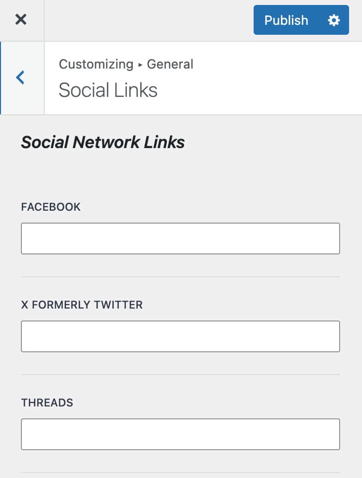
Learn more about Adding Social items and Setting Social Links below.
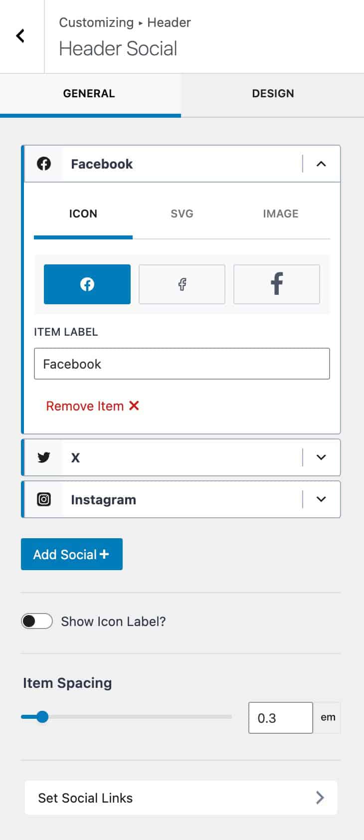
Use the Add Social+ button to select and add a social platform to the social item list.
Click on the Set Social Links tab at the bottom to set each social link. You can scroll to the bottom to set custom social links for custom social items. (If a specific social platform isn’t already available)
Social Style: Set the style of the Social Icons. This can be set to be filled or outlined.

Icon Size: Set the desired size for the social icons.
Use Brand Colors: This option uses the respective brand colors for each icon. For example, Facebook would use blue. This can be set to yes or no and applies to all applicable icons.
Colors: Manually set the icon color for the initial and hover states.
Background Colors: Manually set the icon background color for the initial and hover states.
Border Colors: Set the border colors for icons in the initial and hover states.
Border: Select a border style. Once a style is selected, you can select the border color and border size.
Border Radius: Add a radius to the icon border.
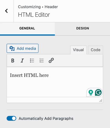
HTML (Free & Premium)
The HTML item is available for free and can be used to add custom HTML text to headers. The Kadence Theme offers one free HTML item, while Theme Kit Pro adds the ability to use a second HTML item.
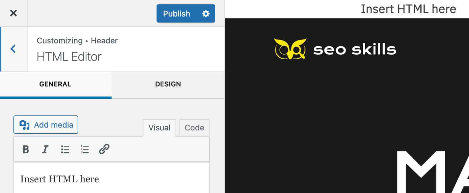
In the General tab of the HTML item, you can access the Visual or Code editor.
Visual Editor: Visually add text and use the available rich text controls to enhance your text.
Code Editor: This editor allows you to directly use HTML tags and formatting.
For example <h1>Hello World!</h1>
Automatically Add Paragraphs: When this option is enabled, paragraph tags will automatically be added to the entire text.
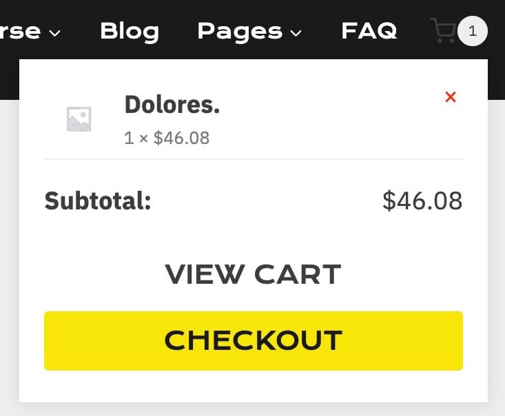
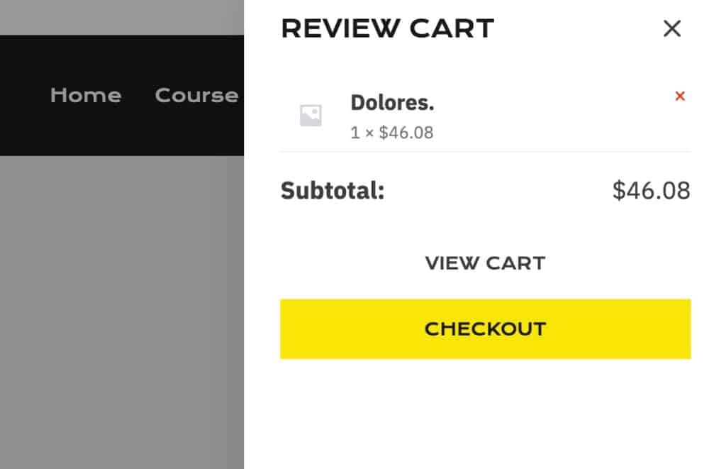
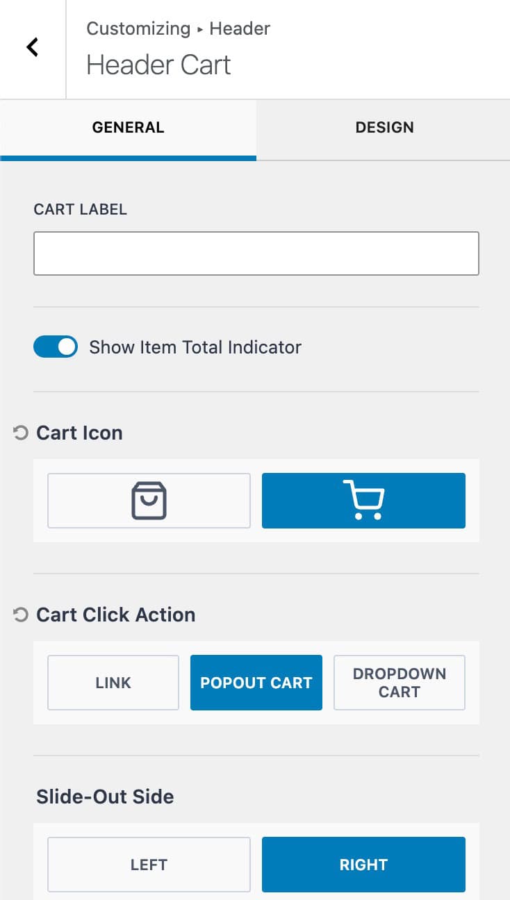
Cart (Free & Premium)
When pairing Kadence with WooCommerce, you can use the Cart item to add an interactive cart to the header. The cart item features the option to link directly to the cart page, display a dropdown cart, or display a popup cart. With Theme Kit Pro, you can also add a free shipping notice to the popout or dropdown cart.

Cart Label: Add a label to the cart item.
Show Item Total Indicator: Enables the total cart count number to be displayed over the cart icon.
Cart Icon: Select one of the two available cart icons.
Cart Click Action: Use an available click action to determine what will happen when clicking on the cart icon.
Slide-Out Side: When using the popout cart, the slide-out side can be set to either left or right.
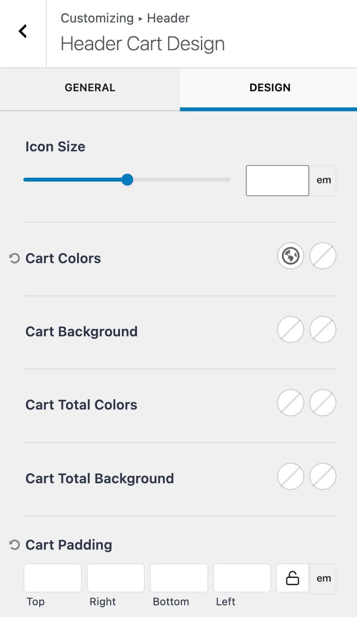
Icon Size: Set an icon size for the cart.
Cart Colors: Set the cart colors for the initial and hover states.
Cart Background: Set the cart background colors for the initial and hover states.
Cart Total Colors: Set the total text colors for the initial and hover states.
Cart Total Background: Set the total text background colors for the initial and hover states.
Cart Padding: Set a padding around the cart item.
Free Shipping Cart Notice (Premium)
When the Cart Click Action is set to Popout Cart or Dropdown Cart, you can also enable the free shipping cart notice.
Amount needed for Free Shipping: Set the minimum cart value needed for free shipping. Note this does not enable free shipping but simply displays the notice when the cart total is less than this value.
Cart Notice Message: Set the message to display when the user has not met the free shipping threshold. Use {cart_difference} to display the amount needed to qualify.

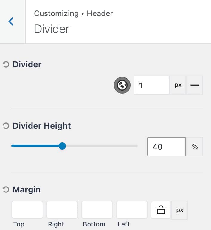
Dividers (Premium)
With Theme Kit Pro Header Addons, you can access the Divider items. This consists of 3 total divider items.
Divider: Set the divider color and width. You can also set the divider style.
Divider Height: Set the height of the divider. (Pixels and percentages available)
Margin: Add a margin around the divider.
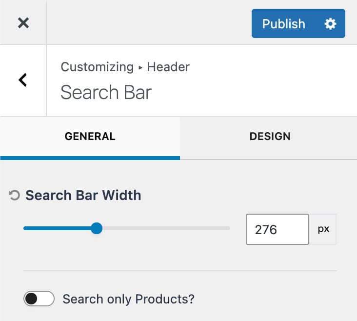
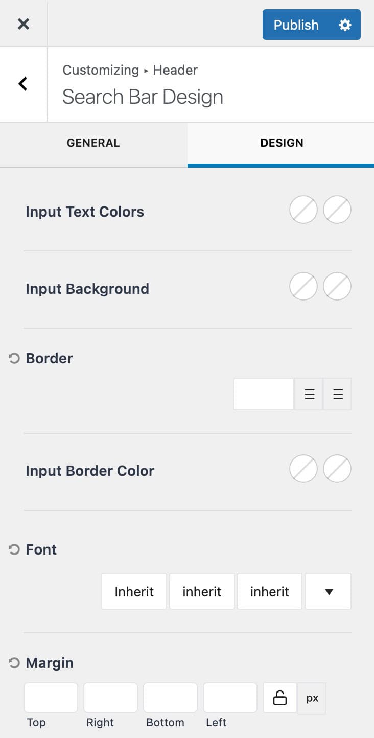
Search Bar (Premium)

Search Bar Width: Set a width for the search bar. The width measurement can be set to either pixels, em, or rem.
Search Only Products: Enable this option to only search through product post types.
Input Text Colors: Set the initial and focus input text colors for input texts.
Input Background: Set the initial and focus input background colors.
Border: Set a border width, unit of measurement, and style.
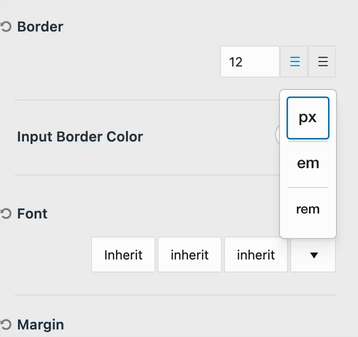
Input Border Color: Set the border color for the initial and focused states.
Font: Set the font family, font style, and font size for the search box texts.
Margin: Add a margin around the search box.
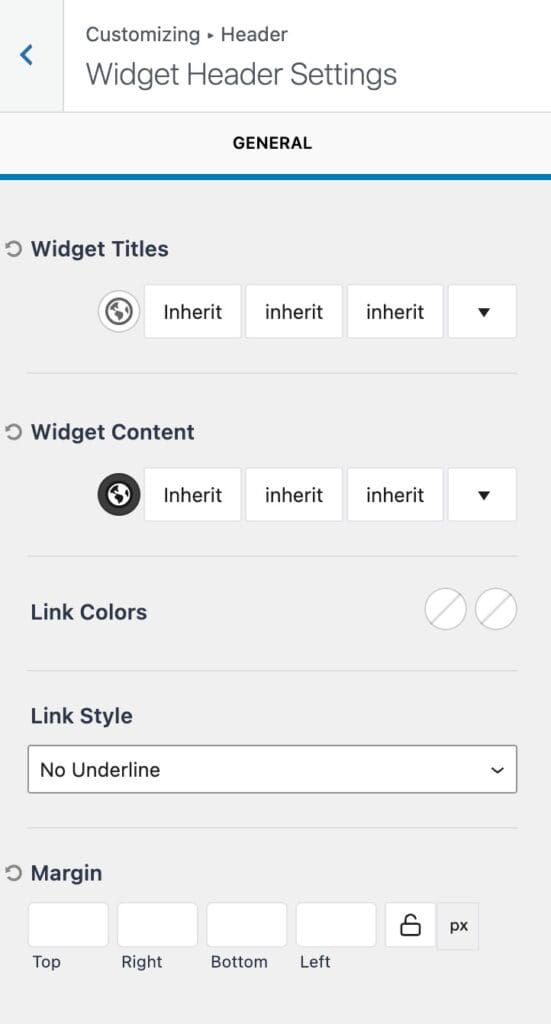
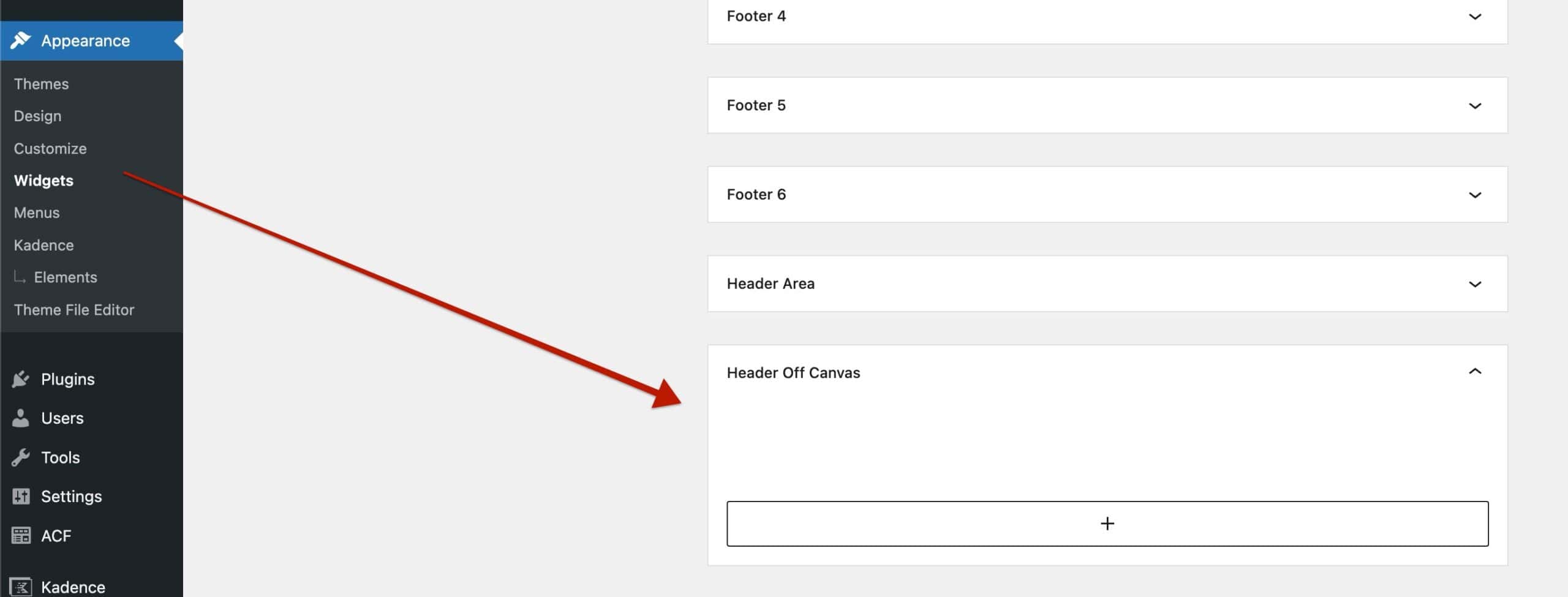
Widget Area (Premium)
The Widget Area allows you to add blocks to a widget and display the widget directly on the header.

You can edit and add blocks to the main widget area from the Dashboard -> Appearance -> Widgets page. Look for the widget named Header Area.
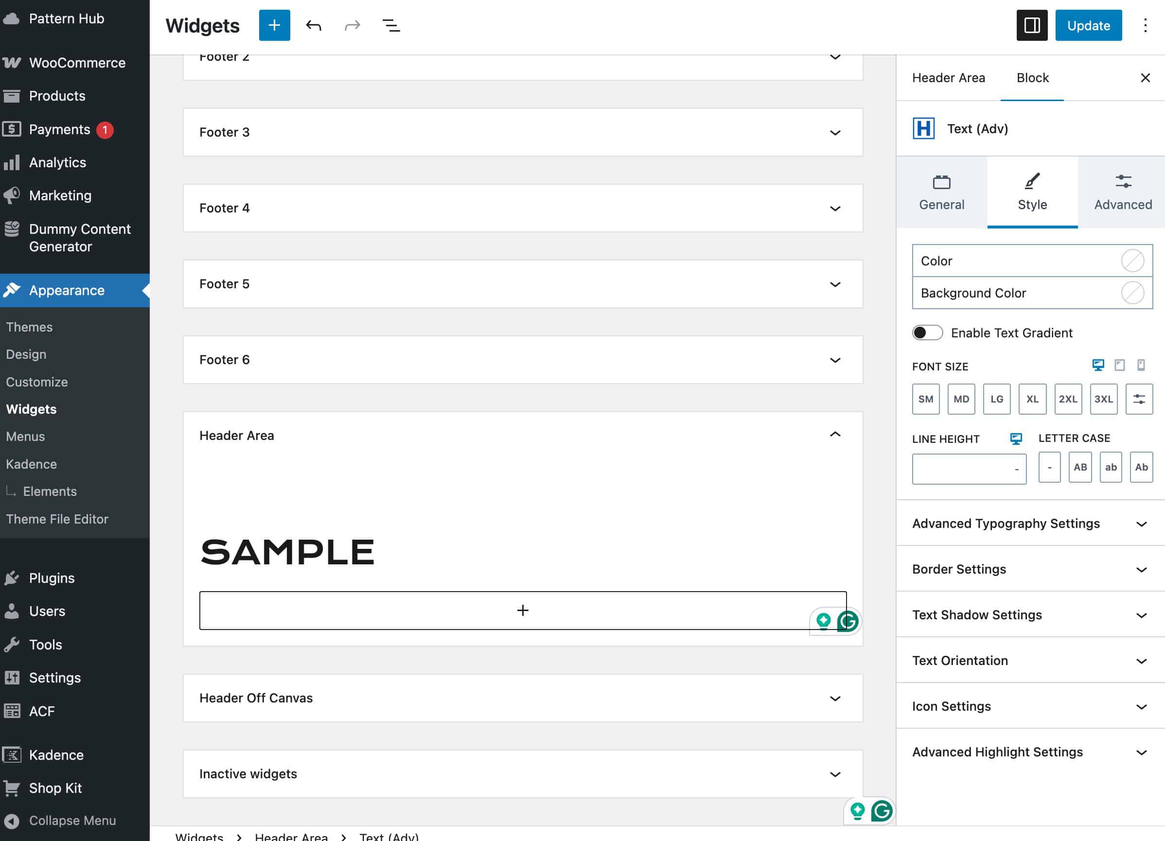
Once the header area is populated with a block, you can make future edits to the header area widget directly from within the customizer.
Locate the widget area item from within the visual builder. Then, click on the gear icon to access the widget editor.
Widget Titles: Set a color, font family, font style, and font size for relevant widget titles.
Widget Content: Set a color, font family, font style, and font size for relevant widget contents.
Link Colors: Set the initial and hover colors for links within widgets.
Link Style: Set the link style for links within widgets.
(The widget styles above apply to Gutenberg legacy widgets.)
Margin: Add a margin around the widget area.
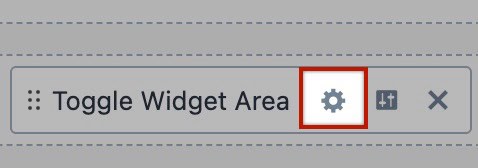
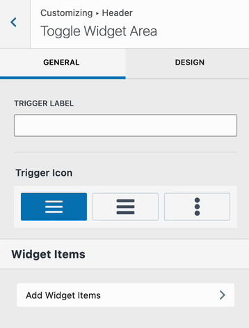
Toggle Widget Area (Premium)
The Toggle Widget Area item adds a toggle/trigger that can be clicked to reveal the Off Canvas Widget.
The Off Canvas Widget can be customized from the Dashboard -> Appearance -> Widgets page under the Off Canvas Header widget. Add various blocks to meet your design goals.
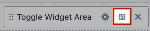
Use the gears icon next to the Toggle Widget Area item to access the toggle settings.
Trigger Label: If you wish to use a trigger label, add the desired text here.
Trigger Icon: Select from one of the available trigger icons.
Widget Items: Click on the Add Widget Items tab to access the Off Canvas Widget Editor directly from the customizer.
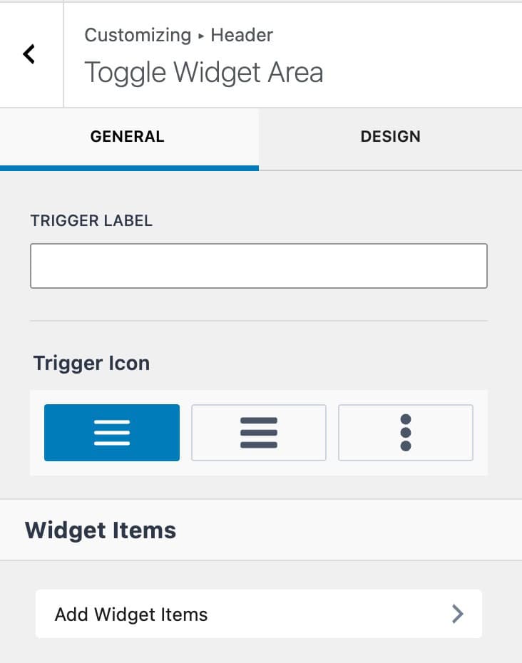
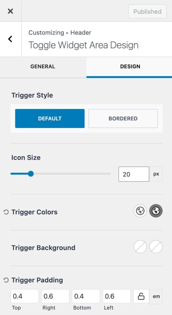
Trigger Style: Set a trigger style to use the default style or a bordered style.
Icon Size: Set the size of the trigger icon. This can be measured in pixels, em, or rem units.
Trigger Colors: Set an initial and hover color for the trigger.
Trigger Background: Set an initial and hover background color for the trigger.
Trigger Padding: Add a padding around the trigger icon.
Use the toggle icon next to the Toggle Widget Area item to access the widget area settings.
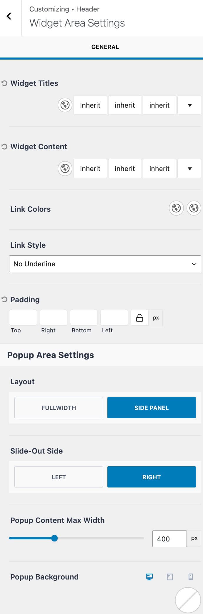
Widget Titles: Set a color, font family, font style, and font size for relevant widget titles.
Widget Content: Set a color, font family, font style, and font size for relevant widget contents.
Link Colors: Set the initial and hover colors for links within widgets.
Link Style: Set the link style for links within widgets.
(The widget styles above apply to Gutenberg legacy widgets.)
Padding: Add padding to the off canvas area.
Layout: Set the off canvas widget area layout to either side panel or full width.
Slide-Out Side: Determine which side the off canvas area will slide in from.
Popup Content Max Width: Use this setting to limit the off canvas popup width.
Popup Background: Set a color, gradient, or image as the popup background.
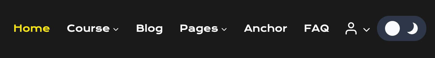
Account (Premium)
Use the Account item to allow users to quickly access account-related features. This includes the ability to have a pop-up account login modal.
When editing the account item, the first setting in the General Settings is the Preview/Customize setting. This setting allows you to edit and view either the Logged In View or the Logged Out View.
Each view will have its own set of General and Design Settings. It is important to go through both views to ensure the account items work as expected.
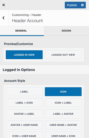
Logged In View
Account Style: Select from various account styles. This includes options to include different combinations of a Label, an Icon, a User Name, and an Avatar.
Account Icon: Select from three available account icons.
Account Action: Set the account action to either use a direct link or a dropdown navigation menu.
Dropdown Source: When using the dropdown option for account actions, you can choose the source: either ‘Navigation Menu’ to use your custom menu, or ‘WooCommerce Account Menu’ to stick with the default WooCommerce menu.
Dropdown Direction: Set the dropdown direction to either left or right.
Account Item Link: Add a direct link for the account item.
Select Menu: When using the Navigation Menu dropdown, you can select the menu using this option.
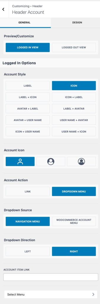
Icon/Image Size: Set the overall icon/image size.
Account Colors: Set the account item colors for the initial and hover states.
Account Background: Set the account item background colors for the initial and hover states.
Border Radius: Set a border radius for the account item.
Label/Name Font: Set the font family, style, and size for the label and/or name fonts.
Padding: Add padding around the account item.
Margin: Add margin around the account item.
Logged Out View
Account Style: Select from various account styles. This includes options to include different combinations of a Label and/or an Icon.
Account Icon: Pick from one of the three available account icons.
Account Action: Set the account action to determine how the account item will function.
- Link: Set the account item to use a standard link
- Dropdown Menu: Set the account item to open a dropdown navigation menu.
- Modal Link: This option makes it so that the account item opens a modal popup, allowing users to log in.
Dropdown Direction: Set the dropdown direction to either left or right.
Account Item Link: Use this setting to add a main link to the account item.
(Applicable when using link or dropdown menu account action.)
Select Menu: When using a dropdown menu option, use this tab to successfully set a dropdown menu from your list of available menus.
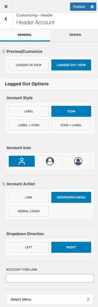
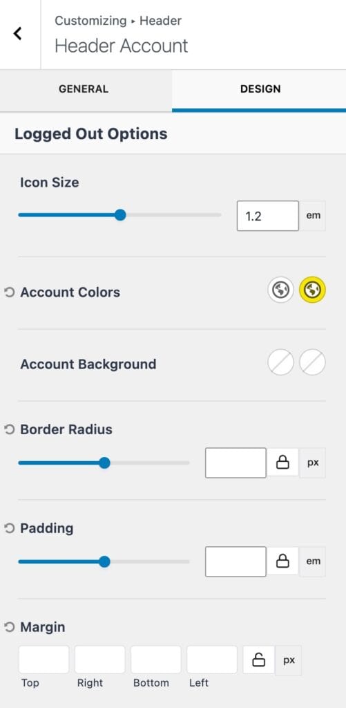
Icon Size: Set the overall icon/image size.
Account Colors: Set the account item colors for the initial and hover states.
Account Background: Set the account item background colors for the initial and hover states.
Border Radius: Set a border radius for the account item.
Padding: Add padding around the account item.
Margin: Add margin around the account item.
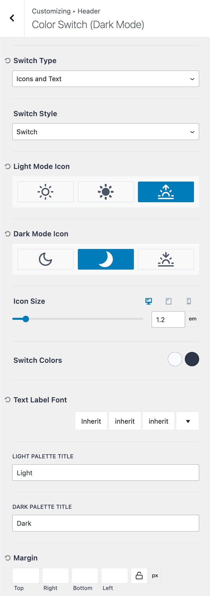
Dark Mode Toggle (Premium)
The Dark Mode Toggle item can be used when using Kadence Dark Mode. This header item allows you to add and customize a switch within the header. Once the switch is clicked, it will respectively change the website theme mode between the dark and light modes.
The Dark mode Theme Kit Pro addon can be enabled from the Dashboard -> Appearance -> Kadence page.
Fully enable dark mode through the Customizer -> General -> Color Switch (Dark Mode) settings.
Once Dark Mode is enabled on the website, the Dark Mode Toggle item can be used in the header to easily access dark/light mode.
Switch Type: Set the switch type to determine the display of the switch. Available options are text, icon, or icons and text.
Switch Style: Set the switch style to either switch or button. (See the examples below.)
Switch Style
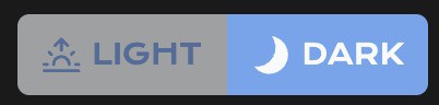
Button Style

Light Mode Icon: Set one of the three available light icons to represent light mode.
Dark Mode Icon: Set one of the three available dark icons to represent dark mode.
Icon Size: Set the icon size for both the dark and light mode icons.
Switch Colors: Set the initial and hover colors of the switch or button.
Text Label Font: Set the text label font family, style, and size.
Light Palette Title: Add a title for the light palette. This will display as the text to represent light mode.
Dark Palette Title: Add a title for the dark palette. This will display as the text to represent dark mode.
Margin: Add a margin around the dark mode toggle.
