
As of Kadence Pro version 1.0.3, there are options to enable a color switch for your users to select a “dark mode” of your website. See an example site to try it out. The approach we took with Kadence was to provide a lightweight option to have a dark mode. Because of that, this tool does not generate dark mode CSS and it may not work out of the box with many plugins or complex sites. There are robust dark mode plugin solutions that will work with Kadence if you are wanting to make a dark mode for a really complex site, however, these can come with a performance hit. The intention of this tool is to be light and work tightly with the Kadence Global colors.
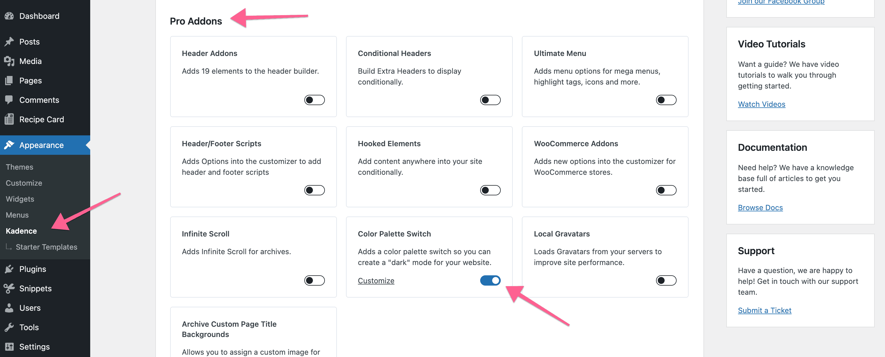
To get started you will need to enable the module under Appearance > Kadence in the WordPress admin.
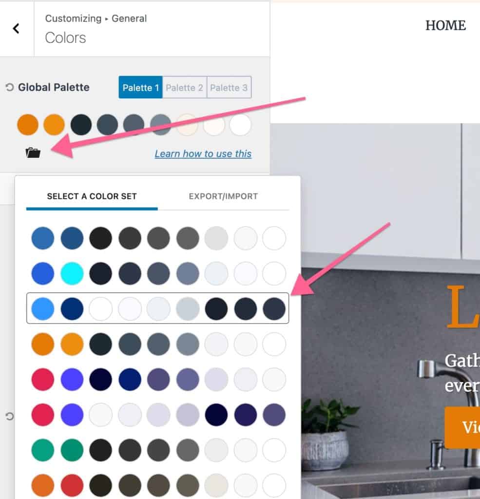
Once you have the Color Palette Switch enabled you will find new settings under Appearance > Customize > General > Color Switch (Dark Mode).
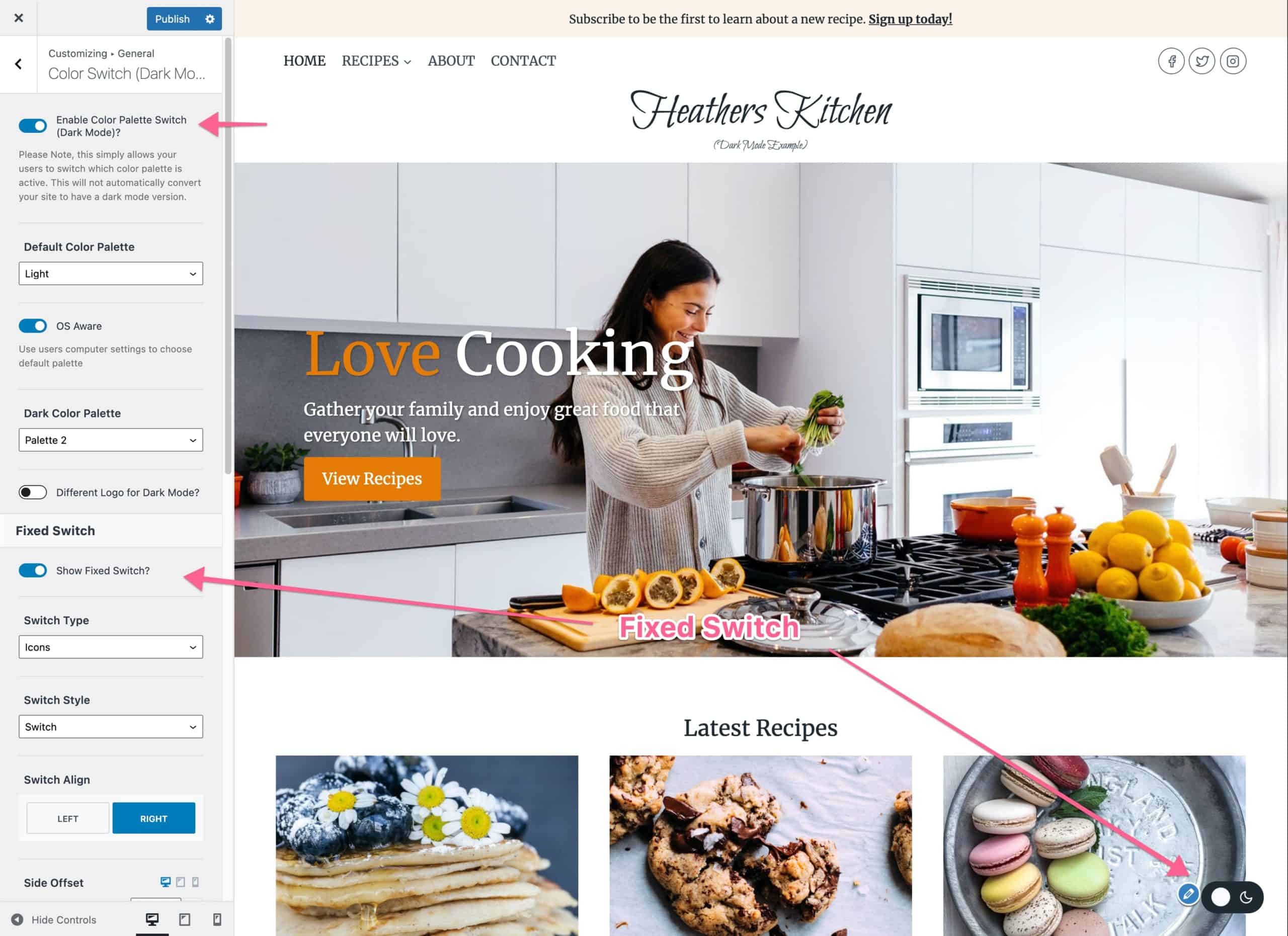
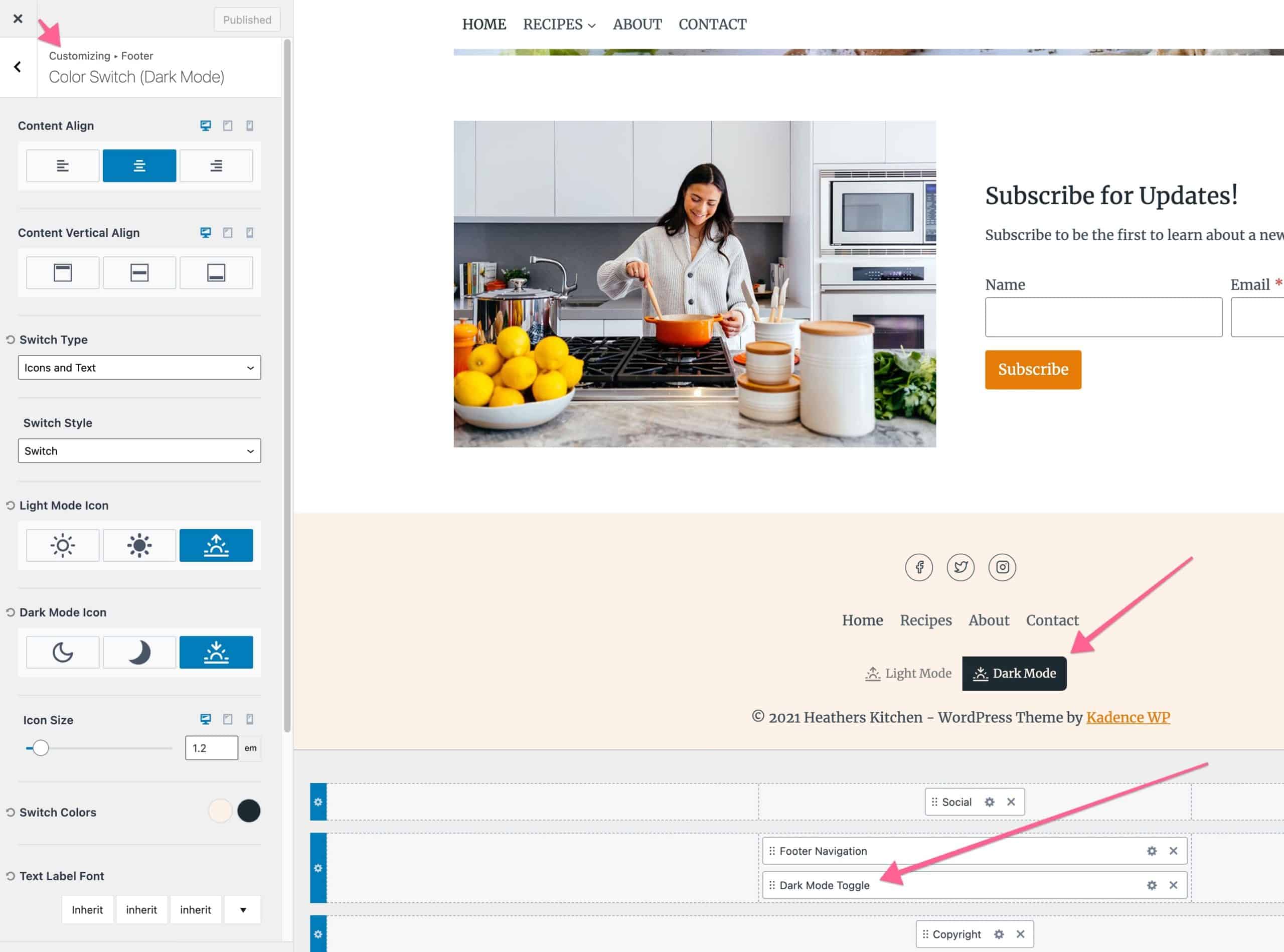
Once enabled you can choose to add a fixed switch to your site. Please note you can also add a switch in the header builder or footer builder if you don’t want it to be fixed on the screen. To use those switches just go to the header builder or footer builder and add the color switch element.
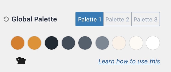
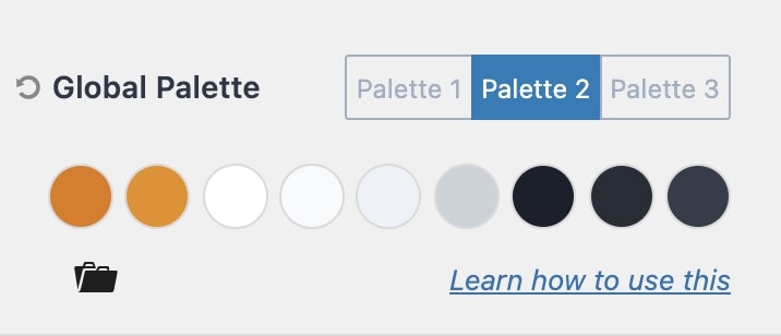
Now to make the switch work you need to set up your “dark” color palette under General > Colors in the customizer. In the example site above, Palette 1 is the light color palette and Palette 2 is the dark color palette.
Note:
It’s critical that you are using the Kadence Global Color Palette correctly and assigning these colors on your site. To learn more on that please read How to use the Kadence Theme Color Palette.
If you want a quick way to experiment you can click the folder icon in the global palette settings to import a dark palette on your site.
Once you have a light and dark palette setup you can experiment with the toggle on your site. Depending on which plugins you are using it’s possible you will have some things that are not attached to the theme global colors and therefore do not switch when toggled. In this situation, you may need to add custom CSS to the customizer > custom CSS input to change those styles when in dark mode.
The key is that in dark mode a class (color-switch-dark) is added to the body tag, this lets you target CSS only for dark mode. Here is an example:
.color-switch-dark .custom-class-that-needs-color-changed {
color:var(--global-palette4);
}
Color Switch Settings
| Setting | Description |
|---|
| Enable Color Palette Switch (Dark Mode)? | Turns on the toggle UI so visitors can switch light/dark mode. |
| Default Color Palette | Select the default palette (Light or Dark) for visitors. |
| OS Aware | When enabled, the visitor’s operating system or browser preference for light/dark mode is used to select the palette by default. |
| Dark Color Palette | Select which Global Palette is the “dark” color palette. |
| Different Logo for Dark Mode? | Option to show a different logo if dark mode is active/selected. Additional options will show when turned on: Option to show a different logo if dark mode is active/selected. Additional options will show when turned on: – Dark Mode Header Logo will give you the image picker to select the “dark mode” logo. – Different Logo for Mobile? will give you the image picker to select the “dark mode” mobile logo. |
| Fixed Switch – Show Fixed Switch? | Shows a floating (fixed) color palette switch on all pages. Additional options will show after turning this on: Option to show a different logo if dark mode is active/selected. Additional options will show when turned on: – Switch Type (Icons, Texts, or Icons and Texts) – Switch Style (Switch or Button) – Switch Align (Left or Right) – Side Offset is the distance of the switch from the sides (left or right) – Bottom Offset is the distance of the switch from the bottom of the screen. – Light Mode Icon (if you select the Icons or Icons and Texts switch style, this sets the icon for the light color palette) – Dark Mode Icon (if you select the Icons or Icons and Texts switch style, this sets the icon for the light dark palette) – Switch Colors – Text Label Font (if you select the Text or Icons and Texts switch style, this is your option to style them) – Light Palette Title sets the text for the light palette in the switch – Dark Palette Title sets the text for the dark palette in the switch – Visibility sets which device views the switch will be shown. |
