
The Kadence Theme features a comprehensive color palette that allows you to connect colors across your website globally. This is great for the Kadence Theme alone and also unlocks more color consistency when combined with the Kadence Blocks plugin.
These colors are not just decorative as they’re foundational to your site’s design system, defining how contrast, background, and emphasis are applied throughout your site. This document will overview each color, what it is for, and guide you on using the Kadence Color palette effectively.
Getting Started
The Kadence Color Palette Feature is a part of the free Kadence Theme ⧉.
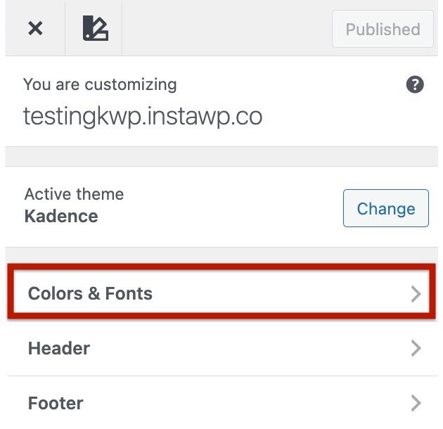
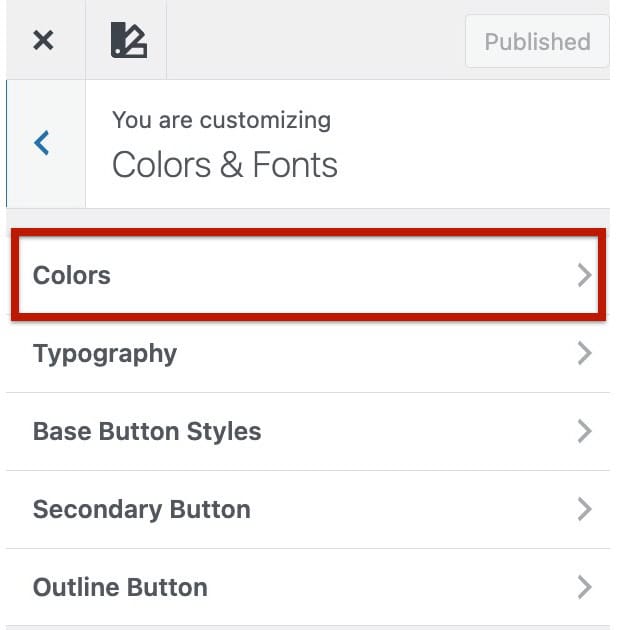
With the Kadence Theme active, you can control the Kadence Color Palette from the Customizer -> Colors & Fonts -> Colors settings.
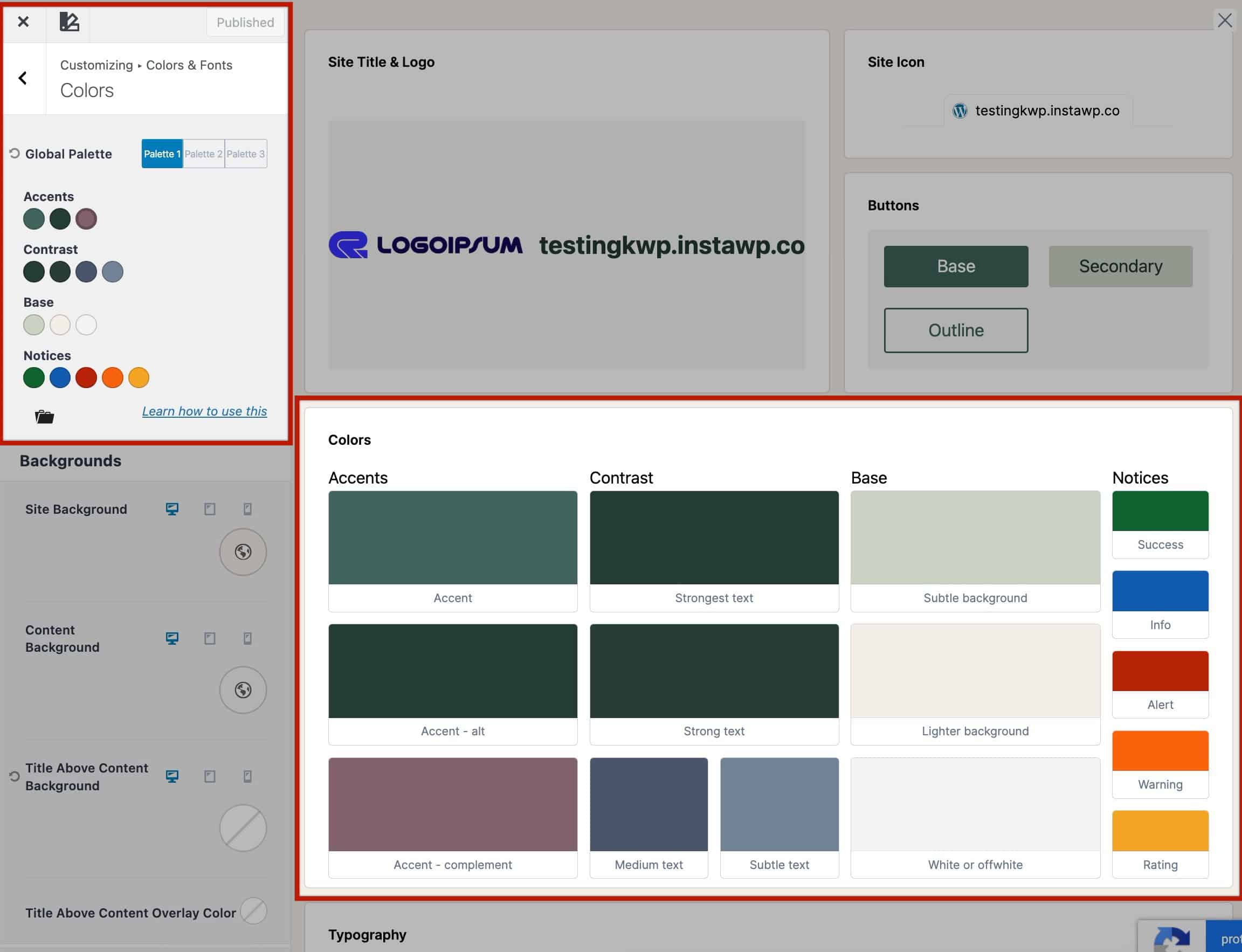
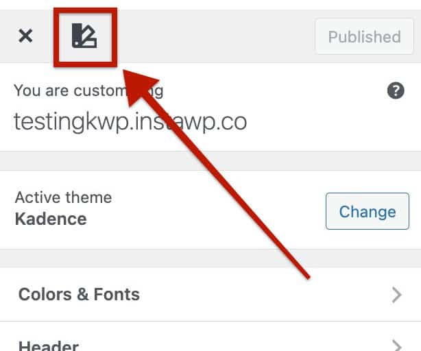
You can also use the Style Guide by clicking on the Style Guide Icon at the top left of the Customizer. This opens a visual representation of the Color Palette, while also allowing you to modify other styles, such as typography texts, button styles, and more.
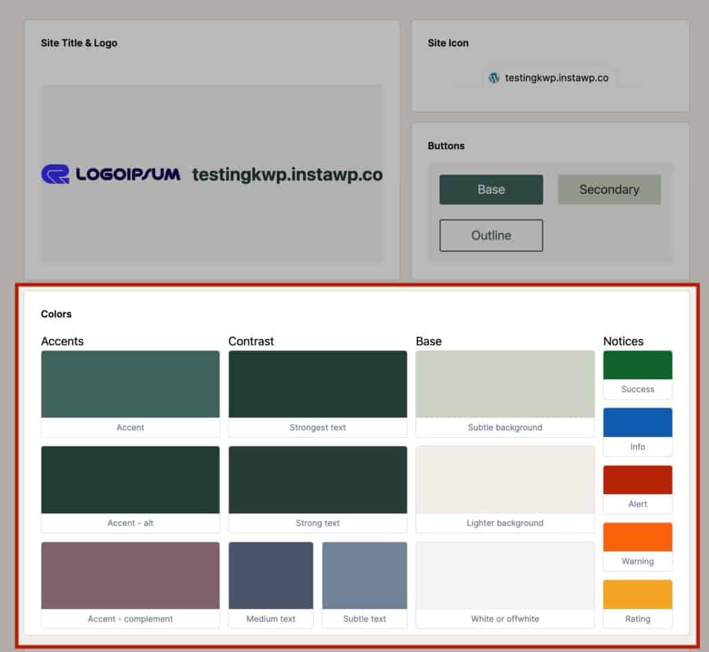
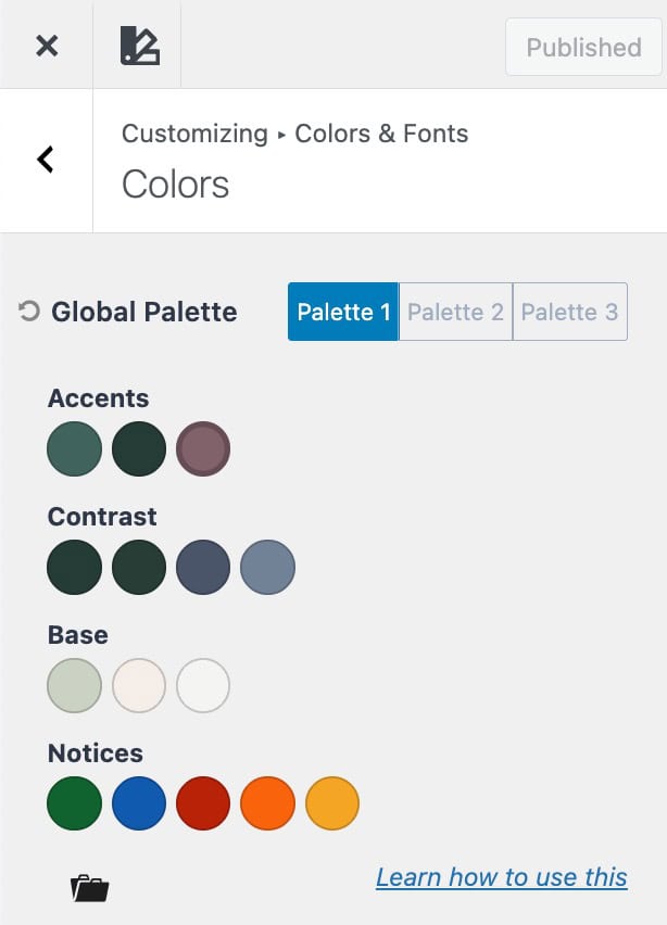
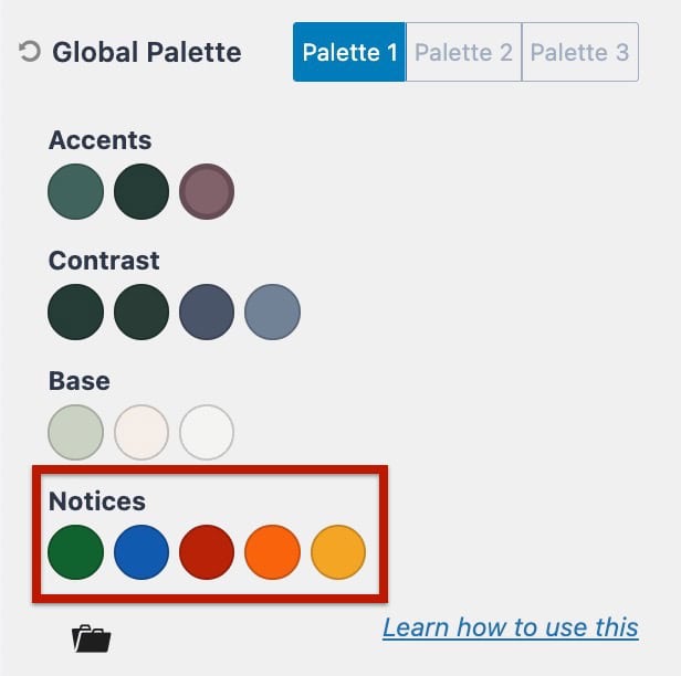
The Kadence Theme Color Palette is organized into four main groups, each designed for a specific purpose across your site:
- Accent: Your brand colors for highlights and interactive elements.
- Contrast: Text and interface tones that define readability and hierarchy.
- Base (Background): The foundational colors that structure your layout.
- Notices (Feedback): Colors for alerts, success, and informational messages.
These groups make it easy to create a balanced design system that stays consistent across pages, templates, and blocks. (Learn more below.)
When adjusting various Kadence Theme Settings, you can select your Color Palette colors directly within the color picker.
Similarly, you can also use Color Palette colors when setting colors in Kadence Blocks and core blocks.
It is important to understand the Color Palette, each group of colors, and their purpose. Each group plays a specific role in maintaining balance, hierarchy, and readability across your entire site.
By using these predefined palette colors instead of random custom colors, your site remains visually consistent and easier to maintain. If you ever decide to adjust your brand colors later, updating the palette in one place will automatically apply those changes sitewide.
Understanding the Color Palette
Your palette is grouped into four key sections. Each group of colors in your palette has a specific purpose. Understanding what each section does helps you keep your site visually consistent and easy to adjust later. Below is a brief overview of each Color Palette group and color purpose.
Accents
Accent colors are your brand-defining tones. The colors that stand out and give your site personality.
They’re used for interactive elements and visual highlights.
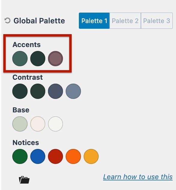
- Accent: Your main brand color. Commonly used for buttons, links, and other elements that grab attention.
- Accent – Alt: A variation of your main accent, often used for hover or active states. It should complement the main accent but have a noticeable difference.
- Accent – Complement: A secondary or supporting accent color that works alongside your main accent.
- The Accent Complement Color acts as a secondary accent that supports your main Accent color. By default, it is linked to the main Accent color, meaning any change made to the main Accent color will automatically update the Accent Complement Color.
- When the two colors are still linked, a highlighted outline will appear around the Accent Complement color, indicating their connection.
- You can customize the Accent Complement color independently by unlinking it. To do this, select the Accent Complement color and click the Unlink Color button. Once unlinked, it becomes independent and will no longer change when you adjust the main Accent color.
Tip: Keep your accent colors cohesive. They should all feel like part of the same family.
Examples:
Accent:
Accent – Alt:
Accent – Complement:
Contrast
Contrast colors define readability and hierarchy across your site. They ensure your text, borders, and other interface details have the right balance of visibility and subtlety.
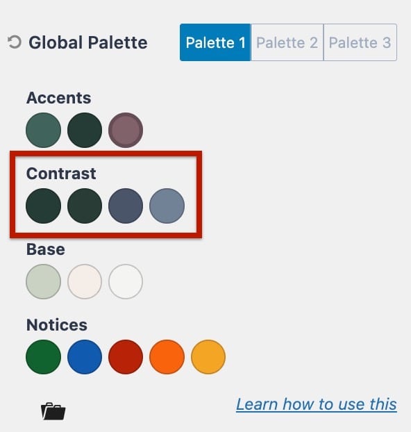
- Strongest Text – The darkest and most prominent color, used for headings and important text.
- Strong Text – The main body text color. Should be clear, readable, and balanced for long-form content.
- Medium Text – A softer tone for secondary content such as metadata, form labels, or captions.
- Subtle Text – A light, low-contrast color used for borders, dividers, or muted text like placeholders.
Strongest Text:
Strong Text:
Medium Text:
Subtle Text:
Base (Background)
Base colors define the foundation of your layout. They separate sections, improve readability, and create subtle contrast between different areas across your website.
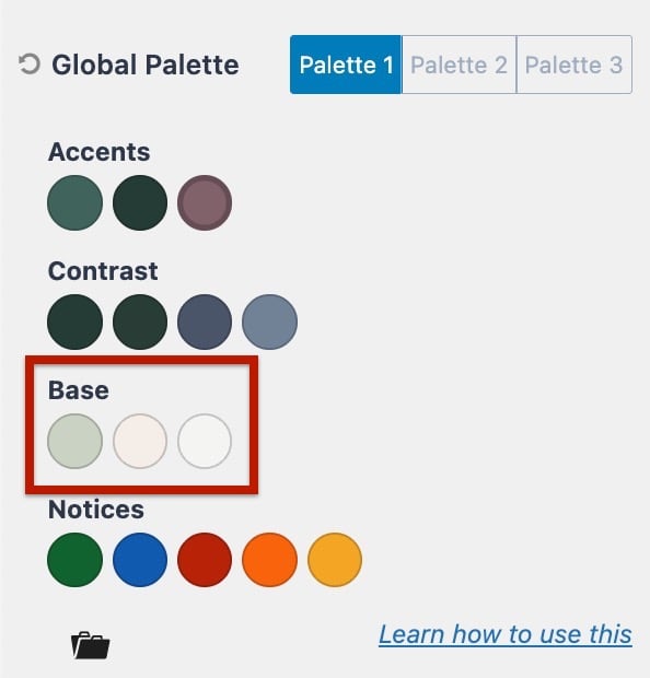
- Subtle Background – A light shade that provides gentle contrast for sections or cards.
- Lighter Background – A slightly lighter tone is used for layering or alternating section backgrounds.
- White or Offwhite – Base or page background.
Examples:
Subtle Background:
Lighter Background:
White or Offwhite:
Notices (Feedback Colors)
These colors are used for system feedback, messages, and interactive states
- Success – Used for positive confirmations or completion messages.
- Info – Used for informative highlights or neutral notifications.
- Alert – Used for critical or error messages.
- Warning – Used for cautionary messages.
- Rating – Used for positive highlights such as star ratings.
Examples:
Success:
Info:
Alert:
Warning:
Rating:
Selectable Palettes
The Kadence Theme features Selectable Palettes. These are pre-defined color palettes designed to help you quickly create balanced, professional color systems for your website.
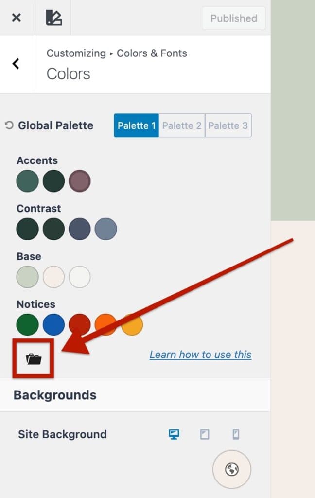
To use a Selectable Palette, open the Customizer and navigate to the Appearance -> Customize -> Colors & Fonts -> Colors.
Then, click the Black Folder Icon beside the color palette. This will open a library of Selectable Palettes you can choose from.
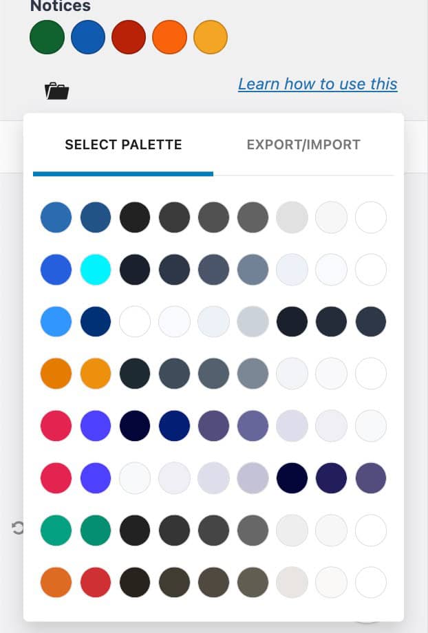
Note: Selecting a new palette will override your current colors. Before exploring new patterns, make sure to save your existing palette in the Customizer. You can then preview any Selectable Palette safely.
If you don’t want to keep the changes, simply refresh the page to restore your original colors.
If you like the new palette, publish your changes to apply it sitewide.
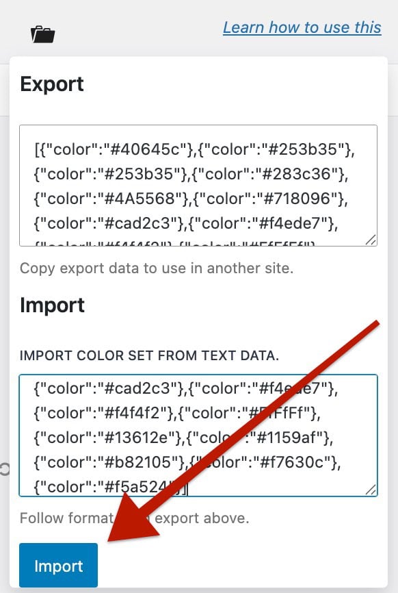
Export/Import Color Palettes
Kadence Color Palettes work through a simple JSON structure. This makes it easy to export your current color setup or import it into another website.
You can find the Export/Import options by opening the Customizer and navigating to:
Appearance → Customize → Colors & Fonts → Colors.
Then, click on the Black Folder Icon to open the Export/Import Tab.
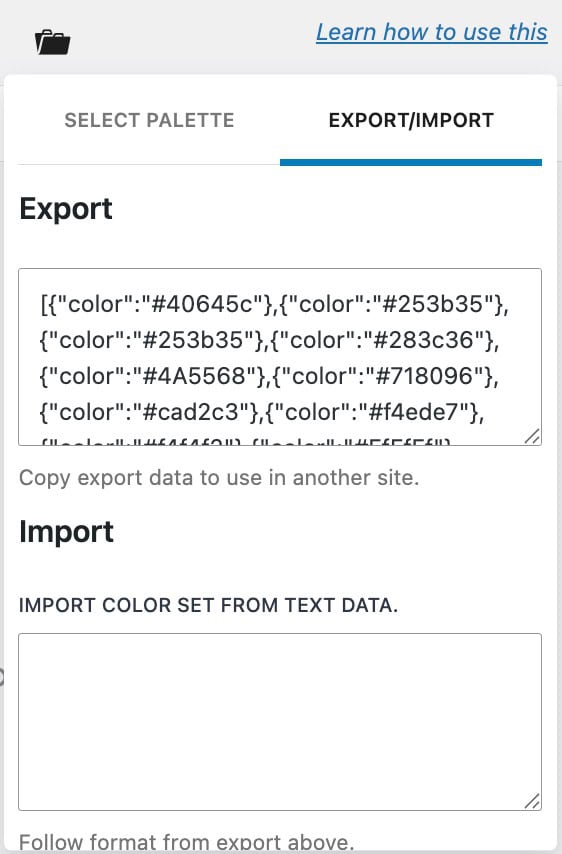
To Export a Color Palette:
- In the Export/Import Tab, copy the entire JSON code shown in the text area.
- Paste and save it somewhere safe — such as a text document — so you can reuse it later or share it with another site.
To Import a Color Palette:
- On your new site, go to Appearance → Customize → Colors & Fonts → Colors.
- Open the Export/Import Tab.
- In the Import box, paste your saved JSON code.
- Afterward, scroll to the bottom and click on the Import button.
Accessible (readability)
Another key factor that is not always taken into account when establishing a color palette is readability. Lucky for you, the web is full of tools to help you create the perfect contrast with your colors to be accessible. A free resource that Kadence recommends is called WebAIM ⧉.
Inspiration
The way Kadence thinks about creating color palettes at Kadence was influenced by Steve Schoger over at https://refactoringui.com/ ⧉. We highly recommend you check out his design tips. You should also browse well-designed sites ⧉ to get inspired and see how others are using color palettes.
