
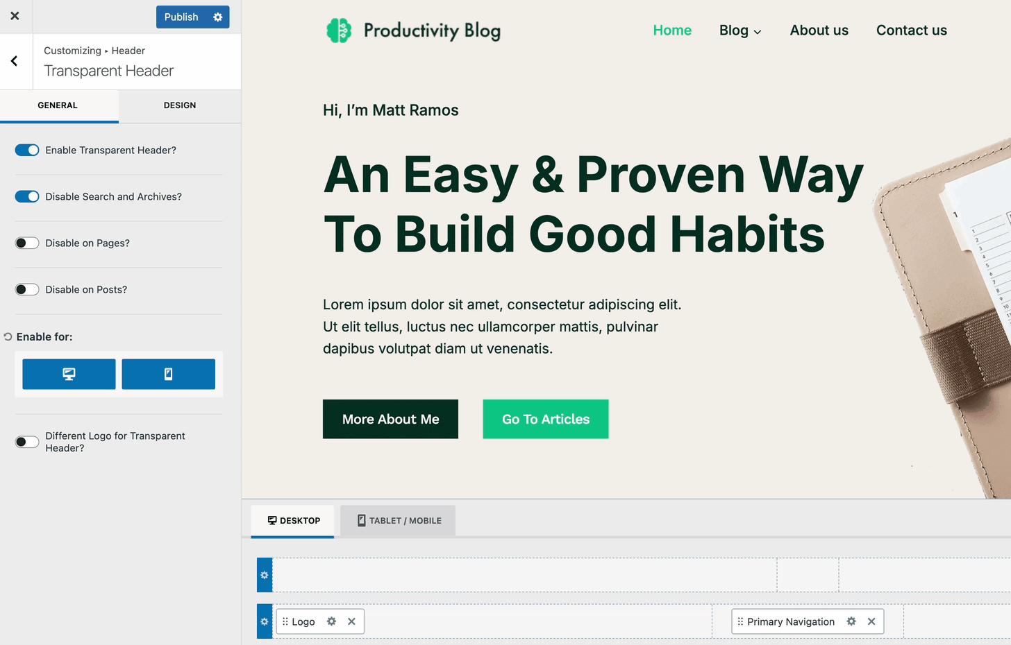
With the Kadence Theme, you have full control over building a custom Header using the Theme Header Builder. Simply drag and drop different Kadence Header Items into various sections of your header and use the available general and design settings to reach your desired design goals.
Kadence provides a range of free and premium Header Items that are highly customizable and add essential functionalities to your header. (For example, the Cart Item allows you to add a WooCommerce Popup Cart to the header, while the Account Item enables a Login Modal for user authentication.)
This document goes over all things related to building and customizing the Kadence Theme Header.
The Kadence Theme Header features a drag-and-drop style Header Builder. Kadence also offers Advanced Headers, which allow Headers to be made using the block editor. Click here to read more about using Advanced Header / Navigation Blocks vs Kadence Theme Header Builder.
Editing the Header
The Theme Header can be accessed by going to the Dashboard -> Appearance -> Customize page. Then, find and click on the Header tab.
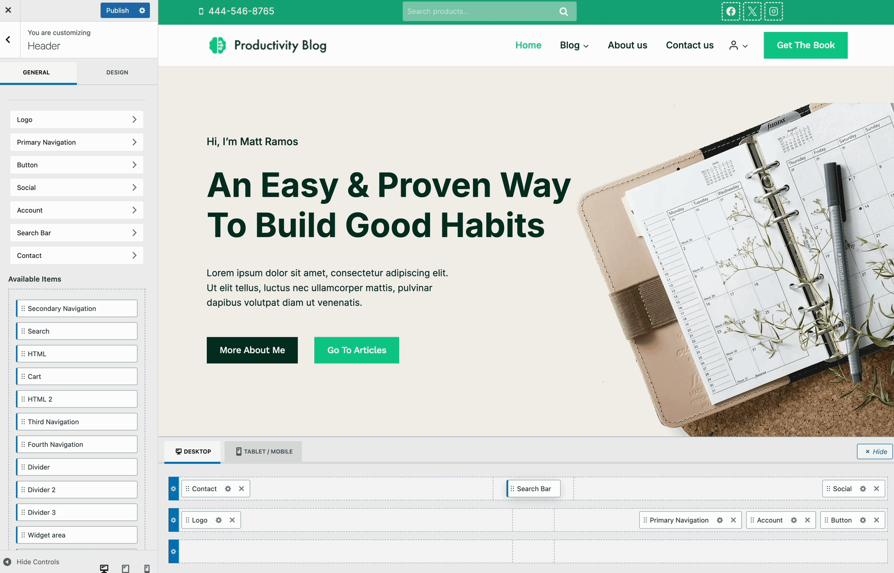
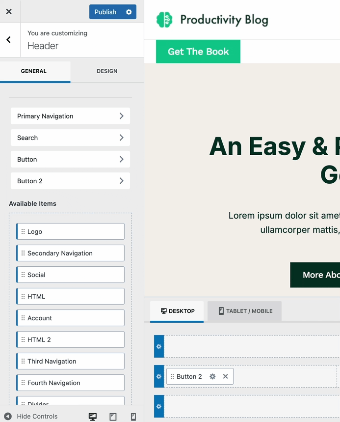
Items can be dragged around to be rearranged. Use the Visual Builder to drag and arrange Header Items across different sections of the header.
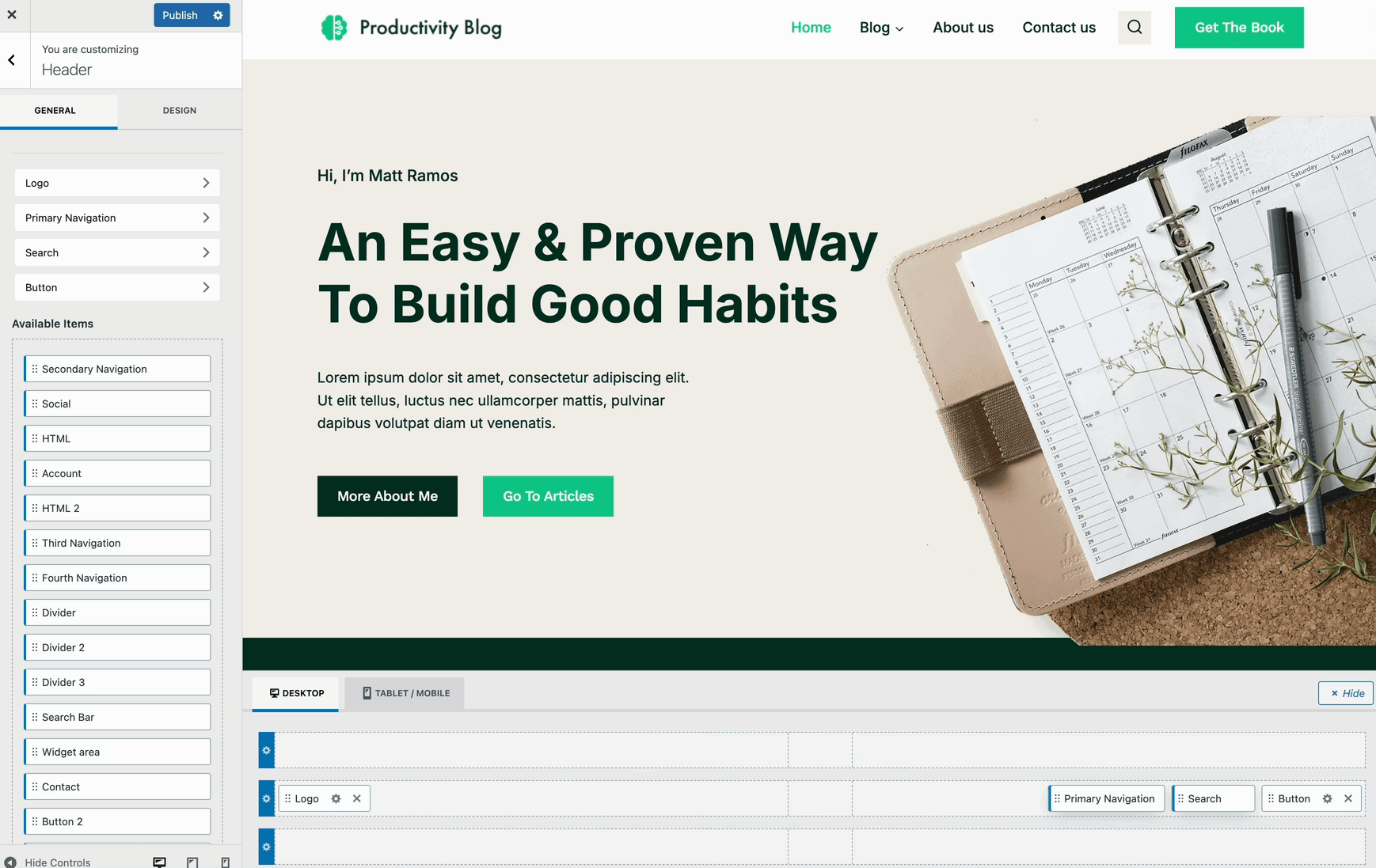
Header Items can be dragged from the Available Items list in the Customizer settings or by clicking on the Plus Icon of a section within the Visual Builder.
The Theme Header consists of three Header Rows. Each row contains three sections for the placement of Header Items.
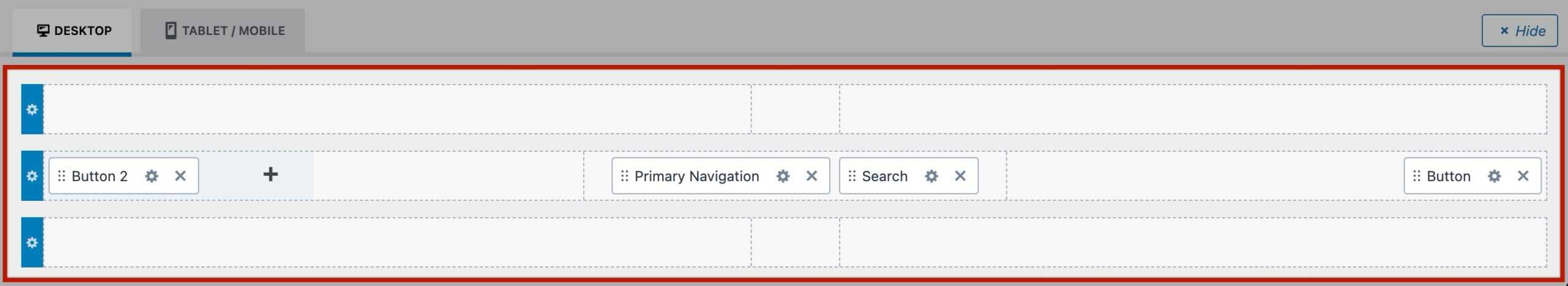
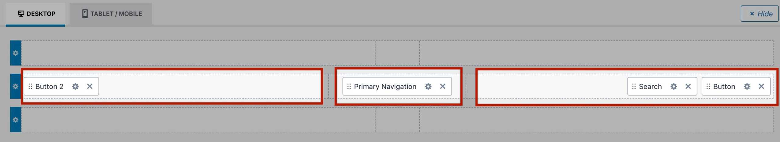
Use the Settings Icon on the far left of each Header Row to control the individual Header Row Settings. (Learn more about the available Header Row Settings below.)
Mobile/Tablet Headers
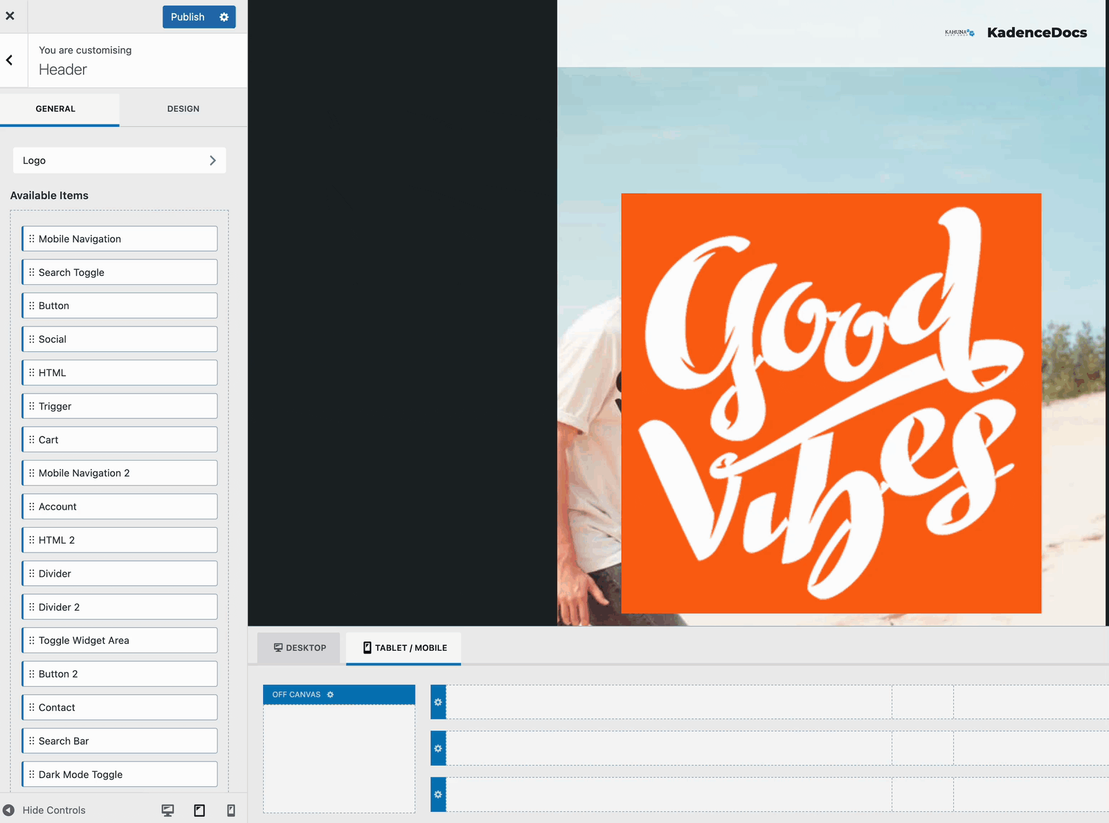
Use the Tablet/Mobile tab within the visual header builder to access the mobile header layout. This view displays the mobile header rows as well as the Off Canvas Area, where you can configure your mobile navigation.
To set up mobile navigation, add the Trigger header item to one of the available header row sections. Then, place the Mobile Navigation header item into the Off Canvas area.
When the trigger is clicked, it will open the Off Canvas area, displaying your mobile menu as intended. Click here to learn more about customizing the mobile navigation area.
General Header Settings
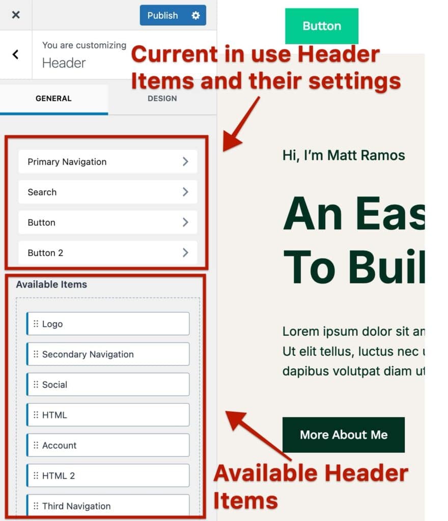
Use the General Header Settings to control the general functionalities of your header. You can access the Available Header Items, the individual Header Item Settings, and other features, such as Transparent, Sticky, and Conditional Headers.
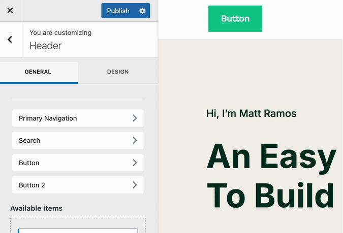
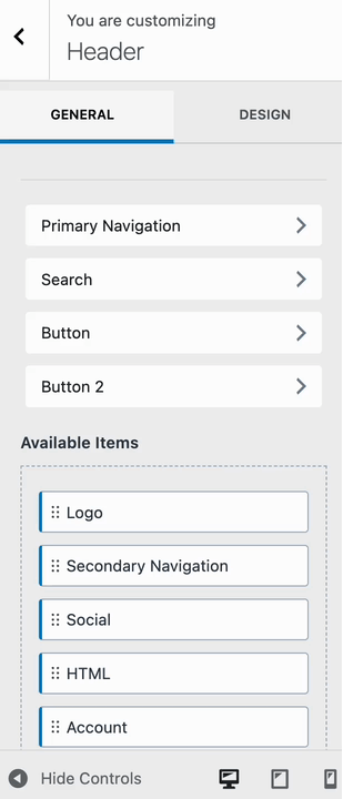
At the top of the General settings, you’ll find a list of the current items in the Theme Header.
- When you add an item to the Header, a corresponding tab appears, allowing you to modify its settings.
- Likewise, removing an item from the Header will remove its associated tab and settings from the list.
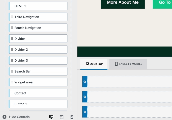
The Available Items section contains elements that have not yet been added to the Header. You can drag and drop these items into the Visual Header Builder to incorporate them into your layout.
Click here to learn about each Header Item and their available settings.
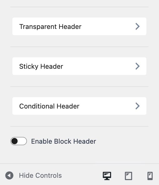
Below the Available Items, you can find additional settings. Such as the Transparent Header, Sticky Header, and Conditional Header settings. This document covers each of these settings below.
- Click here to learn more about the Transparent Header Settings.
- Click here to learn more about the Sticky Header Settings.
- Click here to learn more about the Conditional Header Settings.
The Enable Block Header setting can be used if you wish to use a Kadence Advanced Header instance instead of the Theme Header. Just enable this option and select the desired Advanced Header that you wish to use.
Design Header Settings
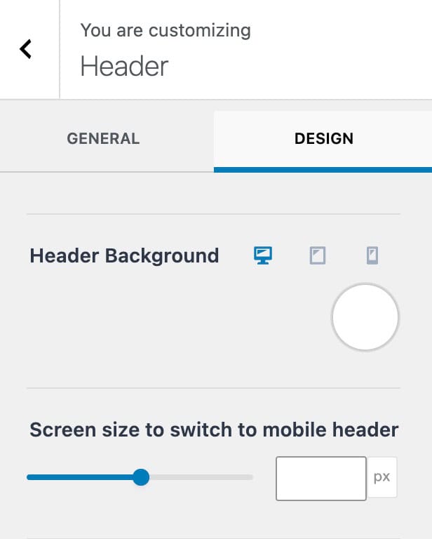
Use the Design Header Settings to control the general styles of your header.
Header Background: Set a background color for the header as a whole. This can be set for desktop, tablet, and mobile devices.
Screen size to switch to mobile header: This setting controls the theme header breakpoint for when the desktop header will become the tablet/mobile Header. The default value is 1024px.
Header Row Settings
The theme header is made up of three header rows: top, main, and bottom. Each header row can be customized individually.
In the Visual Builder, click the settings icon on the far left of the desired header row to access its General Header Row Settings.
From there, you can also navigate to the Design Header Row Settings for further customization.
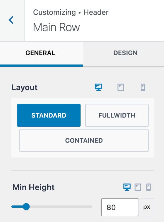
General Row Settings
Layout: Set a Layout for the current header row. You can pick from the following options.
- Standard – This option extends the Row Background to full width, while keeping the content contained to the theme content width.
- FullWidth – This option extends the Row Background and content to full width.
- Contained – This option contains both the Row Background and Content within the theme content width.
Min Height: Set a minimal height for the current header row.
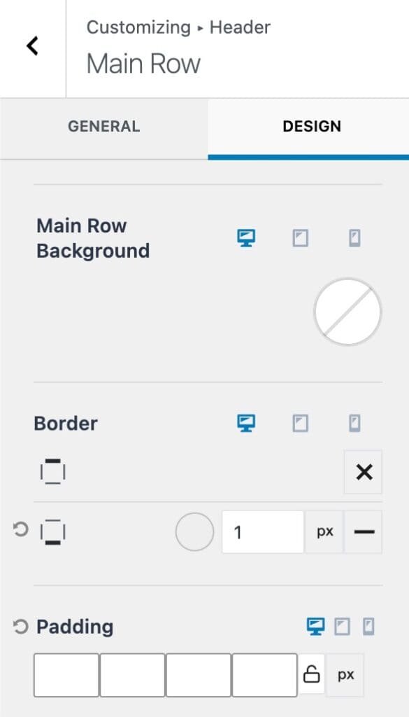
Design Row Settings
Row Background: Set a background color for the current row. This can be set for desktop, tablet, and mobile devices.
Border: Add a Border to the top and/or bottom of the current header row. Click on the x icon to select a border style. Then, you can use the input value to set the border width and color.
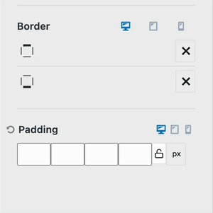
Padding: Add padding to the current header row. This can be set for all sides of the header row and specified for desktop, tablet, and mobile devices.
Transparent Headers
In the Customize -> Header settings, you can find the Transparent Header settings to enable and use the Transparent Header.
Once the Transparent Header is enabled, you will notice various options to disable the transparent header on different page types. This allows the transparent header to be used as needed.
Enable/disable the transparent header where needed accordingly. (If your website includes products, events, etc., you will also see options to disable/enable the transparent header on these pages.
Different Logo for Transparent Header (optional): This setting allows you to enable and select a different logo for the header in the transparent state. This can help if your logo typically depends on a background color to be seen. You can upload a different color/version of your logo that works well on transparent backgrounds.
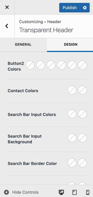
Transparent Design Settings
Use the Design tab to customize the styles of the Transparent Header. These styles take effect when the header is in its Transparent State, overriding any existing color settings.
For example, if your header is both Sticky and Transparent, the Transparent Header styles will apply initially. However, once the Header transitions into the Sticky State, the Sticky Header settings will override the Transparent ones.
There are numerous Design Settings available to customize the colors of various Header Items.
If a header color doesn’t appear correctly in the Transparent Header, you can likely adjust it within the Design Settings for that specific header item.
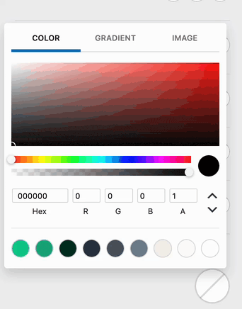
If a specific setting offers more than one color option, then you can adjust additional colors for different states. Such as the initial, hover, and/or active states.
Below is a list of all the available colors that can be modified.
Available Settings: Contact Colors, Search Bar Input Colors, Button Colors, Button2 Colors, Search Bar Input Background, Search Bar Border Color, Widget Area Colors, Mobile Divider Color, Mobile Divider 2 Color, Divider Color, Divider 2 Color, Divider 3 Color, HTML Colors, HTML2 Colors, Logged out Account Colors, Logged in Account Colors, Logged in Account Background, Logo Icon Color, Site Title Color, Navigation Colors, Navigation Items Background, Button Colors, Social Colors, HTML Colors, Transparent Header Background, Bottom Border, and Toggle Widget Colors.
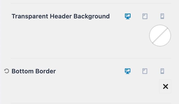
Transparent Header Background: Use this setting to set a background color, gradient, or image whenever the header is in the transparent state.
Bottom Border: Add a border to the bottom of the header when in the transparent state. Once a border style is selected, you will be able to select additional customizations, such as the border size and color.
Transparent Header Page/Post Settings
When using the Transparent Header, you may want to disable it for a specific Post or Page rather than across all content. This can be managed using the Kadence Post/Page Settings in the Editor
- Open the Post or Page you want to edit.
- In the WordPress Editor, navigate to the Post/Page Settings in the top right corner.
- Locate the Transparent Header setting and select your preferred option:
- Default – Uses the global settings configured in the Transparent Header Customizer settings.
- Disable – Turns off the Transparent Header for this specific Post/Page.
- Enable – Forces the Transparent Header on for this specific Post/Page.
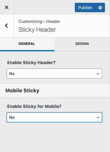
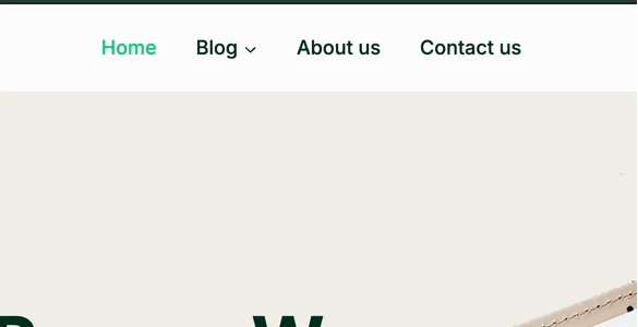
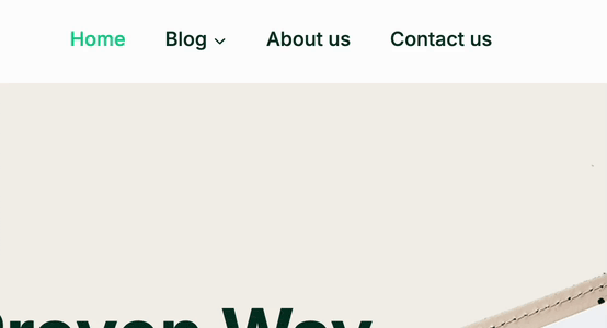
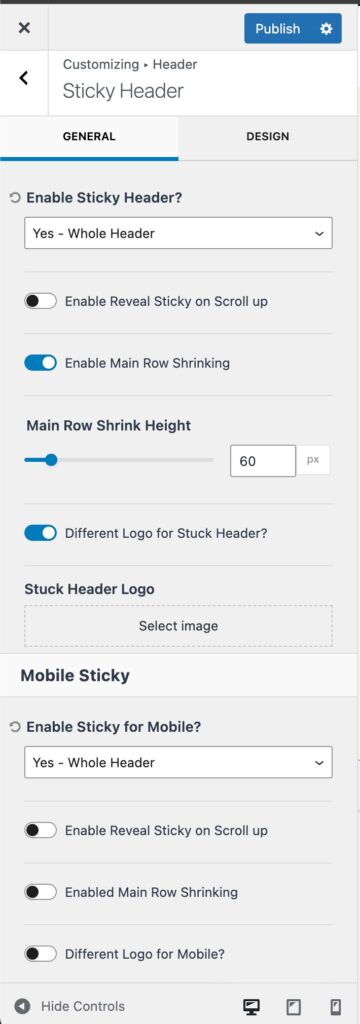
Sticky Headers
In Customize → Header settings, you can find the Sticky Header options to enable and configure a Sticky Header. A dropdown menu allows you to enable the sticky header based on your preference.
There are separate dropdowns for both desktop and tablet/mobile headers, each offering different sticky behavior options.
The selectable options include: Only Main Row, Top Row & Main Row, Whole Header, Only Top Row, or Only Bottom Row.
Once you have selected your preferred sticky header behavior, you will be presented with additional options to control its functionality.
Enable Reveal Sticky on Scroll Up: When enabled, the sticky header will initially disappear as the user scrolls down the page. However, it will reappear when the user scrolls back up the page.
Enable Main Row Shrinking: This option allows you to reduce the height of the sticky header when it becomes sticky. When enabled, the main header row will reduce in height as it becomes sticky, using the specified shrink height
Different Header Logo (optional): This setting lets you assign a different Header Logo that’ll be displayed when the header enters the sticky state.
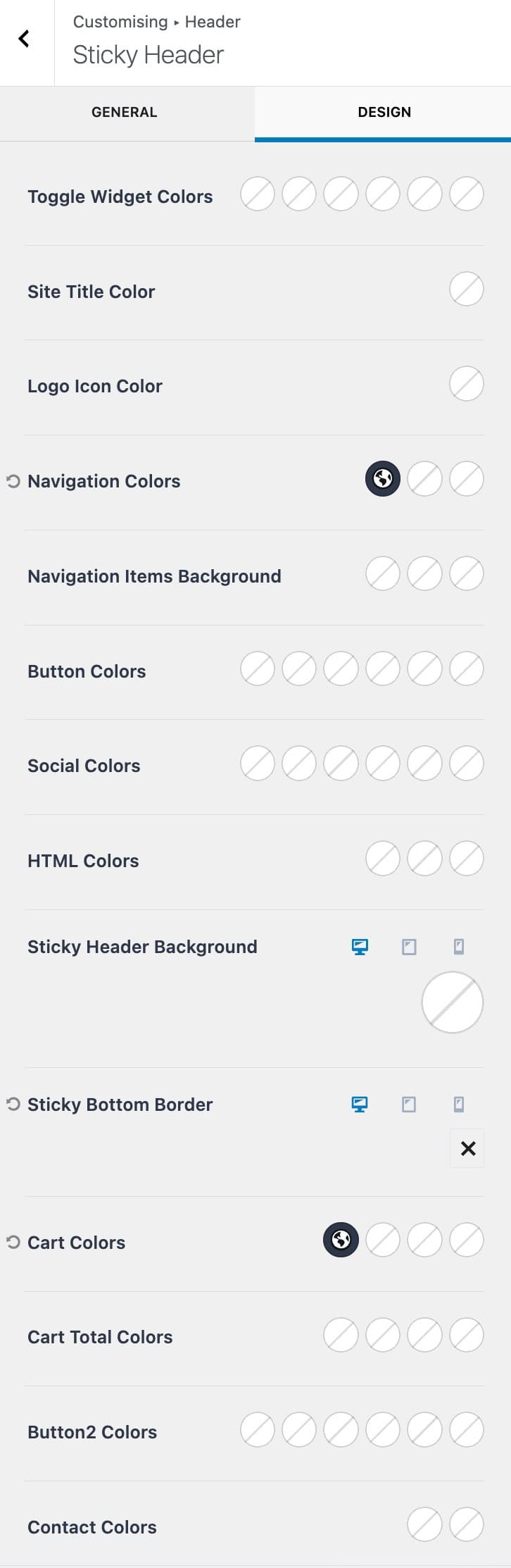
Sticky Design Settings
Use the Design tab to customize the styles of the Sticky Header. These styles take effect when the Header is in its Sticky State, overriding any current existing color settings.
For example, if your Header is set to Sticky, it will initially use the default header styles. Once the Header enters the Sticky State, it will switch to the Sticky Header settings, applying the defined styles for that state.
There are numerous Design Settings available to customize the colors of various Header Items.
If a setting offers more than one color option, then you can adjust colors for different states. This usually includes the Initial, Hover, and/or Active states.
Below is a list of all the available colors that can be modified.
Available Settings: Toggle Widget Colors, Site Title Color, Logo Icon Color, Navigation Colors, Navigation Items Background, Button Colors, Social Colors, HTML Colors, Sticky Header Background, Sticky Bottom Border, Button2 Colors, and Contact Colors.
Customizing Header Navigation Colors
When using the Kadence Theme Classic Header in the WordPress Customizer, you have several options for setting Navigation Colors. You can customize the default navigation colors, the transparent header navigation colors, and the sticky header navigation colors.
To learn more about customizing the Header Navigation Colors for different Header States, refer to the Customizing the Classic Header Navigation Colors (Default Header, Transparent Header, Sticky Header) document.
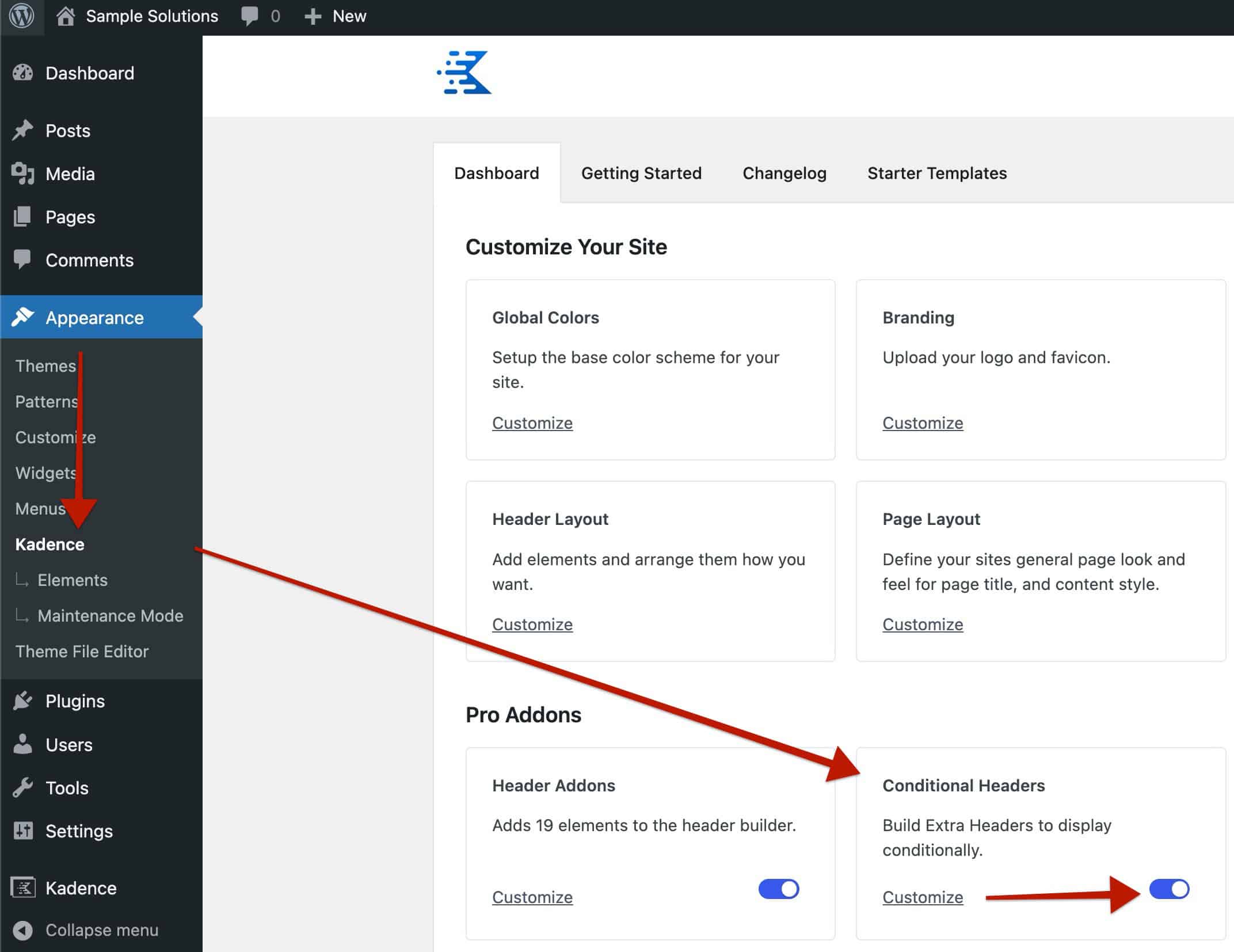
Conditional Headers (Premium)
The Conditional Headers feature, available in Theme Kit Pro, allows you to apply different headers on different posts, pages, and archives based on conditions. This is a premium feature that is available with Kadence Theme Kit Pro. Head over to the Dashboard -> Appearance -> Kadence page and enable the Conditional Headers option.
You can learn more about using Conditional Headers by clicking here.
