
The Row Layout Block significantly improves the column functionality within the new blocks editor. With the Row Layout Block, you can create responsive layouts for your pages and posts easily.
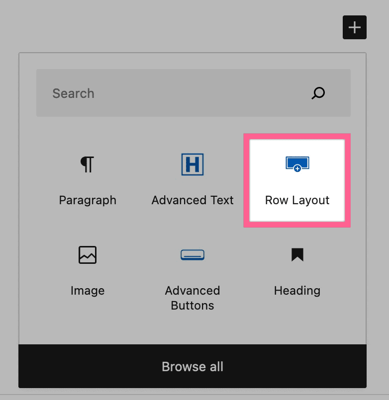
To get started using the Row Layout Block, you can select it from the add block menu.
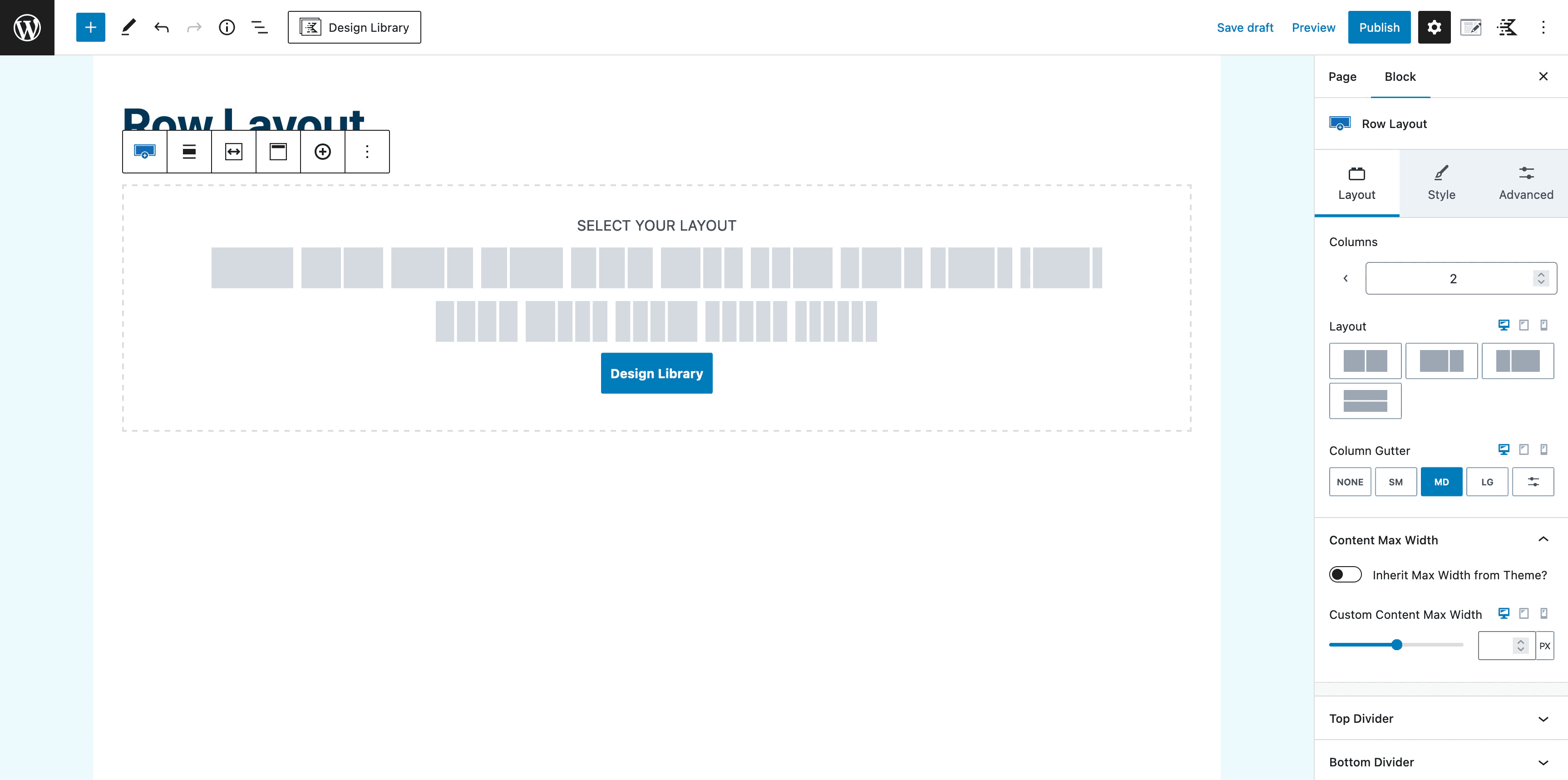
After you select the Row Layout Block, you can set the format of your columns. You can change the number of columns and layout using the settings in the Layout tab.
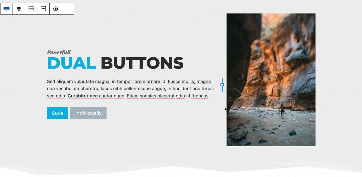
After choosing your preferred layout, you may begin adding blocks to create your content.
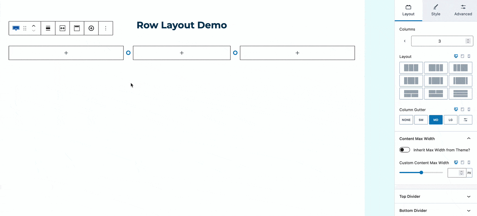
Continue adding blocks until you’re happy with your layout.
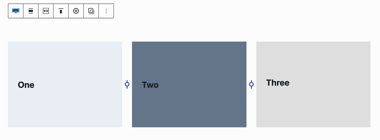
If using a multi-column layout, you can adjust the spacing of your columns by dragging the divider between them.
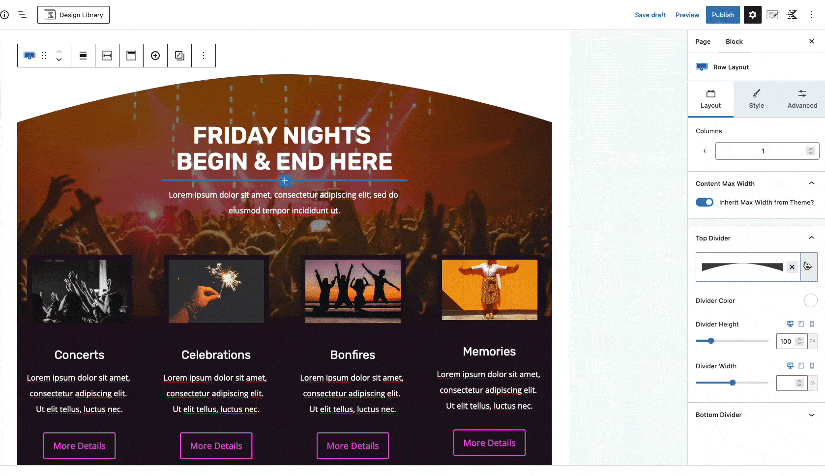
Row Layout Block Settings
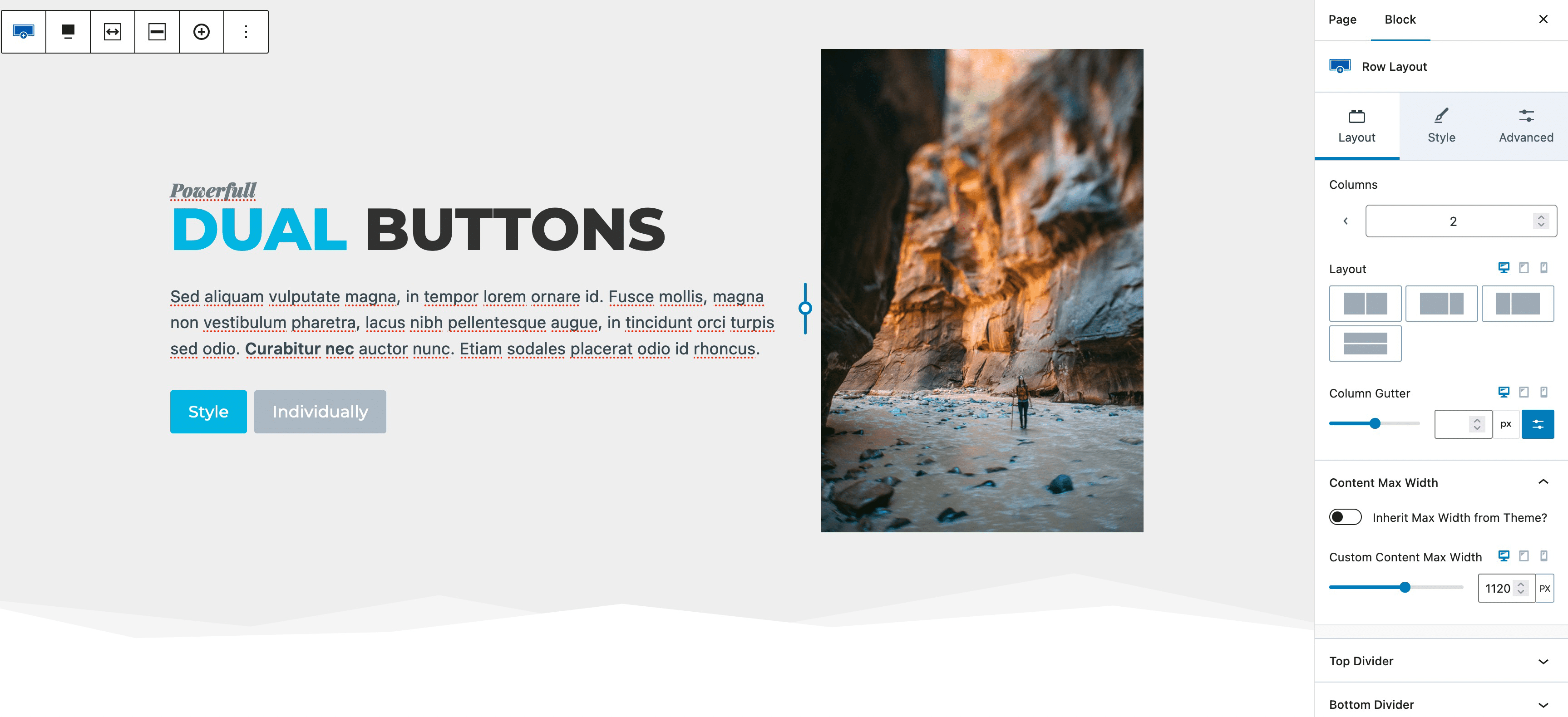
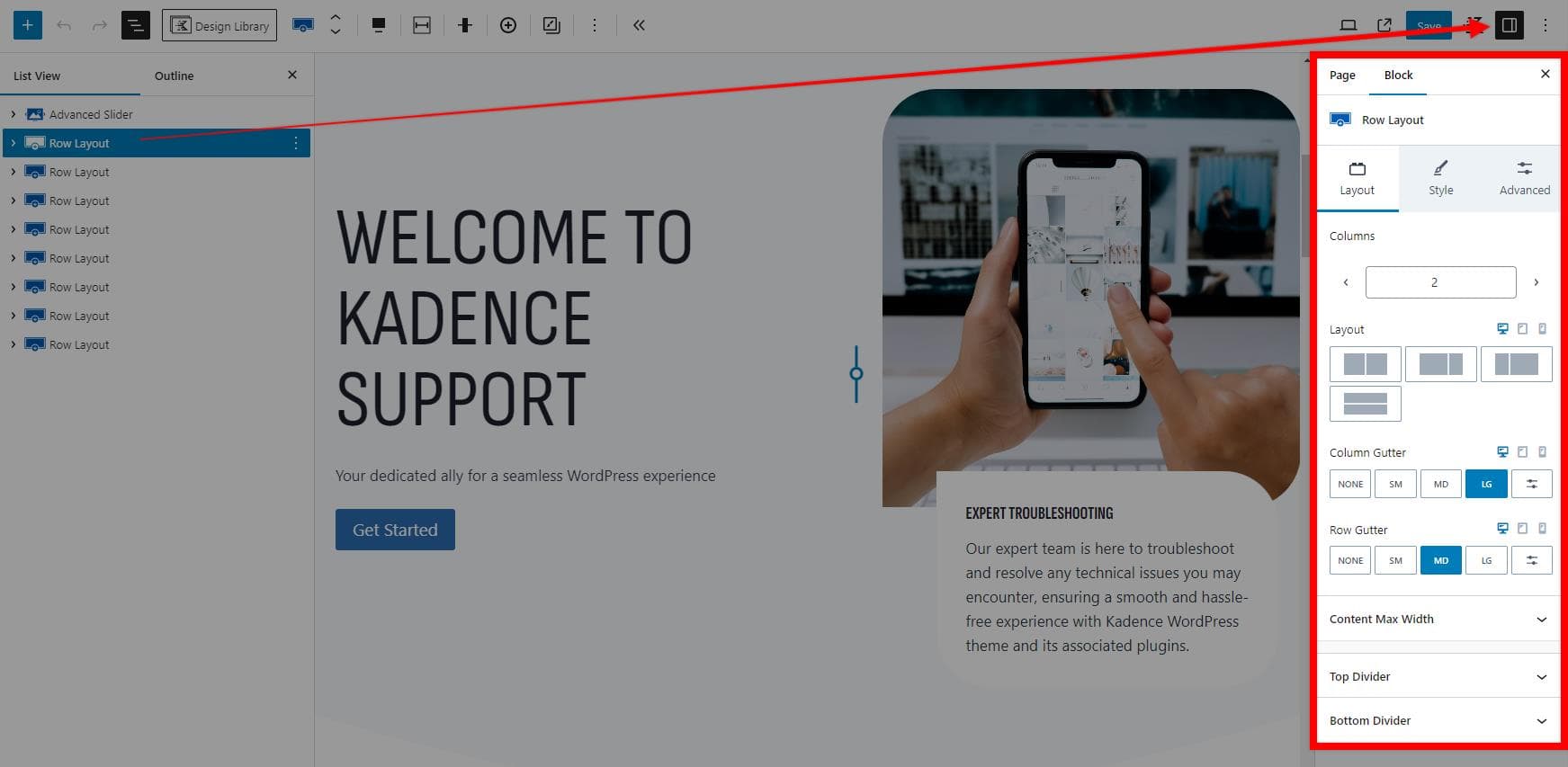
The Row Layout Block Settings allow you to customize your Row Layout Block. You can access the Block Settings by selecting your Row Layout Block and pressing the “Settings” button located by the publish button.
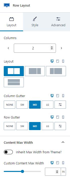
Layout Settings
The Layout Settings allow you to adjust different layout options for your Row Layout Block.
Columns: Use the selector to choose the number of columns for your Row Layout. Note that a maximum of six (6) columns is allowed.
Layout: Choose the layout for your columns based on the number of columns used. The available layouts will be adjusted accordingly. If you use a Single Row Layout, you will also have the option to adjust the Column Widths.
You can learn about setting custom widths in multi-column Row Layout Blocks by clicking here.
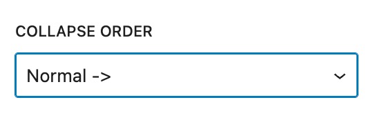
Collapse Order: When using the responsive controls to adjust the layout for tablets/mobile devices, you can choose how sections are ordered. Set this to Normal -> or Reverse <- to control the order in which sections appear on smaller screens.
Column and Row Gutters: The gutter options allow you to set the spacing between your columns and rows.
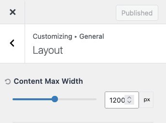
Inherit Max Width From Theme: This setting applies the maximum width specified in the Kadence Theme Settings, which can be configured in the Customizer under General -> Layout Settings.
Custom Content Max Width: Manually set the maximum content width for desktop, tablet, and mobile devices.
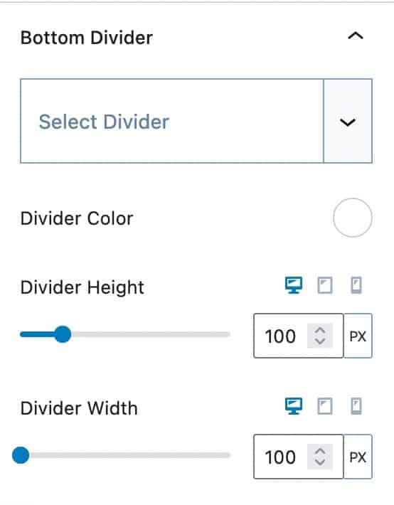
Top and Bottom Dividers: You can add a top and bottom divider to your Row Layout block. Adjust the color, height, and width of each divider to customize the appearance.
Style Settings
The Style Settings allow you to customize various styles of your Row Layout Block.
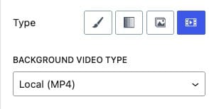
Background Settings: The Background Settings allow you to set a background for your Row Layout block. There are multiple background options available, each with unique settings.
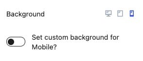
Background: Set a Background for Desktop, Tablet, and Mobile devices. If you click on the Tablet or Mobile responsive icon, you have the option to use a different background for that device type.
You can select from the following Backgrounds:
Classic – Choose a Classic Background by setting a Solid Color or selecting and/or Image.
Gradient – Create a Gradient Background using the Kadence Gradient Color Picker
Slider – Select multiple Images and/or Solid Colors to create a background slider that transitions through each selection.
Video – Set a Video as the Background. (This functionality supports videos but is intended primarily for background visuals, not as a main video player.)
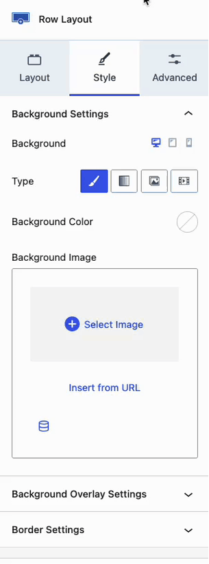
Classic Backgrounds
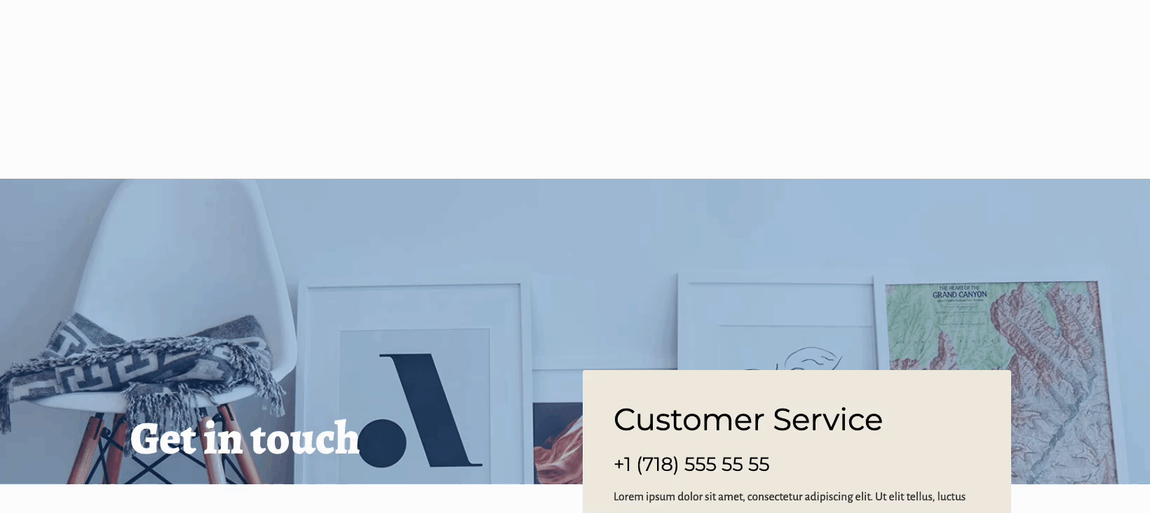
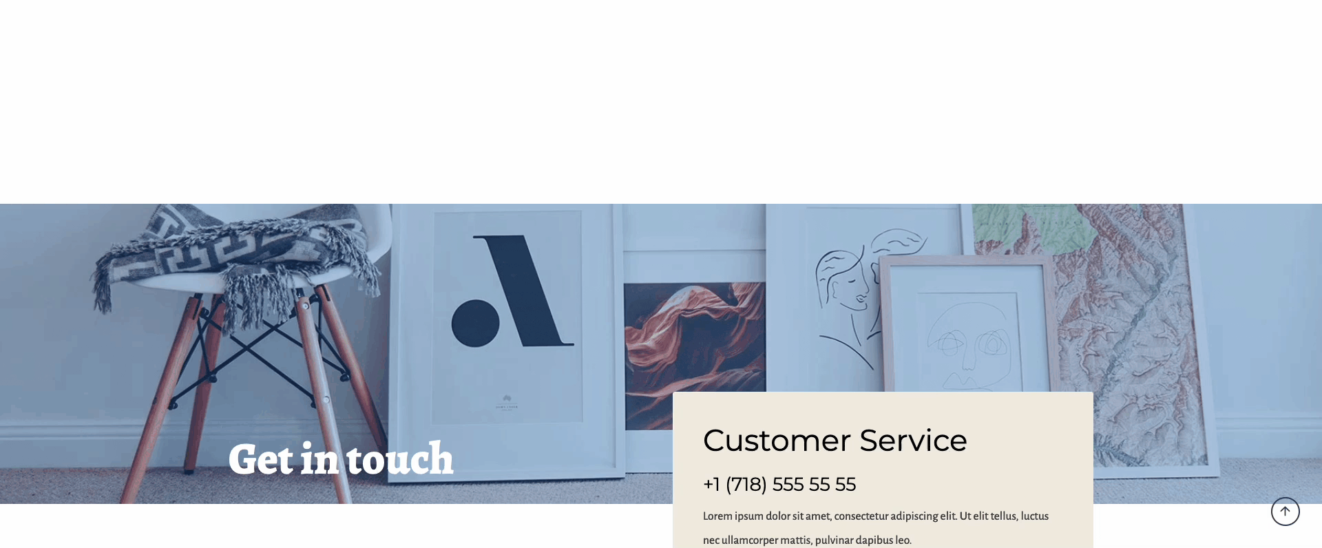
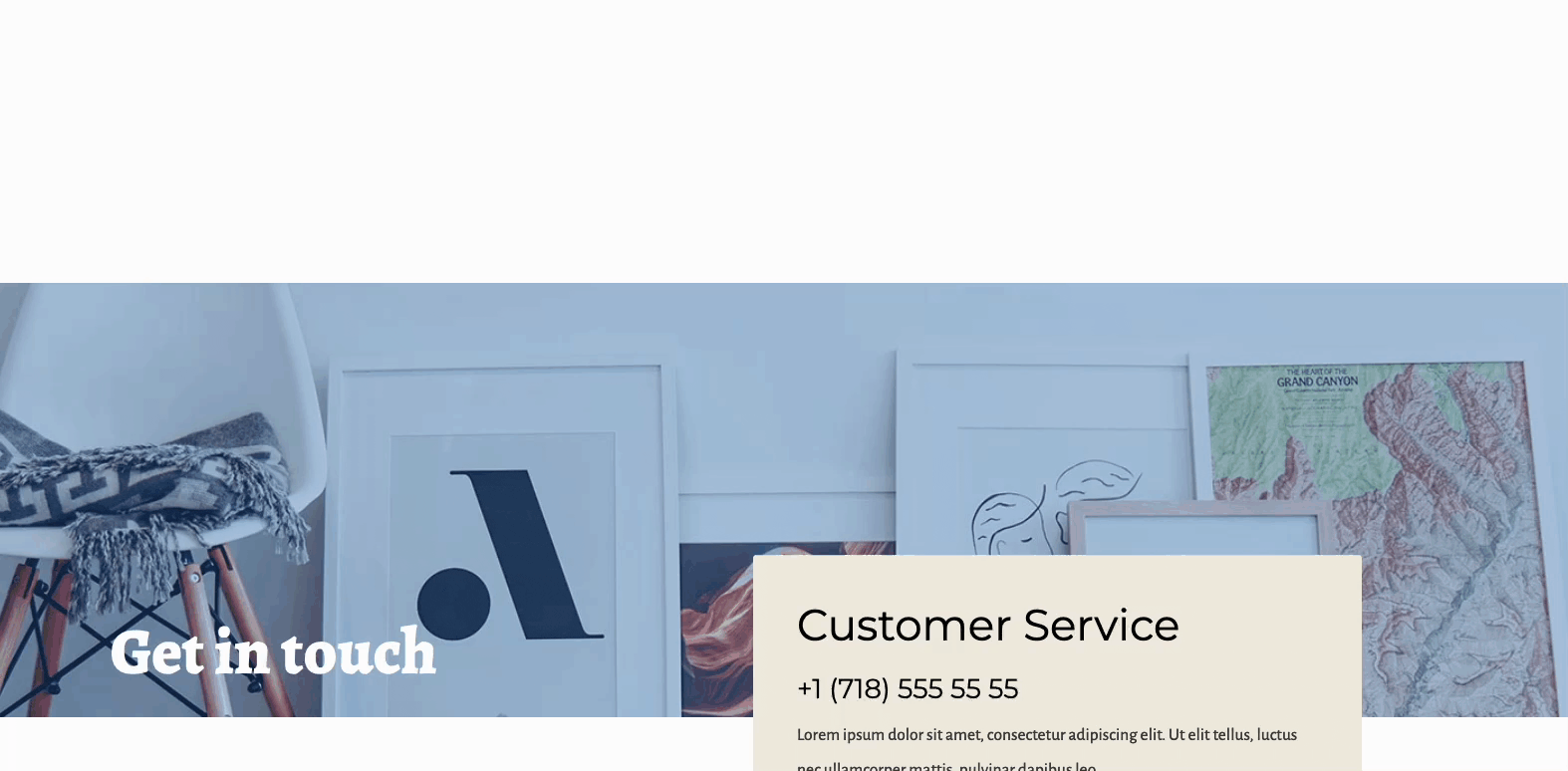
You can use the Classic Background to set a Solid Color and/or an Image as the Row Layout background.
Background Color: This setting provides a Color Picker. You can select a Custom Color or use a Color from the Kadence Color Palette to set it as the background color.
Background Image: This setting allows you to add an Image to the Background. Once a Background Image is uploaded, additional Image Settings will be available.
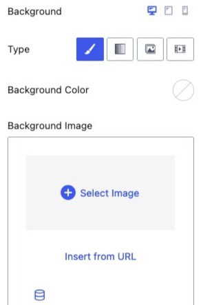
Image Focus: On top of the Image Preview, there is a Grey Circle. This circle can be dragged to the area of the photo that should be focused on. By default, it will be centered.
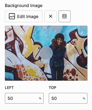
Left and Top: These values refer to the Image Focus. Use these settings to manually adjust the focus by specifying the Left and Top percentages.
Image File Size: Select your preferred Image Size from the dropdown menu, which lists the currently available image sizes.
Background Image Size: Set the Background Image Size to Cover, Contain, Auto, or specify Custom Height and Width values. For more details on each option and how it works, click here.
Background Image Repeat: If you choose a setting other than Cover, your Image may not fill the entire space. In this case, the Background Image Repeat setting will become available. Use this setting to repeat the Image and avoid leaving empty space.
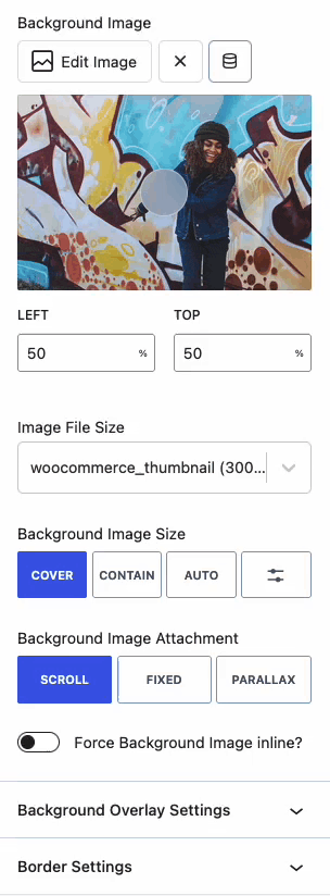
Force Background Image Inline: When enabled, this setting forces the Background Image to be treated as an Inline element, rather than a Block Element. This typically ensures that the Background Image aligns and scales consistently within the container,
Background Image Attachment: This setting determines how the background image behaves as you scroll the page. Below are the available selections.
Scroll: The background image moves with the page content as you scroll. (Regular behavior)
Fixed: The background image remains fixed in place while the content scrolls over it. You can more about Background Image Attachments in general by clicking here.
Parallax: The background image is enlarged and acts like a window. As the user scrolls up or down, more of the image is revealed, creating a depth perspective effect.
Note: Image Focus does not work when Parallax is enabled. This is because the JavaScript that powers the parallax effect dynamically handles the image position as you scroll, revealing more of the image. As a result, any manual background position settings will be overridden.
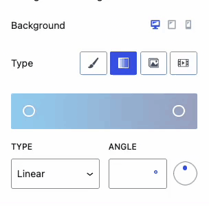
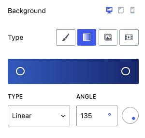
Gradient Backgrounds
Gradient Picker: Use the Gradient Picker to select colors and define the points of transition. By default, there are two preset circles: the first circle represents the starting color, and the second circle represents the ending color. Click anywhere within the Gradient Picker to add additional colors and adjust the gradient transitions.
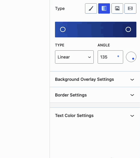
Type: The Gradient can be set to either Linear or Radial.
Angle: Set the Angle for the gradient by entering a value. You can also use the circle on the right side of the Angle setting to adjust the angle by dragging.
Slider Backgrounds
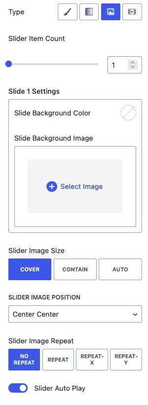
Slider Item Count: Use this setting to add or remove slides from the Background Slider.
Slide Settings: Each slide can have either a background color or a background image. You can mix and match these settings and adjust them on a slide-by-slide basis. There will be Slide Settings for each Slide in the Slider Item Count setting.
Slider Image Size: Set the image size for each slide to Cover, Contain, or Auto.
Slider Image Position: Use this setting to adjust the position of the background image within each slide.
Slider Image Repeat: If using Contain or Auto for the image size, this setting adjusts how the background image repeats within the slide.
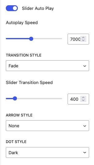
Slider Autoplay: This setting enables the Background Slider to automatically transition through the slides.
Autoplay Speed: Adjust the speed at which the slides transition automatically when autoplay is enabled. A higher number results in faster transitions.
Transition Style: Set the transition style between slides. Options include Fade or Slide.
Arrow Style: By default, arrows are set to None. When enabled, navigational arrows will appear for switching slides. Choose from White on Dark, Black on Light, Outline Black, Outline White, or None.
Dot Style: Below the slider, dots indicate the current slide. Adjust the dot style to Dark, Light, Outline Dark, Outline Light, or None.
Video Backgrounds
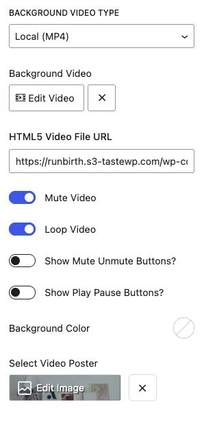
Background Video Type: You can choose from multiple video types for your background. Use a Local Video by uploading it to the Media Library or using an HTML5 video file URL. Additionally, YouTube and Vimeo videos can also be used.
The Video Background feature is designed for decorative purposes to enhance designs. While it does offer basic controls like pause and mute, it’s not a full video player and isn’t meant for delivering primary playable or interactive video content. For a full-on video player, consider the Video Popup Block available in Kadence Blocks Pro.
Local (MP4) Video Settings
Mute Video: This setting automatically mutes the video.
Loop Video: This setting loops the video continuously.
Show Mute/Unmute Buttons: This option determines if the mute and unmute buttons will be visible on the front end.
Show Play/Pause Buttons: This option determines if the play and pause buttons will be visible on the front end.
Background Color: Set a background color for the video. This color may be visible before the video fully loads, so choose a relevant color to ensure a smooth visual transition.
Video Poster: Set a video poster image. This image is displayed behind the video and will be visible before the video fully loads on the page.
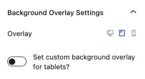
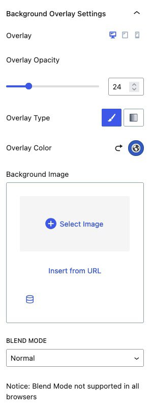
Background Overlay Settings
Overlay: The background overlay can be set differently for desktop, tablet, and mobile devices. Select the Mobile or Tablet Icon to enable this option.
Overlay Opacity: Adjust this value to increase or decrease the overlay opacity.
Overlay Type: Overlays can be set as standard colors or gradients.
Background Image: Set a background image to overlay the main Row Layout background. Once an image is selected, additional background image settings will be available.
Blend Mode: The blend mode determines how the overlay blends into the background. Note that blend mode is not supported in all browsers.
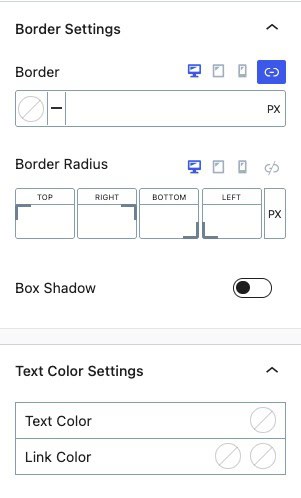
Border & Text Color Settings
Border: Define a color and border width.
Border Radius: If using a border, use this option to add a border radius for rounded corners.
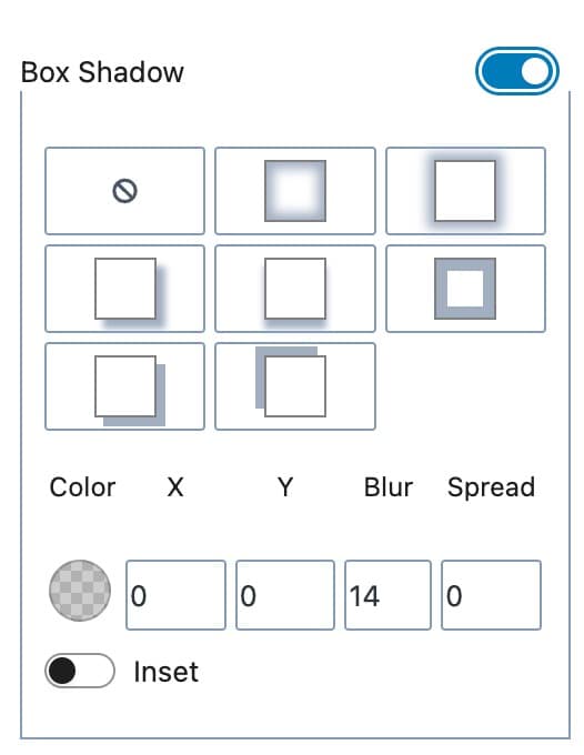
Box Shadow: Enable this option to add a box shadow to the Row Layout block.
Text Color Settings: These settings apply to the inner text within the Row Layout block. The text color can be set for general text, while the link color can be set for both the initial and hovered states.
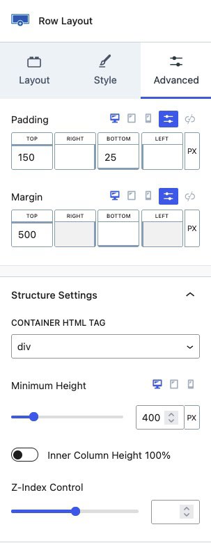
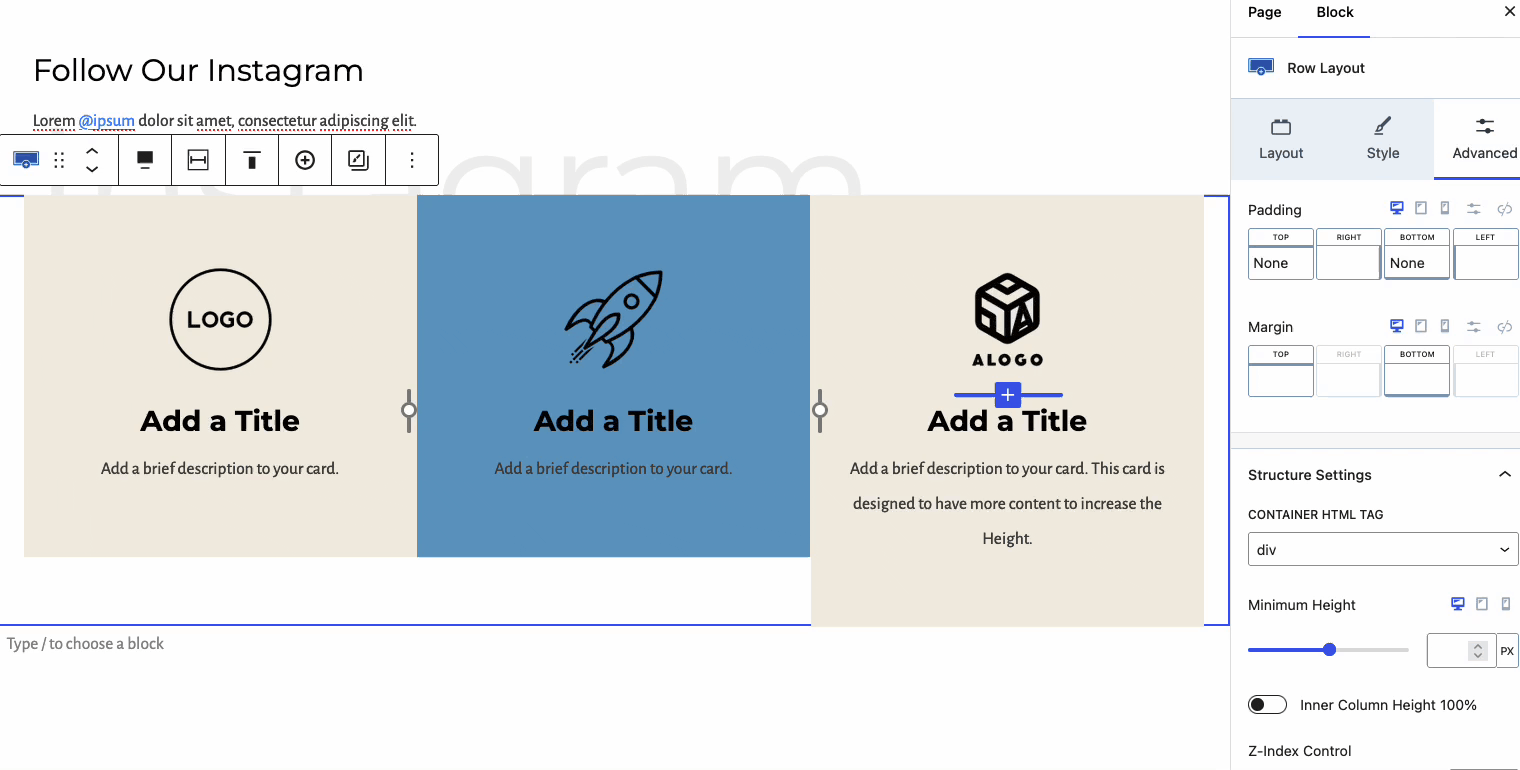
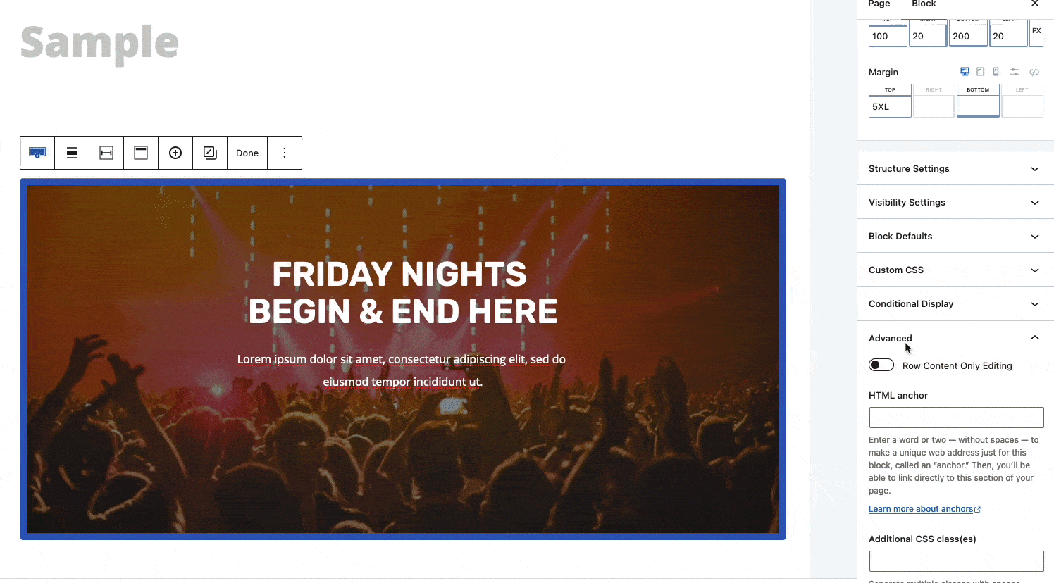
Advanced Settings
The Advanced Settings allow you to adjust advanced settings such as spacing, structure, visibility, and more.
Padding: Add padding spacing to your Row Layout block.
Margin: Add margin spacing to your Row Layout block.
Container HTML Tag: Control the HTML element tag used for the Row Layout block. By default, this is set to Div, but it can be changed to other tags. Available selections are Div, Section, Article, Footer, Header, Main, or Aside.
Minimum Height: Assign a minimum height to the Row Layout block container.
Z-Index Control: Control the Z-index of the Row Layout block.
Inner Column Height 100%: This setting forces all inner sections to be the same height as the tallest section. See the example below.
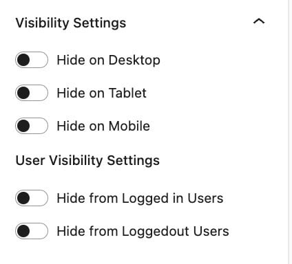
Visibility Settings
You can control when a block is visible on different devices using visibility settings. By default, the block will be displayed on all devices, but you can choose to hide it on desktop, tablet, or mobile by turning on the corresponding switch.
Additionally, there are options to control visibility for logged-in and logged-out users, allowing you to display content based on user status.
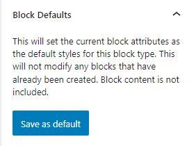
Block Defaults
Sometimes, you need to add a block many times and need them to have identical styles. In these cases, you can save the block’s current settings as default settings for new blocks of the same type. For example, if you use the Advanced Text block throughout your content, you might find it helpful to save default settings so that new Advanced Text blocks have them by default.
Kadence blocks have a Block Defaults section under the Advanced tab in the block settings. After you adjust the settings to the desired defaults, find the Block Defaults section and click the button that reads Save as Default.
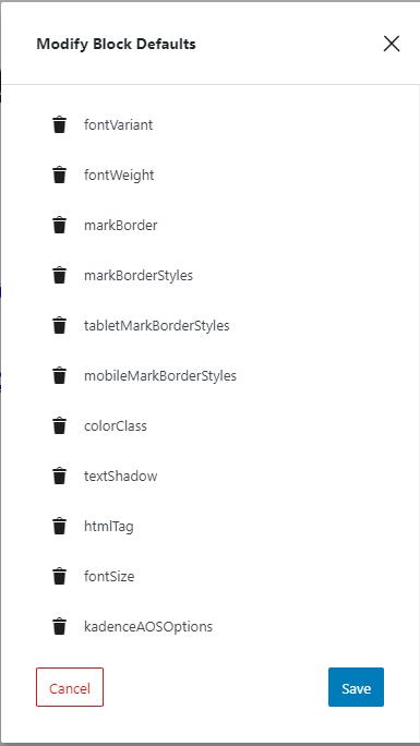
After clicking the button, you will find two new links in the section to Modify Attributes and Reset Defaults. If you choose to Modify Attributes, you can delete the default settings individually. If you choose to Reset Defaults, all the default settings are removed.
Remember, the default settings only apply to newly added blocks, not existing blocks.
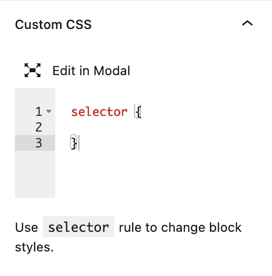
Custom CSS
With the Custom CSS setting, you can incorporate CSS directly into the Row Layout Block. The “selector” pertains to the Row Layout and doesn’t require modification. Nonetheless, you can lengthen the selector to suit your CSS needs.
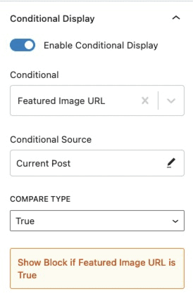
Conditional Display (Pro)
The Conditional Display setting allows you to display the block based on a condition. This is also a Kadence Blocks Pro feature.
Check out our post here for more details about the Conditional Display options.
Advanced
The Advanced settings allow you to enable Row Content Only Editing, set an HTML anchor, and add custom CSS class(es) to your Row Layout Block.
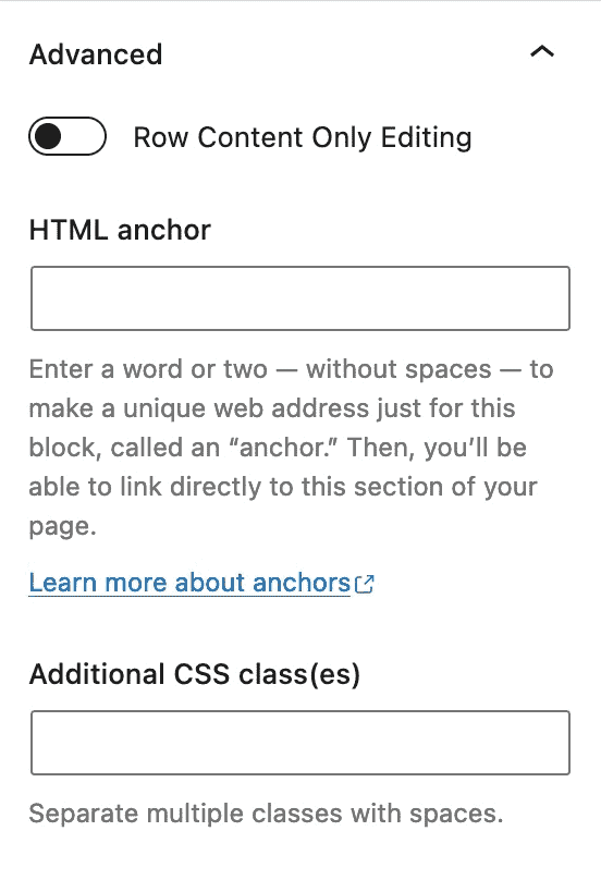
Row Content Only Editing: This setting will replace the block settings with a content selector. You can select your Row Layout Block and press on Modify to get back to your Block Settings.
