
When you require a custom query design, the Advanced Query Loop Block is the perfect solution. This block combines all of the standard Kadence customization features, enabling you to create stunning advanced queries on your website. You can display different post types, add filters, and even search through the query with ease.
Getting Started
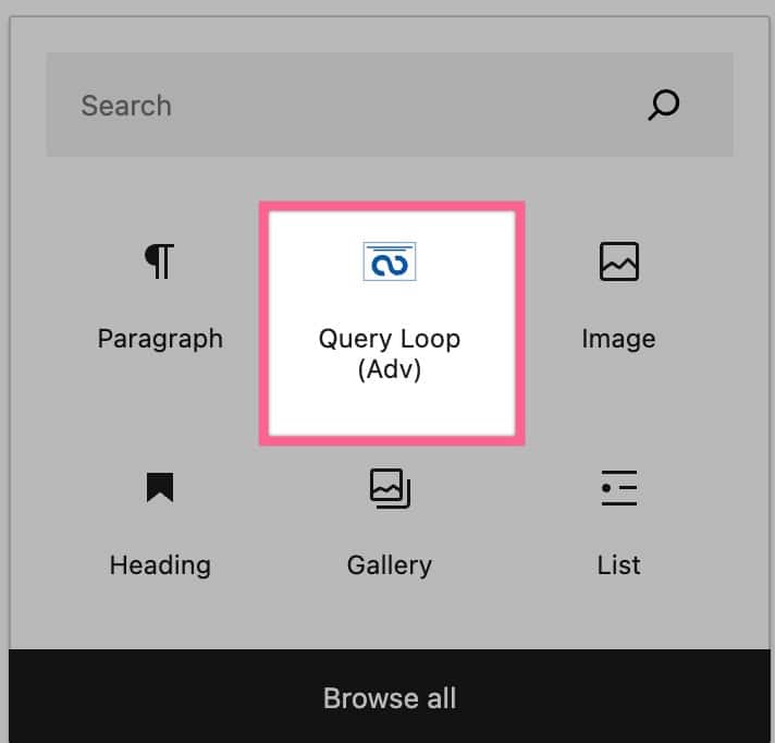
You can get started with the Advanced Query Loop Block by adding a new Query Loop (Adv) Block to your page or post.
Query Loop
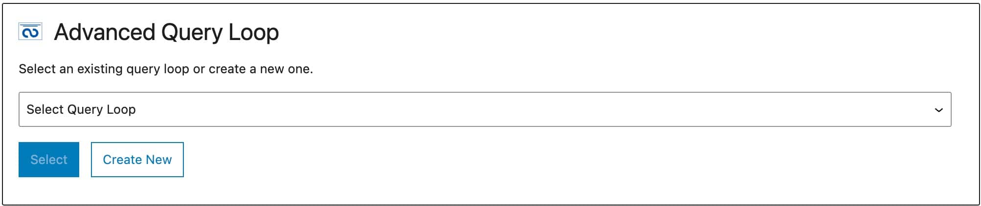
You can create a new Query Loop or use an existing one if you already have one created. Each time you create a new Query Loop, it will be automatically added to your “Select Query Loop” dropdown menu. To create a new Query Loop, click the Create New button.
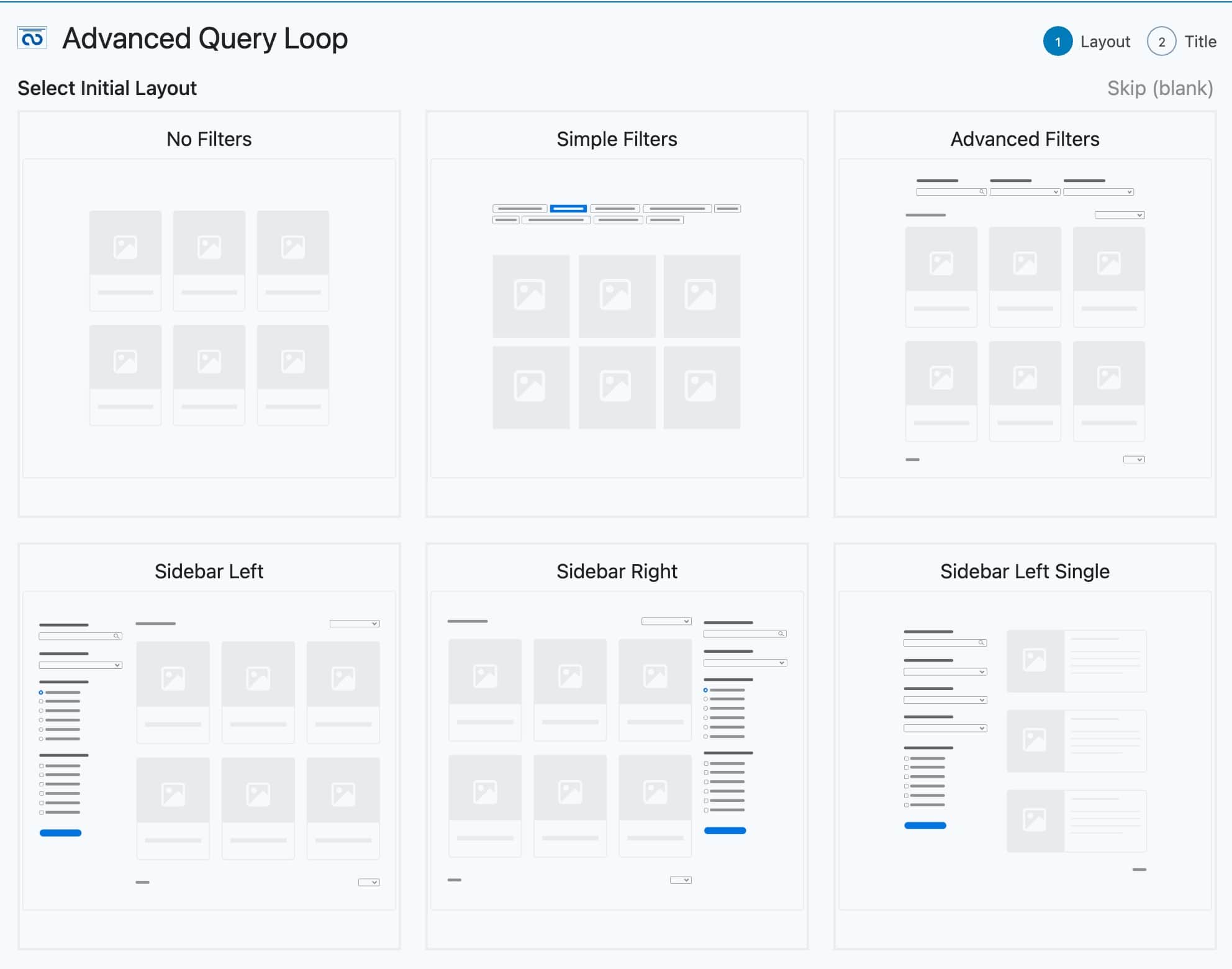
Whenever you create a new Query Loop, you will be prompted to select the Initial Layout.
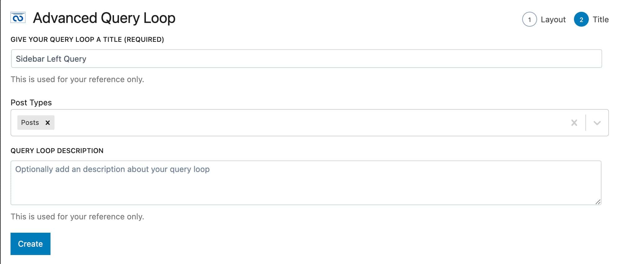
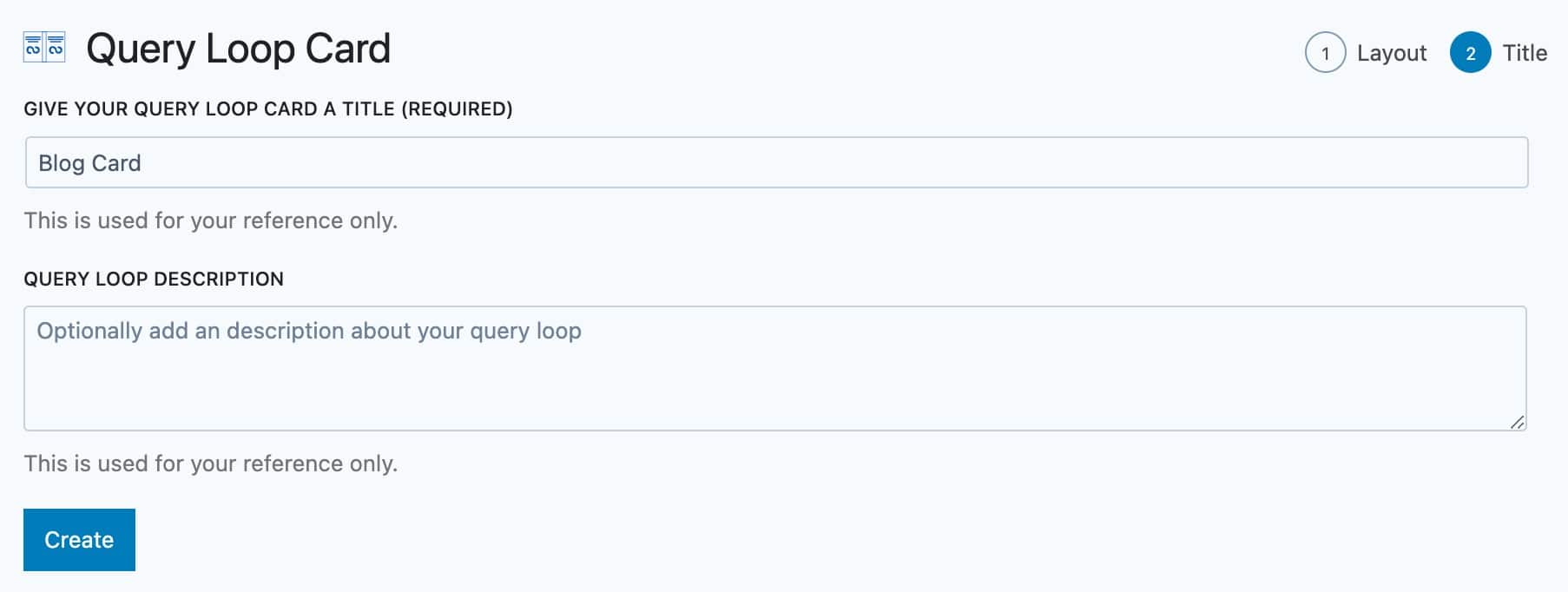
Then, you can select a Query Loop Title, which Post Types you’d like to display, and a Query Loop Description. You can select multiple post types, including Custom Post Types. Then, you can press the Create button to create your Query Loop.
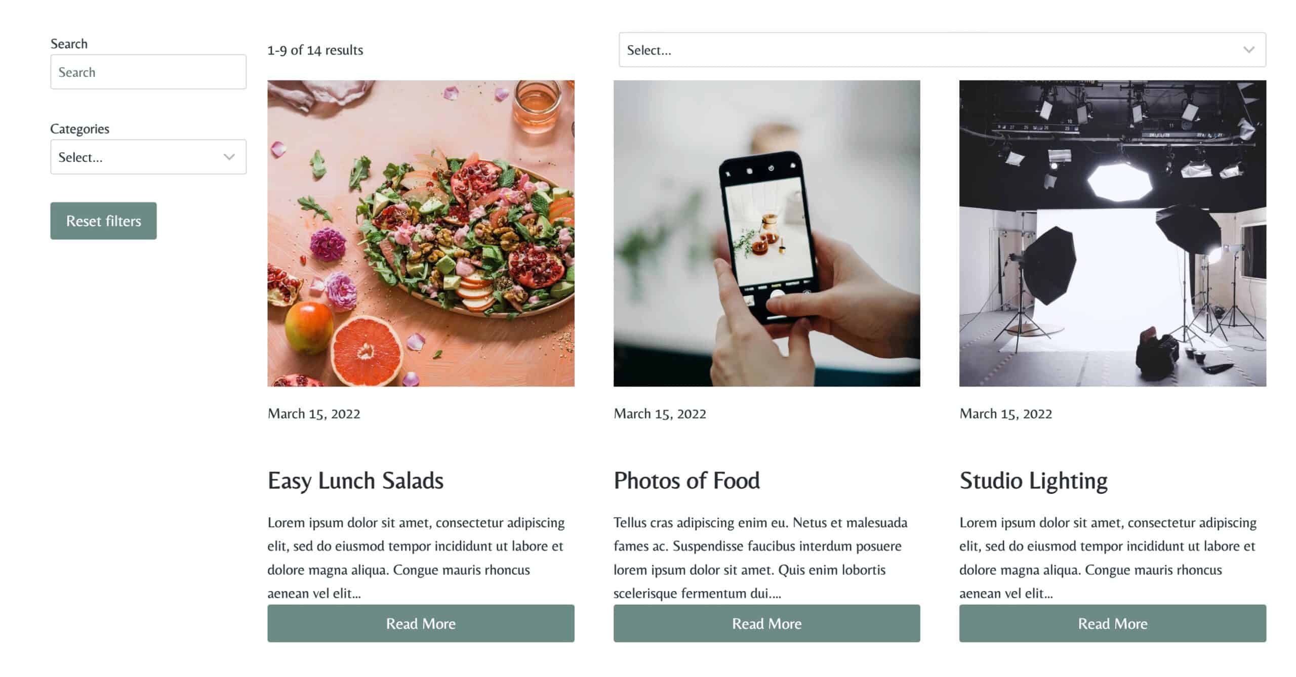
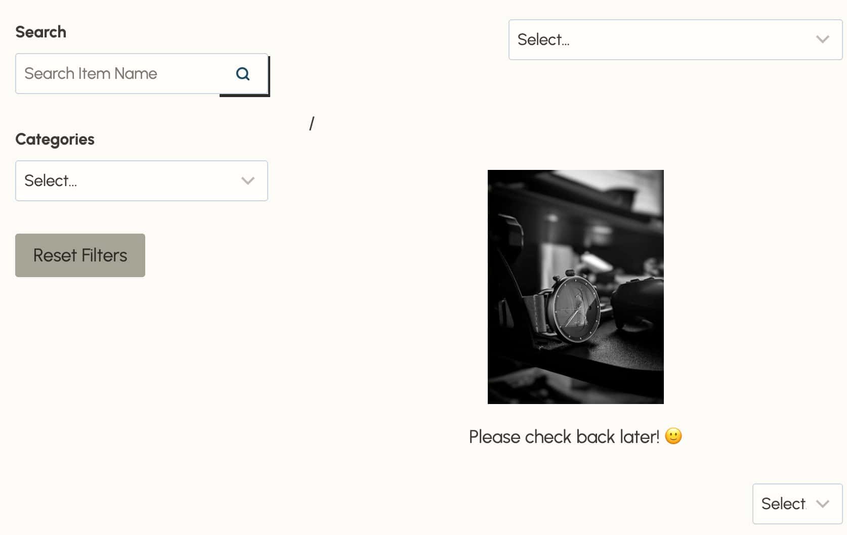
Once your Advanced Query Loop (Query Loop Adv) Block is added, you can insert additional blocks inside the loop to customize your layout. This includes standard Row Layout, Text, Section, and other blocks. You can also include Kadence Filter Blocks to provide advanced filtering options for your content.
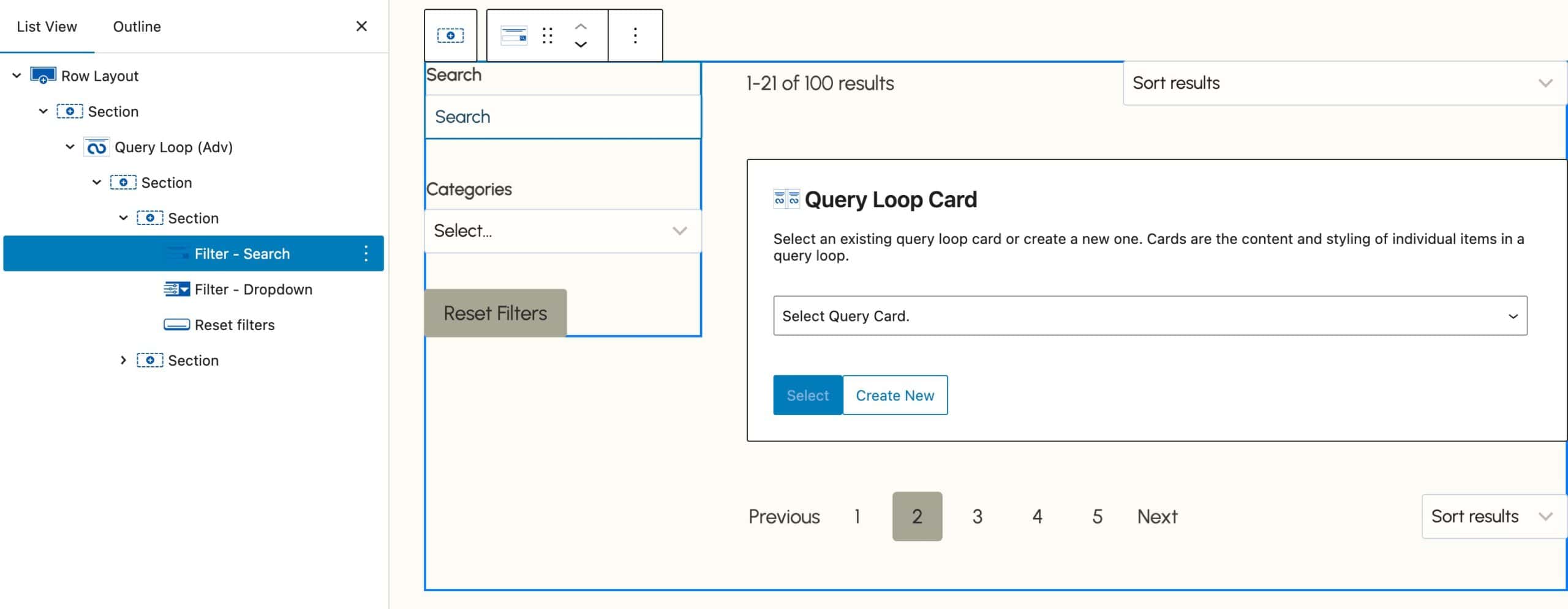
The Query Loop Adv Block also features a No Results Block, which allows you to display custom content whenever the query returns no results based on your filter selections.
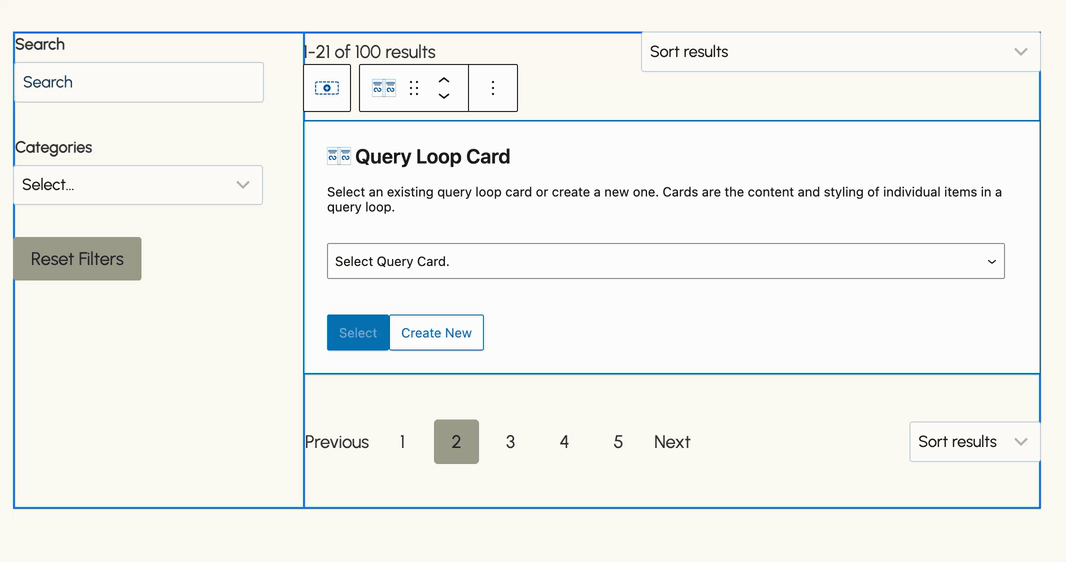
The Query Loop (Adv) Block offers various other blocks, such as the Pagination and Result Count Block. You can learn more in the Filter Blocks section below.
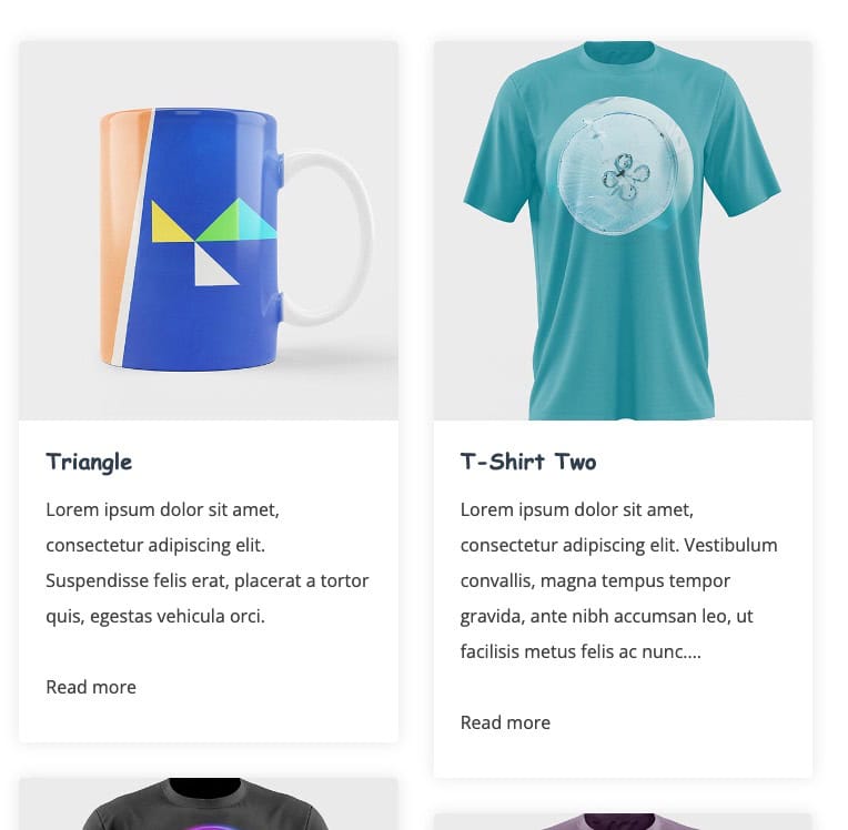
Query Loop Card
After creating your Query Loop, the next step is to create a new Query Card or select an existing one. To create a new Query Card, simply click on the Create New button. You can select existing Query Loop Cards using the Select Card dropdown menu. You can also select an Element or a Woo Template as a Query Loop Card source instead. This allows you to use Template Elements and Product Loop Woo Templates for your Query Cards.
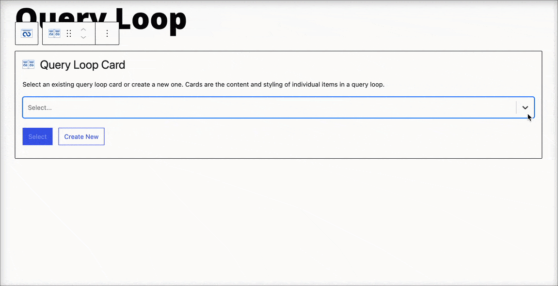
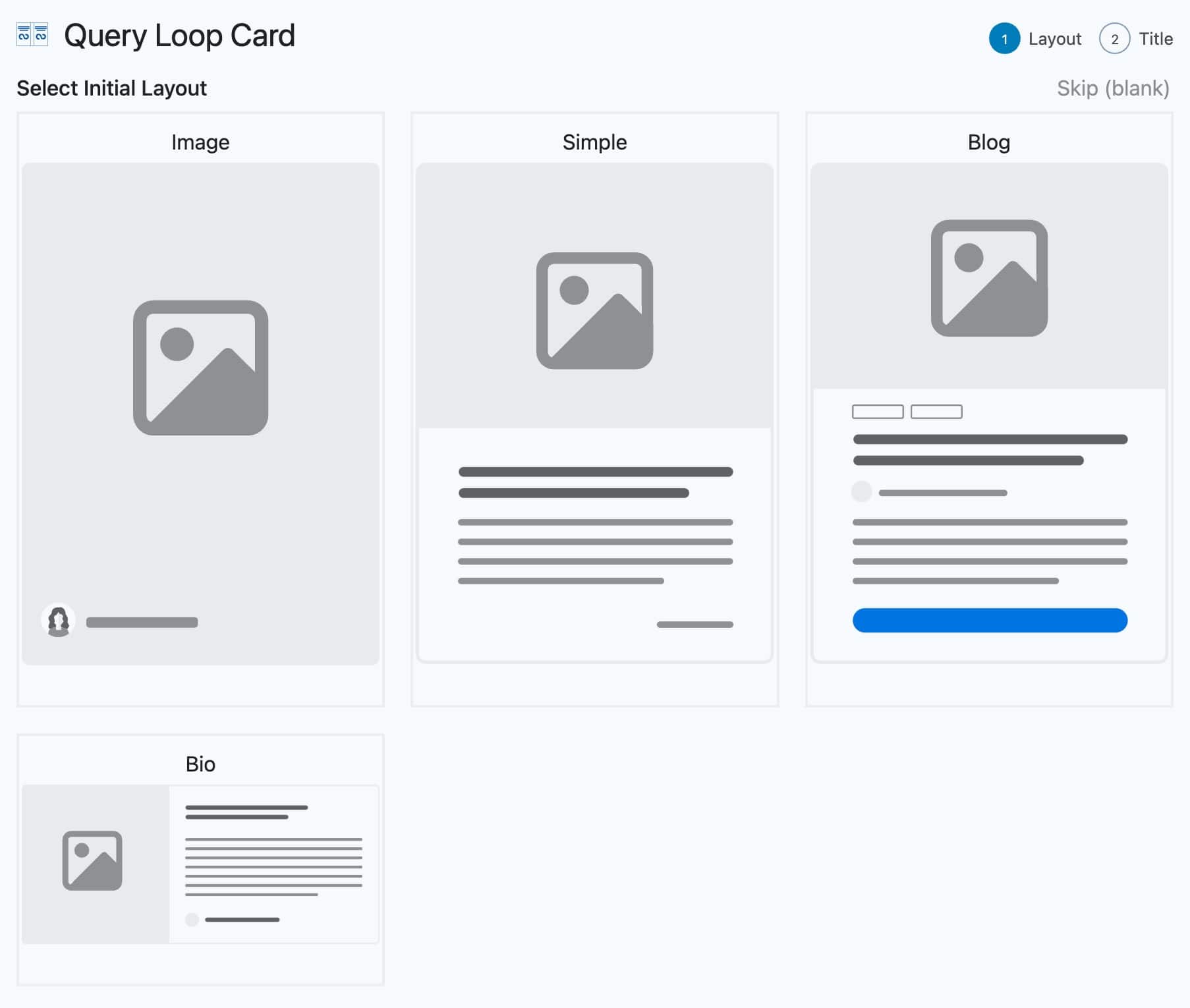
If you select the Create New option, you can then select the Query Loop Card Initial Layout. If you do not want to use an initial layout, you can press the Skip (Blank) link at the top right of the Query Loop Card selection.
Finally, you can add a Query Loop Card Title and a Description to the Query Loop Card. Whenever the Query Loop Card first loads in the Editor, it may appear not to load all of the content. Kindly wait a few seconds to allow the Dynamic Post Titles, Images, etc. to load.
That’s it! Now, you should have a Query Loop displaying based on the options you have selected.
Whenever editing the Query Loop in the Editor, you will also want to give the Blocks a few seconds to properly register all of the Dynamic Content in your Query Loop (Adv) Block. This ensures that you will see your Query Loop properly when editing the page that contains it.
Notes
-The Query Loop (Adv) Block cannot access Indexing on Password Protected Pages.
-If you have any issues related to Filtering and Ajax, ensure that your Firewall and Server do not have anything blocking requests for admin-ajax.php.
-When using Custom Posts, the Custom Post must have Publicly Queryable set to True for Query Loop (Adv) Blocks to display the posts on the Front End.
Duplicating Query Loops and Cards
Query Loops and Query Cards are saved as Custom Post Types (CPTs). This means that if you use the same Query Loop or Card in multiple places across your site, any changes you make to one will automatically apply everywhere that specific loop or card is used. When selecting a Query or a Query Card within a Query Loop (Adv) block, it is important to understand this synchronization.
If you want to have two Advanced Query Loop blocks with different settings or display conditions, consider using the duplication feature (Built into Blocks Pro). That way, you can customize each version independently without affecting the other.
You can duplicate Query Loops by going to Dashboard -> Kadence -> Queries, and Query Cards by heading to Dashboard -> Kadence -> Query Cards. Just hover over the item you want to duplicate and click the Duplicate button to get started.
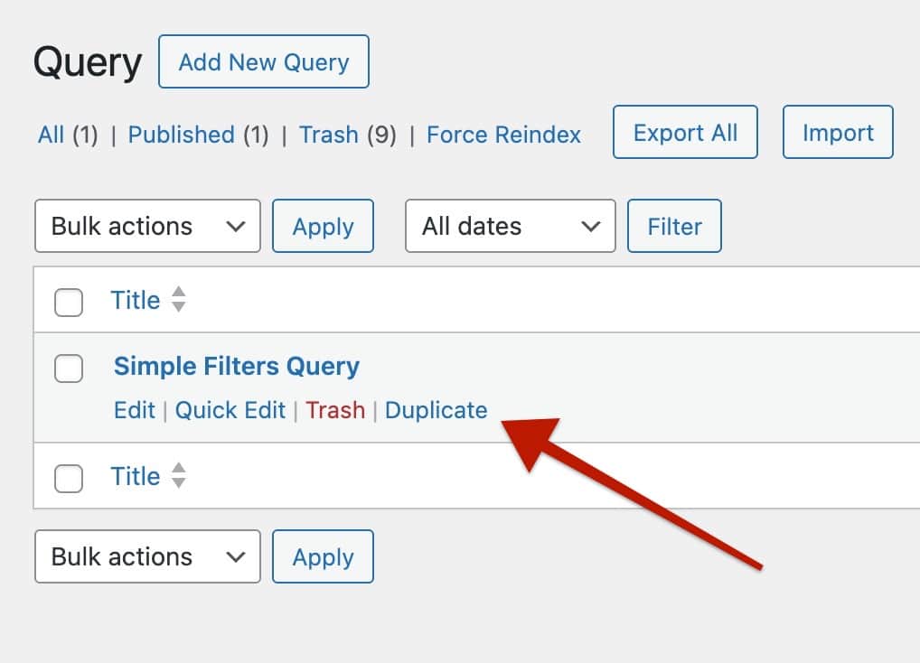
Once duplicated, you can rename it to something unique, then apply the changes you need. After saving, you’ll be able to use it separately from the original; no need to rebuild the entire query or card from scratch. This makes it much easier to create variations without starting over.
How Adv Query Loops and Cards Work
Each Query Loop (Adv) Block and Query Card functions as a Custom Post Type within Kadence.
You can use Query Loop (Adv) Blocks across your website and they remain synchronized. Any changes made to a Query Loop will automatically update all instances of that Query Loop. For instance, modifying the category terms of a Query Loop in one location will reflect across all instances of that Query Loop. To create multiple Loops with distinct settings, it’s advisable to create a completely new Query Loop for each scenario. You can access and manage current Query Loops on your website through Dashboard -> Kadence -> Queries.
Similarly, Query Cards operate in a parallel manner. Changes made to a Query Card will affect all instances of that particular Query Card. These cards dynamically display content, adapting to the current Query. So the same Query Card can also be used across multiple Query Loops at the same time as long as you wish to display the same layout and have the same content to dynamically display. You can access and manage current Query Cards on your website through Dashboard -> Kadence -> Query Cards.
Block Settings
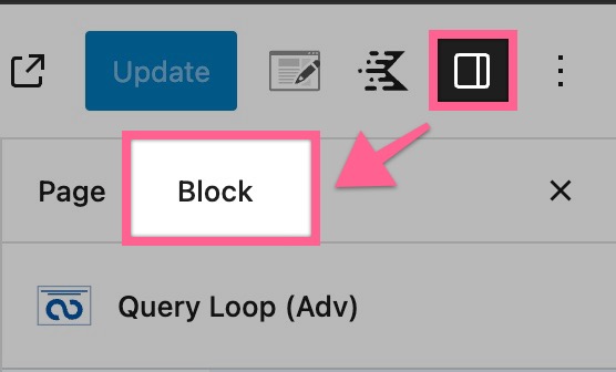
The Advanced Query Loop Block and Query Loop Card Block can be customized using the Block Settings. When using the Advanced Query Loop, you can also add Filter Blocks. Each of these blocks can also be customized through the Block Settings. You can access the Block Settings by selecting your Block and clicking on the Block Settings Icon.
Query Loop (Adv) Block
The Query Loop (Adv) Block is the main Parent Block for the Query Loop. All other Query Loop-related blocks will be nested inside the main Query Loop (Adv) Block.
General Settings
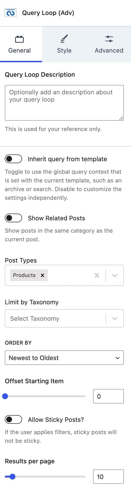
The first General Setting is the option to modify or add a description about your query loop to the Query Loop (Adv) Block.
You can enable or disable the option to Inherit a Query From the current Template. For example, an archive or a search template. If you want to use the global query context (Default Loop Layout) instead of custom settings, you can enable this option.
You can use the Query Loop (Adv) Block to display Related Posts. You can enable or disable the option Show Related Posts. This shows posts that are in the same category as the current post. This option may remove the remaining settings for post-selection since it will use the related posts context. Note: this feature only works for posts and WooCommerce products.
You can select which Post Types you’d like to display in the Query Loop by using the Posts Types dropdown selection. You can select multiple posts.
You can also limit your Post Types based on a Taxonomy. You can select a taxonomy type, and then the taxonomies that apply.
The Order By option allows you to select in which way you would like to order your post types. (Newest to Oldest, Oldest to Newest, Modified Ascending, Modified Descending, A – Z, Z – A, Menu Order, Menu Order (Reversed), Custom Field, Custom Field (Reversed), or Random)
Notes:
- The Menu Order options don’t apply to standard posts. The Menu Order is provided on Pages by default, and some CPT may also have this option. However, posts do not offer this attribute by default.
- The Custom Field options are for those that you added using a code snippet or plugins like ACF or MetaBox.
Selecting this option will give you 2 more options:- Custom Field Key: The field’s key (name).
- Custom Field Data Type: Either a Text, Number, or Date
You can set an Offset Starting Item to offset a specific amount of posts from showing.
You can enable the Allow Sticky Posts option to enable sticky posts. If you apply filters, then sticky posts will not be sticky.
You can set the results per page to limit your query results per page.
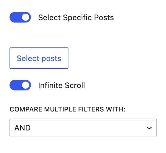
You can enable the option Select Specific Posts to select individual posts. Then, you can click on the Select Posts button to select the posts you’d like to display.
You can use the Infinite Scroll option to enable or disable your Query Loop (Adv) Block from using an infinite scroll.
You can use the Compare Multiple Filters With option to set your filters to compare by either and/or. This would mean whenever you have more than one filter, it will either compare the filters by and or by or.
Example and comparison: The product has both Filter A and Filter B.
Example or comparison: The product has either Filter A or Filter B.
Style Settings
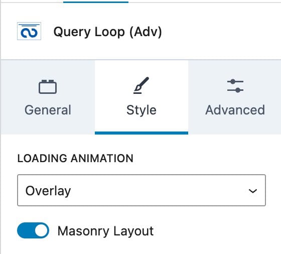
Loading Animation
This will determine the animation applied while the post results are loading. The options are:
- Overlay
- Loader
- Flip
- Cover
- Shrink
- None
Masonry
When this option is enabled, the Query Loop (Adv) Block will display in a masonry layout.
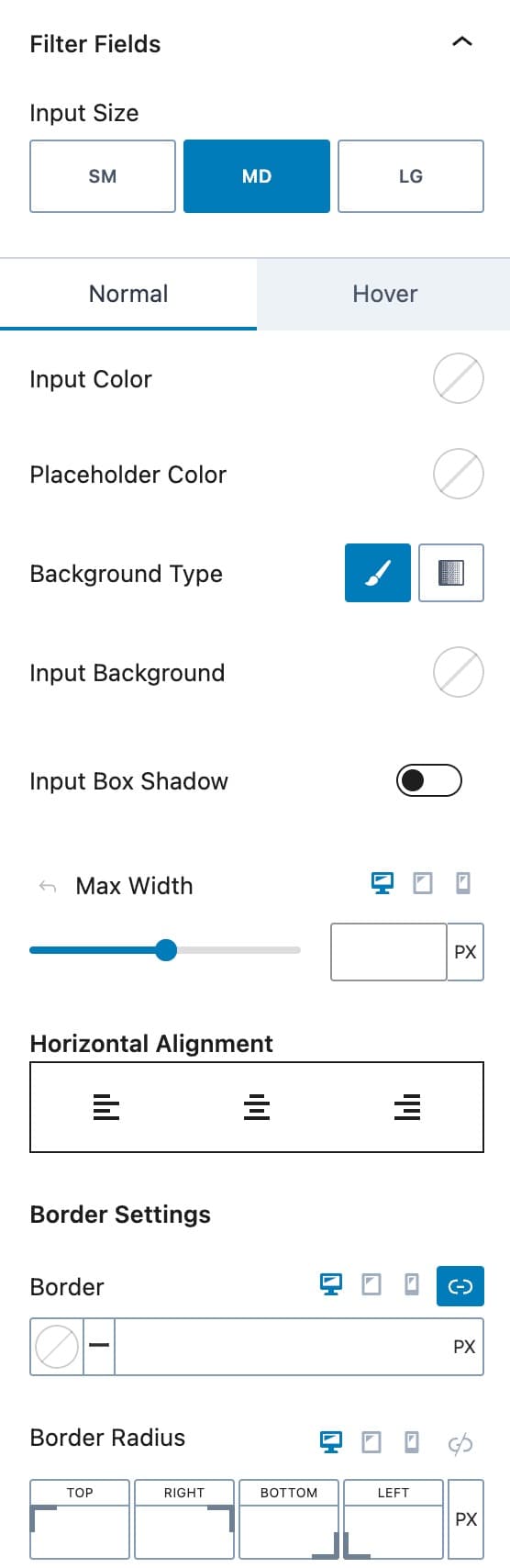
Filter Fields
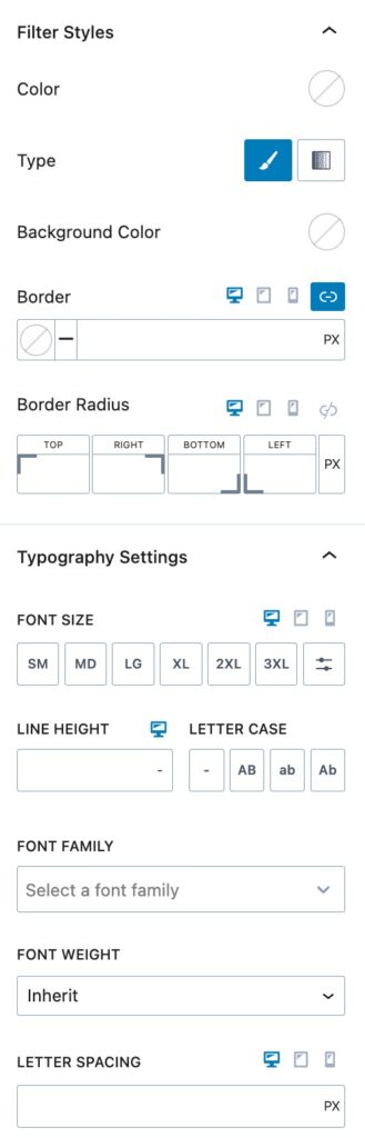
You can use the Filter Fields Settings to adjust the Field Styles for your Filter Blocks within the Query Loop (Adv) Block. This can also be done on each individual filter block in their respective Style Block settings.
The Input Size option allows you to set the Input Sizes as Small, Medium, or Large.
The Normal and Hover selections allow you to style your Inputs in the Normal and Hover States. You can select the Input Color and the Placeholder Color for both states.
You can also set a Background Type. This can be a Solid Color or a Gradient.
You can select the Input Background Color. You also can enable and use an Input Box Shadow.
The Max Width option allows you to set a Max Width for Desktop, Mobile, and Tablet Devices.
You can use the Horizontal Alignment option to set an Alignment on your Filter Fields.
You can set a Border Color and Size for Desktop, Tablet, and Mobile Devices using the border options.
Below the Border Options, you will be able to set the Border Radius for Desktop, Tablet, and Mobile Devices.
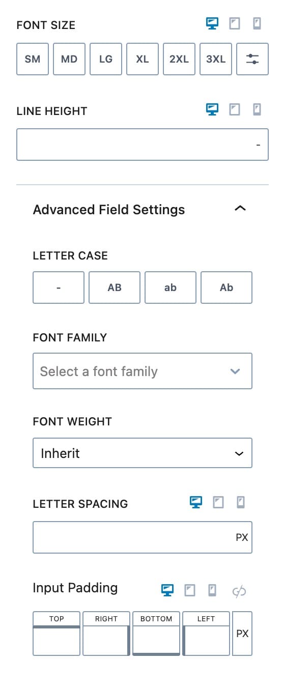
Additionally, you can set the Font size and Line Height on the filter labels for Desktop, Tablet, and Mobile Devices.
Advanced Field Settings
You can expand the Advanced Field Settings to customize more advanced options for the Filter Fields.
You can set a LetterCase effect to your Filter Fields.
You can also set the Font Family and Font Weight for the Filter Fields in the Adv (Query) Block.
You can add an Input Padding for Desktop, Tablet, and Mobile Devices.
Filter Labels
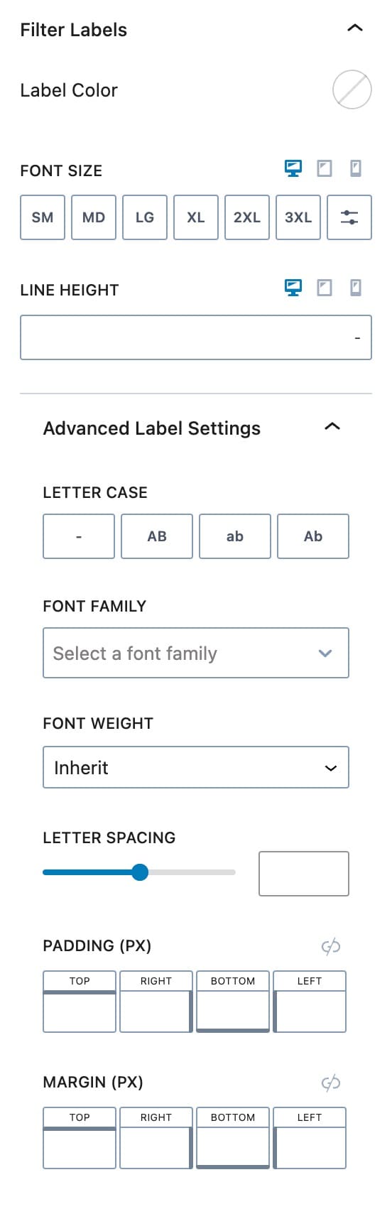
You can also customize the Field Labels for your Filter Blocks. These settings will apply to all of the Filter Block Labels inside your Query Loop (Adv) Block.
You can set the Label Color using the Label Color option.
You can set the Font Size and Line Height for the Label for Desktop, Tablet, and Mobile Devices.
Advanced Label Settings
You can use the Advanced Label Settings to further customize your Query Loop Filter Labels.
You can set a Letter Case on your Labels.
You can set the Font Family, Font Weight, and Letter Spacing for your Labels.
You can also set the Padding. and Margin used on your Labels.
Filter Radio/Checkbox Labels
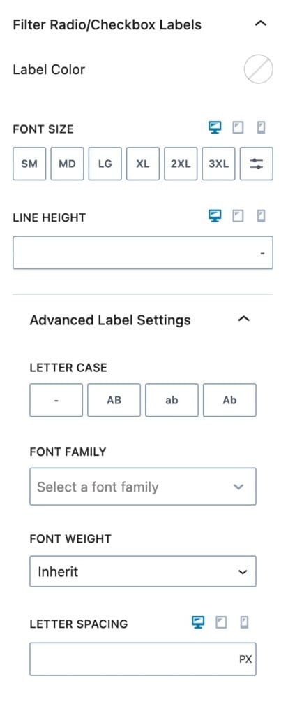
You can also customize the Filter Labels for Radio and Checkbox selection options. These settings apply to Filter Labels on Radio and Checkboxes.
You can select the Label Color to set a Color on Radio/Checkbox Labels.
You can set the Font Size for Desktop, Tablet, and Mobile Devices along with the Line Height for these devices.
Advanced Label Settings
You can expand the Advanced Label Settings to further customize the Filter Radio/Checkbox Labels.
You can set the Font Family and the Font Weight.
You can also select the Letter Spacing for Desktop, Tablet, and Mobile Devices.
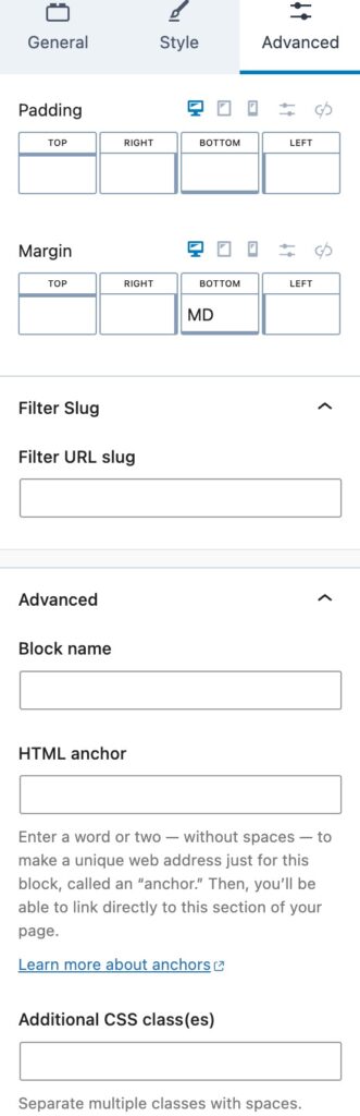
Advanced Settings
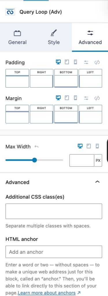
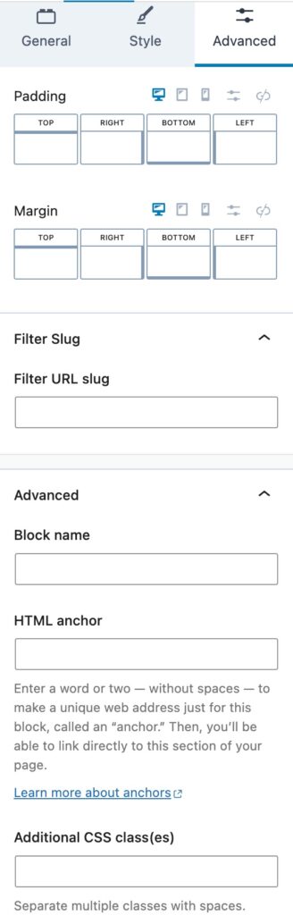
You can apply a Padding or Margin to your Query Loop (Adv) Block by going to the Advanced Block Settings Tab. You can set the Padding and Margin for Desktop, Tablet, and Mobile Devices.
You can set a Max Width for the Query Loop (Adv) Block for Desktop, Tablet, and Mobile Devices.
Advanced
You can expand the Advanced options to further customize your Query Loop (Adv) Block.
You can set an HTML Anchor. This adds an #ID to the Block, allowing it to be linked to directly.
You can also use the Additional CSS Class(es) option to add Custom CSS Classes to your Query Loop (Adv) Block.
Query Card Block
The Query Loop Card Block is nested inside the Query Loop (Adv) Block. This holds and styles your Loop Content.
General Settings
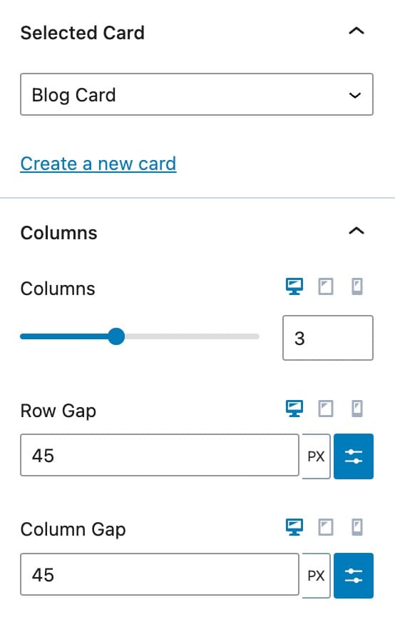
The Selected Card is an option for you to select your Query Card. These are made automatically after you add a Query Card Block to your Query Loop. You can also create a new card directly using this option.
Columns
The Columns options allow you to set the number of columns in your Loop, as well as the Row Gap and the Column Gap for Desktop, Tablet, and Mobile Devices.
Style Settings
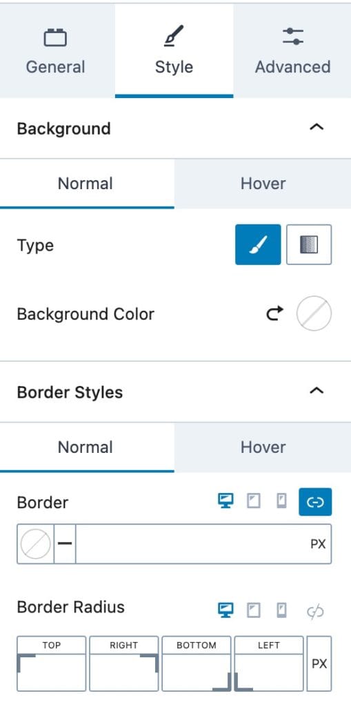
Background
The Background Options allow you to set the Background options for the Normal and Hover State.
You can set the Background Type as a Color or Gradient.
Then you will be able to select the Color/Gradient of your choice.
Border Styles
You can set the border Styles for the Normal and Hover State.
You can apply a Border Size and Color for Desktop, Tablet, and Mobile Devices.
You can also set the Border Radius for Desktop, Tablet, and Mobile Devices.
Advanced Settings
You can use the Advanced Settings to customize more advanced options.
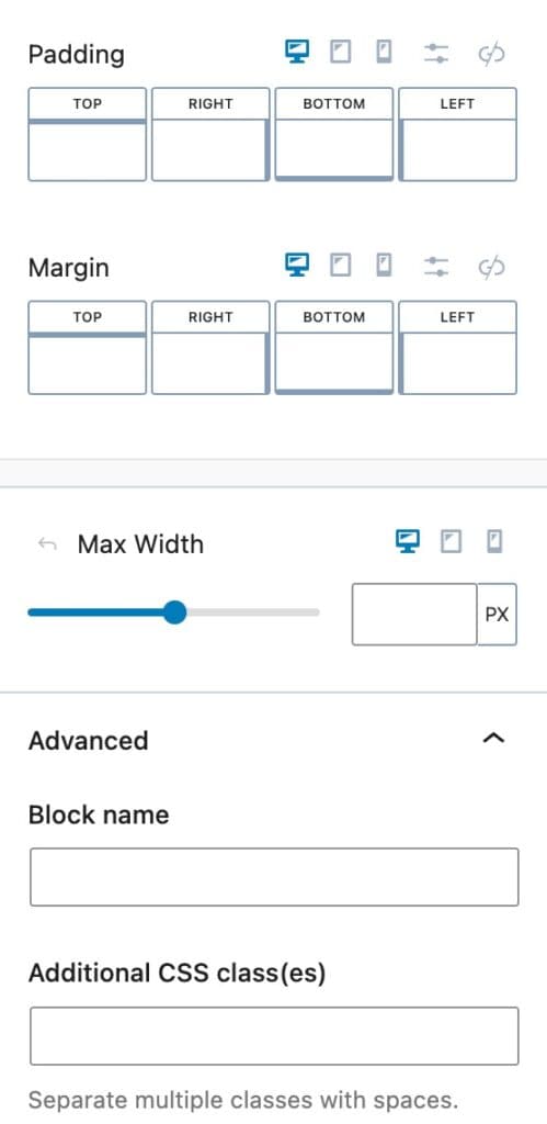
You can add Padding and/or Margin to the Query Card Block for Desktop, Tablet, and Mobile Devices.
You can also set the Max Width for Desktop, Tablet, and Mobile Devices.
Advanced
You can expand the Advanced option for more Advanced options.
You can set the Block Name. This is the name shown in, for example, the List View. This will set the Name of the Block.
You can also add Additional CSS Class(es) to the Block.
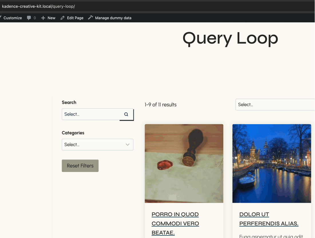
Filter Blocks
We offer different Filter Blocks to allow you to filter and search through the Query Loop. Below will be information and Block Settings for each Filter Block available.
Note: The Query Loop (Adv) block can hold multiple Filter Blocks, allowing for complex and flexible filtering setups.
Available Filter Blocks:
Filter – Search
Filter – Dropdown
Filter – Checkboxes
Filter – Buttons
Filter – Date
Reset Filters
No Results
Additionally, you can click here to learn how to use Popup Modals inside Query Loop (Adv) Blocks to implement an Off-Canvas Popup Filtering system.
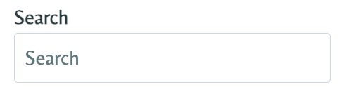
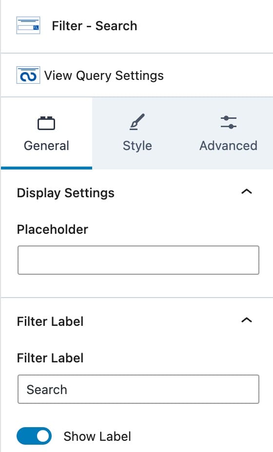
Filter – Search
The Filter – Search Blocks allows users to search within your Advanced Query using WordPress’s built-in search functionality. When a search term matches content within a Post Title or Post Content, the corresponding posts will be displayed as search results in the Advanced Query.
General Settings
Display Settings
You can set a Placeholder text for the Search Box.
Filter Label
You can use the Filter Label option to set a Search Label. (Ex. Search)
You can also enable or disable the Label itself.
You can style your Filter Labels in the parent Query Loop Filter Block Settings.
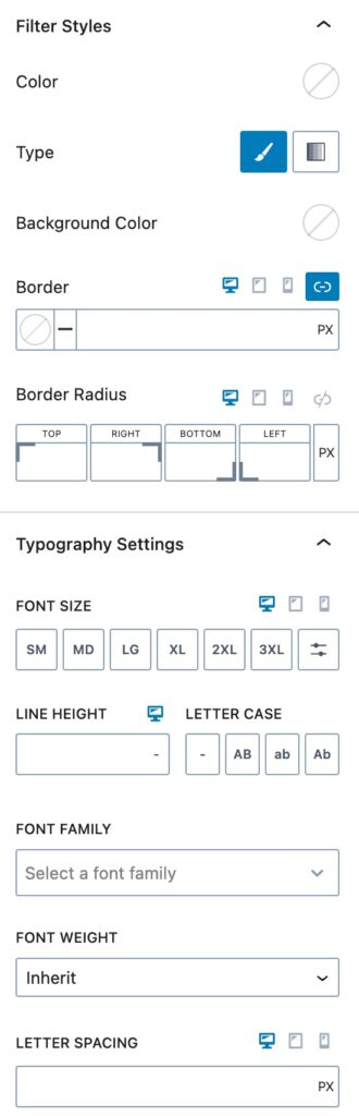
Style Settings
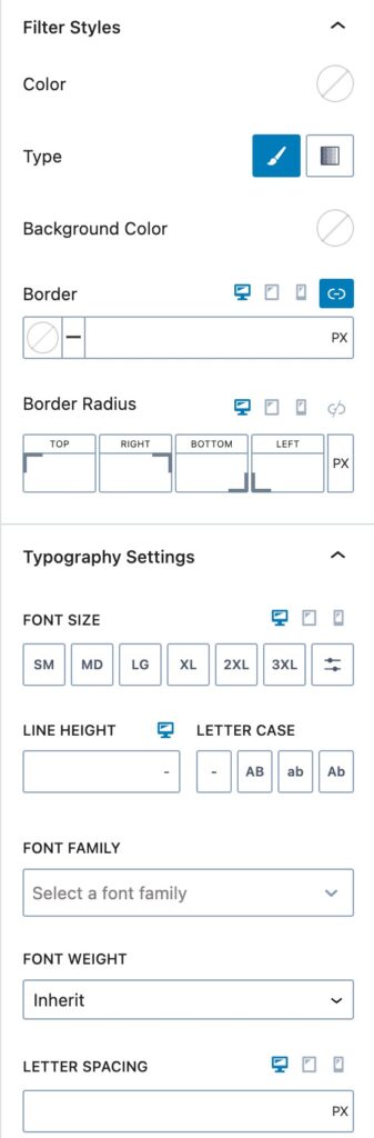
Filter Styles
You can use the Filter Styles to customize the styles on your Filter Block.
You can set your Filter Text Color using the Filter Color option. This controls the color of the Text Inputted into the Search Box.
You can select a Filter Type for the Background. You can select a Color or a Gradient. Once you select a Type, you can select the Background Color or Gradient next.
You can set a Border and a Border Radius for Desktop, Tablet, and Mobile Devices.
Typography Settings
You can use these options to customize your Filter Typography settings.
You can set the Font Size and Line Height for Desktop, Tablet, and Mobile Devices.
You can also set the Letter Case, Font Family, and Font Weight.
Additionally, you can set the Letter Spacing for Desktop, Tablet, and Mobile Devices.
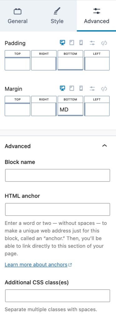
Advanced Settings
You can apply a Padding or Margin to your Filter Block by going to the Advanced Block Settings Tab. You can set the Padding and Margin for Desktop, Tablet, and Mobile Devices.
You can set a Max Width for the Filter Block for Desktop, Tablet, and Mobile Devices.
Advanced
You can expand the Advanced options to further customize your Filter Block.
You can set a Block Name. This is the Name in which the Block displays as in the List View etc.
You can set an HTML Anchor. This adds an #ID to the Block, allowing it to be linked to directly.
You can also use the Additional CSS Class(es) option to add Custom CSS Classes to Filter Block.
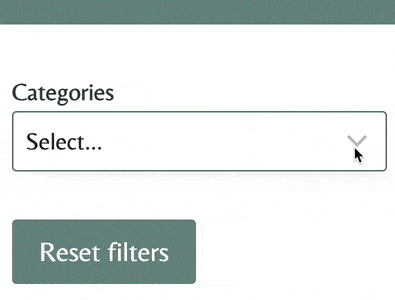
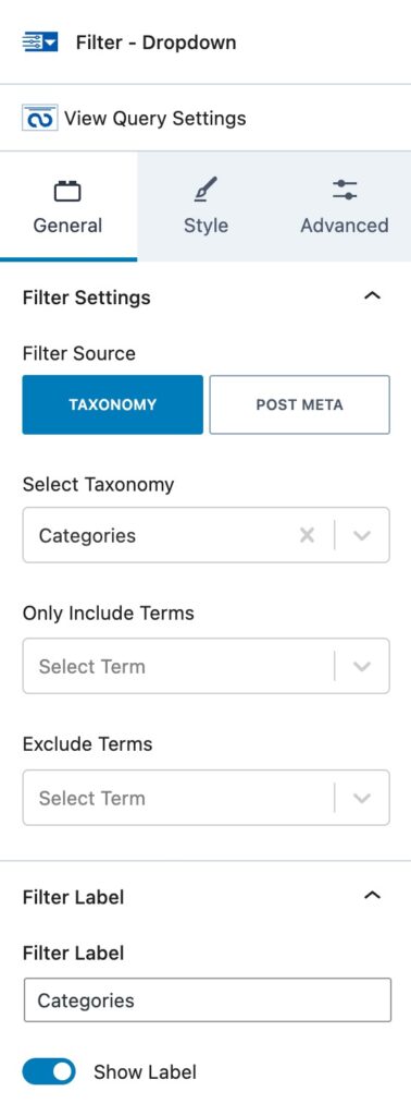
Filter – Dropdown
The Filter – Dropdown Block allows you to filter through your Query Loop using a Dropdown Filter.
General Settings
Filter Settings
You can set a Filter Source. (Taxonomy or Post Meta) If you select Taxonomy, you will be able to select the Taxonomy and Include/Exclude Terms.
If you select Post Meta, you will have different Post Meta options to select from. (Post Type, Post Date, Post Modified Date, Post Title, or Post author)
Filter Label
This controls the Label of your Filter.
You can set the Text for the Filter Label along with an option to enable or disable the Label.
You can style your Filter Labels in the parent Query Loop Filter Block Settings.
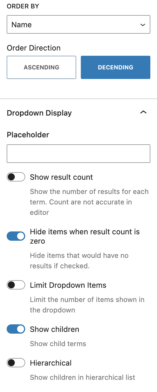
Dropdown Order
You can adjust the Dropdown Order using these options.
You can set how you would like the Dropdown Ordered by using the Order By option. You can select Name, Total Results, or Term Order.
- A term order can be set using a plugin, such as this one.
The Order Direction can be set to Ascending or Descending.
Dropdown Display
You can use these options to set your Dropdown Display options.
You can set a Dropdown Placeholder using the Placeholder option.
You have the option to enable different options. You can enable/disable the Show Result Count, Hide Items when Result Count is Zero, Limit Dropdown Items, Show Children, and/or to show children in a Hierarchical list.
If you enable the Limit Dropdown Items option, you will then be able to select the limited number you wish to use.
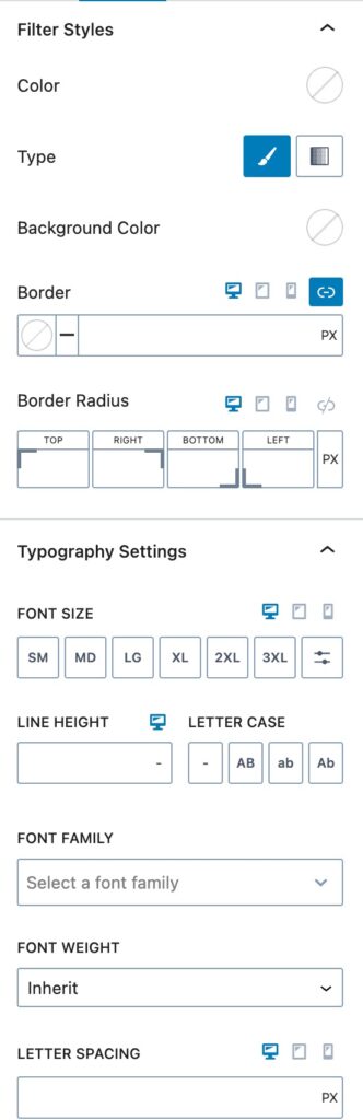
Style Settings
Filter Styles
You can use the Filter Styles to customize the styles on your Filter Block.
You can set your Filter Text Color using the Filter Color option. This controls the color of the Text Inputted into the Search Box.
You can select a Filter Type for the Background. You can select a Color or a Gradient. Once you select a Type, you can select the Background Color or Gradient next.
You can set a Border and a Border Radius for Desktop, Tablet, and Mobile Devices.
Typography Settings
You can use these options to customize your Filter Typography settings.
You can set the Font Size and Line Height for Desktop, Tablet, and Mobile Devices.
You can also set the Letter Case, Font Family, and Font Weight.
Additionally, you can set the Letter Spacing for Desktop, Tablet, and Mobile Devices.
Advanced Settings
You can apply a Padding or Margin to your Filter Block by going to the Advanced Block Settings Tab. You can set the Padding and Margin for Desktop, Tablet, and Mobile Devices.
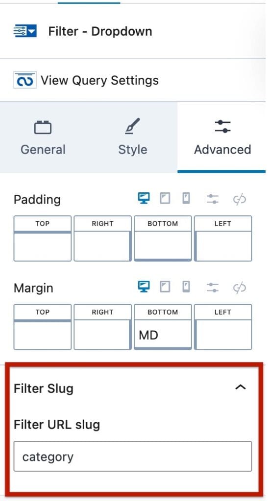
Filter Slug
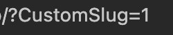
You can set a URL Filter Slug here. This is the Slug used for the URL. For example, if this value was set to “CustomSlug”, once a Filter Option is selected, the URL will reflect using the “CustomSlug” slug:
Advanced
You can expand the Advanced options to further customize your Filter Block.
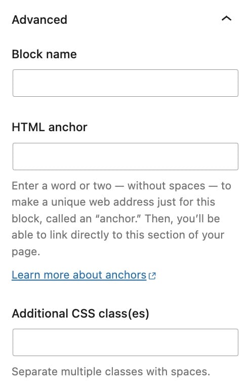
You can set a Block Name. This is the Name in which the Block displays as in the List View etc.
You can set an HTML Anchor. This adds an #ID to the Block, allowing it to be linked to directly.
You can also use the Additional CSS Class(es) option to add Custom CSS Classes to Filter Block.
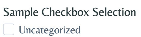
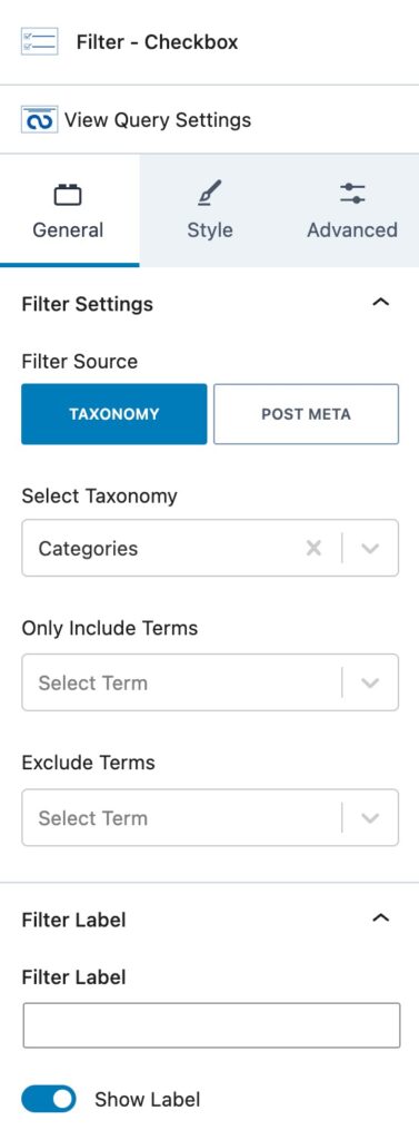
Filter – Checkbox
The Filter – Checkbox Block allows you to filter through your Query Loop using a Checkbox Selection.
General Settings
Filter Settings
You can set a Filter Source. (Taxonomy or Post Meta) If you select Taxonomy, you will be able to select the Taxonomy and Include/Exclude Terms.
If you select Post Meta, you will have different Post Meta options to select from. (Post Type, Post Date, Post Modified Date, Post Title, or Post author)
Filter Label
This controls the Label of your Filter.
You can set the Text for the Filter Label along with an option to enable or disable the Label.
You can style your Filter Labels in the parent Query Loop Filter Block Settings.
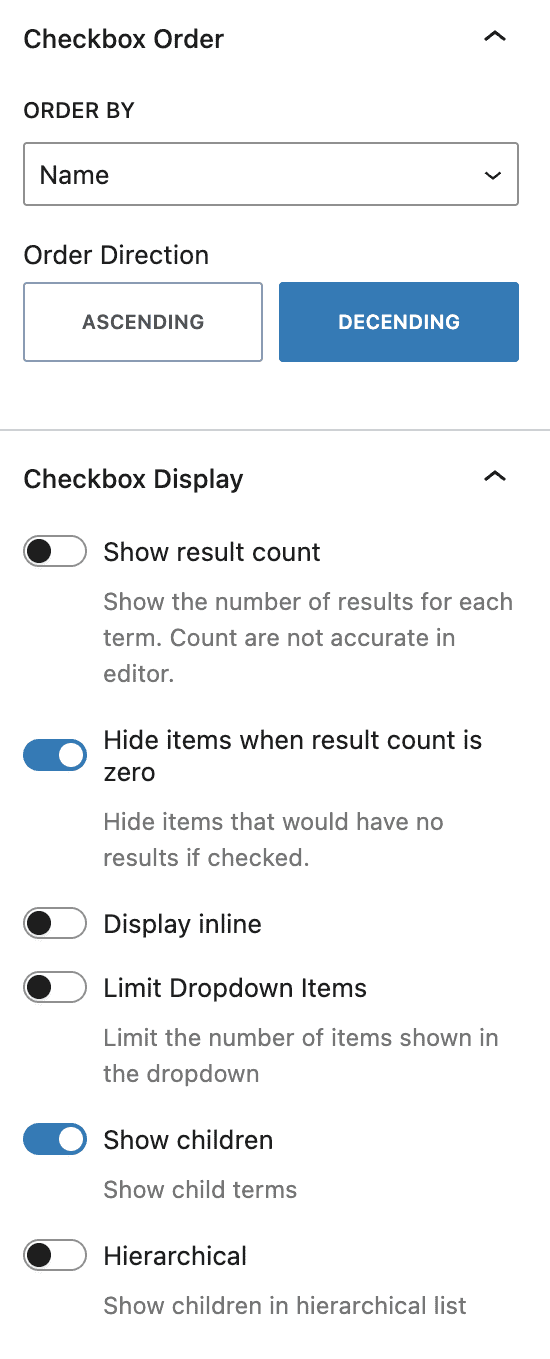
Checkbox Order
You can adjust the Checkbox Order using these options.
You can set how you would like the Checkbox Ordered by using the Order By option. You can select Name or Total Results.
The Order Direction can be set to Ascending or Decending.
Checkbox Display
You can use these options to set your Checkbox Display options.
You can Enable or Disable the Show Result Count, Hide Items when Result Count is Zero, Display Inline, Limit Dropdown Items, Show Children, and show children in a Hierarchical list options.
If you enable the Limit Dropdown Items option, you will then be able to select the limited number you wish to use.
Style Settings
Filter Styles
You can use the Filter Styles to customize the styles on your Filter Block.
You can set your Filter Text Color using the Filter Color option. This controls the color of the Text Inputted into the Search Box.
You can select a Filter Type for the Background. You can select a Color or a Gradient. Once you select a Type, you can select the Background Color or Gradient next.
You can set a Border and a Border Radius for Desktop, Tablet, and Mobile Devices.
Typography Settings
You can use these options to customize your Filter Typography settings.
You can set the Font Size and Line Height for Desktop, Tablet, and Mobile Devices.
You can also set the Letter Case, Font Family, and Font Weight.
Additionally, you can set the Letter Spacing for Desktop, Tablet, and Mobile Devices.
Advanced Settings
You can apply a Padding or Margin to your Filter Block by going to the Advanced Block Settings Tab. You can set the Padding and Margin for Desktop, Tablet, and Mobile Devices.
You can set a Max Width for the Filter Block for Desktop, Tablet, and Mobile Devices.
Filter Slug
You can set a URL Filter Slug here. This is the Slug used for the URL. For example, if this value was set to “CustomSlug”, once a Filter Option is selected, the URL will reflect using the “CustomSlug” slug:
Advanced
You can expand the Advanced options to further customize your Filter Block.
You can set a Block Name. This is the Name in which the Block displays as in the List View etc.
You can set an HTML Anchor. This adds an #ID to the Block, allowing it to be linked to directly.
You can also use the Additional CSS Class(es) option to add Custom CSS Classes to the Filter Block.
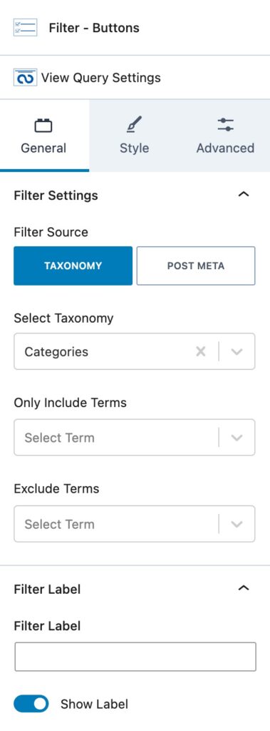
Filter – Buttons
The Filter – Buttons Block allows you to filter by a Taxonomy by clicking a Labeled Button.
General Settings
Filter Settings
You can set a Filter Source. (Taxonomy or Post Meta) If you select Taxonomy, you can choose the Taxonomy and Include/Exclude Terms.
If you select Post Meta, you will have different Post Meta options. (Post Type, Post Date, Post Modified Date, Post Title, or Post author)
Filter Label
This controls the Label of your Filter.
You can set the Text for the Filter Label along with an option to turn the Label on or off.
You can style your Filter Labels in the parent Query Loop Filter Block Settings.
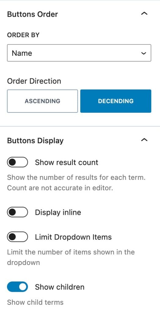
Buttons Order
You can adjust the Button Order using these options.
You can use the Order By option to set how you would like the Buttons Ordered. You can select Name or Total Results.
The Order Direction can be set to Ascending or Descending.
Buttons Display
You can use these options to set your Buttons Display options.
You have the option to enable different options. You can enable/disable the Show Result Count, Display Inline, Limit Dropdown Items, and/or Show Children options.
If you enable the Limit Dropdown Items option, you can select the limited number you wish to use.
Style Settings
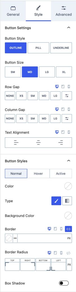
Button Settings
You can use the Button Inherit Styles to use either the Pill, Outline, or Underline Styles.
You can set the Button Size using one of the Kadence Size Presets. (Small, Medium, Large, Extra Large)
The Button Width can be set from Auto to Fixed or Full.
You can set the Row Gap and Column Gap for your Buttons for Desktop, Tablet, and Mobile Devices.
Button Styles
You can set the Button Styles for the Normal and Hover States.
You can set a Color for your Buttons using the Color option.
You can use the Type option to set a Background Color Type. You can select Color or Gradient.
You can then use the Background Color option to set the Background Color.
You can set a Border Color, Size, and border Radius for Desktop, Tablet, and Mobile Devices.
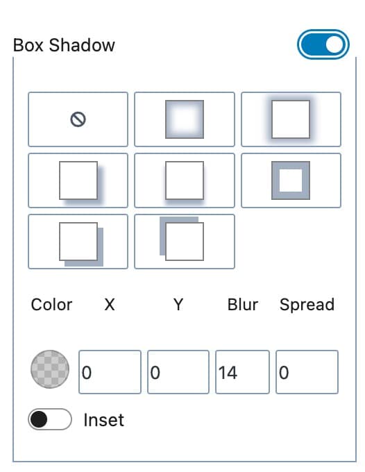
You can enable the Box Shadow option to enable and use a Box Shadow on your Buttons. You can manually select a Box Shadow or use an available preset.
Filter Styles
You can use the Filter Styles to customize the styles on your Filter Buttons Block.
You can set your Filter Text Color using the Filter Color option. This controls the color of the Text Inputted into the Search Box.
You can select a Filter Type for the Background. You can select a Color or a Gradient. Once you select a Type, you can select the Background Color or Gradient next.
You can set a Border and a Border Radius for Desktop, Tablet, and Mobile Devices.
Typography Settings
You can use these options to customize your Filter Typography settings.
You can set the Font Size and Line Height for Desktop, Tablet, and Mobile Devices.
You can also set the Letter Case, Font Family, and Font Weight.
Additionally, you can set the Letter Spacing for Desktop, Tablet, and Mobile Devices.
Advanced Settings
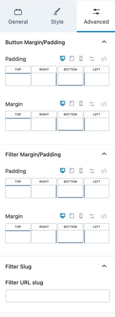
Button Margin/Padding
You can apply a Padding or Margin to your Buttons by going to the Advanced Block Settings Tab. You can set the Padding and Margin for Desktop, Tablet, and Mobile Devices.
You can also set the Padding/Margin for the Filter using the Filter Margin/Padding options.
Filter Slug
You can set a URL Filter Slug here. This is the Slug used for the URL. For example, if this value was set to “CustomSlug”, once a Filter Option is selected, the URL will reflect using the “CustomSlug” slug:
Advanced
You can expand the Advanced options to further customize your Filter Buttons Block.
You can set a Block Name. This is the Name in which the Block displays as in the List View etc.
You can set an HTML Anchor. This adds an #ID to the Block, allowing it to be linked to directly.
You can also use the Additional CSS Class(es) option to add Custom CSS Classes to Filter Buttons Block.
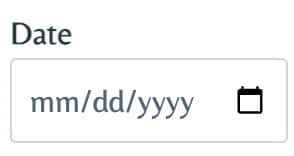
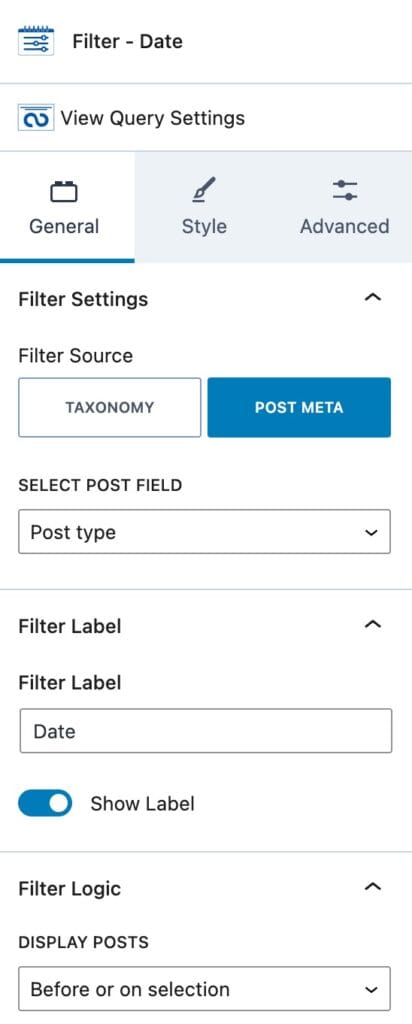
Filter – Date
The Filter – Date Block allows you to filter by a Date.
General Settings
Filter Settings
You can set a Filter Source. (Taxonomy or Post Meta) If you select Taxonomy, you can select the Taxonomy and Include/Exclude Terms.
If you select Post Meta, you will have different Post Meta options to select from. (Post Type, Post Date, Post Modified Date, Post Title, or Post author)
Filter Label
This controls the Label of your Filter.
You can set the Text for the Filter Label along with an option to enable or disable the Label.
You can style your Filter Labels in the parent Query Loop Filter Block Settings.
Filter Logic
You can set the Display Posts option to Before Selection, Before or on Selection, After Selection, After or on Selection, or On Selection.
Style Settings
Filter Styles
You can use the Filter Styles to customize the styles on your Filter Block.
You can set your Filter Text Color using the Filter Color option. This controls the color of the Text Inputted into the Search Box.
You can select a Filter Type for the Background. You can choose a Color or a Gradient. Once you select a Type, you can select the Background Color or Gradient next.
You can set a Border and a Border Radius for Desktop, Tablet, and Mobile Devices.
Typography Settings
You can use these options to customize your Filter Typography settings.
You can set the Font Size and Line Height for Desktop, Tablet, and Mobile Devices.
You can also set the Letter Case, Font Family, and Font Weight.
Additionally, you can set the Letter Spacing for Desktop, Tablet, and Mobile Devices.
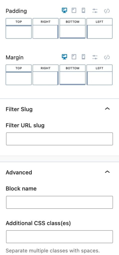
Advanced Settings
You can apply a Padding or Margin to your Date Filter by going to the Advanced Block Settings Tab. You can set the Padding and Margin for Desktop, Tablet, and Mobile Devices.
Filter Slug
You can set a URL Filter Slug here. This is the Slug used for the URL. For example, if this value was set to “CustomSlug”, once a Filter Option is selected, the URL will reflect using the “CustomSlug” slug:
Advanced
You can expand the Advanced options to further customize your Filter Date Block.
You can set a Block Name. This is the Name in which the Block displays as in the List View etc.
You can set an HTML Anchor. This adds an #ID to the Block, allowing it to be linked to directly.
You can also use the Additional CSS Class(es) option to add Custom CSS Classes to Filter Date Block.
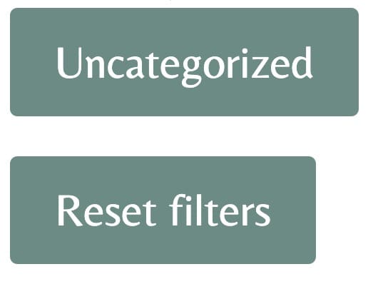
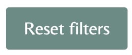
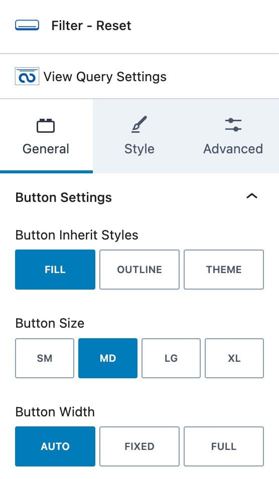
Reset Filters
The Reset Filters Block adds a Button to reset all of your Filters.
General Settings
Button Settings
You can use the Button Inherit Styles to use either your Fill, Outline, or Theme Styles.
You can set the Button Size using one of the Kadence Size Presets. (Small, Medium, Large, Extra Large)
The Button Width can be set from Auto to Fixed or Full.
Style Settings
Button Styles
You can set the Button Styles for the Normal and Hover State.
You can set a Color for your Buttons using the Color option.
You can use the Type option to set a Background Color Type. You can select Color or Gradient.
You can then use the Background Color option to set the Background Color.
You can set a Border Color, Size, and border Radius for Desktop, Tablet, and Mobile Devices.
You can enable the Box Shadow option to enable and use a Box Shadow on your Buttons.
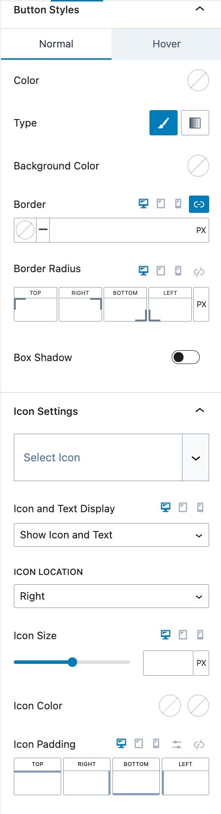
Icon Settings
You can add and customize an Icon to your Reset Filters Button.
You can set the Icon and Text Display. You can set this to Show Icon and Text or Show the Icon Only.
The Icon Location allows you to set the Icon to the Left or Right of the Button Text.
You can set the Icon Size for Desktop, Tablet, and Mobile Devices.
You can select the Icon Color for the Initial and Hover State.
You can add an Icon Padding for Desktop, Tablet, and Mobile Devices.
Advanced Settings
You can apply a Padding or Margin to your Reset Filter Button by going to the Advanced Block Settings Tab. You can set the Padding and Margin for Desktop, Tablet, and Mobile Devices.
Filter Slug
You can set a URL Filter Slug here. This is the Slug used for the URL. For example, if this value was set to “CustomSlug”, once a Filter Option is selected, the URL will reflect using the “CustomSlug” slug:
Block Defaults
You can save your configuration as the Block Default.
Advanced
You can expand the Advanced options to further customize your Reset Filter Button Block.
You can set a Block Name. This is the Name in which the Block displays as in the List View etc.
You can set an HTML Anchor. This adds an #ID to the Block, allowing it to be linked to directly.
You can also use the Additional CSS Class(es) option to add Custom CSS Classes to the Reset Filter Block.
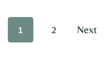
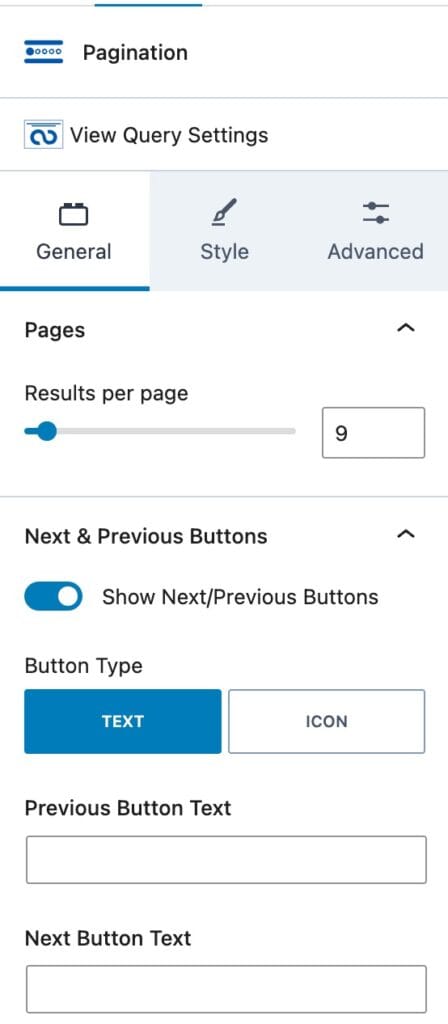
Pagination
The Pagination Block allows you to paginate your Query. This adds buttons that allow you to cycle through your loop results.
General Settings
Pages
You can set the number of Results Per Page. This is how many results are shown until the user must go to the next Paginated Page.
This will only work if “Inherit query from template” is turned off.
If it’s turned on, you can change the number of results in Dashboard > Reading > Blog pages show at most.
Next & Previous Buttons
You can enable or disable the Show Next/Previous Buttons option.
You can use the Button Type to set your Button as either a Text or Icon.
You can use the Previous Button Text option to customize your Previous Button Text.
You can use the Next Button Text option to customize your Next Button Text.
If you select the Icon Button Type, you will have the option to select an Icon for the Previous and Next Buttons.
Style Settings
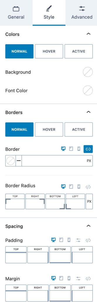
Colors
You can set your Colors for the Normal, Hover and Active State.
You can set the Background and Font Color using their options.
Borders
You can set your Borders for the Normal, Hover, and Active State.
You can set the Border Color, Size, and Radius for Desktop, Tablet and, Mobile Devices.
Spacing
You can add a Padding and/or Margin to your Pagination Block for Desktop, Tablet, and Mobile Devices.
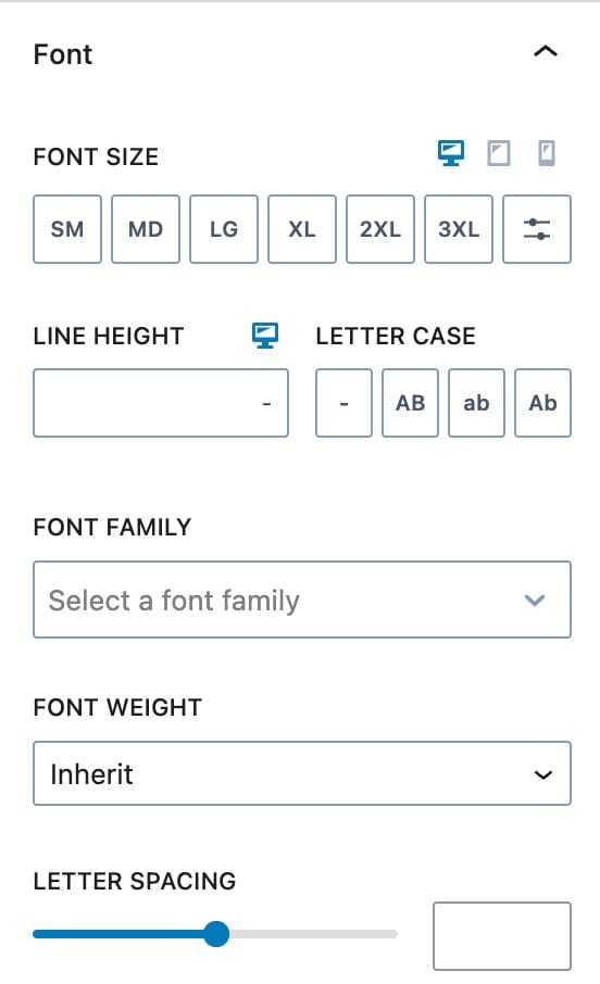
Font
You can set the Font Size and Line Height for Desktop, Tablet, and Mobile Devices.
You can use the Letter Case option to adjust the Letter Case used on your Pagination Block.
You can set a Font Family and Font Weight to your Pagination Block.
You can also set a Letter Spacing to your Pagination Block.
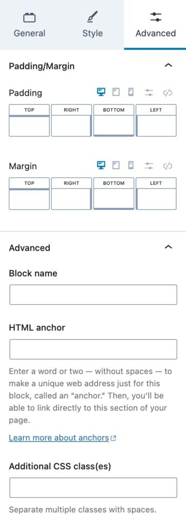
Advanced Settings
You can apply a Padding or Margin to your Pagination Block by going to the Advanced Block Settings Tab. You can set the Padding and Margin for Desktop, Tablet, and Mobile Devices.
Advanced
You can expand the Advanced options to further customize your Pagination Block.
You can set a Block Name. This is the Name in which the Block displays as in the List View etc.
You can set an HTML Anchor. This adds an #ID to the Block, allowing it to be linked to directly.
You can also use the Additional CSS Class(es) option to add Custom CSS Classes to the Pagination Block.
Result Count
The Result Count Block displays the number of the current results. These numbers will change based on the Filters used.
General Settings
The Include Search Value option allows you to add your search term to the end of your Result Count.
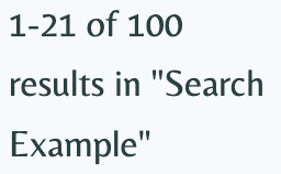
You can use the Before Count option to display a custom text before the count. This appears directly before the first number in the count.
The Count Through option allows you to select the count through symbol. For example, “-“.
You can adjust the Between Count. This is by default the “of” text in the Search Count.
The After Count option allows you to add text after the count.
The Thousands Seperator option allows you to manually set your Thousands Seperator. By default, this is a comma “,”.
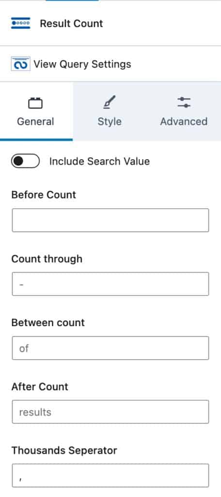
Style Settings
You can use the Background and Font Color options to change the Background and Font Color on your Results Count Block.
You can set a Border Color, Size, and Radius for Desktop, Tablet, and Mobile Devices.
Font
You can set the Font Size and Line Height for Desktop, Tablet, and Mobile Devices.
You can use the Letter Case option to adjust the Letter Case used on your Results Count Block.
You can set a Font Family and Font Weight to your Results Count Block.
You can also set a Letter Spacing to your Results Count Block.
Advanced Settings
You can apply a Padding or Margin to your Results Count Block by going to the Advanced Block Settings Tab. You can set the Padding and Margin for Desktop, Tablet, and Mobile Devices.
Advanced
You can expand the Advanced options to further customize your Results Count Block.
You can set a Block Name. This is the Name in which the Block displays as in the List View etc.
You can set an HTML Anchor. This adds an #ID to the Block, allowing it to be linked to directly.
You can also use the Additional CSS Class(es) option to add Custom CSS Classes to the Results Count Block.
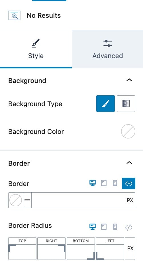
No Results
The No Results Block appears whenever your query returns no results based on your filters. Standard blocks like Pagination and Query Cards will be hidden when there are no results, allowing the No Results Block to display in their place.
By default, the block includes a Paragraph Block with the text “No Results Found”, which you can edit to customize the message. You can also add other supported blocks inside the No Results Block, such as Row Layout Blocks, Images, or Image (Adv) Blocks, to create a richer display when no results are returned. Note that not all blocks are supported inside the No Results Block, so it’s best to stick to layout and content blocks.
In the editor, use the Block Toolbar to Show Content or Hide Content, allowing you to view a placeholder or the actual content within the editor.
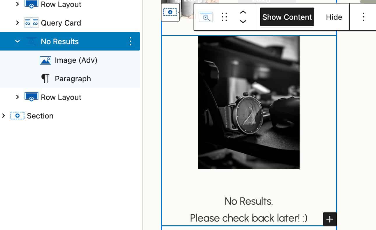
On the front end, when a filter selection or combination returns no results, the No Results Block content will be displayed.
Style Settings
Background Settings
You can set the Background Type to a Color or Gradient. Then, you can select the Color.
Border
You can set a Border Color, Size, and Radius for Desktop, Tablet, and Mobile Devices.
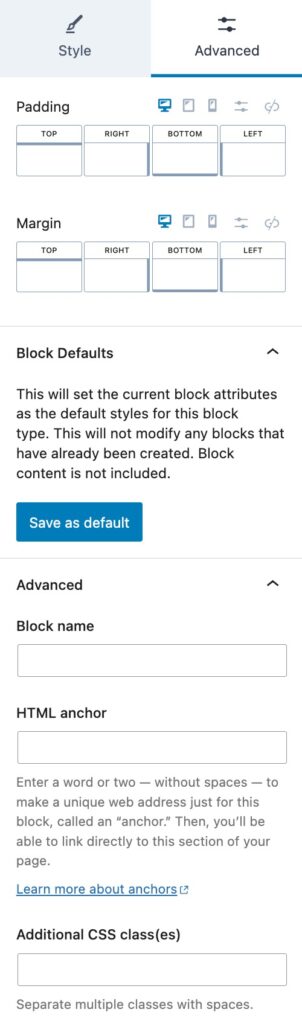
Advanced Settings
Margin/Padding
You can apply a Padding or Margin to your No Results Block by going to the Advanced Block Settings Tab. You can set the Padding and Margin for Desktop, Tablet, and Mobile Devices.
Block Defaults
You can save your configuration as the Block Default.
Advanced
You can expand the Advanced options to further customize your No Results Block.
You can set a Block Name. This is the Name in which the Block displays as in the List View etc.
You can set an HTML Anchor. This adds an #ID to the Block, allowing it to be linked to directly.
You can also use the Additional CSS Class(es) option to add Custom CSS Classes to the No Results Block.
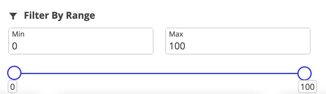
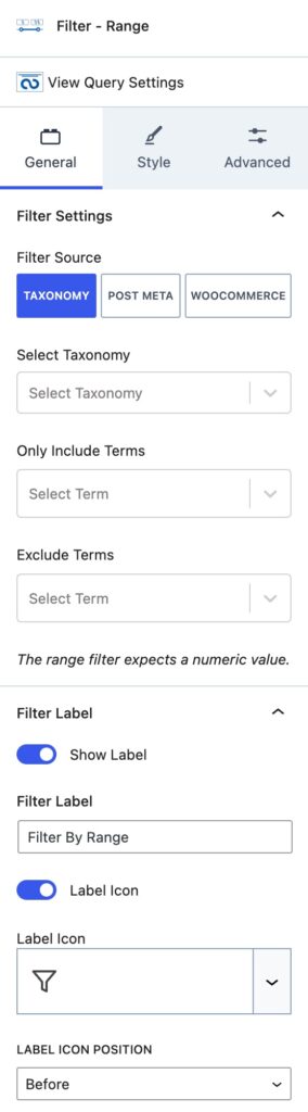
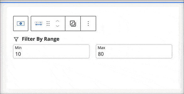
Filter – Range
Users can dynamically filter content based on a range of values. Display ranges with or without a user-friendly slider. You can use Taxonomies, Post Meta, or WooCommerce information, such as Product Prices, to set your range values.
General Settings
Under the General Settings, you can select a Filter Source. Each filter source may display different selectable options.
Taxonomy Filter Source:
The Taxonomy Filter Source allows you to select a Taxonomy.
You can then select the Terms that you wish to be included using the Only Include Terms selection.
You can select the Terms you wish to be Excluded using the Exclude Terms Selection.
The range filter expects and only works with numeric values.
You can enable the Filter Label using the Show Label setting.
You can set your Filter Label using the Filter Label setting.
You can enable an Icon for your Label using the Label Icon setting.
If you enable the Icon, you will be able to select the Icon you wish to use below the Label Icon setting.
You can use the Label Icon Position to position the Icon either before or after the label.
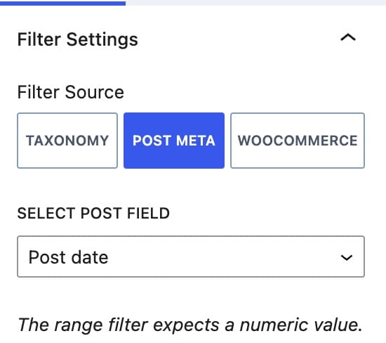
Post Meta Filter Source:
If you use the Post Meta Filter Source, you can use different Post Meta options for your Range. You can select from the Post Date, Post Modified Date, or the Post Title.
You also will have the Label Icon settings for this selection.
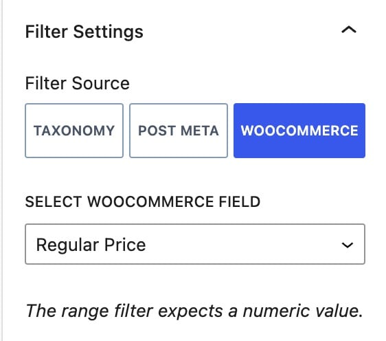
WooCommerce Filter Source:
If you use the WooCommerce Filter Source, you can select different WooCommerce details for your range. You can select from the Price, Sale Price, Regular Price, Average Rating, Stock Status, or Sale Status.
You also will have the Label Icon settings for this selection.
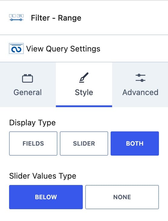
Style Settings
You can set your Slider Display type as Fields, Slider, or Both.
You use the Slider Values Type setting to set the Slider Value Types to Below or None.
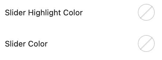
You can also set the Slider Highlight Color and the Slider Color.
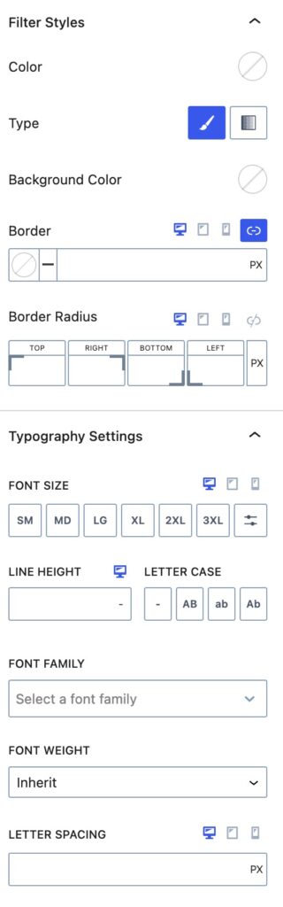
Filter Styles
You can use the Filter Styles to style your Filter.
You can set the Color for your Filter. You can pick the Type of Color as a Solid Color or Gradient Color.
You can set a Background Color for your Filter.
You can set a Border Color and Size for Desktop, Tablet, and Mobile Devices.
You can also set the Border Radius for Desktop, Tablet, and Mobile Devices.
Typography Settings
You can use the Typography Setting to adjust the typography of your filter.
You can set the font size for Desktop, Tablet, and Mobile Devices.
You can set the Line Height and a Letter Case to your Filter.
You can set the Font Family and Font Weight for your filter.
You can also set the Letter Spacing for Desktop, Tablet, and Mobile Devices.
Advanced Settings
Margin/Padding
You can apply a Padding or Margin to your No Results Block by going to the Advanced Block Settings Tab. You can set the Padding and Margin for Desktop, Tablet, and Mobile Devices.
Filter Slug
You can set a Filter URL Slug for the range.
Advanced
You can expand the Advanced options to further customize your Filter.
You can set an HTML Anchor. This adds an #ID to the Block, allowing it to be linked to directly.
You can also use the Additional CSS Class(es) option to add Custom CSS Classes to the Filter.
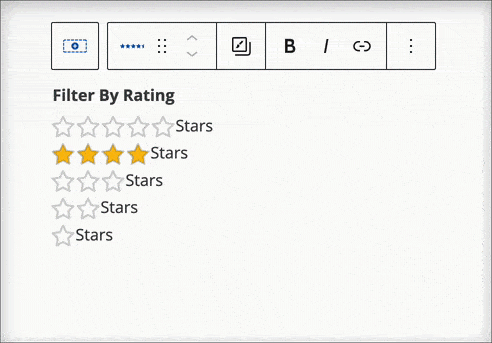
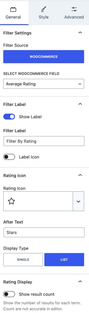
Filter – Rating
The Filter – Rating Block allows you to add a filter to your website that can be based on the product rating. You can also use different Icon Types and different Filter Options other than just ratings. Making this block complete for many different cases.
General Settings
You can select from the following WooCommerce Fields: Price, Sale Price, Regular Price, Average Rating, Stock Status, or Sale Status.
Filter Label
You can enable and use a Filter Label using the Show Label setting.
You can set your Label text using the Filter Label setting.
You can enable the option to use a Label Icon. Then, you can select your Label Icon and select the position of the Icon. The Icon can be set before or after the Label.
Rating Icon
You can select your Rating Icon to use whichever Kadence Icon you would like.
You can also set an After Text to appear after the Icon.
You can have the Icon Display Type as a Single Icon or List Icon.
Rating Display:
You can enable or disable the option to Show the Result Count. This shows the number of results for each term.
Style Settings
Filter Styles
You can use the Filter Styles to style your Filter.
You can set the Color for your Filter. You can pick the Type of Color as a Solid Color or Gradient Color.
You can set a Background Color for your Filter.
You can set a Border Color and Size for Desktop, Tablet, and Mobile Devices.
You can also set the Border Radius for Desktop, Tablet, and Mobile Devices.
Typography Settings
You can use the Typography Setting to adjust the typography of your filter.
You can set the font size for Desktop, Tablet, and Mobile Devices.
You can set the Line Height and a Letter Case to your Filter.
You can set the Font Family and Font Weight for your filter.
You can also set the Letter Spacing for Desktop, Tablet, and Mobile Devices.
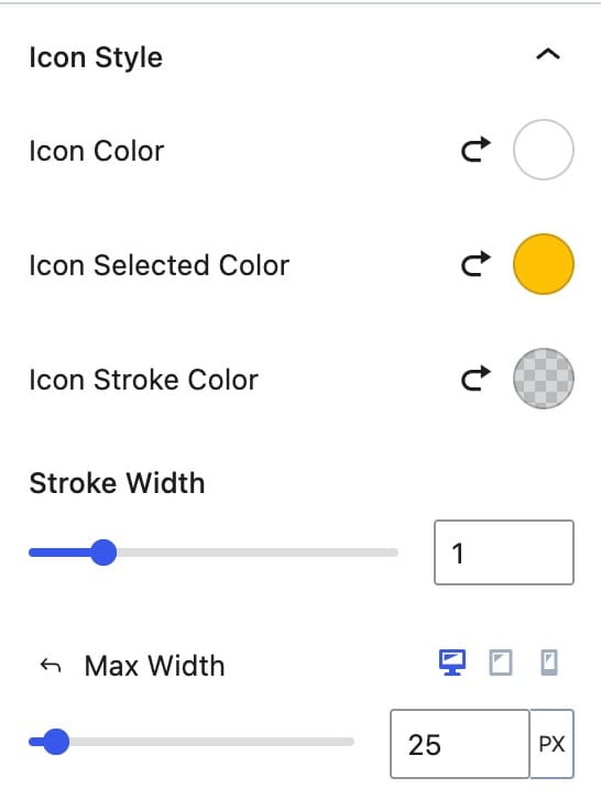
Icon Style
You can customize the Icon Style for your filter.
You can set the Icon Color.
You can set the Icon Selected Color.
You can set the Icon Stroke Color.
You can set the Stroke Width.
You can also set the Icon Max Width for Desktop, Tablet, and Mobile devices.
Advanced Settings
Margin/Padding
You can apply a Padding or Margin to your No Results Block by going to the Advanced Block Settings Tab. You can set the Padding and Margin for Desktop, Tablet, and Mobile Devices.
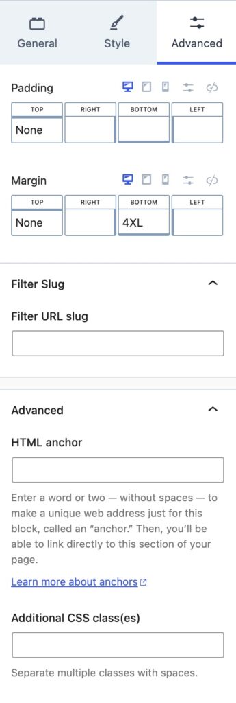
Filter Slug
You can set a Filter URL Slug for the range.
Advanced
You can expand the Advanced options to further customize your Filter.
You can set an HTML Anchor. This adds an #ID to the Block, allowing it to be linked to directly.
You can also use the Additional CSS Class(es) option to add Custom CSS Classes to the Filter.
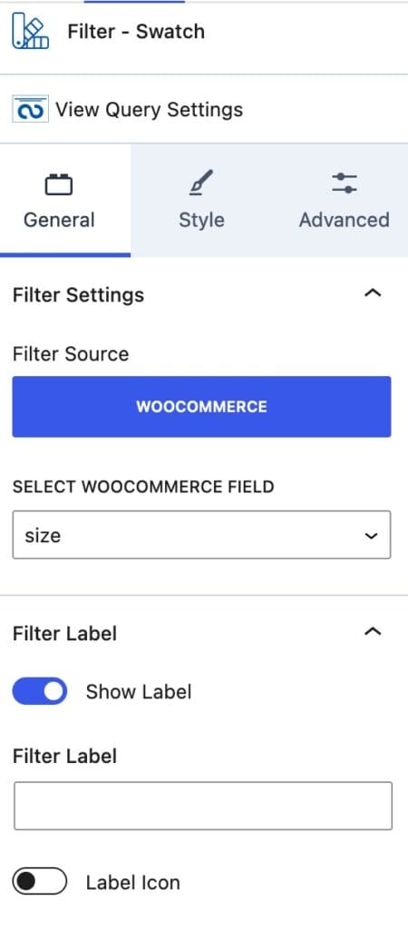
Filter – Swatches
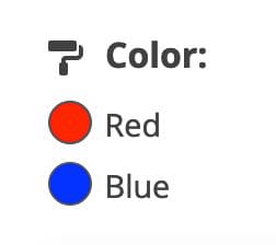
The Filter – Swatches Block allows you to filter WooCommerce products by Swatches, which is useful for sorting by sizes, colors, or other WooCommerce Attributes.
General Settings
Select WooCommerce Field: Select the WooCommerce Attribute to filter by. This will detect WooCommerce Attributes on your website that can be used as Swatches.
Filter Label: Enable and customize a Filter Label and optionally a Label Icon.
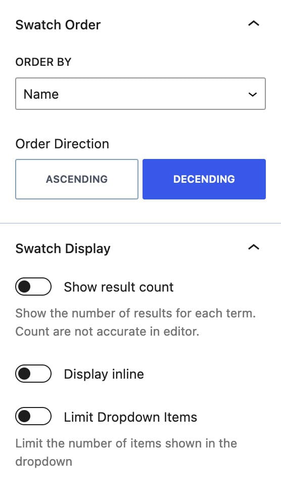
Swatch Order: Set the order of swatches by term and set the Order Direction as preferred.
Swatch Display: Enable different display options, such as showing the result count and displaying items inline. You can also limit the number of dropdown items.
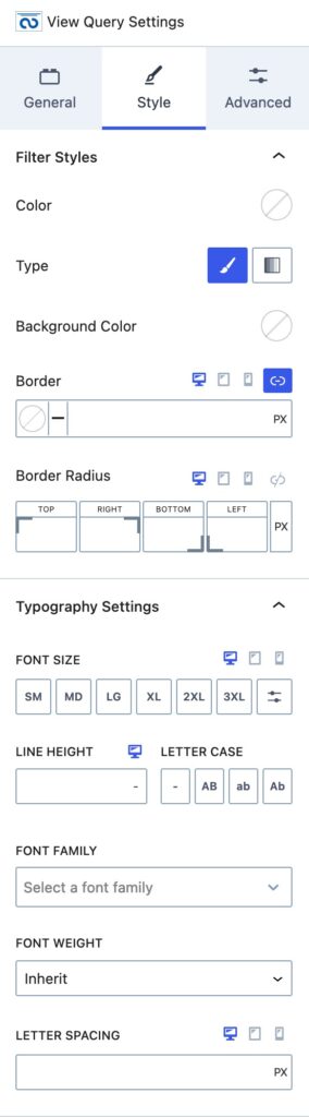
Style Settings
Filter Text Color: Set the color for your filter text.
Background Type: Choose between a solid color or gradient background Type, and then set the background color.
Border and Border Radius: Configure the border and border radius for desktop, tablet, and mobile devices.
Typography Settings: Adjust font styles, including font size, line height, letter case, font family, font weight, and letter spacing.
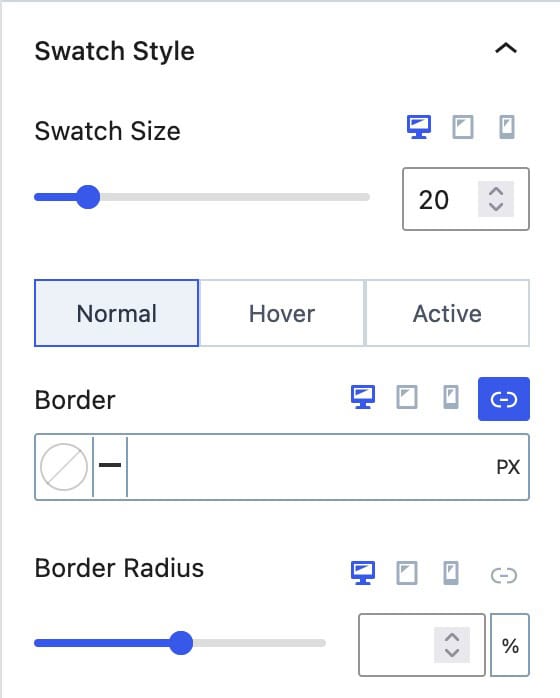
Swatch Size: Set the size of your swatches for desktop, tablet, and mobile devices.
Swatch Border: Customize the border and border radius for swatches in normal, hover, and active states.
Advanced Settings
Margin/Padding
You can apply a Padding or Margin to your Swatches Block by going to the Advanced Block Settings Tab. You can set the Padding and Margin for Desktop, Tablet, and Mobile Devices.
Filter Slug
You can set a Filter URL Slug for the range.
Advanced
You can expand the Advanced options to further customize your Filter.
You can set an HTML Anchor. This adds an #ID to the Block, allowing it to be linked to directly.
You can also use the Additional CSS Class(es) option to add Custom CSS Classes to the Filter.
Pre-Filtered Queries with URL Parameters
When you use Filter Blocks within a Query Loop (Advanced) Block and apply a filter on the front end, the page URL will automatically update with parameters. These parameters allow you to create direct links to pre-filtered queries.
This works best when you assign a Filter Slug to your filters. A Filter Slug can be set in the Advanced Block Settings of the filter block.
Without a slug, the URL may display a long, random, hashed number, such as 1140731708=1. By setting a slug, the URL becomes much cleaner and easier to understand. For example, if you set the slug to category, the parameter updates to category=1, making it both readable and consistent for direct links.
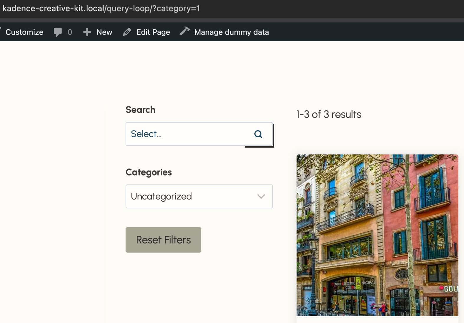
You should be using Filter Slugs if you plan to link directly to pre-filtered queries, since they keep your URLs consistent and easy to read. See the example below.
