
To set a gradient border using CSS in WordPress, you can employ the border-image property or a more advanced technique using background-clip.
Helpful resources:
- Learn how to add Custom CSS Classes and/or Anchor IDs to Kadence Blocks.
- Learn about Applying Block-Level Custom CSS in Kadence Blocks.
Using the border-image property (Simpler, but no border-radius):
This approach is quick to set up and creates a clean gradient border. However, it does not support rounded corners (border-radius).

.your-element-class {
  border-width: 20px; /* Adjust border thickness */
  border-style: solid;
  border-image: linear-gradient(to right, #ffafc7, #73d7ee) 1; /* Customize colors and direction */
}- Replace
.your-element-classwith the actual CSS class or ID of the element you want to style. - Modify
border-widthto control the border’s thickness. - Adjust the
linear-gradientfunction with your desired colors and direction (e.g.,to right,to bottom,45deg). - The
1after thelinear-gradientis theborder-image-slicevalue, indicating a single border region.
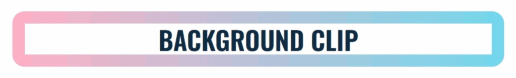
Using background-clip (Compatible with border-radius):
This method provides more flexibility. It allows you to use rounded corners (border-radius) while keeping the gradient border effect.
.your-element-class {
  background: linear-gradient(white, white) padding-box,
              linear-gradient(to right, #ffafc7, #73d7ee) border-box; /* Customize colors and direction */
  border-radius: 20px; /* Adjust border-radius as needed */
  border: 20px solid transparent; /* Adjust border thickness */
}- Replace
.your-element-classwith the actual CSS class or ID of the element. - The first
linear-gradient(white, white) padding-boxcreates a solid white background within the padding box. - The second
linear-gradient(to right, #ffafc7, #73d7ee) border-boxcreates your gradient and clips it to the border box, effectively acting as the border. - Set
border-radiusfor rounded corners. - Set
borderto a transparent solid border with the desired thickness.
