
The Advanced Gallery Block is an included feature in Kadence Blocks (free) that gives you powerful options for creating image galleries in WordPress. This block offers a variety of display styles, including Grid, Masonry, Carousel, and more. Use the Block Settings to adjust the layout and style of your gallery.


Getting Started
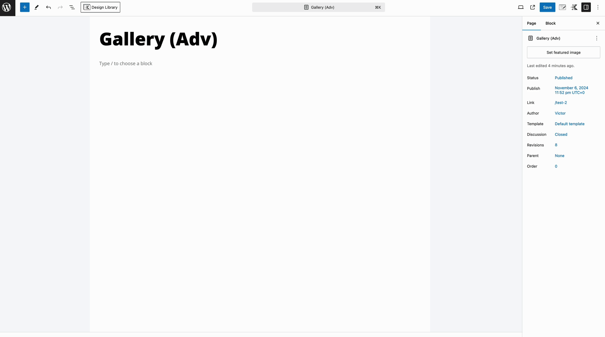
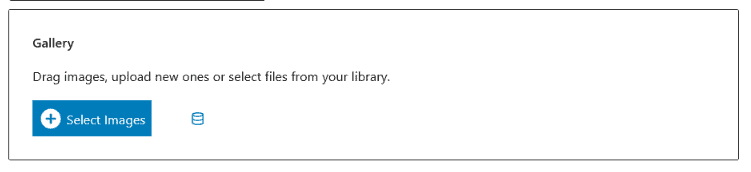
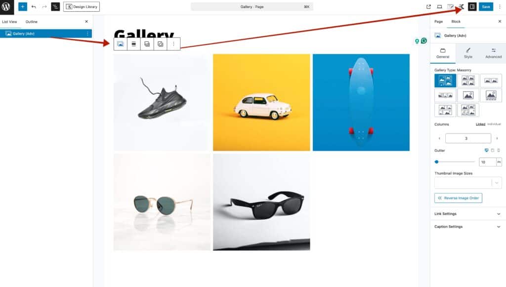
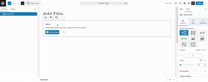
Get started by adding a Gallery (Adv) Block to the page. You can upload images directly into an empty Gallery (Adv) Block or choose images directly from your current media library.
With Kadence Blocks Pro, you can unlock the power of Dynamic Content, enabling you to create Dynamic Galleries using Gallery Custom Field Types. When using Dynamic Content with the Advanced Gallery Block, it’s important to ensure that the gallery is empty and does not contain any pre-selected images, as the dynamic content will automatically populate the gallery based on the specified custom field data.
Kadence Blocks Pro also offers additional gallery arrow positions, giving you greater control over your carousel galleries.
The Advanced Gallery Block Settings can be used to customize the look and style of your gallery. Use the General, Style, and Advanced tabs to control various block settings.
Editing or Adding More Images
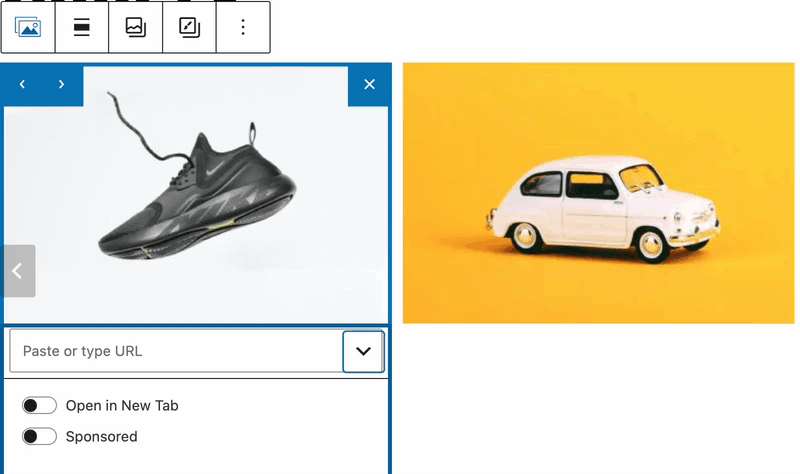
To Add or edit the images in the Gallery Adv block, click the Add/Edit gallery images icon on the Top ToolBar.
Gallery Types
Here is an example of each available Advanced Gallery Type:
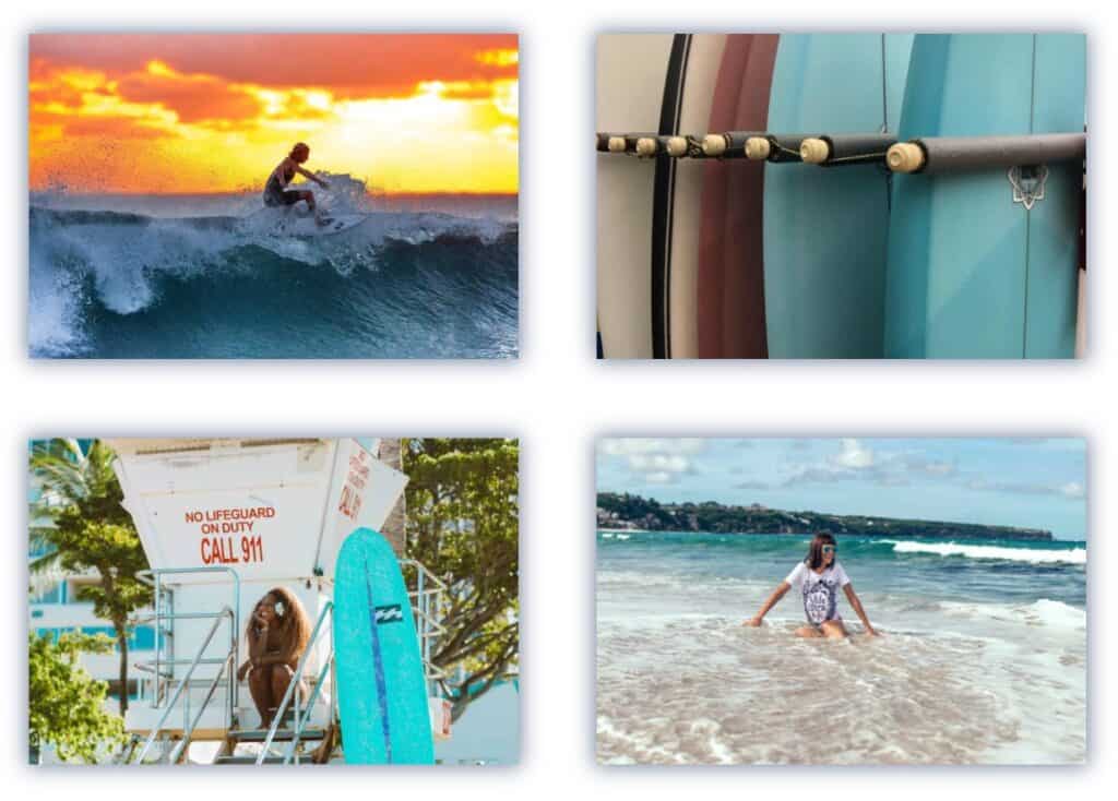
- Masonry – A Masonry gallery has columns that do not have equal row heights. Columns will remove gaps from the row height of the photos.
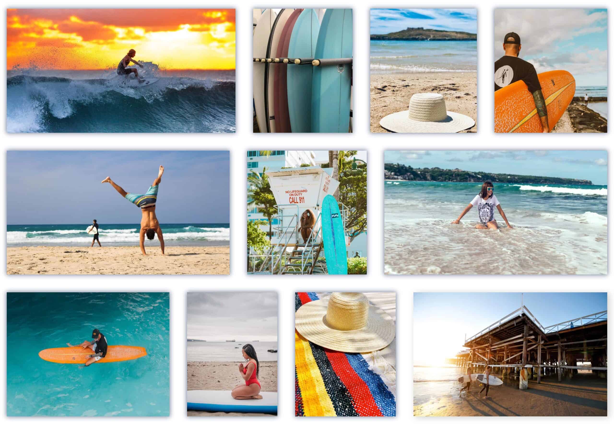
- Grid – A Grid gallery also has columns. However, a Grid gallery type sizes the images to a uniform height.
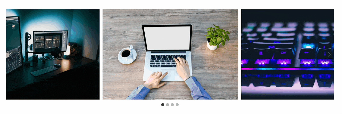
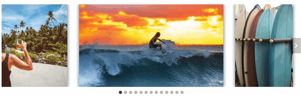
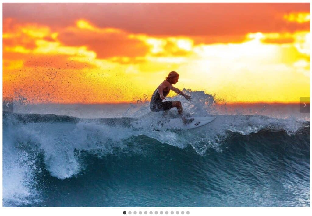
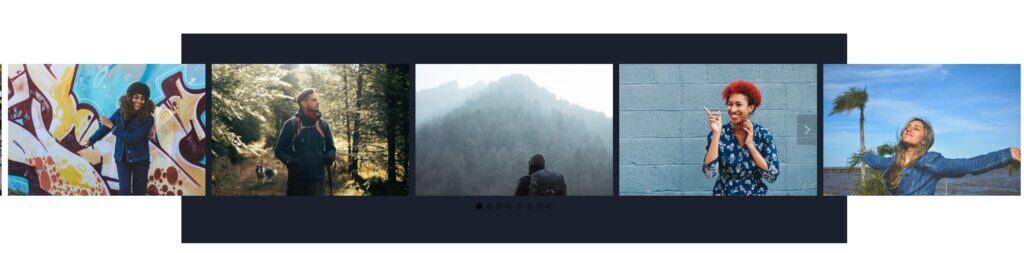
- Carousel – A Carousel gallery displays a revolving selection of images. There are arrows on either side of the gallery for navigation and dots under the pictures for representation. Carousels can also play automatically.
- Fluid Carousel – Fluid Carousels are similar to carousels because they display a revolving selection of images. However, the size of the photos adjusts by height instead of an image ratio.
- Slider – Sliders show images one at a time but have navigation arrows to let the user slide through the gallery. The dots below the picture represent the order of the gallery items.
- Thumbnail Slider – A Thumbnail Slider adds flair to the Slider gallery by replacing the representation dots below the image with a carousel of thumbnails.
- Tiles (Pro) – A Tiles gallery is like a masonry layout because it removes gaps between the photos. However, a Tiles layout removes the gaps between the different widths of the columns.
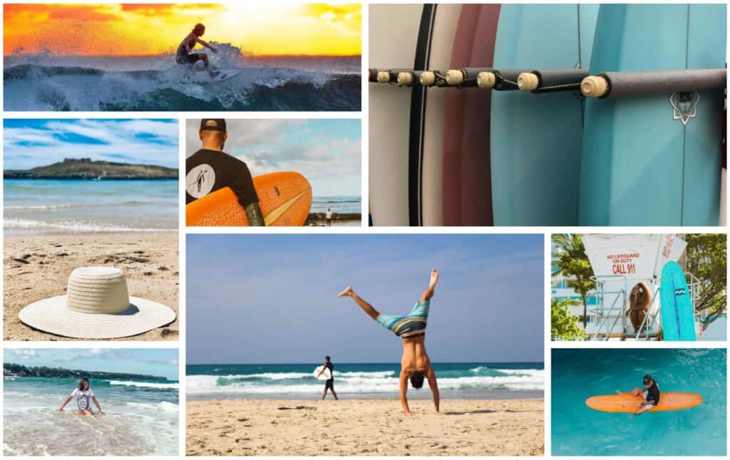
- Mosaic (Pro) – The Mosaic gallery creates a display where images fit in with one another. Unlike standard layouts, Mosaic arranges pictures of different sizes and shapes to fit together perfectly, with no awkward gaps between them. This creates a continuous flow that uses most of your screen space while displaying your collection in a visually interesting way.
Use the Row Height and Gutter settings to take complete control over your Mosaic gallery.
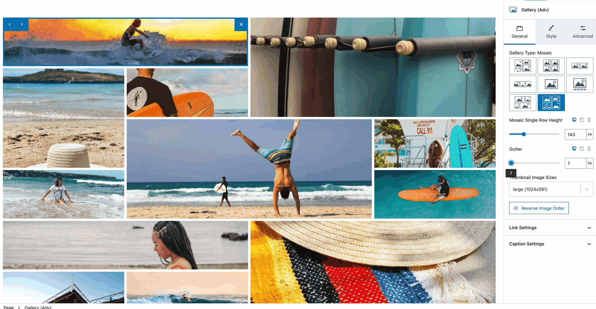
General Settings
Use the General Block Settings to customize general settings related to the Advanced Gallery.
Gallery Type: Set the Gallery Type to a preferred style. View the examples above.
Image Ratio: You can use the Image Ratio setting to control the image output.
Columns: Adjust the Columns to set the number of columns used within the gallery.
Thumbnail Image Sizes: When using a gallery that includes thumbnail images, use the Thumbnail Image Sizes setting to control their output.
Reverse Image Order: Reverse the order of the gallery images.
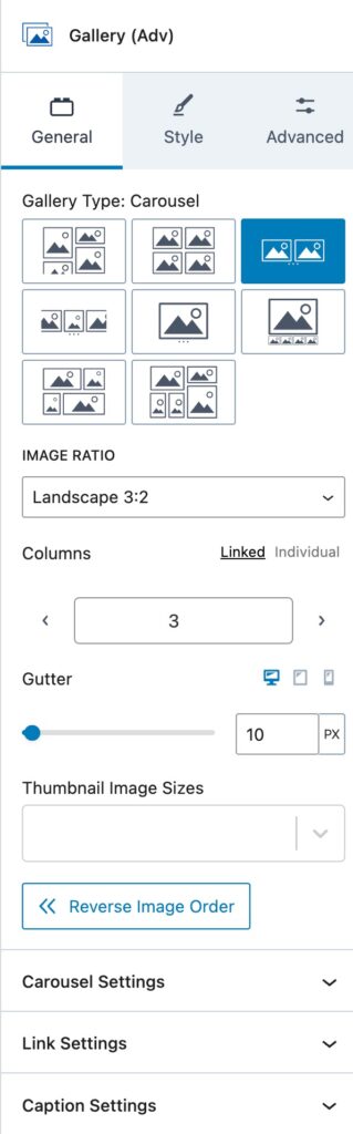
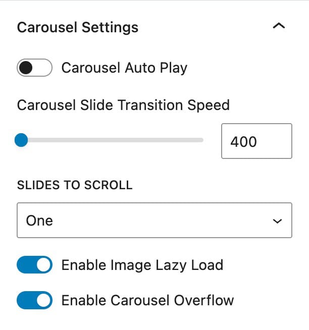
Carousel Settings
An Advanced Gallery can be in the style of a carousel. The Carousel Settings are available for the following Gallery Types: Carousel, Thumbnail Slider, Slider, or Fluid Carousel.
Carousel Auto Play: Enable and use the option for the carousel to automatically play. This unlocks additional options to control the autoplay, which include the Autoplay Speed and the Carousel Slide Transition Speed settings.
Sides To Scroll: Enable whether one side will be scrollable or all sides.
Enable Image Lazy Load: Enable this option to lazy load images within the gallery.
Different gallery types may offer additional or fewer carousel settings, depending on how that specific gallery type behaves.
For example, the Enable Carousel Overflow setting is only available when using the standard Carousel Gallery Type.
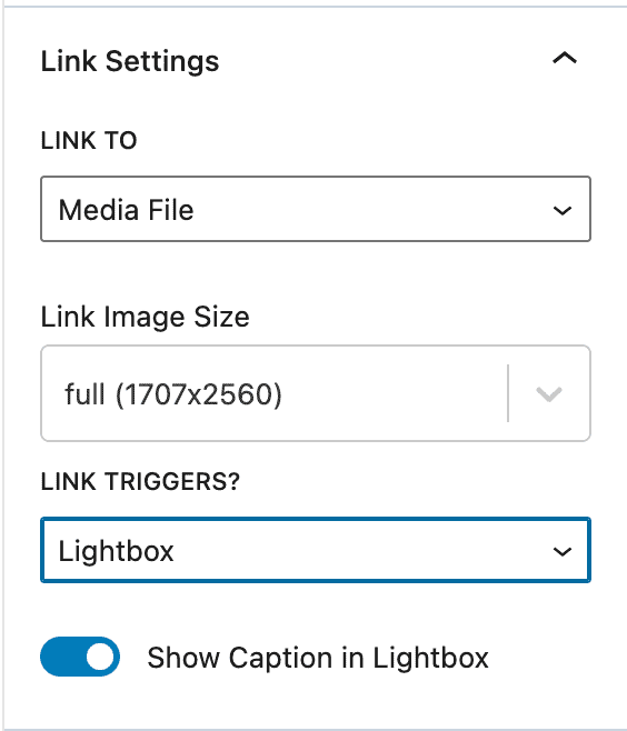
Link Settings
Link To: The images in an Advanced Gallery can serve as links. The links can be to the attachment page for the photo, the media file itself, or a custom link.
- When using the Custom option, you can select each gallery item individually to give it a custom link.
Link Triggers: Determine what will trigger when the link is clicked. This can be set to Media File URL, Lightbox, Custom, or None.
- When using the Lightbox Link Trigger, you must enable Lightbox mode. (You can enable image lightboxes from the Kadence Theme Customizer -> General -> Performance settings)
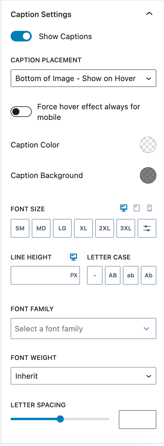
Caption Settings:
Show Captions: Enable this option to show captions from images within the gallery.
Caption Placement: Set where the caption will be placed.
- Options include: Bottom of Image (Show on hover), Bottom of Image (Show always), Below Image (Show always), or Cover Image (Show on hover).
Force Hover Effect Always For Mobile: Enable this to ensure the hover effects show consistently on mobile devices.
Caption Color & Background: Set a Color and a Background Color for the caption text.
Font Settings: Customize the caption’s font, including size, line height, font family, weight, and spacing.
Style Settings
Use the Style Settings to control the styles of your gallery.
Image Style: These settings let you add a border radius to the images or add an image filter that adds a design touch to the gallery. You can edit the border of all images at once by clicking the “linked” icon.
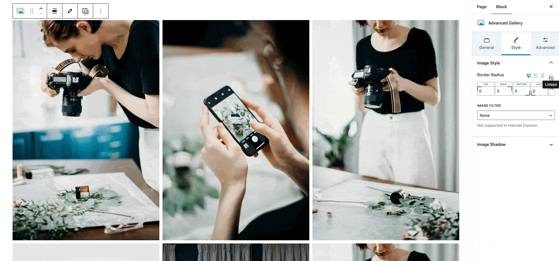
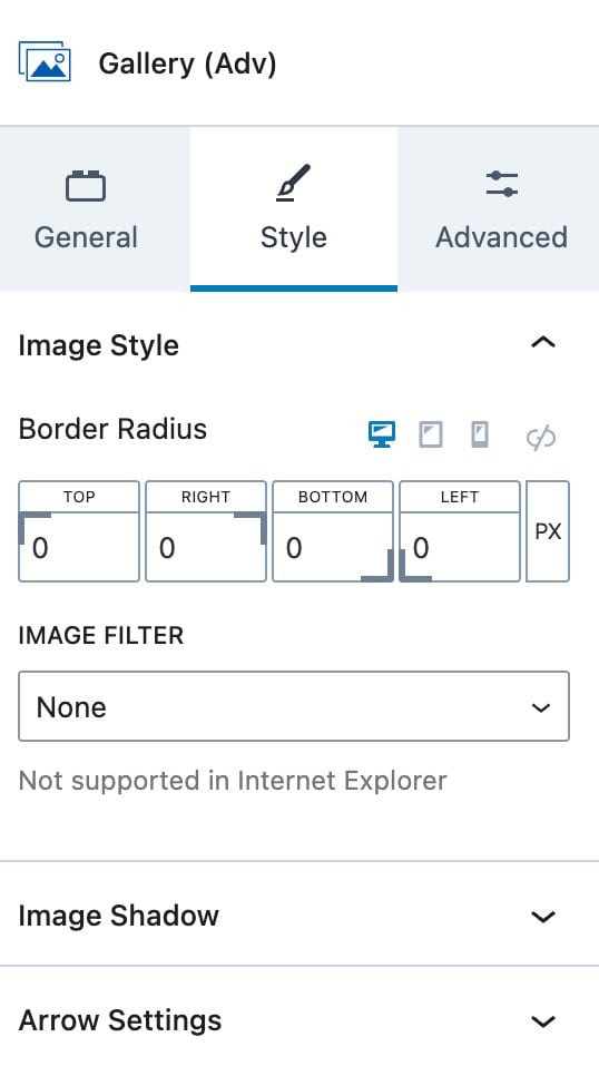
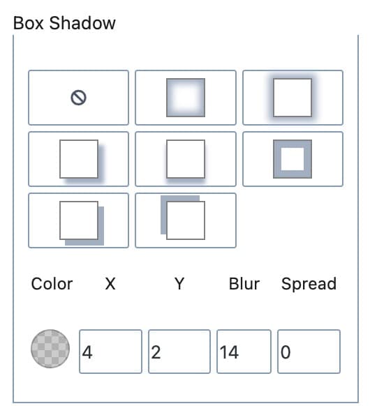
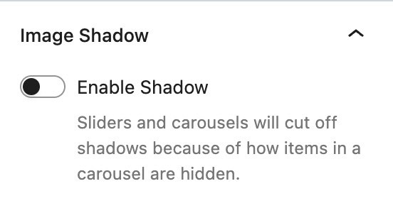
Image Shadow: This setting allows you to enable and use a box shadow on images within the gallery. Once enabled, you can adjust the Color, X Offset, Y Offset, Blur, and Spread. Additionally, you can use an available preset.
Arrow Settings
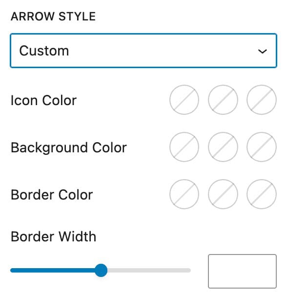
Arrow Style: Select an Arrow Style.
- Free Options include: White on Dark, Black on Light, Outline Black, or Outline White.
- When using Kadence Blocks Pro, you can also select Custom to manually set the arrow colors.
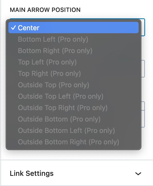
Main Arrow Position: Set the positioning of the arrows when using a gallery type that uses them.
- In the free version of Blocks, this is defaulted to Center. Unlock additional positioning options using Kadence Blocks Pro.
- Additional Pro Positions: Bottom Left, Bottom Right, Top Left, Top Right, Outside Top, Outside Top Left, Outside Top Right, Outside Bottom, Outside Bottom Left, and Outside Bottom Right.
Arrow Size: Set a size for the arrows.
Arrow Margin: Add a margin around the arrows.
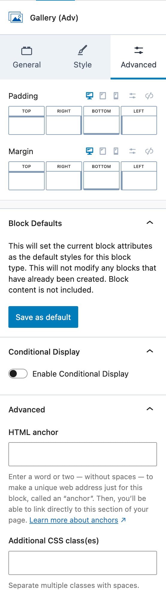
Advanced Settings
Use the Advanced Settings to control more advanced features of the Advanced Gallery Block.
Padding: Set a padding around the entire gallery.
Margin: Set a margin around the entire gallery.
Block Defaults: Set the current block settings as the default settings. Click here to learn more.
Conditional Display (Blocks Pro): Conditionally display the Advanced Gallery Block. Click here to learn more.
HTML Anchor: Add an HTML Anchor to the gallery.
Additional CSS Class(es): Add additional CSS Classes to the gallery for easy targeting.
How to Enable Dynamic Content for the Gallery Adv Block (Kadence Blocks Pro Feature)
The Advanced Gallery block in Kadence Blocks Pro supports dynamic content, allowing you to pull images from a Gallery Custom Field. To do this:
- Add the Gallery Adv block to your page or template.
- Click the Dynamic Gallery icon in the block toolbar.
- Select the custom field.
Supported Plugins
To enable dynamic gallery functionality, you will need one of the following:
- Advanced Custom Fields (ACF) Pro
- Secure Custom Fields (SCF) Pro
These plugins include built-in support for gallery fields. If you are not using the Pro versions, you can use MetaBox as a free and flexible alternative.
Using MetaBox with the Gallery Adv Block
You can use the MetaBox Image Advanced field with the Gallery Adv block’s Dynamic Gallery option.
Step-by-Step Guide
- Install the MetaBox Plugin
Download and activate the plugin from the WordPress repository:
https://wordpress.org/plugins/meta-box - Create the Image Advanced Field
Define the custom field using one of the following methods:- Use the MetaBox Online Generator:
https://metabox.io/online-generator/ - Or follow this guide to create it manually:
Creating Fields with Code (MetaBox Docs)
- Use the MetaBox Online Generator:
- Add the Field Code to Your Site
Use the Code Snippets plugin to safely add the generated MetaBox PHP code to your website. - Enable Dynamic Gallery in the Gallery Adv Block
- Add the Gallery Adv block to your page or template.
- Click the Dynamic Gallery icon in the block toolbar.
- Select the custom field that corresponds to your MetaBox Image Advanced field.
