
Kadence Blocks features the Advanced Navigation Block, designed to create, customize, and manage navigations directly from the Block Editor. This block offers a robust alternative to the Classic Navigation system and supports the creation of dynamic navigations on both Classic and Full Site Editing (FSE) websites.
The Advanced Navigation is a part of the Advanced Header Blocks. These blocks consist of the Header (Adv) Block, the Navigation (Adv) Block, and the Navigation Link Block. Understanding each of these blocks is essential to building great Advanced Headers using Kadence Blocks. Click here for more Advanced Header-Related resources.
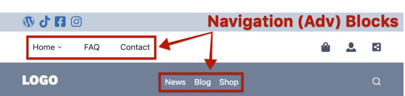
Advanced Navigations can be added inside and outside of Advanced Header Blocks. Use the Navigation Builder to create navigation menus directly in the WordPress Editor.
Getting Started
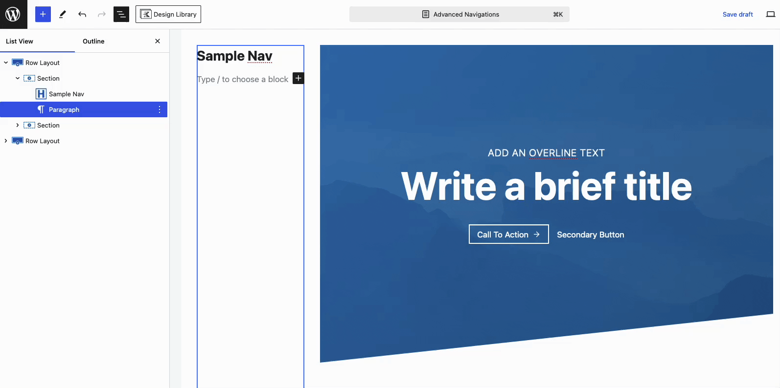
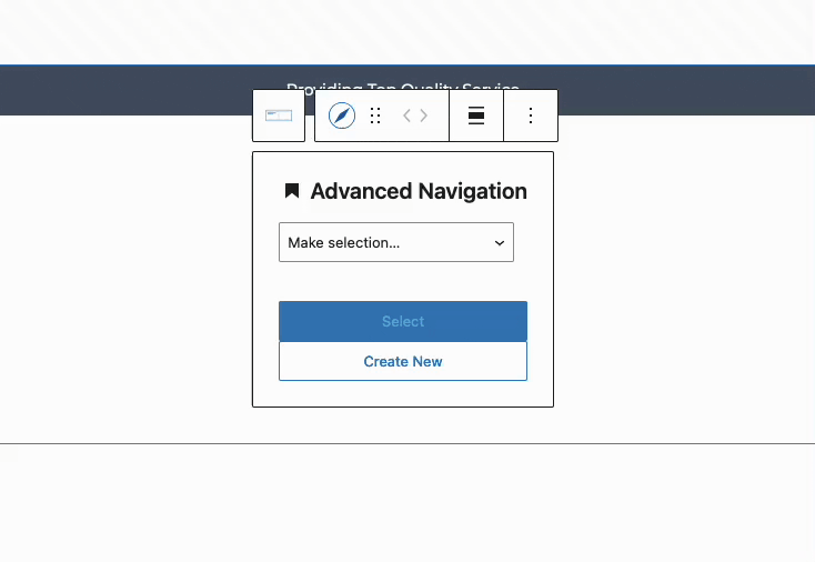
Advanced Navigations can be created directly within the Block Editor. This can be done by adding a new Navigation (Adv) Block where applicable. Typically, Advanced Navigation Blocks are added to Advanced Headers or Hooked Elements. Once the Navigation (Adv) Block is added, you will be prompted to either select an existing navigation or create a new one.
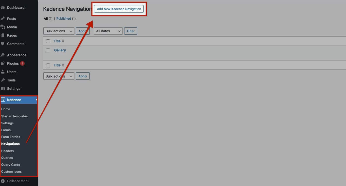
Navigations can also be created from the Dashboard -> Kadence -> Navigations page. Click the Add New Kadence Navigation button at the top of the page to start building a new Advanced Navigation.
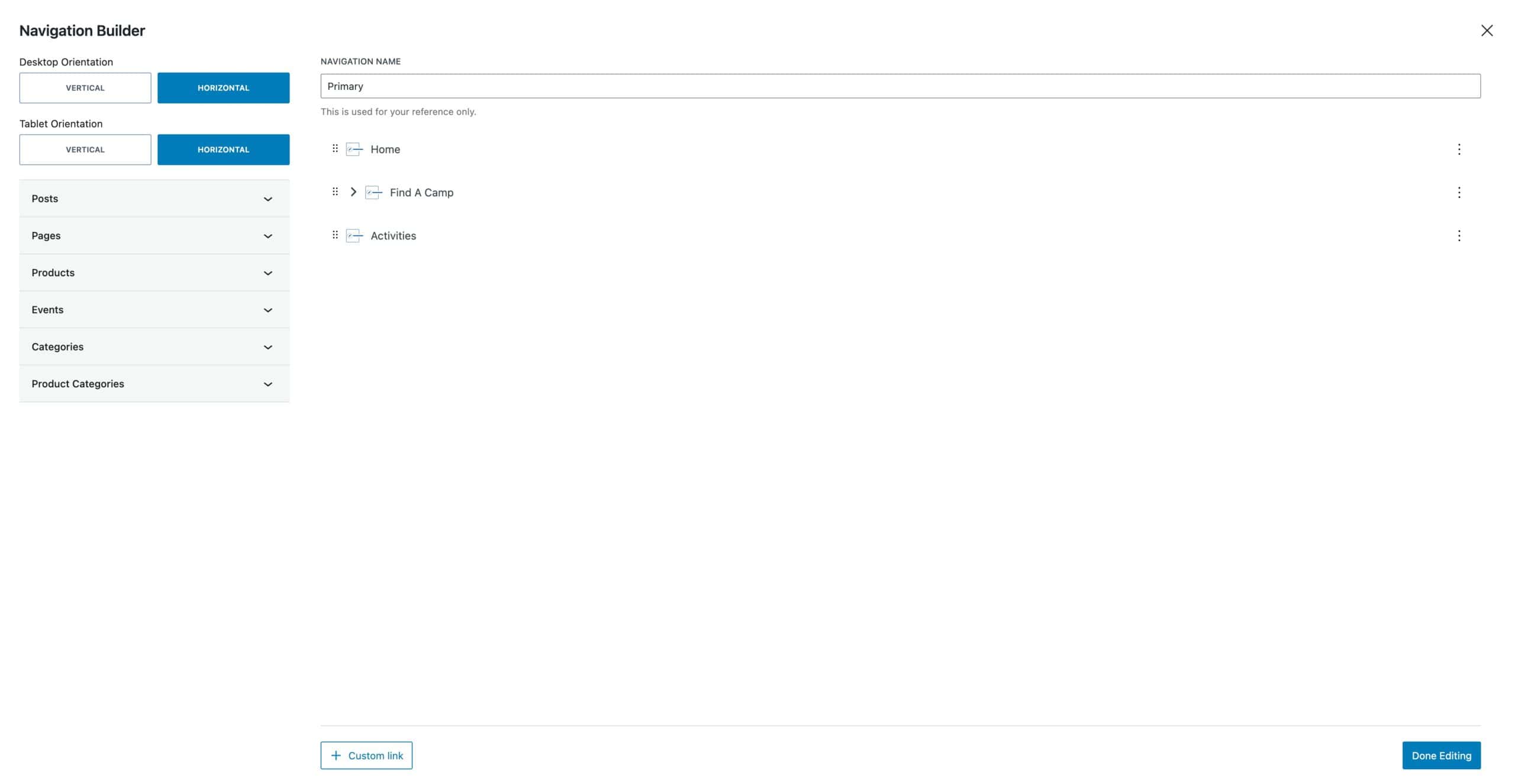
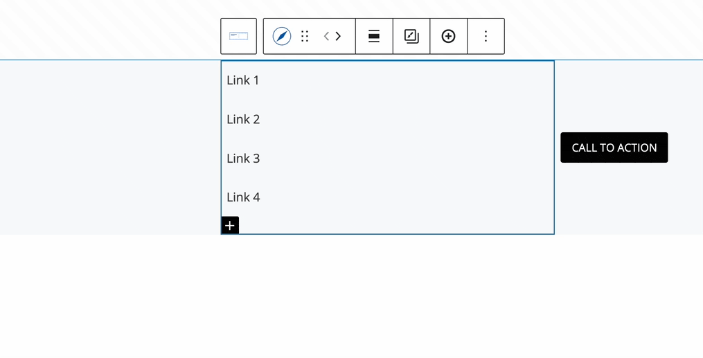
This will trigger the Navigation Builder to open and allow you to create your Navigation. You can use the Tabs to add specific Pages, Posts, Products, or other Post Types to the Navigation. You can also pull in Post and Product Category pages.
Click here for an in-depth tutorial on the Navigation Builder.
This document specifies the Advanced Navigation Block and Settings. For an in-depth tutorial on using Advanced Navigations and Advanced Headers, refer to the Getting Started With Advanced Headers/Navigations document.
Importing WordPress Menus
When adding a new Advanced Navigation Block, you have the option to select from an existing Advanced Navigation. In the same dropdown, you can also choose a WordPress Menu, which will be automatically converted into an Advanced Navigation Menu. This process brings the WordPress Menu into the Advanced Navigation setup for further customization.
When importing a WordPress Menu, any changes made to the Advanced Navigation will not affect the WordPress Menu itself. These changes will only apply to the Advanced Navigation. When you import a WordPress Menu, you are importing the Labels and URLs as new Advanced Navigation Links.
Navigation (Adv) Block Settings
Customize your navigation with the fully responsive Advanced Navigation Block Settings. Adjust styles for Desktop, Tablet, and Mobile devices using the Responsive Controls, allowing you to fine-tune your navigation for each view.
Use the Responsive Controls to modify a setting for Dekstop, Tablet, and Mobile Devices.
General Settings
Selected Navigation: This displays the currently selected navigation. You can choose a different navigation from the dropdown menu.
Create a New Navigation: Use this link/setting to create and apply a new navigation
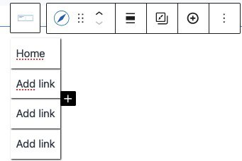
Open Navigation Builder: Click this button to access the Visual Navigation Builder and customize your Navigation Links. (Click here to read more about the Navigation Builder)
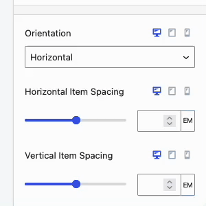
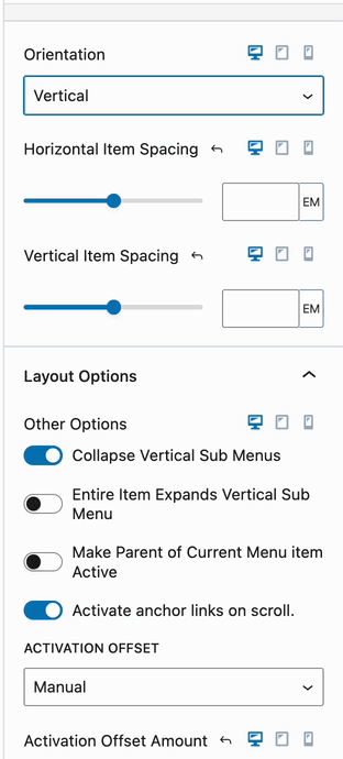
Orientation: Set the orientation of your navigation to either horizontal or vertical.
Horizontal Item Spacing: Adjust the horizontal spacing between Navigation Links.
Vertical Item Spacing: Adjust the vertical spacing between Navigation Links.
Stretch Menu: Force the menu to stretch and fill the available space.
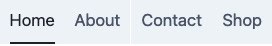
Fill and Center Menu Items: Stack the menu items and center them within the navigation area. (See Image)
Make Parent of Current Menu Item Active: This setting will make the parent menu item active whenever one of the sub-menu pages is being viewed.
See the remaining Layout Options below.
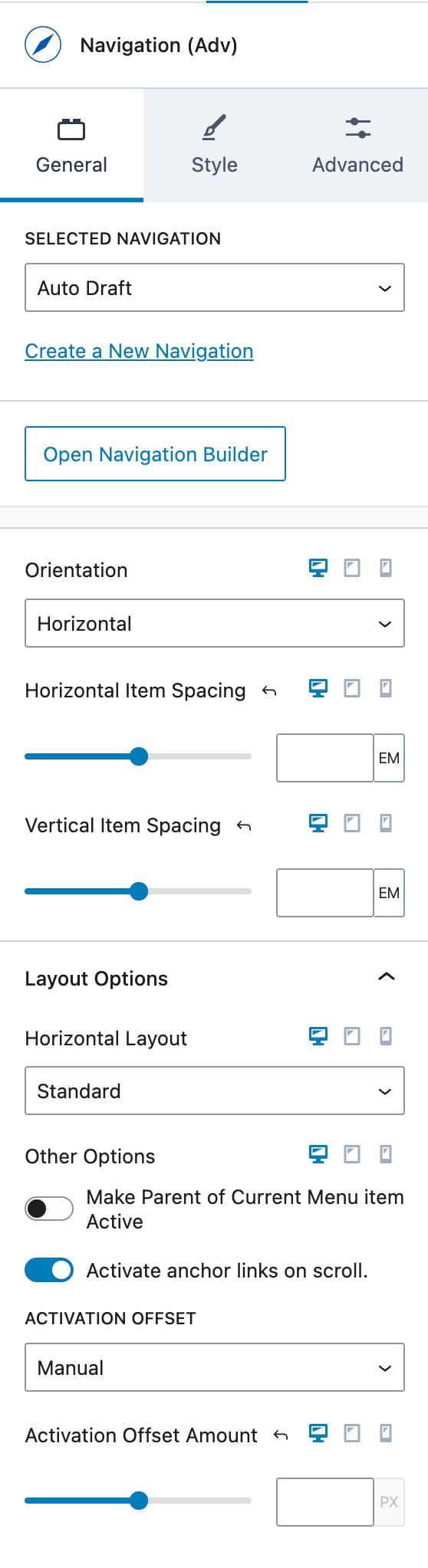
Layout Options
When using the Layout Options, the available settings will depend on the chosen Orientation:
- Horizontal Orientation provides multiple Horizontal Layout options.
- Vertical Orientation provides options specific to Vertical Layouts.
Vertical Layout Settings
When using a Vertical Layout, the following options are available:
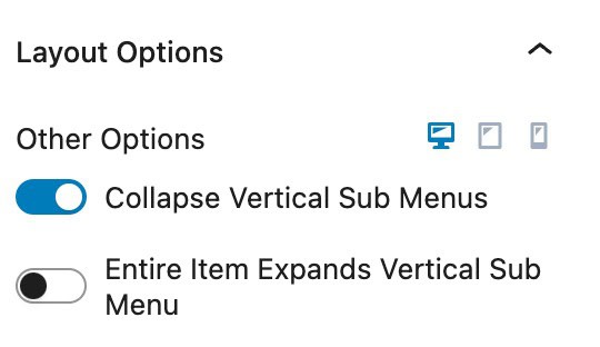
Entire Item Expands Vertical Sub Menu: This option allows the entire width of a Vertical Menu Item to be clickable, expanding the Sub Menu when selected.
Collapse Vertical Sub Menus: This option collapses Vertical Sub Menu links in an accordion style, allowing users to expand and collapse sections.
Horizontal Layout Settings
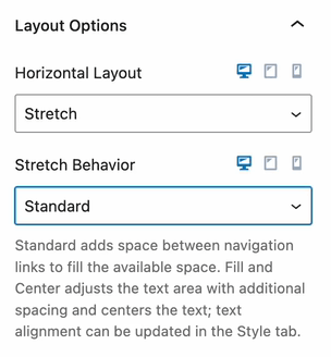
When using the Horizontal Layout Settings, you can choose between Standard, Stretch, and Grid. Use the Standard Layout for standard-styled navigations. The Stretch Layout allows you to expand menu items across the full width of the container, while the Grid Layout provides options to organize menu items within a structured grid format. Both the Stretch and Grid Layouts Options include additional settings to refine their appearance and behavior.
Stretch Layout: The Stretch Layout expands the Navigation Items evenly across the available space.
Stretch Behavior:
Standard: Adds space between navigation links to distribute them evenly across the available space.
Fill and Center: Adjusts the text area by adding spacing and centers the text within each navigation item. Text alignment settings can be customized in the Style Block Settings under the Navigation Item Styles settings.
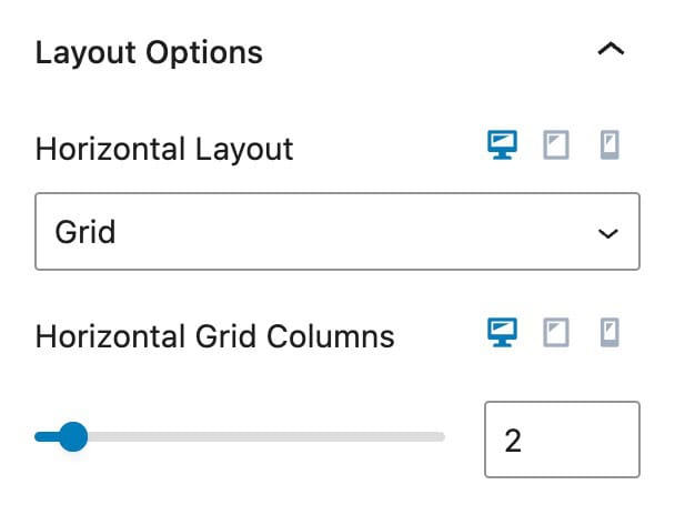
Grid Layout: The Grid Layout arranges Navigation Items into a structured grid format.
Horizontal Grid Columns: Specify the number of columns in the Grid. Navigation Links will align within the defined columns, flowing from left to right in a grid-like manner.
Active Anchor Links
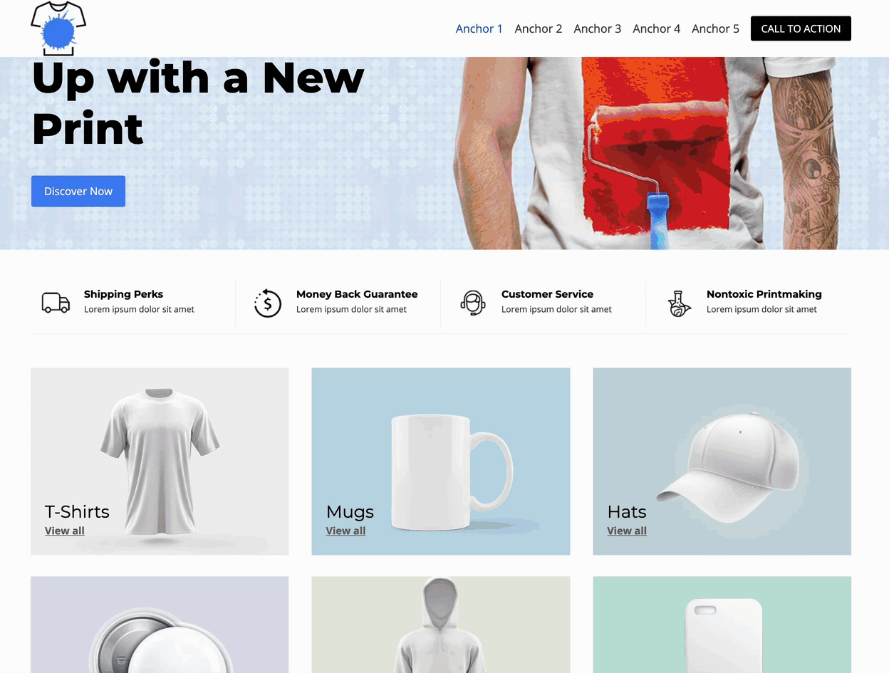
By default, an Anchor Link inside an Advanced Navigation Block will be activated when directly linking to the Anchor. For example: website.com/#anchor1 or website.com/#anchor2. This functionality is useful for directly linking to anchored sections while indicating that the current section is active.
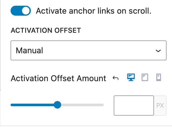
Enable the Activate Anchor on Scroll setting to automatically transform Anchor Links into their active state as users scroll to the corresponding Anchor within the page.
Additionally, use the Activation Offset option to switch between Auto and Manual. When using. Manual, you will be able to manually set an Activation Offset Amount responsively.
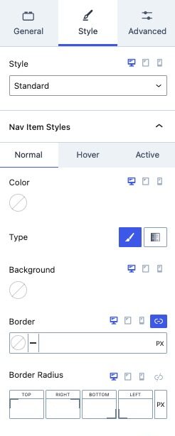
Style Settings
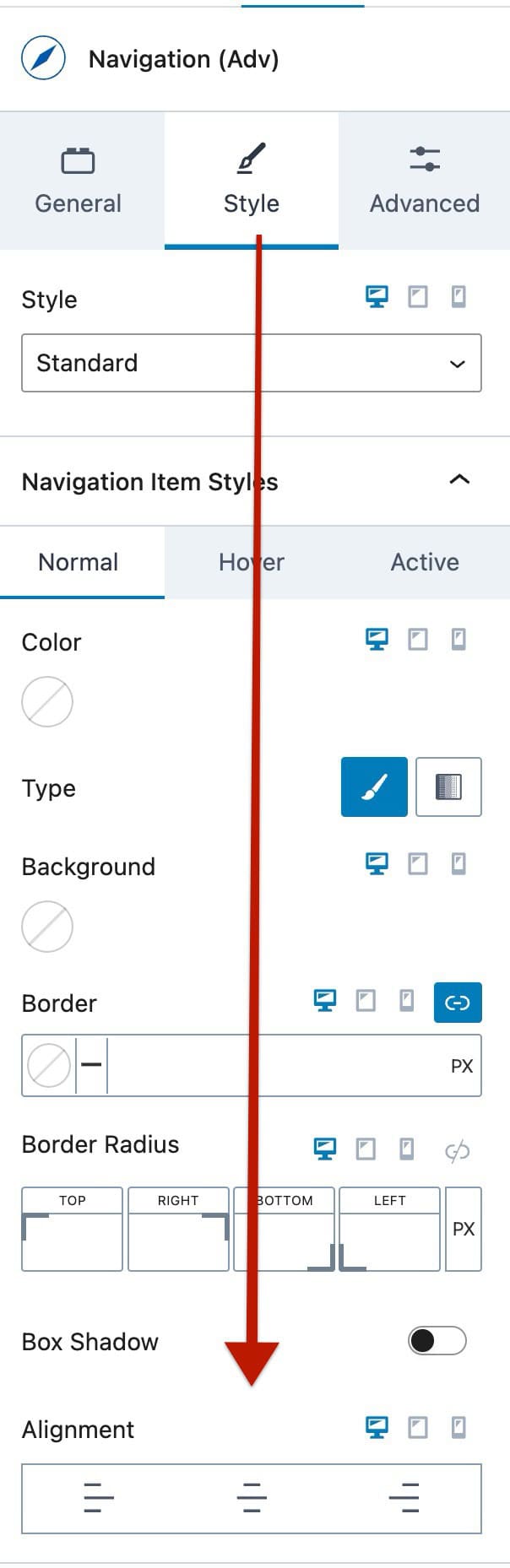
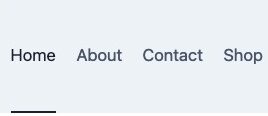
Style: Choose a style for your navigation, such as Standard, Full Height, Underline, or Full Height Underline. These styles will determine the appearance of the navigation menu items. The Underline options add an Underline to the Current Active Page.

The Full Height options make the navigation items take up the full height of the header. They’re useful if you want to show the submenu dropdowns below the parent menu items.
Nav Link Styles: Use these settings to customize the Styles of your Navigation Links. These settings can be adjusted for the Normal, Hover, and Active states of Navigation Links. (These settings apply Globally to all Navigation Links within the Advanced Navigation. However, you can also customize Navigation Links individually by overriding these styles through the Navigation Link Block Style Settings.)
- Color: Set the text color for Navigation Links.
- Type: Select the background type for Navigation Links, either Color or Gradient.
- Border: Add a border to Navigation Links.
- Border Radius: Apply a border radius to round the corners of your borders.
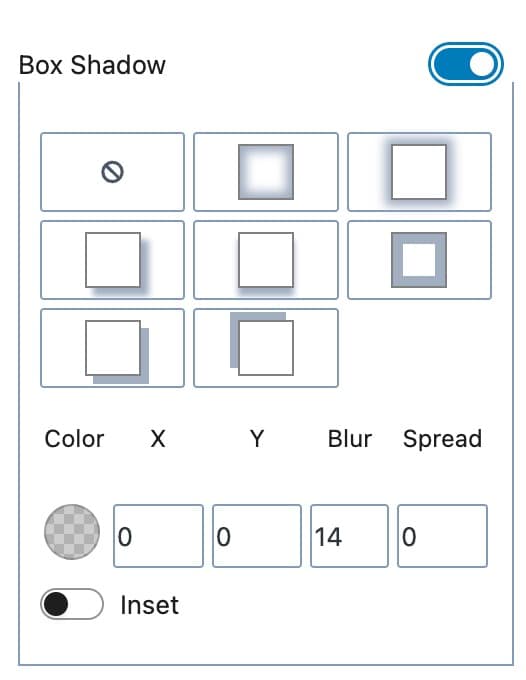
- Box Shadow: Enable this option to add and customize a box shadow for navigation links. You can use a custom box shadow or use an available preset.
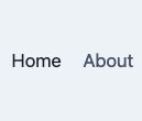
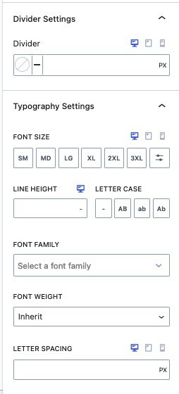
Divider Settings: Add a divider between Navigation Links. Customize the divider by setting its Color and Width. (See Image Below)

Typography Settings: Fine-tune the typography of your Navigation Links for a distinct look and feel. These settings apply globally to all inner Navigation Links. (Typography Settings can be customized on an individual level by overriding these styles through the Navigation Link Block Style Settings.)
- Font Size: Specify the Font Size for Navigation Links.
- Line Height: Adjust the Line Height to control the Line Height Spacing of inner navigation text.
- Letter Case: Apply a Letter Case effect to your Navigation Links for auto capitalizations.
- Font Settings: Choose a Font Family and set the Font Weight to match your design preferences.
- Letter Spacing: Manage the Letter Spacing to achieve the desired spacing between characters in your Navigation Links
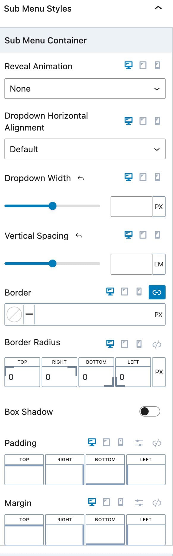
Sub Menu Styles: Customize the appearance of Sub Menu Items. To learn more about Sub Menus, Mega Menus (Pro), and how to use them, Click Here.
- Reveal Animation: Choose the animation to reveal the sub menus on hover. Options include Fade, Fade Up, Fade Down, or None.
- Dropdown Horizontal Alignment: Set the Horizontal Alignment for dropdown links to Left, Center, or Right.
- Dropdown Width: Define the Dropdown Width to control the overall width of the Sub Menu.
- Vertical Spacing: Adjust the Vertical Spacing between Sub Menu Items for proper separation.
- Border and Border Radius: Add a Border to Sub Menu Dropdowns. A Border Radius can also be set.
- Box Shadow: Enable and use a Box Shadow on Sub Menu Items.
- Padding and Margin: Add Padding and/or Margin to your dropdown container.
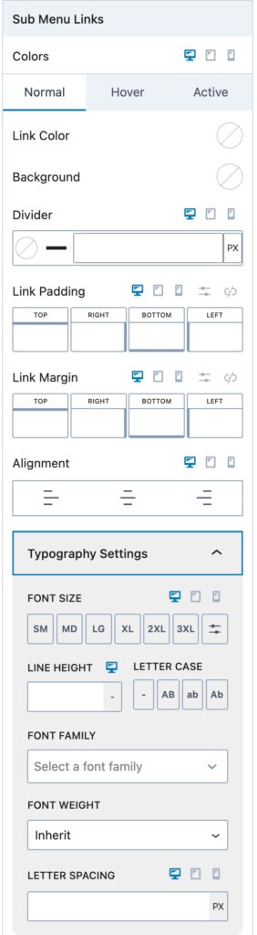
Sub Menu Links: Adjust these settings to control the global Sub Menu Styles for the current Navigation.
- Colors: Set colors for your Nav Links. Each one of these colors can be set for the Normal, Hover, and Active states of the Navigation Link.
- Divider: Add a Divider between Sub Menu items. This divider will appear below each Sub Menu Item.
- Link Padding and Margin: Set a standard Padding and Margin for all Navigation Links in the dropdown.
- Alignment: Set an Alignment for Navigations Links. This can be set to Left, Center, or Right and applied based on device type.
- Typography: Adjust the font size, line height, letter case, font family, font weight, and letter spacing for Sub Menu Items.
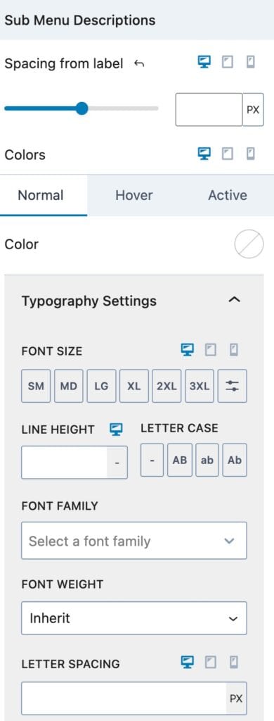
Sub Menu Descriptions: Adjust the styling of Nav Link Descriptions that are inside of a Sub Menu.
- Spacing From Label: Adjust the spacing between the Navigation Labels and Description Text.
- Colors: Adjust the color of the Sub Menu Descriptions for the normal, hover, and active states.
- Typography: Adjust the font size, line height, letter case, font family, font weight, and letter spacing for Sub Menu Descriptions.
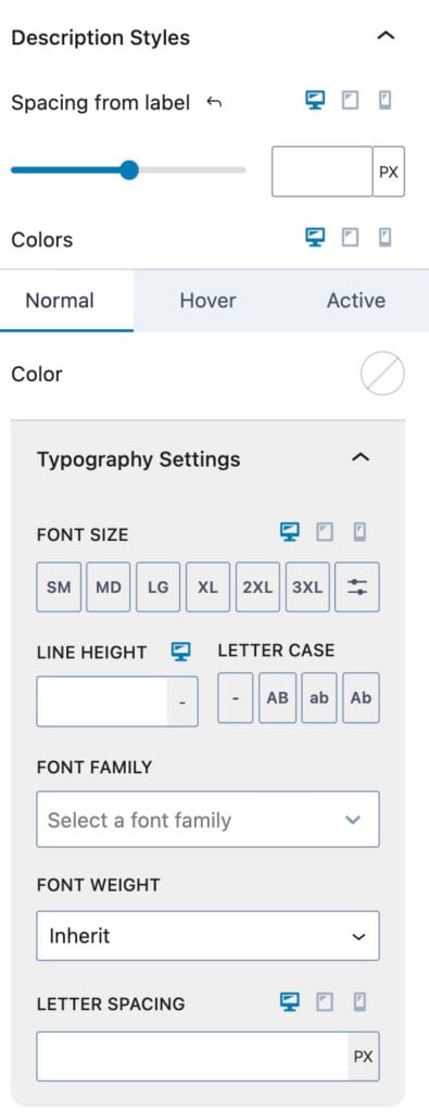
Description Styles: Adjust the Description Styles that are in the Navigation (Adv) Block at a top level.
Spacing From Label: Adjust the spacing between the Navigation Link Labels and Description Text.
Colors: Adjust the color of the Navigation Link Descriptions for the normal, hover, and active states.
Typography: Adjust the font size, line height, letter case, font family, font weight, and letter spacing for Navigation Link Descriptions.
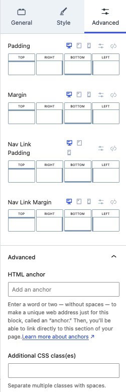
Advanced Settings
Padding and Margin: Add Padding and/or Margin to the entire Navigation Menu.
Nav Link Padding and Nav Link Margin: Add Padding and/or Margin to your Individual Navigation Links.
HTML Anchor: Add an HTML Anchor #ID to the Navigation.
Additional CSS Class(es): Add Custom CSS Classes to the Navigation.
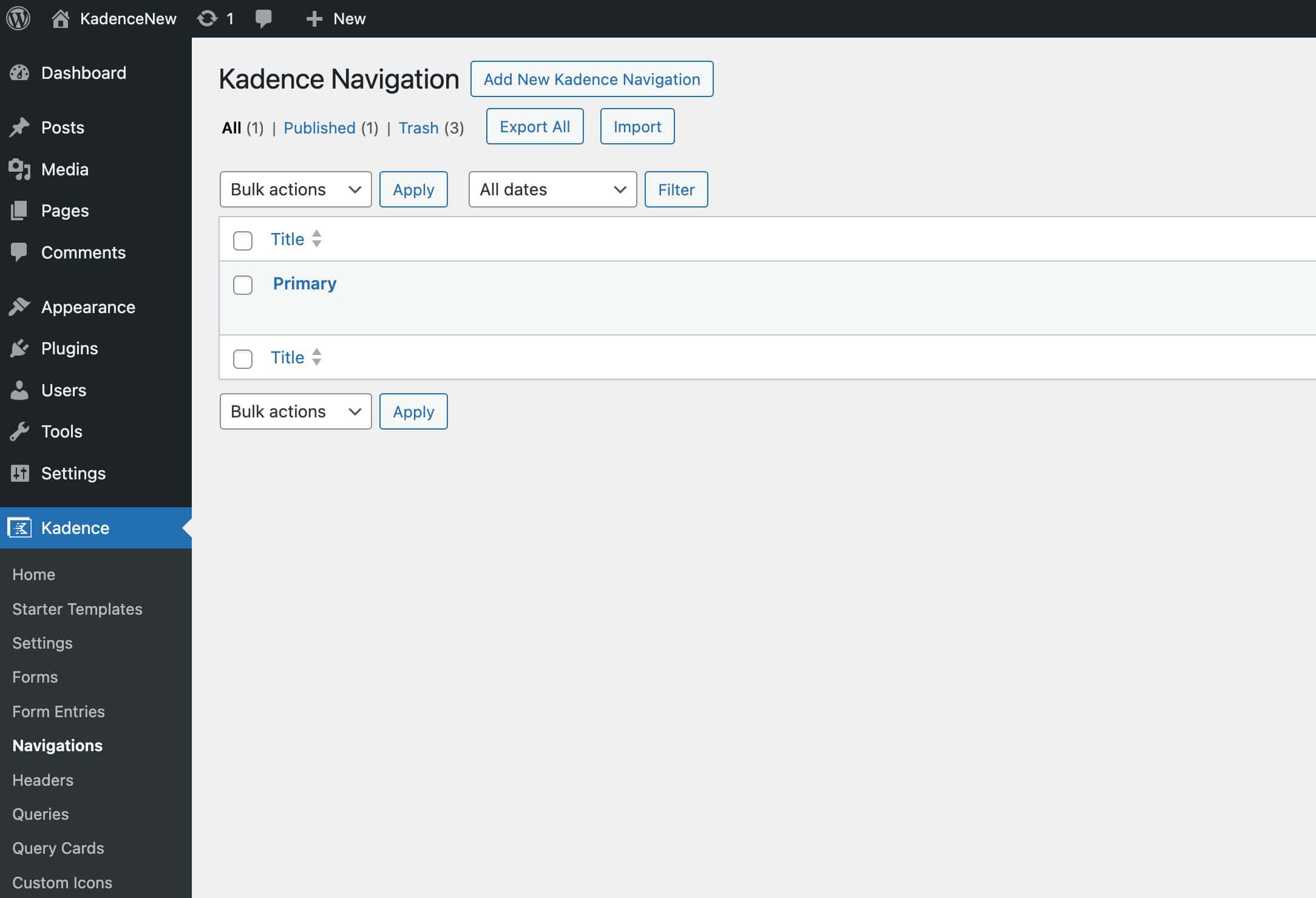
Managing Advanced Navigations
Advanced Navigations can be edited, created, or deleted from the Dashboard -> Kadence -> Navigations page.
Additional Resources
This document primarily covers the usable settings of the Advanced Navigation Block. However, the Advanced Navigation Block is also highly compatible with Advanced Header Blocks and includes Navigation Link blocks for creating megamenus and sub menus. For a comprehensive understanding of how to utilize the Advanced Navigation Block and other related blocks, refer to the resources below.
The Advanced Header Block: Learn the extensive settings and functionalities of the Kadence Advanced Header Block.
Getting Started with Advanced Header / Navigation Blocks: This comprehensive guide offers detailed instructions on setting up and using the Advanced Header Block and Advanced Navigation Block. It covers the complete setup process and provides essential information to help you effectively use Advanced Headers.
The Kadence Advanced Navigation Block: Learn how Advanced Navigation Blocks give you complete control over your navigation(s) directly in the WordPress editor.
The Kadence Navigation Link Block: Discover how to customize each inner Navigation Link Block.
Advanced Navigation Sub Menus and Mega Menus: Learn how to add Sub Menus and Mega Menus (Pro) to the Advanced Header.
