
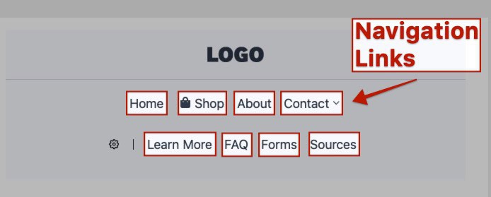
The Kadence Advanced Header features the Advanced Navigation Block. Within the Advanced Navigation Block are multiple Advanced Navigation Link Blocks. Navigation Links can be customized and modified directly through the Block Editor. The Navigation Link Block is versatile and can have images/icons added to it, custom styles on an individual basis, and unlock the power to create sophisticated Menu Items within Advanced Navigations.
NOTE: The Navigation Link Block is part of the Advanced Header Blocks, which consists of the Header (Adv) Block, the Navigation (Adv) Block, and the Navigation Link Block. Understanding each of these blocks is essential to building great Advanced Headers using Kadence Blocks. Click here for more Advanced Header-Related resources.
Getting Started
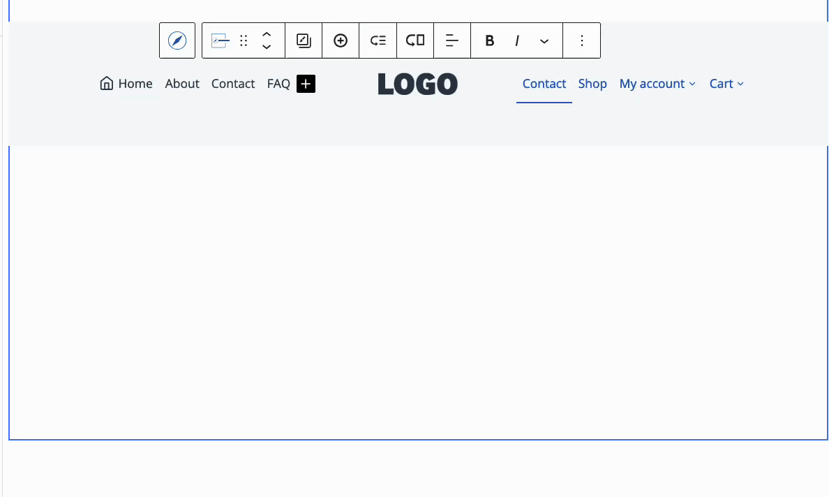
Navigation Link Blocks can be added to an Advanced Navigation Block in multiple ways. Initially, Navigation Links are added through the Navigation Builder when either creating or modifying an Advanced Navigation.
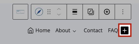
Another way to add a Navigation Link is to select the Navigation (Adv) Block, then click the Plus Icon in the Block Toolbar. From there, you can search for a page and automatically add it as a Navigation Link. Alternatively, you can use the Navigation Link Block Settings to manually add a label and URL to the newly created Navigation Link.
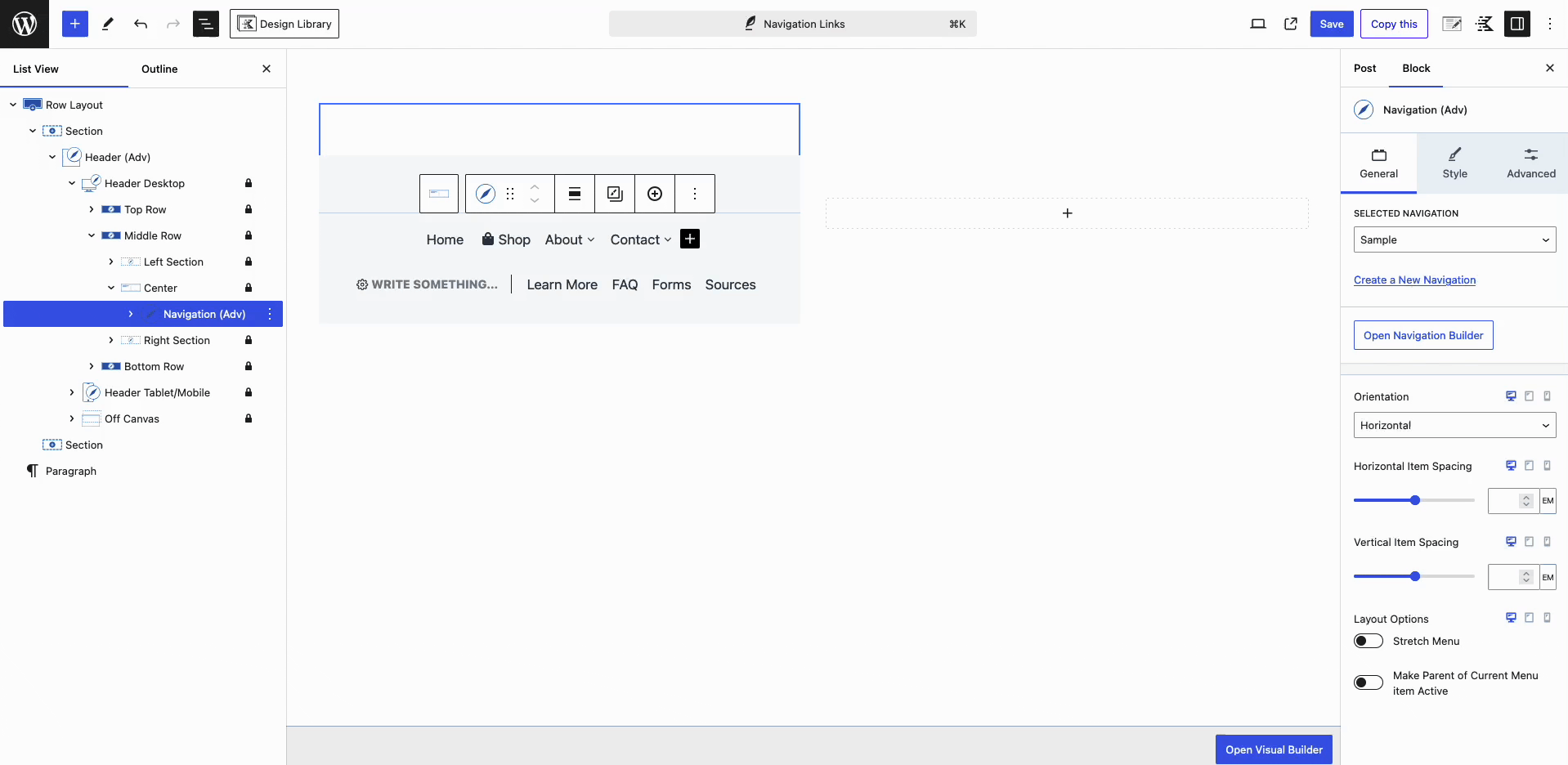
When selecting an Advanced Navigation, you can also use the Black Plus Icon to add a new Navigation Link Block to the navigation.
You can also press the Enter key with the Advanced Navigation Block selected to add a new Navigation Link Block to the Navigation.
Navigation Link Settings
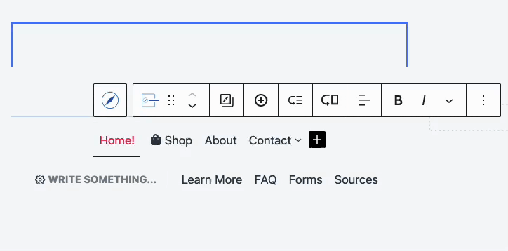
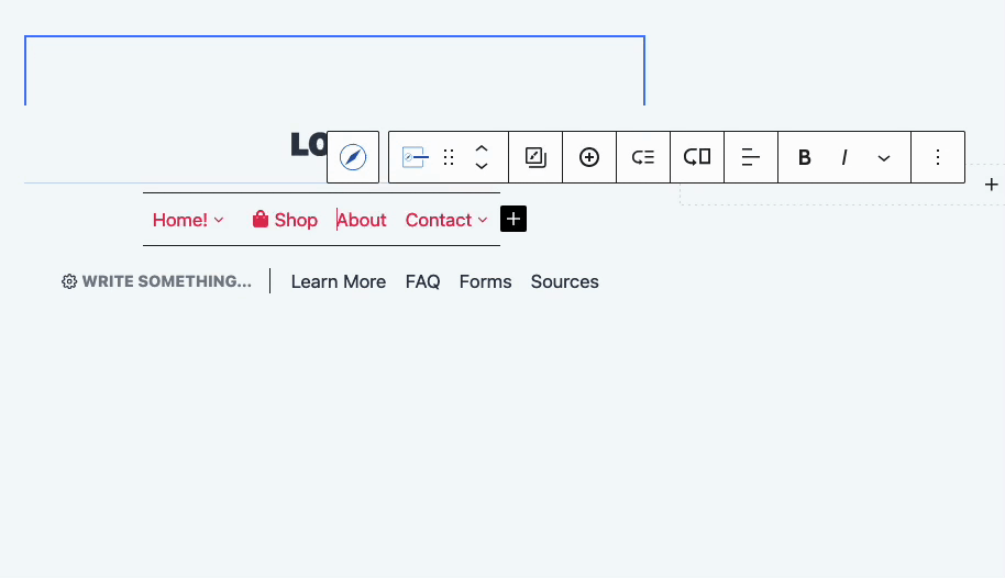
Navigation Links can be customized and configured using the Block Toolbar and Block Settings. To get started, select an Individual Navigation Link Block from within the Advanced Navigation.
These settings apply to individual Navigation Links. The Navigation (Adv) Style Settings control the appearance of all Children Navigation Links at once. When configuring a Navigation Link Block, your customizations will override the main Advanced Navigation styles, giving you complete control over each Navigation Link.
Block Toolbar Settings
While selecting a Navigation Link Block, use the Block Toolbar to copy and paste styles, add additional Navigation Links to your Advanced Navigation, and create Sub Menus and Mega Menus.
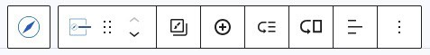
Copy/Paste Styles: The first icon, featuring a boxed-in paintbrush, represents the Copy/Paste Styles setting. Clicking this icon gives you the option to either copy or paste styles.
Add Navigation Link: Add a new Navigation Link to the Advanced Navigation. The new link will be added after the current one and will automatically be selected.
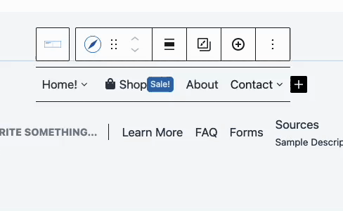
Creating Sub Menus and Mega Menus
The Block Toolbar can be used to Create Sub Menus and Mega Menus (Pro). Sub Menus can be created with the free Kadence Blocks plugin. However, Mega Menus and their options are only available with Kadence Blocks Pro.
In the Block Toolbar, notice the Icons for adding Sub Menus and Mega Menus
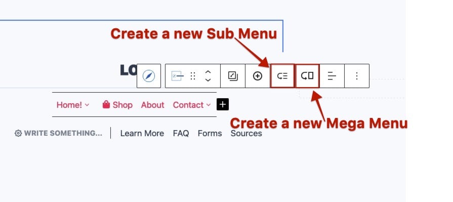
Add Sub Menu: Click on the third icon, the arrow pointing to three lines, to add a Sub Menu item to the currently selected Navigation Link Block.
Add Mega Menu: Click on the fourth icon, which features an arrow pointing to a rectangle, to add a Mega Menu to a Navigation Link Block. This will prompt you to select an initial layout or use the Skip button to start from a blank canvas. Premade layouts will come predesigned with Blocks and ready to be customized and used.
Once the initial column layout is set, you can add blocks, such as additional Advanced Navigation (Adv) Blocks, to further customize the Mega Menu.
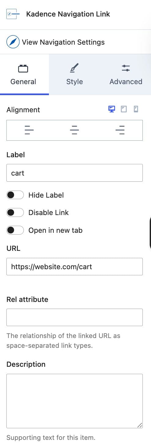
Navigation Link Block Settings
Each Navigation Link within the Advanced Navigation Block can be individually customized. This flexibility allows you to override the main Advanced Navigation Styles and create unique, custom menu items. To get started, select a Navigation Link Block and go to the Block Settings in the WordPress Editor.
General Settings
Alignment: Set an Alignment for the Navigation Link. This can be set to Left, Center, or Right for desktop, tablet, and mobile devices.
Label: Add a Label/Text to the Navigation Link.
Hide Label: This option hides the Label from the front end while enabled.
Disable Link: Disable the Navigation Link using this setting. This is useful if you are using a Navigation Link for something other than linking to a new destination.
Open in New Tab: Enable this option to open the link in a new tab.
URL: Specify the URL. destination for the Navigation Link.
Rel Attribute: Add a Rel Attribute to the Navigation Link.
Description: This setting allows you to add a Description Text to your Navigation Link. The text appears below the Navigation Label.
Open Dropdown On: When using a submenu/mega-menu, use this option to set the menu to open on hover or click.
Mega Menu (Pro): Enable this option to use a Mega Menu. (To learn more about Mega Menus, click here.)
Mega Menu Width (Pro): Whenever a Mega Menu is enabled, the Mega Menu Width can be set.
- Default: By default, the Mega Menu will use a full-width layout.
- Menu Container Width: This setting uses the width of the Parent Navigation Link Menu Item. It is designed for special use cases where a more compact mega menu layout is preferred.
- Content: This setting controls the width of the Header content. If the Advanced Header is set to Full Width, it will adhere to the Full Width Content setting based on the Header (Adv) Layout Block setting. If a Navigation is positioned outside of an Advanced Header Block, the width will default to the Kadence Theme’s Max Width setting.
- Full: This presents the Mega Menu in a Full Width layout.
- Custom Width: Set a custom Width for the Mega Menu.

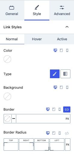
Style Settings
Link Styles: Use these settings to customize the Styles of your Navigation Links. These settings can be adjusted for the Normal, Hover, and Active states of Navigation Links.
Note: You will need Kadence Blocks Pro to access the Style Settings for the Navigation Links.
(If the settings are edited here, they will override the styles set in the Advanced Navigation Link Styles Settings and apply only to the selected Navigation Link Block.)
- Color: Set the text color for Navigation Links.
- Type: Select the background type for Navigation Links, either Color or Gradient.
- Border: Add a border to the Navigation Link.
- Border Radius: Apply a Border Radius to round the corners of the Borders.
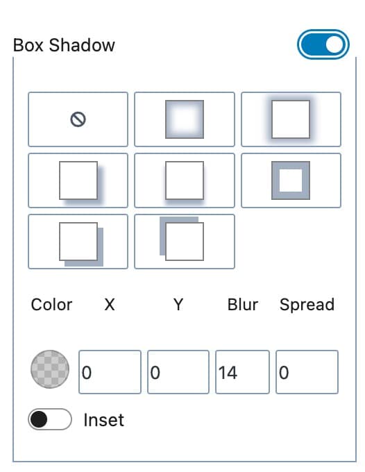
- Box Shadow: Enable this option to add and customize a box shadow for the Navigation Link. You can manually set a box shadow or use a preset.
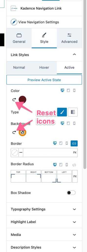
If you want the navigation link to follow the main Advanced Navigation block’s styles again, click the reset icons beside the color circles:
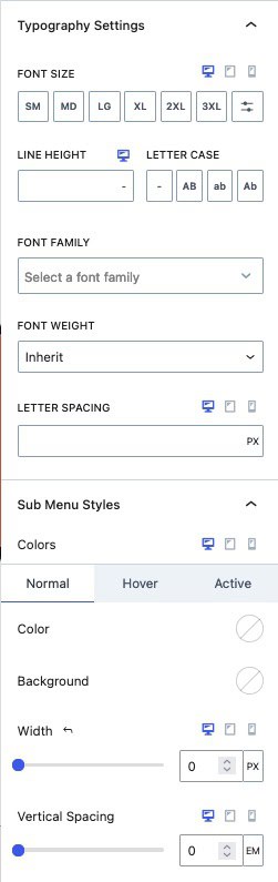
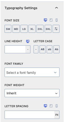
Typography Settings: Fine-tune the typography of the Navigation Link for a distinct look and feel.
(If the Typography settings are edited here, they will override the Typography Styles set in the Advanced Navigation Link Styles Settings and apply only to the selected Navigation Link Block.)
- Font Size: Specify the Font Size for the Navigation Link.
- Line Height: Adjust the Line Height to control the Line Height Spacing of the Navigation Link.
- Letter Case: Apply a Letter Case effect to your Navigation Link for auto capitalizations.
- Font Settings: Choose a Font Family and set the Font Weight to match your design preferences.
- Letter Spacing: Manage the Letter Spacing to achieve the desired spacing between characters in your Navigation Link.
Sub Menu Styles: Customize the styles of Sub Menus that are children of the current Parent Navigation Link.
Color & Background: Set the Color and Background Color for the Normal, Hover, and Active states of Sub Menu links.
Width: Specify the Width of the Sub Menu links.
Vertical Spacing: Adjust the Vertical Spacing between Sub Menu links.
Typography Settings: Customize the Typography for Sub Menu Links using these settings.
(If the Typography settings are edited here, they will override the Typography Styles set in the Advanced Navigation Link Styles Settings and apply only to the selected Navigation Link Block.)
- Font Size: Specify the Font Size for Sub Menu Links.
- Line Height: Adjust the Line Height to control the Line Height Spacing of the Sub Menu Links.
- Letter Case: Apply a Letter Case effect to your Sub Menu Links.
- Font Settings: Choose a Font Family and set the Font Weight to match your design preferences.
- Letter Spacing: Manage the Letter Spacing of Sub Menu Links.
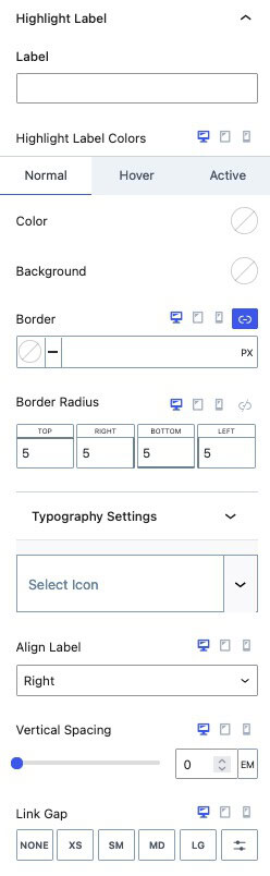
Highlight Label (Pro)
Add a Highlight Label to your Navigation Link.
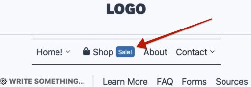
Label: Enter text for the Highlight Label. Once added, the label will appear next to the Navigation Link.
Highlight Label Colors: Customize the Color and Background Color of the Highlight Label. These settings can be configured for the Normal, Hover, and Active states of the current Navigation Link.
Border and Border Radius: Apply a border and/or set a border radius to the Highlight Label.
Typography Settings: Expand and adjust these settings to adjust the Font Size, Line Height, Letter Case, Font Family, Weight, and Letter Spacing of the Highlight Label.
Select Icon: Optionally add an icon to the Highlight Label text. The icon will still be visible even if the label text is left blank.
Align Icon: When an Icon is included in the Highlight Label, the Align Icon setting specifies whether the Highlight Icon is positioned to the left or right of the Highlight Label text. This allows for customization of the icon’s placement relative to the Highlight Label.
Align Label: This setting controls the alignment of the entire Highlight Label relative to the main Navigation Link label text. You can position the Highlight Label either to the Left or Right of the Navigation Link label text.
Vertical Spacing: Adjust the Vertical Spacing of the Highlight Label.
Link Gap: Modify the Gap between the Navigation Link and the Highlight Label.
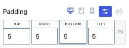
Padding: Add a Padding around the Highlight Label.
Media (Pro)
The Media Settings allow you to add an Icon or Image to the Navigation Link.
Media Type: An Icon or Image can be used as the Media Type.
Media Position: The Media Position can be set to the Top, Bottom, Left, or Right side of the Navigation Link.
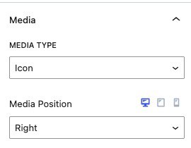
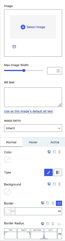
Image Settings
The Image Settings are available when using an Image Media Type.
Image: Select and use an Image with your Navigation Link.
Max Image Width: Set a Maximum Width for your Image to prevent it from appearing too large.
Alt Text: Add Alt Text to the Image. You can use the link titled “Use as this image’s default alt text” to set this Alt Text as the default for the Image.
Image Ratio: Choose an Image Ratio from the available presets. Options include various landscape and portrait ratios, as well as a square 1:1 ratio.
Background: Set a Background to appear behind your Image.
Border and Border Radius: Add a Border and Border Radius to the Image.
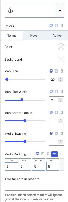
Icon Settings
Icon Settings are available when using an Icon Media Type.
Icon: Choose and use an Icon from the supplied Kadence Icons or upload a Custom SVG Icon (Pro).
Colors: Customize the main Color and Background Color of the Icon.
Icon Size: Set the Size of the Icon.
Icon Line Width: Adjust the width of the Icon Lines.
Icon Border Radius: Modify the Border Radius around the Icon.
Media Spacing: Adjust the spacing between the Media and the Navigation Link.
Media Padding: Add Padding around the Media.
Title for Screen Readers: Add a Title attribute to the Media, allowing Screen Readers to detect it. If no Title is set, Screen Readers will ignore the Media, which can be useful if the Media is purely decorative and not significant.
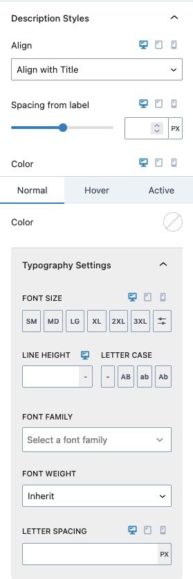
Description Styles: When a Navigation Link includes a description, use the Description Styles to customize the appearance of the description text.
Align: When using both a Media and Description Text, use this setting to set the Description Text Alignment. This can be set to Align with Title or Align with Icon.
Spacing From Link: Adjust the spacing between the Description Text and the Navigation Link.
Color: Set the Text Color for the Navigation Link Description. This can be configured for the Normal, Hover, and Active states of the Navigation Link.
Typography Settings: Customize the Typography of the Navigation Link Description Text using these settings.
- Letter Spacing: Manage the Letter Spacing of the Navigation Link Description.
- Font Size: Specify the Font Size for the Navigation Link Description.
- Line Height: Adjust the Line Height to control the Line Height Spacing of the Navigation Link Description.
- Letter Case: Apply a Letter Case effect to the Navigation Link Description.
- Font Settings: Choose a Font Family and set the Font Weight to match your design preferences.
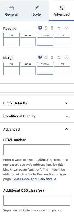
Advanced Settings
Padding and Margin: Add Padding and/or Margin to the Navigation Link.
Block Defaults: Set the current styles as the Block Default Configuration. (Learn more about Block Defaults Here.)
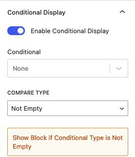
Conditional Display (Pro): Show the Navigation Link Block based on a Condition.
HTML Anchor: Add an HTML Anchor #ID to the Navigation Link.
Additional CSS Class(es): Add Custom CSS Classes to the Navigation Link.
