
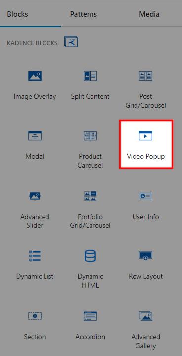
A Video Popup is a great way to engage visitors to your website. Using Kadence Blocks, you can create a popup window displaying a video when a visitor clicks the play button. This can be used to showcase a product or service or to provide an introduction to your website. It is an effective way to capture visitors’ attention and encourage them to explore your website further.
Fully unlock the Video Popup Block using the Kadence Blocks Pro extension plugin to enable the use of all of the available Pro Features.

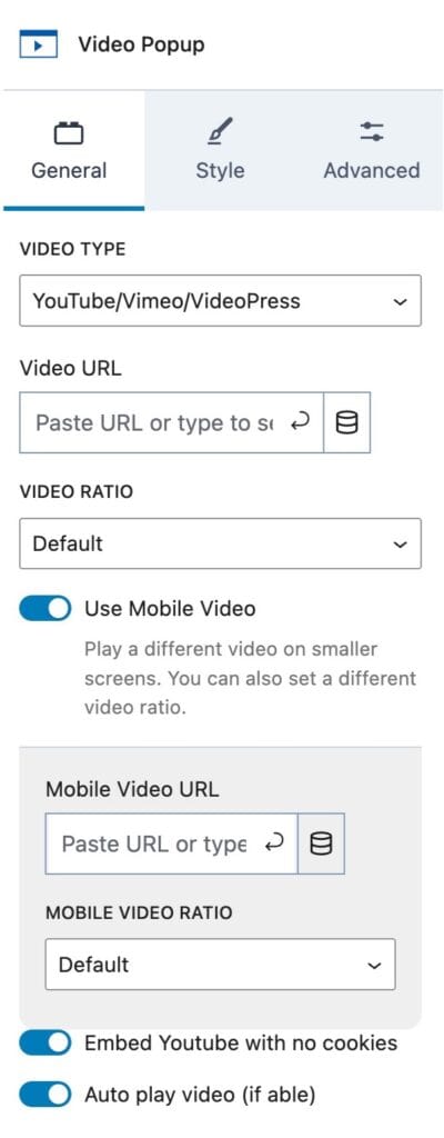
General Settings
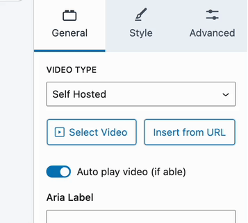
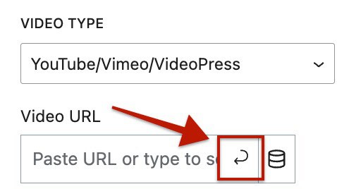
Video Type: You can select different Video Types for your Video Popup Block. You can use either a YouTube/Vimeo/VideoPress Video URL or a Self-Hosted Video (Pro).
The Self-Hosted option is available with Kadence Blocks Pro and allows you to either upload a Video or use a Self-Hosted URL.
With Blocks Pro, you can also use Dynamic Content to populate a YouTube/Vimeo/VideoPress URL.
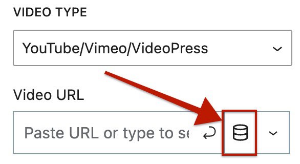
Note: When adding a video URL to the Video Popup Block, make sure to click the Submit icon (the bottom-left back arrow icon). This step is required to properly save the URL in the field. If you skip this step, the video URL will not be pulled into the block.
Video Ratio: This setting determines the video ratio when opened in the video player popup. By default, the ratio is 16:9.
Additional options include: Landscape 4:3, Wide Landscape 16:9, Portrait 3:4, or Vertical 9:16
Use Mobile Video: This allows you to play a different video on smaller screens. You can also use a different mobile video ratio to account for portrait views.
Additional options include: Landscape 4:3, Wide Landscape 16:9, Portrait 3:4, or Vertical 9:16
Embed YouTube with No Cookies: This toggle allows you to enable or disable the option to include YouTube cookies in the embed. When enabled, the video will load without tracking cookies until the user clicks “Play.” This can be beneficial for enhancing user privacy and adhering to data protection regulations.
Auto Play Video (If Able): When applicable, enable this option to enable video auto-play.
Aria Label: This option allows you to add an ARIA label to your Video Popup Block, improving accessibility for screen readers.
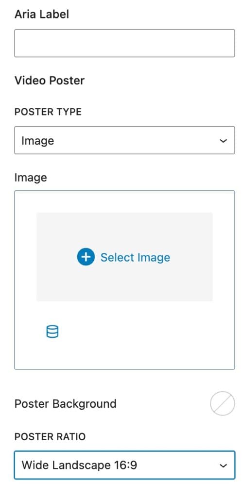
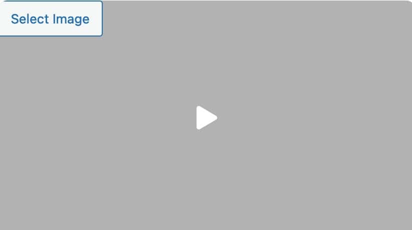
Video Poster: This option allows you to add a poster image or video for your Video Popup Block. This is the poster element seen on the page that can be clicked on to open the video.
Poster Type: Set the Poster Type to use either an image or a video.
Video: When using the video poster type, you will have the option to select a video. It is suggested to use a custom-made, shorter version of the video used in the video popup block. When using a video, you can either select a video from the media library or insert a video via a video URL.
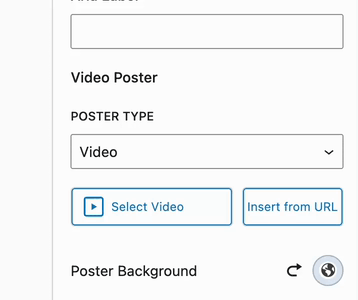
(The video URL setting is intended for self-hosted videos, not YouTube/Vimeo links.)
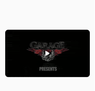
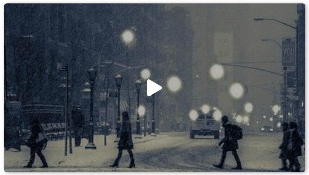
Example of a video poster.
Image: When using the image poster type, select an image from the media library to be used for the poster.
Poster Background Color: This option allows you to set an optional background color for the video poster.
Poster Ratio: This option allows you to set the aspect ratio of the video poster using the dropdown. You can choose from several different ratios to ensure the poster fits your design.
- Square 1:1
- Portrait 3:4
- Tall Portrait 1:2
- Landscape 4:3
- Wide Landscape 16:9
- Wider Landscape 2:1
- Inherit From Image
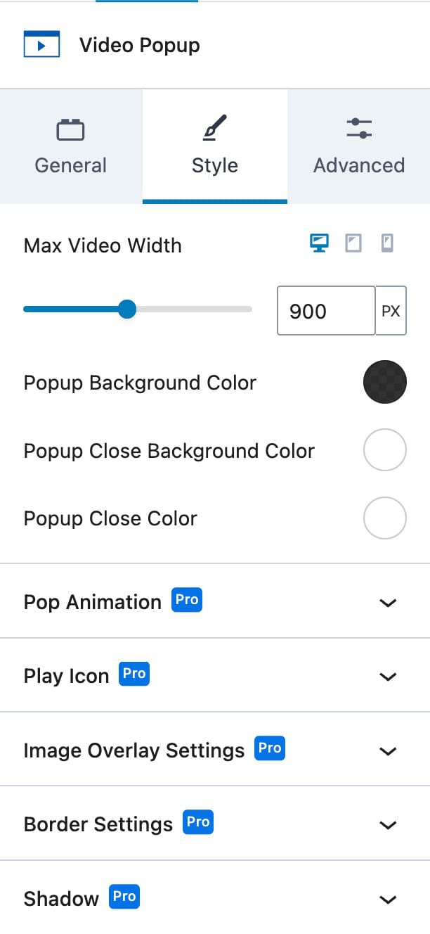
Style Settings
Max Video Width: This setting allows you to define a maximum width for your video. The max width can be configured separately for desktop, tablet, and mobile devices and supports the pixels (PX), viewport width (VW), or percentage (%) units.
Popup Background Color: This setting allows you to customize the background color of the video popup.
Popup Close Background Color: This setting lets you define the background color for the close button on the video popup.
Popup Close Color: This setting allows you to set the color of the close button on the video popup.
The remaining Style Block Settings, which further extend the customization of the Video Popup Block, are available with the Kadence Blocks Pro plugin. This includes the following additional expandable settings:
- Pop Animation
- Play Icon
- Image Overlay Settings
- Border Settings
- Shadow Settings
View more about each setting below.
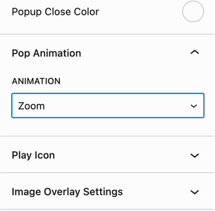
Pop Animation (Pro)
Pop Animation: This setting allows you to choose an animation for the opening and closing of the video popup. You can select from several available animation options.
- Zoom
- Zoom Out
- Slide Right
- Slide Left
- Flip
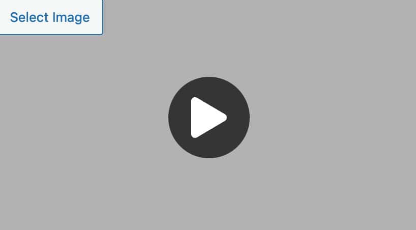
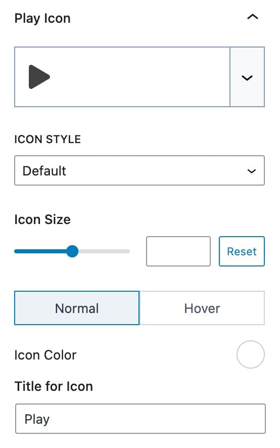
Play Icon (Pro)
Play Icon: This setting allows you to select an icon to use as the play button for your video popup.
Icon Style: This setting lets you choose the icon style, with options for Default or Stacked.
Icon Size: This setting allows you to set a custom size for the icon or reset it to the default size. This setting uses Pixels as the unit of measurement.
Icon Color: This setting lets you define the icon color for both the normal and hover states. If you are using a Stacked Icon, you can also set Borders and Background Colors.
Icon Title: This setting allows you to set a title for the icon.
Stacked Icon Style Settings: When using the Stacked Icon Style, additional settings are available.
Icon Color: This setting allows you to define the icon color for both the normal and hover states.
Background Color: This setting lets you set the background color for the icon in both the normal and hover states.
Border Color: This setting allows you to choose the border color for the icon in both the normal and hover states.
Border Width: This setting enables you to set the border width for the play button using pixels.
Border Radius: This setting lets you adjust the border radius of the play button using percentage values.
Padding: This setting allows you to adjust the padding, adding spacing inside the stacked play button using pixels.
Title for Icon: This setting lets you set an accessible title for the play icon.
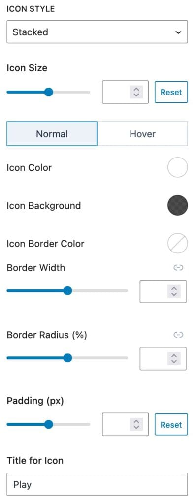
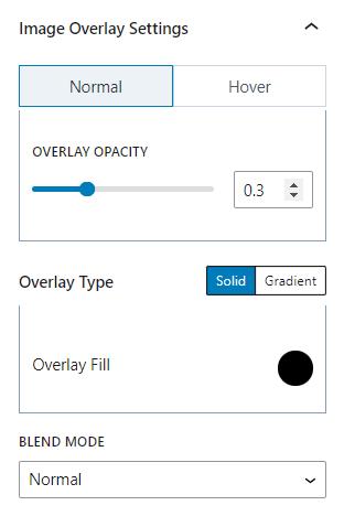
Image Overlay (Pro)
Overlay Opacity: This setting allows you to adjust the overlay opacity for both the normal and hover states of the Poster Image Overlay.
Overlay Type: This setting lets you choose the overlay type, either as a Solid Color or a Gradient.
Blend Mode: This setting allows you to select a blend mode for the overlay, with several options available.
- Multiple
- Screen Overlay
- Darken
- Lighten
- Color Dodge
- Color Burn
- Difference
- Exclusion
- Hue
- Saturation
- Color
- Luminosity
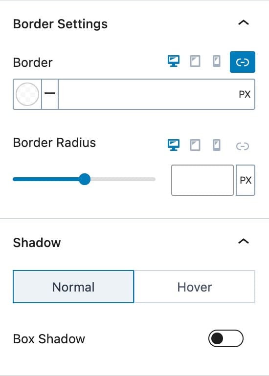
Border (Premium)
Border Color and Size: This setting allows you to define the Border Color and Size for desktop, tablet, and mobile devices.
Border Radius: This setting lets you adjust the border radius for desktop, tablet, and mobile devices.
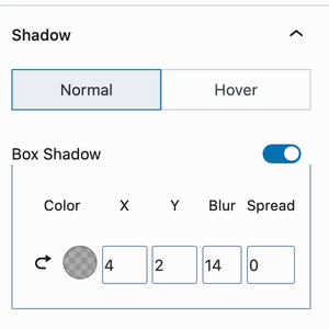
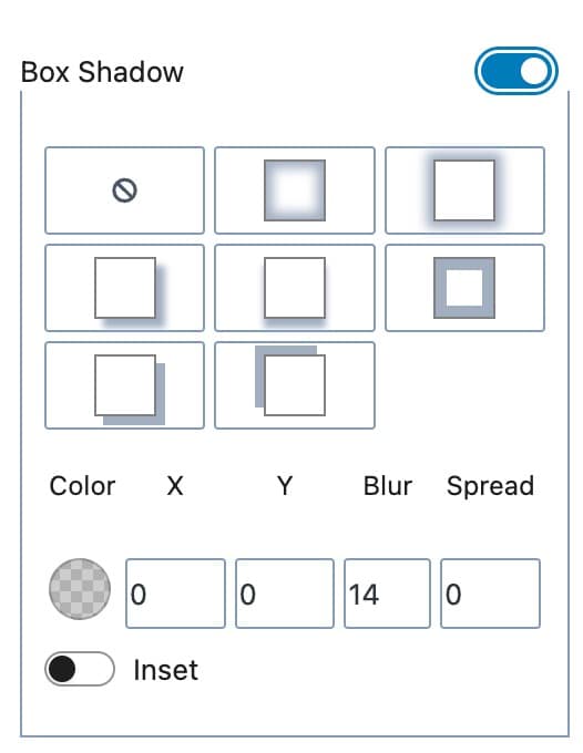
Shadow (Premium)
Box Shadow: This setting allows you to add a box shadow to your Video Popup Block for both the normal and hover states. The box-shadow applies to the Video Popup Block itself, not the video player popup.
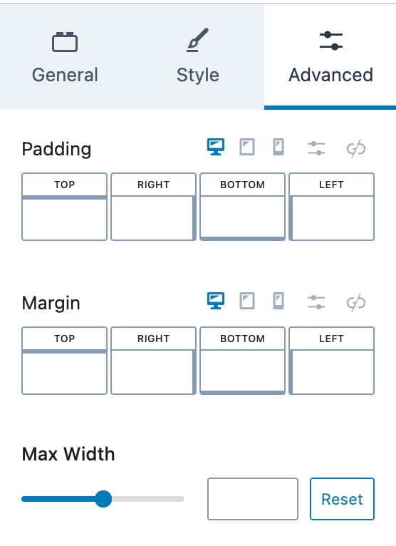
Advanced Settings
Advanced Settings: This section provides advanced options to further customize your Video Popup Block.
Padding and Margin: These settings allow you to define padding and margin for the Video Popup Block on desktop, tablet, and mobile devices.
Max-Width: This setting lets you set a maximum width for the Video Popup Block. Use the reset button to reset it back to the default size.
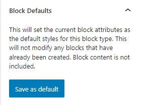
Block Defaults
Block Defaults: Save the current Block Settings Configuration as the Block Default. This will automatically use the current settings on all new Advanced Table Blocks. Learn more here.
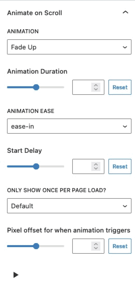
Animate on Scroll (Premium)
The Animate on Scroll settings allow you to add an animation to your block. This is a Premium feature and requires either Kadence Blocks Pro or Kadence Creative Kit to work.
You can select an animation duration, ease, and start delay. You can set this animation to show once per page and set a pixel offset for when the animation triggers.
You can press on the play icon at the bottom of the settings to see how your animation looks in the editor.
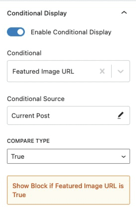
Conditional Display (Premium)
The Conditional Display setting allows you to display the button based on a condition. This is also a Kadence Blocks Pro feature.
Advanced
HTML Anchor: This setting allows you to add an HTML anchor ID to the Video Popup Block.
Additional CSS Class(es): This setting lets you add custom CSS class(es) to the Video Popup Block for advanced customizations.

