
Kadence Blocks features the Advanced Header Block and Advanced Navigation Block. These are powerful Blocks that grant you the ability to create impressive Headers directly from the WordPress Editor. Blocks can be added directly in the Advanced Header, allowing extensive control over the design of your Header. This guide will go over how you can get started with and start using Advanced Header and Navigations across your website.
Kadence Advanced Header Related Blocks: The Advanced Header includes the Advanced Navigation and Navigation Link Blocks. Below are resources for technical documents for each Block.
-Header (Adv) Block Documentation
-Navigation (Adv) Block Documentation
-Navigation Link Block Documentation
-Search (Adv) Block Documentation
-Site Identity Block Documentation
Creating an Advanced Header
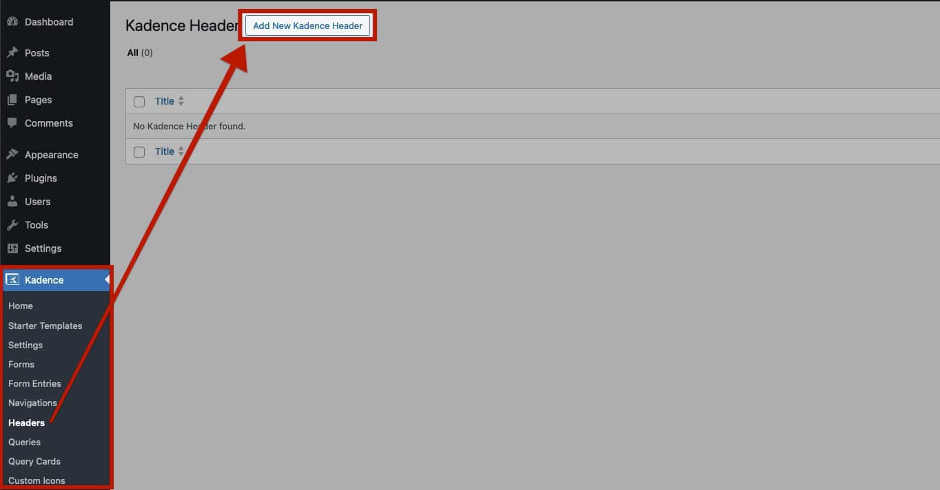
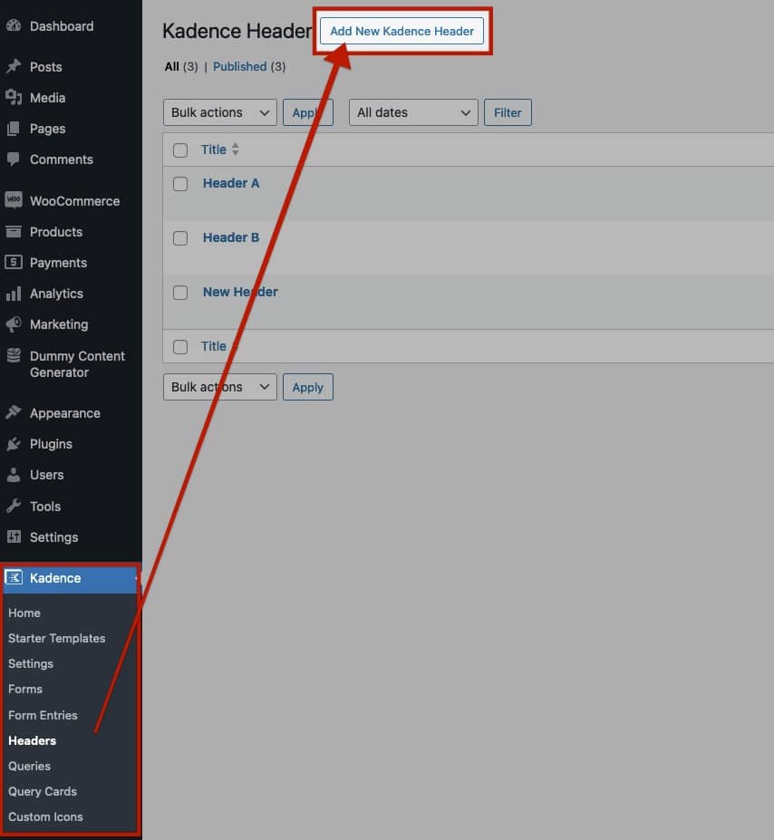
To get started with Advanced Headers, go to the Kadence -> Advanced Headers section in your WordPress Dashboard. From there, select the Add New Advanced Header button at the top to create a new custom header.
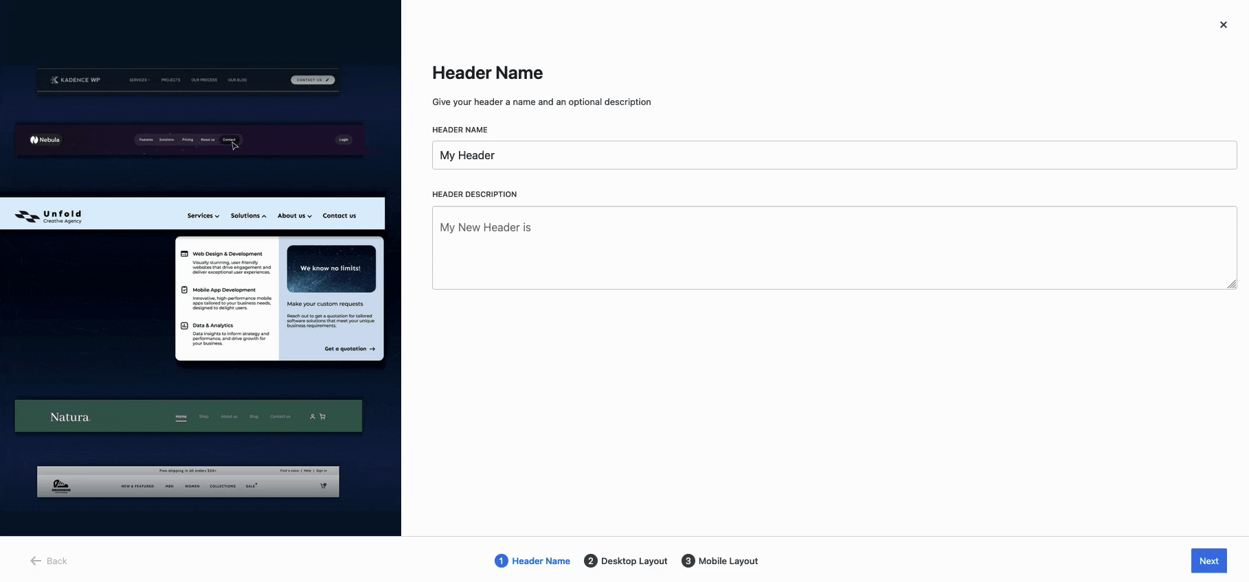
When setting up a new Advanced Header, you have the option to start from a blank template or choose from a variety of pre-built options. Kadence offers prebuilt templates, including Basic and Multi-Row headers, as well as mobile-specific designs. These designs are pre-populated and designed using Blocks and can be edited to meet your design goals.
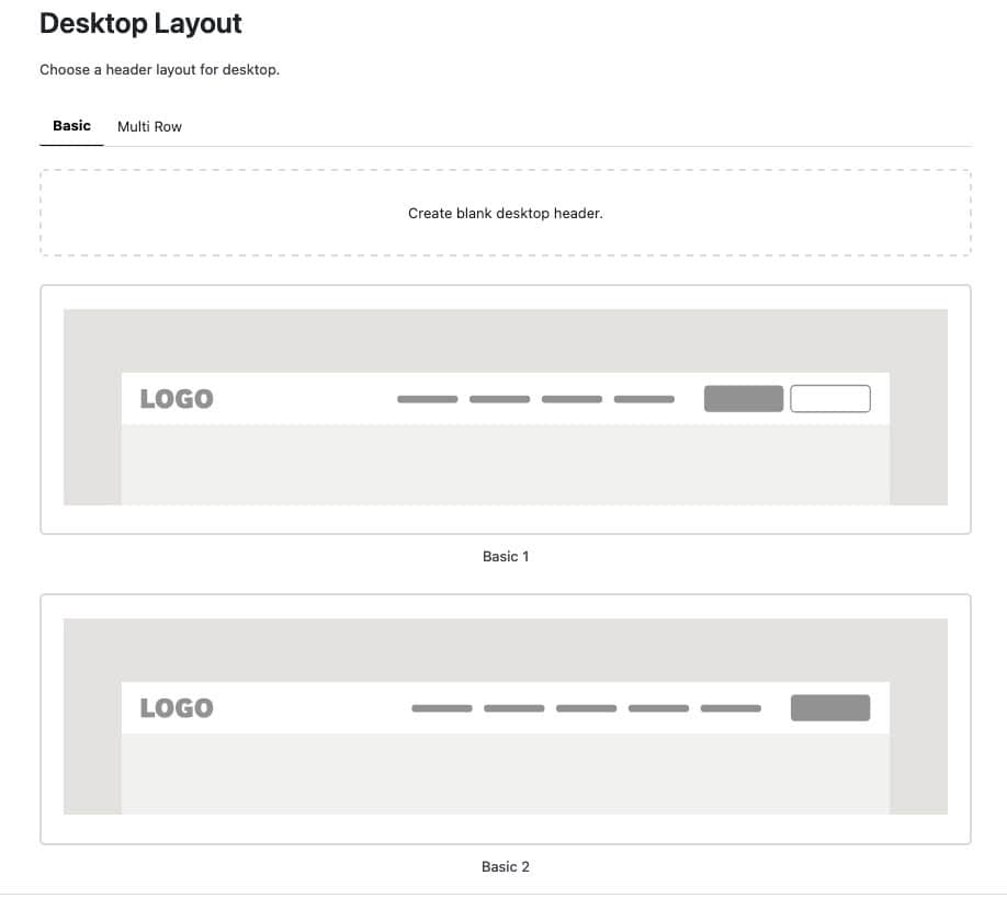
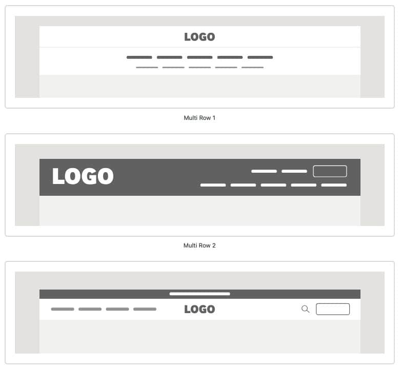
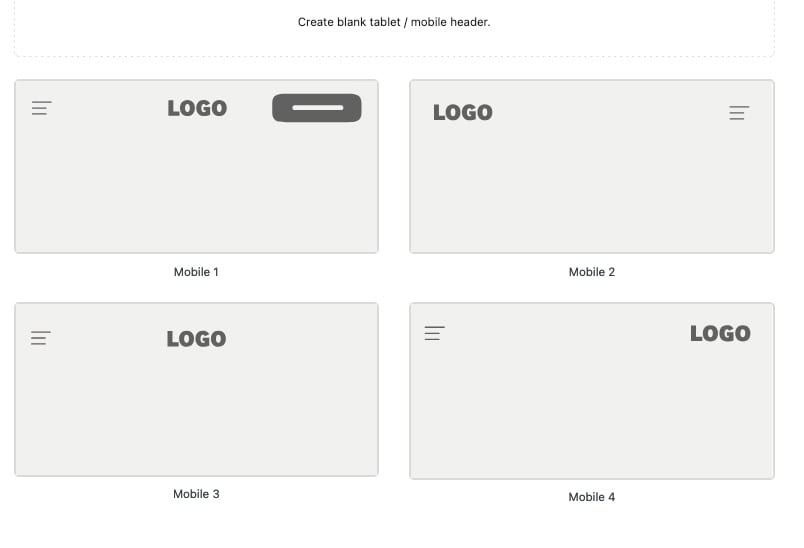
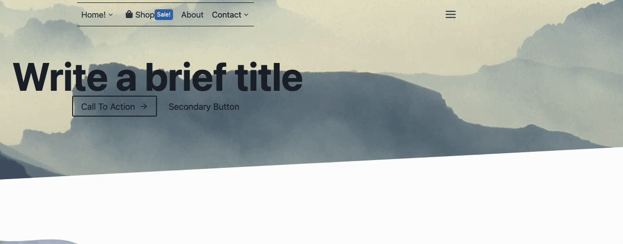
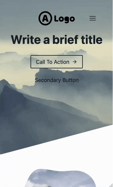
Below are examples of some of the available prebuilt headers and mega menu layouts.
Advanced Header Basic Desktop Layout Examples:
Advanced Header Multi-Row Desktop Layout Examples:
Advanced Header Tablet/Mobile Layout Examples
Adding Blocks to the Header
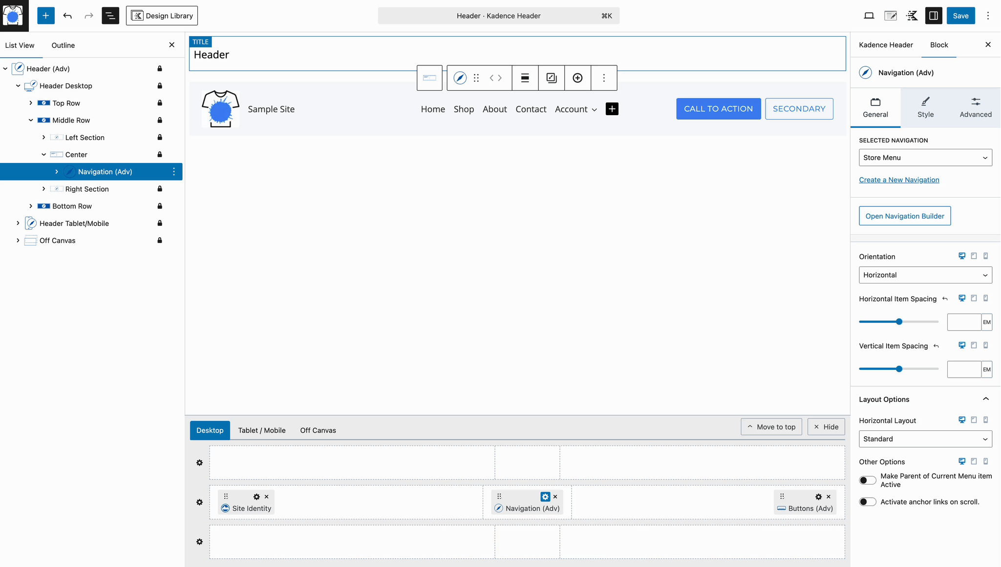
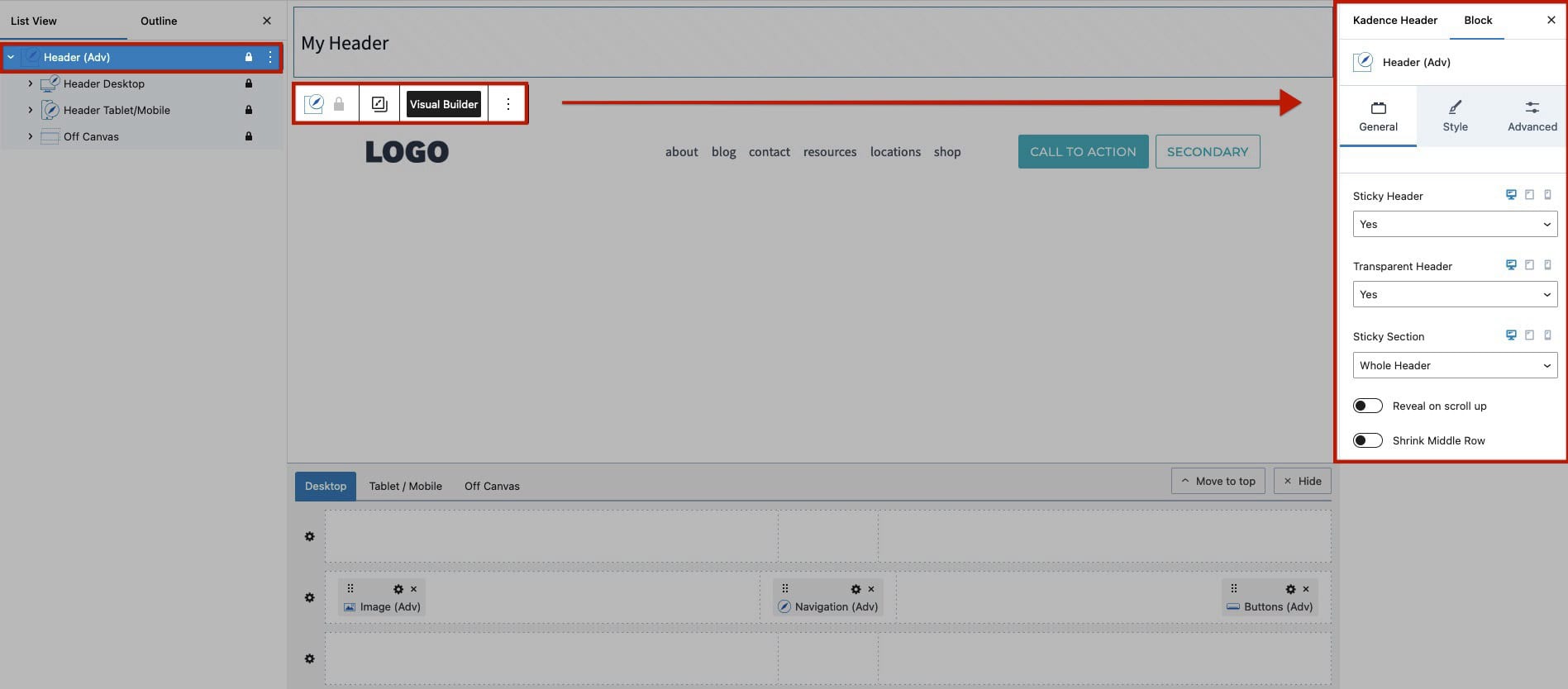
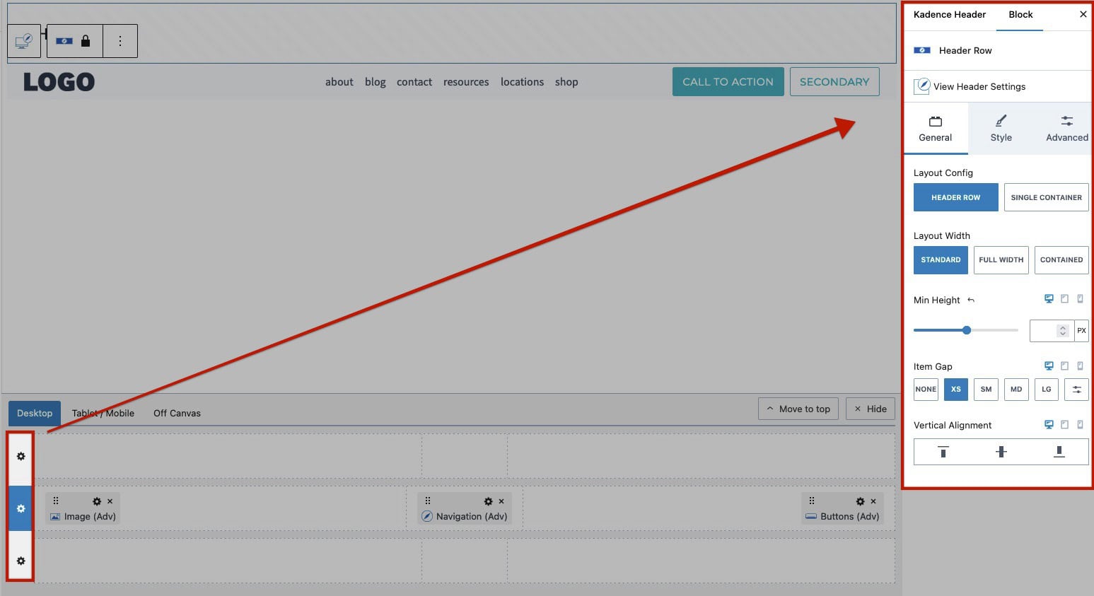
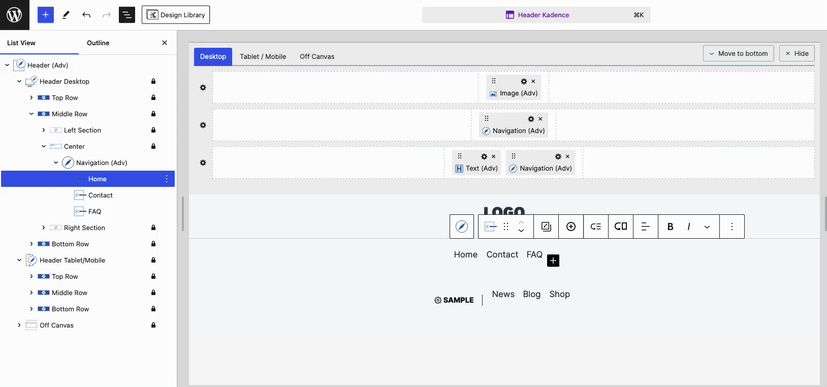
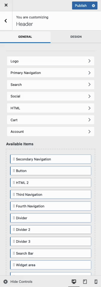
Use the Visual Builder to add Blocks to your Header. Toggle the Visual Builder on or off by selecting the Header (Adv) Block and clicking the Visual Builder button in the Block Toolbar. To move the Visual Builder to the top of the page, simply click the Move to top button within the Visual Builder.
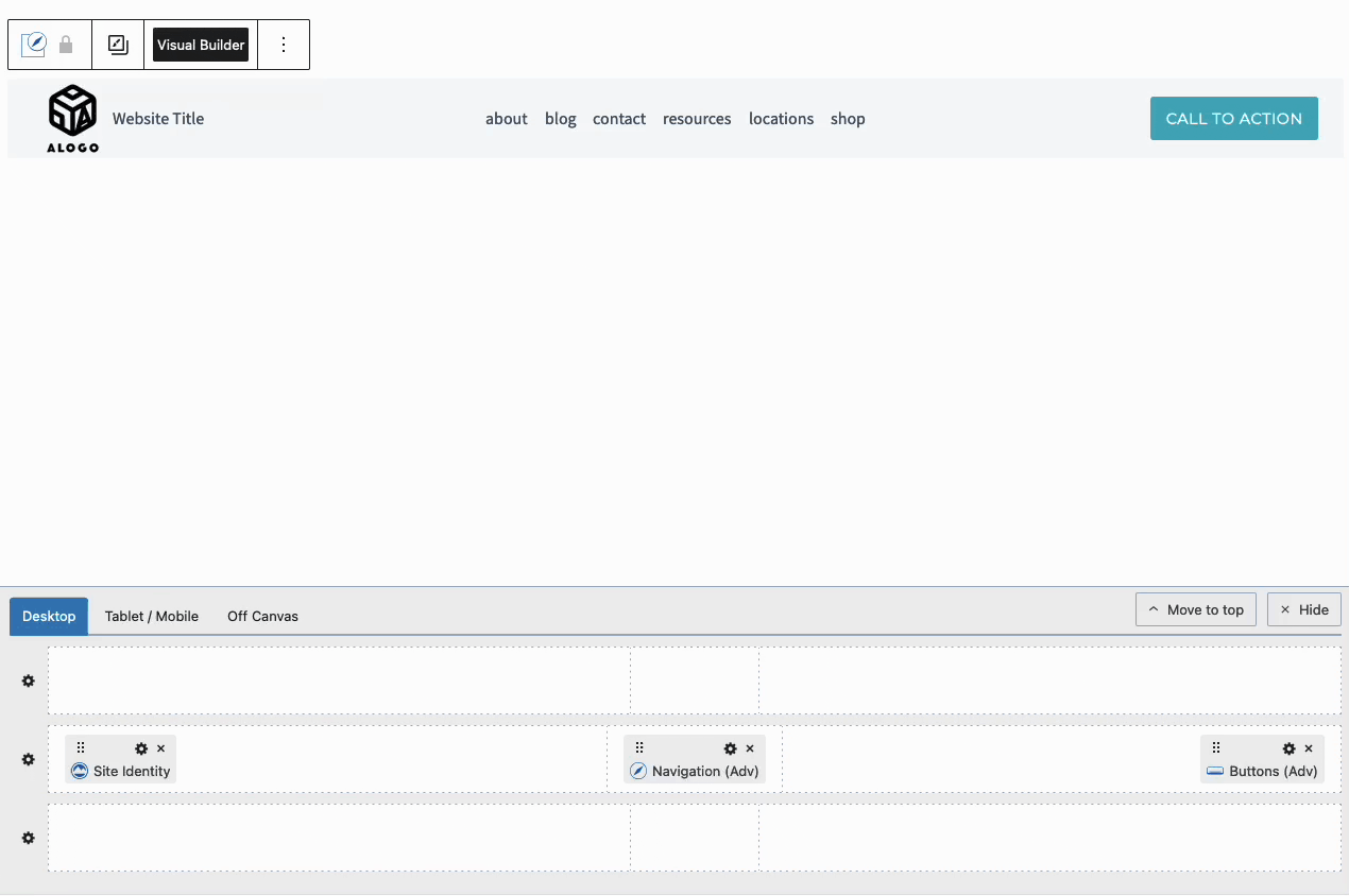
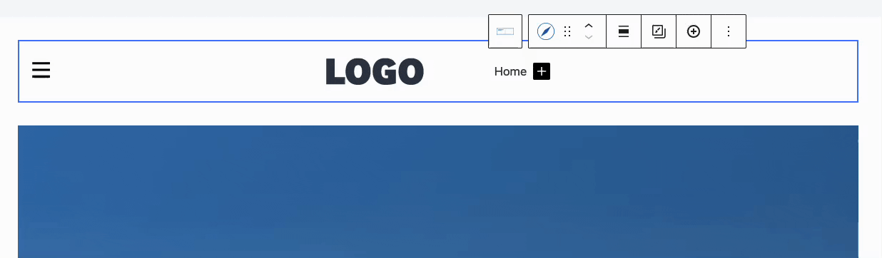
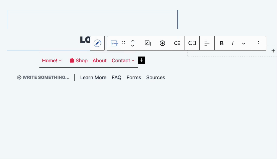
Hover over any section of the Visual Header and click on the Plus Icon to add Blocks to your Header.
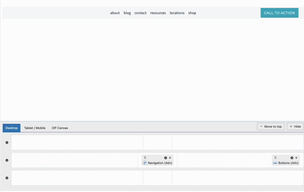
Blocks inside the Visual Builder can be clicked on and dragged around to move them to different sections of the Header.
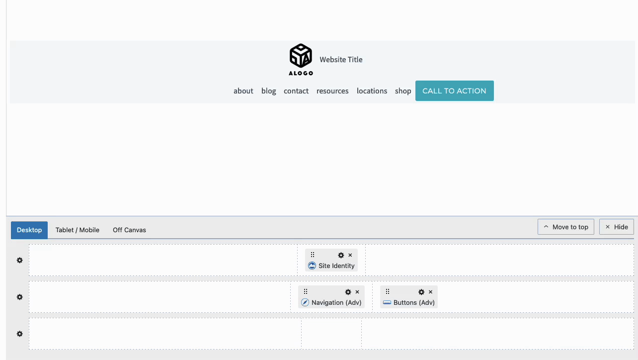
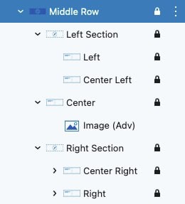
You have three Header Rows available: Top, Middle, and Bottom. Each Header Row contains a Left Section, Center Section, and Right Section.
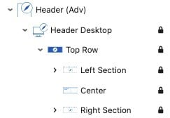
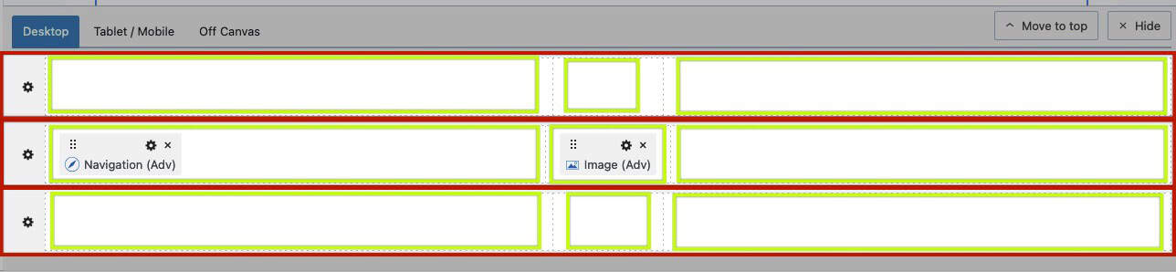
Within each of these sections, there are additional placement areas, providing precise control over block positioning. These placement areas are nested inside the Left and Right sections of a Header Row. Specifically, the Left Section includes placements for Left and Center Left, while the Right Section offers placements for Right and Center Right. This structure allows for accurate block positioning, giving you fine control over your Header Row layout.
Use various Blocks across your Header to fully customize the Header to meet your needs. Here is a list of some Blocks to get you started.
- Use a Site Identity Block to display the Site Logo on your Advanced Header.
- Use Advanced Navigation Blocks to design Navigations. Multiple Advanced Navigation Blocks can be added to a single header. View the section below for more information on getting started with Advanced Navigation Blocks.
- Use Advanced Button Blocks to add call-to-actions to the Header.
- Use an Advanced Text Block to display the Site Title and non-linked texts.
- Use the Search (Adv) Block to add a Search Element to your Header.
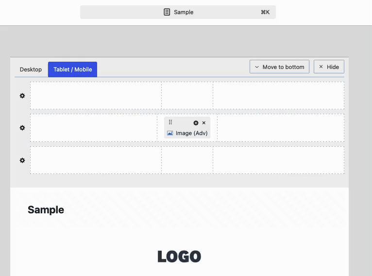
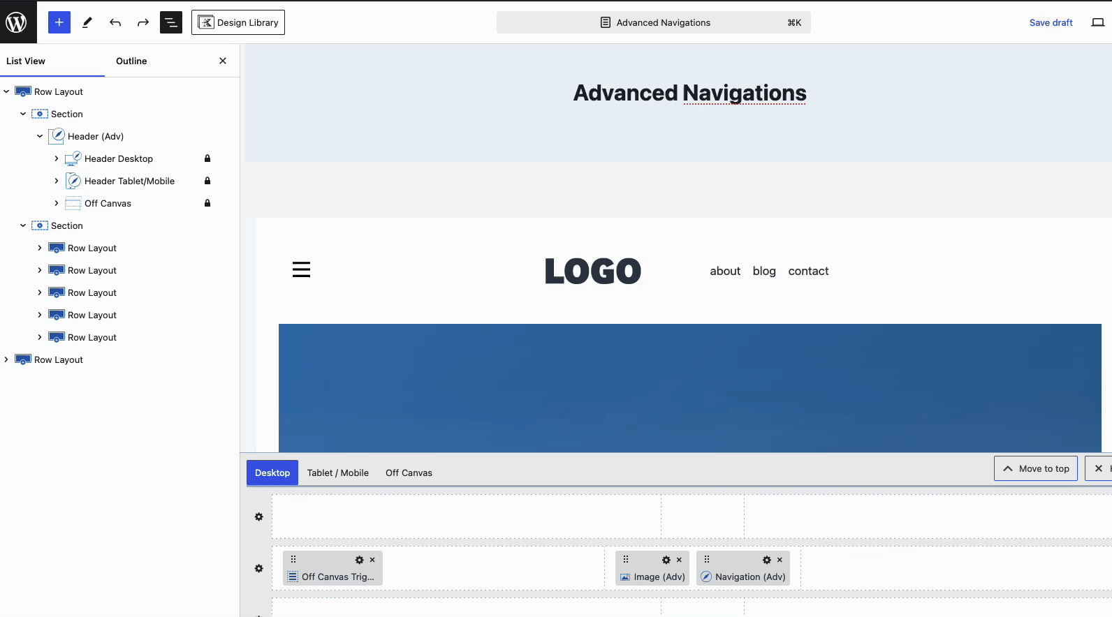
Tablet/Mobile Headers
The Tablet and Mobile Headers are shared and can be customized using the Tablet / Mobile Tab of the Visual Builder.
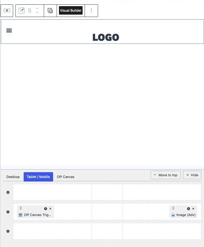
For the Tablet/Mobile Header, it’s common to use an Off Canvas Trigger Block to open the Off Canvas Area, where the navigation menu is displayed. This approach keeps the header clean and provides a more compact navigation experience on smaller screens, rather than displaying the entire navigation directly in the header.
Use the Trigger Block Settings to customize the Trigger Block styles.
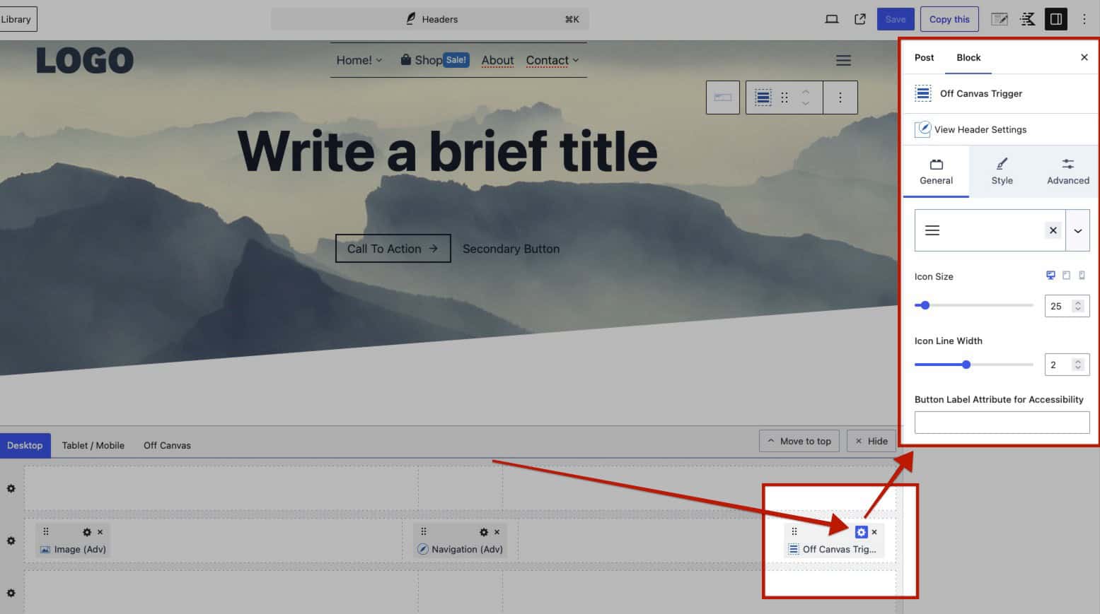
To learn more about the Trigger Block and settings, click here.
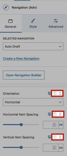
When adding an Advanced Navigation Block to the Off Canvas Area or on a Mobile Header in general, use the Responsive Block Controls to modify the Tablet and Mobile Block Settings.
Learn more about the Off Canvas Area below.
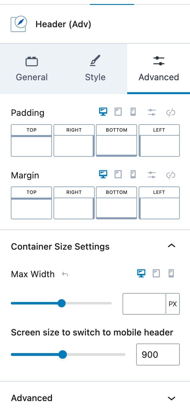
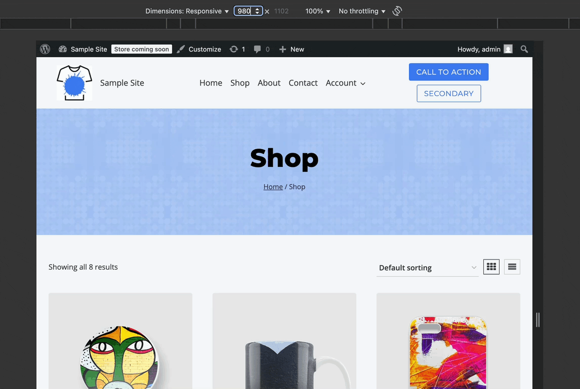
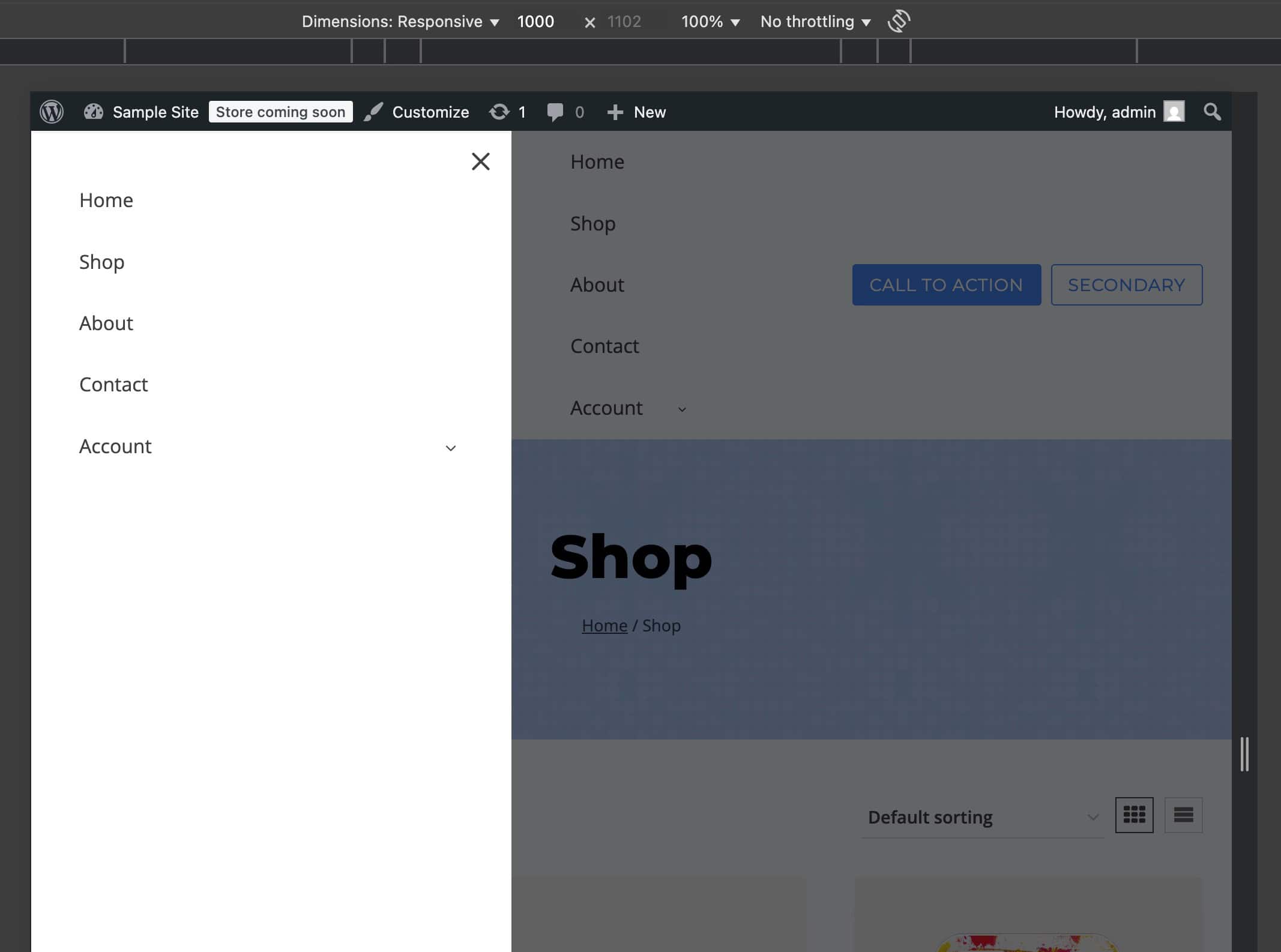
Screen Size to switch to Mobile.
In the Header (Adv) Block Settings -> Advanced Tab -> Structure Settings, notice the Screen Size to Switch to Mobile setting. This setting controls the breakpoint at which the Header (Adv) will switch from Desktop mode to Tablet/Mobile mode.
For example, see the block settings and outcome below. When changing the Screen Size to switch to Mobile Header to 900, the header will begin breaking at 900px instead of 1024px..
Click here to learn how to simulate a mobile environment on a desktop.
Note: This setting only affects the Advanced Header and doesn’t apply to the inner Kadence Blocks. For example, if you’re using the Advanced Navigation Block, it will still follow the default Kadence Blocks breakpoints, even if you’ve customized the tablet/mobile header screen size settings.
(Click here to learn about the default Kadence breakpoints.)
If you’re reusing the same Kadence Navigation within an Advanced Navigation Block across both Desktop and Tablet/Mobile headers and plan to set a custom Screen Size to Switch to Mobile Header, it is recommended to create a separate Kadence Navigation for the Tablet/Mobile Header. This applies to any blocks that are reused responsively within the headers and helps avoid any conflicts between the block’s responsive behavior and the header’s custom responsive settings.
Here is an example where responsive settings may conflict: In the screenshot above, the Screen Size to Switch to Mobile Header is set at 900px. If you were reusing the same Kadence Navigation in Advanced Navigation Blocks for both Desktop and Mobile, you may use the responsive settings to make the Tablet/Mobile Navigation appear vertical.
When doing these things in conjunction, there will be a point at which the Desktop header will present as vertical due to the custom 900px switch being applied.
To resolve this, consider creating and using a new Kadence Navigation specifically for the Off-Canvas Area.
(You can create and duplicate Kadence Navigations from the Dashboard -> Kadence -> Navigations page. See the GIF on the right.)
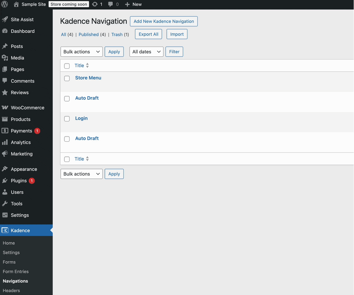
Once you’ve created a separate Kadence Navigation specifically for Tablet/Mobile headers, edit the Advanced Header, go to the Off Canvas Area, and replace the original navigation with your new tablet/mobile-specific version. From there, you can adjust the block settings to suit your tablet and mobile layout requirements. (See the GIF below for reference.)
The Off Canvas Area
The Off Canvas Area is a feature of the Advanced Header Block. Using an Advanced Navigation Block alone will not grant you access to the Off Canvas Area.
Whenever a Header includes a Trigger Block, the Off Canvas Area will become accessible within the Visual Editor. Trigger Blocks can be added to either the Desktop Header, the Tablet/Mobile Header, or both. However, there is only one Off Canvas Area, meaning that if a Trigger is added to both the Desktop and Tablet/Mobile Headers, both will open the same Off Canvas Area.
Desktop Trigger Example:
Mobile Trigger Example:
Once a Trigger is added to the Header, the Off Canvas Tab will become available for use. Blocks can be added to the Off Canvas Area in the same way Blocks are added to the Header in general.
Additionally, when opening the Off Canvas Tab, use the Block Settings to modify the Off Canvas Area.
To learn more about the Off Canvas Area and settings, click here.
Customizing the Header
Use the Header Block Settings to Customize the entire Header.
Each Header Row has a Settings Icon. Click on the Settings Icon to modify the styles of the selected Row.
Sticky and Transparent Headers
Use the Header (Adv) Block Settings to enable and use a Sticky and/or Transparent Header.
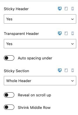
To learn more about using Sticky and Transparent Headers, click here.
Creating an Advanced Navigation
Get started with an Advanced Navigation by adding a Navigation (Adv) Block to a page. This can be done either within or outside of an Advanced Header Block. Once the Navigation (Adv) Block is added, you will be prompted to either select an existing navigation or create a new one.
The Navigation (Adv) Block can be added anywhere blocks are available.
When using Advanced Header templates, click on the navigation placeholder text to select an existing navigation or create a new one.
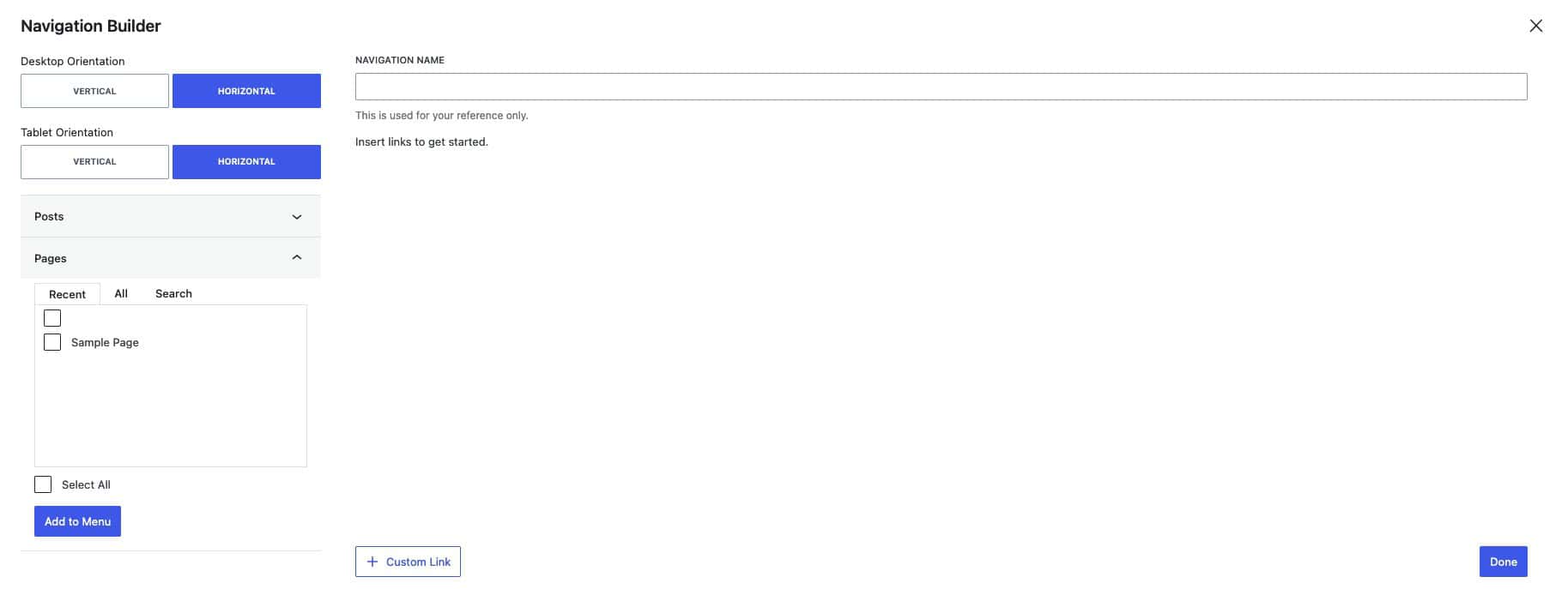
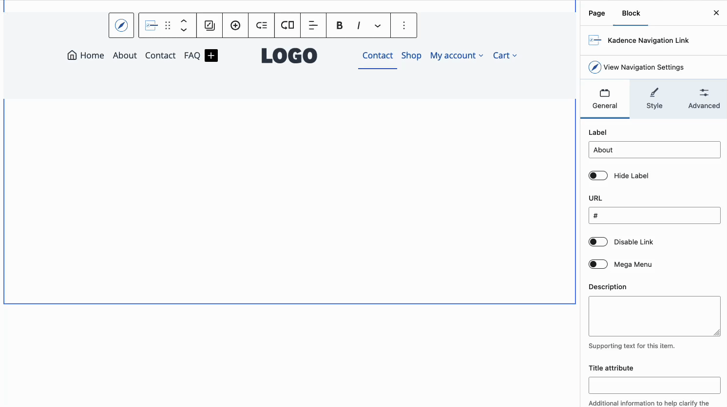
When creating a new navigation, the Navigation Builder will open. Here, you can set the navigation orientation, add posts, pages, and other navigation links, and modify existing navigation links.
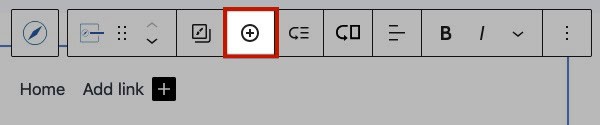
Navigation links can also be added outside of the Navigation Builder. To do this, select the Navigation (Adv) Block and click on the Plus Icon in the Navigation Block or from the Block Toolbar. You can title your new navigation link/item and use the Navigation Link Block settings to customize it
Creating a Sub Menu
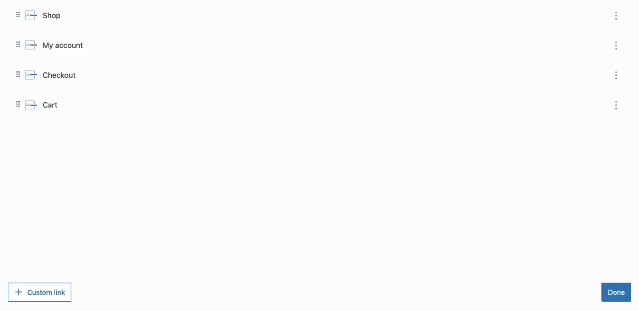
Sub Menu Dropdowns can be created in multiple ways. Primarily, they can be created using the Navigation Builder. In the Navigation Builder, expand a Navigation Link and use the Add Sub Menu Link button to add a new Sub Navigation Link to the expanded one.
You can also create Sub Menu Items using the Block Toolbar. When selecting a Navigation Link Block, click on the Sub Menu Icon in the Block Toolbar to add a new Navigation Link as a Sub Menu Item. You can search for an existing page or use the Navigation Link Block Settings to add a URL and Label to the new Navigation Link.
Drag Navigation Menu Items and nest them using the Gutenberg List View to also create Sub Menus.
Learn more about using Sub Menus by clicking here.
Creating a Mega Menu (Pro)
To create a Mega Menu, select a Navigation Link and enable the Mega Menu setting in the Block Settings. You can then choose a pre-made layout or start from scratch, adding and styling content as needed.
Mega Menus can also be created through the Block Toolbar. To do this, select a Parent Navigation Link Block and click on the icon of an arrow pointing to a rectangle.
Add any Block inside of the Mega Menu to customize it as preferred.
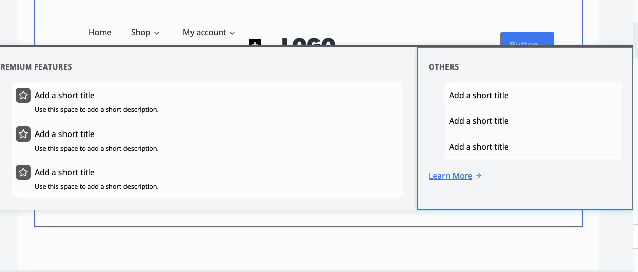
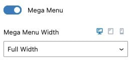
Use the Navigation Link Block Settings to set a Width for the Mega Menu. This can be set to Default, Content Width, Full Width, Menu Container Width, or Custom Width.
Learn more about using Mega Menus by clicking here.
Navigation Links Advanced Configurations
Navigation Link Blocks are versatile and can be customized and used for many purposes. Some features worth mentioning include the option to add Description Texts, Images/Icon, and Highlight Labels features. To learn how to get the most out of the Navigation Link Block, click here.
Navigation Links can be customized primarily through the Advanced Navigation Style Block Settings. These styles apply to all Children Navigation Links for the select Advanced Navigation Block. To customize Navigation Links on an individual basis, use the Navigation Link Block Settings instead.
Adding Advanced Headers sitewide
Advanced Headers are compatible with both Classic WordPress Websites and Full Site Editing (FSE) websites. To integrate Advanced Headers into the Kadence Theme, use the Kadence Theme Customizer Settings to select an Advanced Header. With Kadence Theme Kit Pro, you can utilize Hooked Elements to apply Headers Conditionally across your website. Additionally, add Advanced Headers to Full Site Editing Templates to use it across a FSE Website.
Advanced Header Blocks work similarly to Patterns and are Synced across the website. So whenever you edit a specific Advanced Header in one part of your website, it will also update across all instances of that Advanced Header. This also applies to Advanced Navigation.
To add Advanced Headers to the Kadence Theme, you must first create an Advanced Header. This can be done using the Dashboard -> Kadence -> Headers page.
Once a Header is created, navigate to the Customizer, go to the Header Settings, and enable the Use Block Header setting. Then, select the Advanced Header you wish to use as your Kadence Theme Header and publish the page.
This will apply the Advanced Header across the entire Kadence Website.
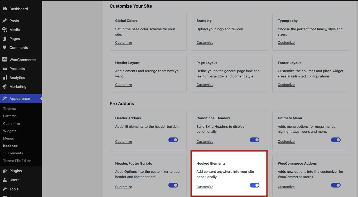
Kadence Theme Kit Pro features Hooked Elements. Use a Hooked Element to automatically insert Advanced Headers across your website to display Headers Conditionally.
Then, Enable Hooked Elements from the Dashboard -> Appearance -> Kadence page.
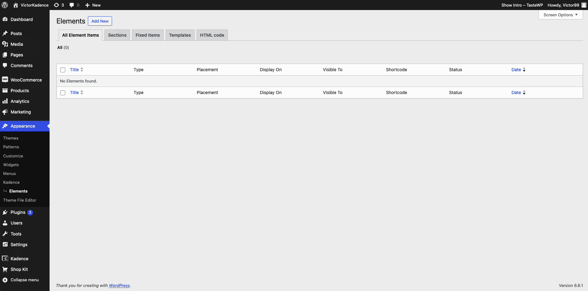
Once Hooked Elements are enabled, navigate to the Appearance -> Kadence -> Elements page and create a new Content Section Element.
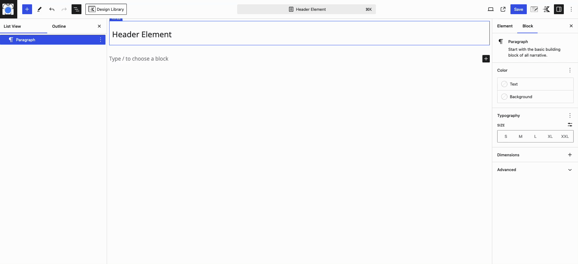
Add a Header (Adv) Block to the page, and customize it as preferred.
Once done, use the Element Settings to specify where the Element will appear. Under Placement, select the Replace Header option. Then, expand the Display Settings and choose the Show On setting to apply it to your desired display options.
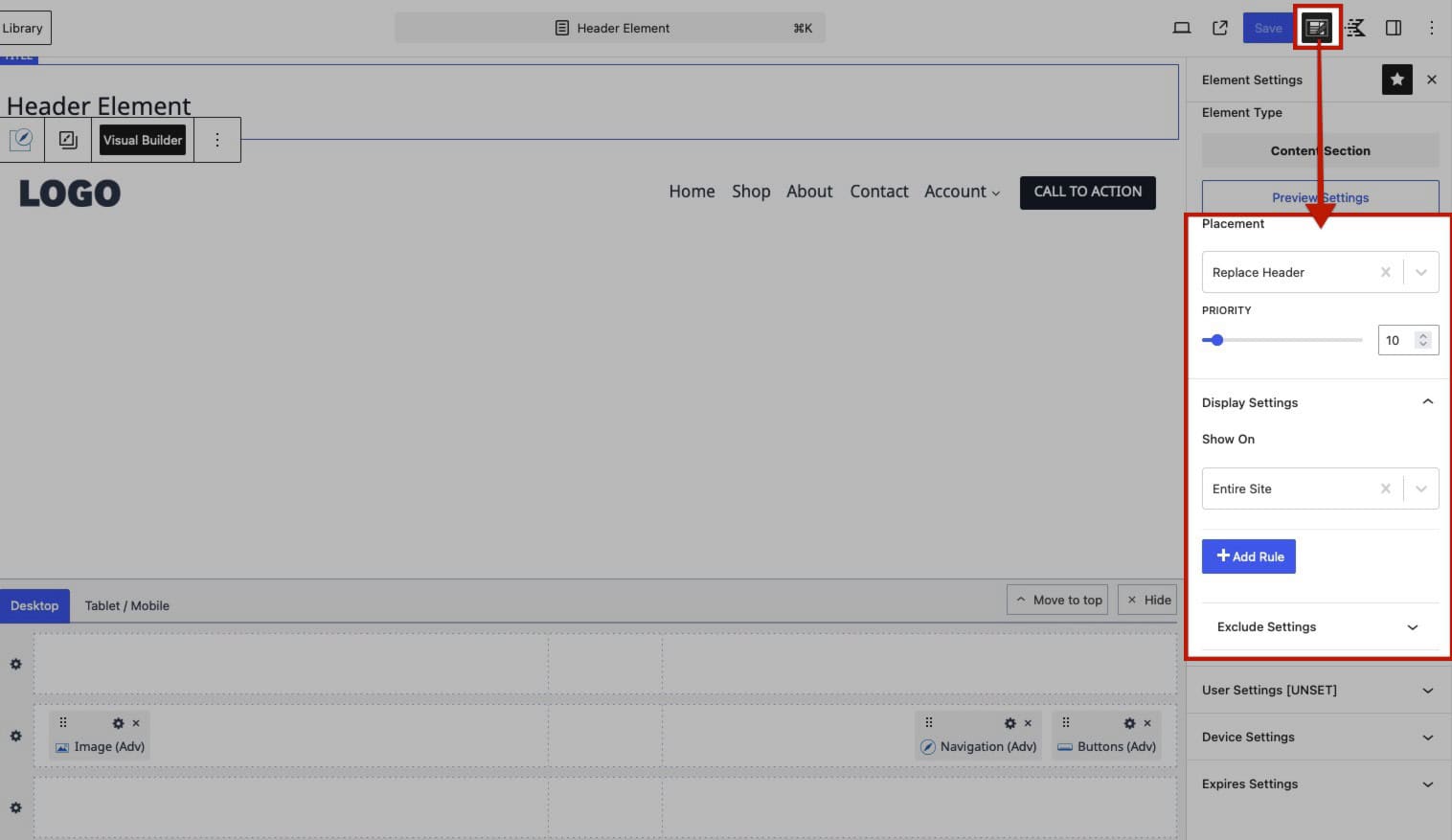
Once saved, the new Hooked Element will replace the Standard Header, allowing you to use Advanced Headers Conditionally across your Kadence website.
For Full Site Editing websites, it is recommended to use the Header Block as the primary block in your Header Pattern or Template. Click here to learn more about using and adding Advanced Headers to Full Site Editing websites.
