
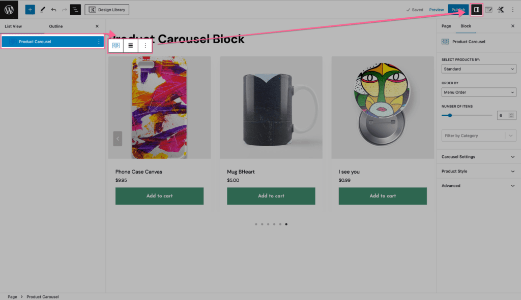
The Product Carousel Block lets you create visually engaging carousels to showcase your products directly on your website. Visitors can browse items and view products straight from the carousel, providing a seamless shopping experience.
The Product Carousel Block is part of Kadence Blocks Pro, available as a stand-alone purchase or included in our Plus, Ultimate, and Lifetime Ultimate Plans for the best value and flexibility.

Block Settings
You can customize the Product Carousel Block using the Block Settings.
General Settings
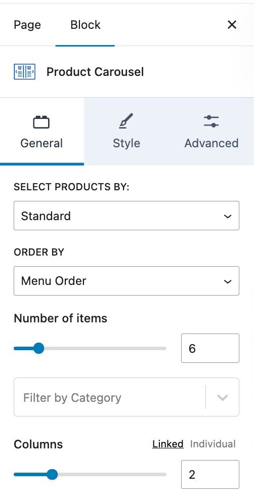
The General Settings allow you to set settings such as selecting products by, order by, and the number of items shown. You can also add a filter by category.
Select Products By: Choose the type of products to display. Options include Standard, On Sale Products, Best Selling Products, Top Rated Products, or Individually. When using individually, you can manually select products in the order you wish them to appear.
Order By: Choose how products are ordered. Options include Menu Order, Newest to Oldest, Oldest to Newest, Price – Lowest to Highest, Price – Highest to Lowest, Sales – Most First, Title A–Z, or Title Z–A.
Number of Items: Set the number of products you want to display in the carousel.
Filter by Category: Filter the product selection to a specific product category.
Columns: Adjust the number of columns displayed in the carousel.
Style Settings
The Style Settings control the overall styles of the Product Carousel Block, including the carousel settings.
Product Style: Use a Boxed or Unboxed product style. When using the boxed option, the post content will become boxed in. When using unboxed, the content will be unboxed and unrestricted.. (See an example ⧉.)
Text Alignment: Set a Text Alignment for the Product Carousel text and contents.
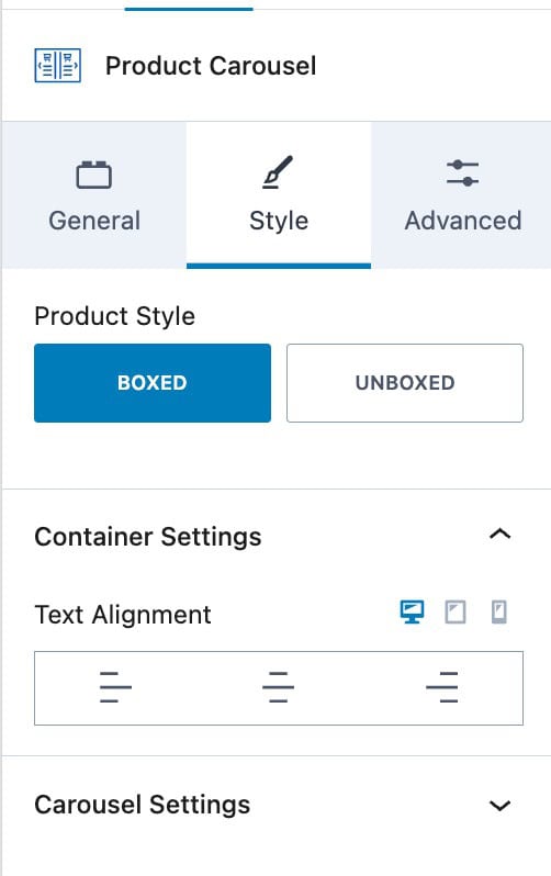
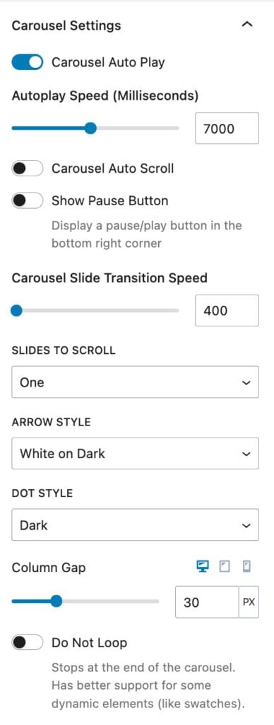
The Carousel Settings allow you to adjust the way your Carousel works. You can enable auto-play, enable auto-scroll, set the number of slides to scroll, and set the arrow and dot styles. You can also set the number of columns and a column gap.
Carousel Auto Play: Enable this for the carousel to automatically play.
Autoplay Speed: Set the speed at which autoplay will work. This is measured in milliseconds.
Carousel Auto Scroll: Set the Product Carousel to scroll automatically rather than sliding. This replaces the autoplay speed option with a scroll speed option, allowing you to control how fast or slow the scroll motion is.
Show Pause Button: Displays a pause/play button in the bottom right corner.
Carousel Slide Transition Speed: Set the slide transition speed when moving through the carousel.
Slides to Scroll: Set whether one or all slides can be scrolled at a time.
Arrow Style: Set an arrow style for the carousel. Options include White on Dark, Black on Light, Outline Black, Outline White, or None.
Dot Style: Set the dot style. Options include Dark, Light, Outline Dark, Outline Light, or None.
Column Gap: Set the column gap between each carousel column.
Do Not Loop: Stops the carousel at the last slide. Provides better support for some dynamic elements (like swatches).
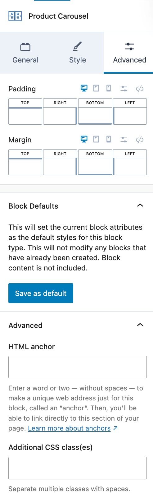
Advanced Settings
The Advanced Settings provide additional advanced options.
Padding: Add a padding around the Product Carousel.
Margin: Add a margin around the Product Carousel.
Block Defaults: This will set the current block attributes as the default styles for this block type. This will not modify any blocks that have already been created. Block content is not included. (Learn more ⧉.)
HTML Anchor: Add an HTML anchor to the Product Carousel Block.
Additional CSS Class(es): Add CSS class(es) to the Product Carousel Block.
