
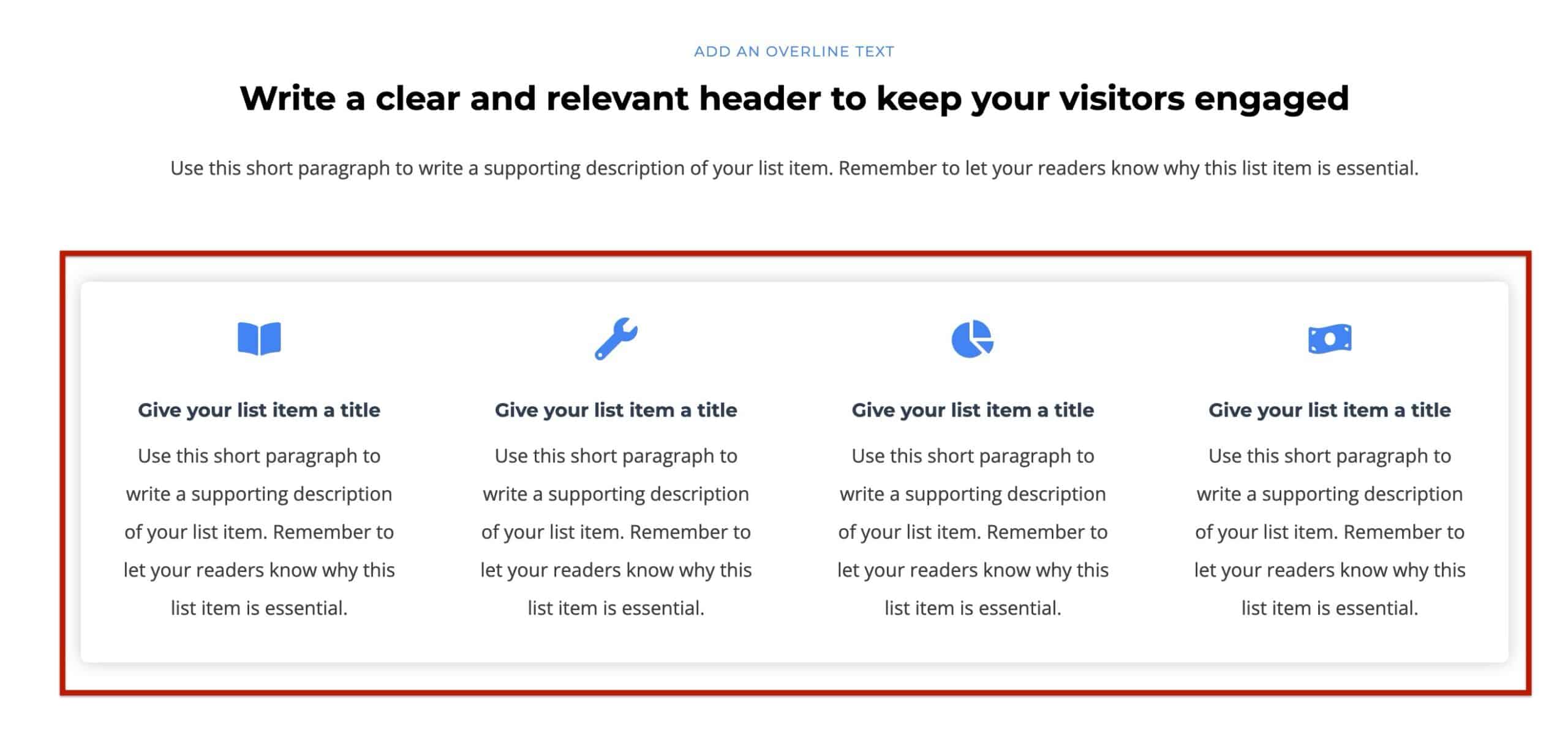
The Kadence Info Box Block is a free Kadence Block designed to help you showcase key information with style and clarity. Whether you’re highlighting services, features, team members, or resource links, this block allows you to pair icons or images with text and optional call‑to‑action links. Everything is fully customizable right within the WordPress block editor.
With options for layout, colors, typography, hover effects, and responsiveness, the Info Box Block gives you the flexibility and control to create engaging content sections that perfectly fit your site’s design.
Inserting an Info Box Block
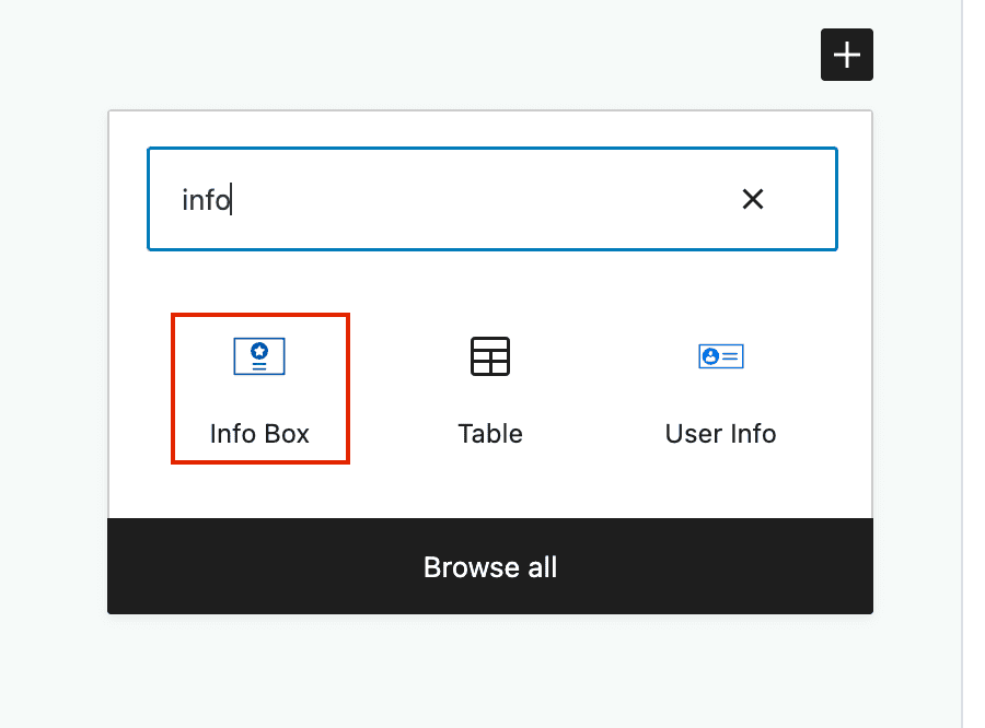
The first step in using the block is to select and place it where you’d like it to appear on the page. The block can be found by finding or searching for the Info Box block option.
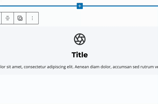
To modify Info Box texts, select them in the editor and make your changes using your keyboard.
Use the Info Box Block Settings to adjust and style the Info Box. (Learn more below.)
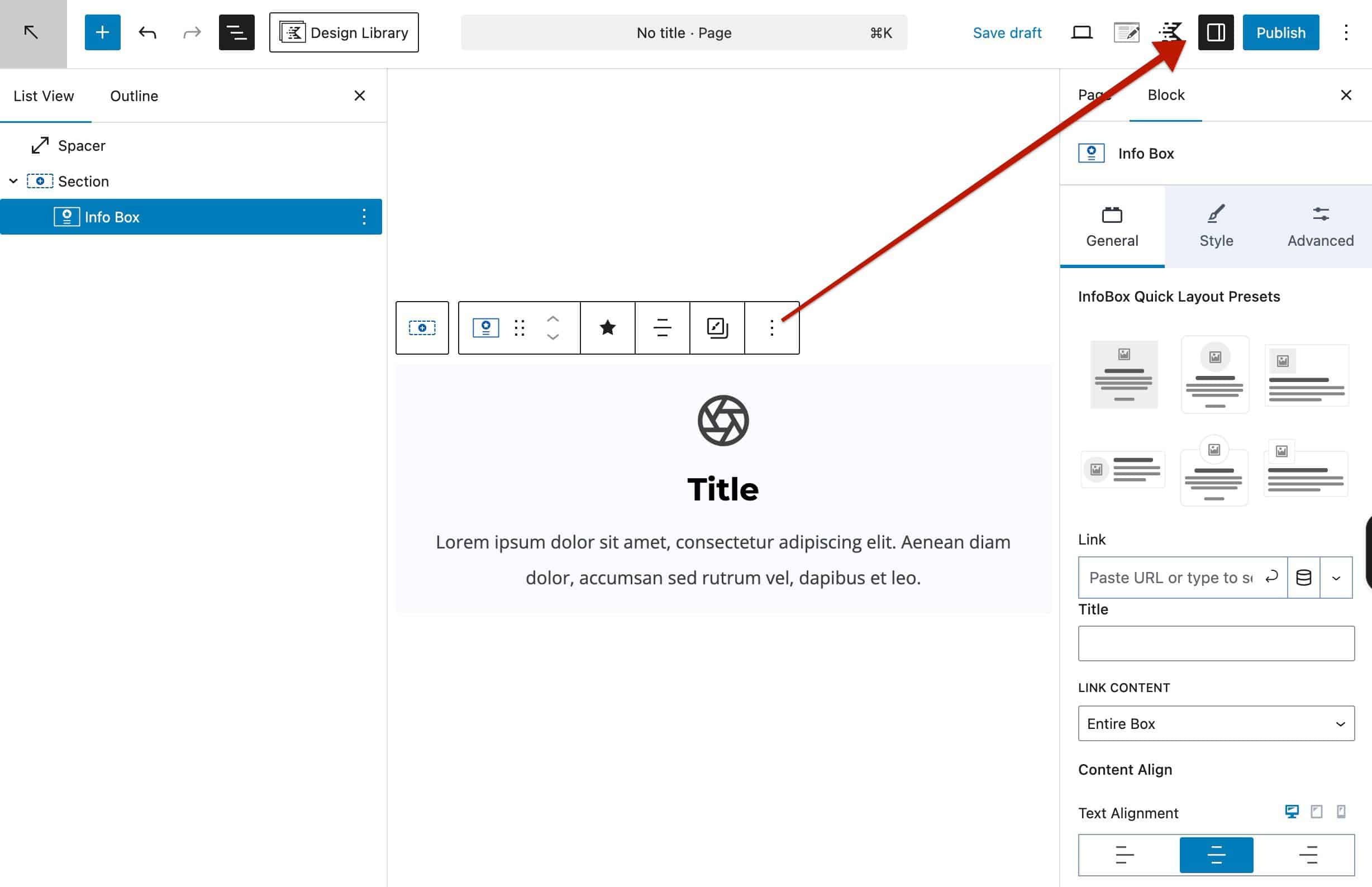
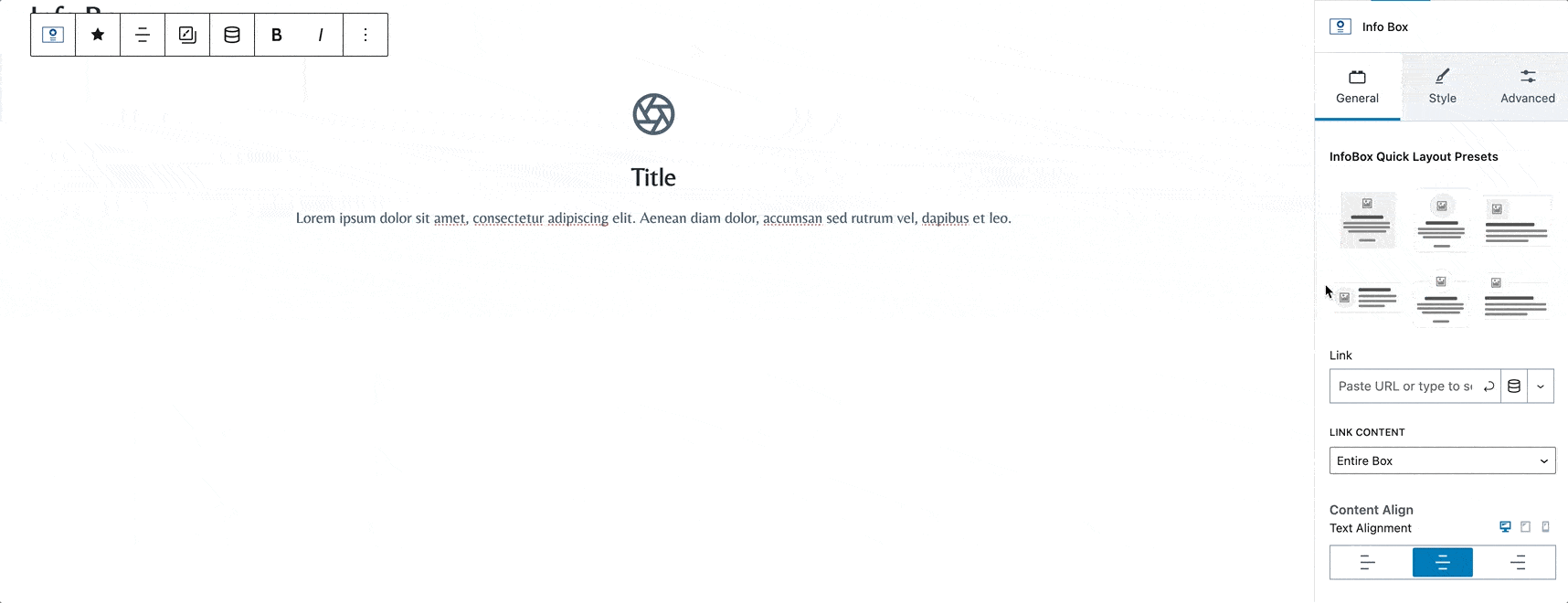
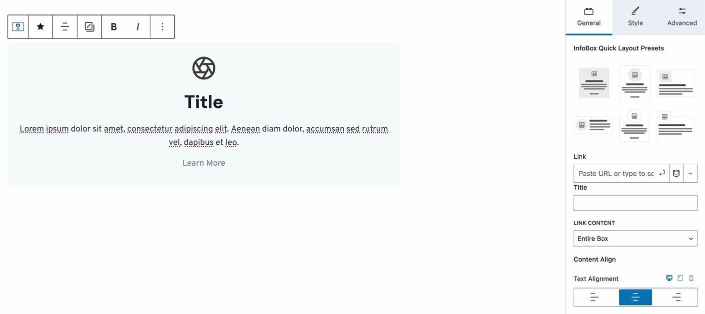
Info Box Block Settings
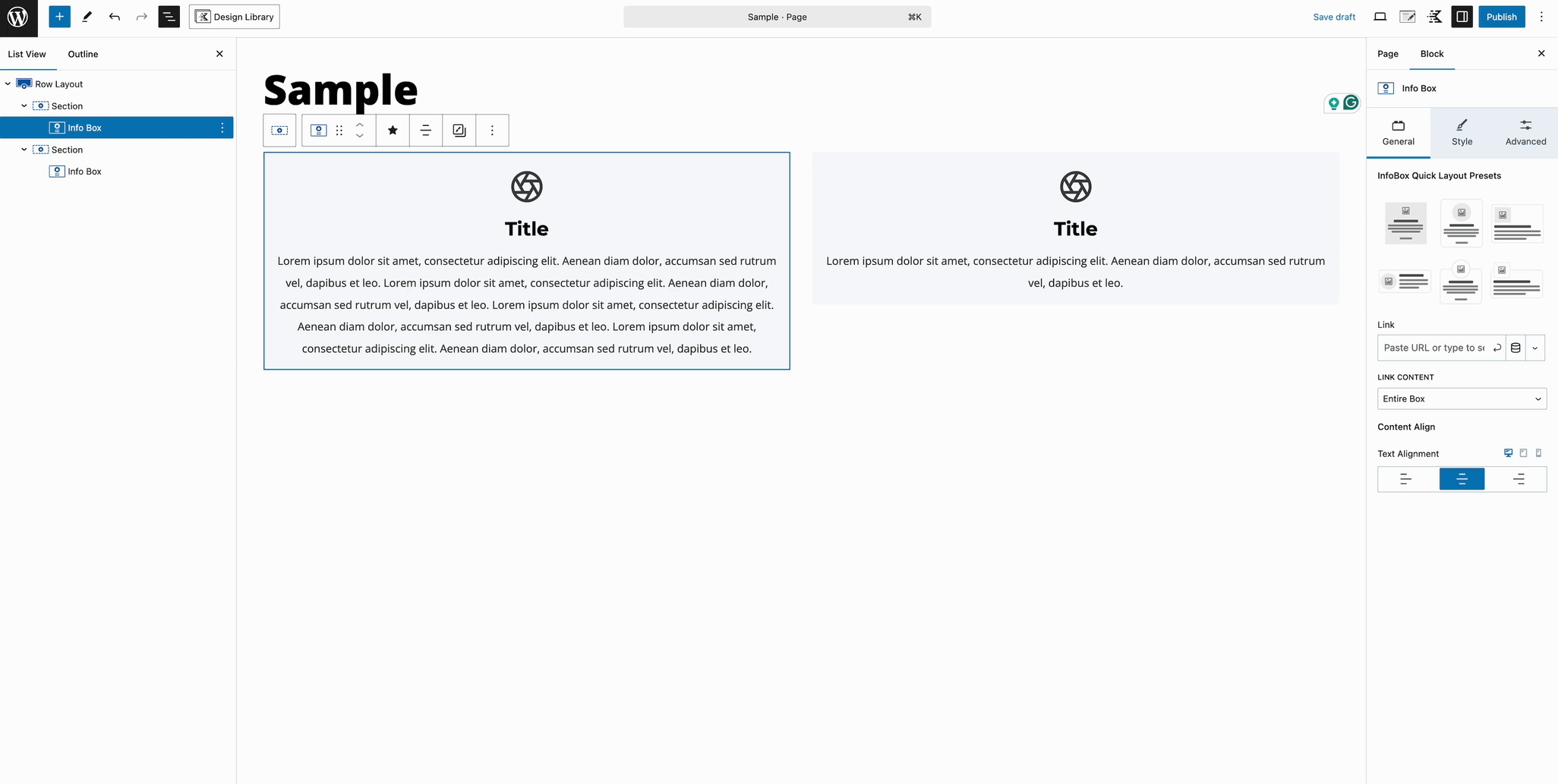
General Settings
Choose from one of several preset layouts for your Info Box.
Link: Search for a post/page, insert a URL, or use Dynamic Content such as an ACF field.
Title: Adds an aria-label to your link for accessibility. This applies to both the Entire Box and the Learn More link options.
Link Content: Set the link to “Entire Box” or “Only Learn More Text.”
Content Align: Set the alignment of the text inside the Info Box. Responsive controls are available.
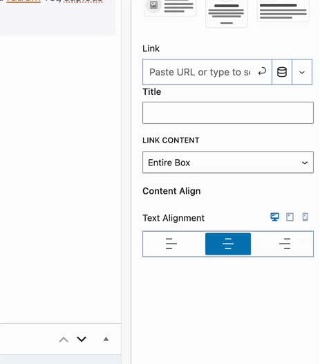
Note: You can only add links to the content if you set the Link Content to “Only Learn More Text.” Text links are disabled when set to “Entire Box.”
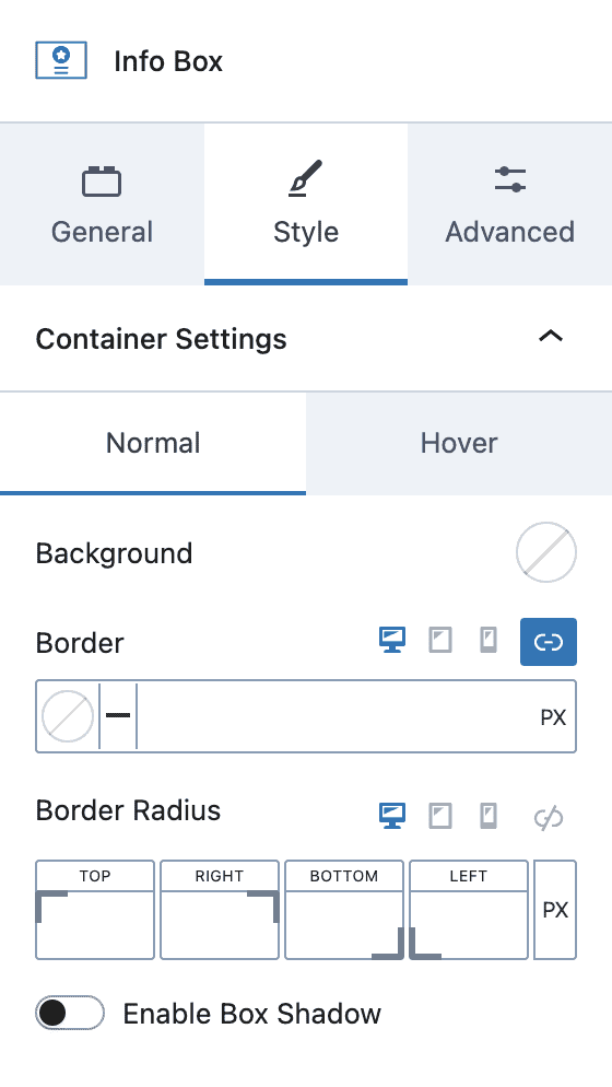
Style Settings
Container Settings
Note: Container styles can be set for both Normal and Hover states.
Background: Select a color for the Info Box background.
Border: Select a color, style, and thickness for your border. Responsive styles are available for borders.
Border Radius: Select the border radius to be used for your block. Responsive styles are available.
Enable Box Shadow: When enabled, several presets are shown, or you can set your own custom values.
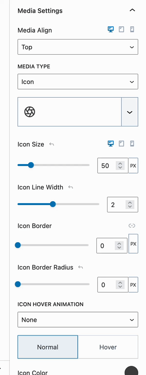
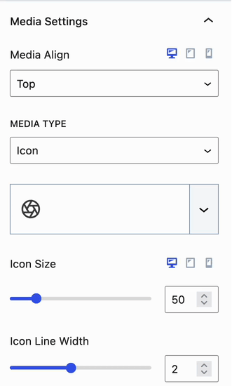
Media Settings
Media Align: The media position can be set to Top, Left, or Right.
Media Type: The available settings will change based on the media type chosen. Selecting “None” will disable media.
|
Icon |
Image |
Number |
|---|---|---|
|
|
|
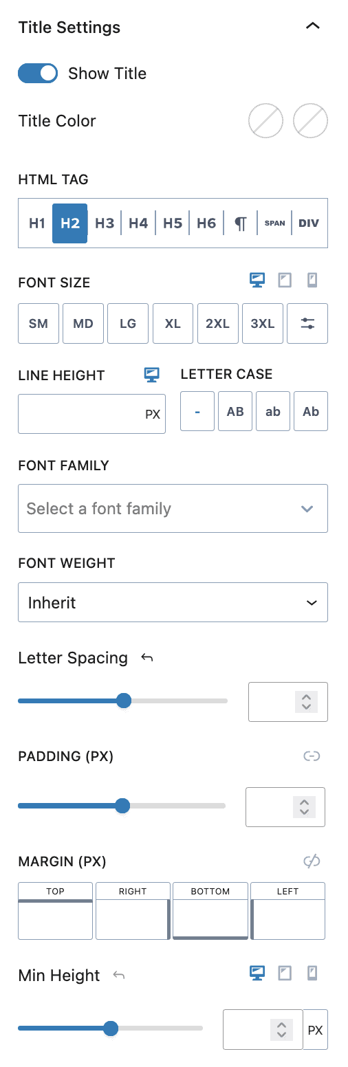
Title Settings
Show Title: Toggle to enable/disable the title element.
Title Color: Select the normal and hover color for the title.
HTML Tag: Select the tag to be used for the Info Box title.
Font Size: Choose a preset or custom size. Leave unset to use the site default. Responsive controls are available.
Line Height: Enter a value and select a unit (i.e., px, em, or rem). Leave blank to use the site default. Responsive controls are available.
Letter Case: Choose a Letter Case effect, from default/none, uppercase, lowercase, or capitalize.
Font Family: Choose a selectable Google Font for texts or leave the setting blank to use the default website font.
Font Weight: Inherit the website’s default font weight or select a value manually.
Letter Spacing: Leave this blank for the default website letter spacing to be used or set a manual px value.
Padding (PX): Set a padding value for the Info Box title. By default, the value will apply to all sides. Use the chainlink icon to unlink this setting and unlock the ability to adjust all sides individually.
Margin (PX): Set a margin for each side of the Info Box title or click the icon to set all sides equally.
Min Height: Add a minimum height to the Info Box title.
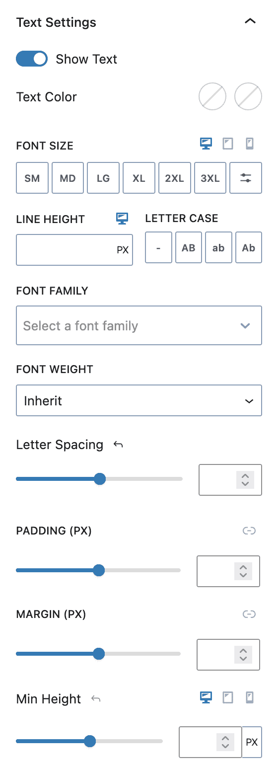
Text Settings
Show Text: Toggle this option to enable/disable the text element.
Text Color: Select the normal and hover color(s) for the text.
Font Size: Choose a font size preset or use a custom size. Leave unset to use the site default. Responsive controls are available.
Line Height: Enter a value and select a unit (i.e., px, em, or rem). Leave blank to use the site default. Responsive controls are available.
Letter Case: Choose a Letter Case effect, from default/none, uppercase, lowercase, or capitalize.
Font Family: Choose a selectable Google Font for texts or leave the setting blank to use the default website font.
Font Weight: Inherit the website’s default font weight or select a value manually.
Letter Spacing: Leave this blank for the default website letter spacing to be used or set a manual px value.
Padding (PX): Set a value for all four sides or click the icon to specify individually.
Margin (PX): Set individual margins or click the icon to set all sides equally.
Min Height: Insert a value and select a unit (i.e., px, em, or rem). Leave blank for content height. Responsive controls are available.
Learn More Settings
Show Learn More: Toggle this option to enable/disable the learn more element.
Note: The Normal and Hover settings can be styled separately
Text Color, Background, and Border Color can be set individually.
Learn More Border Width (px): Set the border width for the learn more link.
Learn More Border Radius (px): Set the border radius for the learn more link.
Font Size: Choose a font size preset or use a custom size. Leave unset to use the site default. Responsive controls are available.
Line Height: Enter a value and select a unit (i.e. px, em, or rem). Leave blank to use the site default. Responsive controls are available.
Letter Case: Choose a Letter Case effect, from default/none, uppercase, lowercase, or capitalize.
Font Family: Choose a selectable Google Font for texts or leave the setting blank to use the default website font.
Font Weight: Inherit the website’s default font weight or select a value manually.
Letter Spacing: Leave this blank for the default website letter spacing to be used or set a manual px value.
Padding (PX): Set a value for all four sides or click the icon to specify individually.
Margin (PX): Set individual margins or click the icon to set all sides equally.
Min Height: Insert a value and select a unit (i.e., px, em, or rem). Leave blank for content height. Responsive controls are available.
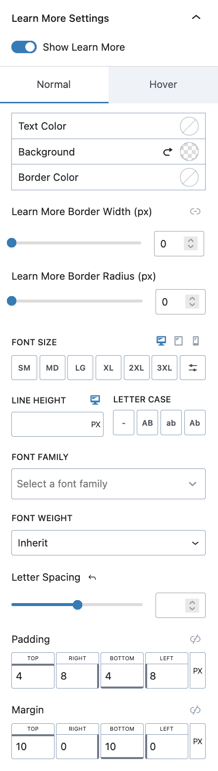
Note: The “Learn More” text is a placeholder – don’t forget to add your text so you can see it on your page.
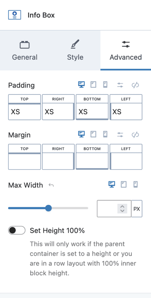
Advanced Settings
Padding and Margins can be set for the block. Use a preset or custom value. Responsive controls are available.
Max Width: Set the maximum width for the block by specifying a value and unit (for example, px, %, or vw). The responsive controls are also available.
Set Height to 100%: As noted below, this will only work if the parent container is set to a specific height or if you are in a row layout with 100% inner block height.
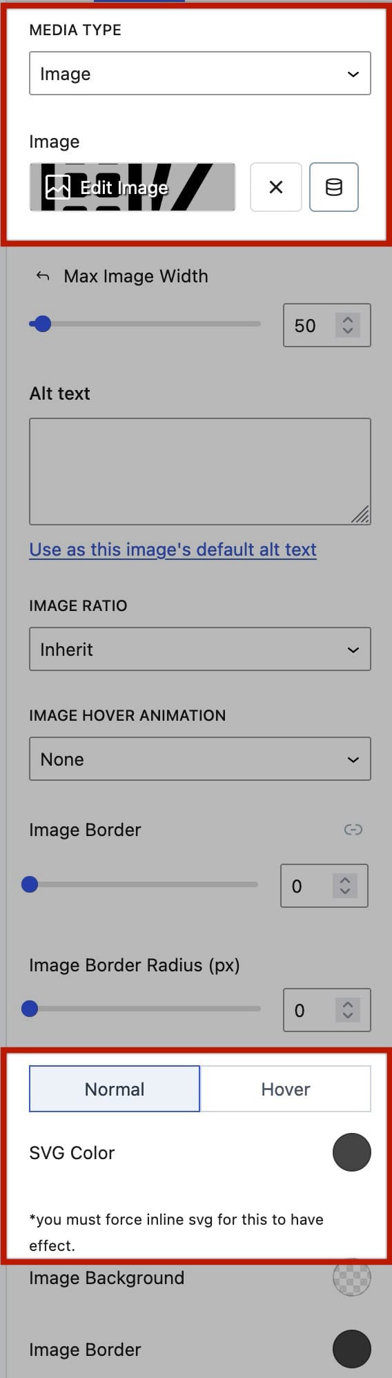
Using Custom SVG Images
The Info Box can use Custom SVG Images as the Media Type. This is done using the Image Media Type.
Using the Info Box → Style settings tab, the Media Settings allows you to select an Image.
When using an SVG file type, the SVG must be presented inline for the SVG color block setting to take effect. See the next section for more on this.
Forcing SVGs Inline Using SVG Support
WordPress doesn’t have a built-in way to force SVG Images Inline. However, this can be done with an easy-to-use, free plugin. Consider using a plugin like the SVG Support plugin to force SVG images inline. Custom CSS Classes can also be added to SVG images. When using SVG images, it is important to ensure you understand the security implications and precautions. See the SVG Security section for more general information on this topic.
To get started, go to the Dashboard → Plugins → Add New Plugin. Then locate, install, and activate the SVG Support plugin.
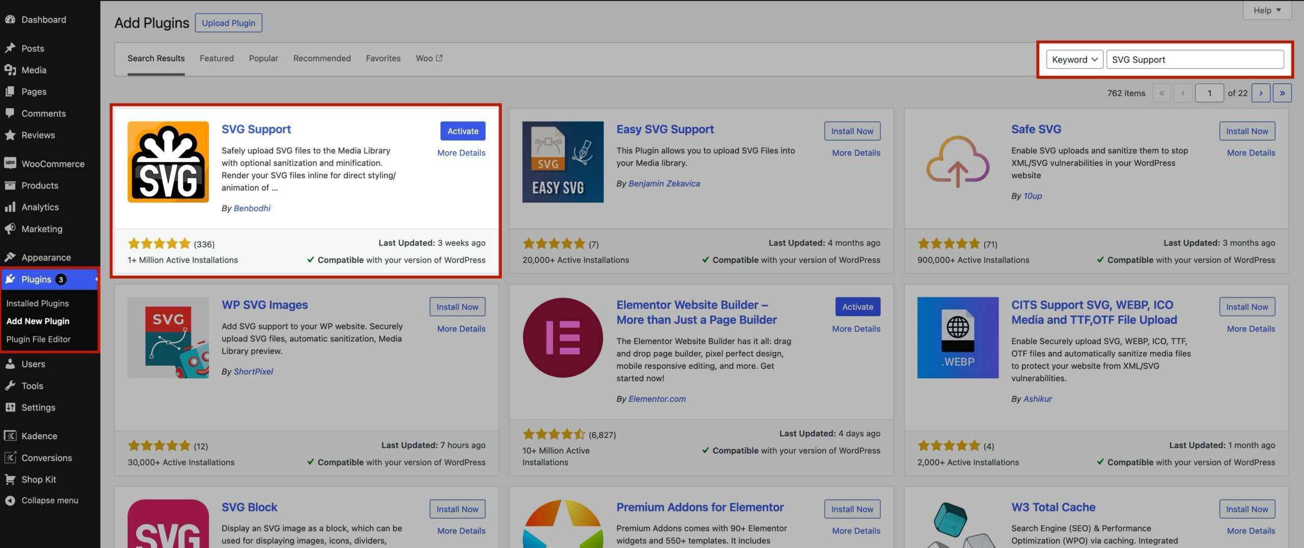
Once the SVG Support plugin is activated, go to the Dashboard → Settings → SVG Support page.
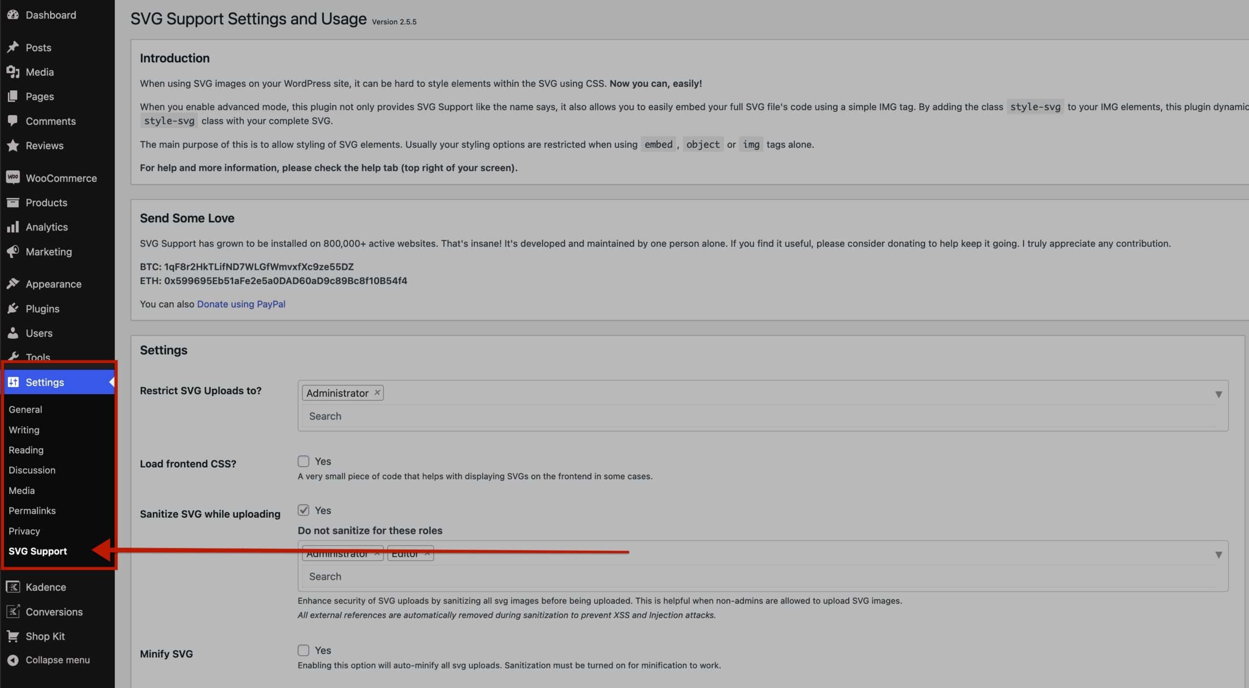
On the SVG Support Settings Page, find the Enable Advanced Mode setting. Check the checkbox to enable the Advanced Mode and save the changes. (View the SVG Security section for additional optional settings that provide additional security)
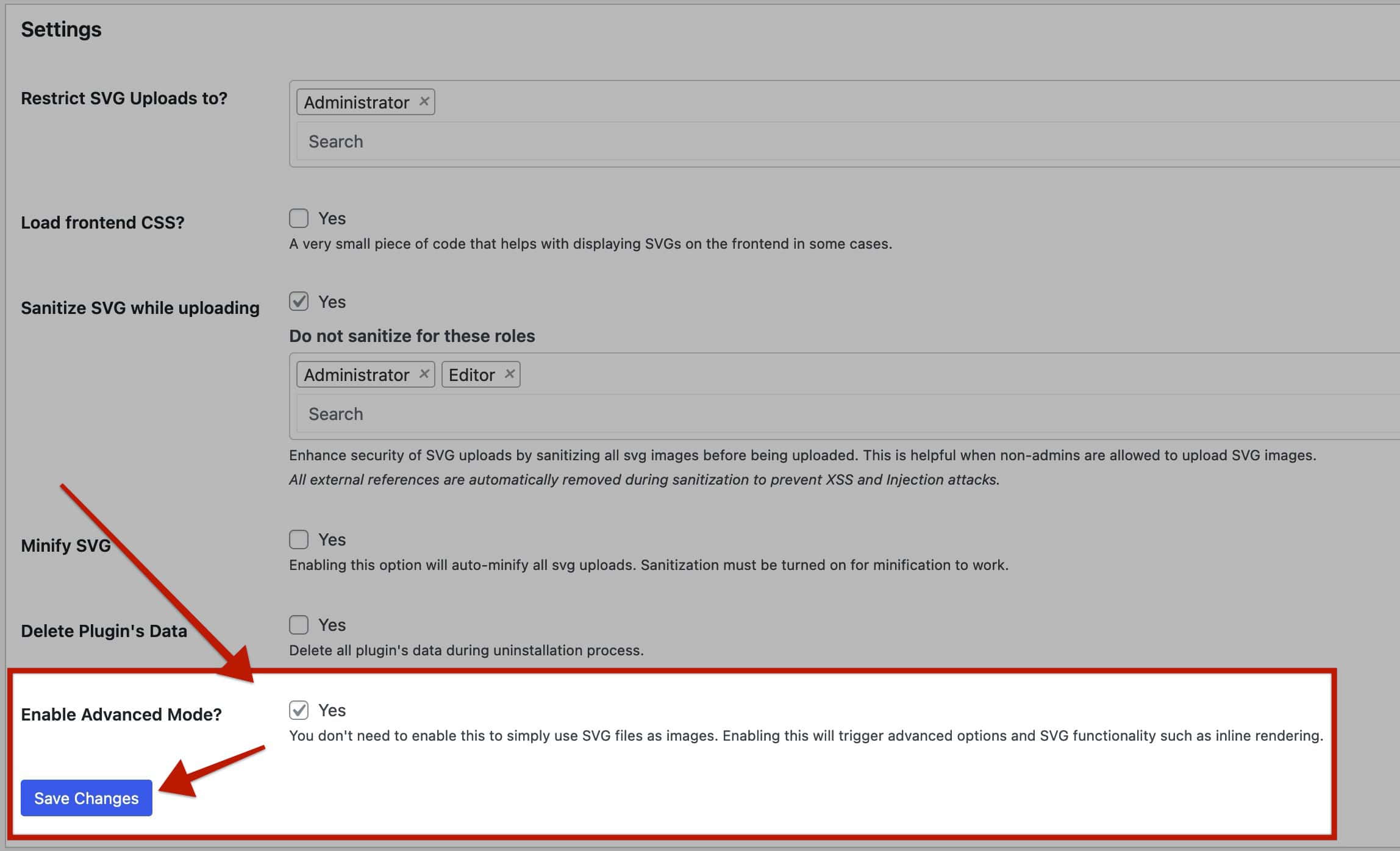
Once Advanced Mode is enabled, there are two main things that need to be done.
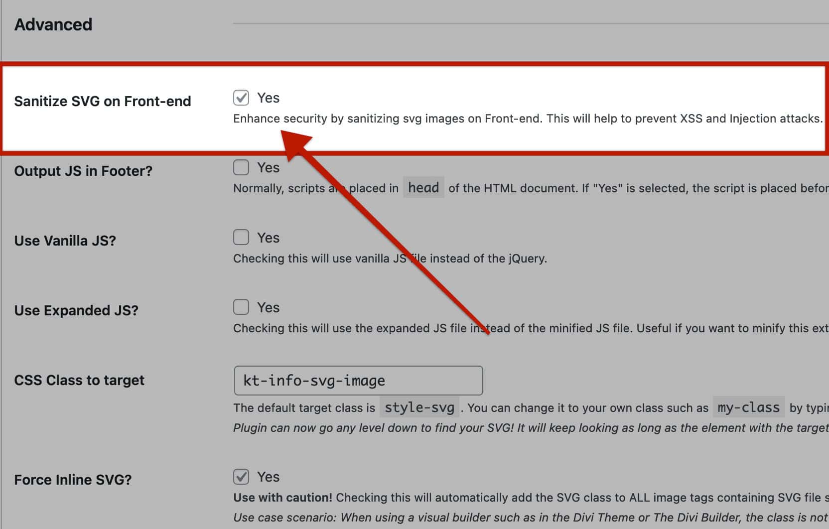
1) Next to the CSS Class to Target setting, input kt-info-svg-image as a Custom Class.
2) Next to the Force Inline SVG setting, enable the Yes checkbox.
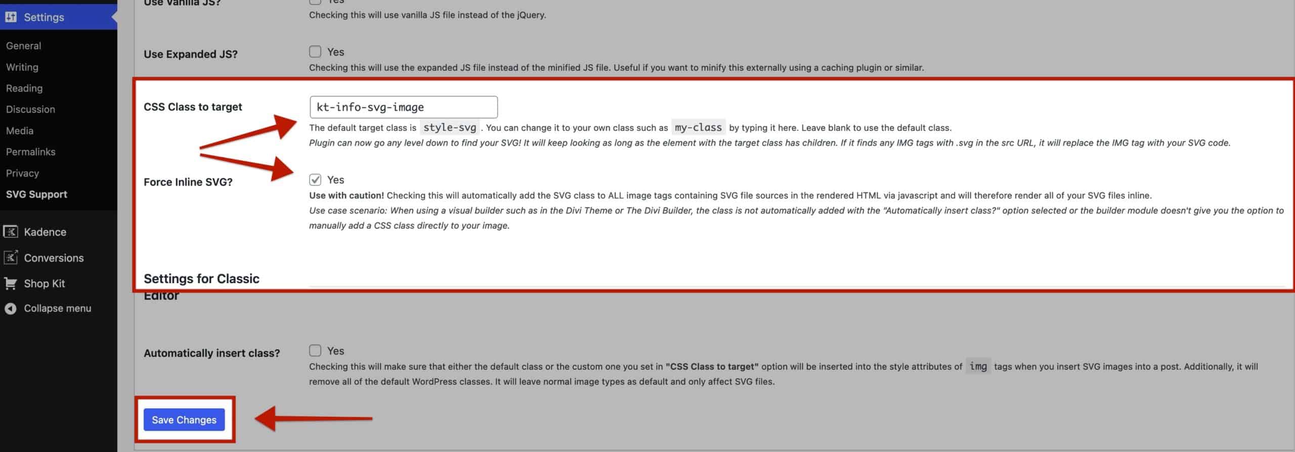
After these steps are complete, be sure to click the Save Changes button.
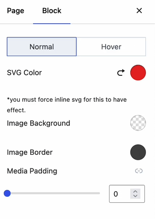
Now the Info Box SVG image can be controlled using the SVG Color block setting.
(The SVG Colors will not appear in the Editor. They will only show on the front end.
Block Settings Editor View
Front End Outcome

SVG Security
When using SVG formats, there are factors related to security that should be taken into consideration. Consider reading This SolidWP Article that provides a general overview of what SVGs are and how they are used.
When using the SVG Support plugin, two optional plugin settings can help enforce secure SVG implementation for your WordPress website. To locate these settings, go to the Dashboard → Settings → SVG Support page.
Under Settings, find the Restrict SVG Uploads To setting. This can optionally be set to Administrator to prevent others from uploading SVG Images.
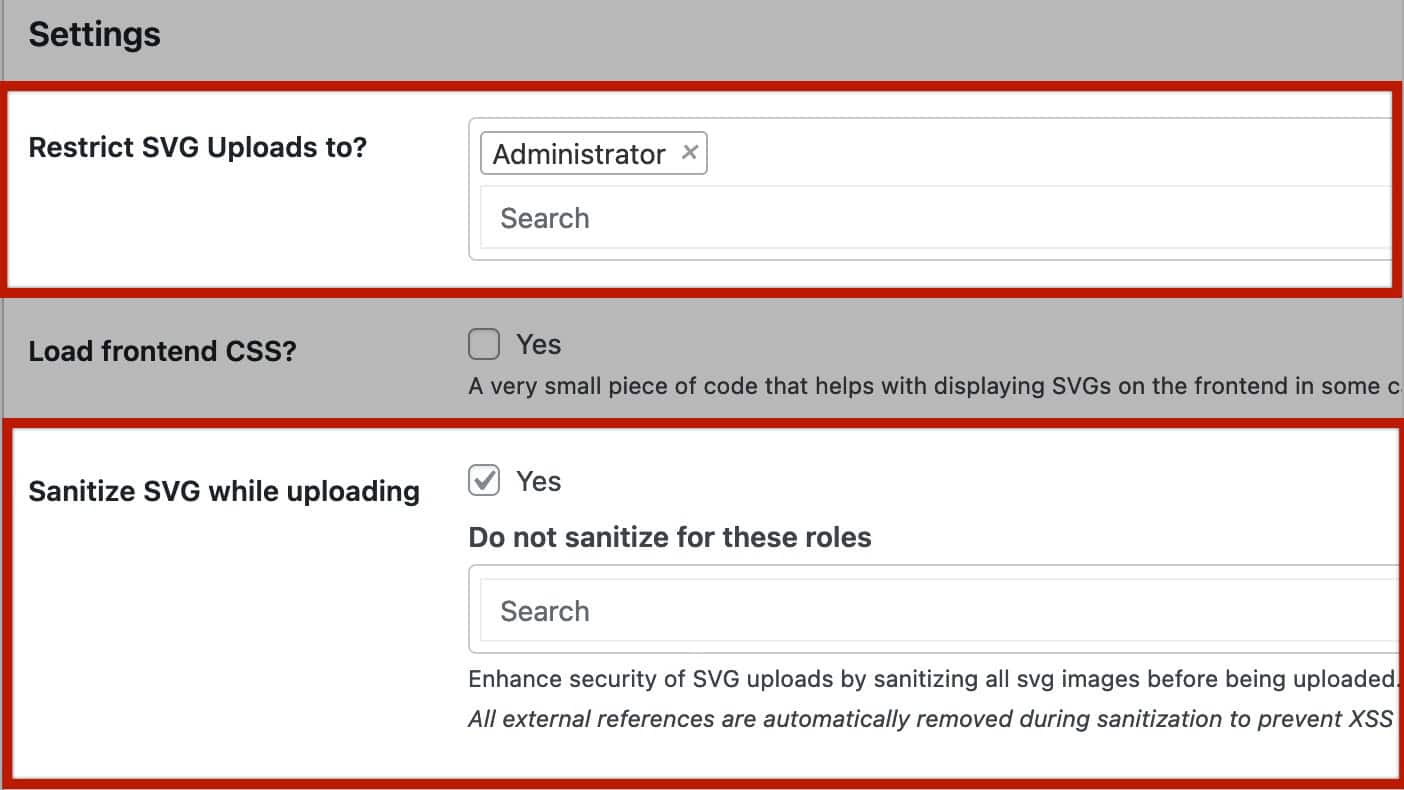
A little below that, the Sanitize SVG While Uploading setting can be found. With this enabled, SVGs will be sanitized before being uploaded.
Under the Advanced settings area, the Sanitize SVG on Front-end setting can be found. This setting enhances security by sanitizing the image on the front end.
Showing Multiple Info Box Blocks With Equal Heights
You can show multiple Info Box Blocks as Equal Heights, allowing Info Boxes to match the same height of one another. This provides a clean layout for presenting content. To do this, the Info Box Blocks must be added inside of Section Blocks within a Row Layout block. The structure should look something like this.

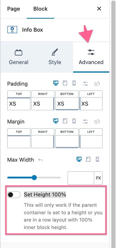
The first step is to set each Info Box Block to use the ‘Set Height 100%‘ block setting. This setting can be found in the Info Box Block settings → Advanced tab.
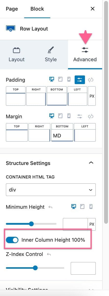
Then, you must also set the parent Row Layout block to use the ‘Inner Column Height 100%‘ block setting. This setting can be found in the Row Layout Block Settings → Advanced Tab under the Structure Settings.
With both of these settings enabled, the Info Boxes will share the same height.
