
The Text (Adv) Block allows you to add and customize Text across your website. You can use a Typed Text Effect, Highlighted Colors, customize advanced typography settings, and much more with the Kadence Text (Adv) Block. This is a block available in the free Kadence Blocks plugin.
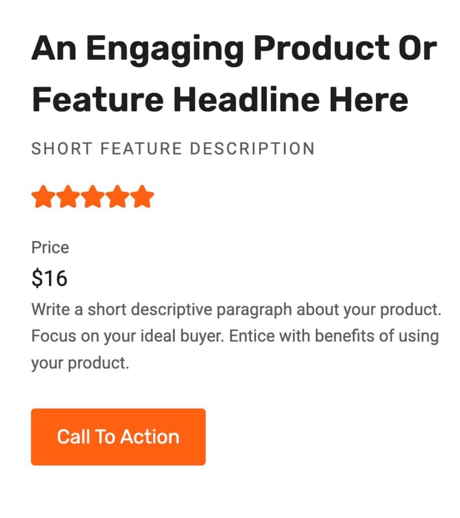
Sample Text (Adv) Block with a border and Highlight.
Learn about using Kadence AI-Powered Inline Content to improve your text by Clicking Here.
Getting Started
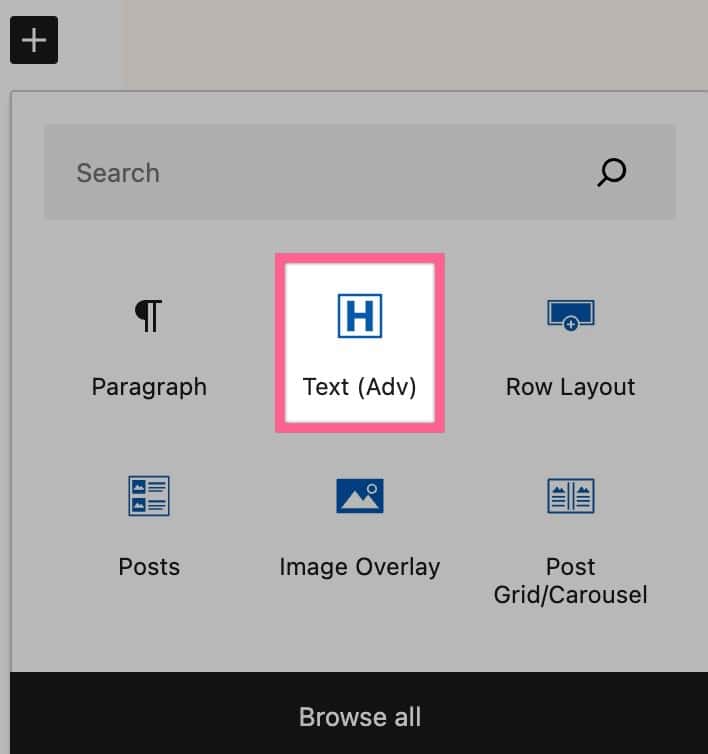
You can get started using the Kadence Text (Adv) Block by first selecting it from your block list .
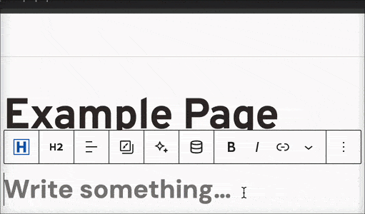
Once you have added the Block to your page, you can add text to it as usual.
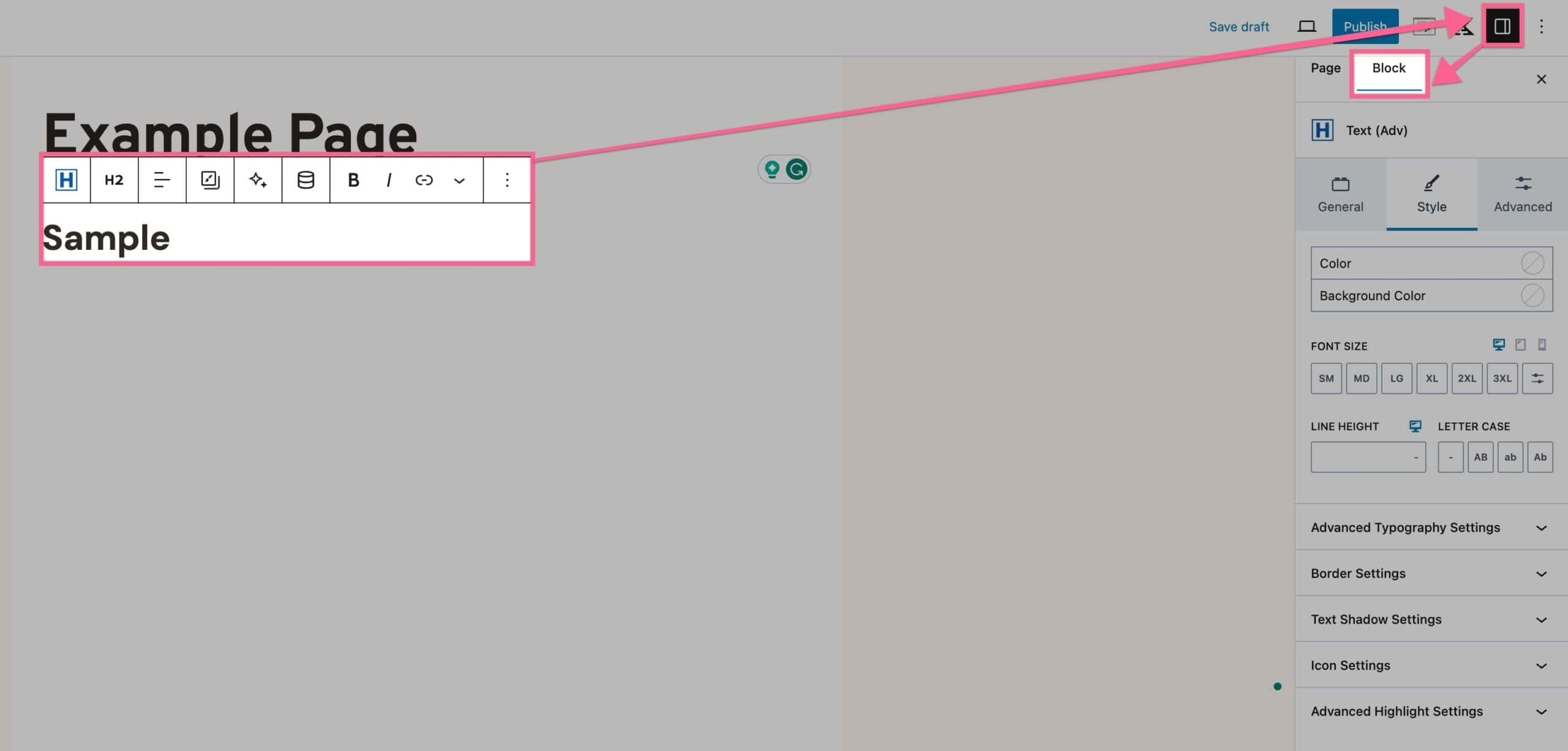
You can use the Block Settings and Block Toolbar to further customize your Advanced Text Block.
Note: For Dynamic Content features, please see the Kadence Dynamic Content document.
Block Settings
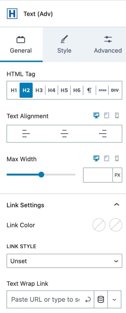
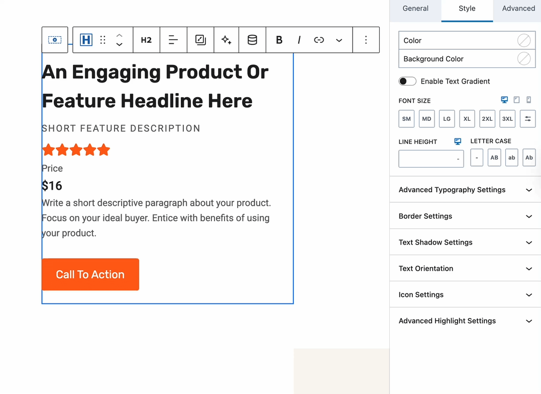
You can access the Block Settings by selecting your Text (Adv) Block, then clicking on the Settings Icon and going to the Block settings.
General
HTML Tag: The General Settings allow you to set an HTML Tag. This can be H1, H2, H3, H4, H5, H6, Paragraph, Span, or Div.
Text Alignment: You can set the Text Alignment to Left, Center, or Right for Desktop, Tablet, and Mobile devices.
Max Width: You can set the Max Width of the Text (Adv) Block for Desktop, Tablet, and Mobile devices.
Link Settings: You can expand the Link Settings to add and customize the Text (Adv) Link. This links the entire text and applies the respective styles when a link is set.
Link Color & Hover Color: You can set the Link Color and the Hover Color for the link.
Link Style: You can set the Link Style. Options include Unset, None, Underline, or Underline on Hover.
Text Wrap Link: You can add your Link to the Input Field, then press the Arrow Icon to submit the Link. You can also use a Dynamic Link if you have Kadence Blocks Pro.
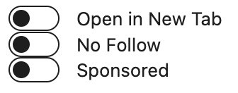
Dynamic Link Options: If you click the Arrow expansion Icon next to the Dynamic Content (Dynamic Link) Icon, you can find additional link options, including: Open in a new tab, no follow, and sponsored. Each setting can be toggled individually.
Style
The Style Settings allow you to set a Color and a Background Color to your text.
Gradient Texts
Enable Text Gradient: The Enable Text Gradient option allows you to use a Text Gradient instead of a Text Color and Background Color.
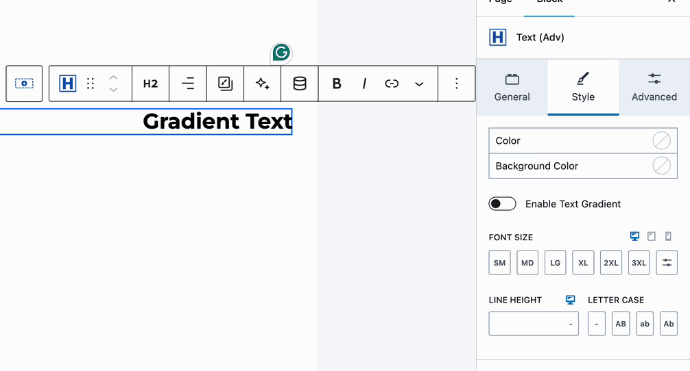
Font Size: You can set a Font Size for Desktop, Tablet, and Mobile Devices. You can use a preset value or click the Toggle Icon to manually set a Font Size.
Note: Font size values are limited to ensure readability, maintain layout integrity, and support a consistent experience across devices. Extremely large sizes can break designs and negatively impact usability if used incorrectly.
Line Height & Letter Case: You can set a Line Height and Letter Case for your Text (Adv) Block.
Advanced Typography: The Advanced Typography Settings allow you to set a Font Family, Font Weight, and Letter Spacing.
Border Settings: The Border Settings allow you to add a Border to your Text (Adv) Block. This can be set for Desktop, Tablet, and Mobile Devices. Borders can be linked or unlinked per side using the Chain Link Icon. You can set the color, pixel width, and Border Radius (also linkable per device).
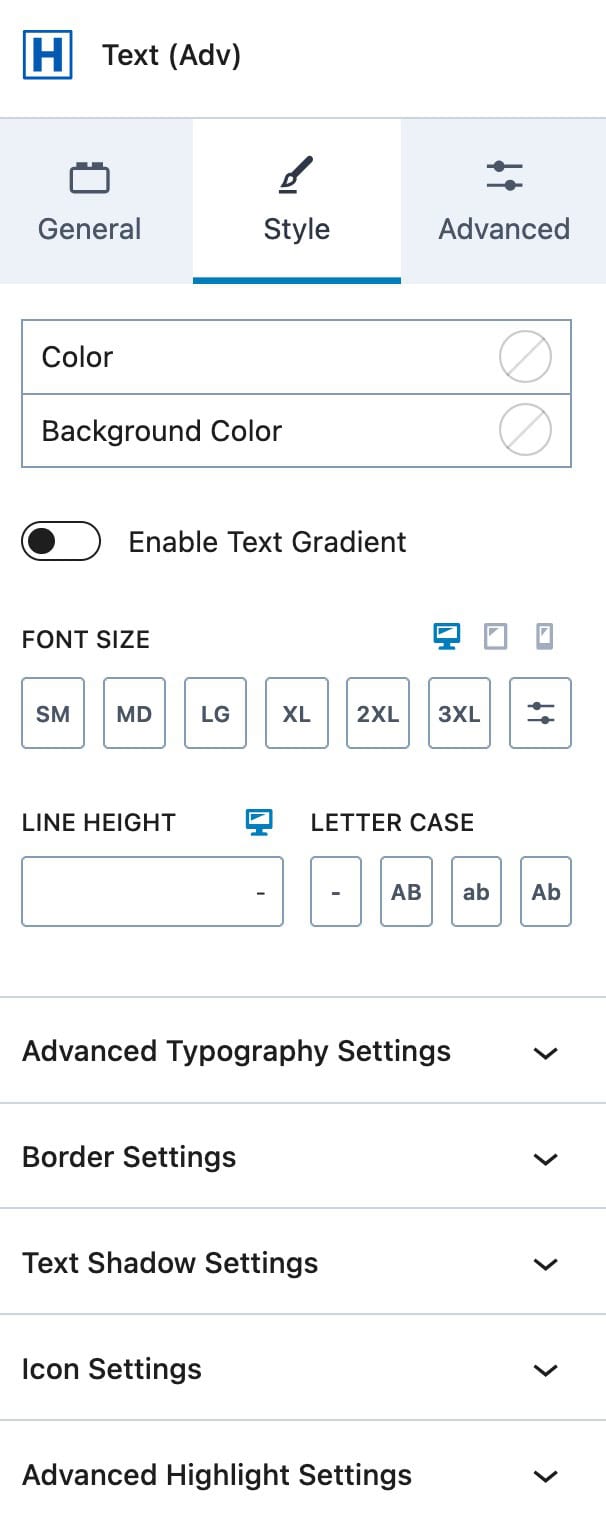
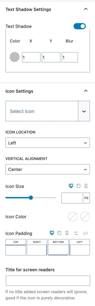
Text Shadow: The Text Shadow Settings allow you to add a Text Shadow to your Text (Adv) Block. You can toggle this on, then set the Color, X, Y, and Blur values.
Select Icon: You can add an Icon to the Text (Adv) Block by selecting from the dropdown.
Icon Location & Vertical Alignment: Set the Icon Location to Left or Right and the Vertical Alignment to Unset, Baseline, Center, End, or Start.
Icon Size: You can set the Icon Size for Desktop, Tablet, and Mobile.
Icon Color: Set the Initial and Hover Colors for the icon.
Icon Padding: Add a padding around the icon.
Title for Screen Readers: Optionally, add a Title for screen readers. If no title is set, decorative icons are ignored.
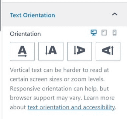
Text Orientation
The Text (Adv) block allows you to change how text is displayed using different orientations, including Horizontal, Stacked Vertically, Sideways Down, and Sideways Up.
Text orientation can be useful for labels, accents, and certain layout patterns where vertical text improves visual hierarchy
Browser Compatibility
Text Orientation uses the CSS writing-mode property, which is supported in most modern browsers. Support may be limited or inconsistent in older browsers. If broad compatibility is required, consider using horizontal text instead of vertical orientations.
Best Practices:
- Use vertical text intentionally and sparingly.
- Set a responsive fallback orientation.
- Test readability at higher zoom levels.
- Avoid vertical text when older browser support is critical.


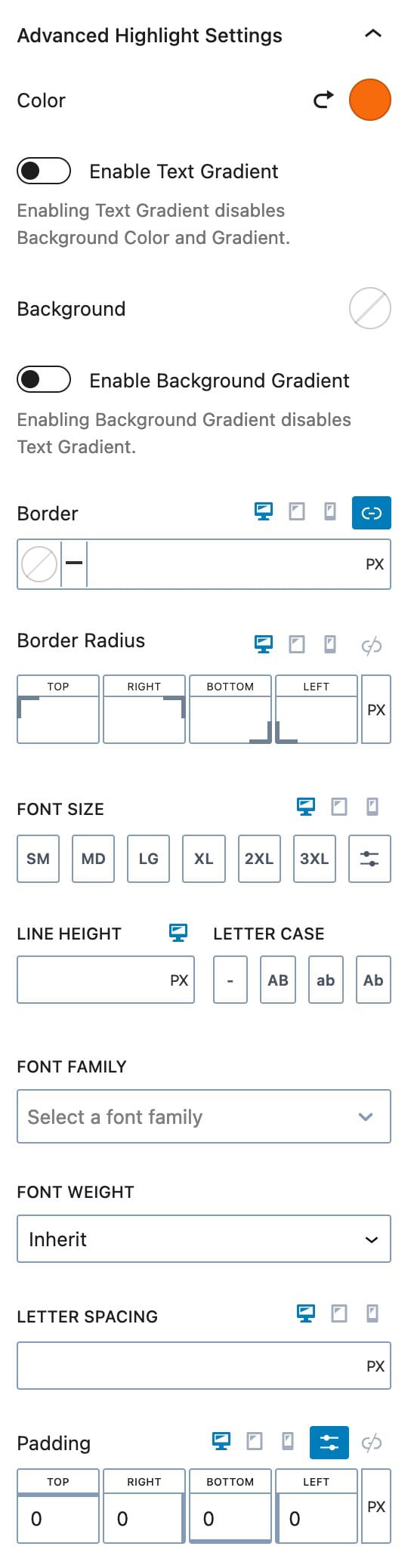
Highlight Settings
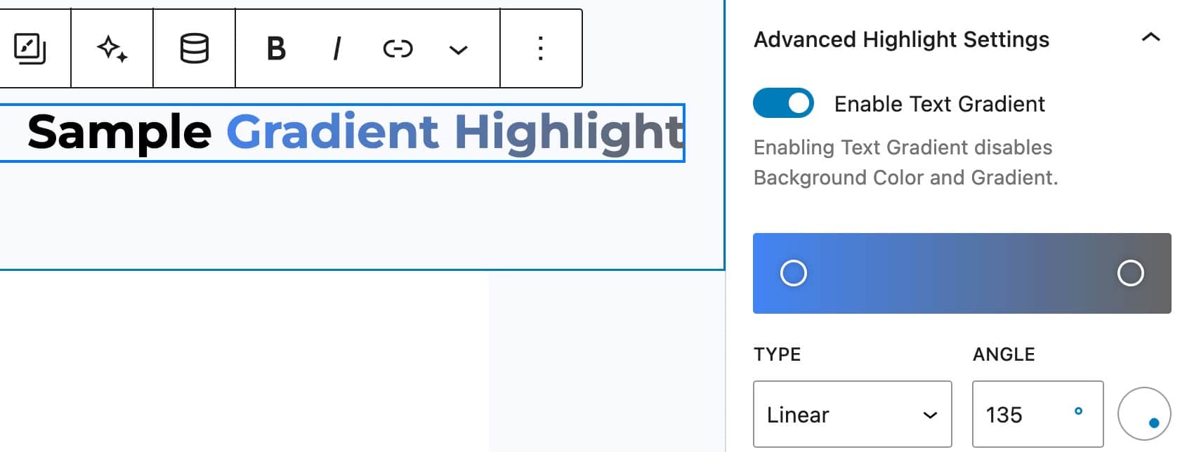
With the Advanced Highlight Settings, you can add color highlights to text in the Advanced Text Block, allowing for multi-colored text effects.
You can select both a Color and a Background Color to create a highlighted look.
Additionally, you can enable either a Text Gradient or a Background Gradient, though both cannot be applied simultaneously. If you choose a Background Gradient, a regular Text Color can still be used.
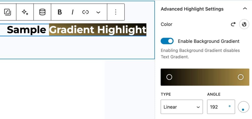
However, if you apply a Text Gradient, the Background Color or Gradient will not be available anymore.
Click here to view our article on How to Use Gradients in Web Design.
You can add a Border and Border Radius to the highlight for Desktop, Tablet, and Mobile Devices.
You can adjust the Font Size for the Highlight Desktop, Tablet, and Mobile Devices.
You can set the Line Height and Letter Case for the Highlight.
You can set the Font Family and Font Weight for the Highlight. You can also set the Letter Spacing and Padding for Desktop, Tablet, and Mobile Devices.
To add a Highlight to a Text (Adv) Block, select the Block and manually highlight and select the text where you want to add the effect. In the Block Toolbar, on the far right, click on the Dropdown Arrow and then select the first Highlight option. This will apply the Highlight to the selected text.
Advanced
The Advanced Settings allow you to customize more advanced features of the Text (Adv) Block.
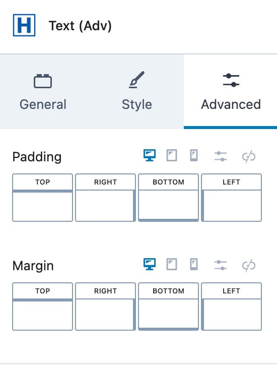
You can add Padding to the Text (Adv) Block for Desktop, Tablet, and Mobile Devices.
You can also add a Margin to the Text (Adv) Block for Desktop, Tablet, and Mobile Devices.
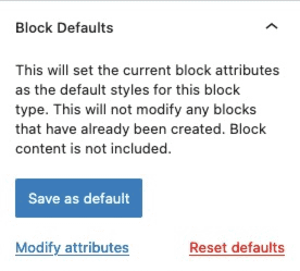
The Block Defaults setting allows you to set the current block attributes as the default styles for this block.
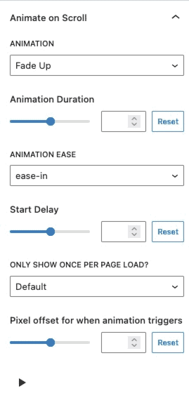
Animate on Scroll (Premium)
The Animate on Scroll settings allows you to add an animation to your block. This is a Premium feature and requires either Kadence Blocks Pro or Kadence Creative Kit to work.
You can select an animation duration, ease, and start delay. You can set this animation to show once per page and set a pixel offset for when the animation triggers.
You can press on the play icon at the bottom of the settings to see how your animation looks in the editor.
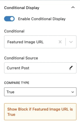
Conditional Display (Pro)
The Conditional Display setting allows you to display the block based on a condition. This is also a Kadence Blocks Pro feature.
Check out our post here for more details about the Conditional Display options.
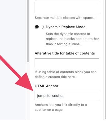
You can expand the Advanced Tab to add an HTML anchor or additional CSS class(es) to your Text (Adv) Block.
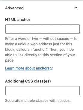
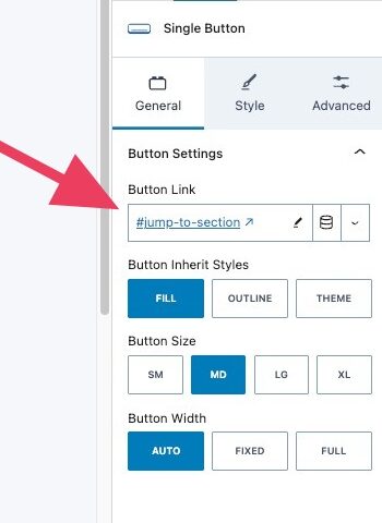
How to link to a specific section on a page or create internal page links
You can add an HTML Anchor to a block from Block Settings > Advanced.
Once set, you can link to that block using a button or text link by referencing the anchor with #your-anchor-id
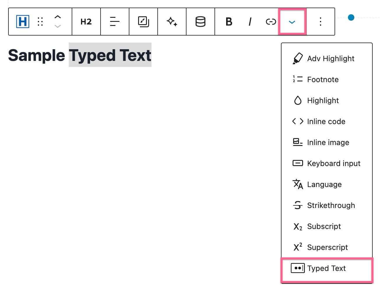
Typed Text
You can add the Typed Text effect to your Advanced Text Block by highlighting the word(s), clicking on the View More drop-down icon on the Toolbar, and clicking on Typed Text.
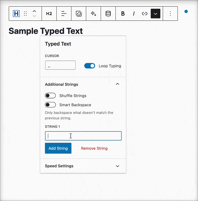
You will be able to add strings to the Typed Text. You can also enable loop typing, shuffle strings, and smart backspace.
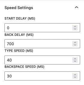
You can also adjust the Speed Settings.
Enhancing Typed Text with Italics or Boldness: Please remember that when you want to make Typed Text appear in italics or bold, it’s crucial to apply the italic or bold formatting before adding the Typed Text to the Advanced Text. This sequence of actions ensures that your Typed Text behaves as intended. If you first add Typed Text and then attempt to apply the Italic or Bold effect, the Typed Text may not function as expected.
AI-Powered Inline Content
Learn about using Kadence AI-Powered Inline Content to improve your text by Clicking Here.
To use Kadence AI-Powered Inline Text with Kadence Blocks, you must first activate Kadence AI. You can Click Here to learn more. Kadence allows you to improve, correct, and alter texts on your website using AI-powered inline Content features. You can use a Preset Prompt or write a custom prompt of your own.
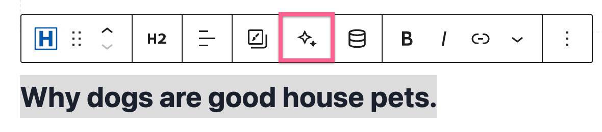
Preset prompts can be accessed without writing any prompt. You can just select any text, click on the AI star icon in the toolbar, and then click again on the AI star icon next to the input field (see photo below).
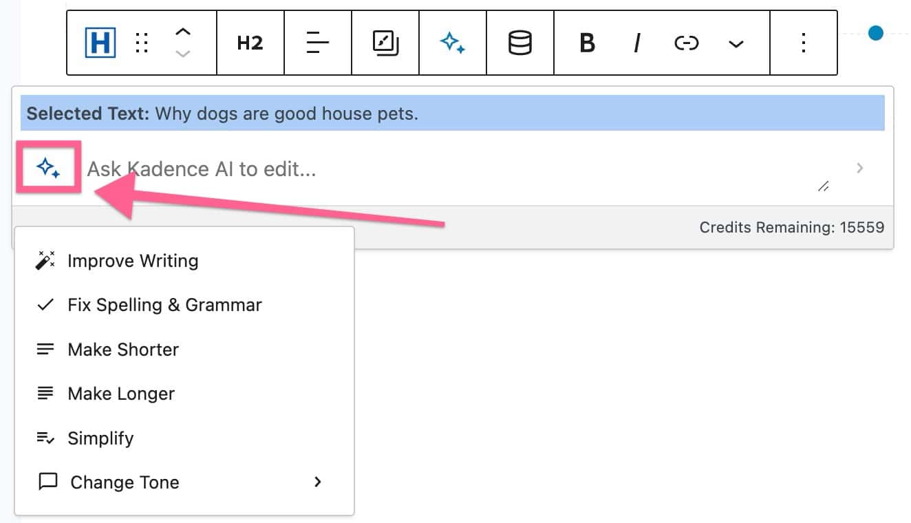
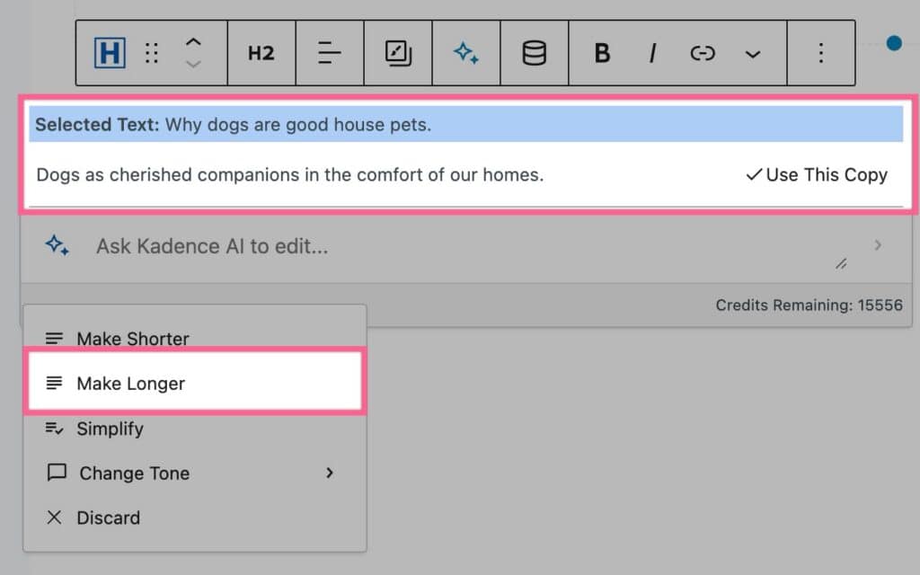
You will have options, such as Improve Writing, Fix Spelling & Grammar, Make Shorter, Make Longer, Simplify, and Change Tone. Each preset will prompt the AI to apply that prompt to your selected text. For example, in the Image Below, we used the Make Longer Preset Prompt to make the “Why dogs are good house pets” text longer.
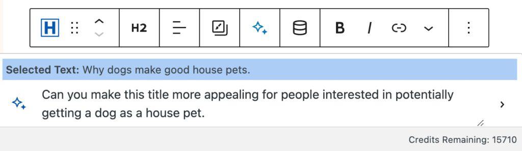
You can also manually enter a prompt to tell the AI what you would like to change about the current text. You can input your custom prompt in the input field.
When finished describing how you’d like to change your text, you can press the Enter key on your keyboard.
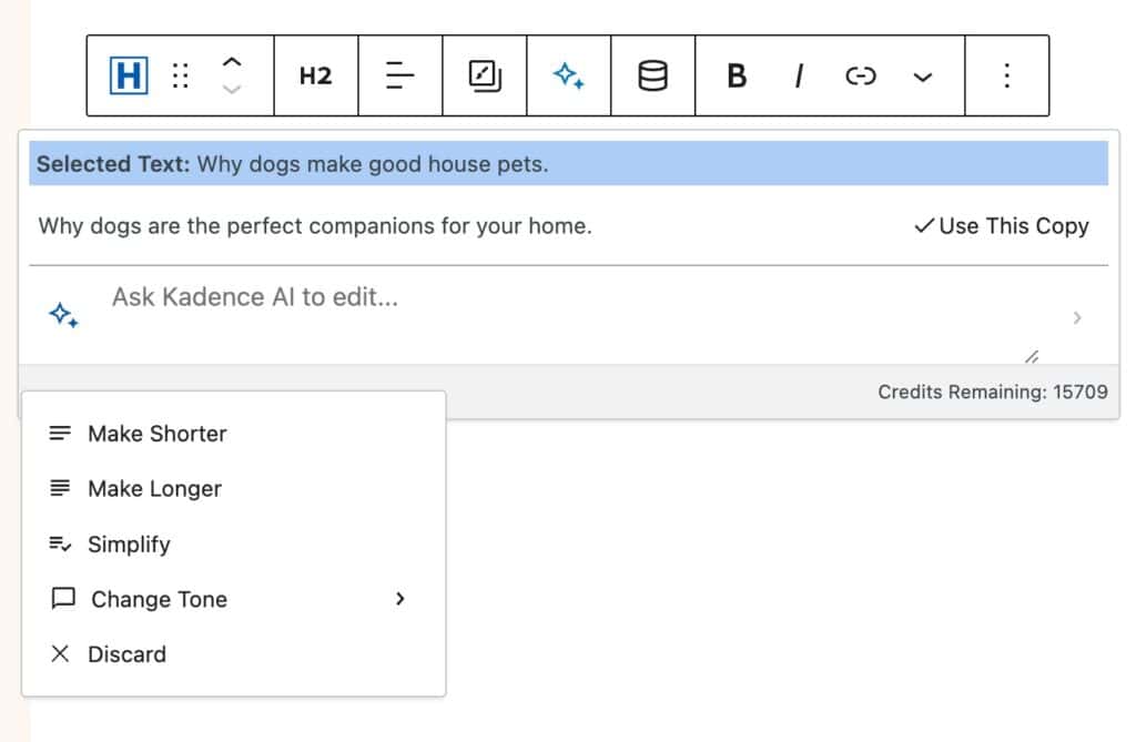
AI will then alter your text to fit the description you provided. You will then be left with a revised version of your Text that you can use or continue to revise.
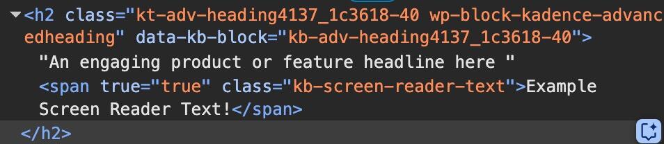
Screen Reader Texts
Accessibility is a big part of web development. In some cases, you may need to further explain what is happening on the page to screen readers. In these cases, the Advanced Text Block has you covered.
Start by adding a Screen Reader Text to your Advanced Text Block in the appropriate area. The text should be specifically for screen reader context. Then, highlight it and use the 3 dots in the block toolbar to set the currently selected text as a Screen Reader Text. This means the text will not be visible on the page, but the context will be fed to screen readers.
Screen Reader Texts will not show up on the physical page, but will within the website code. This follows the standard practices for adding accessible Screen Reader Texts.
