
The Kadence Theme includes a global Button Styles system, allowing you to define and manage how buttons appear across your site. These settings apply to both theme-based buttons and buttons added via blocks, ensuring a consistent design.
The Button Styles in the Customizer replace the need to manually style individual buttons, while giving you global control over their appearance. This document will explain where to find these settings, how they connect to the theme and block buttons, and the differences between each style type.
Getting Started
The Kadence Button Colors Feature is a part of the free Kadence Theme ⧉.
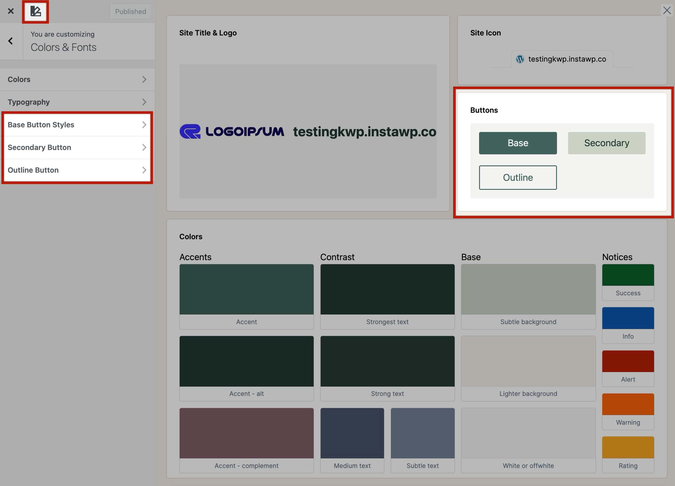
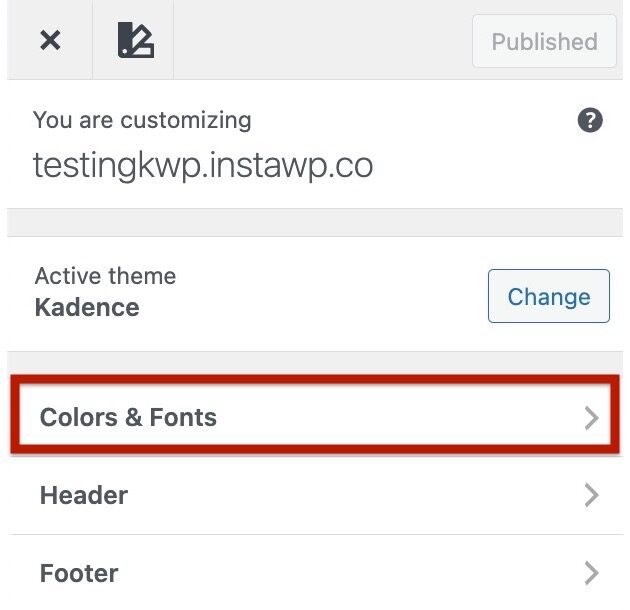
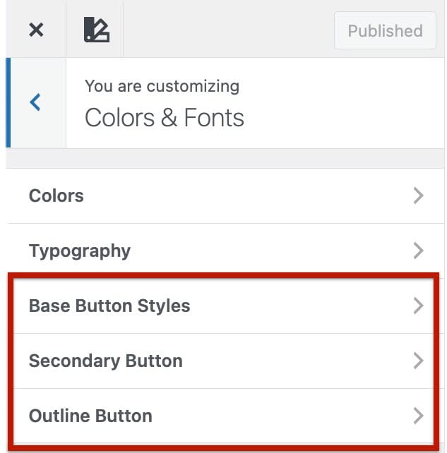
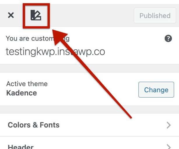
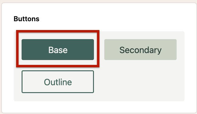
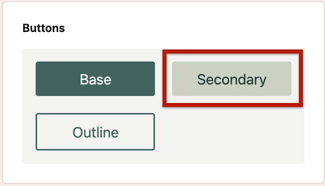
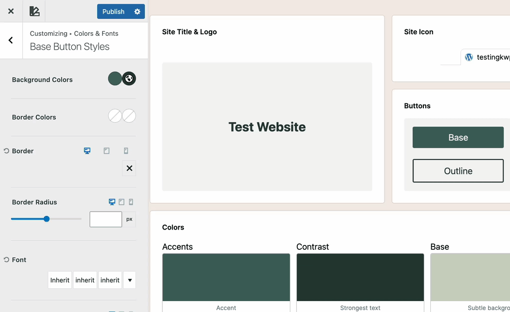
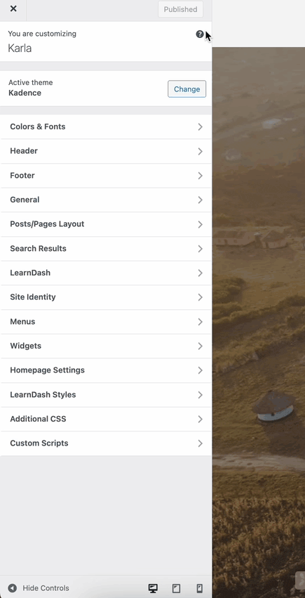
With the Kadence Theme active, you can control global button appearance from the Customizer → Colors & Fonts → Buttons settings. You will see three button types: the Base Button Styles, Secondary Button Styles, and the Outline Button Styles.
You can also use the Style Guide to view how the current Button Colors look. Additionally, you can click on each button type from the Style Guide to go directly to that button types settings.
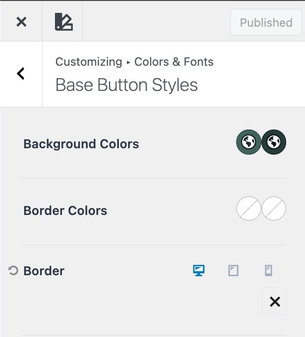
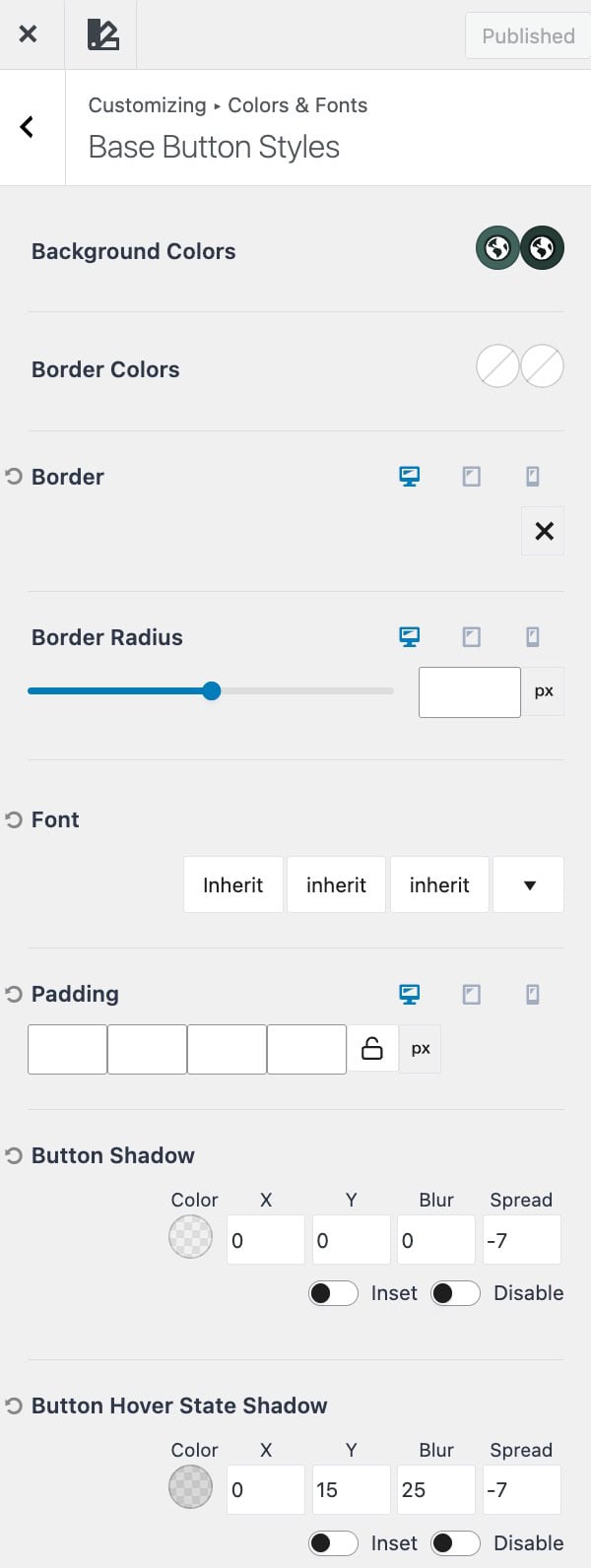
Base Button Styles
The Base Button Styles will apply to buttons automatically. This is the standard/base style of buttons on your website.
Background Colors: Set the background color for both the normal and hover states of your button.
Border Colors: Define the border color for the normal and hover states.
Border: Add or customize a border for your button. Click the X icon to select a border style (such as solid, dashed, or none). Once a style is selected, you can set the Border Width in pixels.
Border Radius: Control the roundness of your button corners. Increasing the radius creates more rounded buttons.
Font: Adjust the typography for your button text, including font family, weight, and size.
Padding: Set the spacing inside your button between the text and its edges. Padding can be customized for top, right, bottom, and left values.
Button Shadow: Add depth to your button by adjusting the Shadow Color, X offset, Y offset, Blur, and Spread values.
Hover Shadow: Define a different shadow style for the button’s hover state.
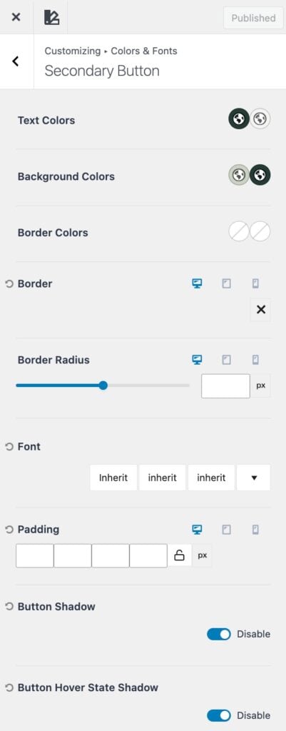
Secondary Button
The Secondary Button style provides an alternate design option for buttons across your site. It’s useful when you need a supporting button that visually differs from your primary button. For example, when displaying two buttons side by side, such as “Learn More” and “Buy Now.”
This style helps create visual hierarchy by distinguishing primary actions from secondary ones while maintaining overall consistency with your site’s design system.
Text Colors: Set the text color for both the normal and hover states of your button.
Background Colors: Set the background color for both the normal and hover states of your button.
Border Colors: Define the border color for the normal and hover states.
Border: Add or customize a border for your button. Click the X icon to select a border style (such as solid, dashed, or none). Once a style is selected, you can set the Border Width in pixels.
Border Radius: Control the roundness of your button corners. Increasing the radius creates more rounded buttons.
Font: Adjust the typography for your button text, including font family, weight, and size.
Padding: Set the spacing inside your button between the text and its edges. Padding can be customized for top, right, bottom, and left values.
(These options must be enabled using the toggle.)
Button Shadow: Add depth to your button by adjusting the Shadow Color, X offset, Y offset, Blur, and Spread values.
Hover Shadow: Define a different shadow style for the button’s hover state.
Note: By default, the Secondary Button inherits the Box Shadow from the Theme’s Base Button. Disable the Disable Box Shadow toggle to apply unique shadow settings independent from the Base Button Shadow settings.
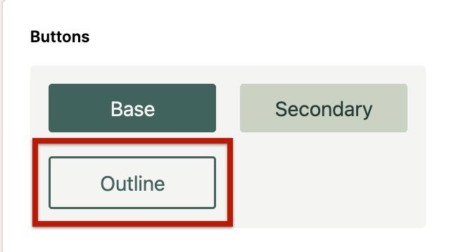
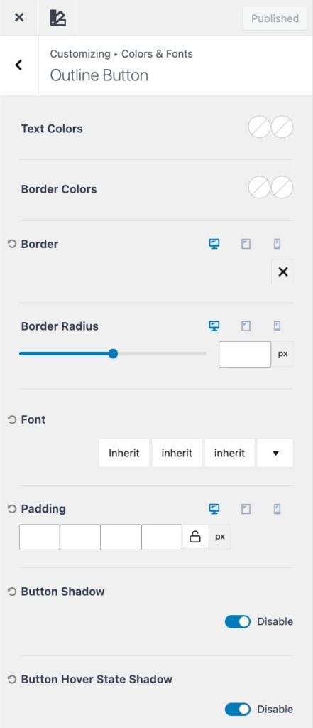
Outline Button
The Outline Button style offers a more minimal design, featuring a transparent background with a defined border. This style is ideal for subtle or secondary actions where a full-color button might draw too much attention. This style doesn’t include a background color, as the background stays transparent.
Text Colors: Set the text color for both the normal and hover states of your button.
Border Colors: Define the border color for the normal and hover states.
Border: Add or customize a border for your button. Click the X icon to select a border style (such as solid, dashed, or none). Once a style is selected, you can set the Border Width in pixels.
Border Radius: Control the roundness of your button corners. Increasing the radius creates more rounded buttons.
Font: Adjust the typography for your button text, including font family, weight, and size.
Padding: Set the spacing inside your button between the text and its edges. Padding can be customized for top, right, bottom, and left values.
(These options must be enabled using the toggle.)
Button Shadow: Add depth to your button by adjusting the Shadow Color, X offset, Y offset, Blur, and Spread values.
Hover Shadow: Define a different shadow style for the button’s hover state.
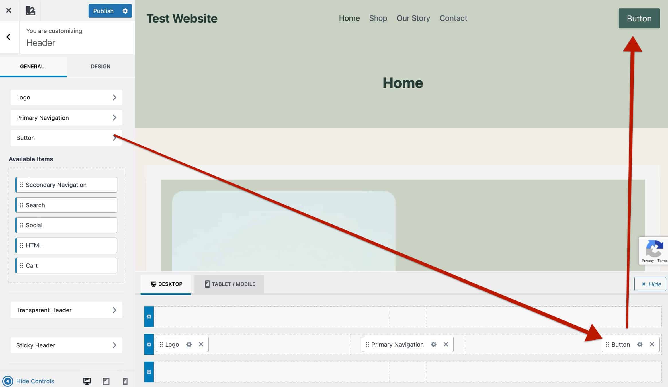
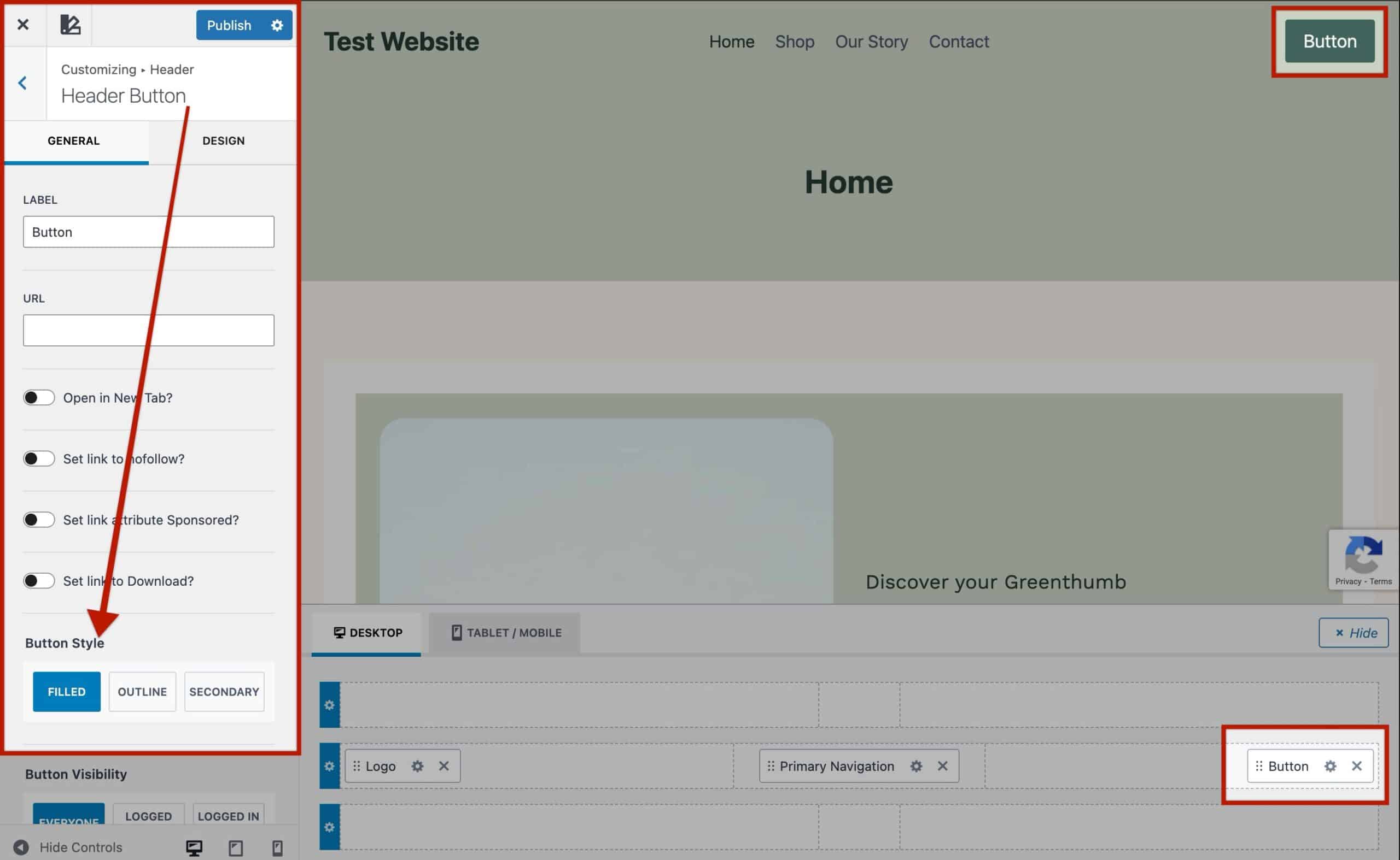
Kadence Theme Buttons
The Kadence Theme Header includes Button Header Items, which automatically use your Base Button Styles by default, ensuring they match the look and feel of standard buttons across your site.
When customizing Header Buttons, you can choose between the three global button style types: Base, Secondary, and Outline. This allows you to easily differentiate primary and secondary actions within your site’s header while maintaining a consistent design system defined in your Customizer.
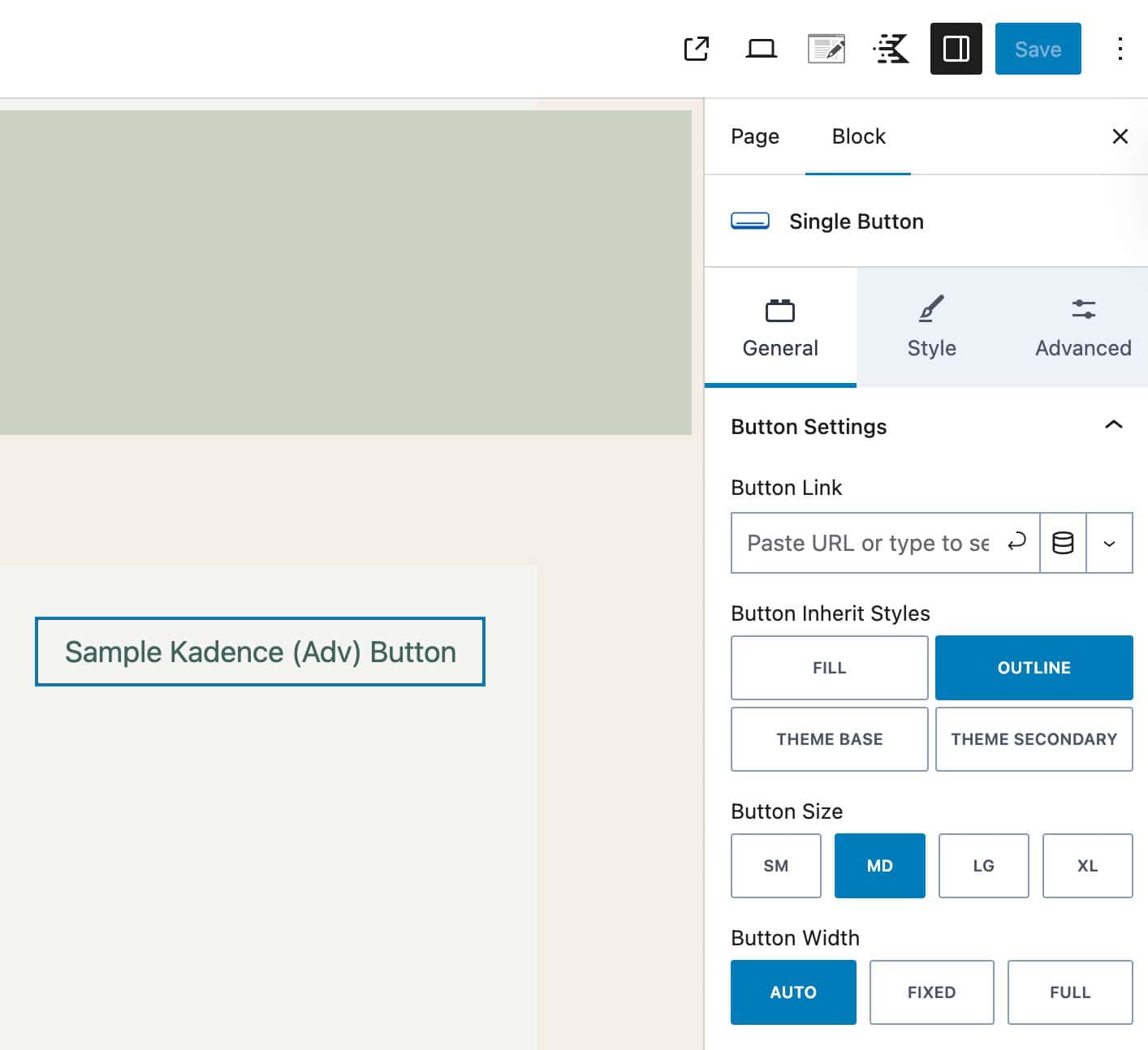
Kadence Advanced Buttons
Advanced Buttons in the Kadence Blocks plugin automatically inherit the Base Button Styles from the Kadence Theme, provided the individual block settings have not been modified. This ensures that your button blocks remain visually consistent with the rest of your site.
When editing an Advanced Button Block, go to Block Settings → General Tab and locate the Button Inherit Styles option. Here, you can choose between:
- Fill – Uses a solid button style. The Text Color and Background Color are pulled from the Kadence Base Button Styles. Other customizations, such as borders, are not applied from the Base Styles and will instead use the settings defined in the Advanced Button Block
- Outline – Inherits the Outline Button Styles from the Kadence Theme.
- Theme Base – Inherits the Base Button Styles from the Kadence Theme.
- Theme Secondary – Inherits the Secondary Button Styles from the Kadence Theme.
When using Theme Styles, you can still adjust individual block settings, such as background color, typography, or padding. Changing one of these settings will only override that specific property. It won’t remove or reset the rest of the inherited Theme Styles.
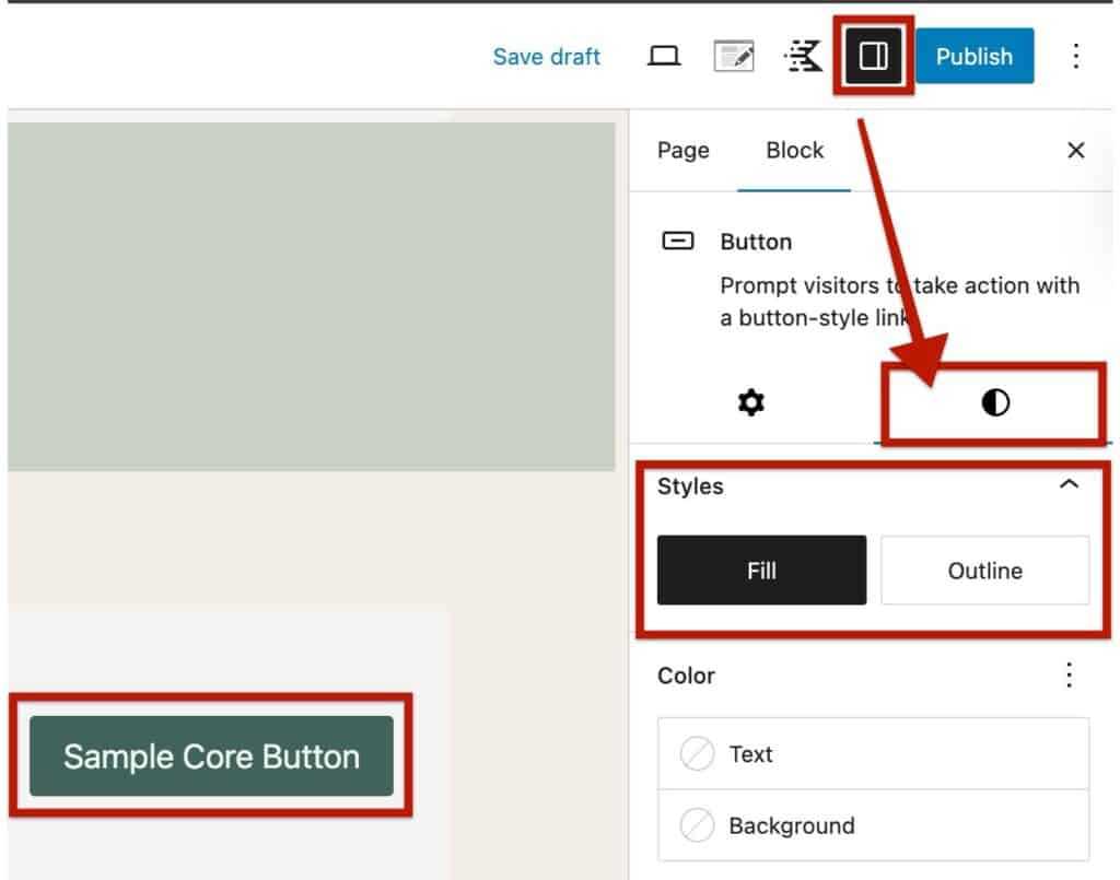
Core Block Buttons
WordPress Core Buttons automatically inherit the Base Button Styles from the Kadence Theme, as long as the individual block settings have not been customized.
When editing a Core Button Block, you’ll find two tabs for settings in the block toolbar. Click the Styles icon (half black / half transparent circle) to switch between available button styles. The available options in Core Blocks consist of the Base Styles or the Outline Styles.
- Fill – Uses a solid button style. The Text Color and Background Color are pulled from the Kadence Base Button Styles. Other customizations, such as borders, are not applied from the Base Styles and will instead use the settings defined in the Advanced Button Block
- Outline – Inherits the Outline Button Styles from the Kadence Theme.
Button Color opacity
If you want the color to be more see-through, drag the circle on the second line under the color picker.
You can also type a number (like 0.5) in the “A” box to set the opacity; 0.5 means 50% see-through.

Text Colors – The Text Colors setting allows you to set an initial color and hover color for your button text.
Background Colors – The Background Colors setting allows you to set an initial color and hover color for your button background.
Border Colors – The Borders Colors setting allows you to set an initial color and hover color for your button border.
Border – The Border setting allows you to set and use a border on your buttons.
Border Radius – The Border Radius setting allows you to set the border radius on your buttons.
Font – The Font setting allows you to specify a font, font style, and font size to your button.
Padding – The Padding setting allows you to add padding to your button for desktop, tablet, and mobile devices.
Button Shadow – The Button Shadow setting allows you to set a shadow around your button.
Button Shadow Hover State – The Button Shadow Hover State setting allows you to set a hover shadow around your button.
Color opacity
If you want the color to be more see-through, drag the circle on the second line under the color picker.
You can also type a number (like 0.5) in the “A” box to set the opacity — 0.5 means 50% see-through.
