
The Kadence Theme features a built-in global Style Guide that provides an easy way to customize and preview your site’s main design styles in one place. This includes your logo and tagline, Theme Color Palette, Typography, and Button Styles.
The Style Guide serves as a visual control center for your site’s appearance, helping you ensure that color, typography, and the overall brand alignment are consistent. Any changes made in the Style Guide automatically apply across your entire site, creating a global design system without needing to edit individual blocks or pages.
Getting Started
The Style Guide opens a live preview where you can see how your chosen colors, fonts, and buttons appear together before publishing your changes.
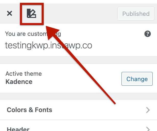
You can access the Style Guide from the Dashboard -> Appearance -> Customizer by clicking the Style Guide Icon at the top left corner.
From here, you’ll see a live preview of various theme styles. You can hover over any Style Guide item to quickly edit that specific setting. When hovering, a pencil icon will appear. Click it to open the corresponding setting directly in the Customizer.
This makes it easy to visually adjust styles such as colors, typography, and buttons while immediately seeing how your changes affect the overall design of your site.
You can close the Style Guide by pressing the Style Guide Icon again or clicking on the X at the top right of the Customizer preview.
The Style Guide consists of five main sections, each representing a key part of your site’s global design system. When changing settings related to these sections, you will see a live representation in the Customizer preview Style Guide.
You can learn more about how each section works below.
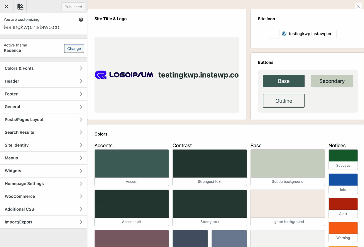
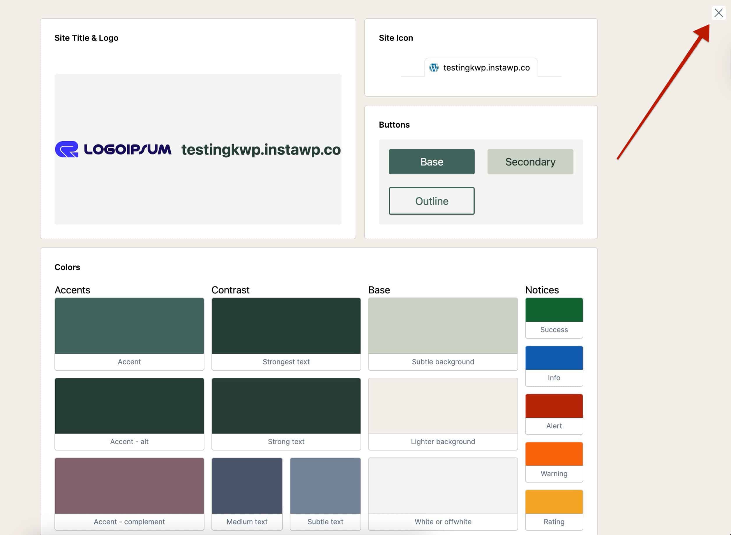
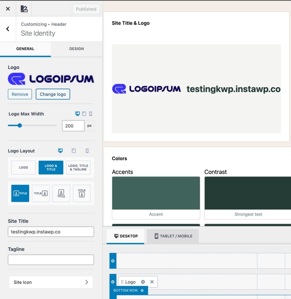
Site Title & Logo
The Site Title and Logo shown in the Style Guide pull directly from your Kadence Header settings. These elements represent your brand identity across the site.
To edit them, click the pencil icon next to either item, which will take you to the Header -> Site Identity settings in the Customizer. From there, you can upload your logo, adjust its size, and edit the site title and tagline.
Set a Logo Image and adjust the Logo Max Width setting to control the overall Size of the logo.
Use the Logo Layout settings to choose what you want to display: just the logo, the logo with your site title, or the full combo of logo, title, and tagline.
You’ll also be able to choose how these things are positioned.
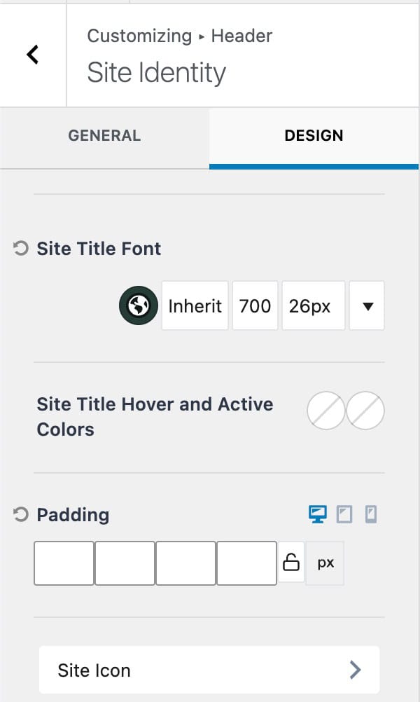
Use the Design Tab to gain access to more styling options, such as the Site Title Font and Padding.
Learn more about the Kadence Header Items and their settings.
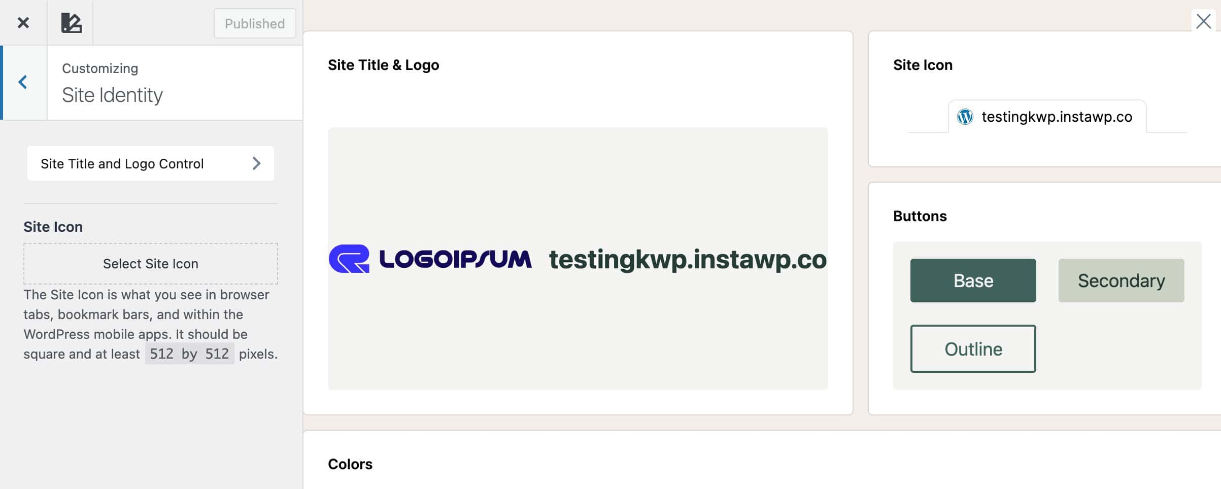
Site Icon
The Site Icon (favicon) uses the default WordPress Core Customizer setting. This icon appears in browser tabs, bookmarks, and mobile shortcuts.
To change it, click the pencil icon beside the site icon preview, or go to Customizer -> Site Identity -> Site Icon to upload your preferred image.
Recommended Size: Use an image 512 × 512 pixels or larger. WordPress will automatically generate the smaller sizes (16×16, 32×32, 48×48, etc.) required by Google, browsers, and devices. Use a simple, recognizable design, and consider a transparent background for best results.
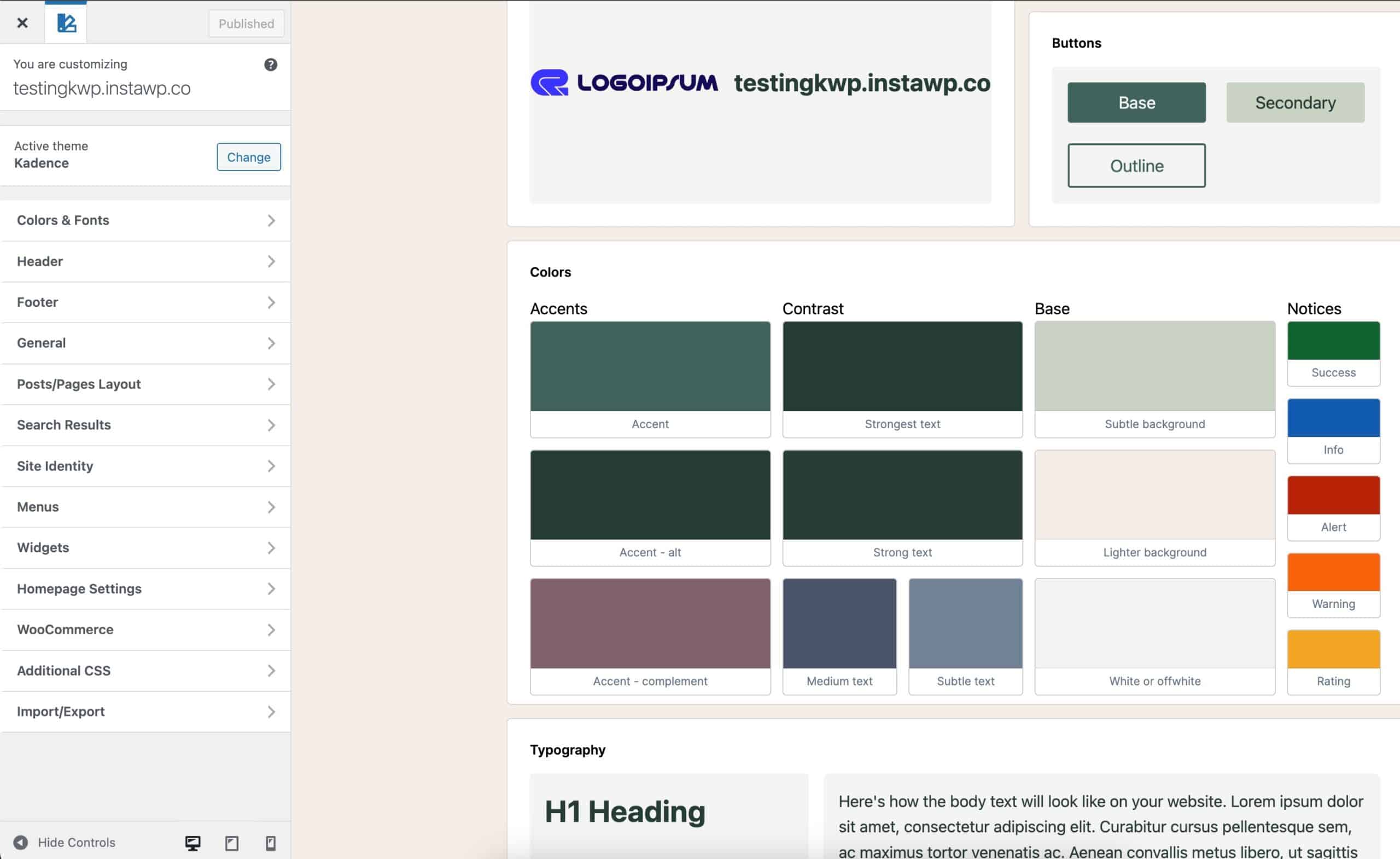
Colors (Color Palette)
The Colors section of the Style Guide displays your active Theme Color Palette, allowing you to see how your chosen colors work together across your site. You can click any color block to edit it directly or navigate to Customizer -> Colors & Fonts -> Colors.
These global colors are used throughout your theme and are available within both Core and Kadence Blocks, creating a global design system. Any changes made here automatically update sitewide, including all locations where a color has previously been applied. Whether it was applied in the theme or a block.
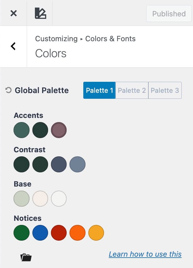
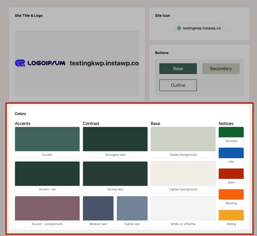
The Kadence Color Palette is organized into four main groups, each serving a specific purpose:
- Base (Background) Colors – Foundational colors used for page sections, cards, and general layout backgrounds. Provides subtle contrast and structure to your site.
- Accent Colors – Brand-defining colors used for highlights, links, buttons, and interactive elements. Includes your main accent, alternate accent for hover/active states, and a complementary accent for supporting tones.
- Contrast Colors – Colors for text and interface elements that ensure readability and hierarchy. Includes the strongest, strong, medium, and subtle text colors.
- Notices (Feedback) Colors – Colors for system feedback, alerts, and status messages, including success, info, alert, warning, and rating highlights.
By understanding these groups, you can maintain balance and consistency in your design while quickly adjusting colors when needed.
Learn more about the Kadence Theme Color Palette settings.
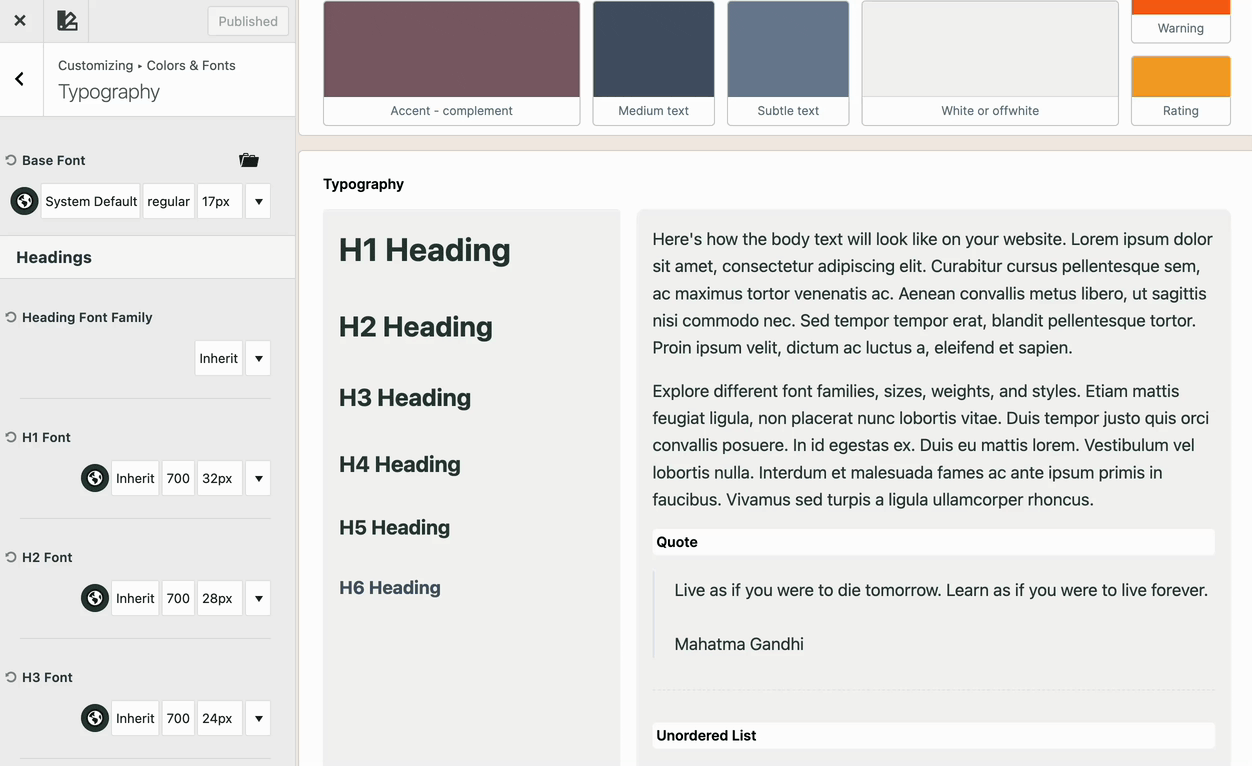
Typography
The Typography section lets you review and adjust your site-wide font styles for headings, body text, and other elements. Click any text example in the Style Guide to open the Customizer -> Colors & Fonts -> Typography settings.
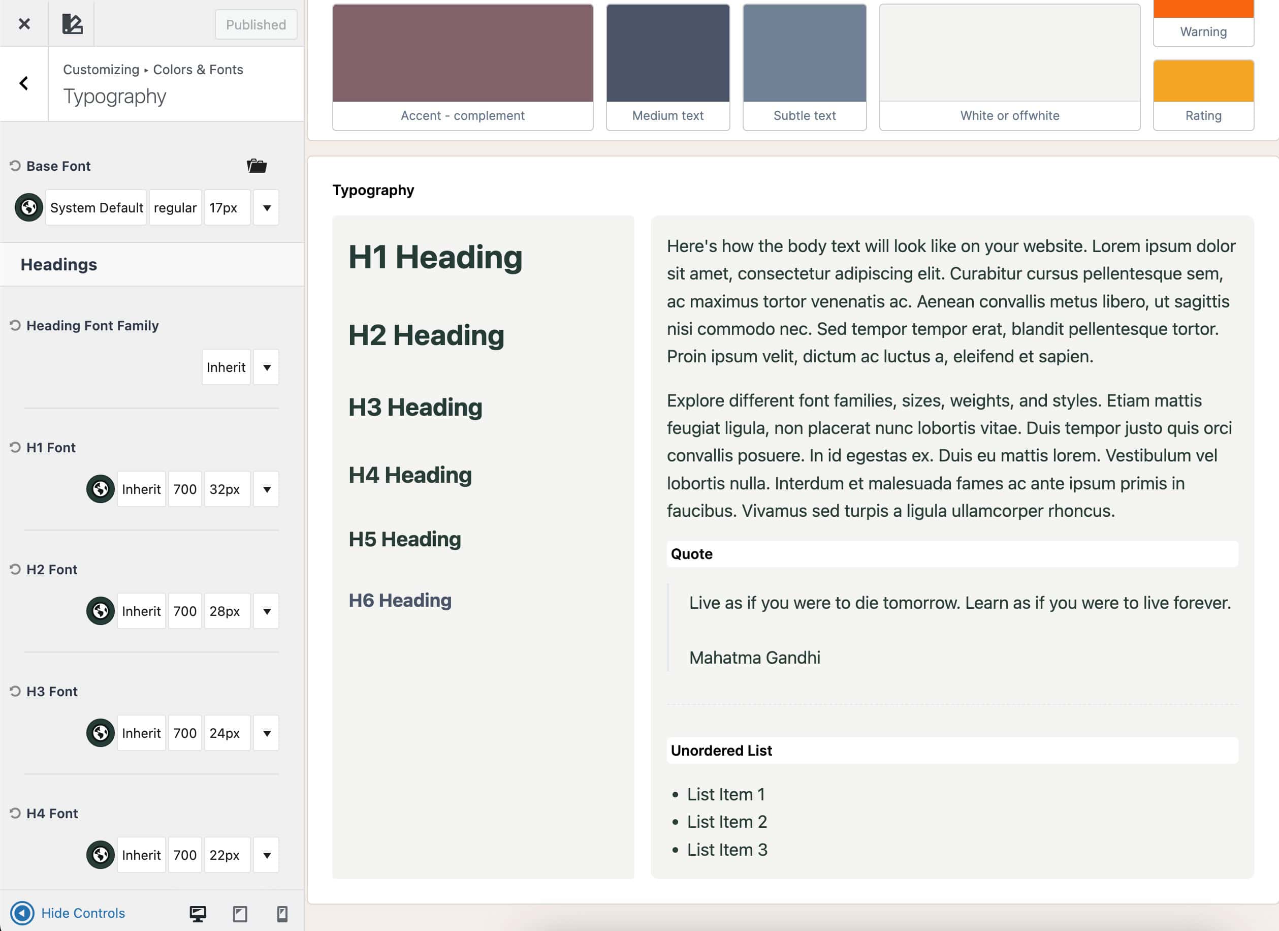
Each heading type (H1, H2, H3, etc.) represents a global setting for that level of heading across your site. The Base Font controls standard text elements such as paragraphs, menu items, and other general body text. From here, you can customize font families, weights, sizes, and line heights for each text type accordingly.
Learn more about the Kadence Theme Typography settings.
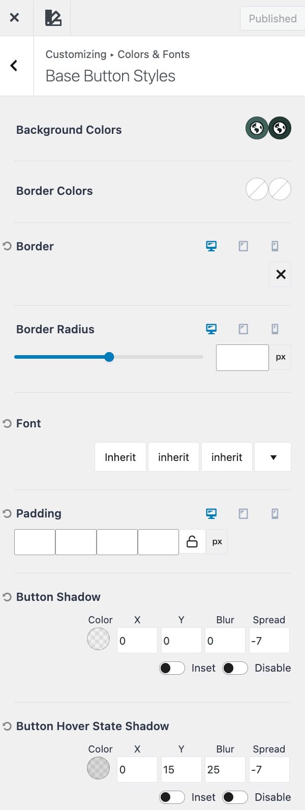
Buttons
The Buttons section of the Style Guide gives you a live preview of your global Kadence Theme Button Styles, allowing you to quickly visualize and refine how buttons appear across your entire site.
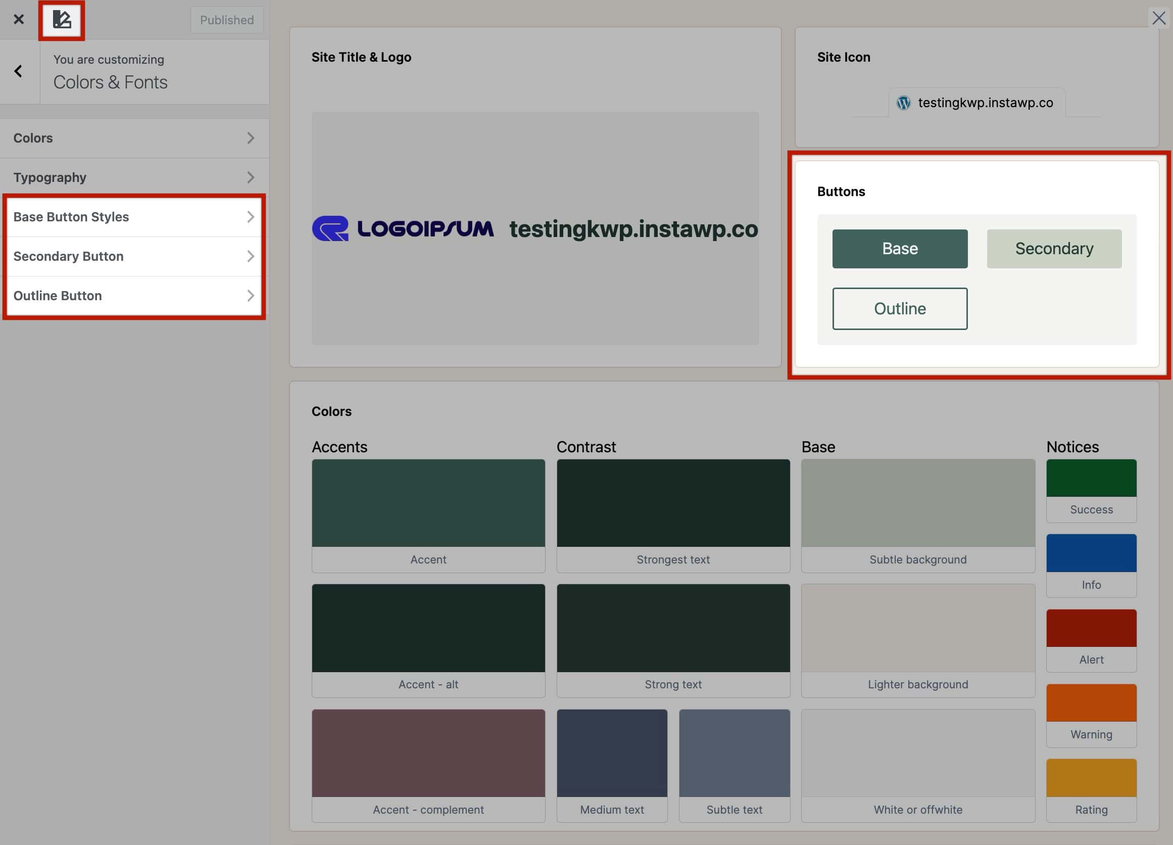
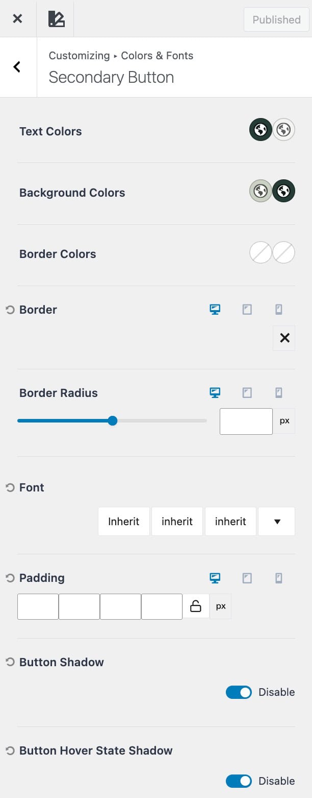
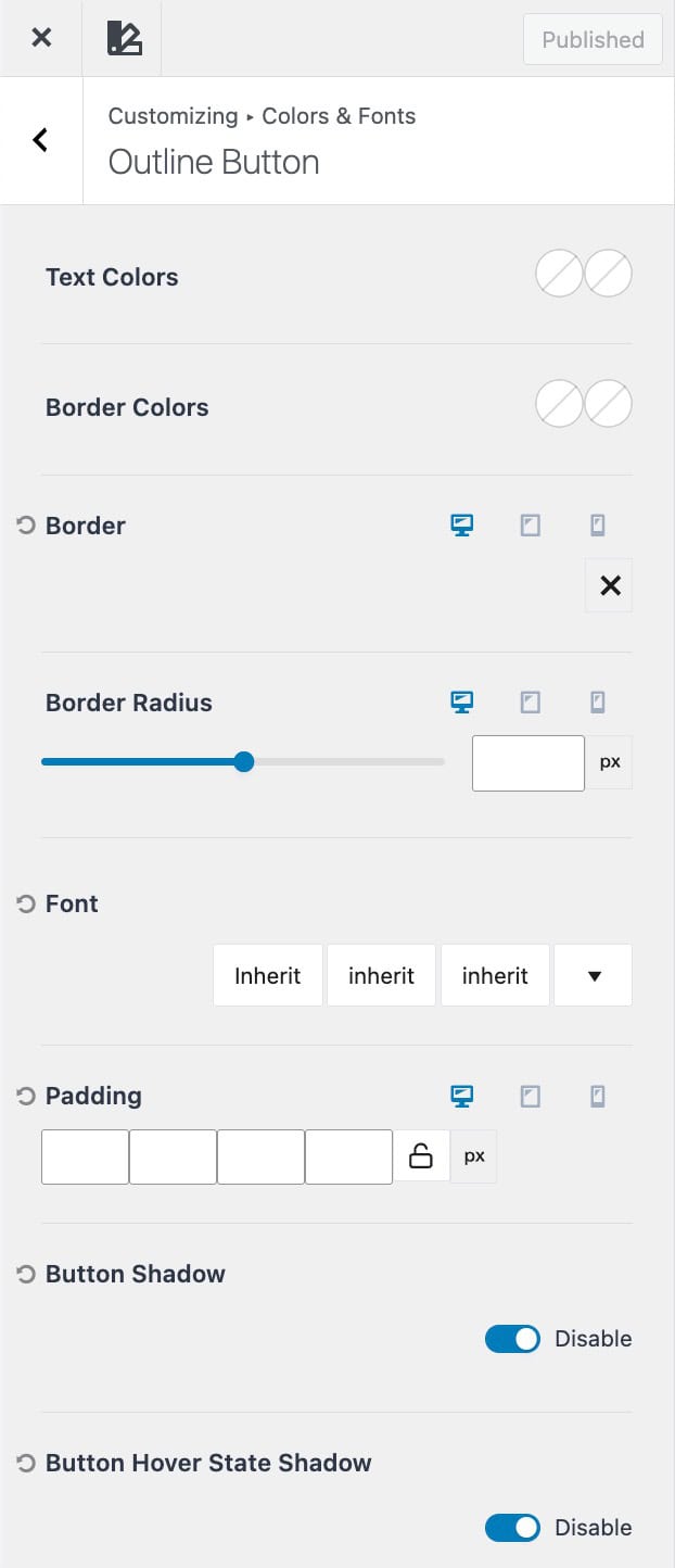
Kadence provides three button style types: Base, Secondary, and Outline, which are used throughout your theme and can also be inherited by Kadence Blocks and Core Button Blocks.
- Base Buttons – Your site’s primary button style. These are used by default across standard theme buttons and provide the foundation for your global button design.
- Secondary Buttons – An alternate button style designed for supporting actions. These are often used alongside a primary button (for example, “Learn More” next to “Get Started”) to create visual hierarchy.
- Outline Buttons – A minimal button style that features a transparent background with a visible border. This style is ideal for subtle or secondary interactions that require less visual emphasis.
Each button type can be customized for text color, background color, border, and hover states directly in Customizer → Colors & Fonts → Buttons. You can also click on each button type within the Style Guide to open its specific settings in the Customizer.
Changes made here apply globally to theme buttons and are inherited by Kadence and Core button blocks for consistent design across your site.
