
Within your Kadence Theme settings, you can adjust various Typography Settings to take complete control of texts across your website. You can also responsively adjust font size-related settings for desktop, tablet, and mobile devices.
Kadence includes built-in support for Google Fonts in both the free Kadence Theme and the free Kadence Blocks plugin. No additional plugins or the Custom Fonts add-on are required to access Google Fonts in Kadence. You can select Google Fonts directly in typography settings, and they will load automatically from Google’s servers.
Typography Customizer Settings
First, navigate to the Dashboard -> Appearance -> Customize settings.
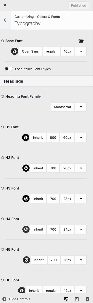
Then, go to the Colors & Fonts -> Typography section of the customizer.
The Typography Settings control the Fonts, Font Color, Font Sizes, and other Font Styles across your website.
The Base Font controls the basic font across the website. For example, in Paragraph Text, Navigation Texts, Breadcrumbs, etc.
The Heading Font Family option allows you to set a Font that applies across all Heading HTML tags like H1, H2, H3, etc.
By default, “Inherit” is selected in the Customize options, which means the font will follow either the Base Font or the Heading Font Family, depending on the element.
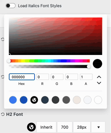
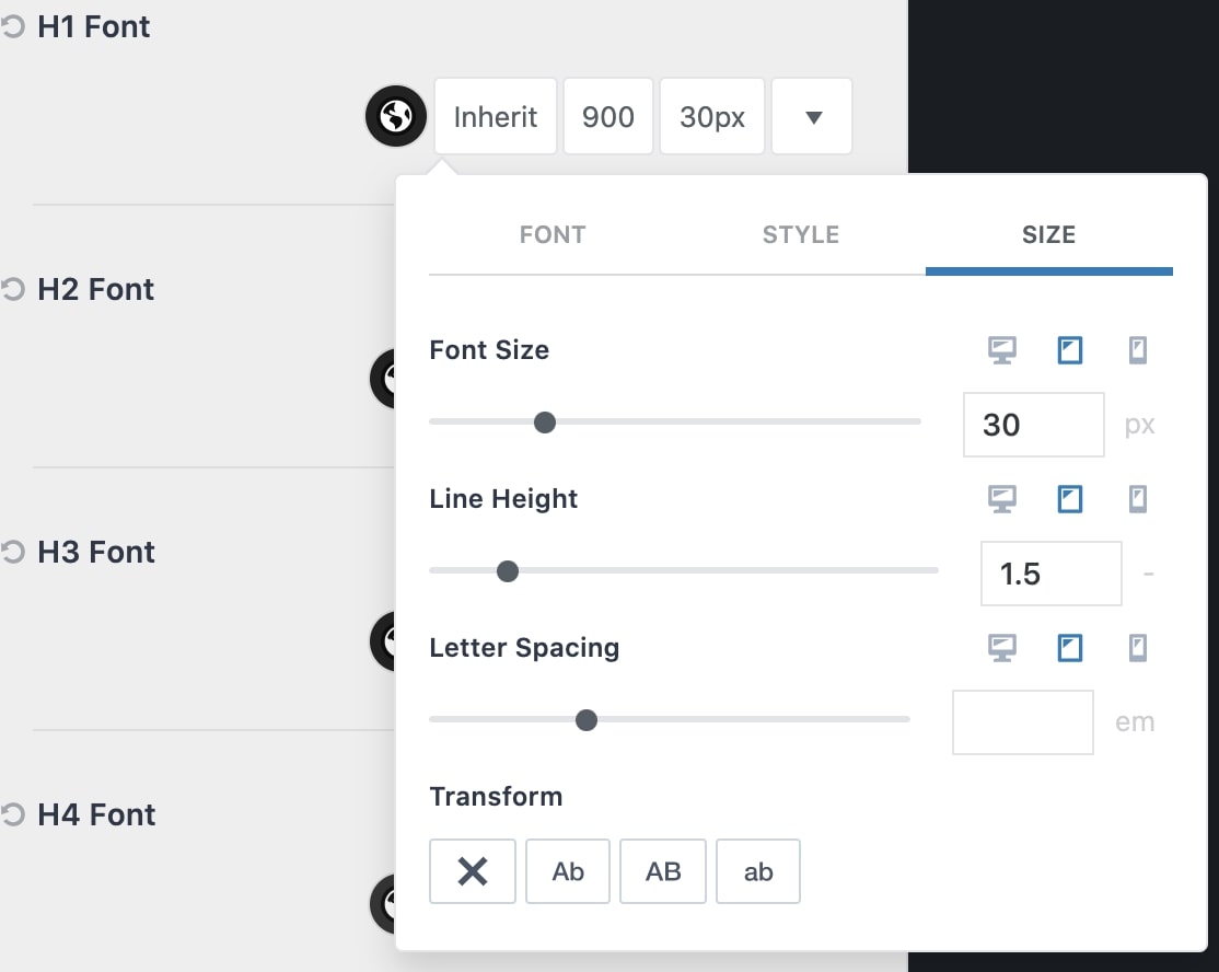
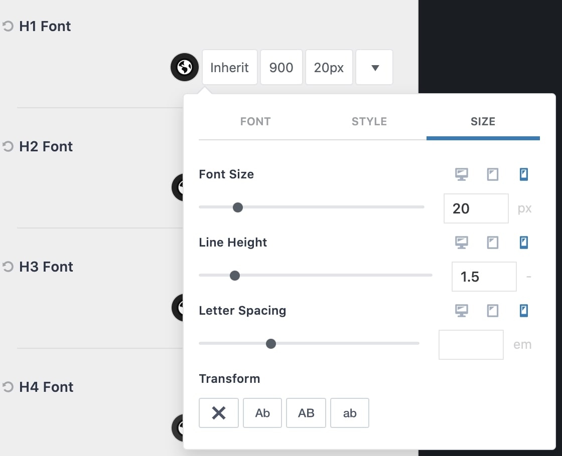
Use the Color Picker to select a Font Color. Then, you can use the Font Selector to set a Specific Font. On the side of the Font Selector, you can set the Font Weight. Next to the Font Weight, you can set a specified Font Size and adjust additional font settings.
On the far right of the Typography Setting, use the dropdown arrow to view an example of the current font setting selection.
Responsive Font Sizes
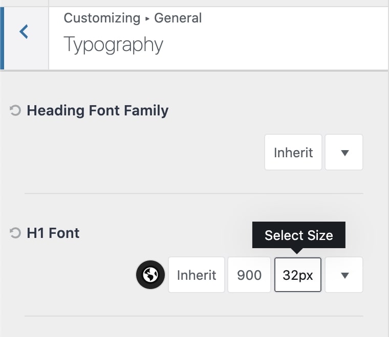
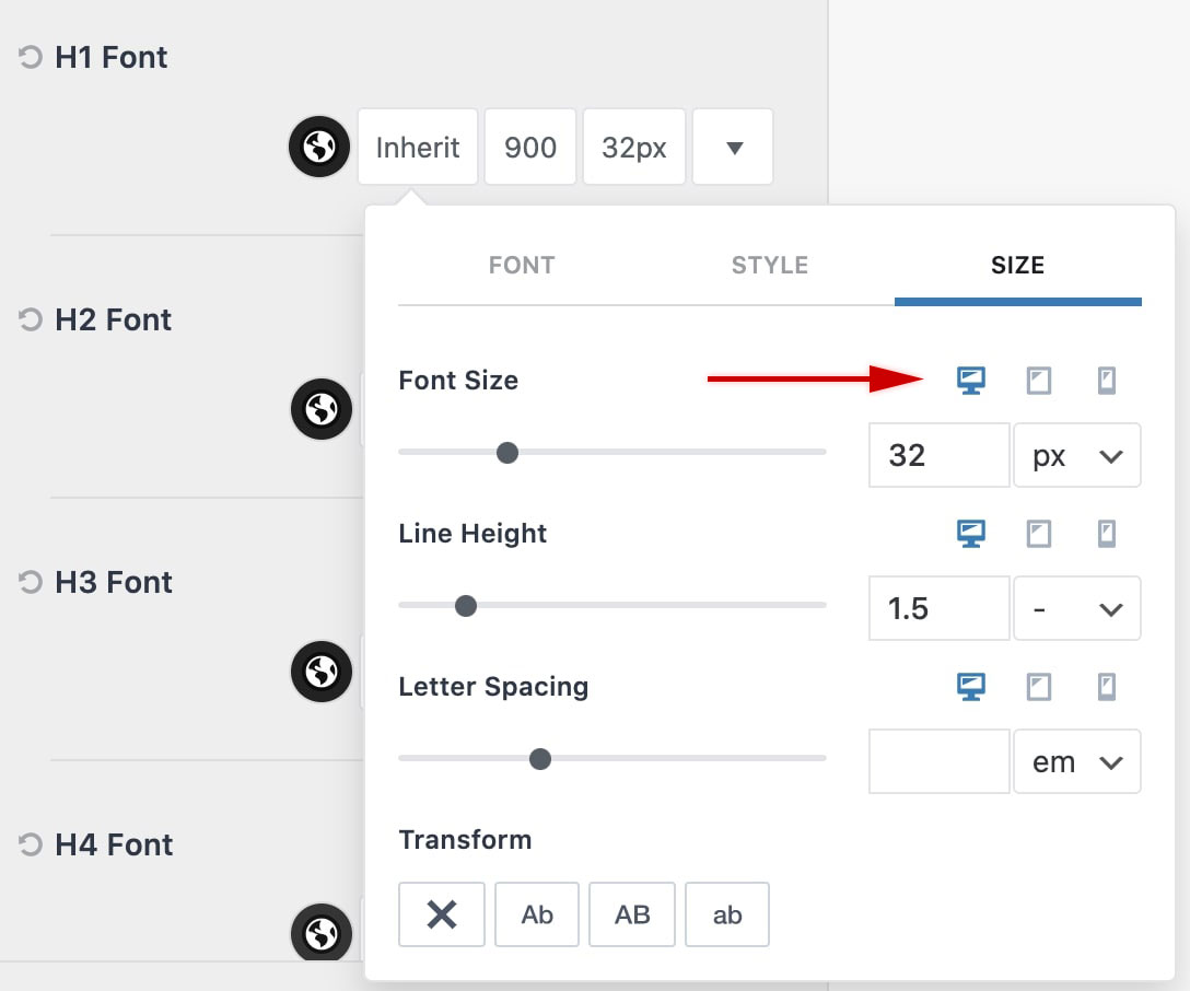
When selecting a Font Size, there are responsive options available. This allows you to adjust the font size, line height, and letter spacing individually for different device types.
In the Typography Settings, find the font size setting for the appropriate Heading Tag and click the font size value. This will open up the size selector.
Notice that there are three icons next to each font size-related setting. These are the responsive controls. You can click on the Tablet Icon to modify the value for tablet devices. You can also click on the Mobile Icon to modify values on mobile devices.
This feature is extremely useful for providing precise and responsive text on your website. Once finished, make sure to press the Publish button to save your changes!
