
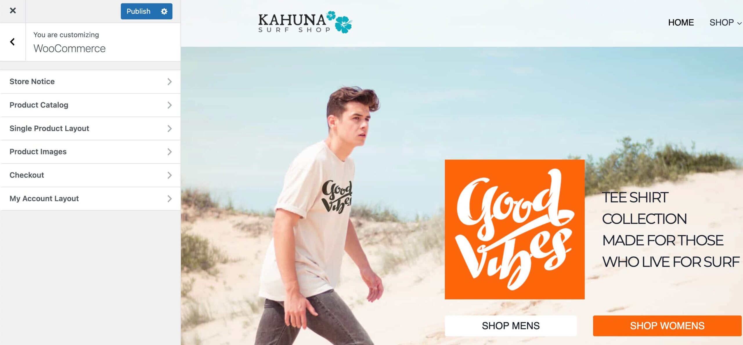
The Kadence Theme offers robust ways to customize your WooCommerce pages. This includes customizing the Single Product Page, Shop Catalog Page, a custom Store Notice, and more!
The WooCommerce Customizer Settings can be accessed from the Customizer -> WooCommerce settings.
Single Product Layout Settings
Use the Single Product Layout settings to take control over your single product pages.
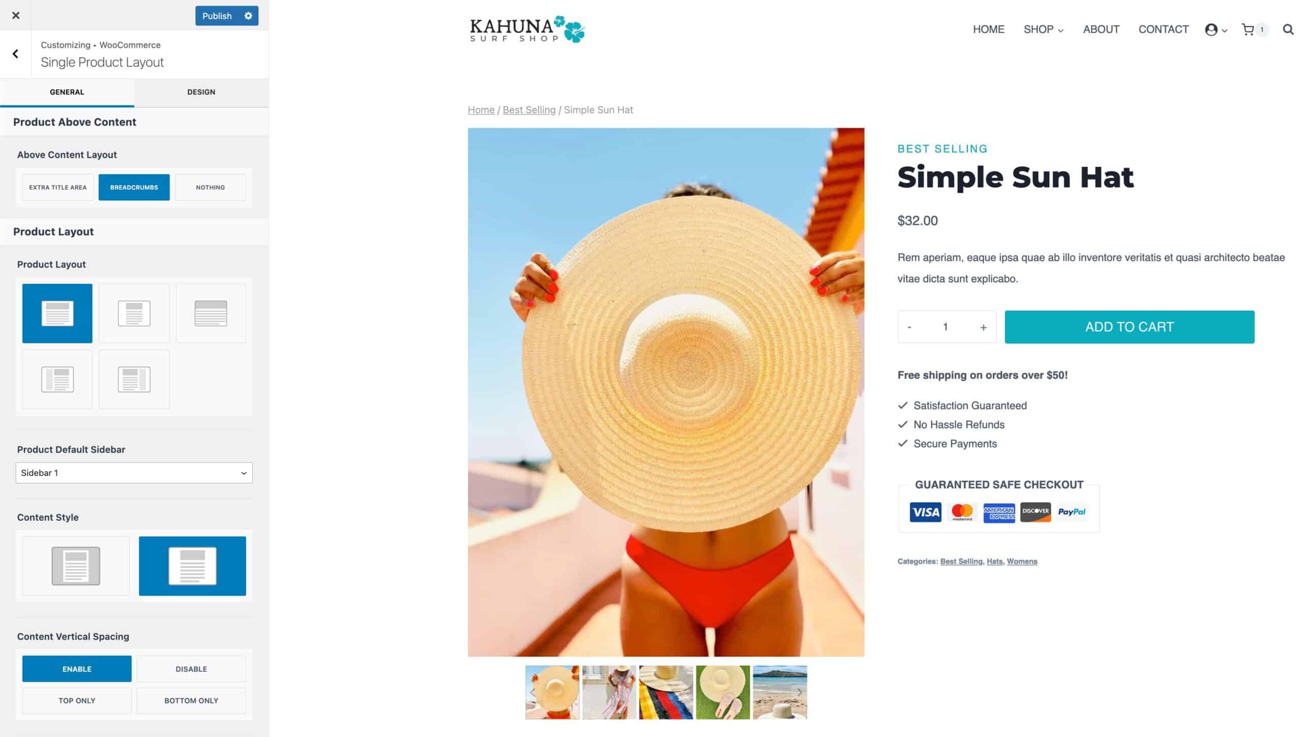
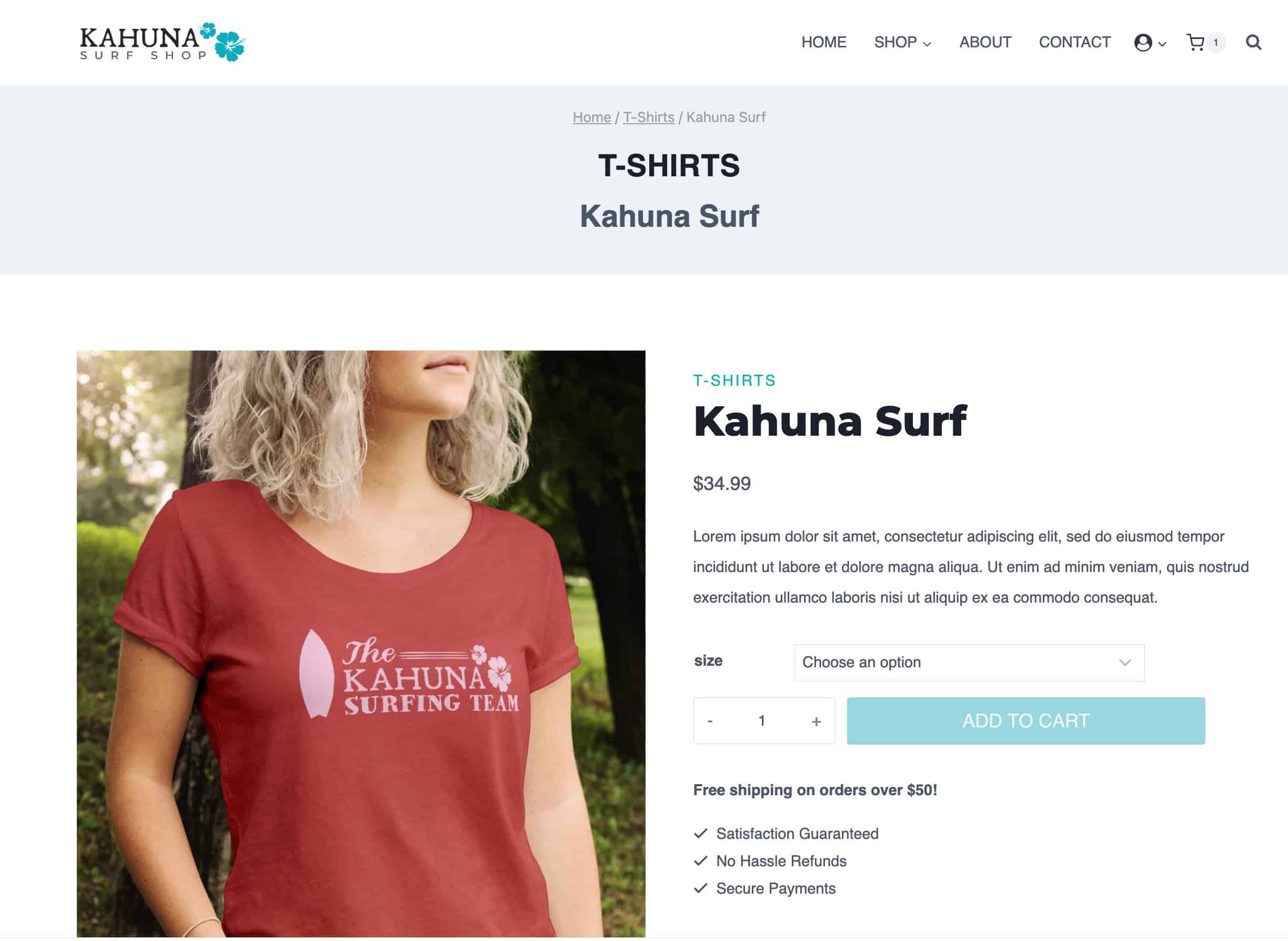
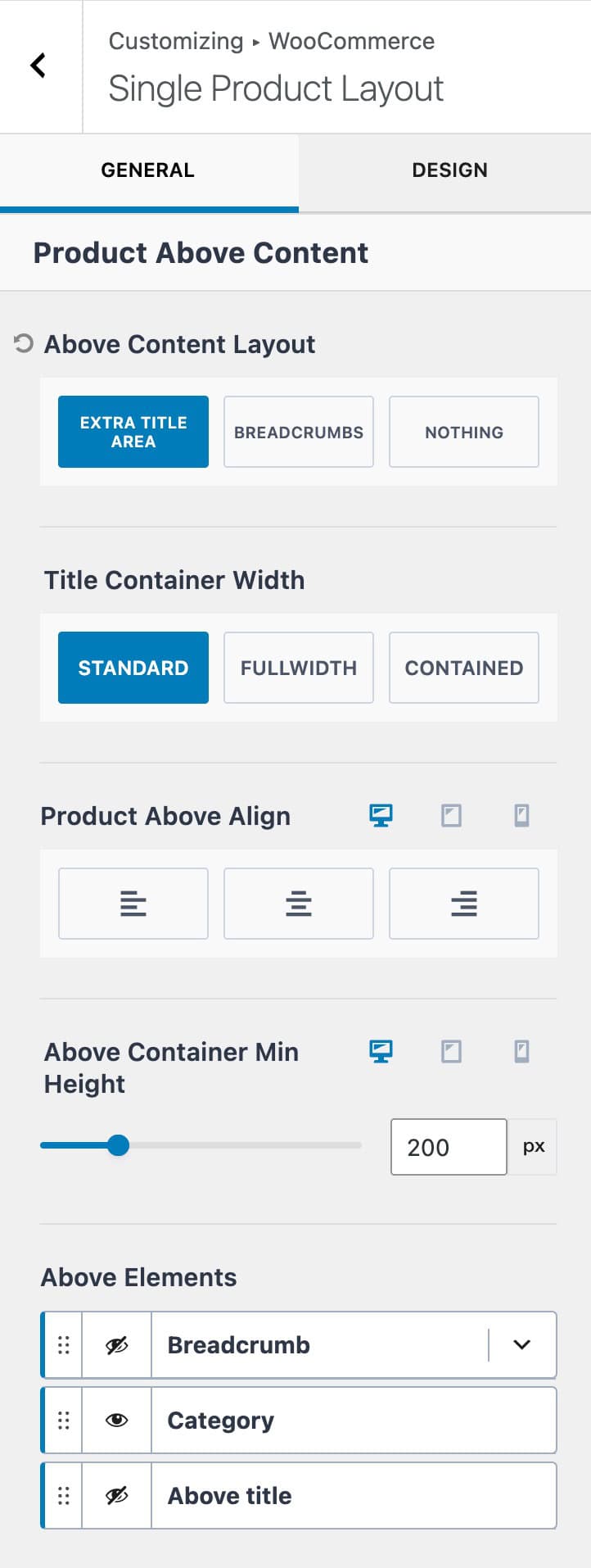
Above Content Layout: Set the layout shown above the main product content. Use the breadcrumbs option to display only the breadcrumbs. Use nothing to show nothing above the content. The Extra Title Area option allows you to add an additional title area to the product. (See the image below)
Title Container Width: When using the Extra Title Area Layout, set the container width to either Standard, Fullwidth, or Contained.
Product Above Align: Set an alignment for the product title. This can be set to left, center, or right. (Available when using the Extra Title Area)
Container Min Height: Add a minimum height to the Extra Title Area.
Above Elements: Show which elements you wish to show above the main product. This setting is available when using the Extra Title Area.
- Breadcrumbs – Enable and use the Kadence breadcrumbs.
- Category – Enable and show product categories.
- Above Title – Enable this option to show a second title above text.
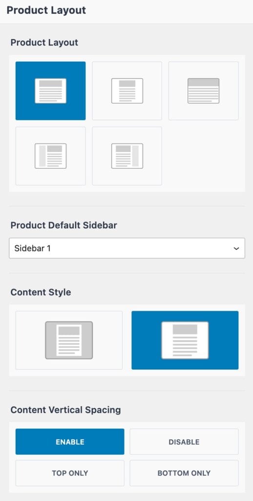
Product Layout: Choose between Normal, Narrow, Fullwidth, or Left/Right Sidebar for the product layout.
- Normal – Uses the theme’s Content Width.
- (The Content Max Width can be set from the Customizer -> General -> Layout settings.)
- Narrow – Creates a layout narrower than the standard theme content width, ideal for more compact designs.
- (The Narrow Layout Content Max Width can be set from the Customizer -> General -> Layout settings.)
- Fullwidth – Extends content to the full width of the page.
- Left/Right Sidebar – Allows a sidebar to be added to the product page. Choose between Sidebar 1 and Sidebar 2.
- (Sidebars can be designed from the Dashboard -> Appearance -> Widgets page.)
Product Default Sidebar: Set a default sidebar layout for product pages.
Content Style: Set the Product Content Style to either Boxed or Unboxed.
Content Vertical Spacing: Set a default vertical spacing for product pages. This can be set from enable to disable, top only, or bottom only.
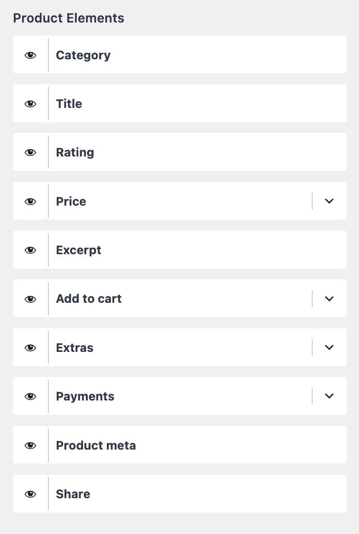
Product Elements: Use the eye visibility icon to show or hide different single product page elements.
- Category – Show/hide the current product category.
- Title – Show/hide the main product title.
- Rating – Hide/show the product rating information.
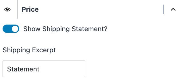
- Price – Show/hide the product price. You can also enable and set a shipping statement.

- Excerpt – Show/hide the product excerpt.
- Add to cart – Show/hide the product add-to-cart button. You can also select the add to cart button size. This can be set to normal, medium-large, or large.
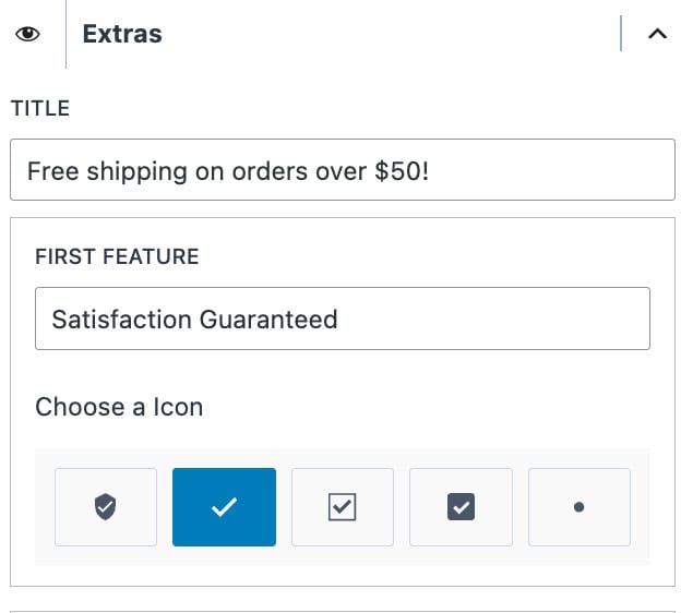
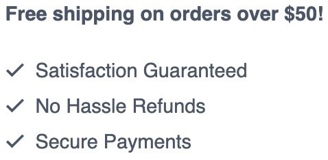
- Extras – Show/hide the product extras. This consists of a title and multiple features. Each feature offers a selectable icon and feature text.
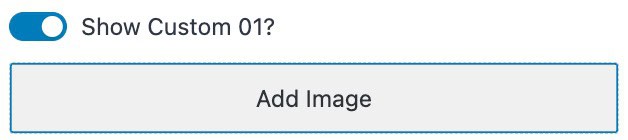
- Payments – Display payment methods on the product page. You can enable different preset options available or enable and add an image to show custom payment options. (This is for display purposes only!) The initial icon colors can be set to either inherit or gray.
Available pre-defined payment options are: Stripe, Visa, Mastercard, Amex, Discover, Link, Paypal, Apple Pay, and Google Pay. You can use a custom payment item by enabling one of the 5 options. Once enabled, you can upload a custom image for the payment option.
- Product Meta – Show/hide the product meta. This includes categories and tags.
- Share – When using the Kadence Simple Share plugin, show/hide simple share icons/features.
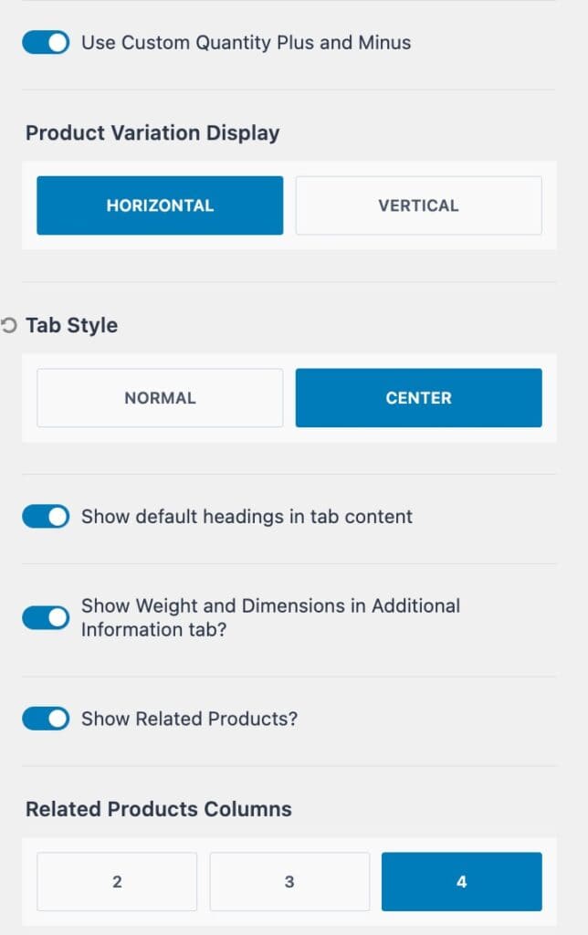
Use Custom Quantity Plus and Minus: Enable this if you wish to use the Kadence quantity icons.

Product Variation Display: Determine if product variations will display horizontally or vertically.
Tab Style: Use either the normal (default) tab style or select center to center the product tabs.
Enable or disable the following settings accordingly.
- Show default headings in tab content
- Show Weight and Dimensions in Addtional Information tab
- Show Related Products
Related Products Columns: Specify how many columns will show for the related products display.
Design Settings
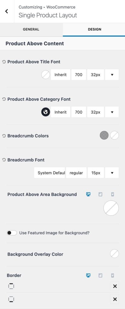
Product Above Title Font Color: Set above title font color, family, style, and size. This is available when using the Extra Title Area.
Product Above Category Font: Set the above category font family, style, and size.
Breadcrumb Colors: Adjust the breadcrumbs color for the initial state and the hover state.
Breadcrumb Font: Set the breadcrumbs font family, style, and size.
Product Above Area Background: Set the product above area background to either a Color, Gradient, or Image. (Available when using the Extra Title Area).
- Enable the Use Featured Image for Background option to use the Featured Image here.
- Use the Background Overlay Color setting to add an overlay color to the background.
Border: Select a Border for the Top and Bottom of the Extra Title Area. This initial icon will be an X. Click on the X to select a specific Border Style. You will also be able to select the Border Width (px) and Color once a Border Style is selected.
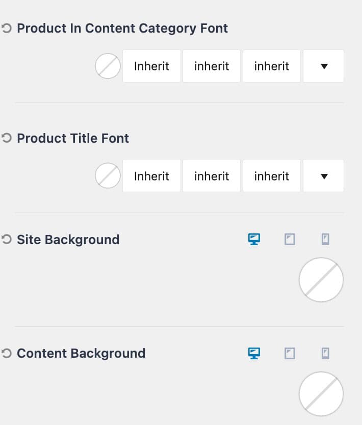
Product In Content Category Font: Set the font color, style, and size for the in-content category.
Product Title Font: Set the font color, style, and size for the main product title.
Site Background: Set a Background Color for product pages. This applies to the entire Site Background.
Content Background: Set a Content Background color for product pages. This applies to the Background of the Main Content.
Product Catalog Settings
Use the Product Catalog Settings to control WooCommerce archives. This includes the main shop page and related shop archive pages, such as product category archives.
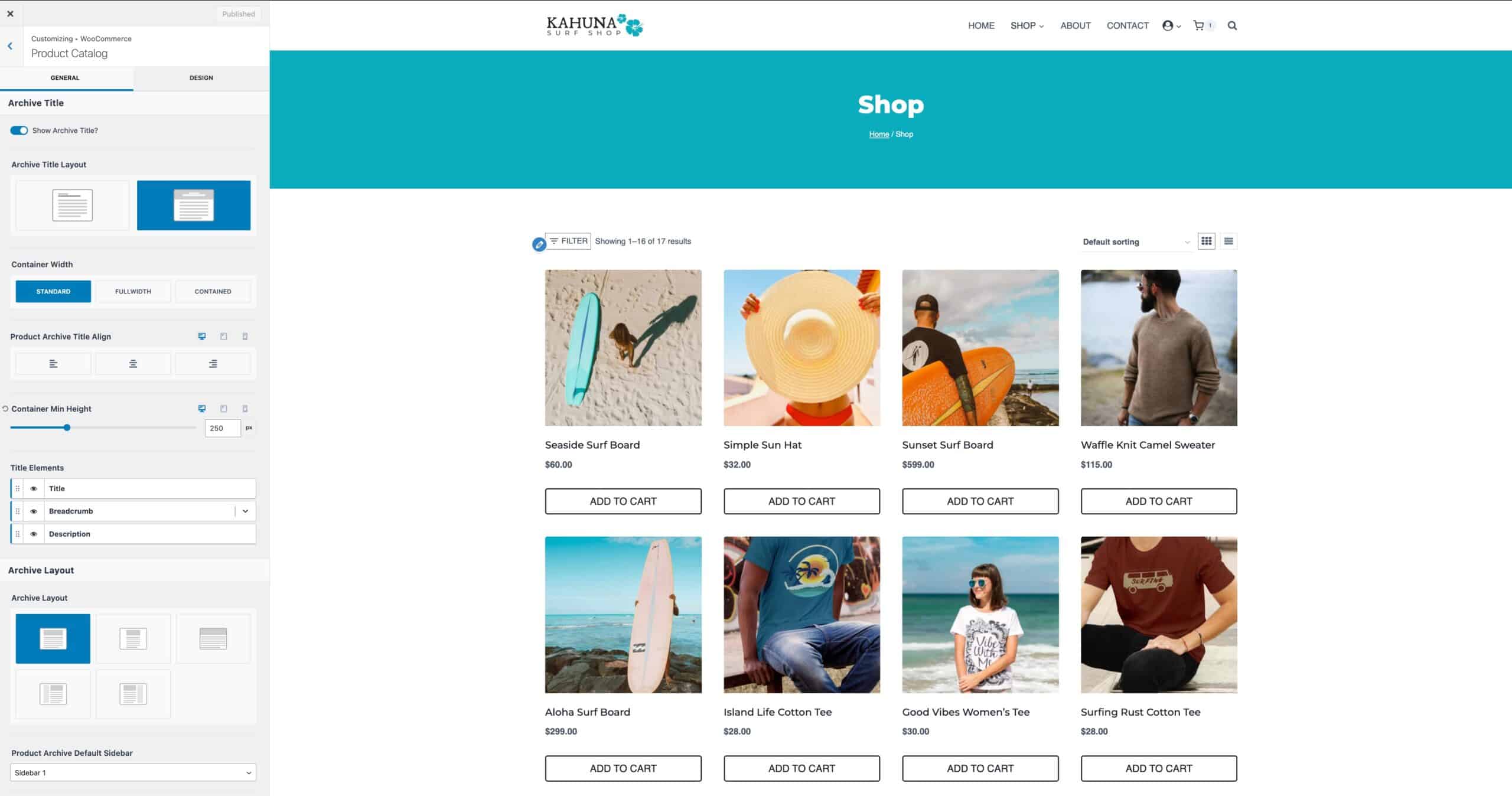
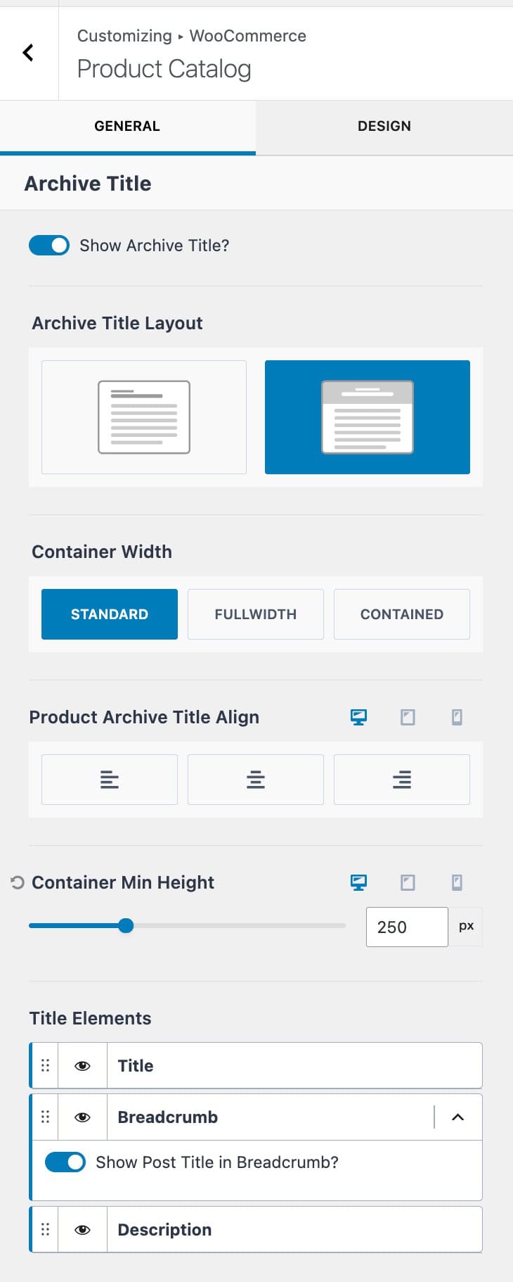
Show Archive Title: This setting enables or disables the default Archive Title.
Archive Title Layout: Set the Archive Title Layout to In Content or Above Content. The In Content option places the title at the top of the content, while the Above Content option adds an Archive Title Banner above the content. (Click here to view an example.)
Container Width: When using the Above Content Layout, set the container width to either Standard, Fullwidth, or Contained.
Post Archive Title Align: Set an alignment for the title. This can be set to Left, Center, or Right.
Container Min Height: Add a minimum height to an Above Content Archive Title container.
Title Elements: Show/hide specific title elements to show within the archive title. This includes showing/hiding the title, breadcrumbs, and/or archive description.
Align Button at Bottom: This setting ensures that all Product Add-to-Cart Buttons align at the bottom of each product.
Shop Page display: Set which items will show on the main shop page. This can be set to one of the following options: Show Products, Show Categories, or Show Categories and Products.
Category Display: Set which items will show on the taxonomy shop archives. This can be set to one of the following options: Show Products, Show Categories, or Show Categories and Products.
Default Product Sorting: Set the default sorting for products across the shop. This can be set to one of the following options: Popularity (Sales), Average Rating, Most Recent, Price (ASC), or Price (DESC).
Products Per Row: Determine how many products will show per row.
Rows Per Page: Determine how many rows will be shown per page.
Custom Shop Page: Enable this option if you wish not to use the default WooCommerce Shop Archive and rather use custom content instead.
Archive Active Filters: When using WooCommerce filtering blocks with Kadence, these options can be used to control the active filters. Use the Add active filters to Shop option to show the current WooCommerce filters above the shop. Use the Show button to remove all filters option to allow all filters to be removed at once.
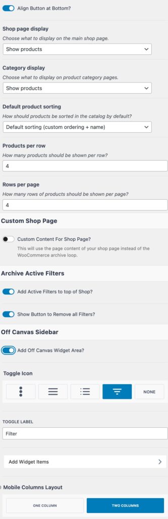
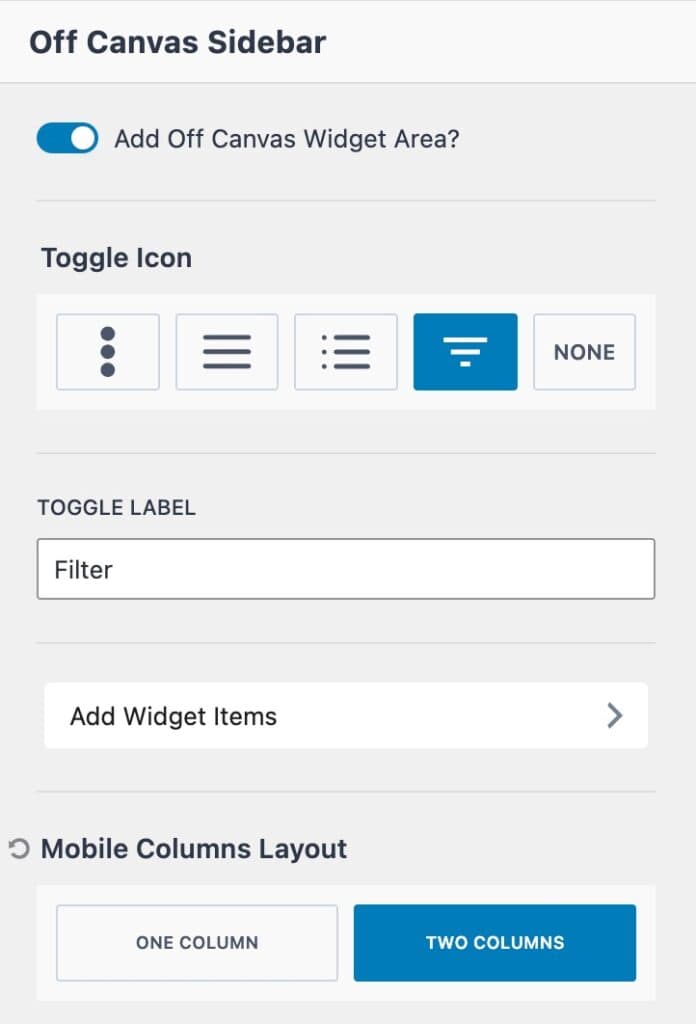
Add Off Canvas Widget Area: Enable this option to add a custom off-canvas widget to the shop. The widget area can be customized from the Customizer or Dashboard -> Appearance -> Widgets page. A common use for this feature is to add WooCommerce Filter Blocks to filter the shop.
Toggle Icon: Select from one of the available toggle icons, or select none.
Toggle Label: Add a custom label to the toggle.
Add Widget Items: Click this tab to access the Off Canvas Sidebar Widget Editor directly from the customizer. Learn more below.
Mobile Columns Layout: Set mobile devices to show either one or two columns.
Design Settings
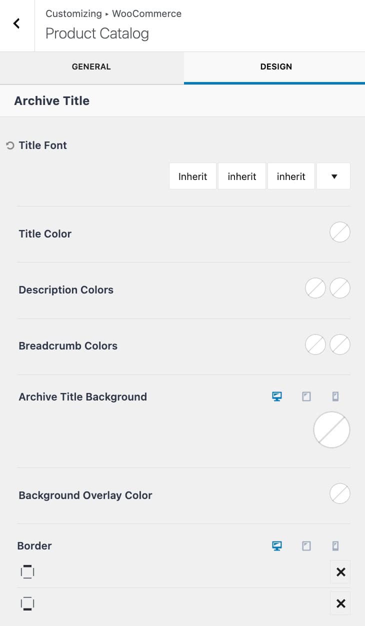
Title Font: Set the Archive Title font family, style, and size.
Title Color: Set the Archive Title color.
Description Colors: Adjust the Description Text Color and the Description Link Hover Color.
Breadcrumbs Colors: Adjust the Breadcrumbs Color for the initial state and the hover state.
Archive Title Background: Set the Archive Title Background to either a Color, Gradient, or Image. (See the GIF to the right.)
Background Overlay Color: Set an Archive Title Background Overlay. This can be set to a Color or a Gradient.
Border: Select a Border for the Top and Bottom of the Archive Title and/or the Left and Right sides. This initial icon will be an X. Click on the X to select a specific Border Style. You will also be able to select the Border Width (px) and Color once a Border Style is selected. (See the GIF below.)
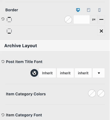
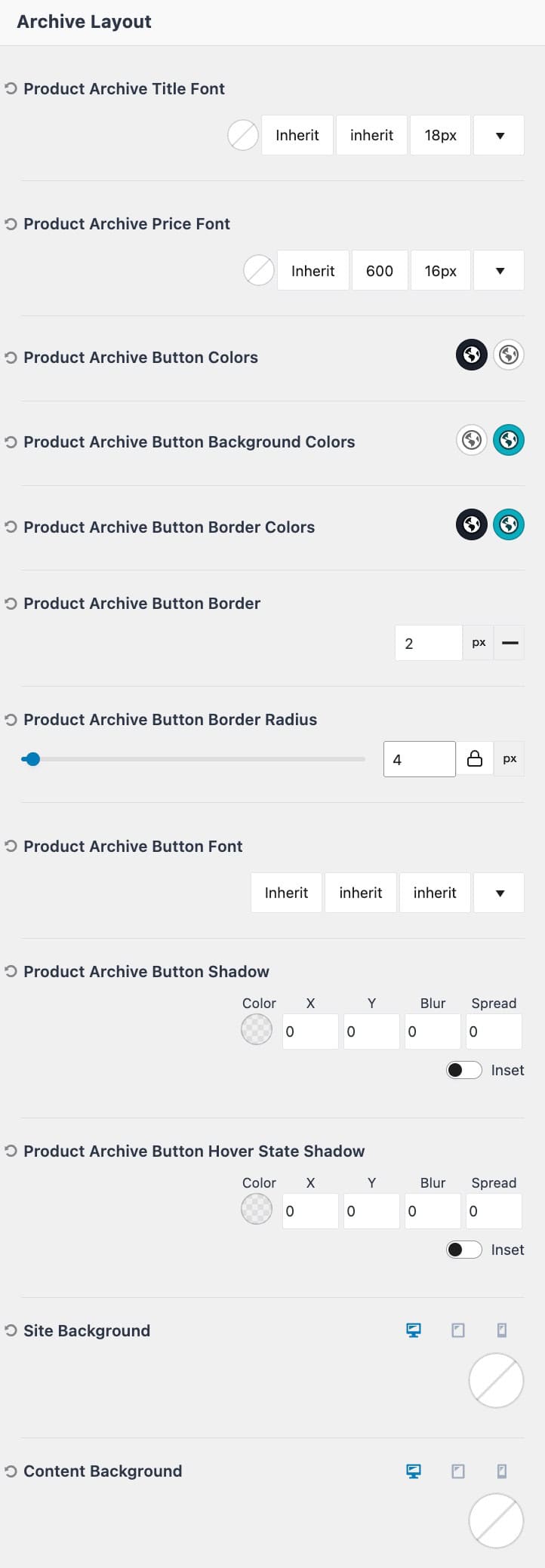
Product Archive Title Font: Set the font color, family, style, and size for product loop titles.
Product Archive Price Font: Set the font color, family, style, and size for product loop prices.
Product Archive Button Colors: Set the initial and hover colors for the add-to-cart text.
Product Archive button Background Colors: Set the initial and hover background colors for the add-to-cart button.
Product Archive Button Border Colors: Set the initial and hover border colors for the add-to-cart button.
Product Archive Button Border: Set a border style, width, and radius for the add-to-cart button.
Product Archive Button Font: Set a font family, style, and size for the add-to-cart button.
Product Archive Button Shadow: Define a button shadow for the add-to-cart button.
Product Archive Button Hover State Shadow: Define a button shadow for the add-to-cart button when being hovered.
Site Background: Set a Background Color for the Archive Pages. This applies to the entire Site Background.
Content Background: Set a Content Background color for the Archive Pages. This applies to the Background of the Main Content.
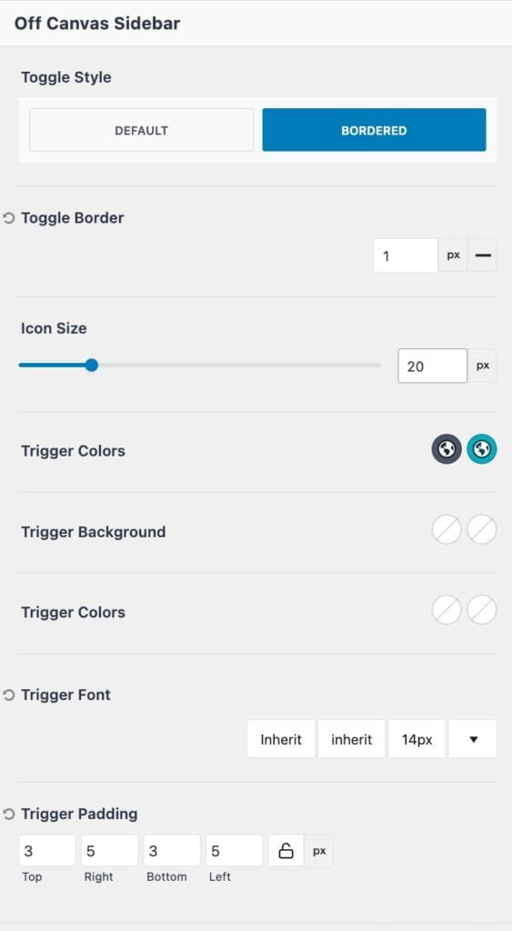
Toggle Style: Set the off-canvas sidebar toggle style to either default or bordered.
Toggle Border: When using the bordered toggle style, set the border width and style.
Icon Size: Define an icon size for the toggle icon.
Trigger Colors: Set the initial and hover colors for the tigger.
Trigger Background: Set the trigger background color for the initial and hover states.
Trigger Font: Define a trigger font family, style, and size.
Trigger Padding: Add padding to the trigger.
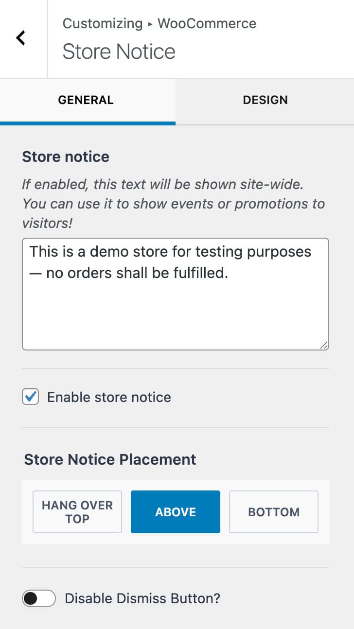
Store Notice
The Store Notice and be enabled and used across the entire site to display a message/notice about the store. This can be used to indicate a demo store, share shop promotions, and more.
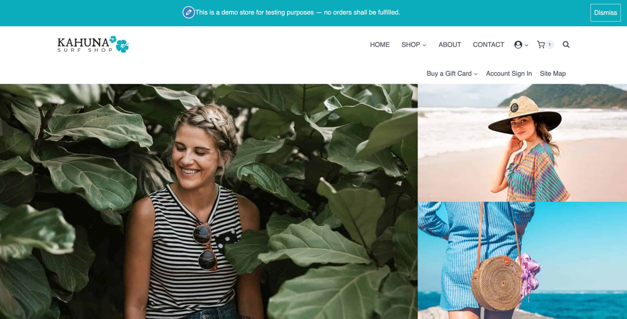
Store Notice: When enabled, this text will appear across the entire website. Use the text box to define which text you wish to display within the notice.
Enable Store Notice: Check this box to enable and use the store notice across your website.
Store Notice Placement: Define the placement of the store notice. This can be set to hang over top of the screen, set to show above the screen, or set to be shown at the bottom of the screen.
Disable Dismiss Button: The WooCommerce store notice includes a dismiss button to hide the notice. Enable this option to force the notice to always show.
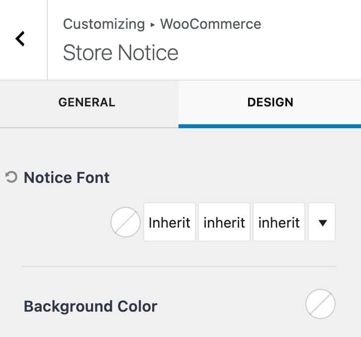
Use the Design Tab to navigate to the style settings for the store notice.
Notice Font: Set a font color, family, style, and size for the store notice text.
Background Color: Set a background color for the store notice.
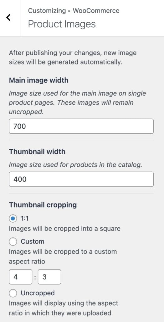
Product Images
The Product Images settings can be used to adjust how product images behave on your shop pages.
Main Image Width: Set the main image width. This applies to the main product images on the single product pages.
Thumbnail Width: Define a thumbnail width for images shown on the product catalog/archives.
Thumbnail Cropping: By default, this is set to 1:1 to ensure thumbnails are equal-sized squares. You can also use a custom aspect ratio or choose the uncropped option if you wish not to crop images on the product catalog/archive pages.
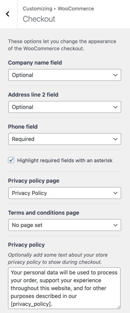
Checkout
Use the Checkout settings to take control over the WooCommerce checkout behaviors.
Field Settings: There are three main field settings available. The company name field, the address line 2 field, and the phone field. Use the dropdown to determine if each of these fields is either optional, hidden, or required.
Highlight required fields with an asterisk: This option adds a need asterisk next to required fields when enabled.
Privacy Policy Page: Define an official privacy policy page for the shop.
Terms and Conditions Page: Define an official terms and conditions page for the shop.
Privacy Policy: This is an optional step. When text is added here, the privacy policy text will show during checkout.
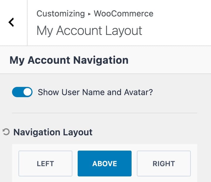
My Account Layout
The My Account Layout settings can be used to control basic behaviors related to the WooCommerce my account page.
Show User Name and Avatar: Enable this option to display the current username and avatar when visiting the my account page.
Navigation Layout: Use this setting to control where the my account navigation will display. This can be set to the left of the content, above the content, or to the right of the content.
Theme Kit Pro Settings
Unlock additional WooCommerce Customizer Settings using Theme Kit Pro. This includes additional options such as using an Off Canvas Sidebar or adjusting how items are added to the cart.
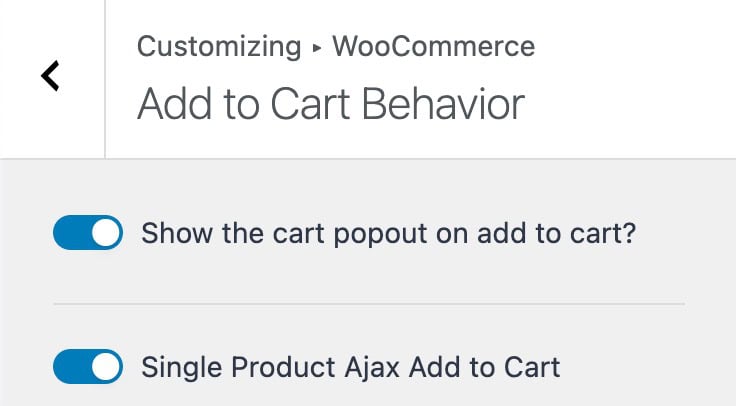
Add To Cart Behavior
Use the Add to Cart Behavior settings to control how products are added to the cart.
Show the Cart Popup on Add To Cart: This option enables a pop-up off-canvas widget that shows the cart details after an item is added to the cart.
Single Product Adjax Add To Cart: This setting allows products to be added to the cart using Ajax, which doesn’t require a full page refresh upon completion.
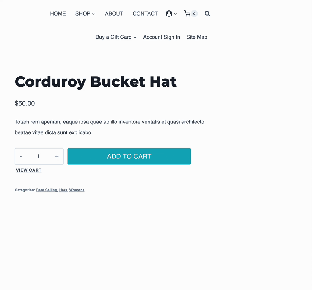
In the example below, both add to cart behaviors are enabled. Notice the pop up cart and how the page does not refresh when adding the item to the cart.
Off Canvas Sidebar
The Off Canvas Sidebar can be used to add a toggleable off-canvas area to product catalog/archive pages. Go to the Customizer -> WooCommerce -> Off Canvas Sidebar settings to add blocks to the Off Canvas Sidebar in real time.
You can add any available block directly from the customizer. Some common blocks used here are WooCommerce Core Filtering blocks, such as the Filter By Category Block.
For more advanced filtering control and Ajax filtering, consider using the Advanced Query Loop Block instead. (Available in Blocks Pro)
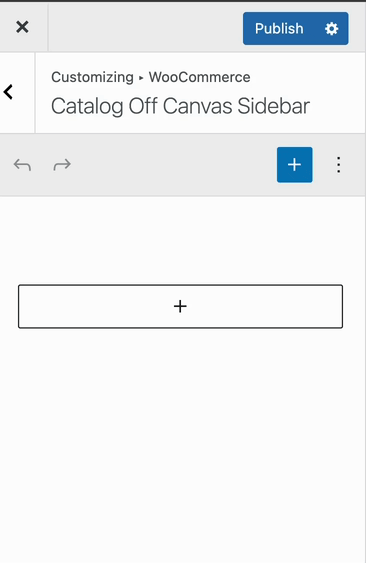
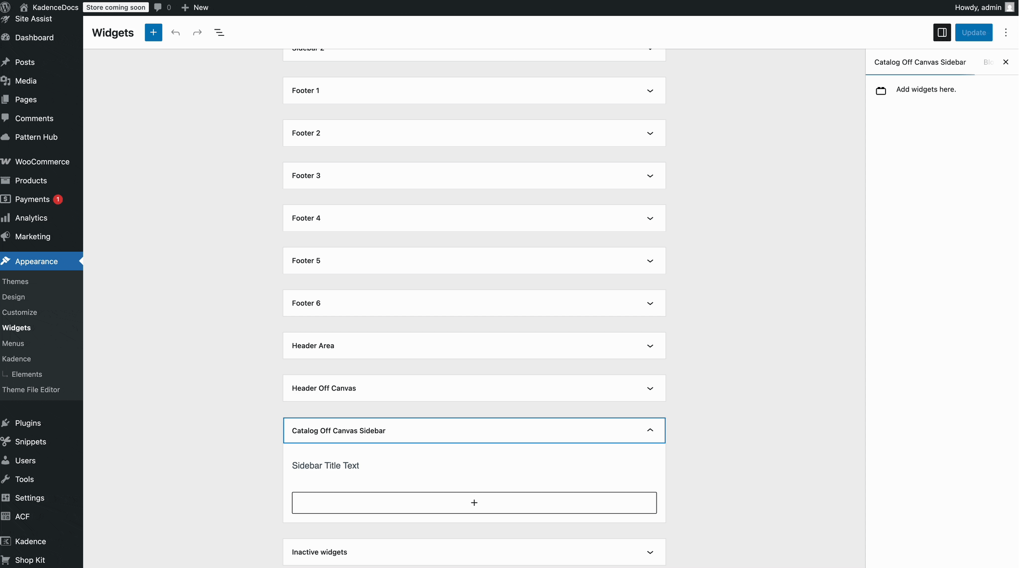
You can also access the Off Canvas Sidebar widget directly from the Dashboard -> Appearance -> Widgets page. Just look for the item named Catalog Off Canvas Sidebar.
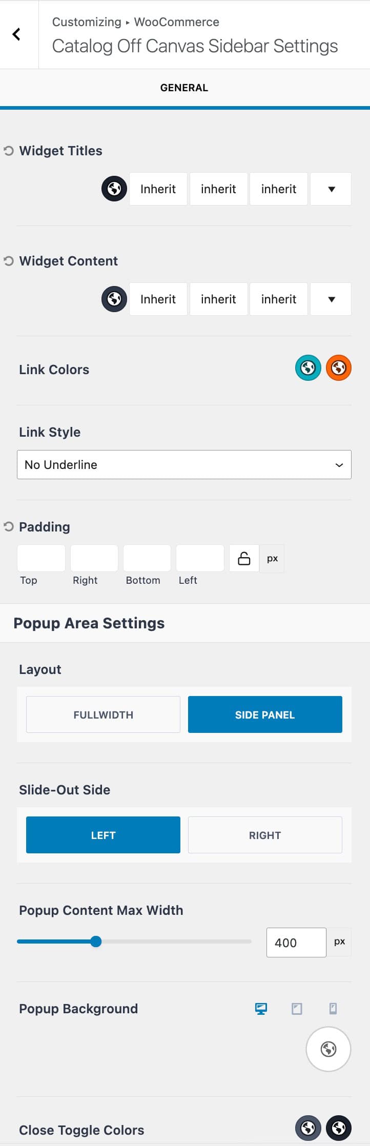
Off Canvas Sidebar Settings
Use the Off Canvas Sidebar Settings to control general functionalities related to the off-canvas sidebar.
Widget Titles: When using WordPress legacy widgets, set the widget title color, font family, font style, and font size.
Widget Content: When using WordPress legacy widgets, set the widget content color, font family, font style, and font size.
Link Colors: Customize the link colors within the off-canvas sidebar for the initial and hover states.
Link Style: Define a link style for links within the off-canvas sidebar.
Padding: Add padding to the off-canvas sidebar.
Layout: Set the popup area layout to either full-width or side panel.
Slide-Out Side: When using a side panel layout, set the slide-out to either left or right.
Popup Content Max Width: Define a maximum width for the popup area.
Popup Background: Set a background for the popup. This can be set to a color, gradient, or image.
Close Toggle Colors: Define the initial and hover colors for the popup close toggle icon.
