
The Kadence Theme now includes support for CSS Clamp within the Typography settings. This modern approach to responsive design ensures your text adapts smoothly to any screen size. This allows content to stay readable on small devices and balanced on large displays.
If you’ve ever struggled to find the perfect font size that looks good on both mobile and desktop, CSS Clamp is the solution.
What is CSS Clamp?
CSS Clamp is a native CSS function that allows you to define a range for a property. In this case, the font size. It automatically scales the value based on the user’s screen width, while keeping it within the boundaries you define.
In its simplest form, Clamp looks like this:
font-size: clamp(min, preferred, max);Each value has a specific role:
- Min: The smallest allowed size.
- Preferred: The fluid, flexible value that adjusts as screen size changes.
- Max: The largest allowed size.
The browser calculates the font size dynamically within this range. If the screen width becomes smaller than your defined range, it stays at the minimum size. If the screen width becomes larger, it stays at the maximum size. Between those two points, it scales fluidly.
Why CSS Clamp Matters
Traditionally, developers used media queries to define font sizes for different screen widths. For example, one value for mobile, another for tablet, and another for desktop. While effective, this required extra CSS and often led to jumps between sizes. Clamp eliminates that problem by making scaling continuous.
Key advantages:
- Fluid scaling — Fonts resize smoothly between various screen widths.
- Better readability — Text never becomes too small or too large for the viewer.
- Consistent design — Every text scales evenly across all device types.
How Kadence Uses CSS Clamp
The Kadence Theme brings this functionality directly into your Typography settings.
Instead of writing custom CSS, you can visually configure your clamp ranges within the Customizer.
Each Theme Typography Text Type, such as the Base Font, Heading options, or Buttons font settings, includes a Clamp Font Size option. When enabled, Kadence automatically generates the clamp() function for you based on the input.
This gives you full control over:
- The minimum and maximum font sizes your text can reach.
- The screen width range where scaling occurs.
Kadence handles the math and outputs the correct CSS automatically.
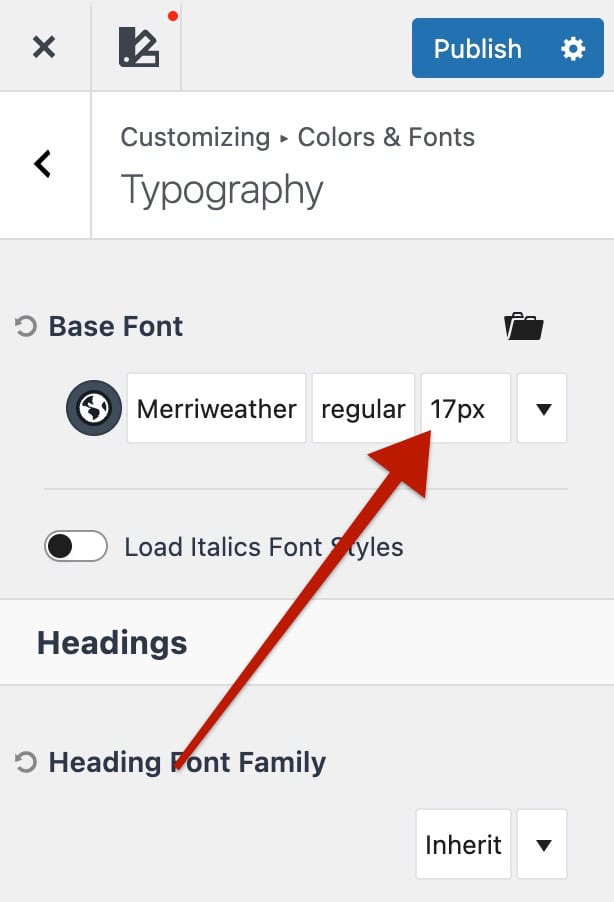
How to Access Clamp Settings in the Kadence Theme
- Go to the Dashboard -> Appearance -> Customize -> Colors & Fonts -> Typography settings.
- Select the text type you want to modify ( Base Font, Heading 1, Heading 2, Buttons, etc.).
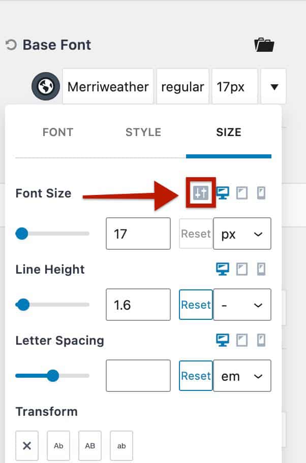
- Find the Font Size control.
- Click the toggle icon next to the font size input.
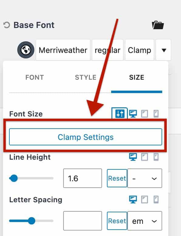
- Click Clamp Settings to open the Clamp Font Size panel.
Learn more about the Typography Settings.
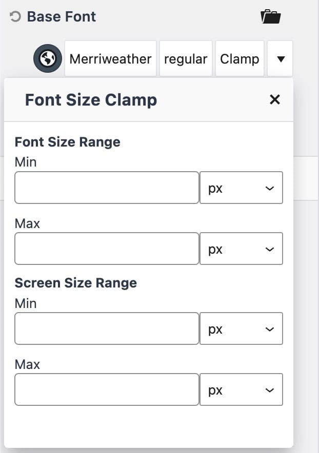
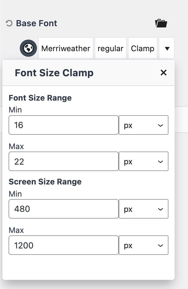
Font Size Range
Defines the minimum and maximum font sizes.
- Min: The smallest allowed size.
- Max: The largest allowed size.
(You can use PX or REM values.)
Screen Size Range
Defines the screen width range where scaling happens.
- Min: The smallest screen width where scaling begins.
- Max: The largest screen width where scaling stops.
(These fields accept PX values only.)
Once these values are set, Kadence automatically generates the clamp() function to scale your text smoothly between those limits.
Example
Let’s say you want your base font to scale between 16px and 22px, depending on screen width.
You could configure the following in the Clamp Settings panel
- Font Size Range: Min = 16px, Max = 22px
- Screen Size Range: Min = 480px, Max = 1200px
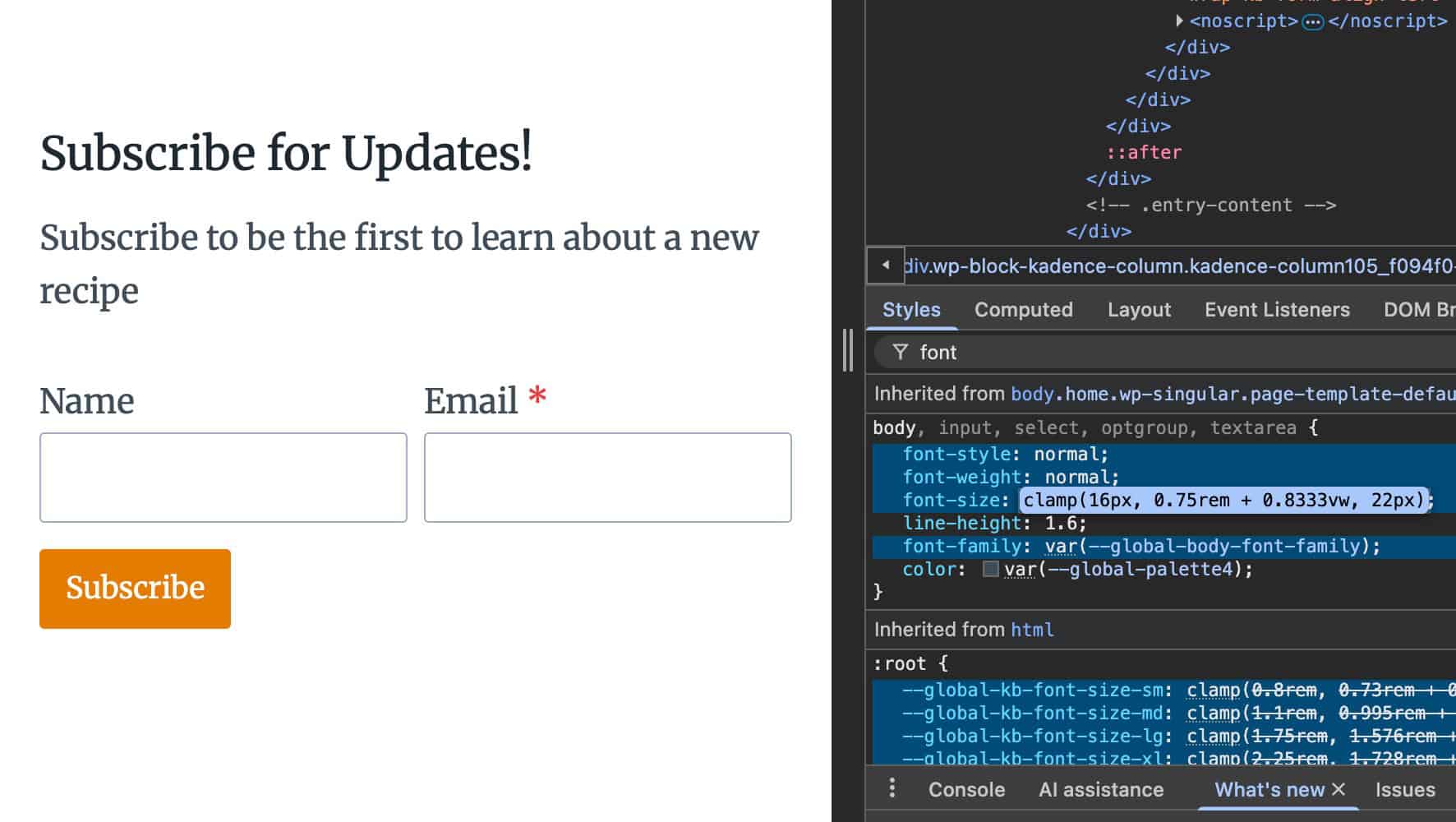
Kadence will output something like this:
clamp(16px, 0.75rem + 0.8333vw, 22px)This means your text will:
- Stay at 16px on smaller screens,
- Grow smoothly between 480px and 1200px,
- Stop growing once it reaches 22px on larger screens.
Here is what this looks like from the Customizer and how the front-end code reflects.
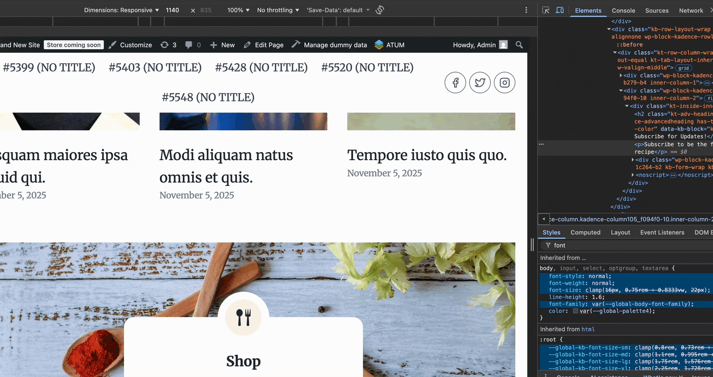
You can also see how the font responds to the screen width as it changes in the GIF below. Notice how the font-size CSS scales up and down as the screen width increases and decreases.
Kadence Theme Typography and Kadence Blocks
Kadence Theme Typography applies globally to both core WordPress blocks and Kadence Blocks. By default, any block that hasn’t been customized will automatically inherit the theme’s font family, style, and size. For example, H1s within blocks will use the theme’s H1 settings, while paragraph and standard texts will follow the Base Font.
Additionally, Kadence Blocks includes predefined Clamp CSS Variable Font Sizes. These presets also scale fluidly across screen sizes but are exclusive to Kadence Blocks. Customizing these variable sizes requires custom code. To learn more about how predefined clamp sizes work in Kadence Blocks and how to modify them, click here ⧉.
