
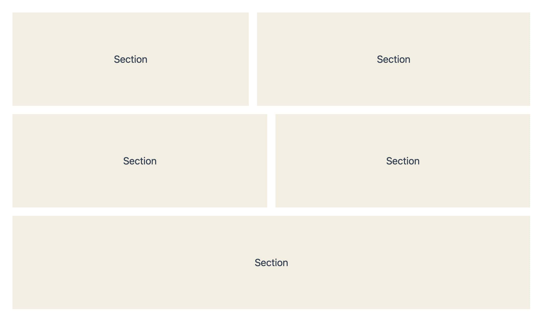
The Section Block in Kadence Blocks includes Flexbox controls by default. These controls make it possible to build layouts where each piece of content behaves independently. This is especially helpful for cards, columns, or expandable content that should not affect nearby items.
Section Block using Flexbox sizes itself based on its own content. This allows more flexibility with alignment, spacing, and wrapping, both initially and responsively, across all device types.
This guide explains:
- When to use Flexbox in the Section Block instead of a Row Layout.
- How the Section Block Flex settings work.
- Key differences between Row Layout and Section Flex behavior.
Before You Begin
Before using Flexbox layouts in the Section Block, confirm the following:
- Kadence Blocks is installed and active on the website.
- A Section Block is added to the page.
Flexbox controls are available on the Section Block by default under the Block Settings. The layout behavior changes based on the Flex settings that are applied.
When to Use Section Block Flexbox
Flexbox in the Section Block is a good choice when:
- Columns should behave independently.
- The content of neighboring content should not affect nearby items.
- Card layouts include dynamic or expandable content.
- Layouts need precise control over alignment, spacing, or wrapping.
Understanding Section Block Flex Settings
Flex settings control how child blocks inside a Section Block are arranged. These options are available in the Section Block settings panel and can be adjusted at any time.
Flex Direction
Flex Direction determines how child blocks are laid out.
Available options:
- Vertical. Items stack from top to bottom. This is the default.
- Horizontal. Items sit side by side.
- Vertical Reverse. Items stack from bottom to top.
- Horizontal Reverse. Items align side by side in reverse order.
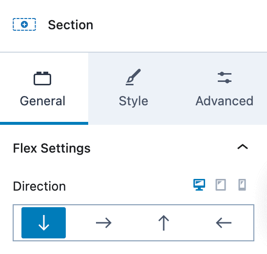
Tip: The horizontal direction is most commonly used for card layouts and columns.
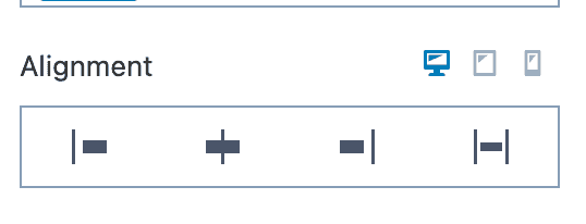
Alignment
This setting controls how items are aligned horizontally within the Section width.
Options include:
- Start – Align items to the left side of the Section.
- Center – Center items horizontally within the Section.
- End – Align items to the right side of the Section.
- Stretch – Stretch items to fill the available horizontal space (when supported).
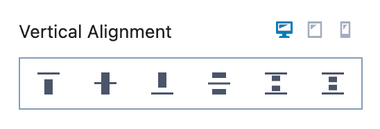
Vertical Alignment
This setting controls how items are aligned vertically within the Section height.
Options include:
- Top – Align items to the top of the Section.
- Middle – Center items vertically within the Section.
- Bottom – Align items to the bottom of the Section.
- Space Between – Place the first and last items at the top and bottom, with space distributed between items.
- Space Around – Distribute items with space above and below each item.
- Space Evenly – Distribute items so the spacing between items and the Section edges is equal.
The Vertical Alignment changes based on the Flex Direction. For horizontal layouts, this setting controls left-to-right spacing.
Gaps
Gaps control spacing between child blocks and replace the need for margins. You can use a Vertical and/or Horizontal Gap.
Available gap options:
- Vertical Gap. Available for vertical layouts
- Horizontal Gap. Appears when Flex Direction is set to Horizontal or Horizontal Reverse
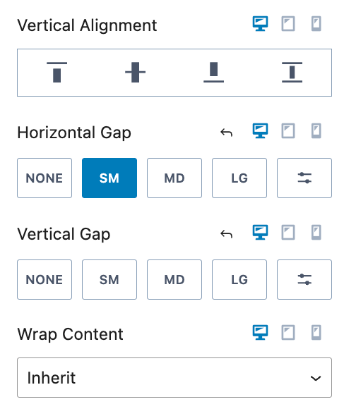
Tip: Using gaps instead of margins keeps spacing consistent and responsive across screen sizes.
Advanced Flex Options for Horizontal Layouts
Additional options appear when Flex Direction is set to Horizontal or Horizontal Reverse.
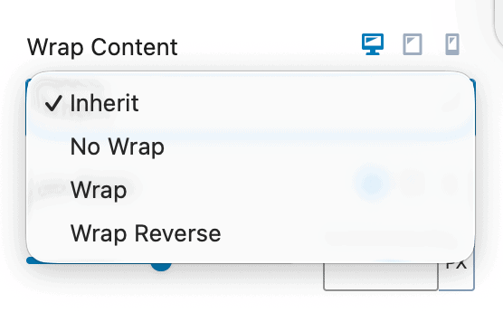
1. Wrap Content
Wrap Content controls how items behave when there is not enough horizontal space available.
Options include:
- Inherit – Go off of the default behavior.
- No Wrap – Do not allow items to wrap.
- Wrap – Allow items to wrap.
- Wrap Reverse – Allow items to wrap, and when wrapping occurs, reverse the order.
This setting is especially helpful for responsive card grids that adjust naturally on smaller screens.
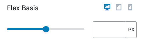
2. Flex Basis
Flex Basis defines the starting width of each child block before Flexbox adjusts the layout.
Common uses include:
- Equal-width cards
- Controlled column sizing
- Responsive layouts that adjust by screen size
Example:
- Setting Flex Basis to 50% creates two equal-width columns.
- Setting a Flex Basis of 250px will make each section use a 250px width. If there isn’t enough width available, the content will wrap depending on the wrap block setting.
3. Flex Grow
Use the Flex Grow setting to control how a Section expands to fill available space within a flex layout.
The Flex Grow Block setting can be found at:
Section Block Settings → Advanced Tab → Structure Settings
Flex Grow works best when multiple Sections are placed inside a parent Section. It determines how the remaining space is distributed between sibling Sections.
For example:
- A Section with Flex Grow: 1 will take up an equal share of available space.
- A Section with Flex Grow: 2 will take up twice as much space as a Section with Flex Grow set to 1.
- A Section with Flex Grow: 0 will not grow beyond its base size.
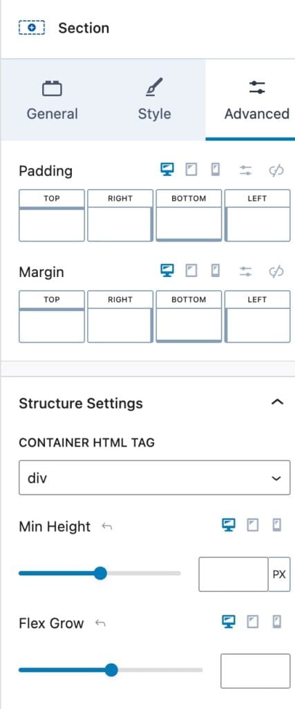
Flex Grow is especially useful for creating flexible, responsive layouts where Sections need to adapt dynamically to the available width or height.
Section Block vs Row Layout Block
The Row Layout Block already uses Section Blocks internally. In many cases, you can use a Row Layout Block on its own to achieve most layouts. However, Section Blocks are more versatile and can also be used independently or in combination with Row Layout Blocks to provide greater control over complex designs.
Row Layout Block
- Grid-based rows and columns.
- All columns in a row share the same height.
- Expanding content affects the entire row.
- Offers using the Theme Content Max Width for limiting the content width.
- Best for structured, symmetrical layouts.
Section Block with Flexbox
- Content-driven sizing
- Columns behave independently
- Flexible alignment and spacing
- Ideal for dynamic or expandable content
