
Kadence Blocks offers a powerful feature that allows you to add tooltips to texts, icons, and buttons across your website. Tooltips are small pop-up boxes that appear when a user hovers over a target, providing additional information or tips related to that text/target. This functionality is particularly useful for defining terminology, offering extra details, or providing supplementary information without cluttering your content.
Tooltips are a great way to provide context and help users understand a specific text on your website. This feature enhances user experience without impacting search engine results, either positively or negatively. Therefore, tooltips should be used primarily to improve the overall user experience rather than for SEO purposes.
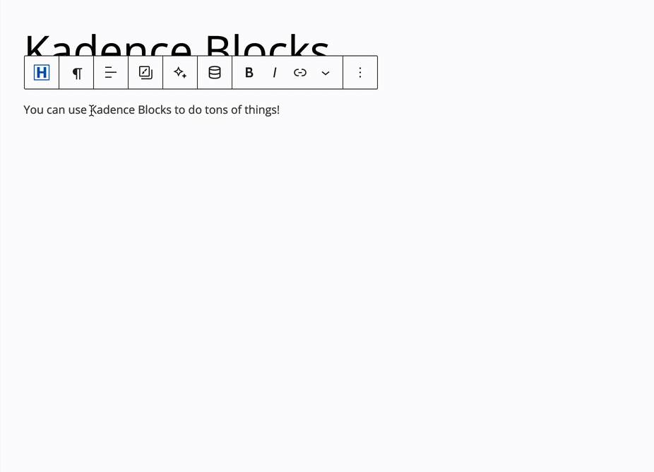
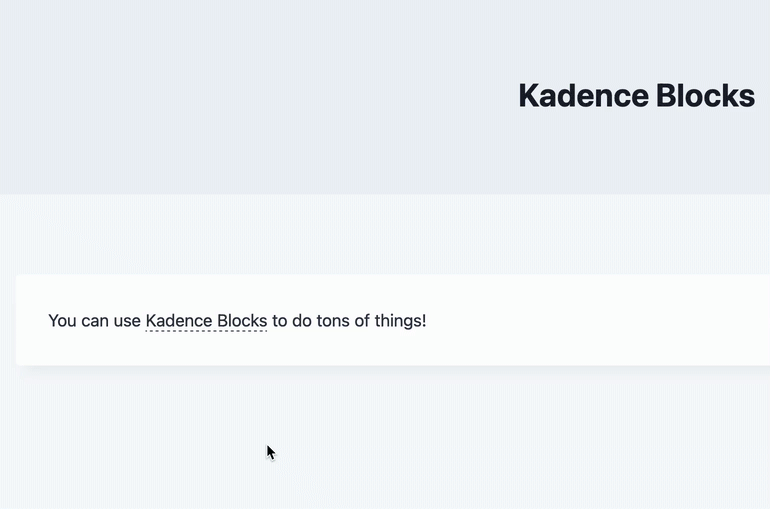
Adding Tooltips to Kadence Blocks
You can add Tooltips to supported blocks using the Block Toolbar.
Tooltips are available for the following Kadence Blocks:
–Text (Adv) Block
–Button (Adv) Block
–Icon Block
–Icon List Block
Text (Adv) Block Tooltips
Start by highlighting the text you want to provide the Tooltip for, then in the Block Toolbar click the downward arrow at the far right to open more settings. From the expanded settings, select the Tooltip effect to enable the Tooltip for your highlighted text. This simple process allows you to enhance your content with helpful tooltips.
Icon Block Tooltips
Start by selecting the Icon in the Block Editor. From the Block Toolbar, click on the Bubble Icon to access the Icon Tooltips Settings.
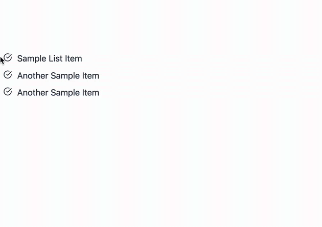
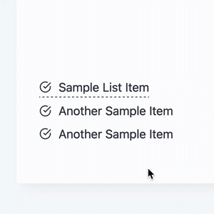
Icon List Block Tooltips
Start by selecting the Icon List Item in the Block Editor. From the Block Toolbar, click on the Bubble Icon to access the Icon List Item Tooltips Settings.
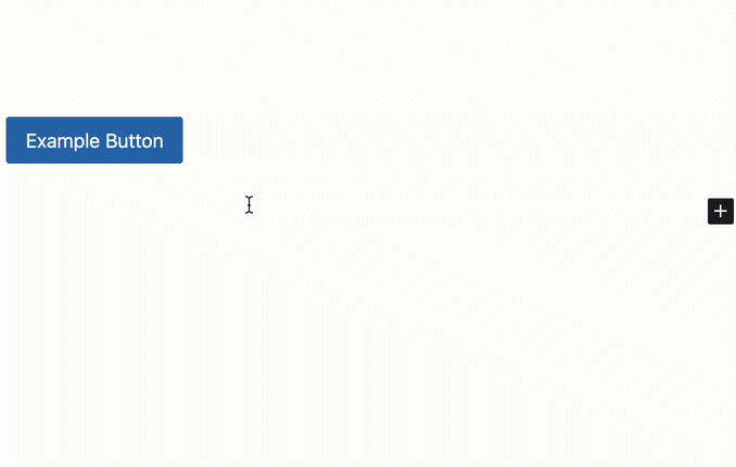
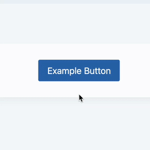
Button (Adv) Tooltips
Start by selecting the Advanced Button in the Block Editor. From the Block Toolbar, click on the Bubble Icon to access the Button Tooltips Settings.
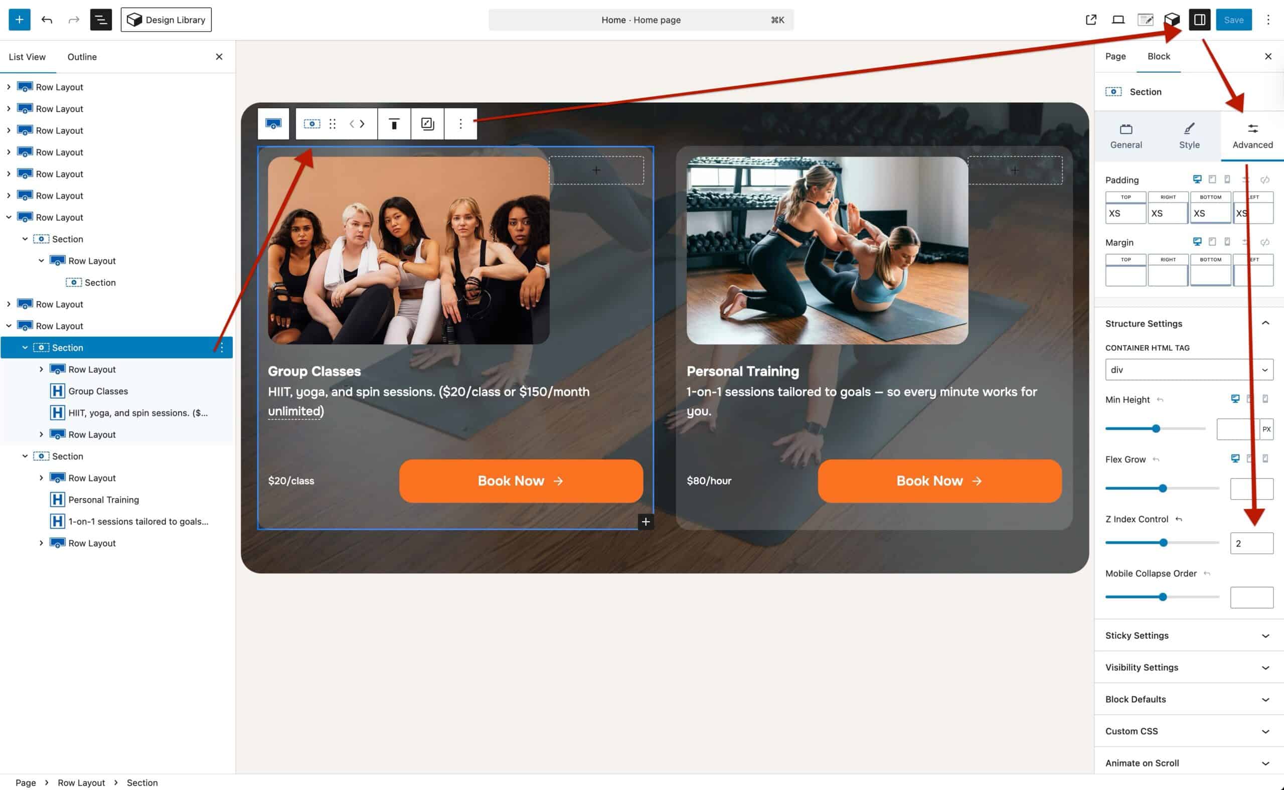
Controlling Tooltip Overlap with Z-Index
When adding tooltips to your designs, it’s important to understand how they layer on top of surrounding content. By default, Tooltips are contained within the same section as the parent container they’re inside of. For example, a Section Block. This ensures accessibility, since screen readers can only recognize and announce the Tooltip if it’s bound to its parent container. If tooltips were automatically moved outside of that container, assistive technologies would skip over the content entirely.
Because of this container-based approach, you may need to adjust z-index values so Tooltips display correctly when overlapping nearby sections.
For example:
Imagine you have two sections side by side.
A tooltip in the left section opens toward the right, but it needs to overlap the right section. (See the example below.)

Within the main parent Section Block, you can use Block Settings → Advanced Tab → Structure Settings to set the left section to a z-index of 2 and the right section to 1. This gives the left section a higher stacking order, allowing its tooltip to overlap the right section successfully.
Left Section Example
Right Section Example
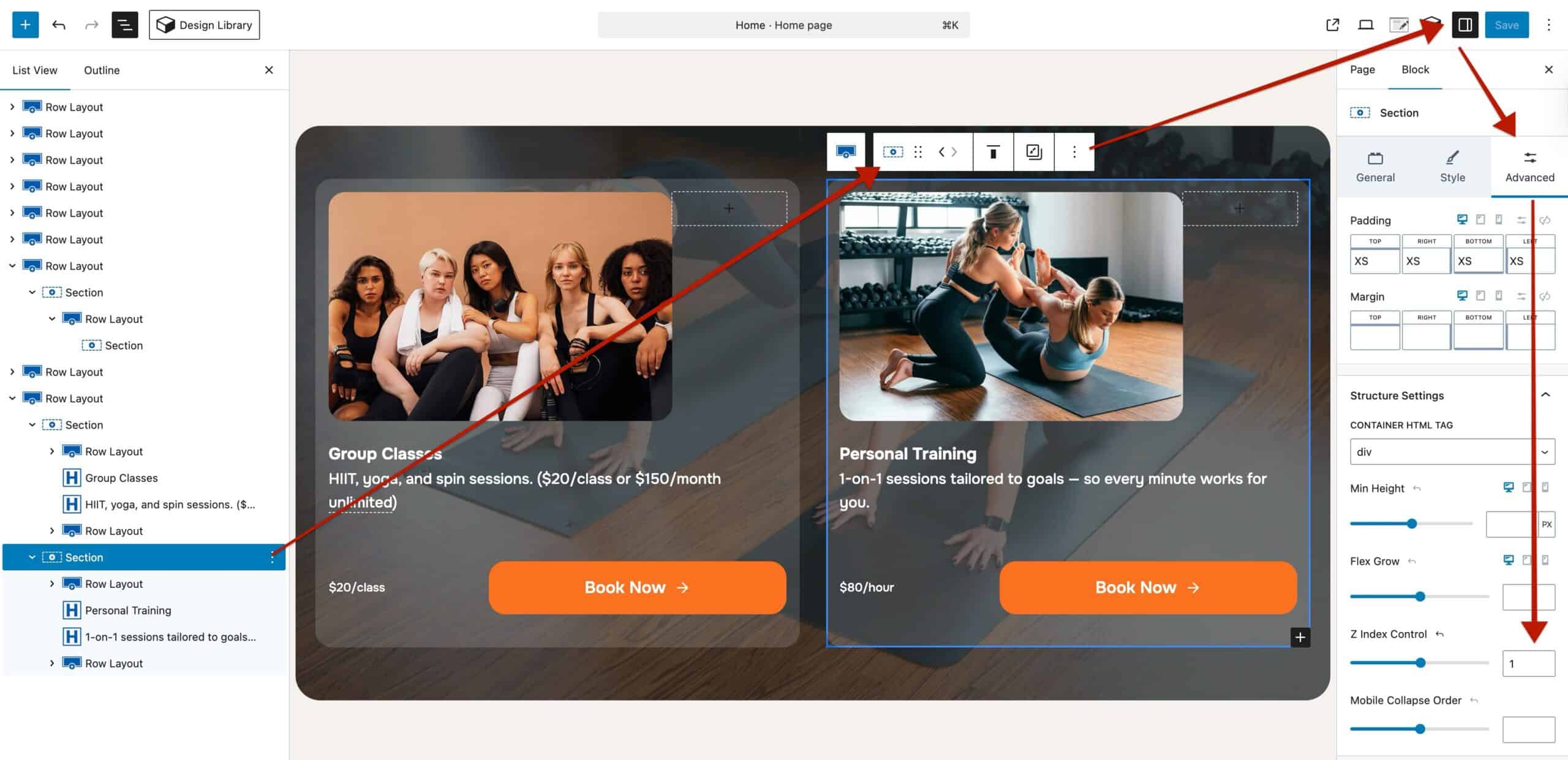
Result

If you add a third section that also needs overlapping tooltips, you can continue stacking z-index values as needed (for example, 3, 2, 1).
This approach gives you full control over how tooltips layer across sections while ensuring they remain accessible to all visitors.
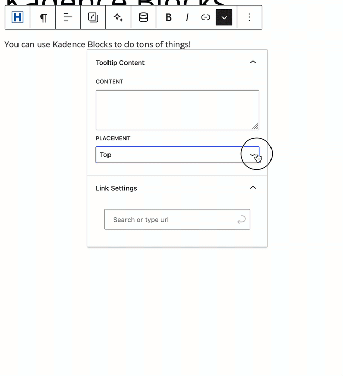
Tooltip Settings
Tooltip Placement: This setting determines where the Tooltip will pop up. There are many options available here for flexibility.
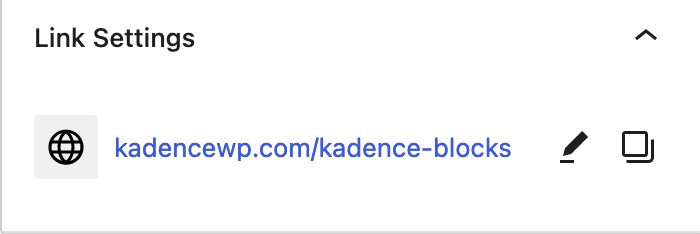
Link Settings (Available for Advanced Texts Only): If you wish to add a Hyperlink to the Highlighted Text that shows the Tooltip, you can use the Link Settings to add that link. (This will link the Text itself and not the Tooltip or text within the Tooltip)
Only Apply Tooltip To (Available for Icon List Items Only): This setting allows the Tooltip to be set to either the Icon, the Text, or the Entire List Item.
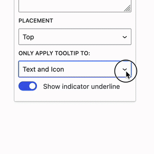
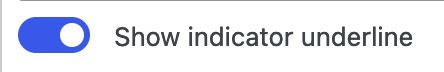
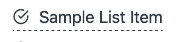
Show Indicator Underline (Available for Icons and Icon List Items Only): This allows an underline to indicate that hovering the target will trigger a tooltip. (This is on by default and can’t be turned off for Advanced Text Tooltips)
