Skip to content
Help Center
  • Pricing
  • ProductsExpand
    • Premium PlansGet all the tools you need in one plan
    • Kadence ThemeLightning-fast performance theme for modern websites
    • Kadence BlocksDrop in ready designs with advanced controls for pixel perfect websites
    • Kadence Shop KitCreate a more effective WooCommerce shopping experience
    • Kadence ConversionsBoost sales and build engaged audiences with popups and banners
    • Kadence InsightsEasily create A/B tests. Optimize your pages to drive higher conversions.
    • View All Products
    • Get Kadence + Hosting
      In One Place

      Enjoy faster setup, top-tier performance, and worry-free WordPress hosting – Kadence Theme, Kadence Blocks, and Solid Security all pre-installed.

      Learn More

  • Kadence AI
  • Starter Templates
  • Blog
  • SupportExpand
    • Resource HubStart here for guides, Product docs, FAQs, and Troubleshooting tips, all in one place.
    • Contact SupportStuck on something? We’re here to help! Open a ticket for top-notch support.
    • Contact Our TeamGot pre-sales questions or need help choosing a plan? Open a ticket and our team will guide you.
    • About usCrafted with love in Missoula, Montana. Meet the team behind the mission.
Account Account
Get Kadence
Kadence Blocks
  • Features
  • Pro
  • Blocks
  • HelpExpand
    • Documentation
    • Submit a Ticket
    • Facebook Group
    • Feature Requests
    • Roadmap
    • Changelog
Help Center
Kadence Blocks

Kadence Blocks

  • Row Layout Block
  • Text (Adv) Block
  • Buttons (Adv) Block
  • Image (Adv) Block
  • Gallery (Adv) Block
  • Section Block
  • Testimonial Block
  • Table of Contents Block
  • Form (Adv) Block
  • Table (Adv) Block
  • Accordion Block
  • Tabs Block
  • Info Box Block
  • Google Maps Block
  • Show More Block
  • Icon Block
  • Icon List Block
  • Progress Bar Block
  • Posts Block
  • Count Up Block
  • Countdown Block
  • Vector Graphic Block
  • Lottie Animations Block
  • Repeater Block
  • Spacer/Divider Block
  • The Kadence Header (Adv) Block
  • The Kadence Navigation (Adv) Block
  • The Kadence Navigation Link Block
  • Search (Adv) Block
  • Site Identity Block
  • Kadence Blocks Default Icon Selections

Getting Started

  • Installing Kadence Blocks
  • Getting Started with Kadence Performance
  • Kadence AI-Powered Design Library
  • Setting custom widths in multi-column Row Layout Blocks
  • How to define a color Palette with Kadence Blocks
  • How to delete/remove a Block
  • How to Duplicate and Copy/Paste Block Styles
  • Setting Block Defaults
  • Kadence Blocks Pexels Integration

Block Tutorials

  • How to Import and Export Blocks or Sections Between Websites
  • How to Use Flexbox Layouts with Section Blocks
  • How to Make a Top Section Sticky with Kadence Blocks
  • Using Padding and Margin in Kadence Blocks
  • Responsive Breakpoints in Kadence
  • Using GIFS and Lottie Animations with Kadence Blocks
  • Adding a Full-width Row
  • How to hide Kadence blocks via WordPress Gutenberg Preferences
  • How To Add Animate on Scroll Effects To Your Page
  • How to add Custom CSS Classes and HTML IDs to Kadence Blocks
  • How to Show Events Using the Kadence Post Grid/Carousel Block
  • How to use Popup Modal Filters with Advanced Query Loops
  • Create a Full Screen Landing Page
  • Displaying Shortcodes in the WordPress Editor
  • Advanced Navigation Sub Menus and Mega Menus
  • Creating Sticky and Transparent Advanced Headers
  • Getting started with Advanced Header/Navigations
  • Building Headers and Footers in Full Site Editing with Kadence Blocks
  • Applying Block-Level Custom CSS in Kadence Blocks
  • How to Access the Kadence Design Library
  • Adding Video Backgrounds to Row Layout
  • Pexels Picker
  • Adding Classic Wireframes, Starter Packs, and Sections to the New Design Library
  • How to customize the design library color palette
  • Adding Privacy Policy link to Kadence Form
  • Set Equal Column Heights with the Row Layout Block
  • How to Control the Hero or Title Section Sitewide and Per Page in Kadence
  • How to Change the Query Loop (Adv) “All” Button Text

Kadence Blocks Pro

  • Kadence Blocks Pro Plugin
  • Product Carousel Block
  • User Info Block
  • Portfolio Grid/Carousel Block
  • Query Loop (Adv) Block
  • Post Grid/Carousel Block
  • The Kadence Block Controls
  • Dynamic Content
  • Display Blocks Conditionally (Conditional Display)
  • Advanced Slider
  • Video Popup Block
  • Image Overlay Block
  • Split Content Block
  • Modal Block
  • Using a Dynamic List Block
  • Dynamic Content: Custom Input and Showing Fields from all Post Types
  • Dynamic HTML Block
  • Using Custom SVG Icons with Kadence Blocks Pro
  • Kadence Custom Fonts

Troubleshooting Blocks

  • Troubleshooting the “Error, Unable to access library database, please try re-syncing” error on the Kadence Blocks Design Library
  • Troubleshooting Query Loop (Adv) Blocks, Filters, and Search issues
  • Kadence Blocks Errors when SCRIPT_DEBUG is Enabled
  • Troubleshooting White/Blank Screens in the Editor or Customizer
  • How to Force Reindex Advanced Queries
  • How to Download Previous Versions of the Kadence Theme and Plugins
  • Resolving Autoplay Problems in Advanced Slider/Gallery Blocks
  • Recommended Server Resources
  • Troubleshooting Kadence Form (Adv) Email Delivery
  • How to Recover a Broken Block

Advanced

  • How to Modify SVG Dividers in Kadence Row Layout Blocks
  • How to Override the Kadence Forms Email Template
  • How To Set Your Own Conditions for Successful Form (Adv) Submissions
  • How to Block Form (Adv) Spam Using WordPress Disallowed Comment Keys
  • Custom Queries for the Portfolio Grid/Carousel Block (Filter)
  • Customizing the Kadence Blocks Pro Post Grid/Carousel block’s Query to show multiple post types
  • Custom Queries for the Posts Block (Filter)
  • How to Set a Gradient Border for the Section block
  • Run JavaScript when Query Loop (Adv) Updates
  • Custom Upload Directory in Kadence Form (Adv) Block
  • Populate Select, Checkbox, and Radio field option values programmatically in Form (Adv)
  • Query Loop (Adv) Block: Split Character Filter
  • How to add Multiple Markers in the Kadence Google Maps Block
  • Custom Queries for the Post Grid/Carousel Block (Filter)
  • How to Run JavaScript After a Kadence Form is Successfully Submitted (On Event)
  • Dynamically Displaying ACF or Metabox Relationships in Query Loop (Adv) blocks
  • How to Customize the Kadence Blocks Variable Font Sizes (SM, MD, LG, XL, 2XL, and 3XL)
  • Using Tooltips with Kadence Blocks
  • Custom Queries for the Advanced Query Loop Block (Filter)
  • Adding a Custom Font to Kadence Blocks

Advanced Headers

  • How to use Advanced Headers Globally and Conditionally in Kadence
  • The Kadence Header (Adv) Block
  • Using Advanced Header / Navigation Blocks vs Kadence Theme Header Builder
  • Advanced Header Best Practices
  • Getting the most out of Navigation Link Blocks
  • Creating Sticky and Transparent Advanced Headers
  • Advanced Navigation Sub Menus and Mega Menus
  • The Kadence Navigation Builder
  • The Kadence Visual Builder & Off Canvas Settings
  • Importing & Exporting Advanced Headers & Navigations

Kadence Form Integrations

  • How to Modify the Form (Adv) Submit Actions using a Filter
  • How to integrate hCaptcha with Kadence Form (Adv) Blocks
  • How to Integrate Kadence Forms with Cloudflare Turnstile
  • How to Integrate Google reCAPTCHA with Kadence Forms
  • How to Integrate Google Analytics with Kadence Forms
  • Integrating Kadence Forms with FluentCRM
  • Integrating Kadence Forms with Kit (ConvertKit)
  • Kadence Forms and Database Entries
  • Kadence Forms and Auto Respond Emails
  • Integrating Kadence Forms with Webhooks
  • Integrating Kadence Forms with Mailchimp
  • Integrating Kadence Forms with Brevo
  • Integrating Kadence Forms with ActiveCampaign
  • Integrating Kadence Forms with Mailerlite
  • Home
  • Knowledge Base
  • Kadence Blocks
  • Kadence Blocks

Section Block

Kadence provides the Section block to help design sections of content. The Section block is automatically included in Row Layout blocks and can also be used outside of Row Layout blocks. You can add any block to the section and design it using block settings.

Table of Contents
  • General Settings
    • Vertical Flex Direction
    • Horizontal Flex Direction
  • Style Settings
    • Backdrop Filter
  • Advanced Settings
    • Flex Grow

General Settings

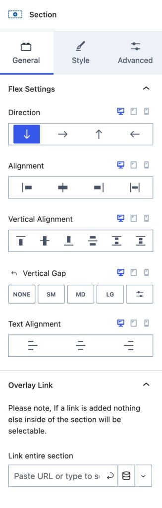
The Section Block General Settings can be used to adjust the flex and other general settings for a Section Block. The first settings displayed are the Flex Settings.

Flex Settings: These settings control the Flex CSS used on your Section. The direction will determine which other Flex Settings are available. If the Direction is changed, it will also change the remaining flex settings to match that Direction.

Vertical Flex Direction

The Vertical Flex Direction is the default one used on new Section Blocks. The Vertical Flex Direction and Reverse Vertical Flex Direction options present the same flex settings.

Direction: This determines the direction your Section will present inner content. By default, this is set to Vertical. So blocks will stack on top of each other within the section. Other available options are Horizontal, Reverse Vertical, and Reverse Horizontal. When using a reverse option, it will reverse the inner contents order.

Alignment: This determines where your Items will Align. This can be set to Start, Center, End, or Stretch. Stretch will force the content to stretch and fill in any extra space between inner items.

Vertical Alignment: This is for the Vertical Alignment of the items within your Section. This can be set to Top, Middle, Bottom, Space Between, Space Around, or Space Evenly.

Vertical Gap: This sets a Vertical Gap between items within the Section.

Text Alignment: Set a specific Alignment for the inner text of the Section Block.

Overlay Link: You can use this option to add an Overlay Link to your Section. This will turn the entire Section into a clickable link.,

Horizontal Flex Direction

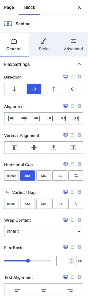
The Horizontal Flex Direction and Reverse Horizontal Flex Direction options present the same flex settings while allowing the content to display horizontally.

Alignment: This determines where your Items will align. This can be set to Start, Center, End, Space Between, Space Around, or Space Evenly.

Vertical Alignment: This is also for the Vertical Alignment of the items within your Section.

Horizontal Gap: This sets a Horizontal Gap to add spacing between items that are Horizontal to each other.

Vertical Gap: Whenever the Horizontal content wraps, it will have items vertically below your inner contents. The Vertical Gap can be used to adjust that spacing.

Wrap Content: Whenever a Section doesn’t have room to stay Horizontal, the Wrap Content option can be used. This can be set to inherit, wrap, wrap reverse, or no wrap.

Flex Basis: This sets the starting width for an item inside your Section. When used with Wrap Content, Flex Basis determines the minimum space each item needs before it will wrap onto a new line.
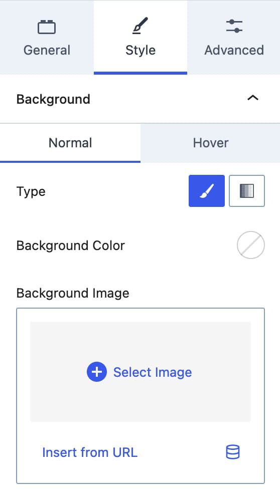
Style Settings

The Style settings have settings for the background, background overlay, border styles, and text color settings.

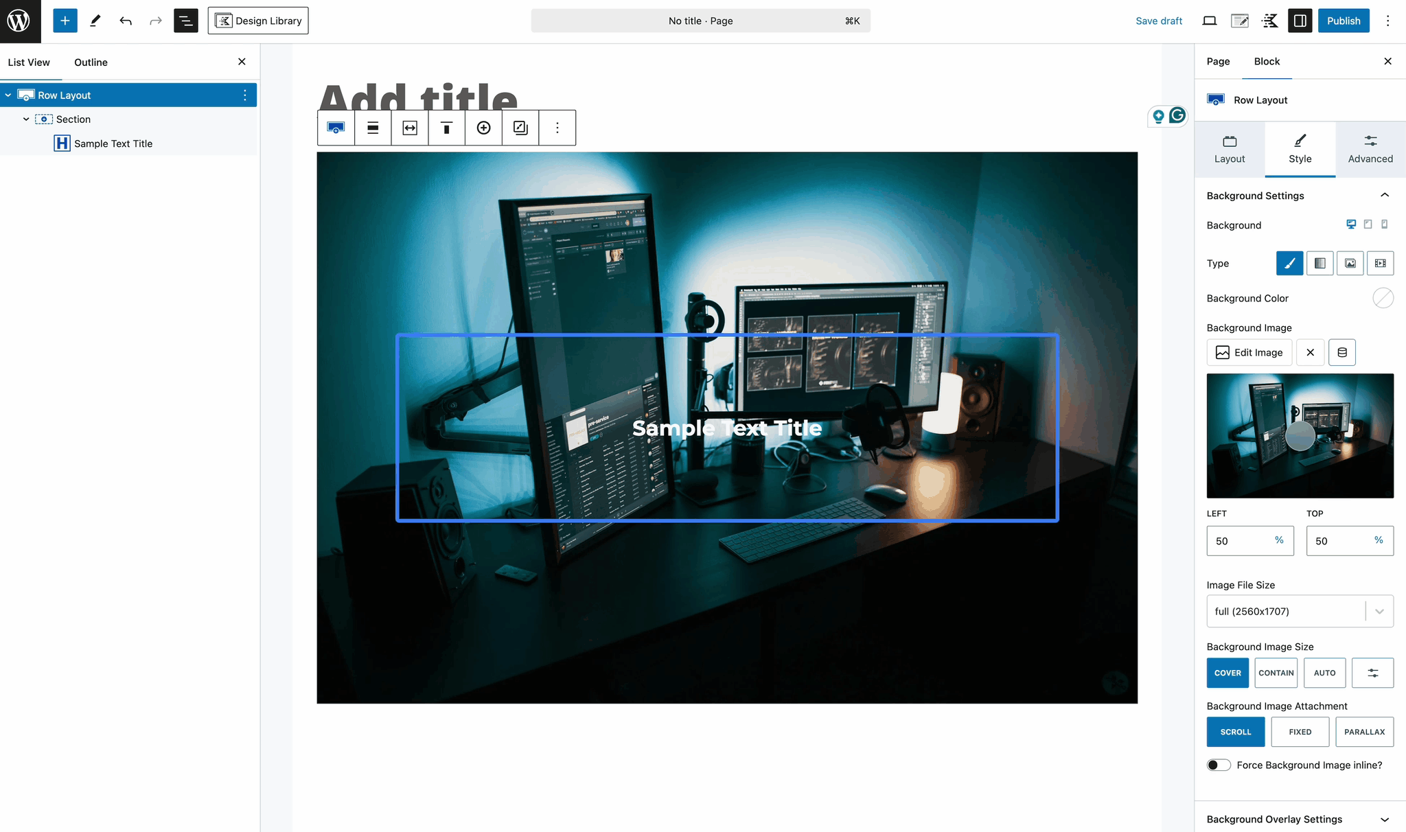
Background: Set a Background Color or Image for the Normal and Hover state of your Background.

Type: Set your Background Type as a Color or a Gradient Color.

Background Image: Rather than using a color, a Background Image can be used instead. This option also supports Dynamic Content.

Note: while it is possible to specify a video as a background image using the Insert from URL option (i.e. MP4 or similar format), many browsers do not support video background images. To properly insert a video background, please see: Adding Video Backgrounds to Row Layout.

Style Settings A

Backdrop Filter

The Backdrop Filter settings allow you to apply a Backdrop Filter effect to Sections layered over other content, such as Row Layout Images Backgrounds. These settings are specifically designed for Sections with completely Transparent or Semi-Transparent Background Colors or Gradients. By default, the Section Block Background is transparent, enabling the Backdrop Filter to apply automatically.

To make the Backdrop Filter effective, having content behind the Section is important. For example, if you’re using a Row Layout Block with a nested Section Block, you can set an Image Background for the Row Layout Block. Then, apply the Section Backdrop Filter to create an effect over the Row Layout’s Image Background.

Backdrop Section

Optionally, you can add a Semi-Transparent Background or Gradient to the Section Block to further refine the Backdrop Effect. Use the Opacity Slider within the Color Picker to adjust the transparency level, enhancing the filter’s visual impact.

Transparency Color

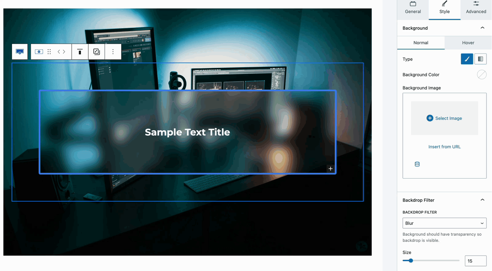
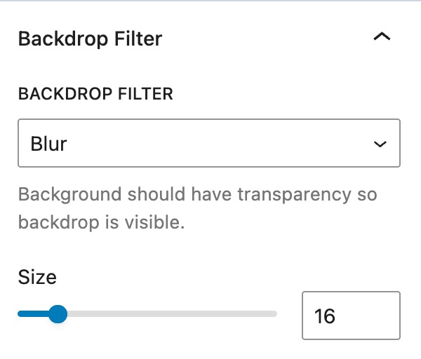
Backdrop Filter: Add a Backdrop Filter to the Background of the Section Block. Use the Size Slider to emphasize how strong you would like the Backdrop Filter to apply.

Available Filters: Blur, Brightness, Contrast, Greyscale, Hue Rotate, Invert, Saturate, or Sepia

BackDrop Filter

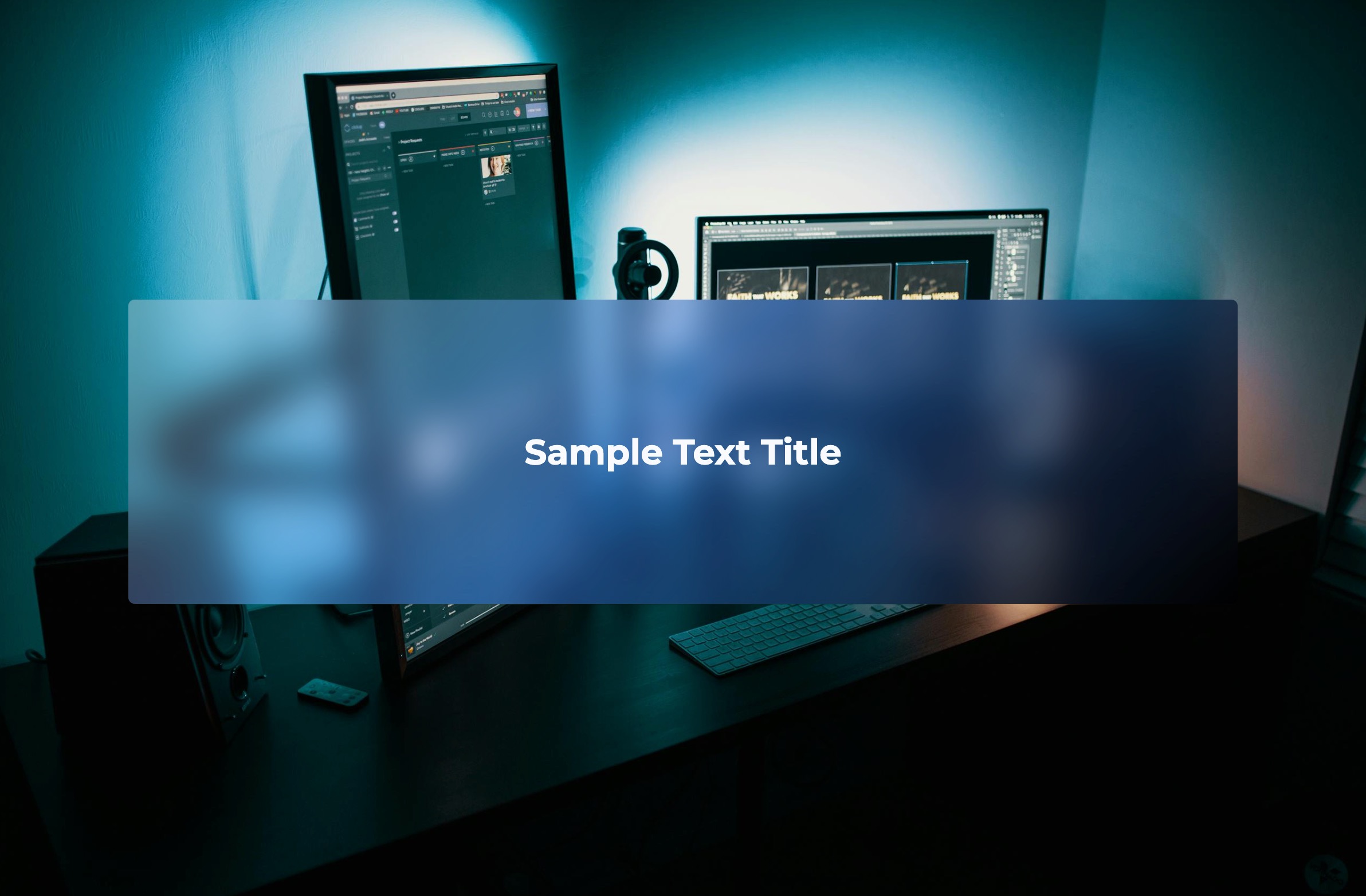
Example of a Blur Backdrop Filter.

Backdrop Example

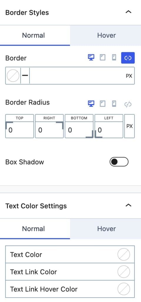
Border Styles: Adjust the Section Border Styles for the Normal and Hover States.

Border: Apply a Border to your Section. On the left side of the Border setting, a Border Color can be selected.

Border Radius: Add a Border Radius to your Section.

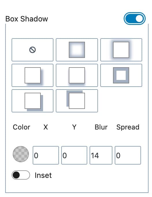
Box Shadow: Enable and use a Box Shadow on the Section.

Box Shadow

Text Color Settings: These settings control the text colors within a Section. These settings can be set for the Normal and Hover State.

Text Color: This is the regular color of text.

Text Link Color: This applies to Link Texts within the Section.

Text Link Hover Color: This applies to Link Texts within the Section whenever they are hovered over.

Style Settings B

Advanced Settings

The Advanced Settings allow you to adjust advanced settings such as spacing settings, structure settings, visibility settings, and more.

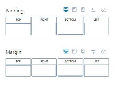
Padding: Adjust the padding around the Section.

Margin: Adjust the margin around the Section.

Padding Margin

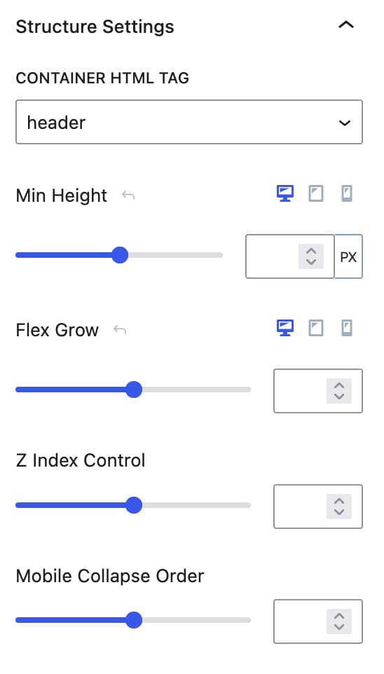
Container HTML Tag: Set the HTML Tag that the Section Block will use. By default, this is set to Div and doesn’t need to be changed unless there is a specific use case to change the HTML Tag. The options available are div, header, section, article, main, aside, or footer.

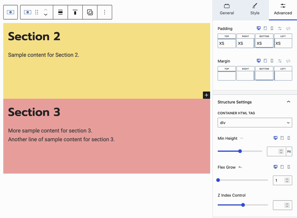
Min Height: Set a minimum height for your Section. This ensures the Section is at least the height of this setting or greater.

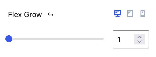
Flex Grow: Set Sections to use the Flex Grow feature. This can grow Section sizes and cause Sections to increase in size to fill a space. View the Flex Grow Demonstration below for an example of how this can be used.

Z Index Control: Control the Z Index of your Section. This can be useful for cases where you may need to display content behind or in front of a Section.

Mobile Collapse Order: Whenever a Section is inside of a Row Layout Block and the screen size goes from Desktop to Mobile, sections will usually collapse into rows. In this case, you can set a Mobile Collapse Order for each section.

Structure Settings

Flex Grow

The Flex Grow setting can be used whenever you have multiple sections in a layout like the one below:

Flex Grow Sample 1

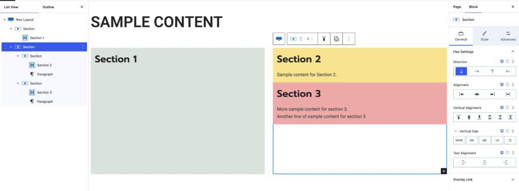
In this case, the second and third sections have empty space below them. In many cases, it is ideal for these sections to stretch and fill in areas like this. Using the Bottom Vertical Alignment option along with setting a Flex Grow to the sections used, allows the sections to grow and fill in so there is no space left.

In the demonstration above, there is a Row Layout Block with two main sections. Inside the second section, there are two more sections. In this case, we would focus on the Row Layout Block’s Second Main Section and the two Nested Sections within it.

Flex Grow Sample 2

The first step to make the Second and Third Sections grow would be to set the Parent Section Vertical Alignment to the Bottom option.

Bottom Align Gif

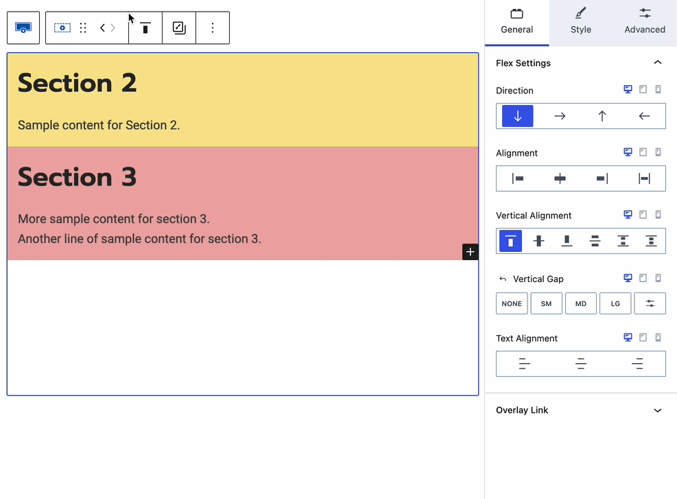
Then, in the Advanced Block Settings -> Structure Settings, apply a Flex Grow of 1 to the Parent Section. (The flex-grow values can vary based on the design. This is just for demonstration purposes)

Finally, each Nested Section can be set to also use a Flex Grow of 1 or another preferred value. This will make each Section use the same Grow and equally fill in the Parent Sections Space.

Flex Grow Sample 3

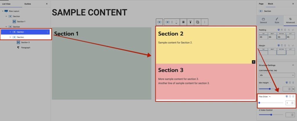
The Flex Grow setting can be adjusted on each Nested Section individually to get the desired layout. Increasing the Flex Grow value will allow the Section to take up more of the available space. Lowering the Flex Grow value will make the Section take up less space.

Flex Grow Sample 4

Sticky Settings

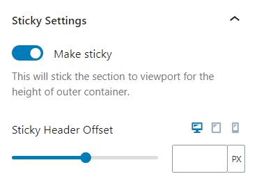
Sticky Settings: The Sticky Option can be used on a Section inside of Row Layout Block. Making a Section Sticky will keep it sticky as the user scrolls through a row. This is particularly useful when dealing with multiple columns of varying heights.

Sticky Section


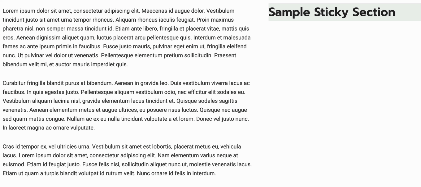
The section sticks to the top of the page but can be offset for the header.

Section Sticky Settings

Notes:

  • Sticky section setting wouldn’t work for the “Collapse to Rows” Row Layout.
    • If you stack the sections, the styles will not work.
    • The built-in sticky section’s CSS styles will be applied to an inner div element, and the main div of the Section block needs to have enough height for that inner div to “stick”.
  • If the sticky section setting is not working, check the vertical alignment setting and make sure that no vertical alignment is set.
  • Don’t turn on the Inner Column Height 100% option in the parent Row Layout block.

By setting an alignment and turning on the equal heights option, you’ve likely affected the column’s height so that the sticky element inside no longer has room to “stick” — it just scrolls normally.
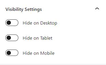
Visibility Settings

Visibility Settings: Hide the Section Block for specific devices. The Sec Block can be hidden for desktop, tablet, and mobile devices.

You can also hide the Section Layout Block from logged-in and logged-out users.

Section Block Visibility Settings

Block Defaults: You can save your Section Block Settings as a Block Default Click here to learn more,

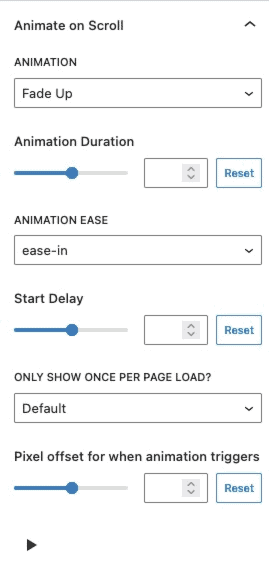
Animate on Scroll (Premium)

The Animate on Scroll settings allow you to add an animation to your block. This is a Premium feature and requires either Kadence Blocks Pro or Kadence Creative Kit to work.

You can select an animation duration, ease, and start delay. You can set this animation to show once per page and set a pixel offset for when the animation triggers.

You can press on the play icon at the bottom of the settings to see how your animation looks in the editor.

animate on scroll

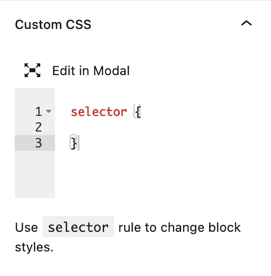
Custom CSS: Add CSS directly inside the Section Block using this Block Setting. Click on the Edit in Modal button above the Selector to view the CSS in a larger popup modal. Use the Selector rule to change the Section Block Styles when using Custom CSS.

For example:

selector {
color: #ffff;
}

Row Layout Custom CSS

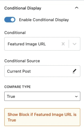
Conditional Display (Pro)

The Conditional Display setting allows you to display the block based on a condition. This is also a Kadence Blocks Pro feature.

Check out our post here for more details about the Conditional Display options.

conditional display

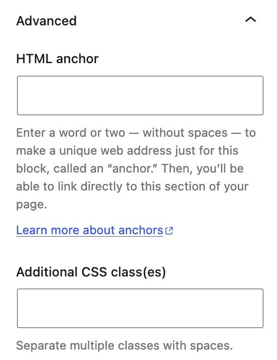
HTML Anchor: Set an HTML Anchor ID to your Section.

Additional CSS Class(es): Add additional custom CSS Classes to the Section.

Advanced Settings
Do you feel this document was helpful?
Gallery (Adv) BlockTestimonial Block
The Kadence WP Logo
Crafted in Missoula, Montana
  • Follow Kadence on Facebook
  • Follow Kadence on Youtube
  • X
  • Follow Kadence on Instagram
Trustpilot
Products
  • Kadence Plans
  • Kadence Theme
  • Kadence Blocks
  • Kadence AI
  • Kadence Starter Templates
  • Kadence Shop Kit
  • Kadence Conversions
  • Kadence Pattern Hub
  • View All
Resources
  • Blog
  • Podcast
  • Knowledgebase
  • Support ticket
  • Feature Requests
  • FAQ
  • WordPress Hosting Services
About Us
  • About Kadence
  • Become an affiliate
  • Contact us
  • Terms
  • Privacy Policy
  • Security
Our Partner Brands
  • SolidWP
  • LearnDash
  • The Events Calendar
  • GiveWP
  • MemberDash
Kadence Community
  • Kadence Marketplace
  • Join the Facebook Group
  • Subscribe to our YouTube Channel
© 2024 Kadence WP | All prices are in USD
Logo for StellarWP an umbrella brand of Premium WordPress plugins
  • Pricing
  • Products
    • Premium PlansGet all the tools you need in one plan
    • Kadence ThemeLightning-fast performance theme for modern websites
    • Kadence BlocksDrop in ready designs with advanced controls for pixel perfect websites
    • Kadence Shop KitCreate a more effective WooCommerce shopping experience
    • Kadence ConversionsBoost sales and build engaged audiences with popups and banners
    • Kadence InsightsEasily create A/B tests. Optimize your pages to drive higher conversions.
    • View All Products
    • Get Kadence + Hosting
      In One Place

      Enjoy faster setup, top-tier performance, and worry-free WordPress hosting – Kadence Theme, Kadence Blocks, and Solid Security all pre-installed.

      Learn More

  • Kadence AI
  • Starter Templates
  • Blog
  • Support
    • Resource HubStart here for guides, Product docs, FAQs, and Troubleshooting tips, all in one place.
    • Contact SupportStuck on something? We’re here to help! Open a ticket for top-notch support.
    • Contact Our TeamGot pre-sales questions or need help choosing a plan? Open a ticket and our team will guide you.
    • About usCrafted with love in Missoula, Montana. Meet the team behind the mission.
Account Login
  • Features
  • Pro
  • Blocks
  • HelpExpand
    • Documentation
    • Submit a Ticket
    • Facebook Group
    • Feature Requests
    • Roadmap
    • Changelog